library(tidyverse) # Sine Qua Non package in R
library(mosaic) # Our Favourite Bag of Tricks
library(ggformula) # Graphing
library(skimr) # Data Inspection and Summary
##
library(crosstable) # Fast stats for multiple variables in table form
library(tinytable) # Elegant Tables for our data
library(visdat) # Mapping missing data
library(naniar) # Missing data visualization and munging
library(janitor) # Clean the data
library(tinytable) # Printing Tables for our data
library(DT) # Interactive Tables for our data
library(ggrepel) # Repel overlapping text labels in ggplot2
library(marquee) # Annotations for ggplot2
How much of this and that?
2022-11-15
“The fear of death follows from the fear of life. A man who lives fully is prepared to die at any time.”
— Mark Twain
Plot Fonts and Theme
Code
library(systemfonts)
library(showtext)
## Clean the slate
systemfonts::clear_local_fonts()
systemfonts::clear_registry()
##
showtext_opts(dpi = 96) # set DPI for showtext
sysfonts::font_add(
  family = "Alegreya",
  regular = "../../../../../../fonts/Alegreya-Regular.ttf",
  bold = "../../../../../../fonts/Alegreya-Bold.ttf",
  italic = "../../../../../../fonts/Alegreya-Italic.ttf",
  bolditalic = "../../../../../../fonts/Alegreya-BoldItalic.ttf"
)

sysfonts::font_add(
  family = "Roboto Condensed",
  regular = "../../../../../../fonts/RobotoCondensed-Regular.ttf",
  bold = "../../../../../../fonts/RobotoCondensed-Bold.ttf",
  italic = "../../../../../../fonts/RobotoCondensed-Italic.ttf",
  bolditalic = "../../../../../../fonts/RobotoCondensed-BoldItalic.ttf"
)
showtext_auto(enable = TRUE) # enable showtext
##
theme_custom <- function() {
  theme_bw(base_size = 12) +

    # theme(panel.widths = unit(11, "cm"),
    #       panel.heights = unit(6.79, "cm")) + # Golden Ratio

    theme(
      plot.margin = margin_auto(t = 1, r = 2, b = 1, l = 1, unit = "cm"),
      plot.background = element_rect(
        fill = "bisque",
        colour = "black",
        linewidth = 1
      )
    ) +

    theme_sub_axis(
      title = element_text(
        family = "Roboto Condensed",
        size = 12
      ),
      text = element_text(
        family = "Roboto Condensed",
        size = 10
      )
    ) +

    theme_sub_legend(
      text = element_text(
        family = "Roboto Condensed",
        size = 8
      ),
      title = element_text(
        family = "Alegreya",
        size = 10
      )
    ) +

    theme_sub_plot(
      title = element_text(
        family = "Alegreya",
        size = 14, face = "bold"
      ),
      title.position = "plot",
      subtitle = element_text(
        family = "Alegreya",
        size = 10
      ),
      caption = element_text(
        family = "Alegreya",
        size = 6
      ),
      caption.position = "plot"
    )
}

## Use available fonts in ggplot text geoms too!
ggplot2::update_geom_defaults(geom = "text", new = list(
  family = "Roboto Condensed",
  face = "plain",
  size = 3.5,
  color = "#2b2b2b"
))
ggplot2::update_geom_defaults(geom = "label", new = list(
  family = "Roboto Condensed",
  face = "plain",
  size = 3.5,
  color = "#2b2b2b"
))

ggplot2::update_geom_defaults(geom = "marquee", new = list(
  family = "Roboto Condensed",
  face = "plain",
  size = 3.5,
  color = "#2b2b2b"
))
ggplot2::update_geom_defaults(geom = "text_repel", new = list(
  family = "Roboto Condensed",
  face = "plain",
  size = 3.5,
  color = "#2b2b2b"
))
ggplot2::update_geom_defaults(geom = "label_repel", new = list(
  family = "Roboto Condensed",
  face = "plain",
  size = 3.5,
  color = "#2b2b2b"
))

## Set the theme
ggplot2::theme_set(new = theme_custom())

## tinytable options
options("tinytable_tt_digits" = 2)
options("tinytable_format_num_fmt" = "significant_cell")
options(tinytable_html_mathjax = TRUE)


## Set defaults for flextable
flextable::set_flextable_defaults(font.family = "Roboto Condensed")

Quantitative Data
carat(dbl): weight of the diamond 0.2-5.01depth(dbl): depth total depth percentage 43-79table(dbl): width of top of diamond relative to widest point 43-95price(dbl): price in US dollars $326-$18,823x(dbl): length in mm 0-10.74y(dbl): width in mm 0-58.9z(dbl): depth in mm 0-31.8
Qualitative Data
cut: diamond cut Fair, Good, Very Good, Premium, Ideal color: diamond color J (worst) to D (best). (7 levels) clarity. measurement of how clear the diamond is I1 (worst), SI2, SI1, VS2, VS1, VVS2, VVS1, IF (best).
These have 5, 7, and 8 levels respectively. The fact that the class for these is ordered suggests that these are factors and that the levels have a sequence/order.
Business Insights on Examining the diamonds dataset
- This is a large dataset (54K rows).
- There are several Qualitative variables:
carat,price,x,y,z,depthandtableare Quantitative variables.- There are no missing values for any variable, all are complete with 54K entries.
price?
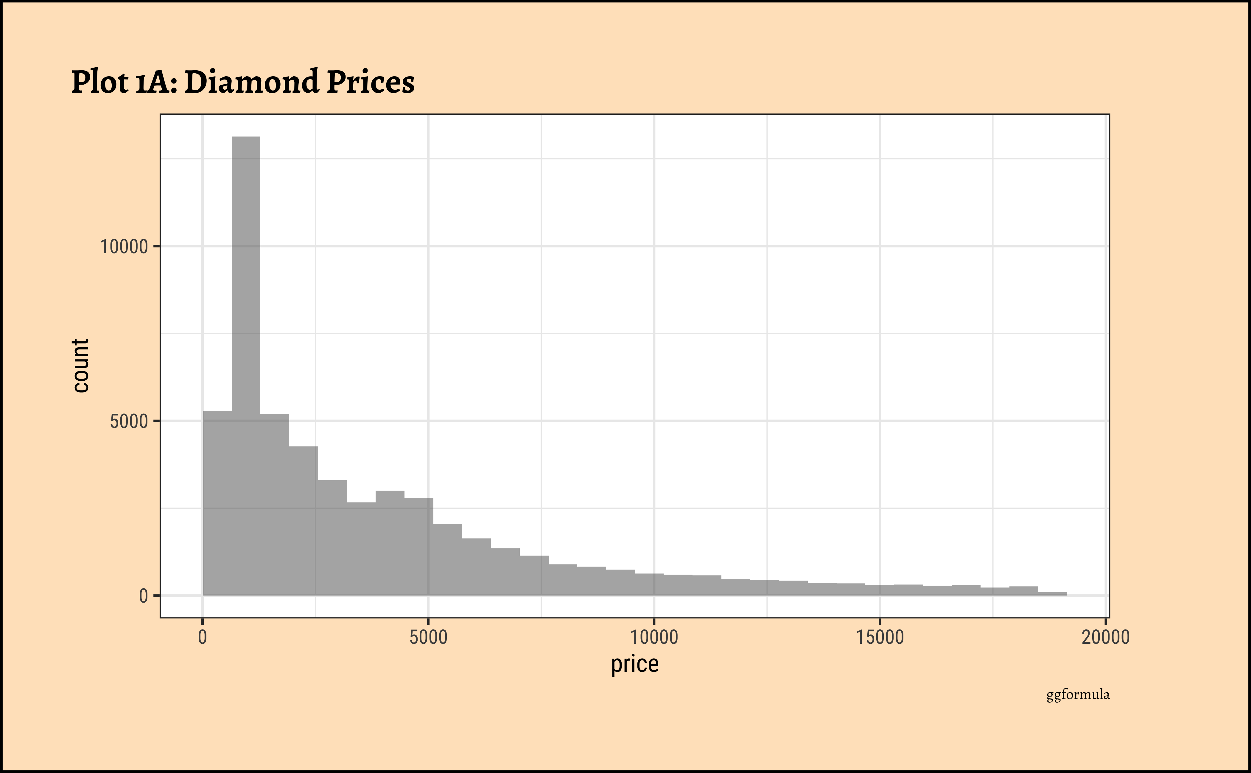
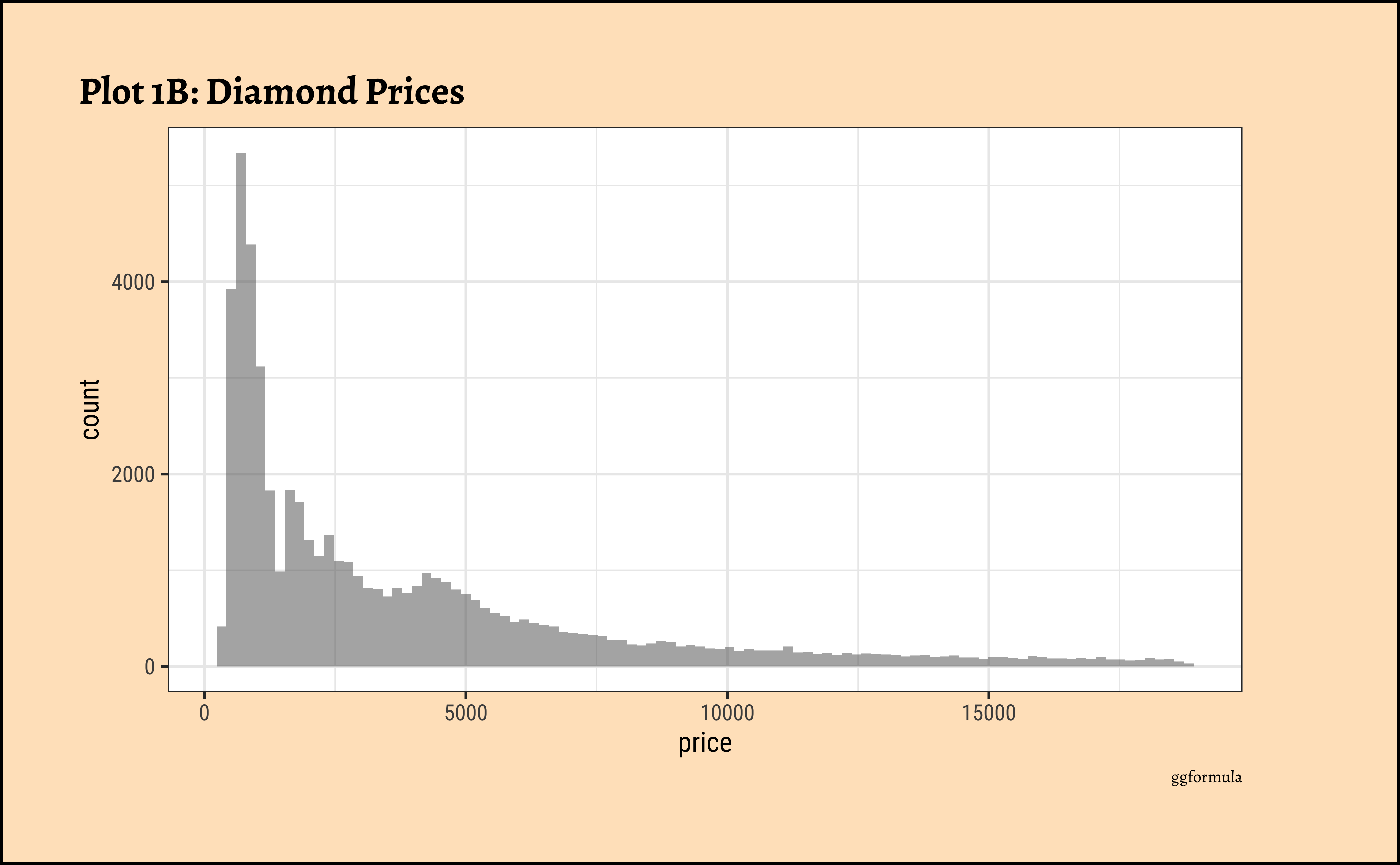
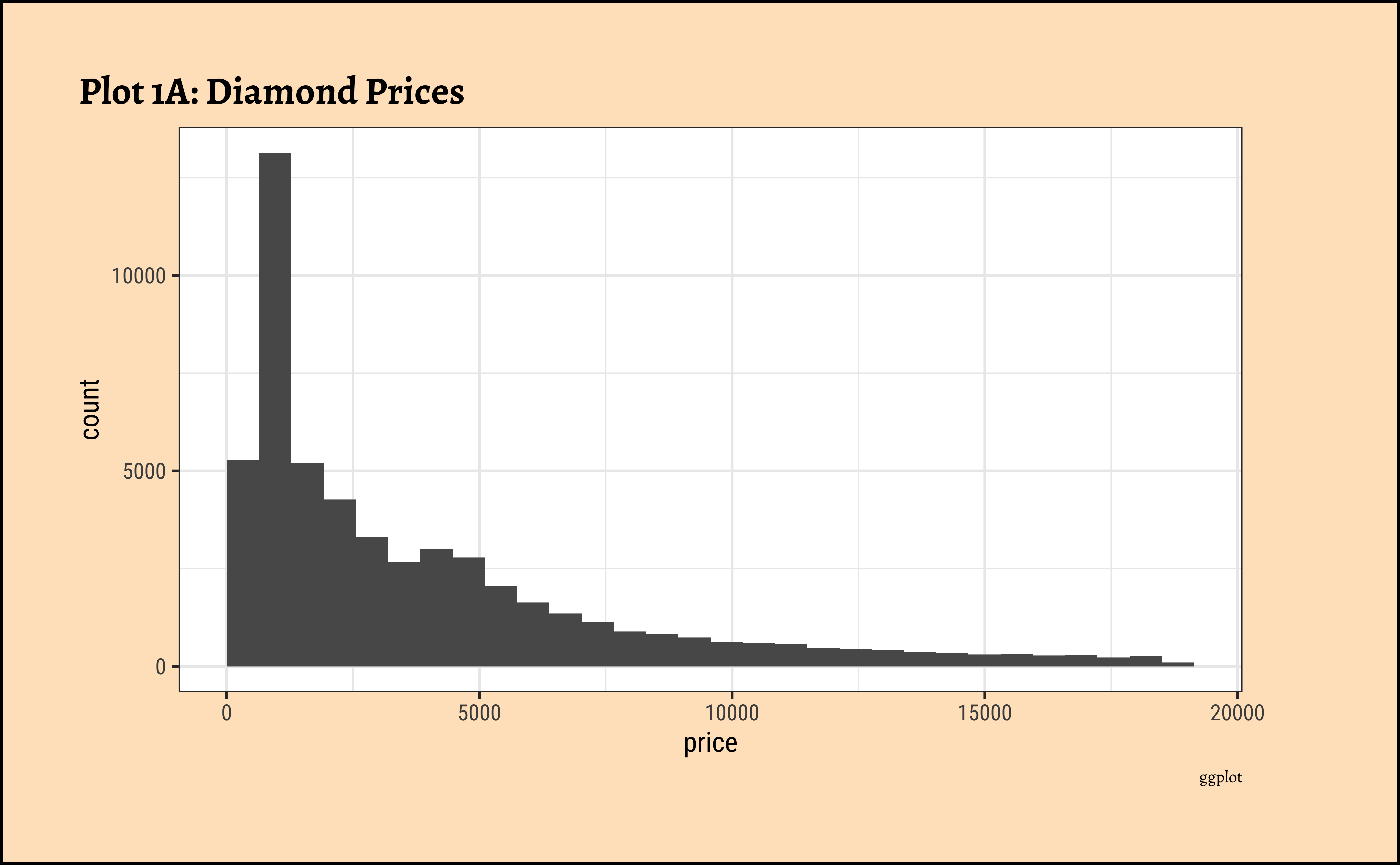
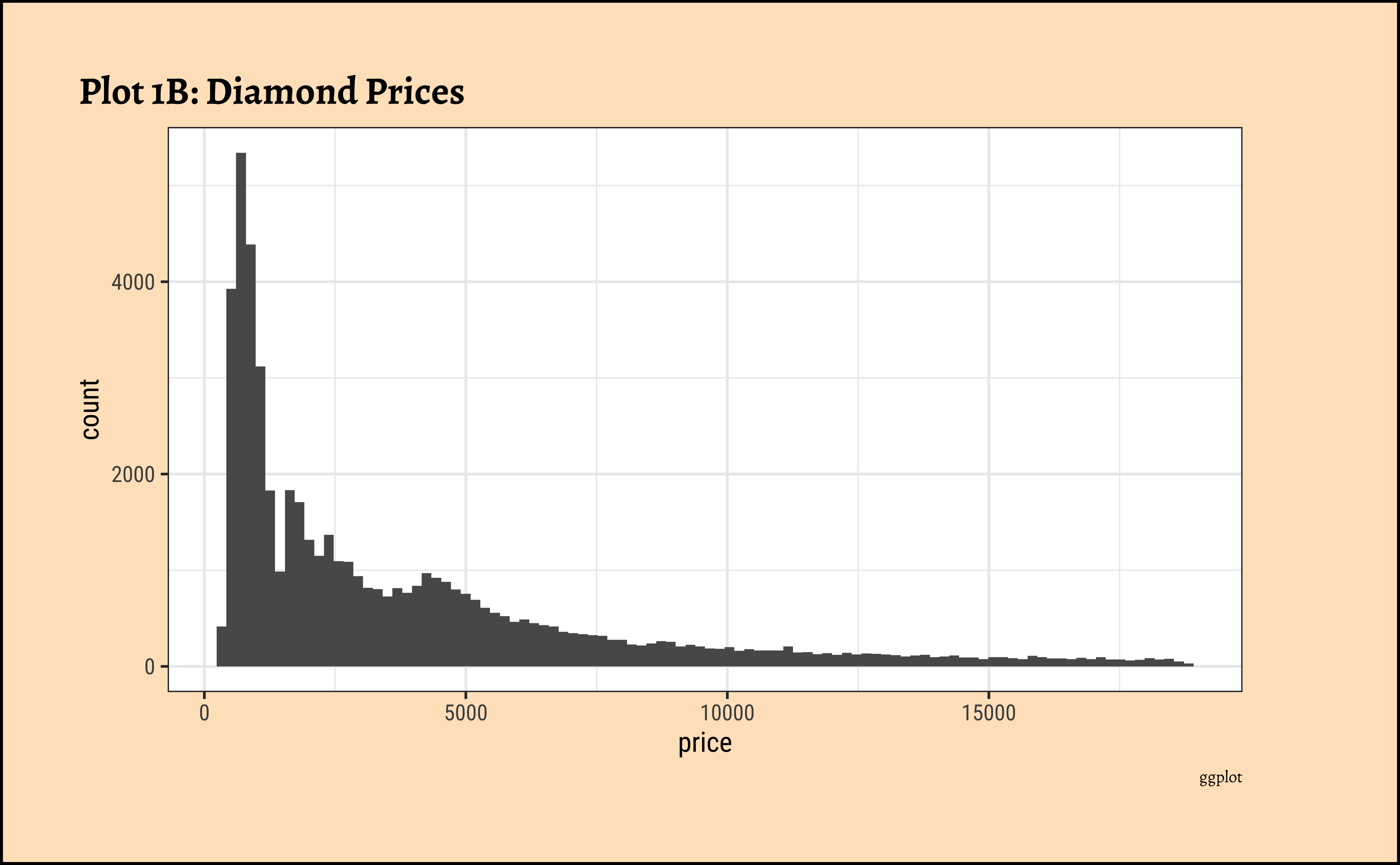
- The
pricedistribution is heavily skewed to the right.
- There are a great many diamonds at relatively low prices, but there are a good few diamonds at very high prices too.
- Using a high number of bins does not materially change the view of the histogram.
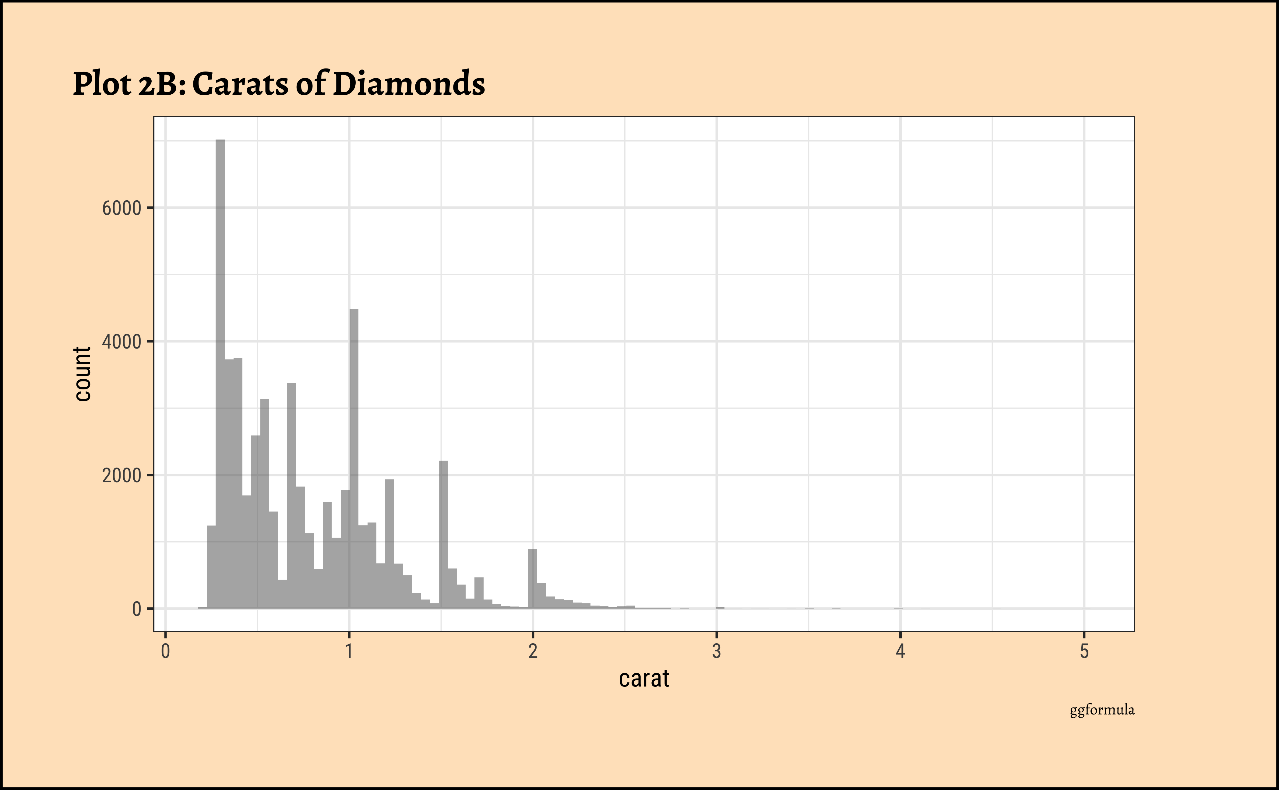
carat?
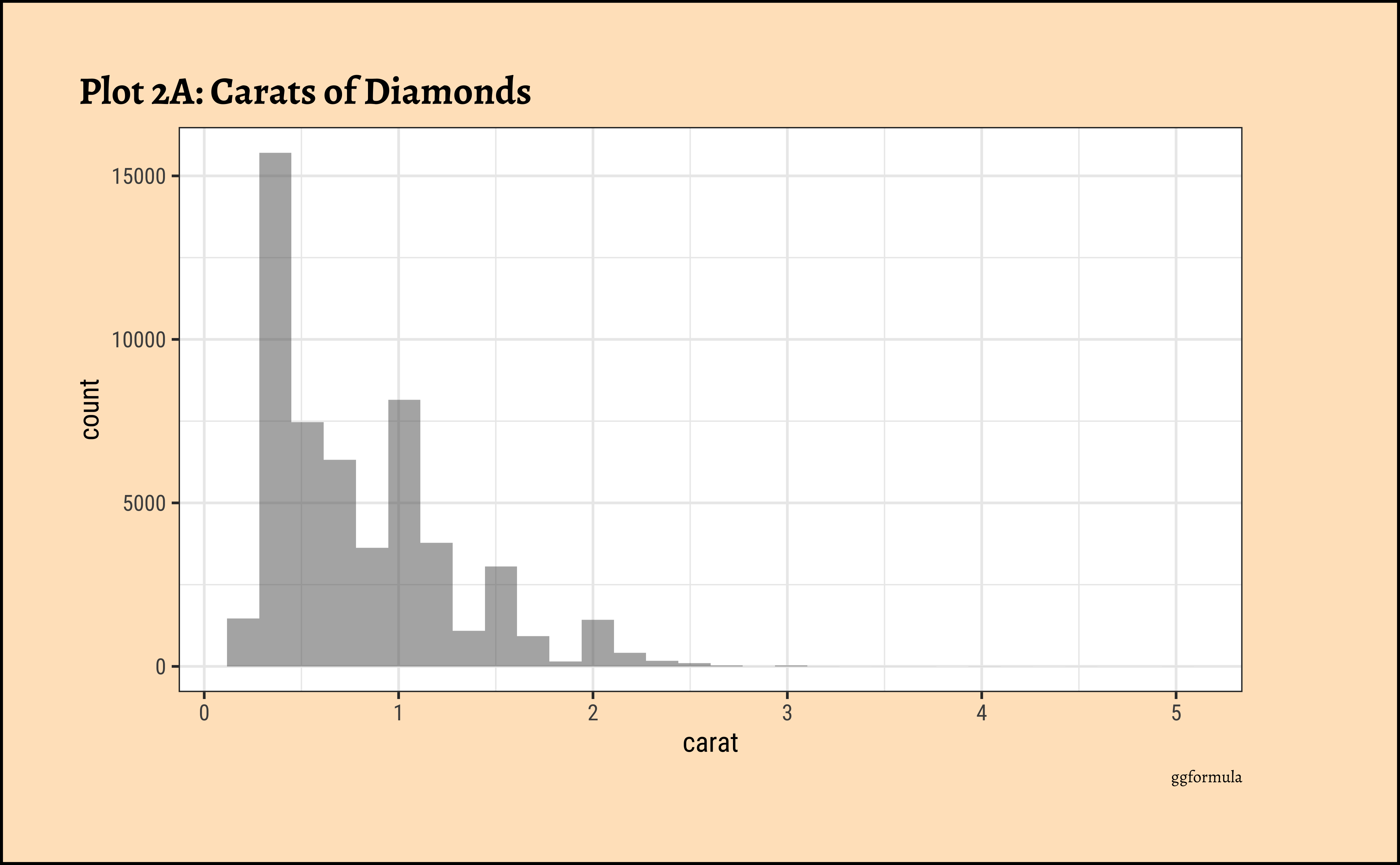
ggplot2::theme_set(new = theme_custom())

diamonds_modified %>%
  ggplot() +
  geom_histogram(aes(x = carat)) +
  labs(
    title = "Plot 2A: Carats of Diamonds",
    caption = "ggplot"
  )
## More bins
diamonds_modified %>%
  ggplot() +
  geom_histogram(aes(x = carat), bins = 100) +
  labs(
    title = "Plot 2A: Carats of Diamonds",
    caption = "ggplot"
  )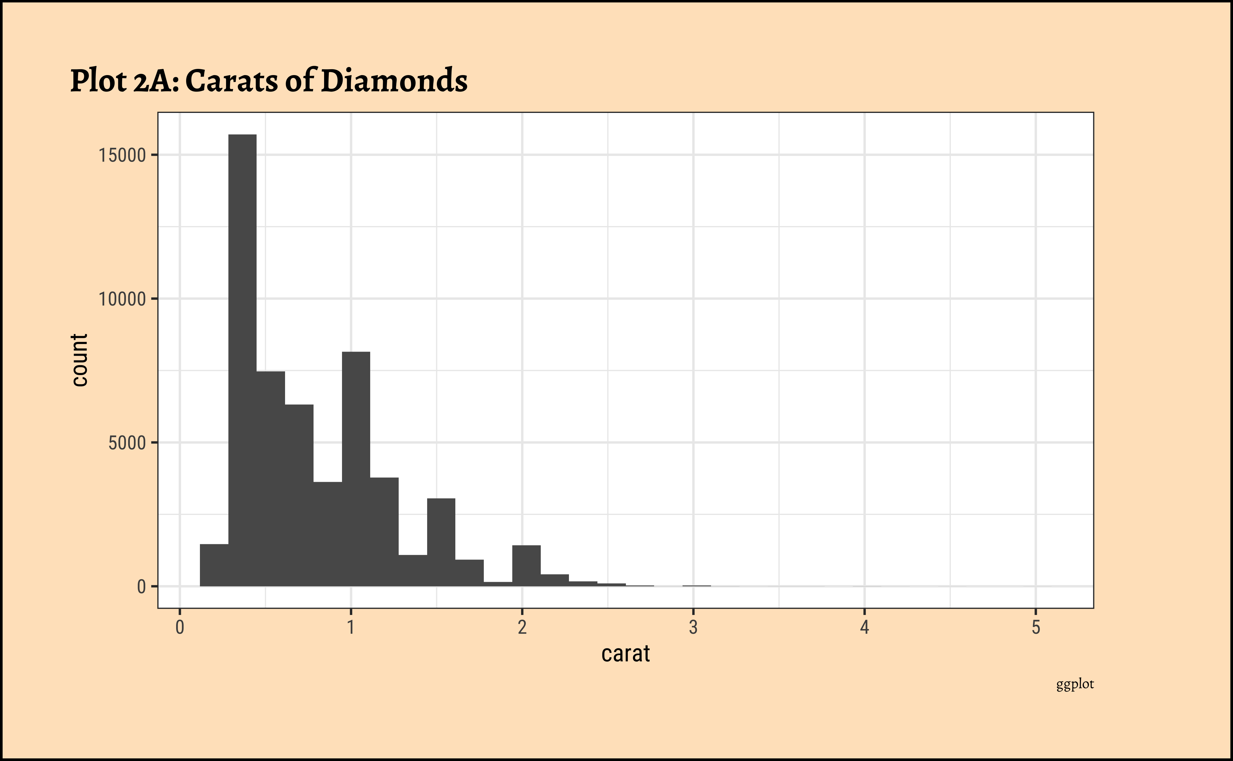
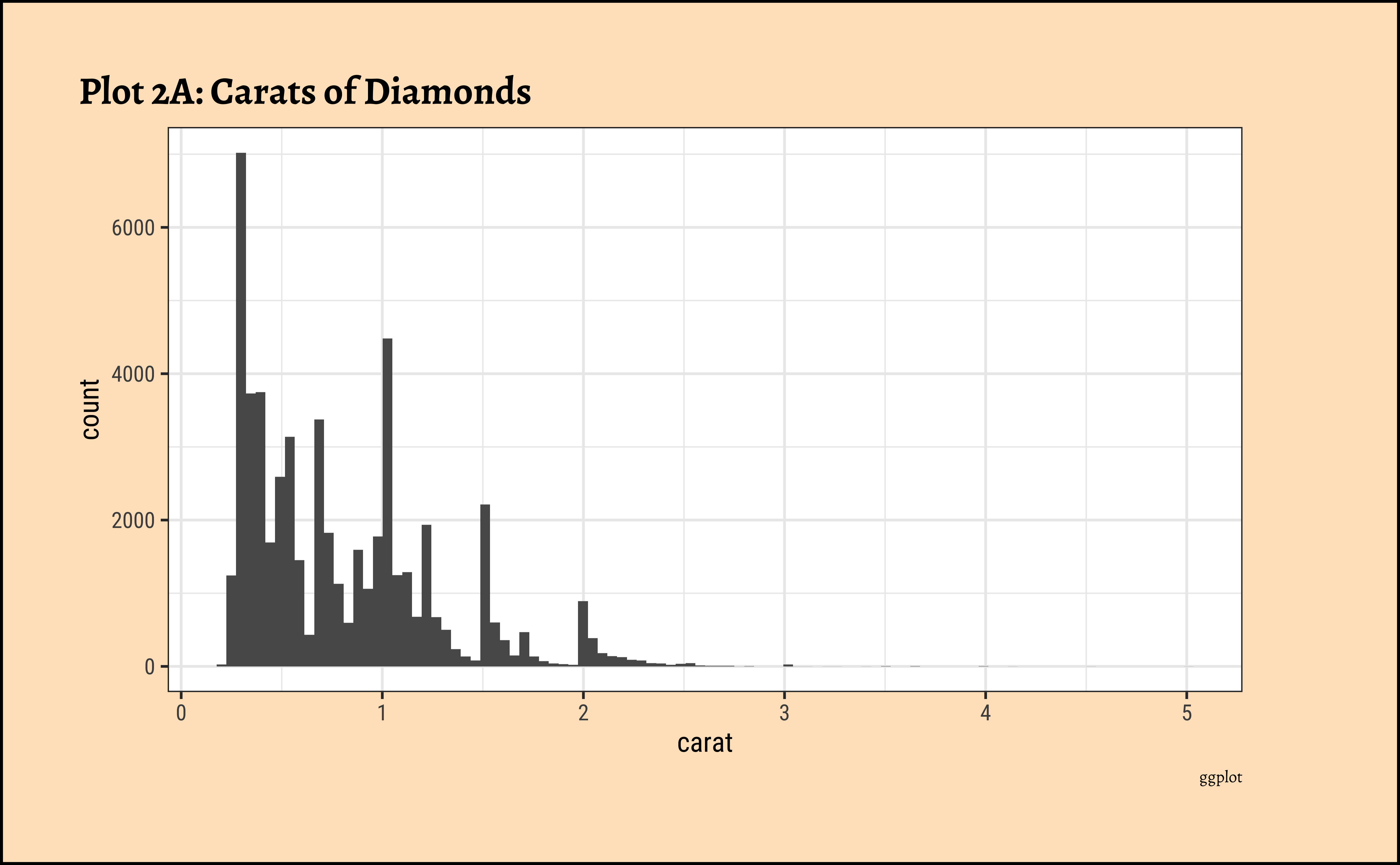
caratalso has a heavily right-skewed distribution.
- However, there is a marked “discreteness” to the distribution. Some values of carat are far more common than others. For example, 1, 1.5, and 2 carat diamonds are large in number.
- Why does the X-axis extend up to 5 carats? There must be some, very few, diamonds of very high carat value!
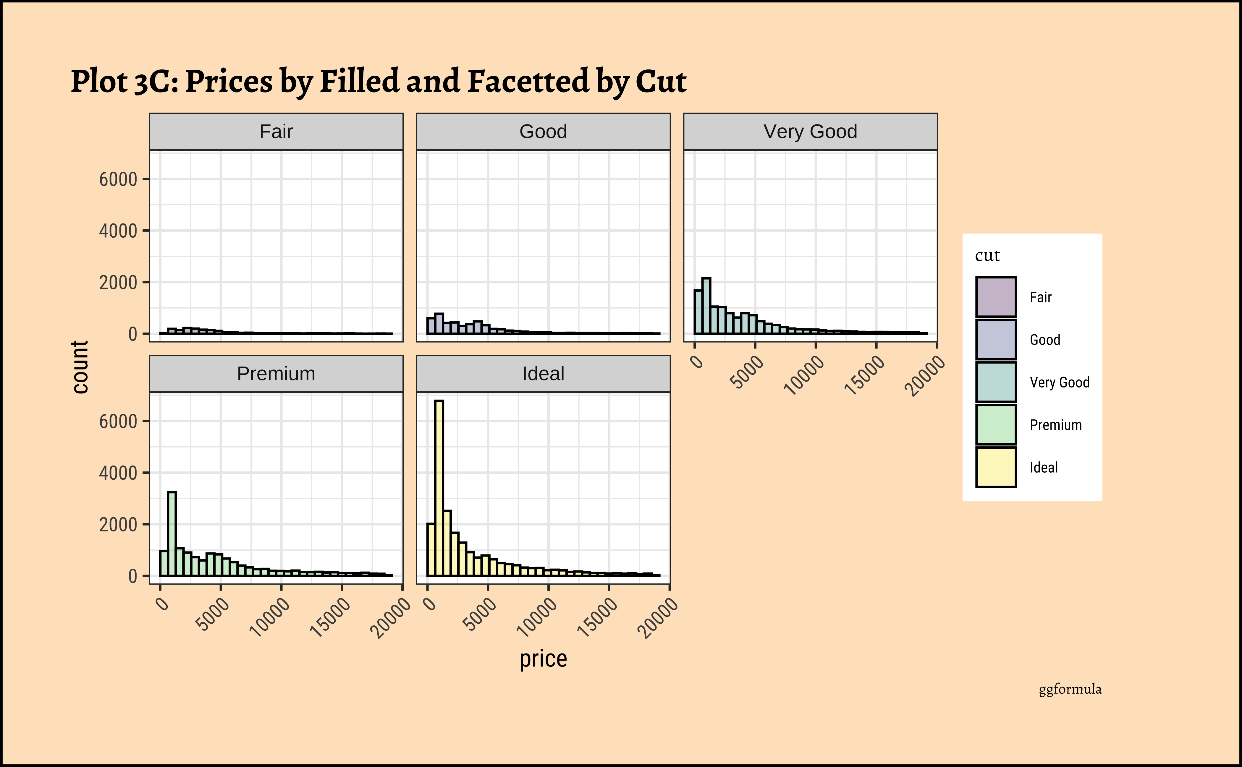
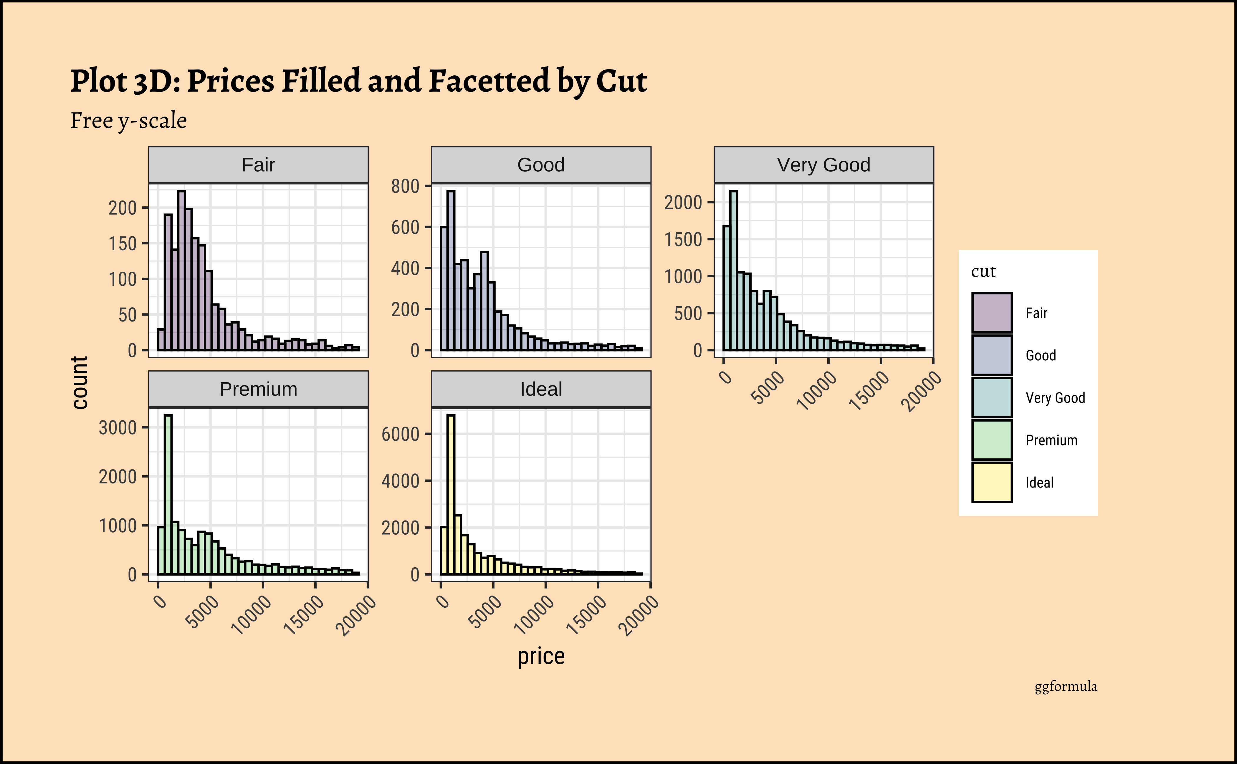
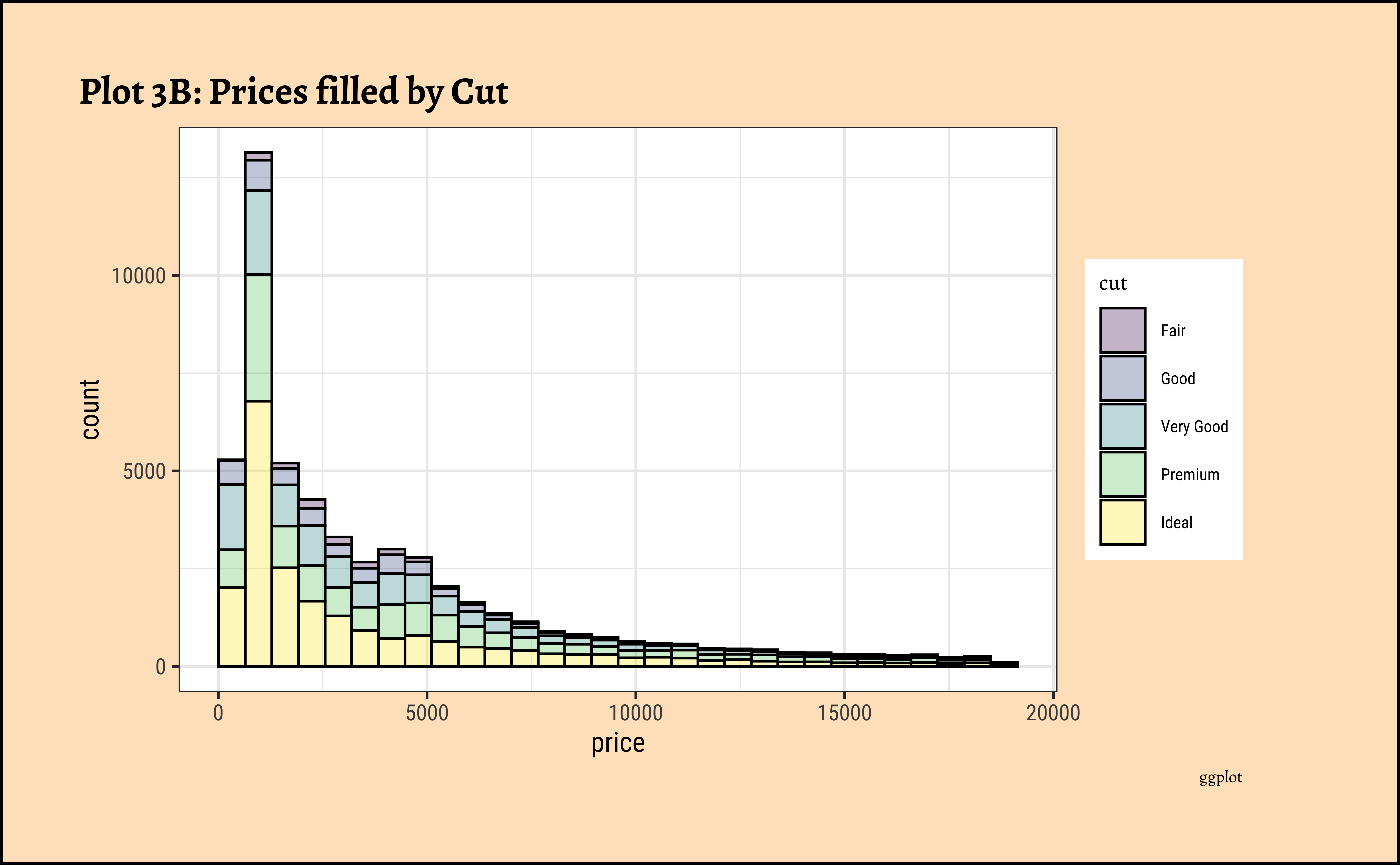
price distribution vary based upon type of cut, clarity, and color?

ggplot2::theme_set(new = theme_custom())

diamonds_modified %>%
  gf_histogram(~price, fill = ~cut, color = "black", alpha = 0.3) %>%
  gf_facet_wrap(~cut) %>%
  gf_labs(
    title = "Plot 3C: Prices by Filled and Facetted by Cut",
    caption = "ggformula"
  ) %>%
  gf_theme(theme(
    axis.text.x = element_text(
      angle = 45,
      hjust = 1
    )
  ))
ggplot2::theme_set(new = theme_custom())

diamonds_modified %>%
  gf_histogram(~price, fill = ~cut, color = "black", alpha = 0.3) %>%
  gf_facet_wrap(~cut, scales = "free_y", nrow = 2) %>%
  gf_labs(
    title = "Plot 3D: Prices Filled and Facetted by Cut",
    subtitle = "Free y-scale",
    caption = "ggformula"
  ) %>%
  gf_theme(theme(
    axis.text.x =
      element_text(
        angle = 45,
        hjust = 1
      )
  ))
ggplot2::theme_set(new = theme_custom())
diamonds_modified %>% ggplot() +
geom_histogram(aes(x = price, fill = cut), alpha = 0.3) +
labs(title = "Plot 3A: Prices by Cut", caption = "ggplot")
##
diamonds_modified %>%
ggplot() +
geom_histogram(aes(x = price, fill = cut),
colour = "black", alpha = 0.3
) +
labs(title = "Plot 3B: Prices filled by Cut", caption = "ggplot")
##
diamonds_modified %>% ggplot() +
geom_histogram(aes(price, fill = cut),
colour = "black", alpha = 0.3
) +
facet_wrap(facets = vars(cut)) +
labs(
title = "Plot 3C: Prices by Filled and Facetted by Cut",
caption = "ggplot"
) +
theme(axis.text.x = element_text(angle = 45, hjust = 1))
##
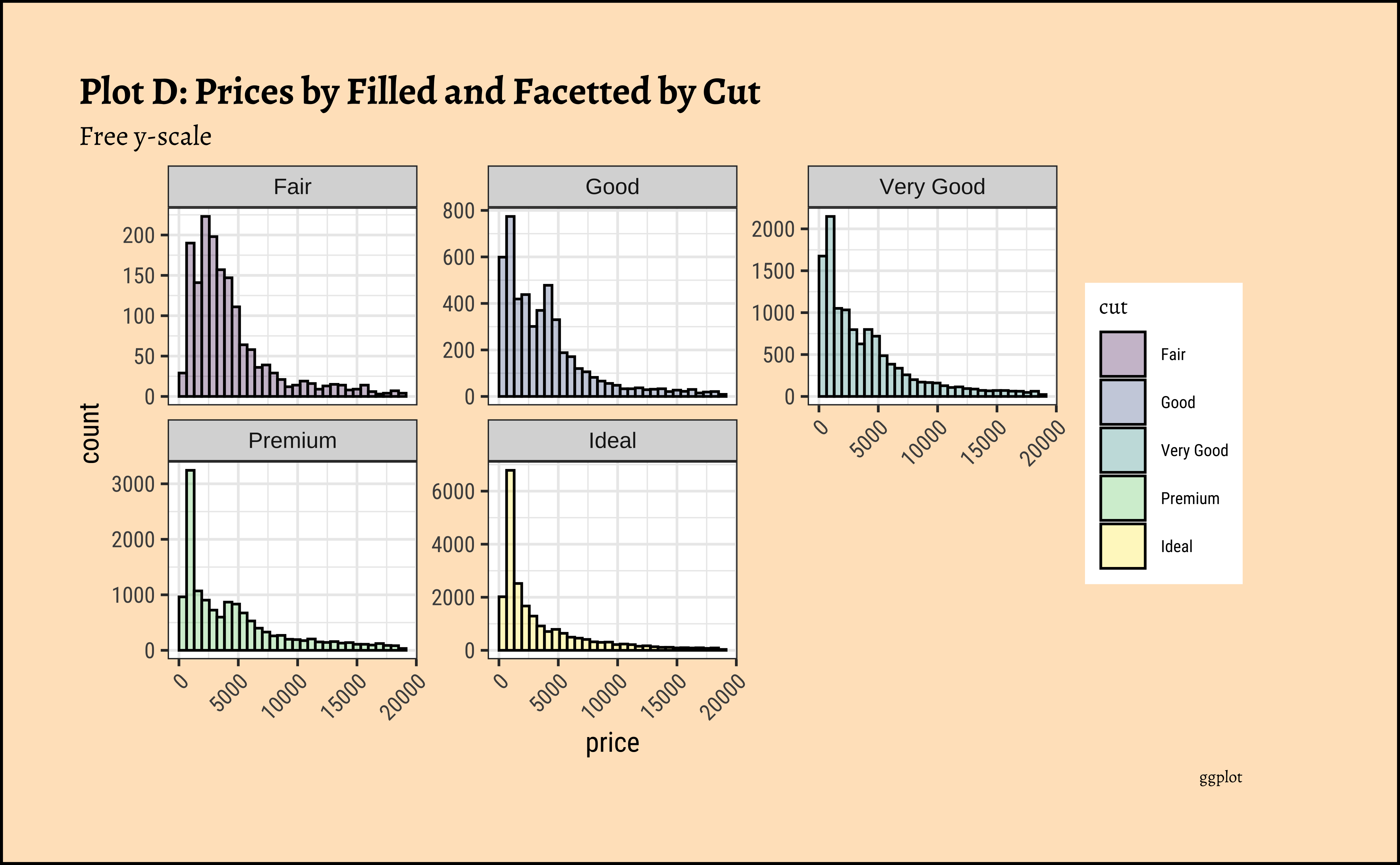
diamonds_modified %>% ggplot() +
geom_histogram(aes(price, fill = cut),
colour = "black", alpha = 0.3
) +
facet_wrap(facets = vars(cut), scales = "free_y") +
labs(
title = "Plot D: Prices by Filled and Facetted by Cut",
subtitle = "Free y-scale",
caption = "ggplot"
) +
theme(axis.text.x = element_text(angle = 45, hjust = 1))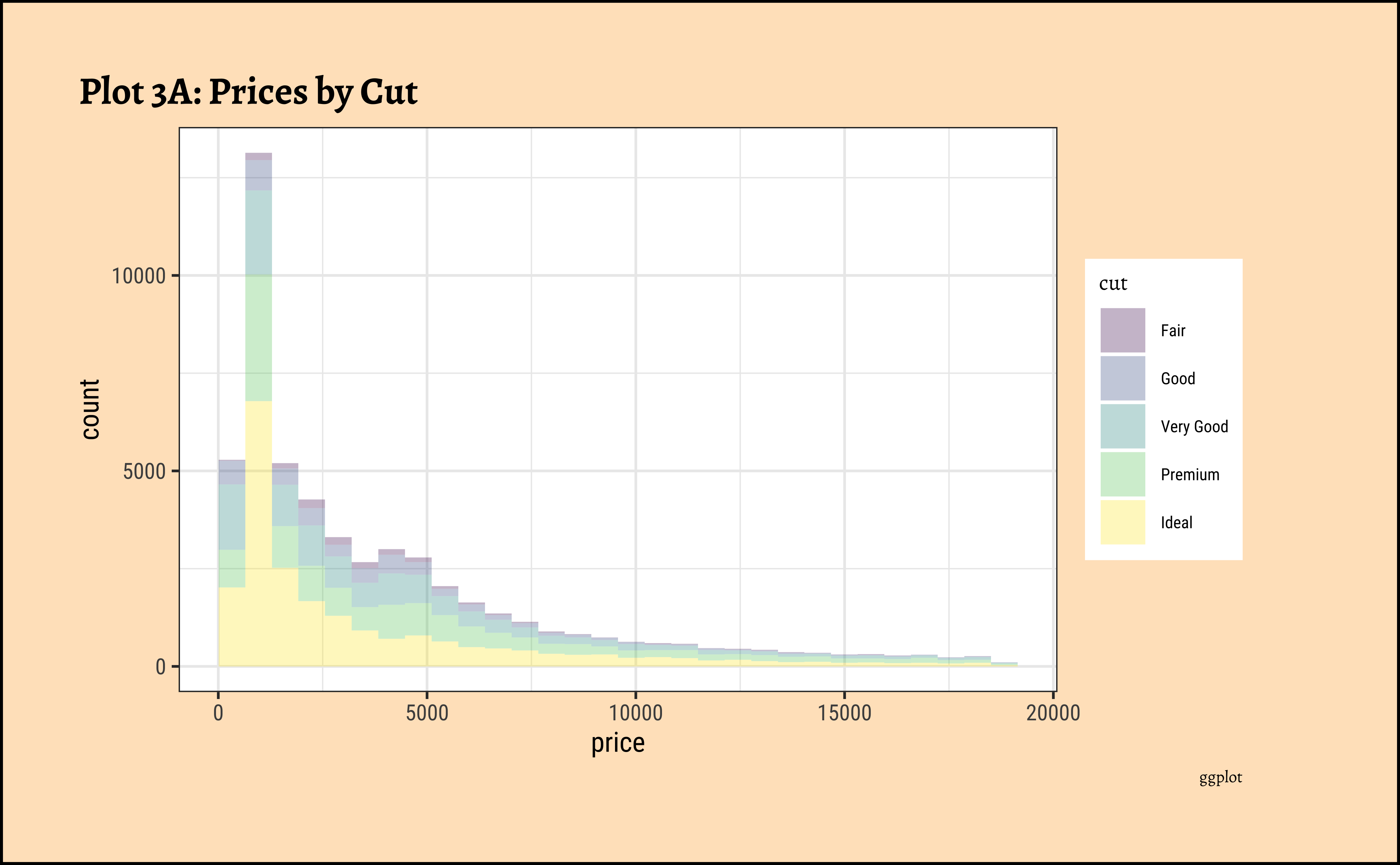

gf_histogram(~ price, fill = ~ cut, data = diamonds_modified) %>%
  gf_labs(title = "Plot 3A: Diamond Prices",caption = "ggformula")
###
diamonds_modified %>%
  gf_histogram(~ price, fill = ~ cut, color = "black", alpha = 0.3) %>%
  gf_labs(title = "Plot 3B: Prices by Cut",
          caption = "ggformula")
###
diamonds_modified %>%
  gf_histogram(~ price, fill = ~ cut, color = "black", alpha = 0.3) %>%
  gf_facet_wrap(~ cut) %>%
  gf_labs(title = "Plot 3C: Prices by Filled and Facetted by Cut",
          caption = "ggformula") %>%
  gf_theme(theme(axis.text.x = element_text(angle = 45, hjust = 1)))
###
diamonds_modified %>%
  gf_histogram(~ price, fill = ~ cut, color = "black", alpha = 0.3) %>%
  gf_facet_wrap(~ cut, scales = "free_y", nrow = 2) %>%
  gf_labs(title = "Plot 3D: Prices Filled and Facetted by Cut",
          subtitle = "Free y-scale",
          caption = "ggformula") %>%
gf_theme(theme(axis.text.x = element_text(angle = 45, hjust = 1)))- The price distribution is heavily skewed to the right AND This
long-tailednature of the histogram holds true regardless of thecutof the diamond. - See the x-axis range for each plot in Plot D! Price ranges are the same regardless of cut !! Very surprising! So
cutis perhaps not the only thing that determines price… - Facetting the plot into small multiples helps look at patterns better: overlapping histograms are hard to decipher. Adding
colordefines the bars in the histogram very well.
Real World Histograms
The value variable in this dataset is the population of a country. Let us plot densities/histograms for value:
Code
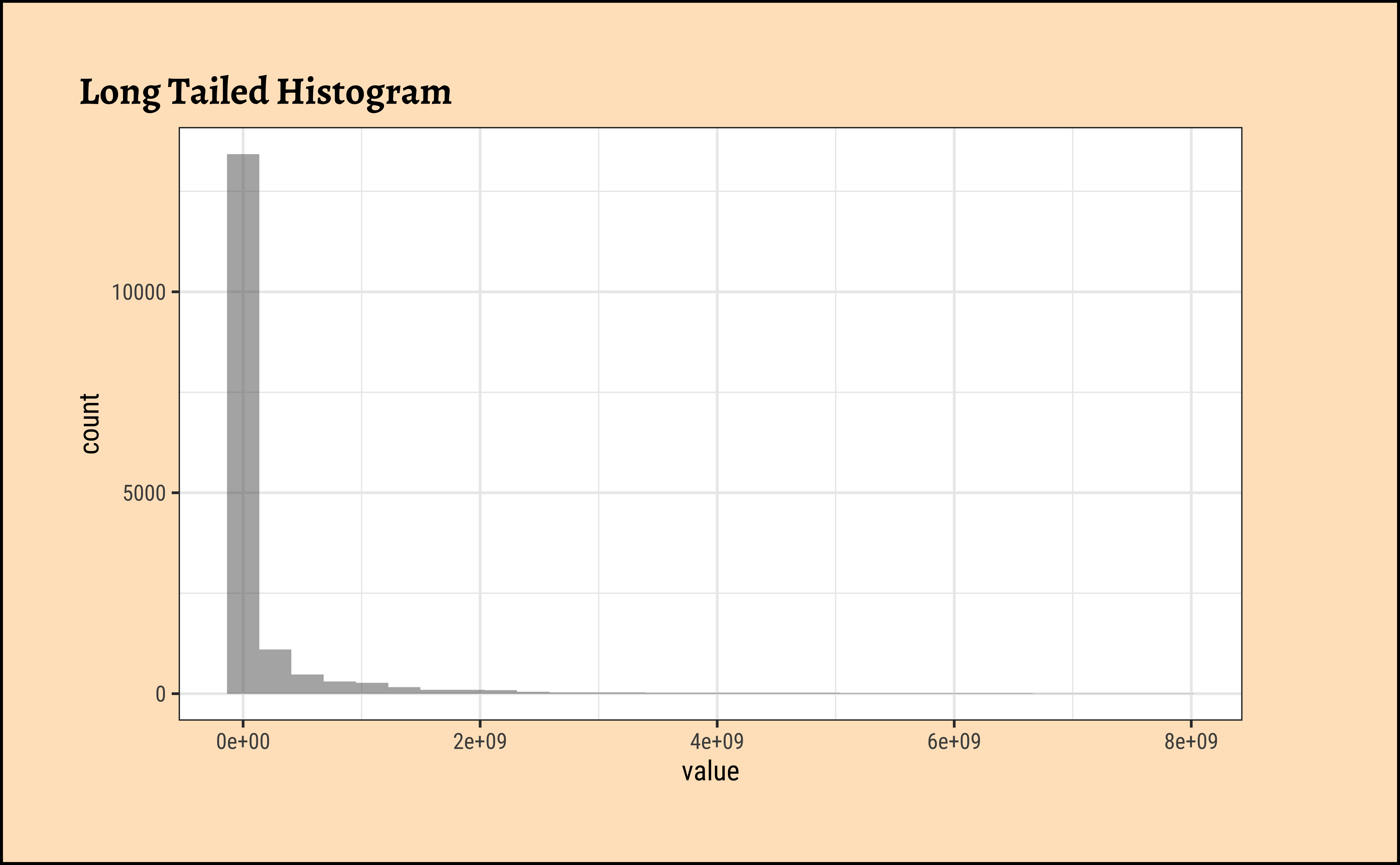
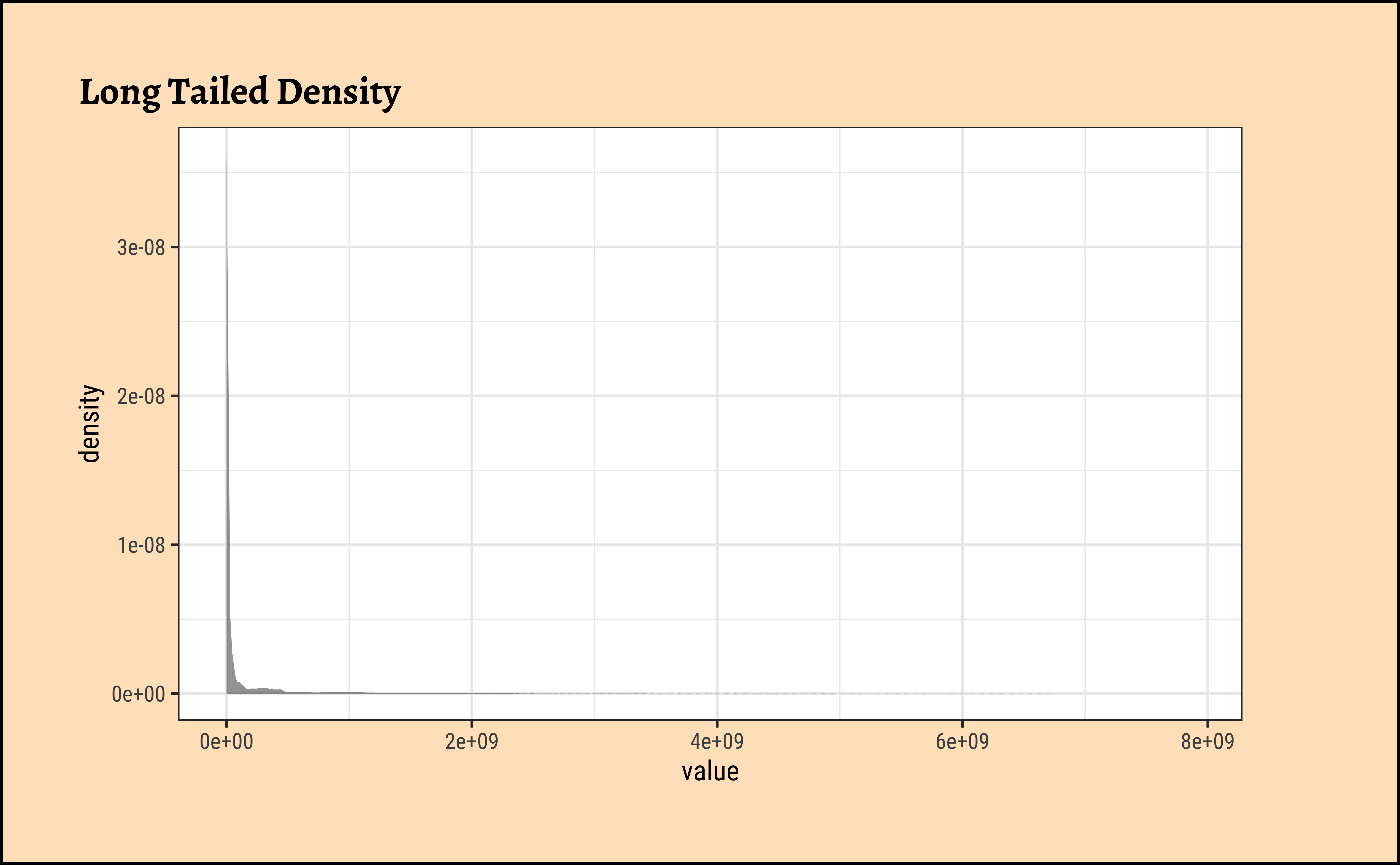
These graphs convey very little to us: the data is very heavily skewed to the right and much of the chart is empty. There are many countries with small populations and a few countries with very large populations. Such distributions are also called “long tailed” distributions.
Transforming the Variable
To develop better insights with this data, we should transform the variable concerned, using say a “log” transformation:
Code
Be prepared to transform your data with log or sqrt transformations when you see skewed distributions!
Code
# options(ragg.max_dim = 7000) # to avoid error in ragg device

# Build dataset with different distributions
library(hrbrthemes)

data <- data.frame(
  type = c(rep("edge peak", 1000), rep("comb", 1000), rep("normal", 1000), rep("uniform", 1000), rep("bimodal", 1000), rep("skewed", 1000)),
  value = c(rnorm(900), rep(3, 100), rnorm(360, sd = 0.5), rep(c(-1, -0.75, -0.5, -0.25, 0, 0.25, 0.5, 0.75), 80), rnorm(1000), runif(1000), rnorm(500, mean = -2), rnorm(500, mean = 2), abs(log(rnorm(1000))))
)

# Represent it
data %>%
  ggplot(aes(x = value)) +
  geom_histogram(fill = "#69b3a2", color = "#e9ecef", alpha = 0.9) +
  facet_wrap(~type, scale = "free_x") +
  theme_custom()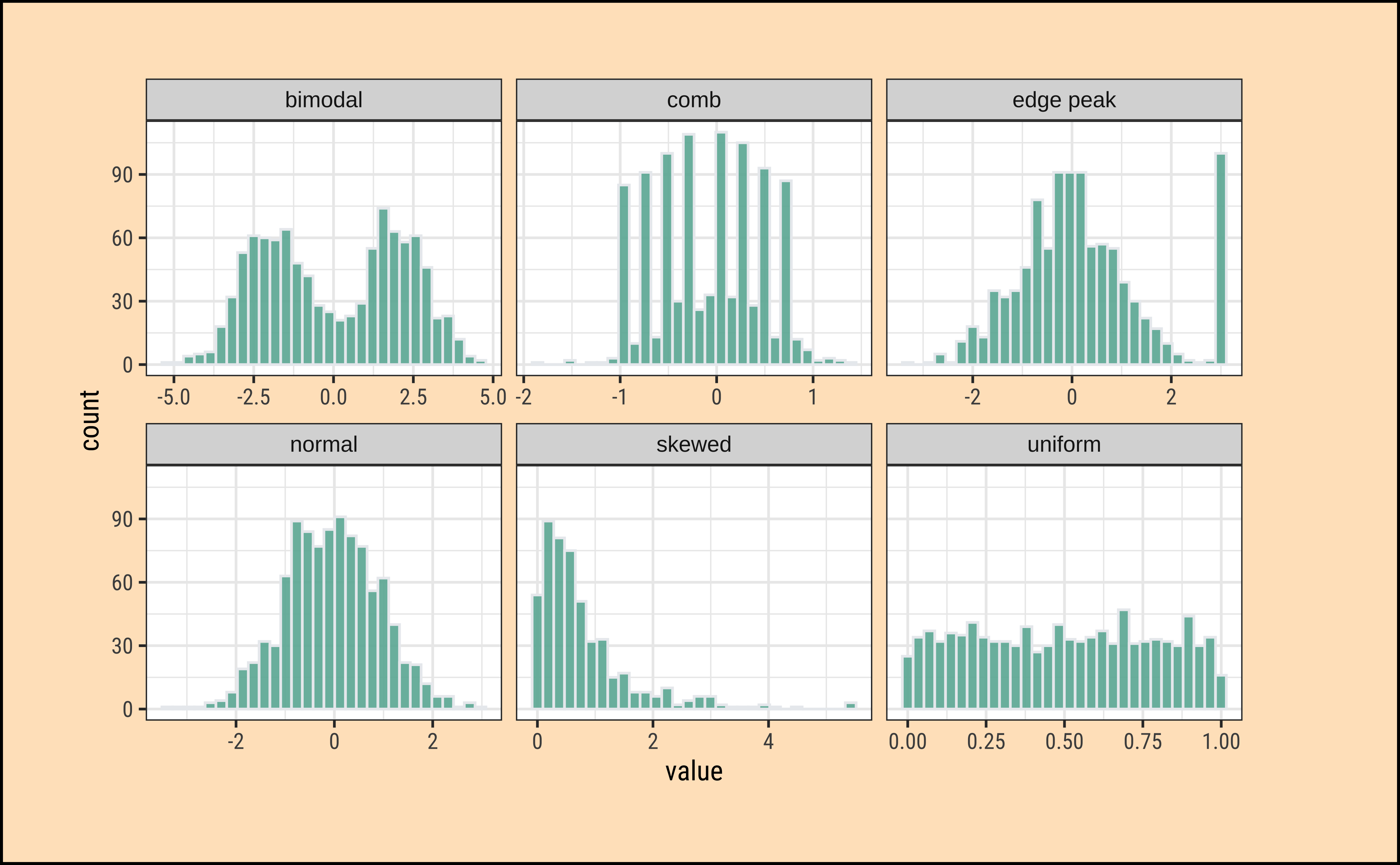
What insights could you develop based on these distribution shapes?
- Bimodal: Maybe two different systems or phenomena or regimes under which the data unfolds. Like the geyser dataset (. Or a machine that works differently when cold and when hot. Intermittent faulty behaviour…
- Comb: Some specific Observations occur predominantly, in an otherwise even spread or observations. In a survey many respondents round off numbers to nearest 100 or 1000. Check the distribution of the diamonds dataset for
caratvalues which are suspiciously integer numbers in too many cases.
- Edge Peak: Could even be a data entry artifact!! All unknown / unrecorded observations are recorded as \(999\) !!🙀
- Normal: Just what it says! Course Marks in a Univ cohort…
- Skewed: Income, or friends count in a set of people. Do UI/UX peasants have more followers on Insta than say CAP people?
- Uniform: The World is
notflat. Anything can happen within a range. But not much happens outside! Sharp limits…
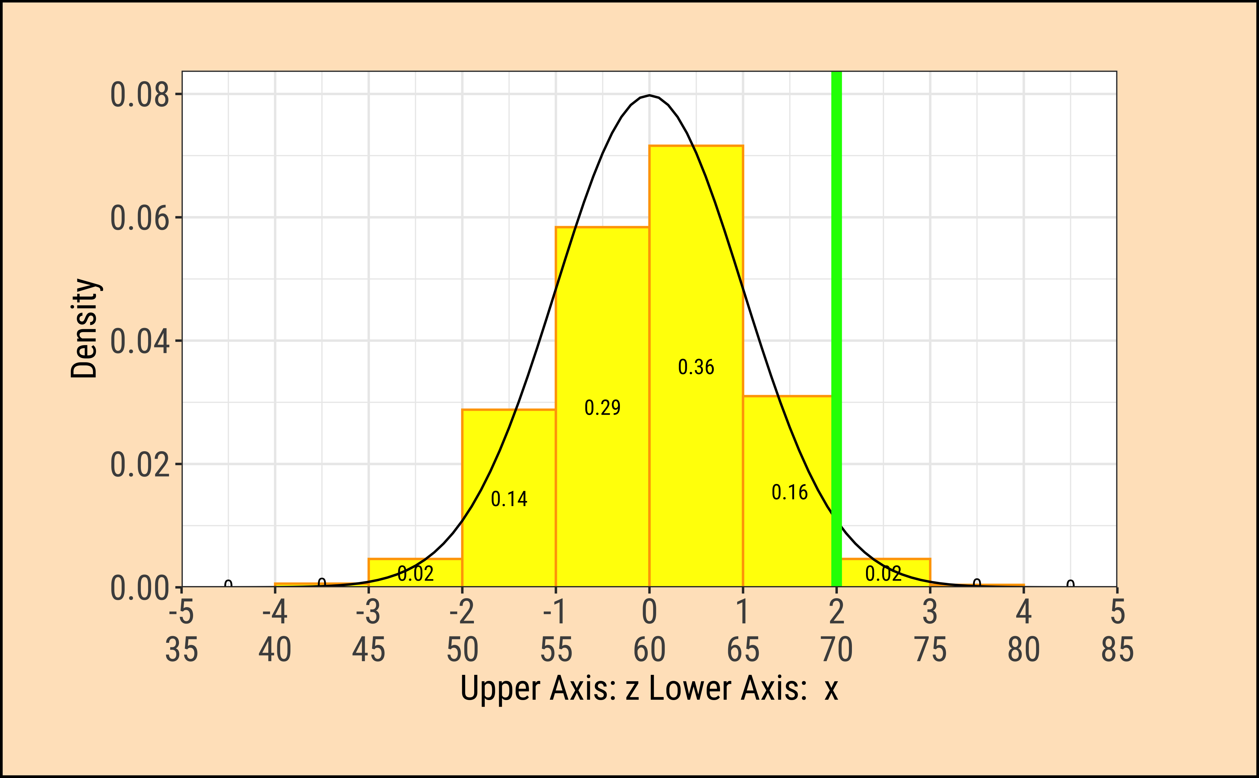
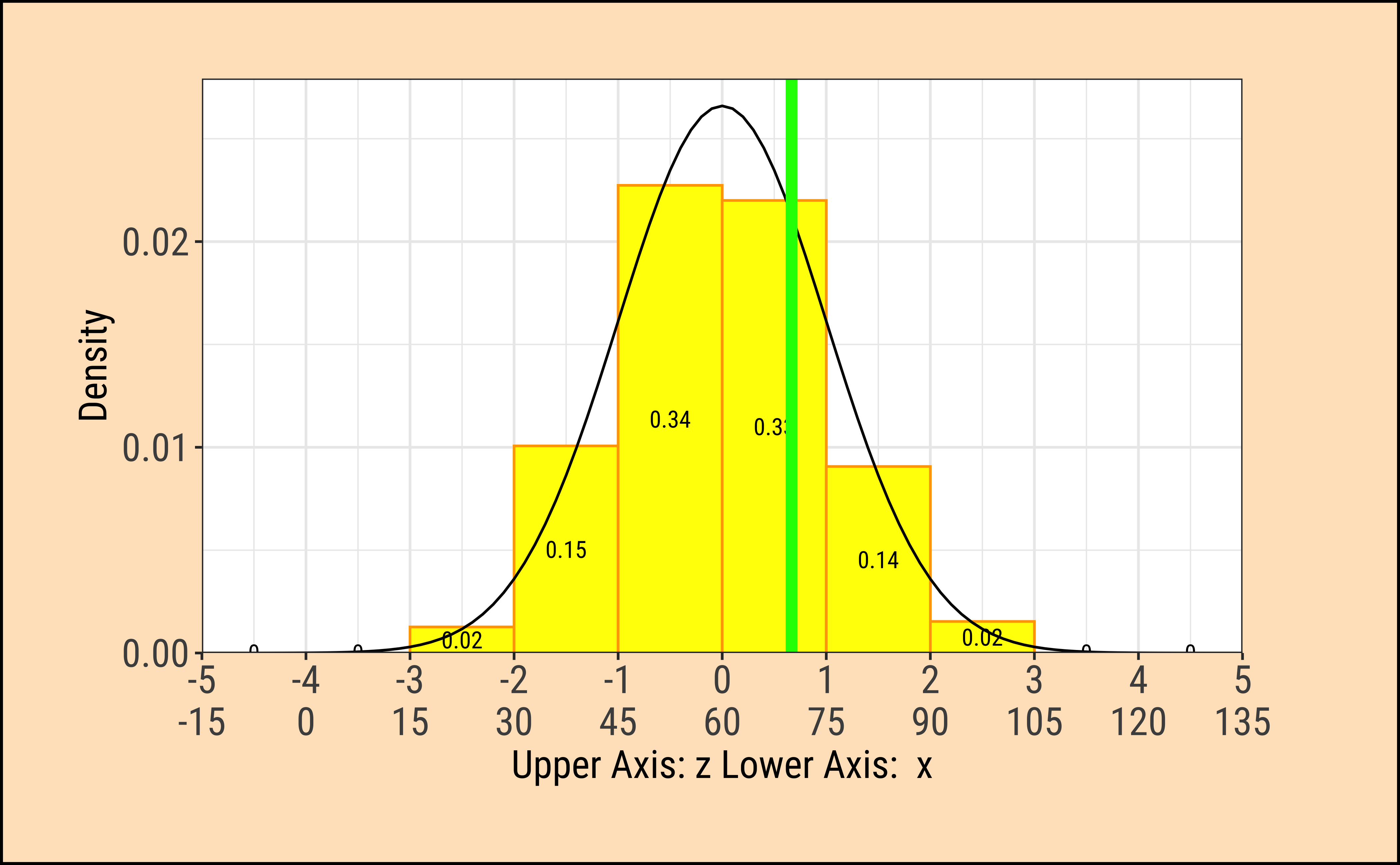
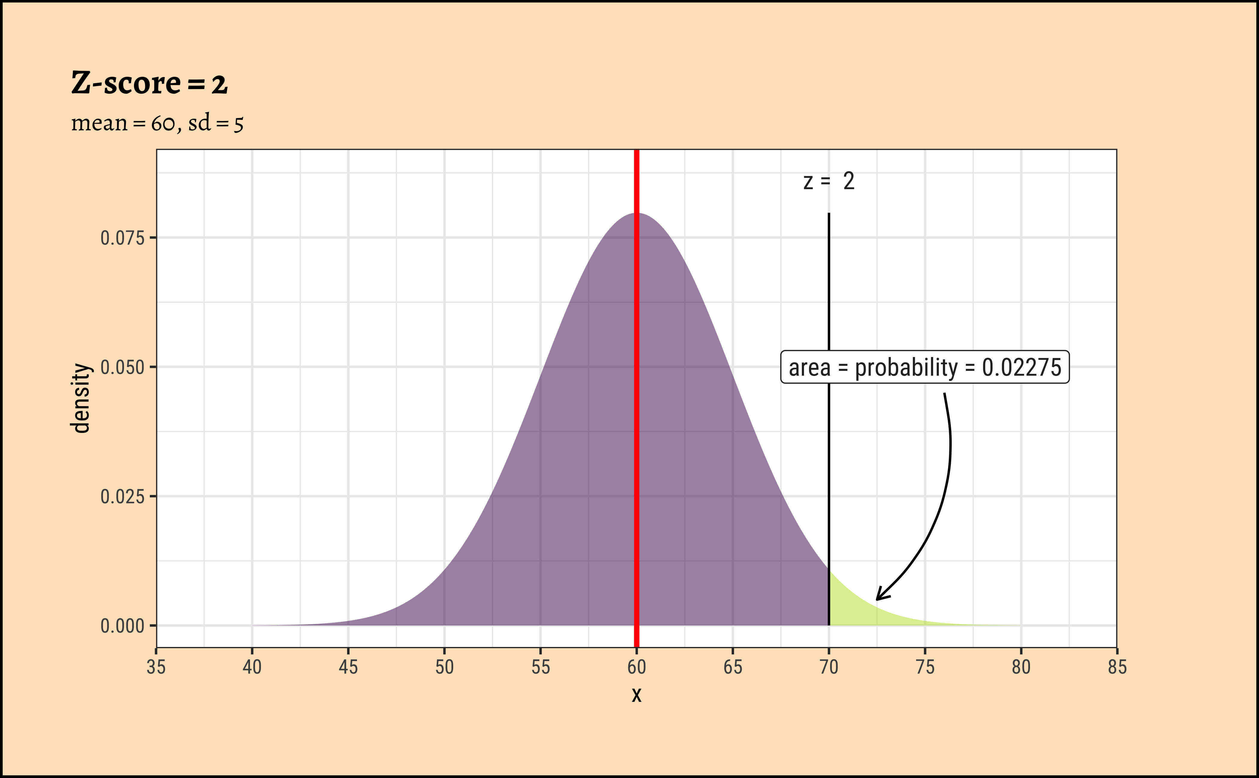
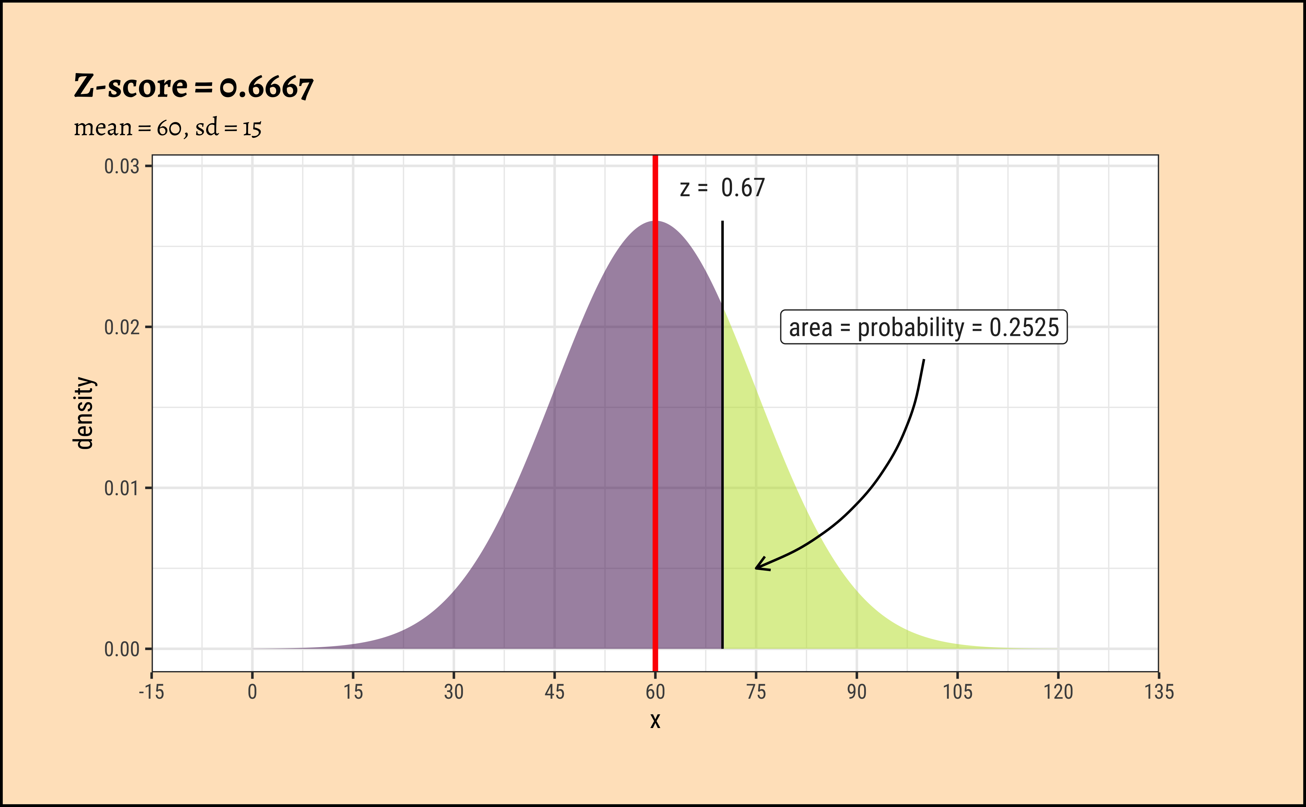
Look at the 4 graphs below:
Code
TeachHistDens(Mean = 60, Sd = 5, VLine1 = 70, AxisFontSize = 14)

TeachHistDens(Mean = 60, Sd = 15, VLine1 = 70, AxisFontSize = 14)

xpnorm(
  mean = 60, sd = 5, q = 70, return = "plot", alpha = 0.5,
  method = "gg"
) %>%
  gf_vline(xintercept = 60, colour = "red", linewidth = 1) %>%
  gf_annotate("label", x = 75, y = 0.05, label = "area = probability = 0.02275") %>%
  gf_annotate("curve",
    x = 76, y = 0.045, xend = 72.5, yend = 0.005,
    curvature = -0.3, arrow = arrow(length = unit(0.2, "cm"))
  ) %>%
  gf_labs(title = "Z-score = 2", subtitle = "mean = 60, sd = 5") %>%
  gf_refine(
    scale_x_continuous(
      limits = c(35, 85),
      breaks = seq(35, 85, by = 5),
      expand = c(0, 0)
    )
  )

xpnorm(
  mean = 60, sd = 15, q = 70, return = "plot", alpha = 0.5,
  method = "gg"
) %>%
  gf_vline(xintercept = 60, colour = "red", linewidth = 1) %>%
  gf_annotate("label", x = 100, y = 0.02, label = "area = probability = 0.2525") %>%
  gf_annotate("curve",
    x = 100, y = 0.018, xend = 75, yend = 0.005,
    curvature = -0.3, arrow = arrow(length = unit(0.2, "cm"))
  ) %>%
  gf_labs(title = "Z-score = 0.6667", subtitle = "mean = 60, sd = 15") %>%
  gf_refine(scale_x_continuous(
    limits = c(-15, 135),
    breaks = seq(-15, 135, by = 15), expand = c(0, 0)
  ))
| Package | Version | Citation |
|---|---|---|
| crosstable | 0.9.0 | Chaltiel (2026) |
| ggridges | 0.5.7 | Wilke (2025) |
| janitor | 2.2.1 | Firke (2024) |
| naniar | 1.1.0 | Tierney and Cook (2023) |
| NHANES | 2.1.0 | Pruim (2015) |
| TeachHist | 0.2.1 | Lange (2023) |
| TeachingDemos | 2.13 | Snow (2024) |
| tinytable | 0.16.0 | Arel-Bundock (2026) |
| visdat | 0.6.0 | Tierney (2017) |
| visualize | 4.5.0 | Balamuta (2023) |
Arel-Bundock, Vincent. 2026. tinytable: Simple and Configurable Tables in “HTML,” “LaTeX,” “Markdown,” “Word,” “PNG,” “PDF,” and “Typst” Formats. https://doi.org/10.32614/CRAN.package.tinytable.
Balamuta, James. 2023. visualize: Graph Probability Distributions with User Supplied Parameters and Statistics. https://doi.org/10.32614/CRAN.package.visualize.
Chaltiel, Dan. 2026. crosstable: Crosstables for Descriptive Analyses. https://doi.org/10.32614/CRAN.package.crosstable.
Firke, Sam. 2024. janitor: Simple Tools for Examining and Cleaning Dirty Data. https://doi.org/10.32614/CRAN.package.janitor.
Lange, Carsten. 2023. TeachHist: A Collection of Amended Histograms Designed for Teaching Statistics. https://doi.org/10.32614/CRAN.package.TeachHist.
Pruim, Randall. 2015. NHANES: Data from the US National Health and Nutrition Examination Study. https://doi.org/10.32614/CRAN.package.NHANES.
Snow, Greg. 2024. TeachingDemos: Demonstrations for Teaching and Learning. https://doi.org/10.32614/CRAN.package.TeachingDemos.
Tierney, Nicholas. 2017. “visdat: Visualising Whole Data Frames.” JOSS 2 (16): 355. https://doi.org/10.21105/joss.00355.
Tierney, Nicholas, and Dianne Cook. 2023. “Expanding Tidy Data Principles to Facilitate Missing Data Exploration, Visualization and Assessment of Imputations.” Journal of Statistical Software 105 (7): 1–31. https://doi.org/10.18637/jss.v105.i07.
Wilke, Claus O. 2025. ggridges: Ridgeline Plots in “ggplot2”. https://doi.org/10.32614/CRAN.package.ggridges.