library(tidyverse)
library(mosaic)
library(ggformula) # Our Formula based graphing package
library(skimr)
library(fpp3)
# Wrangling
# library(lubridate) # Deal with dates. Loads with tidyverse
# library(tsibble) # loads with ffp3
# library(tsibbledata) # loads with fpp3
# devtools::install_github("FinYang/tsdl")
library(tsdl)
library(TSstudio)
library(timetk)
library(tsbox)
library(gghighlight) # Highlight specific parts of charts
library(ggtime) # Mitchell Ohara-Wild June 2025
library(ggrepel) # Repel overlapping text labels in ggplot2
library(marquee) # Add text labels across a ggplot2 chart
Time Series
2022-12-15
Plot Fonts and Theme
Code
library(systemfonts)
library(showtext)
## Clean the slate
systemfonts::clear_local_fonts()
systemfonts::clear_registry()
##
showtext_opts(dpi = 96) # set DPI for showtext
sysfonts::font_add(
family = "Alegreya",
regular = "../../../../../../fonts/Alegreya-Regular.ttf",
bold = "../../../../../../fonts/Alegreya-Bold.ttf",
italic = "../../../../../../fonts/Alegreya-Italic.ttf",
bolditalic = "../../../../../../fonts/Alegreya-BoldItalic.ttf"
)
sysfonts::font_add(
family = "Roboto Condensed",
regular = "../../../../../../fonts/RobotoCondensed-Regular.ttf",
bold = "../../../../../../fonts/RobotoCondensed-Bold.ttf",
italic = "../../../../../../fonts/RobotoCondensed-Italic.ttf",
bolditalic = "../../../../../../fonts/RobotoCondensed-BoldItalic.ttf"
)
showtext_auto(enable = TRUE) # enable showtext
##
theme_custom <- function() {
theme_bw(base_size = 10) +
# theme(panel.widths = unit(11, "cm"),
# panel.heights = unit(6.79, "cm")) + # Golden Ratio
theme(
plot.margin = margin_auto(t = 1, r = 2, b = 1, l = 1, unit = "cm"),
plot.background = element_rect(
fill = "bisque",
colour = "black",
linewidth = 1
)
) +
theme_sub_axis(
title = element_text(
family = "Roboto Condensed",
size = 10
),
text = element_text(
family = "Roboto Condensed",
size = 8
)
) +
theme_sub_legend(
text = element_text(
family = "Roboto Condensed",
size = 6
),
title = element_text(
family = "Alegreya",
size = 8
)
) +
theme_sub_plot(
title = element_text(
family = "Alegreya",
size = 14, face = "bold"
),
title.position = "plot",
subtitle = element_text(
family = "Alegreya",
size = 10
),
caption = element_text(
family = "Alegreya",
size = 6
),
caption.position = "plot"
)
}
## Use available fonts in ggplot text geoms too!
ggplot2::update_geom_defaults(geom = "text", new = list(
family = "Roboto Condensed",
face = "plain",
size = 3.5,
color = "#2b2b2b"
))
ggplot2::update_geom_defaults(geom = "label", new = list(
family = "Roboto Condensed",
face = "plain",
size = 3.5,
color = "#2b2b2b"
))
ggplot2::update_geom_defaults(geom = "marquee", new = list(
family = "Roboto Condensed",
face = "plain",
size = 3.5,
color = "#2b2b2b"
))
ggplot2::update_geom_defaults(geom = "text_repel", new = list(
family = "Roboto Condensed",
face = "plain",
size = 3.5,
color = "#2b2b2b"
))
ggplot2::update_geom_defaults(geom = "label_repel", new = list(
family = "Roboto Condensed",
face = "plain",
size = 3.5,
color = "#2b2b2b"
))
## Set the theme
ggplot2::theme_set(new = theme_custom())
## tinytable options
options("tinytable_tt_digits" = 2)
options("tinytable_format_num_fmt" = "significant_cell")
options(tinytable_html_mathjax = TRUE)
## Set defaults for flextable
flextable::set_flextable_defaults(font.family = "Roboto Condensed")
There are multiple formats for time series data. The ones that we are likely to encounter most are:
The ts format: We may simply have a single series of measurements that are made over time, stored as a numerical vector. The
stats::ts()function will convert a numeric vector into an R time seriestsobject, which is the most basic time series object in R. The base-Rtsobject is used by established packagesforecastand is also supported by newer packages such astsbox.The tibble format: the simplest and most familiar data format is of course the standard tibble/data frame, with or without an explicit
timecolumn/variable to indicate that the other variables vary with time. The standard tibble object is used by many packages, e.g.timetk&modeltime.The tsibble format: this is a new format for time series analysis. The special
tsibbleobject (“time series tibble”) is used byfable,feastsand others from thetidyvertsset of packages.
There are many other time-oriented data formats too…probably too many, such a tibbletime and TimeSeries objects. For now the best way to deal with these, should you encounter them, is to convert them (Using the package tsbox) to a tibble or a tsibble and work with these.

To start, we will use simple ts data first, and then do another with a “vanilla” tibble format that we can plot as is. We will then look at a tibbledata that does have a time-oriented variable. We will then perform conversion to tsibble format to plot it, and then a final example with a ground-up tsibble dataset.
ts format data
There are a few datasets in base R that are in ts format already.
Jan Feb Mar Apr May Jun Jul Aug Sep Oct Nov Dec
1949 112 118 132 129 121 135 148 148 136 119 104 118
1950 115 126 141 135 125 149 170 170 158 133 114 140
1951 145 150 178 163 172 178 199 199 184 162 146 166
1952 171 180 193 181 183 218 230 242 209 191 172 194
1953 196 196 236 235 229 243 264 272 237 211 180 201
1954 204 188 235 227 234 264 302 293 259 229 203 229
1955 242 233 267 269 270 315 364 347 312 274 237 278
1956 284 277 317 313 318 374 413 405 355 306 271 306
1957 315 301 356 348 355 422 465 467 404 347 305 336
1958 340 318 362 348 363 435 491 505 404 359 310 337
1959 360 342 406 396 420 472 548 559 463 407 362 405
1960 417 391 419 461 472 535 622 606 508 461 390 432 Time-Series [1:144] from 1949 to 1961: 112 118 132 129 121 135 148 148 136 119 ...This can be easily plotted using base R:
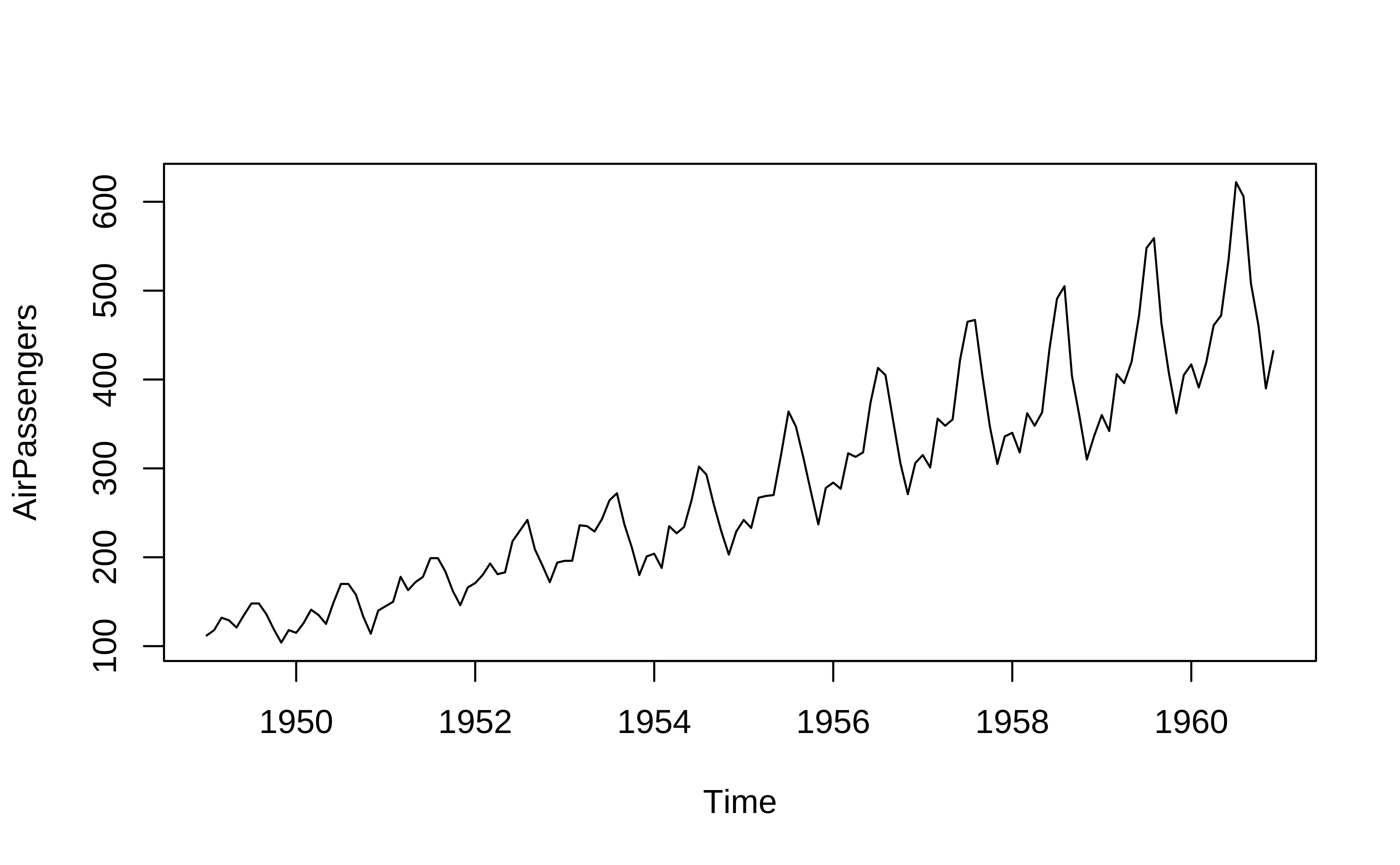
One can see that there is an upward trend and also seasonal variations that also increase over time. This is an example of a multiplicative time series, which we will discuss later.
Let us take data that is “time oriented” but not in ts format. We use the command ts to convert a numeric vector to ts format: the syntax of ts() is:
Syntax: objectName <- ts(data, start, end, frequency), where,
data: represents the data vectorstart: represents the first observation in time seriesend: represents the last observation in time seriesfrequency: represents number of observations per unit time. For example 1=annual, 4=quarterly, 12=monthly, 7=weekly, etc.
We will pick simple numerical vector data ( i.e. not a time series ) ChickWeight:
Classes 'nfnGroupedData', 'nfGroupedData', 'groupedData' and 'data.frame': 578 obs. of 4 variables:
$ weight: num 42 51 59 64 76 93 106 125 149 171 ...
$ Time : num 0 2 4 6 8 10 12 14 16 18 ...
$ Chick : Ord.factor w/ 50 levels "18"<"16"<"15"<..: 15 15 15 15 15 15 15 15 15 15 ...
$ Diet : Factor w/ 4 levels "1","2","3","4": 1 1 1 1 1 1 1 1 1 1 ...
- attr(*, "formula")=Class 'formula' language weight ~ Time | Chick
.. ..- attr(*, ".Environment")=<environment: R_EmptyEnv>
- attr(*, "outer")=Class 'formula' language ~Diet
.. ..- attr(*, ".Environment")=<environment: R_EmptyEnv>
- attr(*, "labels")=List of 2
..$ x: chr "Time"
..$ y: chr "Body weight"
- attr(*, "units")=List of 2
..$ x: chr "(days)"
..$ y: chr "(gm)" Time-Series [1:12] from 1 to 6.5: 42 51 59 64 76 93 106 125 149 171 ...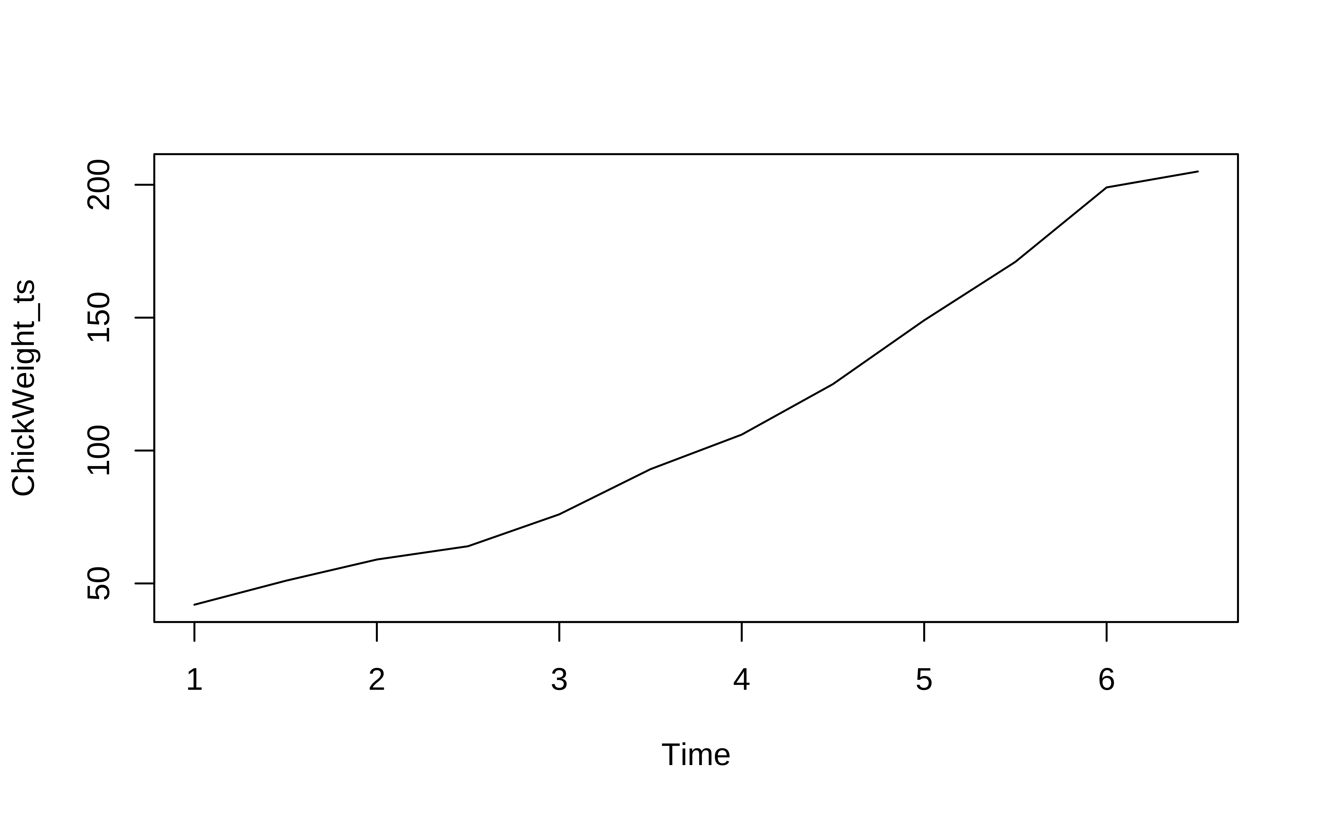
#| label: ts-using-stats-ts-webr
ChickWeight %>% head()
# Filter for Chick #1 and for Diet #1
ChickWeight_ts <- ChickWeight %>%
dplyr::filter(Chick == 1, Diet ==1) %>%
dplyr::select(weight, Time)
# stats::ts does not accept pipe format
ChickWeight_ts <- stats::ts(ChickWeight_ts$weight,
frequency = 2)
str(ChickWeight_ts)
plot(ChickWeight_ts) # Using base-RWe see that the weights of a young chick specimen #1 increases over time.
tibble data
The ts data format can handle only one time series; in the above example, we could not have plotted the weight of two chicks, if we had wanted to. If we want to plot/analyze multiple time series, based on say Qualitative variables, (e.g. sales figures over time across multiple products and locations) we need other data formats. Using the familiar tibble structure opens up new possibilities.
- We can have multiple time series within a tibble (think of numerical time-series data like
GDP,Population,Imports,Exportsfor multiple countries as with thegapminder1data we saw earlier).
gapminder data
| country | year | gdpPercap | pop | lifeExp | continent |
|---|---|---|---|---|---|
| Afghanistan | 1952 | 779.4453 | 8425333 | 28.801 | Asia |
| Afghanistan | 1957 | 820.8530 | 9240934 | 30.332 | Asia |
| Afghanistan | 1962 | 853.1007 | 10267083 | 31.997 | Asia |
| Afghanistan | 1967 | 836.1971 | 11537966 | 34.020 | Asia |
| Afghanistan | 1972 | 739.9811 | 13079460 | 36.088 | Asia |
- It also allows for data processing with
dplyrsuch as filtering and summarizing.
Let us read and inspect in the US births data from 2000 to 2014. Download this data by clicking on the icon below, and saving the downloaded file in a sub-folder called data inside your project.
Read this data in and inspect it.
Rows: 5,479
Columns: 5
$ year <dbl> 2000, 2000, 2000, 2000, 2000, 2000, 2000, 2000, 2000, 20…
$ month <dbl> 1, 1, 1, 1, 1, 1, 1, 1, 1, 1, 1, 1, 1, 1, 1, 1, 1, 1, 1,…
$ date_of_month <dbl> 1, 2, 3, 4, 5, 6, 7, 8, 9, 10, 11, 12, 13, 14, 15, 16, 1…
$ day_of_week <dbl> 6, 7, 1, 2, 3, 4, 5, 6, 7, 1, 2, 3, 4, 5, 6, 7, 1, 2, 3,…
$ births <dbl> 9083, 8006, 11363, 13032, 12558, 12466, 12516, 8934, 794…
quantitative variables:
name class min Q1 median Q3 max mean sd
1 year numeric 2000 2003 2007 2011 2014 2006.999270 4.321085
2 month numeric 1 4 7 10 12 6.522723 3.449075
3 date_of_month numeric 1 8 16 23 31 15.730243 8.801151
4 day_of_week numeric 1 2 4 6 7 3.999817 2.000502
5 births numeric 5728 8740 12343 13082 16081 11350.068261 2325.821049
n missing
1 5479 0
2 5479 0
3 5479 0
4 5479 0
5 5479 0| Name | births_2000_2014 |
| Number of rows | 5479 |
| Number of columns | 5 |
| _______________________ | |
| Column type frequency: | |
| numeric | 5 |
| ________________________ | |
| Group variables | None |
Variable type: numeric
| skim_variable | n_missing | complete_rate | mean | sd | p0 | p25 | p50 | p75 | p100 | hist |
|---|---|---|---|---|---|---|---|---|---|---|
| year | 0 | 1 | 2007.00 | 4.32 | 2000 | 2003 | 2007 | 2011 | 2014 | ▇▇▇▇▇ |
| month | 0 | 1 | 6.52 | 3.45 | 1 | 4 | 7 | 10 | 12 | ▇▅▅▅▇ |
| date_of_month | 0 | 1 | 15.73 | 8.80 | 1 | 8 | 16 | 23 | 31 | ▇▇▇▇▆ |
| day_of_week | 0 | 1 | 4.00 | 2.00 | 1 | 2 | 4 | 6 | 7 | ▇▃▃▃▇ |
| births | 0 | 1 | 11350.07 | 2325.82 | 5728 | 8740 | 12343 | 13082 | 16081 | ▂▂▁▇▁ |
This is just a tibble containing a single data variable births that varies over time. All other variables, although depicting time, are numerical columns and not explicitly time columns. There are no Qualitative variables (yet!).
Plotting tibble-oriented time data
We will now plot this using ggformula. Using the separate year/month/week and day_of_week / day_of_month columns, we can plot births over time, colouring by day_of_week, for example:
ggplot2::theme_set(new = theme_custom())
# grouping by day_of_week
births_2000_2014 %>%
gf_line(births ~ year,
group = ~day_of_week,
color = ~day_of_week
) %>%
gf_point(
title = "Births, By Day of Week",
subtitle = "Over the Years"
) %>%
gf_theme(scale_colour_distiller(palette = "Paired"))
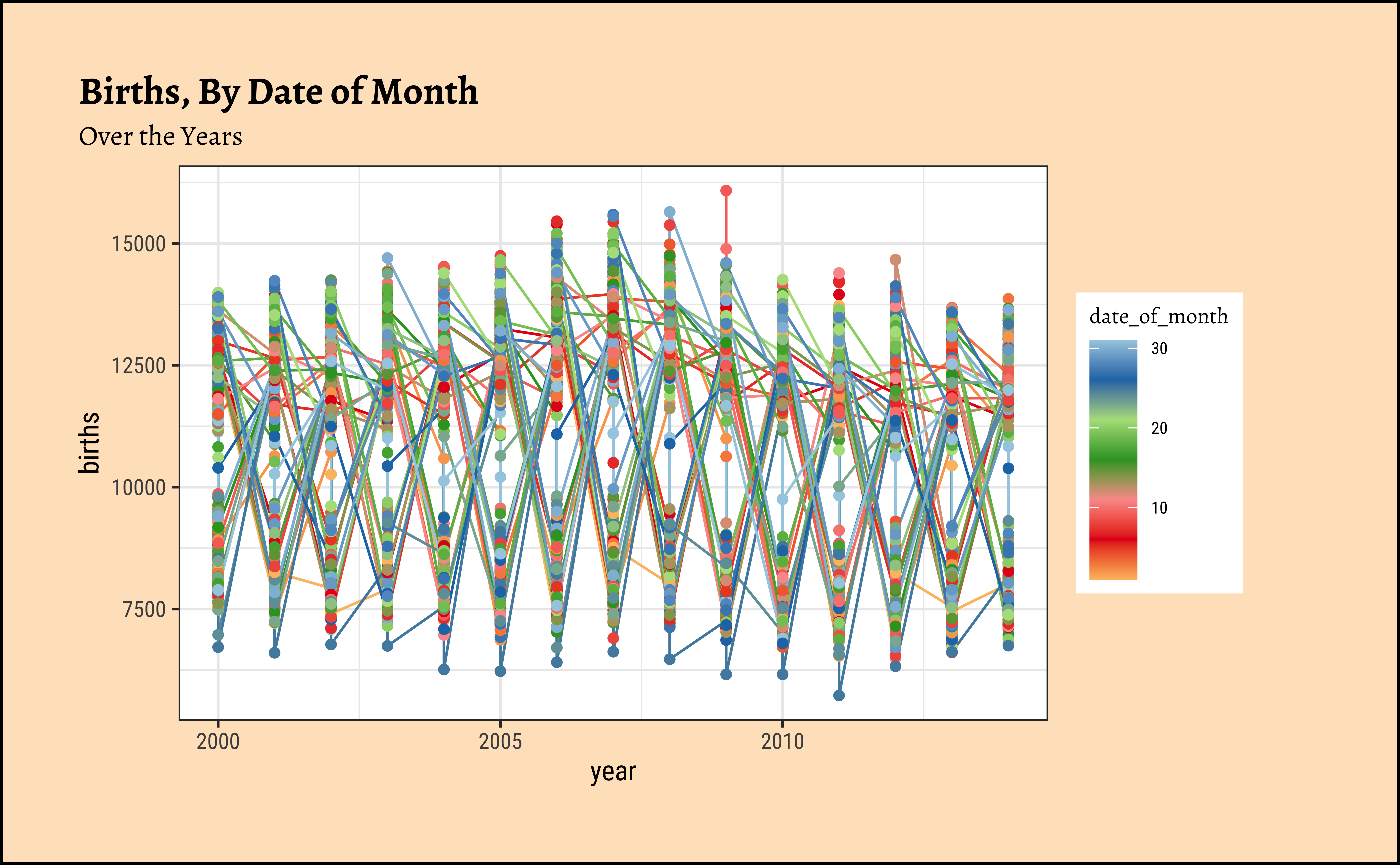
# Grouping by date_of_month
births_2000_2014 %>%
gf_line(births ~ year,
group = ~date_of_month,
color = ~date_of_month
) %>%
gf_point(
title = "Births, By Date of Month",
subtitle = "Over the Years"
) %>%
gf_theme(scale_colour_distiller(palette = "Paired"))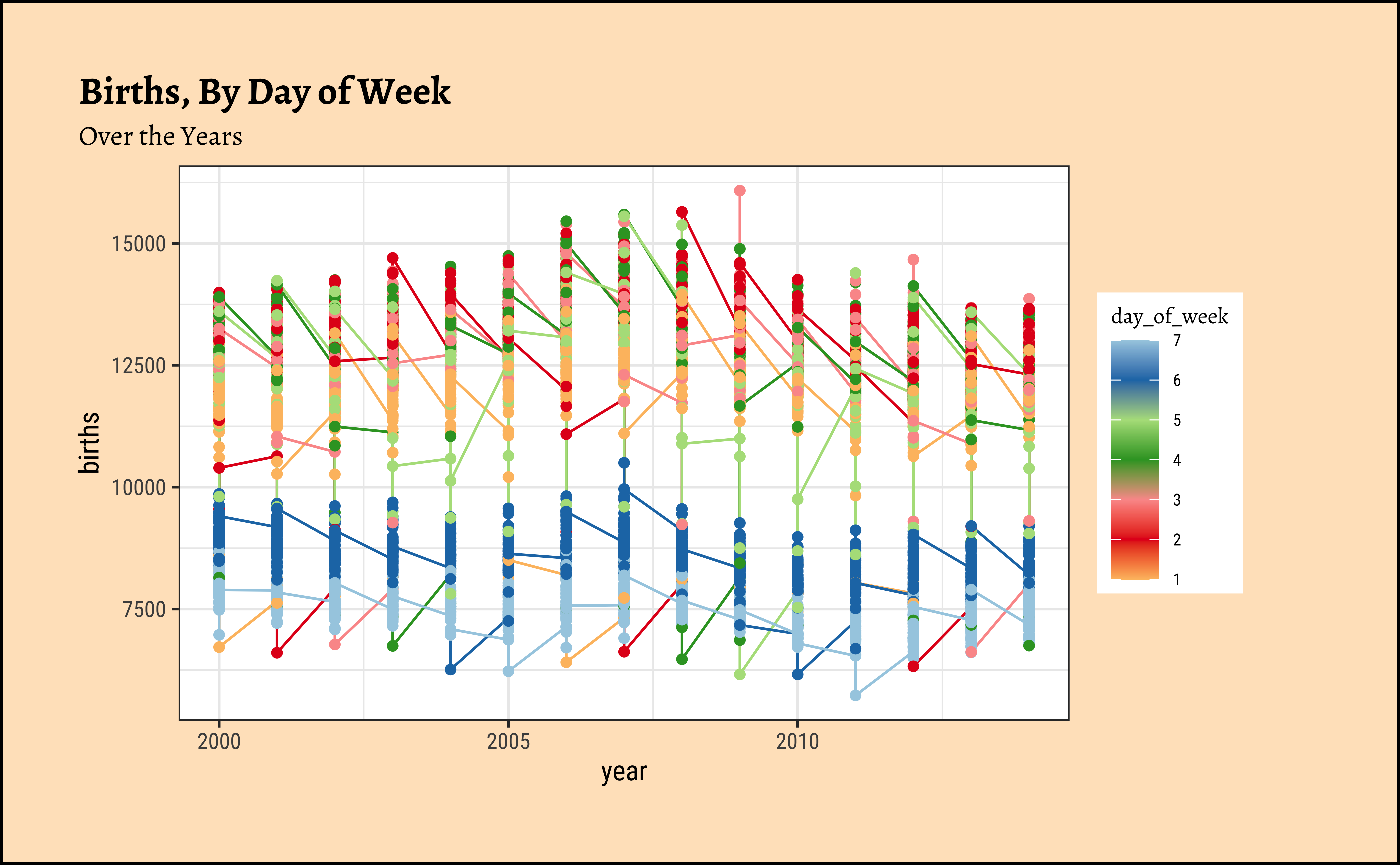

Not particularly illuminating. This is because the data is daily and we have considerable variation over time, and here we have too much data to visualize.
Summaries will help, so we could calculate the the mean births per month in each year and plot that:
Code
ggplot2::theme_set(new = theme_custom())
births_2000_2014_monthly <- births_2000_2014 %>%
# Convert month to factor/Qual variable!
# So that we can have discrete colours for each month
# Using base::factor()
# Could use forcats::as_factor() also
mutate(month = base::factor(month, labels = month.abb)) %>%
# `month.abb` is a built-in dataset containing names of months.
dplyr::group_by(year, month) %>%
dplyr::summarise(mean_monthly_births = mean(births, na.rm = TRUE))
births_2000_2014_monthly
####
births_2000_2014_monthly %>%
##
gf_line(mean_monthly_births ~ year,
group = ~month,
colour = ~month, linewidth = 1
) %>%
##
gf_point(
size = 1.5,
title = "Summaries of Monthly Births over the years"
) %>%
## palette for 12 colours
gf_theme(scale_colour_brewer(palette = "Paired"))
Note
These are graphs for the same month each year: we have a January graph and a February graph and so on. So…average births per month were higher in all months during 2005 to 2007 and have dropped since.
We can do similar graphs using day_of_week as our basis for grouping, instead of month:
Code
ggplot2::theme_set(new = theme_custom())
births_2000_2014_weekly <- births_2000_2014 %>%
mutate(day_of_week = base::factor(day_of_week,
levels = c(1, 2, 3, 4, 5, 6, 7),
labels = c("Mon", "Tue", "Wed", "Thu", "Fri", "Sat", "Sun")
)) %>%
group_by(year, day_of_week) %>%
dplyr::summarise(mean_daily_births = mean(births, na.rm = TRUE))
##
births_2000_2014_weekly
##
births_2000_2014_weekly %>%
gf_line(mean_daily_births ~ year,
group = ~day_of_week,
colour = ~day_of_week,
linewidth = 1,
data = .
) %>%
gf_point(size = 2, title = "Births over the Years by Day of Week") %>%
# palette for 12 colours
gf_theme(scale_colour_brewer(palette = "Paired"))
We will now plot this using ggplot for completeness. Using the separate year/month/week and day_of_week / day_of_month columns, we can plot births over time, colouring by day_of_week, for example:
ggplot2::theme_set(new = theme_custom())
# grouping by day_of_week
births_2000_2014 %>%
ggplot(aes(year, births,
group = day_of_week,
color = day_of_week
)) +
geom_line() +
geom_point() +
labs(
title = "Births, By Day of Week",
subtitle = "Over the Years"
) +
scale_colour_distiller(palette = "Paired")
##
# Grouping by date_of_month
births_2000_2014 %>%
ggplot(aes(year, births,
color = date_of_month,
group = date_of_month
)) +
geom_line() +
geom_point() +
labs(
title = "Births, By Date of Month",
subtitle = "Over the Years"
) +
scale_colour_distiller(palette = "Paired")
ggplot2::theme_set(new = theme_custom())
births_2000_2014_monthly <- births_2000_2014 %>%
# Convert month to factor/Qual variable!
# So that we can have discrete colours for each month
# Using base::factor()
# Could use forcats::as_factor() also
mutate(month = base::factor(month, labels = month.abb)) %>%
# `month.abb` is a built-in dataset containing names of months.
group_by(year, month) %>%
dplyr::summarise(mean_monthly_births = mean(births, na.rm = TRUE))
births_2000_2014_monthly
births_2000_2014_monthly %>%
ggplot(aes(year, mean_monthly_births,
group = month,
colour = month
)) +
geom_line(linewidth = 1) +
geom_point(size = 1.5) +
labs(title = "Summaries of Monthly Births over the years") +
# palette for 12 colours
scale_colour_brewer(palette = "Paired")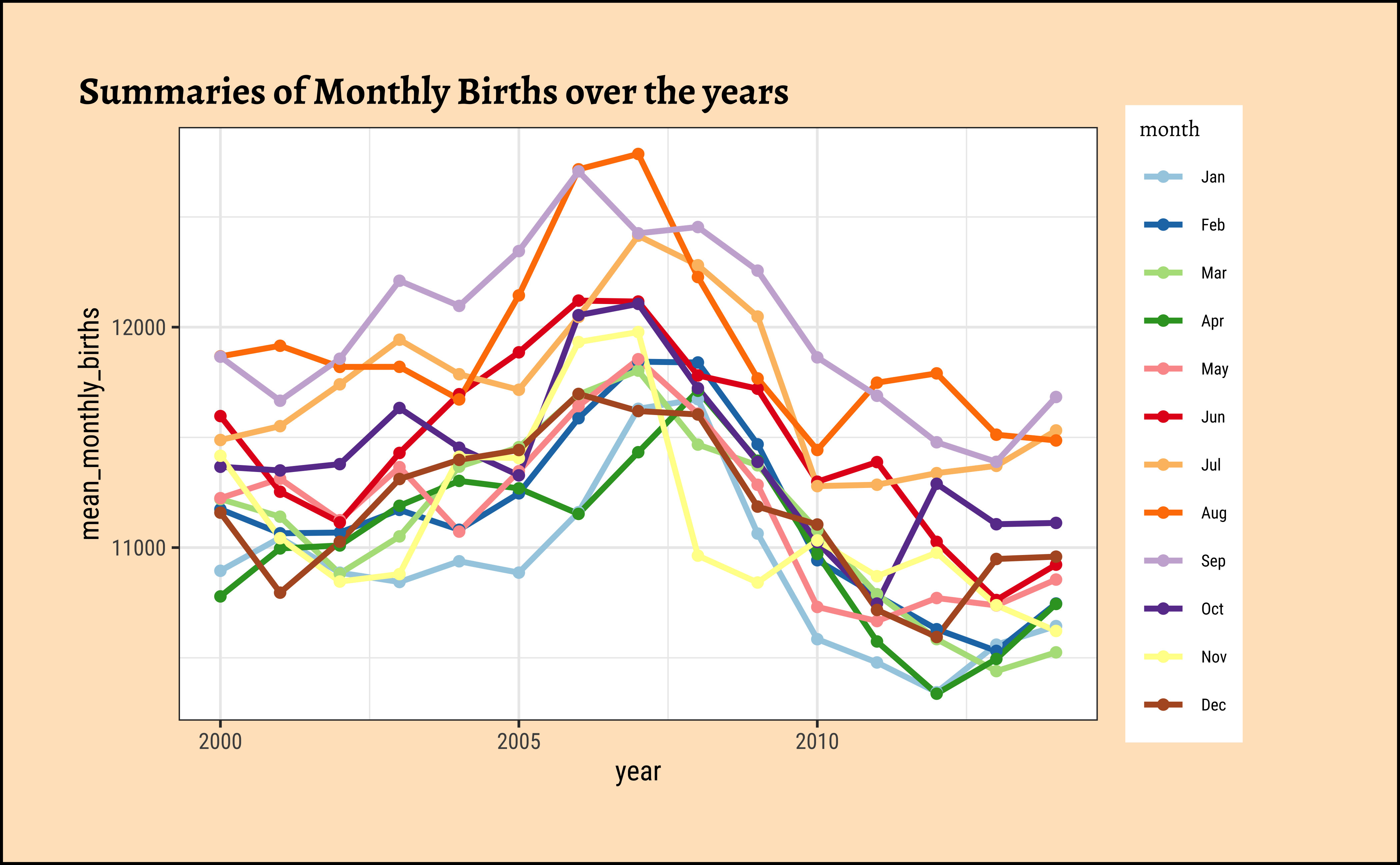
ggplot2::theme_set(new = theme_custom())
births_2000_2014_weekly <- births_2000_2014 %>%
mutate(day_of_week = base::factor(day_of_week,
levels = c(1, 2, 3, 4, 5, 6, 7),
labels = c("Mon", "Tue", "Wed", "Thu", "Fri", "Sat", "Sun")
)) %>%
group_by(year, day_of_week) %>%
dplyr::summarise(mean_daily_births = mean(births, na.rm = TRUE))
births_2000_2014_weekly
births_2000_2014_weekly %>%
ggplot(aes(year, mean_daily_births,
group = day_of_week,
colour = day_of_week
)) +
geom_line(linewidth = 1) +
geom_point(size = 2) +
# palette for 12 colours
scale_colour_brewer(palette = "Paired") +
labs(title = "Births over the Years by Day of Week")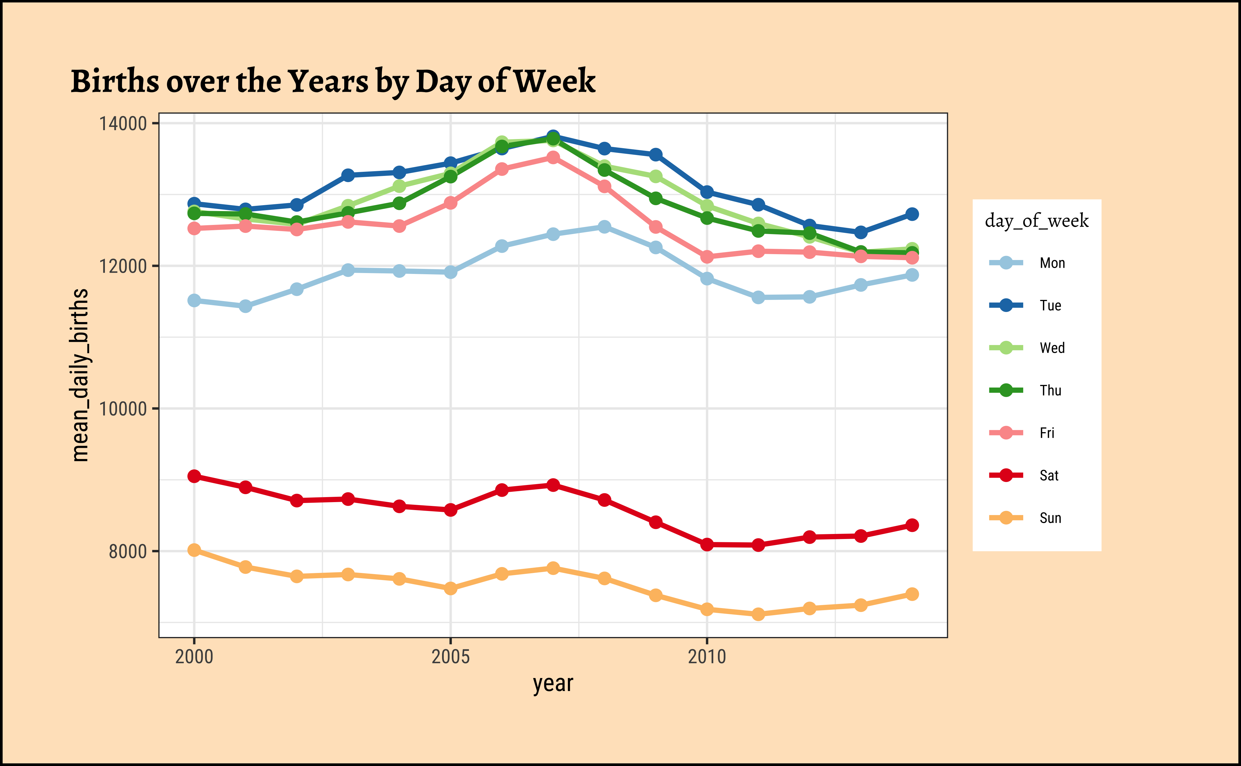
Instead of looking at multiple overlapping time series graphs, we could split these up into small multiples or facets and still retain the overall picture that is offered by the overlapping graphs. The trick here is the highlight one of the graphs at a time, while keeping all other graphs in the background. We can do this with the gghighlight package.
ggplot2::theme_set(new = theme_custom())
births_2000_2014_monthly
###
births_2000_2014_monthly %>% ggplot() +
geom_line(aes(
y = mean_monthly_births,
x = year,
group = month
)) +
labs(
x = "Year", y = "Mean Monthly Births over the Years",
title = "Mean Births by Month",
caption = "Using gghighlight package"
) +
### Add highlighting
gghighlight(
use_direct_label = F,
unhighlighted_params = list(colour = alpha("grey85", 1))
) +
### Add faceting
facet_wrap(vars(month))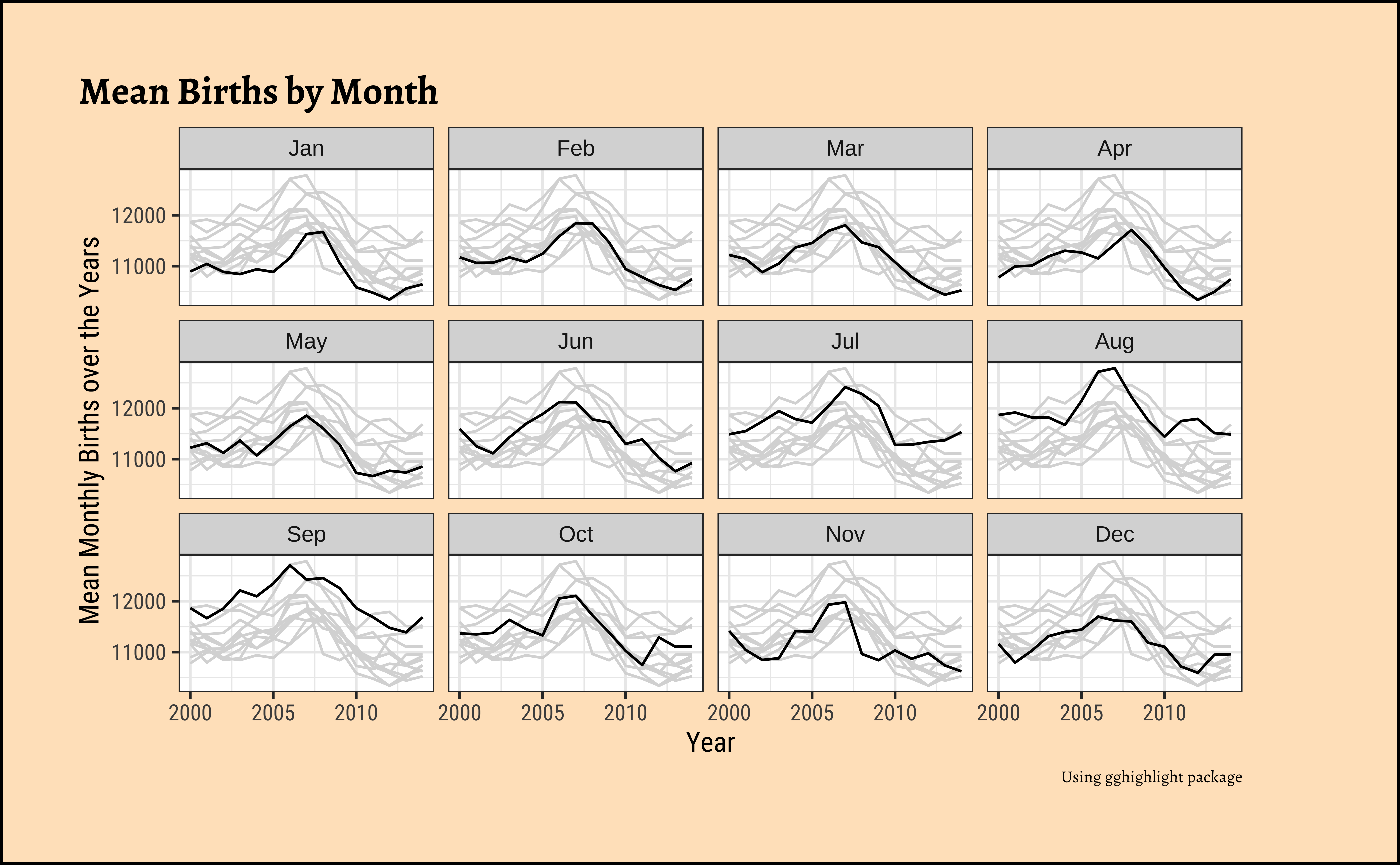
ggplot2::theme_set(new = theme_custom())
births_2000_2014_weekly
###
births_2000_2014_weekly %>% ggplot() +
geom_line(aes(y = mean_daily_births, x = year, group = day_of_week)) +
labs(
x = "Year", y = "Mean Daily Births over the Years",
title = "Mean Births by Day of Week",
caption = "Using gghighlight package"
) +
### Add highlighting
gghighlight(
use_direct_label = F,
unhighlighted_params = list(colour = alpha("grey85", 1))
) +
### Add faceting
facet_wrap(vars(day_of_week))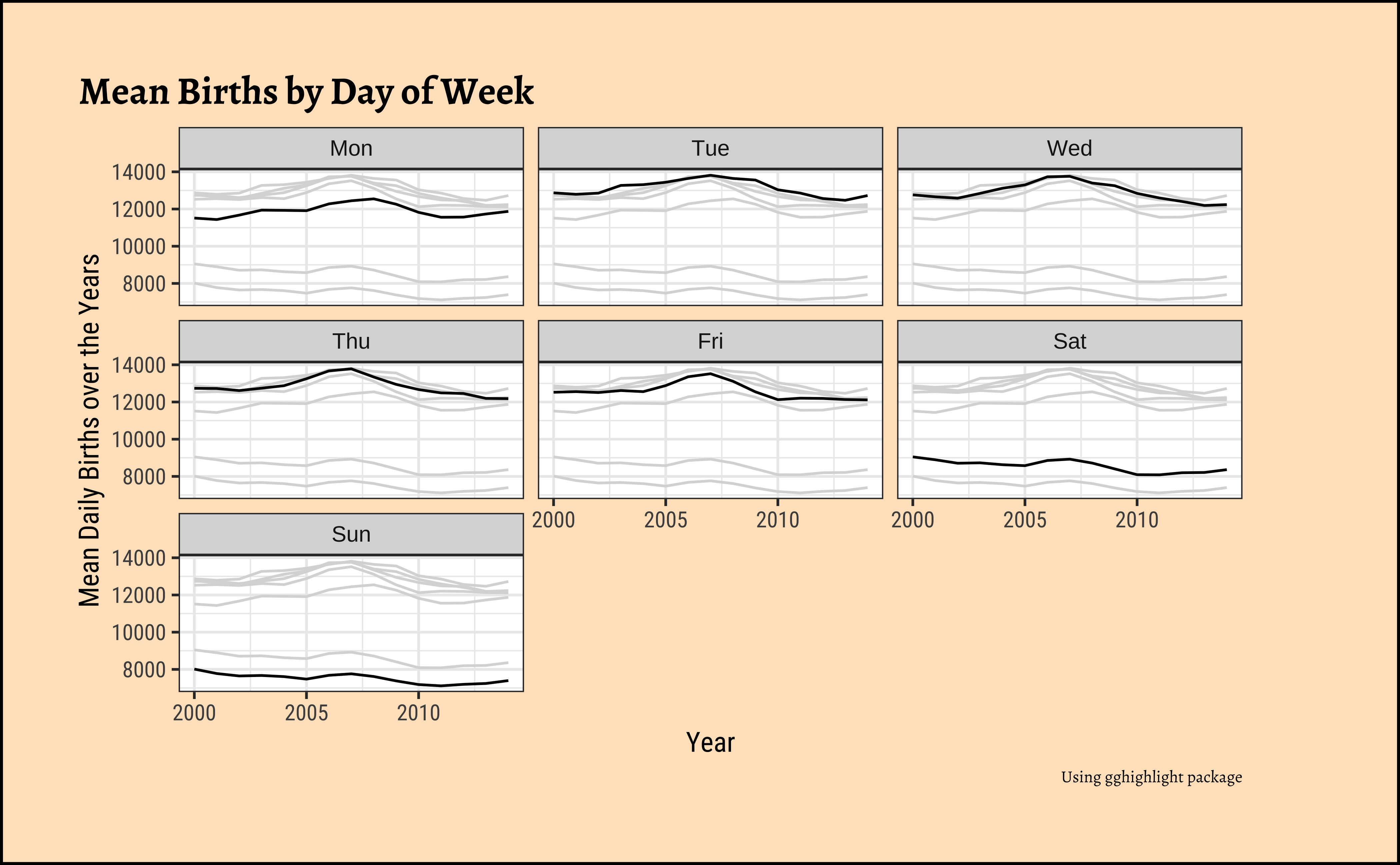
Why are fewer babies born on weekends?
Looks like an interesting story here…there are significantly fewer births on average on Sat and Sun, over the years! Why? Should we watch Grey’s Anatomy ?
And more births in September? That should be a no-brainer!! 😄
Important
Note that this is still using just tibble data, without converting it into a time series format. So far we are simply treating the year/month/day variables are simple variables and using dplyr to group and summarize. We have not created an explicit time or date variable.
Plotting tibble time-series
Now, we can convert the time-oriented columns in this dataset into a single date variable, giving us a proper tibble time-series:
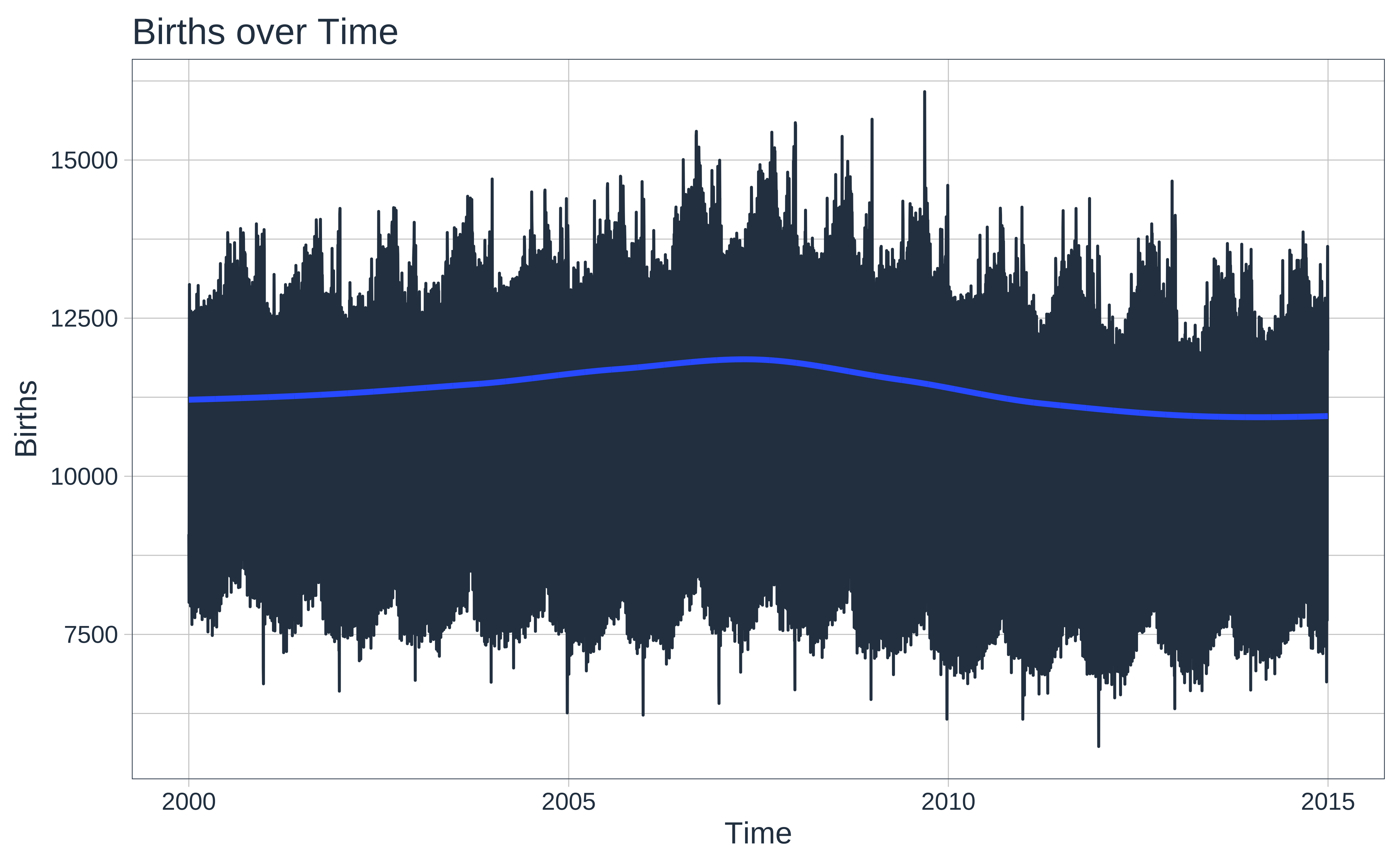
Note that we have a proper date formatted column, as desired. This is a single time series, but if we had other Qualitative variables such as say city, we could easily have had multiple series here. We can plot this with ggformula/ggplot as we have done before, and with now with timetk:
Data Dictionary
Note
Data Description: This is a large-ish dataset.Run PBS in your console)
- 67K observations
- 336 combinations of
keyvariables (Concession,Type,ATC1,ATC2) which are categorical, as foreseen. - Data appears to be monthly, as indicated by the
1M. - the time index variable is called
Month, formatted asyearmonth, a new type of variable introduced in thetsibblepackage.
Note that there are multiple Quantitative variables (Scripts,Cost), each sliced into 336 time-series, a feature which is not supported in the ts format, but is supported in a tsibble. The Qualitative Variables are described below. (Type help("PBS") in your Console.)
The data is dis-aggregated/grouped using four keys:
- Concession: Concessional scripts are given to pensioners, unemployed, dependents, and other card holders
- Type: Co-payments are made until an individual’s script expenditure hits a threshold ($290.00 for concession, $1141.80 otherwise). Safety net subsidies are provided to individuals exceeding this amount.
- ATC1: Anatomical Therapeutic Chemical index (level 1). 15 types
- ATC2: Anatomical Therapeutic Chemical index (level 2). 84 types, nested inside ATC1.
Code
PBS %>%
DT::datatable(
caption = htmltools::tags$caption(
style = "caption-side: top; text-align: left; color: black; font-size: 150%;",
"PBS Dataset (Clean)"
),
options = list(pageLength = 10, autoWidth = TRUE)
) %>%
DT::formatStyle(
columns = names(PBS),
fontFamily = "Roboto Condensed",
fontSize = "12px"
)Let us simply plot Cost over time:

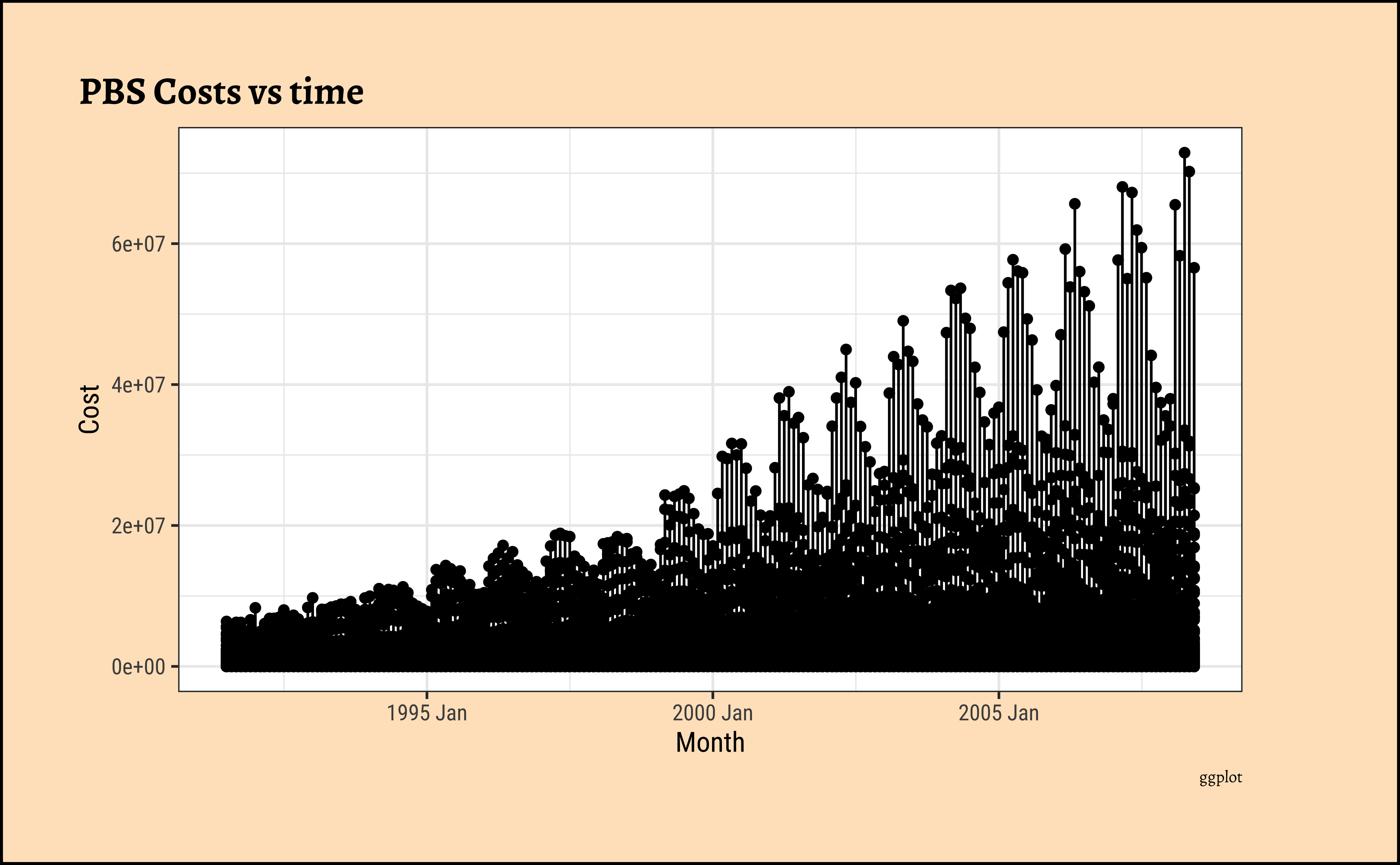
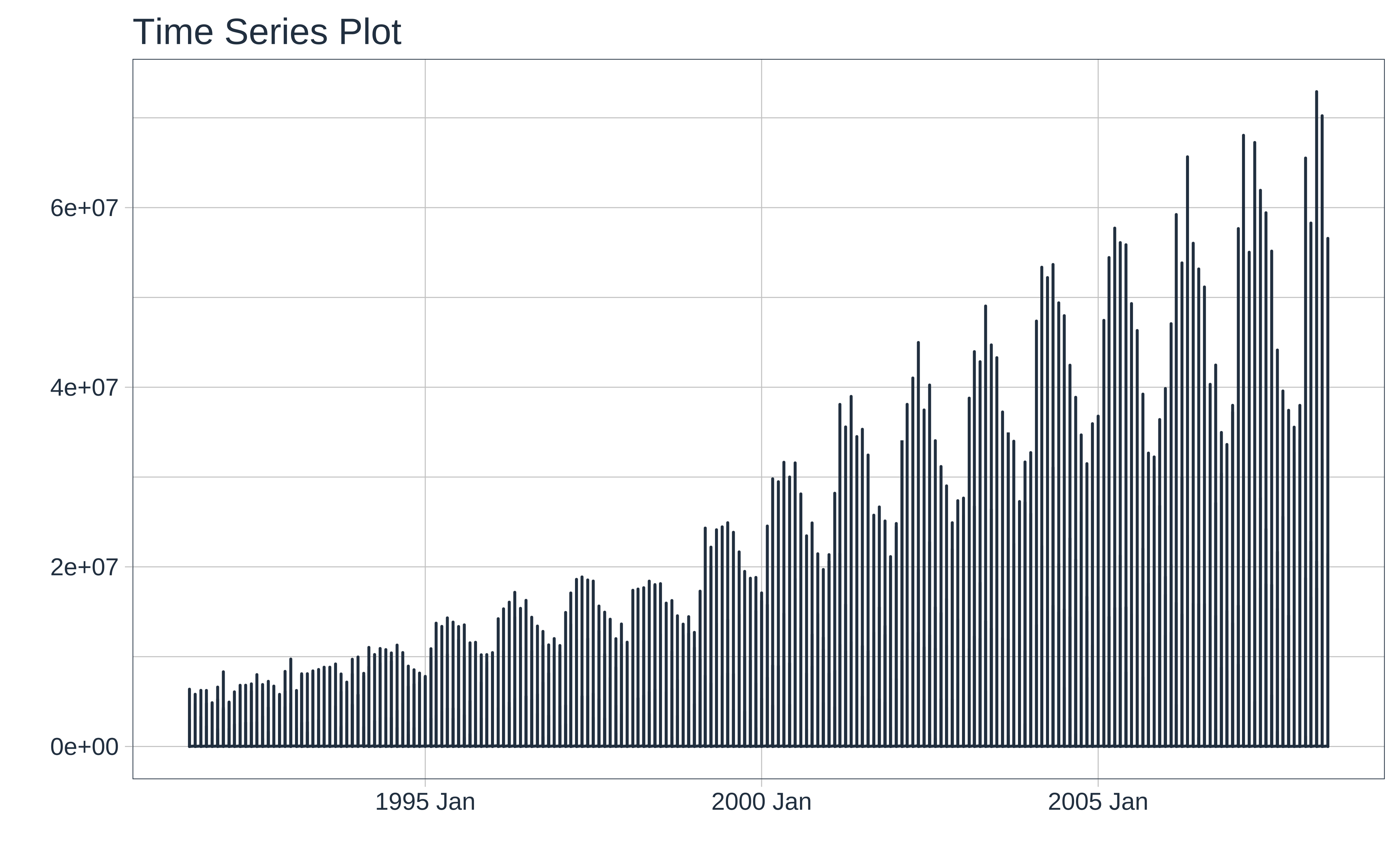
This basic plot is quite messy. Other than an overall rising trend and more vigorous variations pointing to a multiplicative process, we cannot say more. There is simply too much happening here and it is now time (sic!) for us to look at summaries of the data using dplyr-like verbs.
We will do that in the Section 1.
How about a heatmap? We can cook up a categorical variable based on the number of births (low, fine, high) and use that to create a heatmap:
ggplot2::theme_set(new = theme_custom())
births_2000_2014 %>%
mutate(birthrate = case_when(
births >= 10000 ~ "high",
births <= 8000 ~ "low",
TRUE ~ "fine"
)) %>%
mutate(birthrate = base::factor(birthrate,
labels = c("high", "fine", "low"),
ordered = TRUE
)) %>%
gf_tile(
data = .,
year ~ month,
fill = ~birthrate,
color = "black"
) %>%
gf_labs(title = "Heatmap as a Time Series Representation") %>%
gf_theme(scale_x_time(
breaks = 1:12,
labels = c(
"Jan", "Feb", "Mar", "Apr",
"May", "Jun", "Jul", "Aug",
"Sep", "Oct", "Nov", "Dec"
)
)) %>%
gf_theme(scale_fill_brewer(
name = "Birth Rate", type = "qual", palette = "OrRd",
direction = -1
))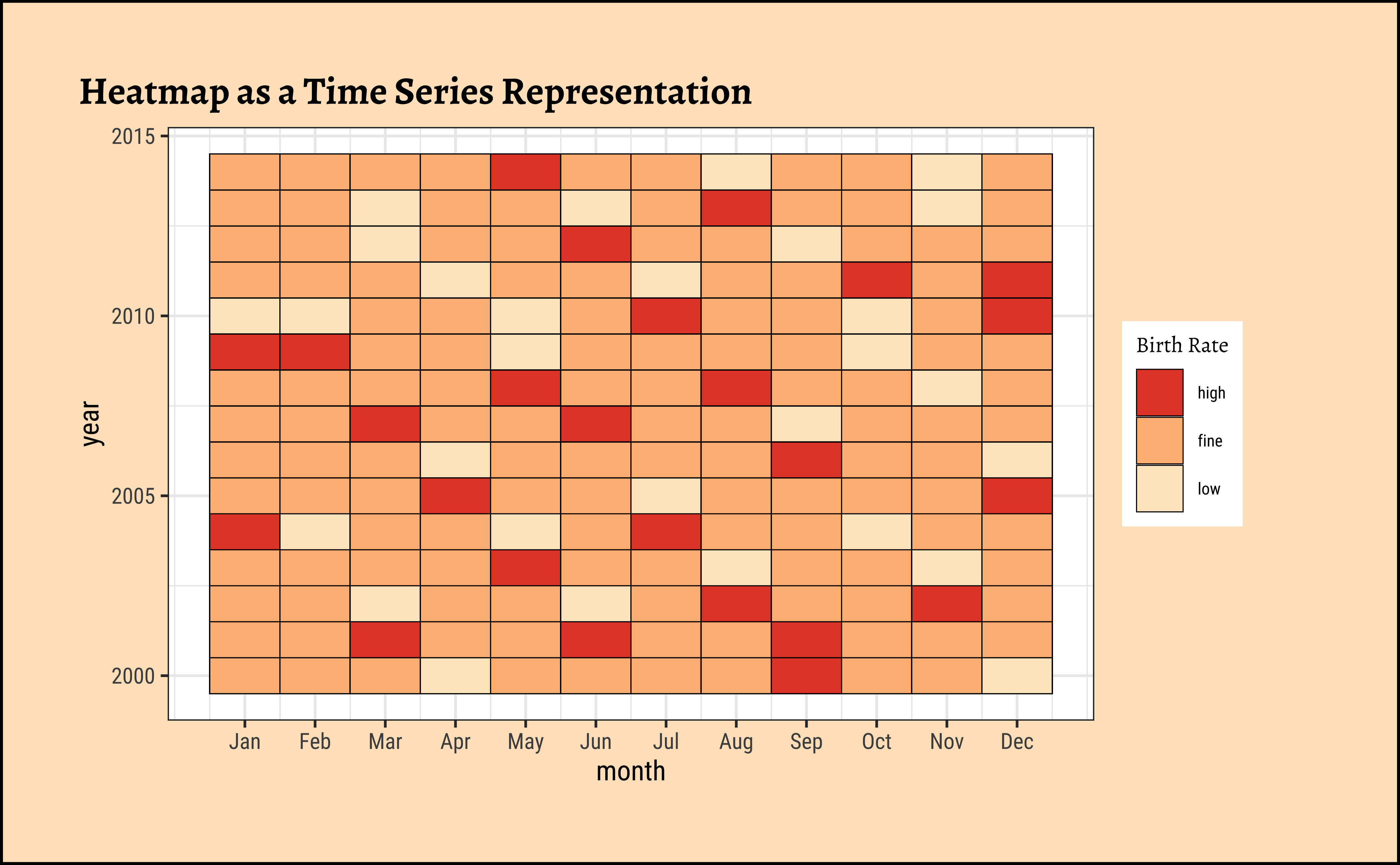
Note how both X and Y axis seem to be a time-oriented variable in a heatmap!
Dancho, Matt, and Davis Vaughan. 2025. timetk: A Tool Kit for Working with Time Series. https://doi.org/10.32614/CRAN.package.timetk.
Hyndman, Rob. 2026. Fpp3: Data for “Forecasting: Principles and Practice” (3rd Edition). https://doi.org/10.32614/CRAN.package.fpp3.
Hyndman, Rob, and Yangzhuoran Yang. 2026. tsdl: Time Series Data Library. https://github.com/FinYang/tsdl.
Krispin, Rami. 2023. TSstudio: Functions for Time Series Analysis and Forecasting. https://doi.org/10.32614/CRAN.package.TSstudio.
O’Hara-Wild, Mitchell, Rob Hyndman, Earo Wang, and Rakshitha Godahewa. 2022. tsibbledata: Diverse Datasets for “tsibble”. https://doi.org/10.32614/CRAN.package.tsibbledata.
Wang, Earo, Dianne Cook, and Rob J Hyndman. 2020. “A New Tidy Data Structure to Support Exploration and Modeling of Temporal Data.” Journal of Computational and Graphical Statistics 29 (3): 466–78. https://doi.org/10.1080/10618600.2019.1695624.
Yutani, Hiroaki. 2025. gghighlight: Highlight Lines and Points in “ggplot2”. https://doi.org/10.32614/CRAN.package.gghighlight.