Inference for a Single Mean
“The more I love humanity in general, the less I love man in particular. ― Fyodor Dostoyevsky, The Brothers Karamazov
2022-11-10
Plot Fonts and Theme
Code
library(systemfonts)
library(showtext)
## Clean the slate
systemfonts::clear_local_fonts()
systemfonts::clear_registry()
##
showtext_opts(dpi = 96) # set DPI for showtext
sysfonts::font_add(
  family = "Alegreya",
  regular = "../../../../../../fonts/Alegreya-Regular.ttf",
  bold = "../../../../../../fonts/Alegreya-Bold.ttf",
  italic = "../../../../../../fonts/Alegreya-Italic.ttf",
  bolditalic = "../../../../../../fonts/Alegreya-BoldItalic.ttf"
)

sysfonts::font_add(
  family = "Roboto Condensed",
  regular = "../../../../../../fonts/RobotoCondensed-Regular.ttf",
  bold = "../../../../../../fonts/RobotoCondensed-Bold.ttf",
  italic = "../../../../../../fonts/RobotoCondensed-Italic.ttf",
  bolditalic = "../../../../../../fonts/RobotoCondensed-BoldItalic.ttf"
)
showtext_auto(enable = TRUE) # enable showtext
##
theme_custom <- function() {
  theme_bw(base_size = 10) +

    # theme(panel.widths = unit(11, "cm"),
    #       panel.heights = unit(6.79, "cm")) + # Golden Ratio

    theme(
      plot.margin = margin_auto(t = 1, r = 2, b = 1, l = 1, unit = "cm"),
      plot.background = element_rect(
        fill = "bisque",
        colour = "black",
        linewidth = 1
      )
    ) +

    theme_sub_axis(
      title = element_text(
        family = "Roboto Condensed",
        size = 10
      ),
      text = element_text(
        family = "Roboto Condensed",
        size = 8
      )
    ) +

    theme_sub_legend(
      text = element_text(
        family = "Roboto Condensed",
        size = 6
      ),
      title = element_text(
        family = "Alegreya",
        size = 8
      )
    ) +

    theme_sub_plot(
      title = element_text(
        family = "Alegreya",
        size = 14, face = "bold"
      ),
      title.position = "plot",
      subtitle = element_text(
        family = "Alegreya",
        size = 10
      ),
      caption = element_text(
        family = "Alegreya",
        size = 6
      ),
      caption.position = "plot"
    )
}

## Use available fonts in ggplot text geoms too!
ggplot2::update_geom_defaults(geom = "text", new = list(
  family = "Roboto Condensed",
  face = "plain",
  size = 3.5,
  color = "#2b2b2b"
))
ggplot2::update_geom_defaults(geom = "label", new = list(
  family = "Roboto Condensed",
  face = "plain",
  size = 3.5,
  color = "#2b2b2b"
))

ggplot2::update_geom_defaults(geom = "marquee", new = list(
  family = "Roboto Condensed",
  face = "plain",
  size = 3.5,
  color = "#2b2b2b"
))
ggplot2::update_geom_defaults(geom = "text_repel", new = list(
  family = "Roboto Condensed",
  face = "plain",
  size = 3.5,
  color = "#2b2b2b"
))
ggplot2::update_geom_defaults(geom = "label_repel", new = list(
  family = "Roboto Condensed",
  face = "plain",
  size = 3.5,
  color = "#2b2b2b"
))

## Set the theme
ggplot2::theme_set(new = theme_custom())

## tinytable options
options("tinytable_tt_digits" = 2)
options("tinytable_format_num_fmt" = "significant_cell")
options(tinytable_html_mathjax = TRUE)


## Set defaults for flextable
flextable::set_flextable_defaults(font.family = "Roboto Condensed")
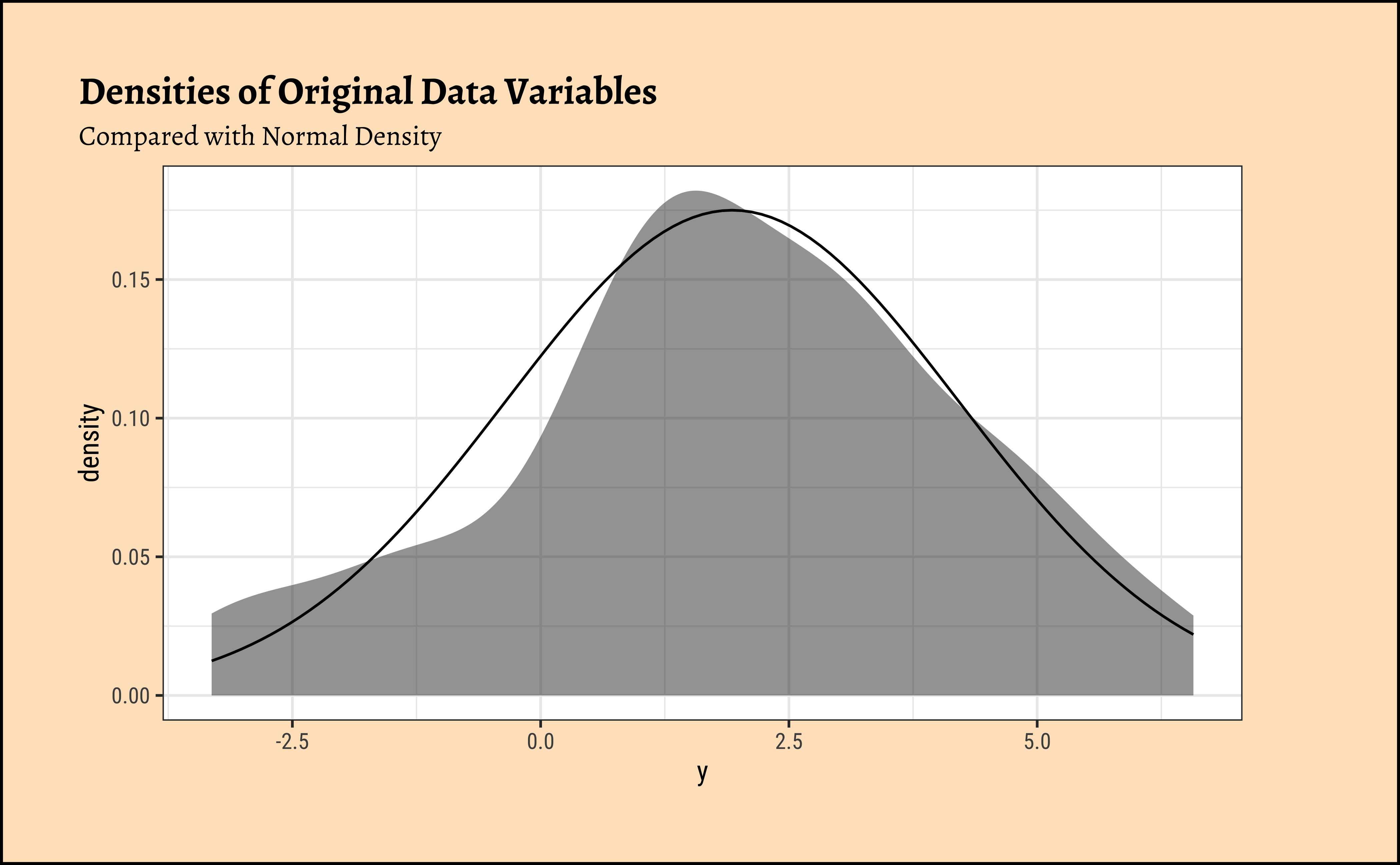
Observations from Density Plots
- The variable \(y\) appear to be centred around
- It does not seem to be normally distributed…
- So assumptions are not always valid…
A. Model
We have \(mean(y) = \bar{y}.\) We formulate “our disbelief” of \(\bar{y}\) with a NULL Hypothesis, about the population as follows:
\[ \ H_0: \mu = 0 \] And the alternative hypothesis, again about the population as
\[ H_a:\mu \ne 0 \]
B. Code
So \(\bar{y}\) i.e. the estimate is \(2.045689\). The confidence intervals do not straddle zero. The chances that this particular value of mean (\(2.045689\)) would randomly occur under the assumption that \(\mu\) is zero, are exceedingly slim, \(p.value = 1.425 * 10^{-8}\). Hence we can reject the NULL hypothesis that the true population, of which y is a sample, could have mean \(\mu = 0\).
“Signed Rank” Values: A Small Digression
When the Quant variable we want to test for is not normally distributed, we need to think of other ways to perform our inference. Our assumption about normality has been invalidated.
Most statistical tests use the actual values of the data variables. However, in these cases where assumptions are invalidated, the data are used in rank-transformed sense/order. In some cases the signed-rank of the data values is used instead of the data itself. The signed ranks are then tested to see if there are more of one polarity than the other, roughly speaking, and how probable this could be.
Signed Rank is calculated as follows:
- Take the absolute value of each observation in a sample
- Place the ranks in order of (absolute magnitude). The smallest number has rank = 1 and so on.
- Give each of the ranks the sign of the original observation ( + or -)
Since we are dealing with the mean, the sign of the rank becomes important to use.
A. Model
\[ mean(signed\_rank(y)) = \beta_0 \]
\[ H_0: \beta_0 = 0 \] \[ H_a: \beta_0 \ne 0 \]
B. Code
Again, the confidence intervals do not straddle \(0\), and we need to reject the belief that the mean is close to zero.
Note
Note how the Wilcoxon Test reports results about \(y\), even though it computes with \(signed-rank(y)\). The “equivalent t-test” used with signed-rank data cannot do this, since it uses “rank” data as-is.
We saw from the diagram created by Allen Downey that there is only one test 1! We will now use this philosophy to develop a technique that allows us to mechanize several Statistical Models in that way, with nearly identical code.
We can use two packages in R, mosaic to develop our intuition for what are called permutation based statistical tests; and a more recent package called infer in R which can do pretty much all of this, including visualization.
We will stick with mosaic for now. We will do a permutation test first, and then a bootstrap test. In subsequent modules, we will use infer also.
For the Permutation test, we mechanize our belief that \(\mu = 0\) by shuffling the polarities of the y observations randomly 4999 times to generate other samples from the population \(y\) could have come from2. If these samples can frequently achieve \(\bar{y_i} \leq 0\), then we might believe that the population mean may be 0!
We see that the means here that chances that the randomly generated means can exceed our real-world mean are about \(0\)! So the mean is definitely different from \(0\).
Code
ggplot2::theme_set(new = theme_custom())

# Calculate exact mean
obs_mean <- mean(~y, data = mydata)
belief1 <- 0 # What we think the mean is
obs_diff_mosaic <- obs_mean - belief1
obs_diff_mosaic
## Steps in Permutation Test
## Repeatedly Shuffle polarities of data observations
## Take means
## Compare all means with the real-world observed one
null_dist_mosaic <-
  mosaic::do(9999) * mean(
    ~ abs(y) *
      sample(c(-1, 1), # +/- 1s multiply y
        length(y), # How many +/- 1s?
        replace = T
      ), # select with replacement
    data = mydata
  )
##
range(null_dist_mosaic$mean)
##
## Plot this NULL distribution
gf_histogram(
  ~mean,
  data = null_dist_mosaic,
  fill = ~ (mean >= obs_diff_mosaic),
  bins = 50, title = "Distribution of Permutation Means under Null Hypothesis",
  subtitle = "Why is the mean of the means zero??"
) %>%
  gf_labs(
    x = "Calculated Random Means",
    y = "How Often do these occur?"
  ) %>%
  gf_vline(xintercept = obs_diff_mosaic, colour = "red") %>%
  gf_refine(
    scale_y_continuous(expand = expansion(add = c(0, 20))),
    scale_x_continuous(expand = expansion(add = c(0.25, 0.25)))
  )

# p-value
# Null distributions are always centered around zero. Why?
prop(~ mean >= obs_diff_mosaic,
  data = null_dist_mosaic
)
[1] 2.634253
[1] -1.809948 1.745760
prop_TRUE
0 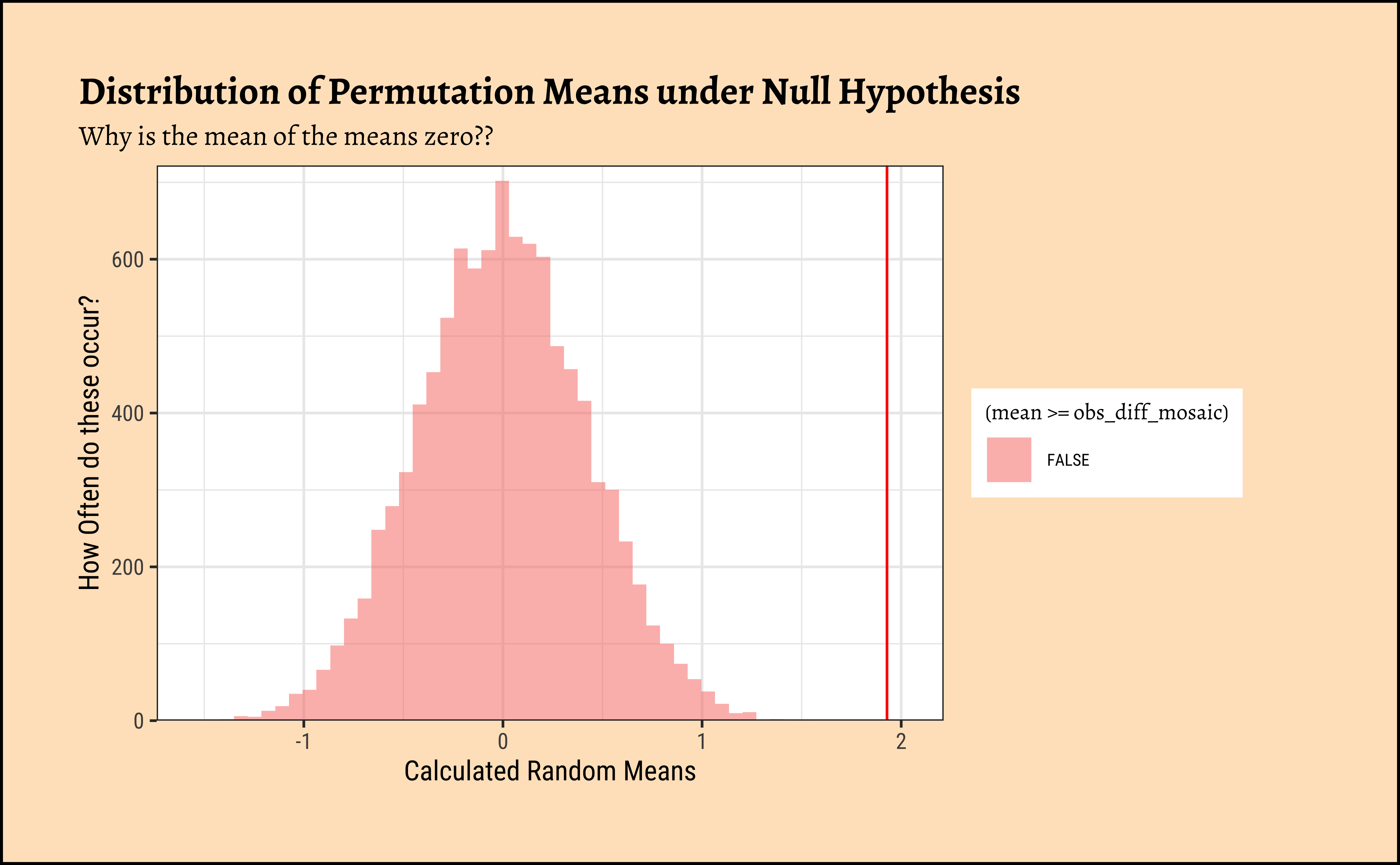
Let us try the bootstrap test now: Here we simulate samples, similar to the one at hand, using repeated sampling the sample itself, with replacement, a process known as bootstrapping, or bootstrap sampling.
Code
ggplot2::theme_set(new = theme_custom())

## Resample with replacement from the one sample of 50
## Calculate the mean each time
null_toy_bs <- mosaic::do(4999) *
  mean(
    ~ sample(y,
      replace = T
    ), # select with replacement
    data = mydata
  )

## Plot this NULL distribution
gf_histogram(
  ~mean,
  data = null_toy_bs,
  bins = 50,
  title = "Distribution of Bootstrap Means"
) %>%
  gf_labs(
    x = "Calculated Random Means",
    y = "How Often do these occur?"
  ) %>%
  gf_vline(xintercept = ~belief1, colour = "red") %>%
  gf_refine(
    scale_y_continuous(expand = expansion(add = c(0, 20))),
    scale_x_continuous(expand = expansion(add = c(1, 1)))
  )

prop(~ mean >= belief1,
  data = null_toy_bs
) +
  prop(~ mean <= -belief1,
    data = null_toy_bs
  )
prop_TRUE
1 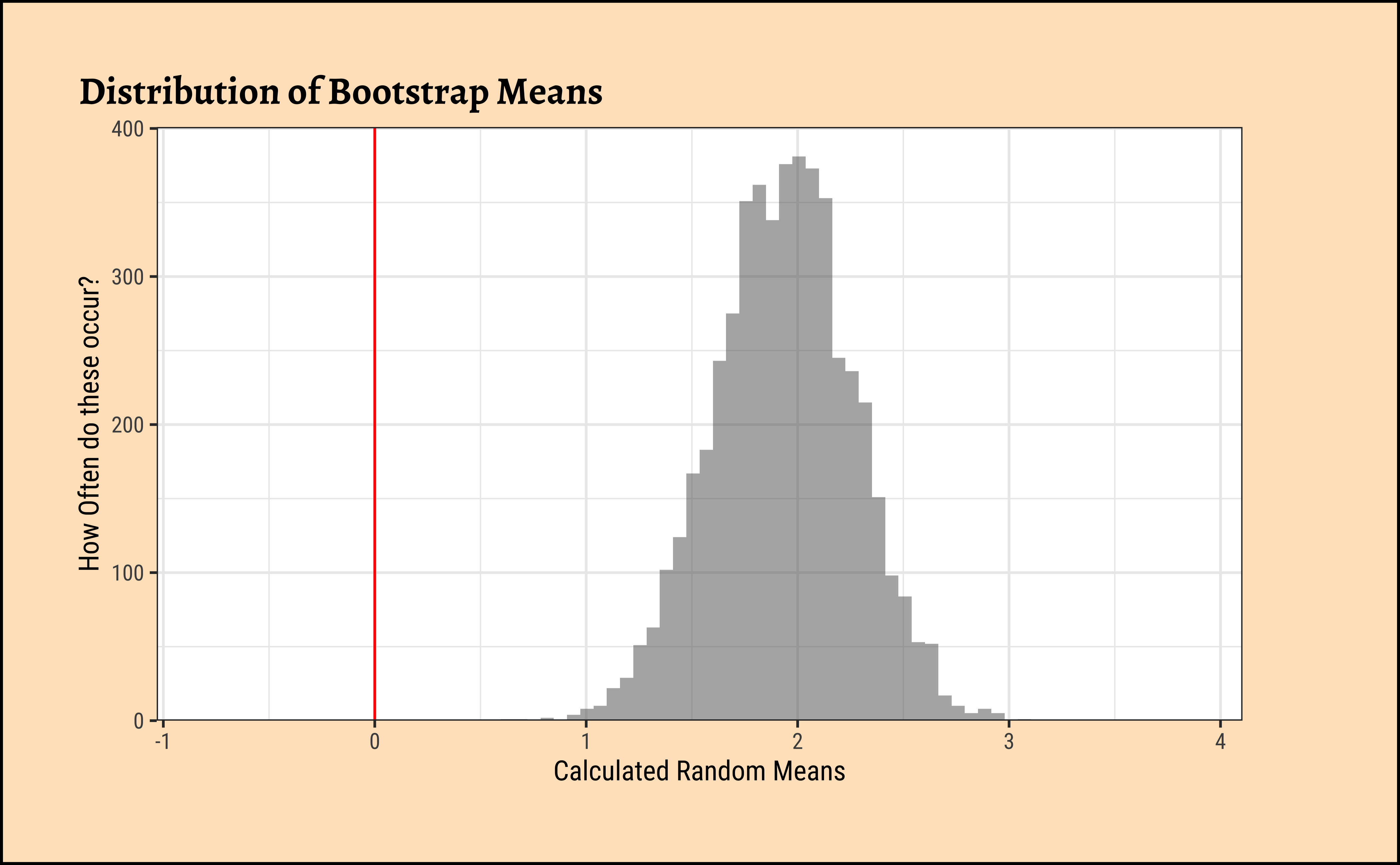
Permutation vs Bootstrap
There is a difference between the two. The bootstrap test uses the sample at hand to generate many similar samples without access to the population, and calculates the statistic needed (i.e. mean). No Hypothesis is stated. The distribution of bootstrap samples looks “similar” to that we might obtain by repeatedly sampling the population itself. (centred around a population parameter, i.e. \(\mu\))
The permutation test generates many permutations of the data and generates appropriates measures/statistics under the NULL hypothesis. Which is why the permutation test has a NULL distribution centered at \(0\) in this case, our NULL hypothesis.
As student Sneha Manu Jacob remarked in class, Permutation flips the signs of the data values in our sample; Bootstrap flips the number of times each data value is (re)used. Good Insight!!
Yes, the t-test works, but what is really happening under the hood of the t-test? The inner mechanism of the t-test can be stated in the following steps:
- Calculate the
meanof the sample \(\bar{y}\). - Calculate the
sdof the sample, and, assuming the sample is normally distributed, calculate thestandard error(i.e. \(\frac{sd}{\sqrt{n}}\)) - Take the difference between the sample mean \(\bar{y}\) and our expected/believed population mean \(\mu\).
- Scale the difference by the
standard errorto get atest statistic\(t\). - If the
test statisticis more than \(\pm 1.96\), we can say that it is beyond the theconfidence intervalof the sample mean \(\bar{y}\). - Therefore if the difference between actual and believed is far beyond the confidence interval, hmm…we cannot think our belief is correct and we change our opinion.
Let us translate that mouthful into calculations!
[1] 0Null Hypothesis / Belief
[1] 0.3272517Standard Error
[1] 2.634253Sample Mean
Confidence Intervals
[1] 8.049623Test Statistic
How can we visualize this?
Code
ggplot2::theme_set(new = theme_custom())

mosaic::xqnorm(
  p = c(0.025, 0.975),
  mean = sample_mean, sd = sample_se,
  return = c("value"), verbose = T, plot = F
) -> xq

## Sample-Mean Distribution
xqnorm(
  p = c(0.025, 0.975),
  mean = sample_mean, sd = sample_se,
  digits = 3, plot = TRUE,
  return = c("plot"), pattern = "rings",
  verbose = F, alpha = 0.5, colour = "black",
  system = "gg"
) %>%
  gf_dhistogram(~y, data = mydata, inherit = F) %>%
  gf_fitdistr(~y, data = mydata) %>%
  gf_vline(xintercept = ~mean_belief_pop, colour = "red") %>%
  gf_vline(xintercept = sample_mean, colour = "purple") %>%
  ## Sample Distribution
  gf_annotate(
    geom = "label", x = 5, y = 0.25,
    label = "Sample Histogram and Density",
    colour = "black"
  ) %>%
  ## Null Hypothesis
  gf_annotate(
    geom = "label", x = mean_belief_pop, y = 1.4,
    label = "Null Hypothesis (Belief)"
  ) %>%
  ## Sampling Mean Distribution
  gf_annotate(
    geom = "label", x = sample_mean - 3, y = 1.0,
    label = "Sample-Mean Distribution", colour = "purple"
  ) %>%
  gf_annotate("curve",
    x = sample_mean - 3, y = 1.05,
    xend = sample_mean - 0.25, yend = 1.0,
    curvature = -0.25, color = "purple",
    arrow = arrow(length = unit(0.25, "cm"))
  ) %>%
  ## Observed Mean
  gf_annotate(
    geom = "label", x = sample_mean, y = 1.5,
    label = "Sample Mean", colour = "purple"
  ) %>%
  ## Confidence Intervals
  gf_annotate(
    geom = "label", x = sample_mean, y = 0.6,
    label = "95% Confidence Interval",
    colour = "purple"
  ) %>%
  gf_annotate("segment",
    x = xq[1], y = 0.0,
    xend = xq[1], yend = 0.5,
    color = "purple", linewidth = 0.5
  ) %>%
  gf_annotate("segment",
    x = xq[2], y = 0.0,
    xend = xq[2], yend = 0.5,
    color = "purple", linewidth = 0.5
  ) %>%
  gf_annotate("segment",
    x = xq[1], y = 0.35,
    xend = xq[2], yend = 0.35,
    color = "purple", linewidth = 0.5,
    arrow = arrow(length = unit(0.25, "cm"), ends = "both")
  ) %>%
  gf_labs(
    title = "Visualizing the t-test for Toy Data",
    subtitle = "Sample-Mean-Distribution is plotted as theoretical Gaussian Bell Curve",
    x = "Sample Values and Means", y = "Density"
  ) %>%
  gf_refine(
    scale_y_continuous(limits = c(0, 1.6), expand = c(0, 0)),
    scale_x_continuous(
      limits = c(-2.5, 7.5),
      breaks = c(-2.5, 0, 2.5, 5, 7.5, sample_mean),
      labels = scales::number_format(
        accuracy = 0.01,
        decimal.mark = "."
      )
    )
  ) %>%
  gf_theme(theme_custom())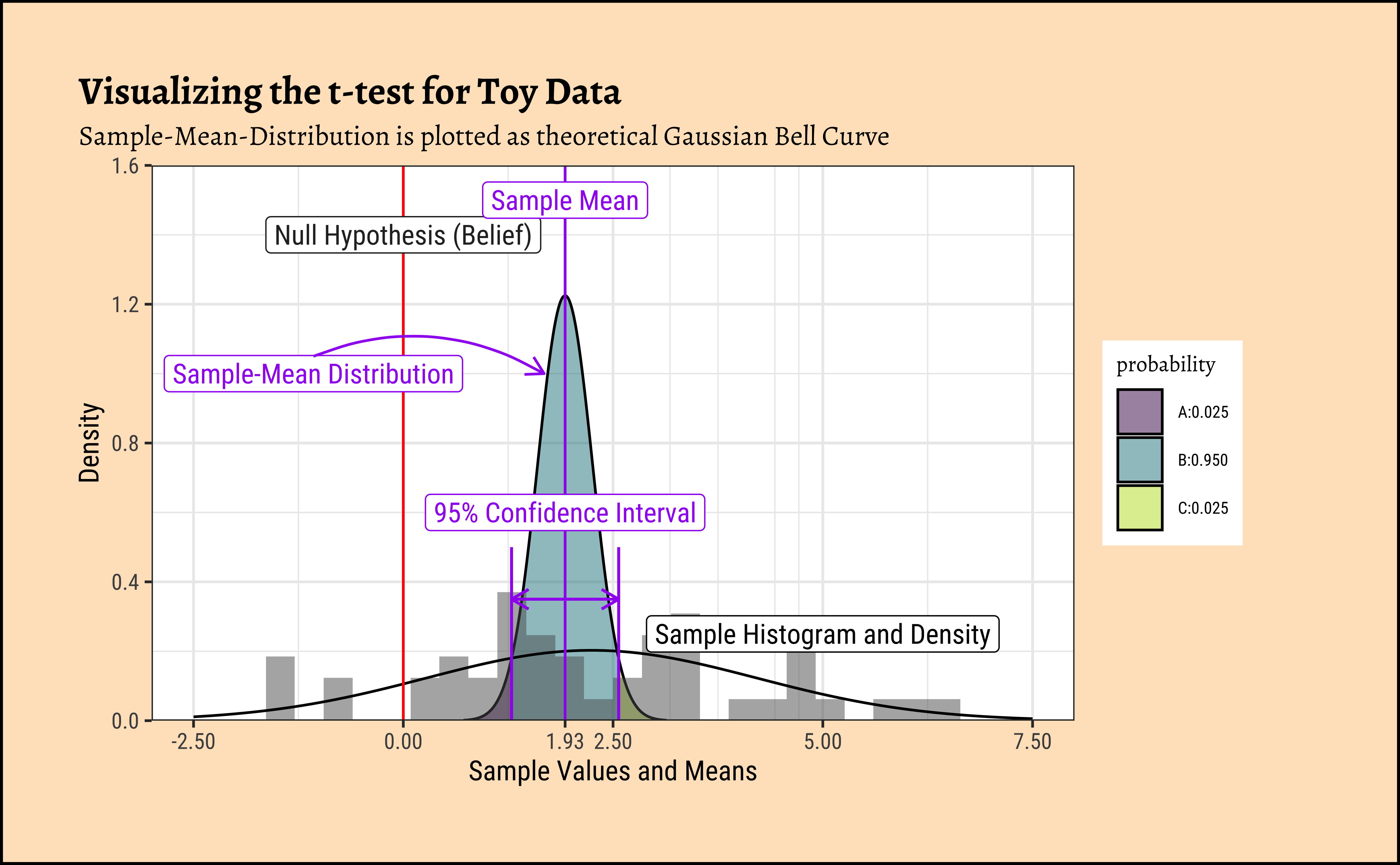
We see that the difference between means is 8.0496231 times the std_error! At a distance of \(1.96\) (either way) the probability of this data happening by chance already drops to \(2.5 \%\) !! At this distance of 8.0496231, we would have negligible probability of this data occurring by chance!
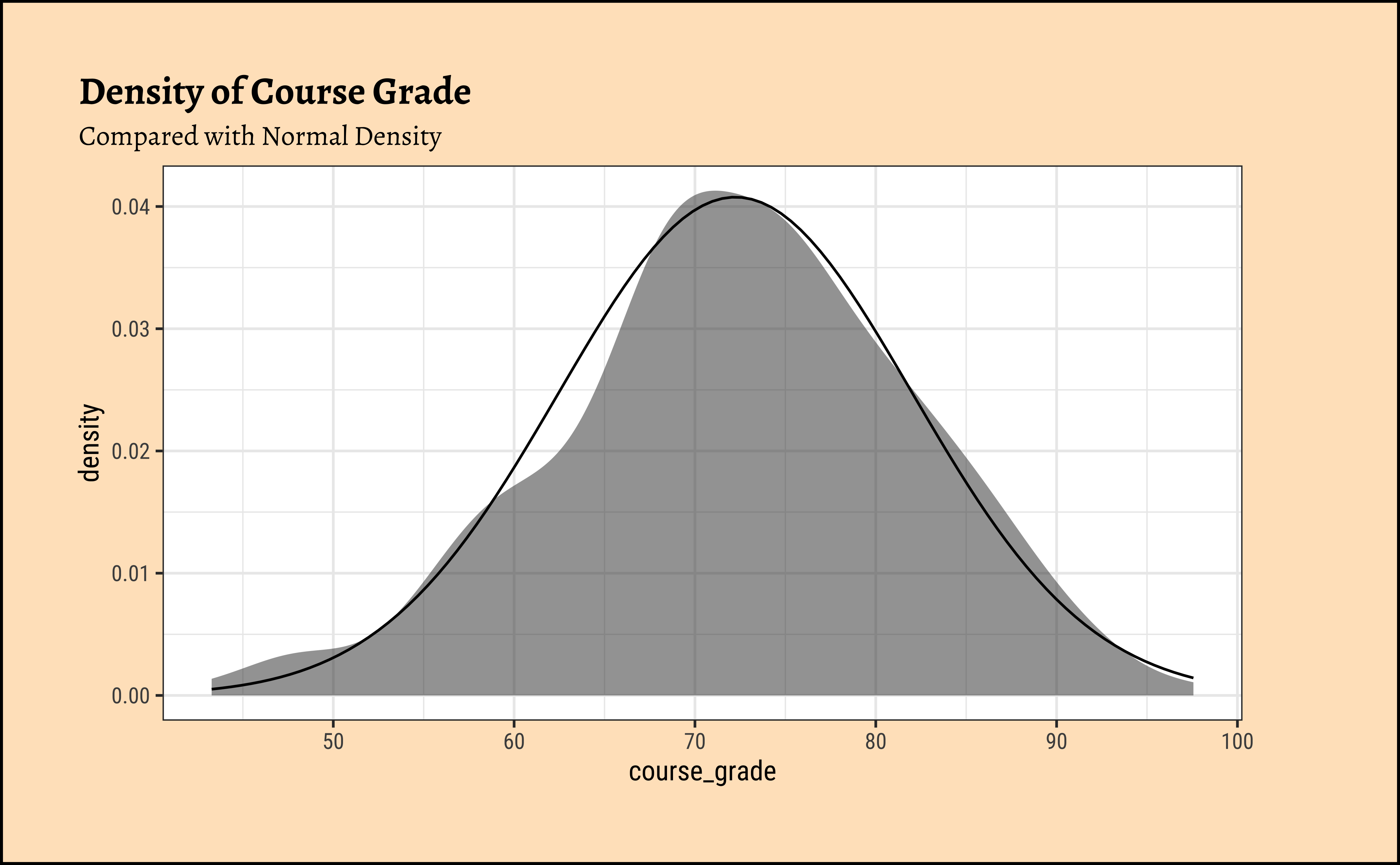
Hmm…data looks normally distributed. But this time we will not merely trust our eyes, but do a test for it.
Inference
A. Model
We have that \(mean(course\_grade) = \beta_0\). As before, we formulate “our (dis)belief” in this sample mean with a NULL Hypothesis about the population, as follows:
\[ \ H_0: \mu= 80 \]
\[ H_a: \mu \ne 80 \]
B. Code
So, we can reject the NULL Hypothesis that the average grade in the population of students who have taken this class is 80, since there is a minuscule chance that we would see an observed sample mean of 72.238, if the population mean \(\mu\) had really been \(80\).
This test too suggests that the average course grade is different from 80.
Why compare on both sides?
Note that we have computed whether the average course_grade is generally different from 80 for this Teacher. We could have computed whether it is greater, or lesser than 80 ( or any other number too). Read this article for why it is better to do a “two.sided” test in most cases.
Code
ggplot2::theme_set(new = theme_custom())

# Calculate exact mean
obs_mean_grade <- mean(~course_grade, data = exam_grades)
belief <- 80
obs_grade_diff <- belief - obs_mean_grade
## Steps in a Permutation Test
## Repeatedly Shuffle polarities of data observations
## Take means
## Compare all means with the real-world observed one
null_dist_grade <-
  mosaic::do(4999) *
    mean(
      ~ (course_grade - belief) *
        sample(c(-1, 1), # +/- 1s multiply y
          length(course_grade), # How many +/- 1s?
          replace = T
        ), # select with replacement
      data = exam_grades
    )

## Plot this NULL distribution
gf_histogram(
  ~mean,
  data = null_dist_grade,
  fill = ~ (mean >= obs_grade_diff),
  bins = 50,
  title = "Distribution of Permutated Difference-Means Under Null Hypothesis",
  subtitle = "Why is the mean of the means zero?"
) %>%
  gf_labs(
    x = "Random Means Calculated by Permutation",
    y = "How Often do these occur?"
  ) %>%
  gf_vline(xintercept = obs_grade_diff, colour = "red") %>%
  gf_vline(xintercept = -obs_grade_diff, colour = "red") %>%
  gf_annotate(
    geom = "label", x = obs_grade_diff, y = 400,
    label = "Belief ( + 80)",
    colour = "red"
  ) %>%
  gf_annotate(
    geom = "label", x = -obs_grade_diff, y = 400,
    label = "Belief ( - 80)",
    colour = "red"
  ) %>%
  gf_refine(
    scale_fill_manual(
      values = c("skyblue", "grey"),
      name = "Observed Mean Difference",
      labels = c("Not Exceeding", "Exceeding")
    ),
    scale_x_continuous(
      limits = c(-10, 10),
      breaks = c(-10, -5, -obs_grade_diff, 0, obs_grade_diff, 5, 10),
      labels = scales::number_format(
        accuracy = 0.01,
        decimal.mark = "."
      )
    )
  ) %>%
  gf_refine(scale_y_continuous(expand = expansion(add = c(0, 40))))


# p-value
# Permutation distributions are always centered around zero. Why?
prop(~ mean >= obs_grade_diff,
  data = null_dist_grade
) +
  prop(~ mean <= -obs_grade_diff,
    data = null_dist_grade
  )
prop_TRUE
0 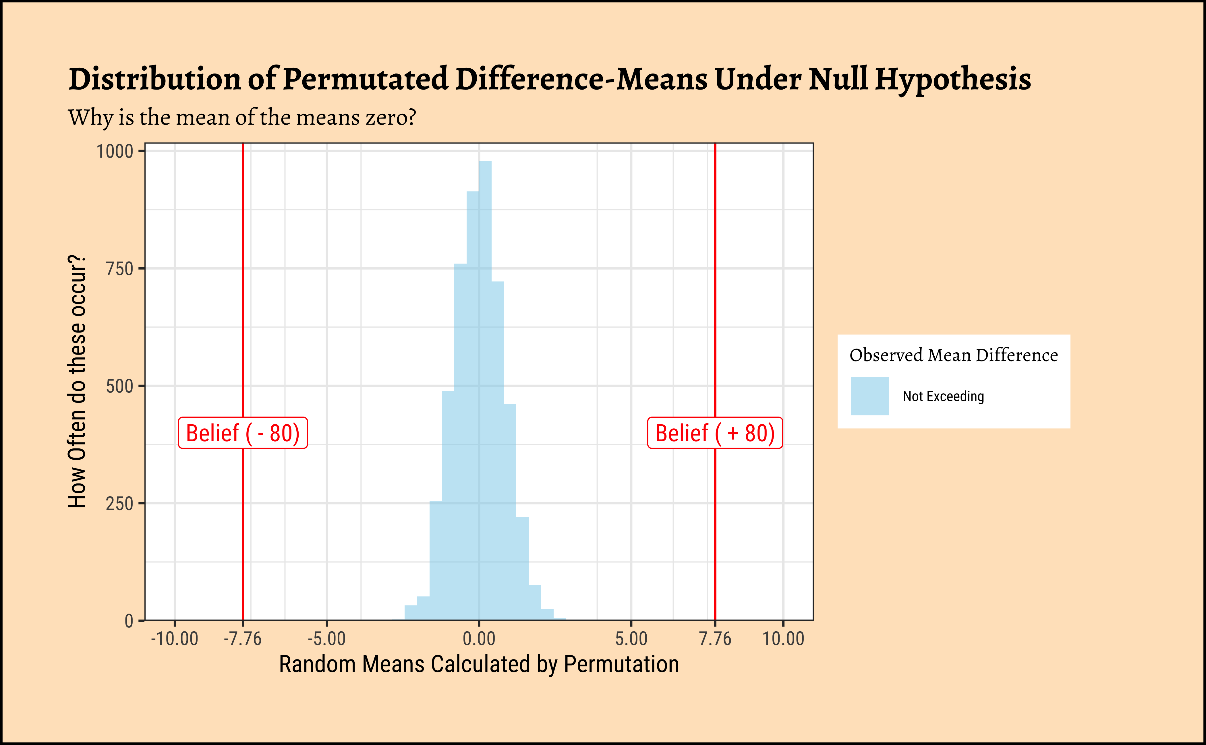
And let us now do the bootstrap test:
Code
ggplot2::theme_set(new = theme_custom())

null_grade_bs <- mosaic::do(4999) *
  mean(
    ~ sample(course_grade,
      replace = T
    ), # select with replacement
    data = exam_grades
  )

## Plot this NULL distribution
gf_histogram(
  ~mean,
  data = null_grade_bs,
  fill = ~ (mean >= obs_grade_diff),
  bins = 50,
  title = "Distribution of Bootstrap Means"
) %>%
  gf_labs(
    x = "Calculated Random Means",
    y = "How Often do these occur?"
  ) %>%
  gf_vline(xintercept = ~belief, colour = "red") %>%
  gf_annotate(
    geom = "label", x = belief, y = 400,
    label = "Belief ( + 80)",
    colour = "red"
  ) %>%
  gf_refine(
    scale_fill_manual(
      values = c("skyblue", "grey"),
      name = "Observed Mean Difference",
      labels = c("Not Exceeding", "Exceeding")
    ),
    scale_x_continuous(
      limits = c(60, 85),
      breaks = c(60, 65, 70, 75, 80, 85, belief),
      labels = scales::number_format(
        accuracy = 0.01,
        decimal.mark = "."
      )
    )
  ) %>%
  gf_refine(scale_y_continuous(expand = expansion(add = c(0, 40))))

prop(~ mean >= belief,
  data = null_grade_bs
) +
  prop(~ mean <= -belief,
    data = null_grade_bs
  )
prop_TRUE
0 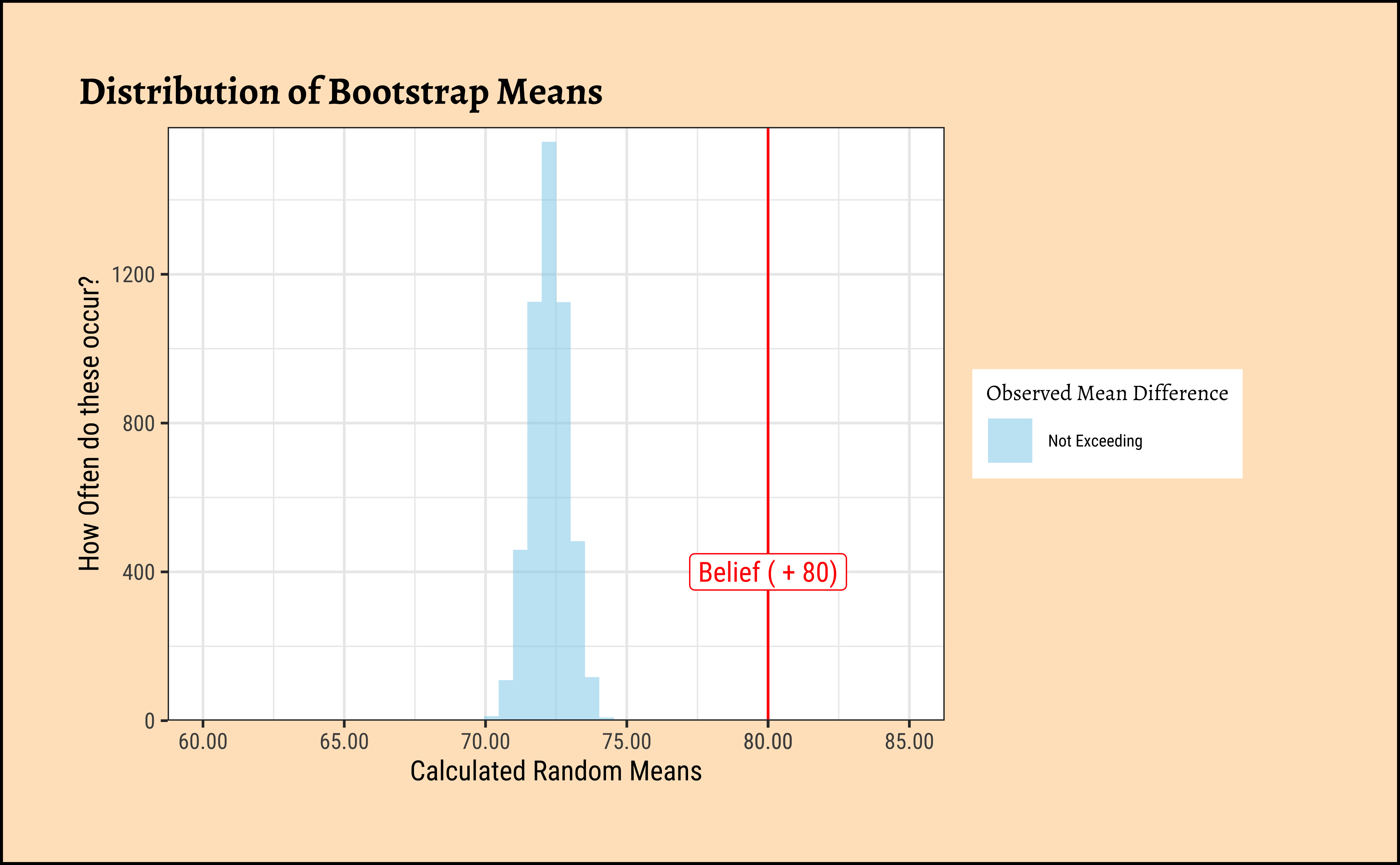
The permutation test shows that we are not able to “generate” the believed mean-difference with any of the permutations. Likewise with the bootstrap, we are not able to hit the believed mean with any of the bootstrap samples.
Hence there is no reason to believe that the belief (80) might be a reasonable one and we reject our NULL Hypothesis that the mean is equal to 80.
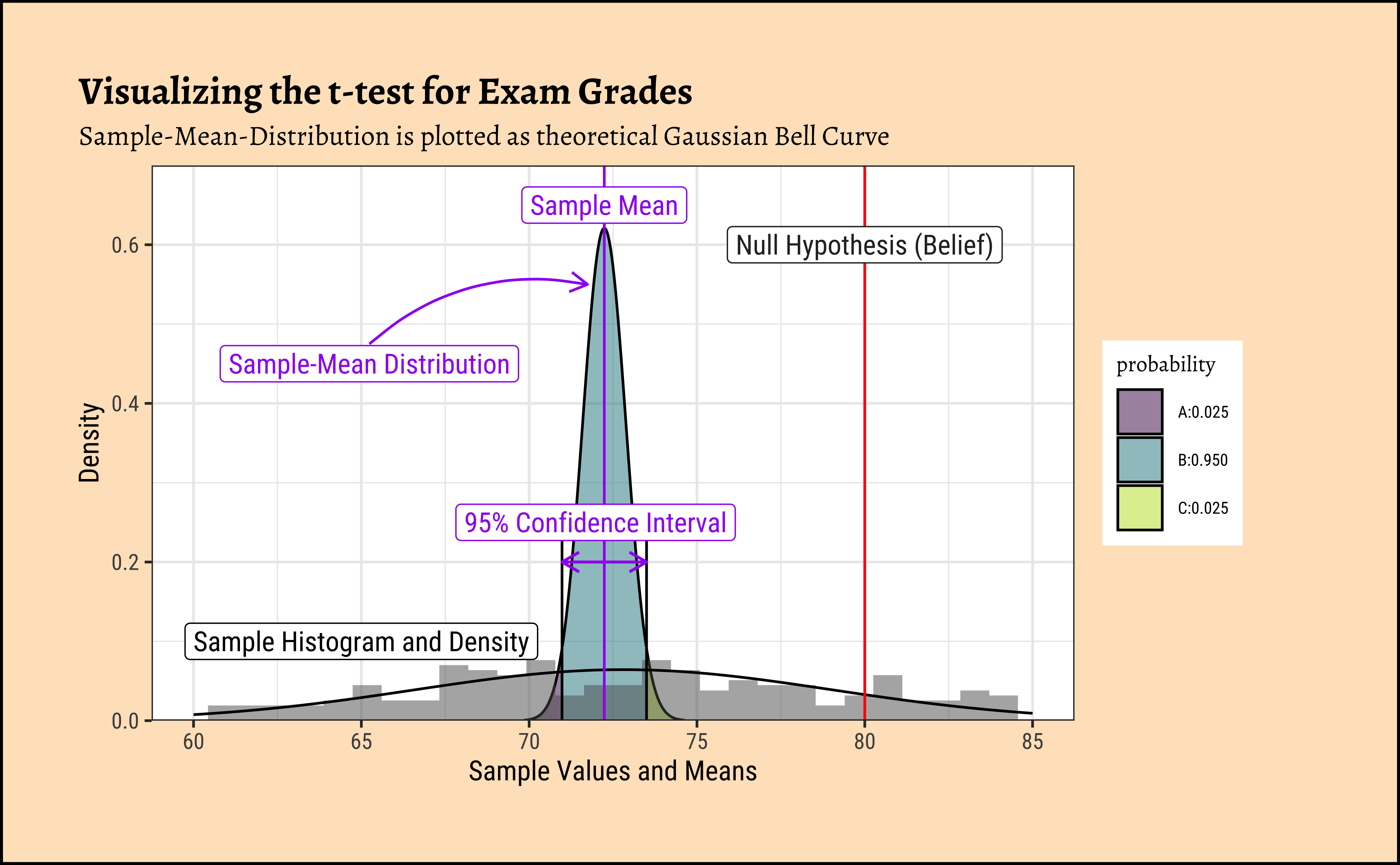
Let us plot the sample distribution, the theoretical distribution of the sample mean, and the confidence intervals, as we did before for the toy data.
[1] 72.23883Sample Mean
[1] 80Null Hypothesis / Belief
[1] 9.807053Sample Standard Deviation
[1] 0.6424814Sample Standard Error
[1] -12.07999Test Statistic
Now let us plot the figure with all these calculations:
Code
## Let's plot this
## Sample Data
ggplot2::theme_set(new = theme_custom())

mosaic::xqnorm(
  p = c(0.025, 0.975),
  mean = obs_mean_2, sd = sample_se_2,
  return = c("value"), verbose = T, plot = F
) -> xq2

## Sample-Mean Distribution
xqnorm(
  p = c(0.025, 0.975),
  mean = obs_mean_2, sd = sample_se_2,
  digits = 3, plot = TRUE,
  return = c("plot"), verbose = F,
  alpha = 0.5, colour = "black", pattern = "rings",
  system = "gg"
) %>%
  gf_dhistogram(~course_grade, data = exam_grades, inherit = F) %>%
  gf_fitdistr(~course_grade, data = exam_grades, inherit = F) %>%
  gf_vline(xintercept = obs_mean_2, colour = "purple") %>%
  gf_annotate(
    geom = "label", x = 65, y = 0.1,
    label = "Sample Histogram and Density",
    colour = "black"
  ) %>%
  ## Null
  gf_vline(xintercept = ~mean_belief_pop_2, colour = "red") %>%
  gf_annotate(
    geom = "label", x = mean_belief_pop_2, y = 0.6,
    label = "Null Hypothesis (Belief)"
  ) %>%
  ## Sample Mean and Distribution
  gf_annotate(
    geom = "label", x = obs_mean_2, y = 0.65,
    label = "Sample Mean", colour = "purple"
  ) %>%
  gf_annotate(
    geom = "label", x = obs_mean_2 - 7, y = 0.45,
    label = "Sample-Mean Distribution", colour = "purple"
  ) %>%
  gf_annotate("curve",
    x = obs_mean_2 - 7, y = 0.475,
    xend = obs_mean_2 - 0.5, yend = 0.55,
    curvature = -0.25, color = "purple",
    arrow = arrow(length = unit(0.25, "cm"))
  ) %>%
  ## Z-limits for p = 0.95
  gf_annotate("segment",
    x = obs_mean_2 - 1.96 * sample_se_2, y = 0.0,
    xend = obs_mean_2 - 1.96 * sample_se_2, yend = 0.25
  ) %>%
  gf_annotate("segment",
    x = obs_mean_2 + 1.96 * sample_se_2, y = 0.0,
    xend = obs_mean_2 + 1.96 * sample_se_2, yend = 0.25
  ) %>%
  ## Confidence Intervals
  gf_annotate("segment",
    x = obs_mean_2 - 1.96 * sample_se_2, y = 0.2,
    xend = obs_mean_2 + 1.96 * sample_se_2, yend = 0.2,
    color = "purple", linewidth = 0.5,
    arrow = arrow(length = unit(0.25, "cm"), ends = "both")
  ) %>%
  gf_annotate(
    geom = "label", x = obs_mean_2 - 1.96 * sample_se_2 + 1, y = 0.25,
    label = "95% Confidence Interval",
    colour = "purple"
  ) %>%
  gf_annotate("curve", # CI
    x = xq[2] + 0.05, y = 0.7,
    xend = xq[2] - 0.4, yend = 0.37,
    curvature = 0.25, color = "purple",
    arrow = arrow(length = unit(0.25, "cm"))
  ) %>%
  gf_labs(
    title = "Visualizing the t-test for Exam Grades",
    subtitle = "Sample-Mean-Distribution is plotted as theoretical Gaussian Bell Curve",
    x = "Sample Values and Means", y = "Density"
  ) %>%
  gf_refine(
    scale_y_continuous(
      limits = c(0, 0.7),
      expand = expansion(add = c(0, 0))
    ),
    scale_x_continuous(limits = c(60, 85))
  )
Please see the Section 14 for an Explanation of of this model generated using AI + R.