library(tidyverse)
library(mosaic) # Our go-to package
library(ggformula)
library(infer) # An alternative package for inference using tidy data
library(broom) # Clean test results in tibble form
library(skimr) # data inspection
library(tinytable) # Pretty Tables
library(kableExtra) # Pretty Tables
library(ggprism) # Prism-like ggplot themes
##
library(visStatistics) # All-in-one Stats test package
##
library(resampledata3) # Datasets from Chihara and Hesterberg's book
library(openintro) # datasetsInference for Two Independent Means
How diff-different(sic) are you?
2022-11-22
Plot Fonts and Theme
Code
library(systemfonts)
library(showtext)
## Clean the slate
systemfonts::clear_local_fonts()
systemfonts::clear_registry()
##
showtext_opts(dpi = 96) # set DPI for showtext
sysfonts::font_add(
  family = "Alegreya",
  regular = "../../../../../../fonts/Alegreya-Regular.ttf",
  bold = "../../../../../../fonts/Alegreya-Bold.ttf",
  italic = "../../../../../../fonts/Alegreya-Italic.ttf",
  bolditalic = "../../../../../../fonts/Alegreya-BoldItalic.ttf"
)

sysfonts::font_add(
  family = "Roboto Condensed",
  regular = "../../../../../../fonts/RobotoCondensed-Regular.ttf",
  bold = "../../../../../../fonts/RobotoCondensed-Bold.ttf",
  italic = "../../../../../../fonts/RobotoCondensed-Italic.ttf",
  bolditalic = "../../../../../../fonts/RobotoCondensed-BoldItalic.ttf"
)
showtext_auto(enable = TRUE) # enable showtext
##
theme_custom <- function() {
  theme_bw(base_size = 10) +

    # theme(panel.widths = unit(11, "cm"),
    #       panel.heights = unit(6.79, "cm")) + # Golden Ratio

    theme(
      plot.margin = margin_auto(t = 1, r = 2, b = 1, l = 1, unit = "cm"),
      plot.background = element_rect(
        fill = "bisque",
        colour = "black",
        linewidth = 1
      )
    ) +

    theme_sub_axis(
      title = element_text(
        family = "Roboto Condensed",
        size = 10
      ),
      text = element_text(
        family = "Roboto Condensed",
        size = 8
      )
    ) +

    theme_sub_legend(
      text = element_text(
        family = "Roboto Condensed",
        size = 6
      ),
      title = element_text(
        family = "Alegreya",
        size = 8
      )
    ) +

    theme_sub_plot(
      title = element_text(
        family = "Alegreya",
        size = 14, face = "bold"
      ),
      title.position = "plot",
      subtitle = element_text(
        family = "Alegreya",
        size = 10
      ),
      caption = element_text(
        family = "Alegreya",
        size = 6
      ),
      caption.position = "plot"
    )
}

## Use available fonts in ggplot text geoms too!
ggplot2::update_geom_defaults(geom = "text", new = list(
  family = "Roboto Condensed",
  face = "plain",
  size = 3.5,
  color = "#2b2b2b"
))
ggplot2::update_geom_defaults(geom = "label", new = list(
  family = "Roboto Condensed",
  face = "plain",
  size = 3.5,
  color = "#2b2b2b"
))

ggplot2::update_geom_defaults(geom = "marquee", new = list(
  family = "Roboto Condensed",
  face = "plain",
  size = 3.5,
  color = "#2b2b2b"
))
ggplot2::update_geom_defaults(geom = "text_repel", new = list(
  family = "Roboto Condensed",
  face = "plain",
  size = 3.5,
  color = "#2b2b2b"
))
ggplot2::update_geom_defaults(geom = "label_repel", new = list(
  family = "Roboto Condensed",
  face = "plain",
  size = 3.5,
  color = "#2b2b2b"
))

## Set the theme
ggplot2::theme_set(new = theme_custom())

## tinytable options
options("tinytable_tt_digits" = 2)
options("tinytable_format_num_fmt" = "significant_cell")
options(tinytable_html_mathjax = TRUE)


## Set defaults for flextable
flextable::set_flextable_defaults(font.family = "Roboto Condensed")
First, histograms, densities and counts of the variable we are interested in, after converting data into long format:
Code
Code
# Set graph theme
theme_set(new = theme_custom())

# https://www.statology.org/r-geom_path-each-group-consists-of-only-one-observation/
MathAnxiety %>%
  gf_density(
    ~AMAS,
    fill = ~Gender, colour = ~Gender,
    alpha = 0.5,
    title = "AMAS Math Anxiety Score Densities",
    subtitle = "Boys vs Girls"
  )
##
MathAnxiety %>%
  pivot_longer(
    cols = -c(Gender, Age, Grade),
    names_to = "type",
    values_to = "value"
  ) %>%
  dplyr::filter(type == "AMAS") %>%
  gf_jitter(
    value ~ Gender,
    group = ~type, color = ~Gender,
    width = 0.08, alpha = 0.3,
    ylab = "AMAS Anxiety Scores",
    title = "AMAS Math Anxiety Score Jitter Plots",
    subtitle = "Illustrating Difference in Means"
  ) %>%
  gf_summary(
    group = ~1, # Damn!!! Look at the reference link above
    fun = "mean", geom = "line",
    colour = ~"MeanDifferenceLine",
    lty = 1, linewidth = 2
  ) %>%
  gf_summary(geom = "point", size = 3, colour = "black") %>%
  gf_refine(scale_x_discrete(
    breaks = c("Boy", "Girl"),
    labels = c("Boys", "Girls"),
    guide = guide_prism_bracket(width = 0.1, outside = FALSE)
  )) %>%
  gf_annotate(x = 0.65, y = 25, geom = "text", label = "Mean\n Boys' Anxiety Scores", family = "Roboto Condensed") %>%
  gf_annotate(x = 2.35, y = 25, geom = "text", label = "Mean\n Girls' Anxiety Scores", family = "Roboto Condensed") %>%
  gf_annotate(x = 1.5, y = 30, geom = "label", label = "Mean Difference Line\nSlope indicates\n differences in mean", fill = "moccasin", family = "Roboto Condensed") %>%
  gf_theme(theme(legend.position = "none", axis.line.x = element_line(linewidth = 1)))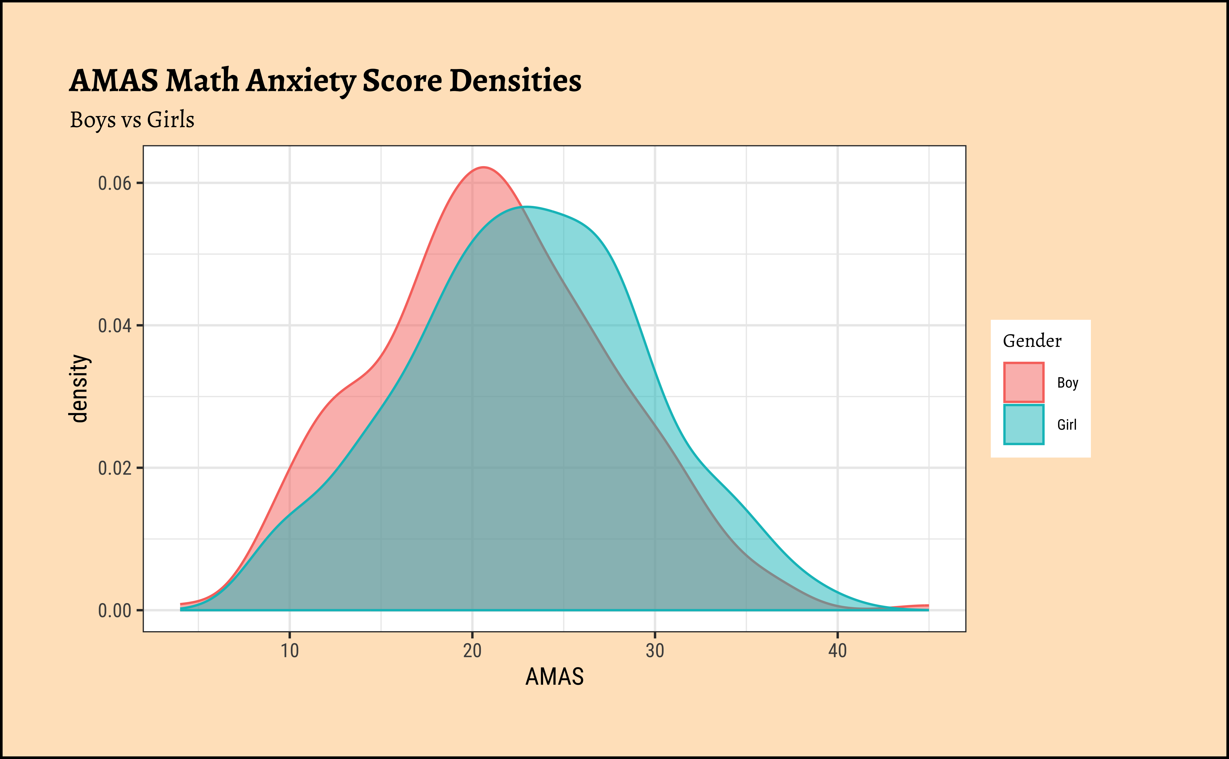
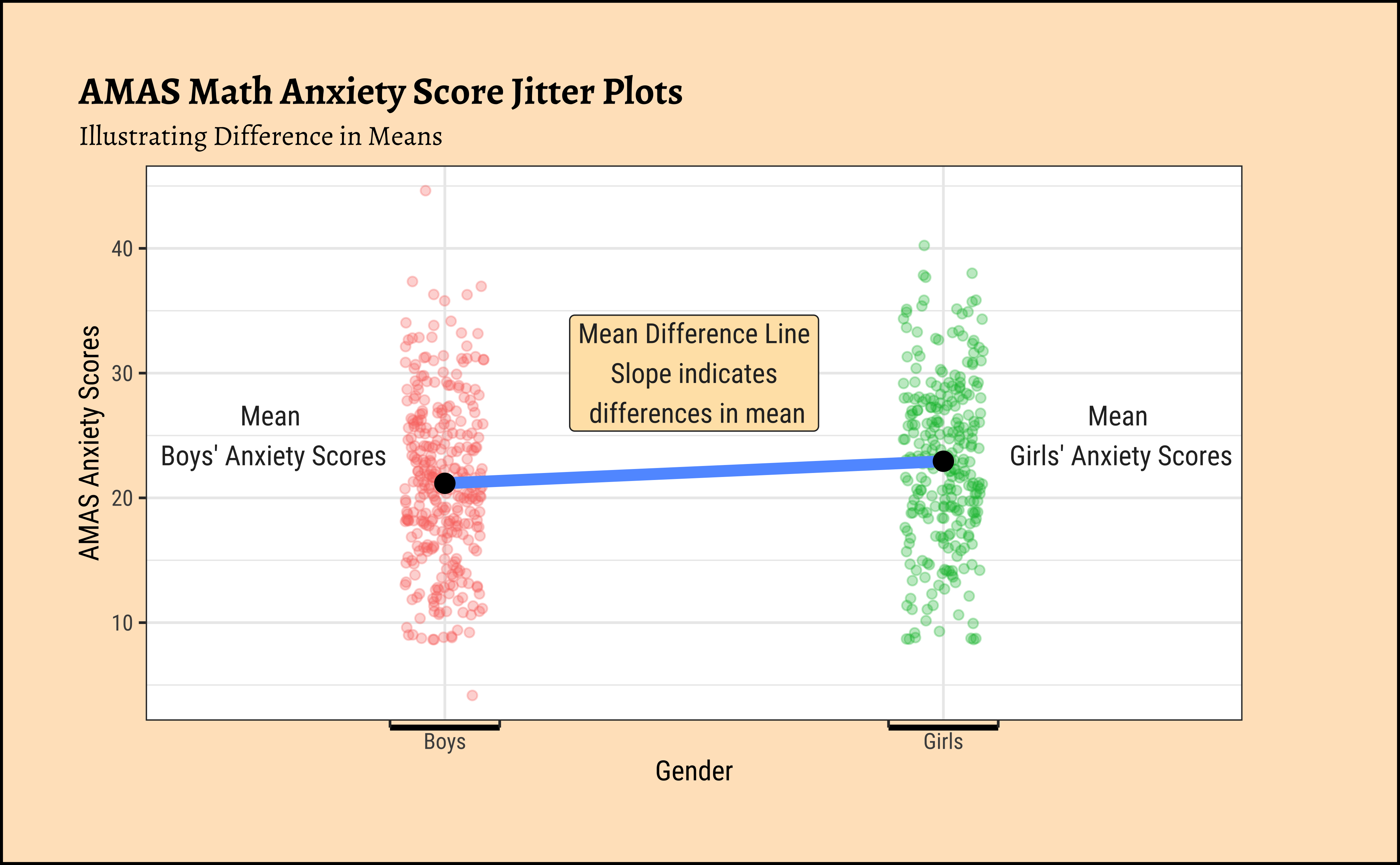
The distributions for anxiety scores for boys and girls overlap considerably and are very similar, though the jitter plot for boys shows significant outliers. Are they close to being normal distributions too? We should check.
A.
Statistical tests for means usually require a couple of checks1 2:
- Are the data normally distributed?
- Are the data variances similar?
Let us complete a check for normality: the shapiro.wilk test checks whether a Quant variable is from a normal distribution; the NULL hypothesis is that the data are from a normal distribution. We will also look at Q-Q plots for both variables:
Code
# Set graph theme
theme_set(new = theme_custom())
#
MathAnxiety %>%
gf_density(~AMAS,
fill = ~Gender,
alpha = 0.5,
title = "Math Anxiety scores for boys and girls"
) %>%
gf_facet_grid(~Gender) %>%
gf_fitdistr(dist = "dnorm") %>%
gf_theme(theme(legend.position = "none")) # No Need!!
##
MathAnxiety %>%
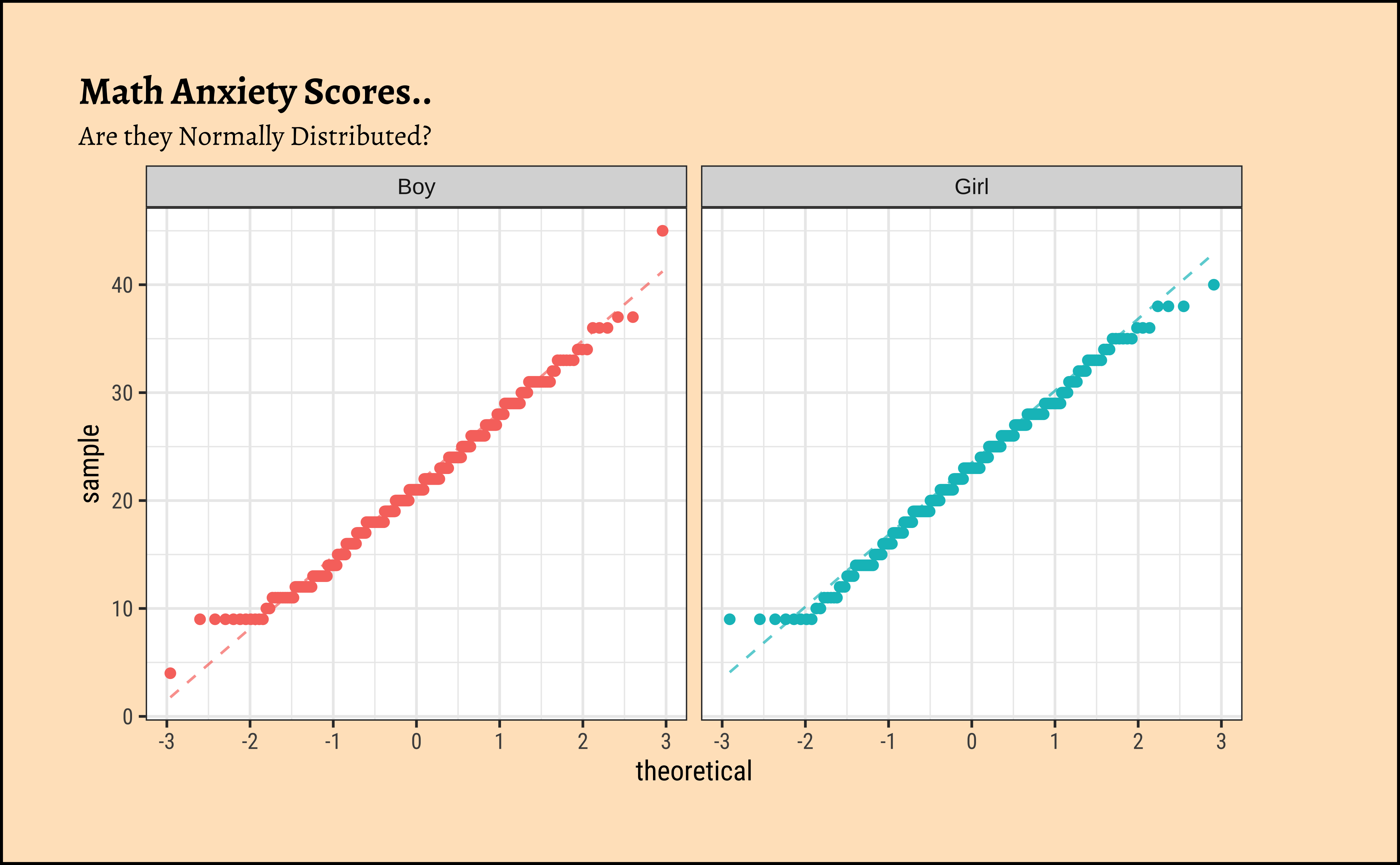
gf_qqline(~AMAS,
color = ~Gender,
title = "Math Anxiety Scores..",
subtitle = "Are they Normally Distributed?"
) %>%
gf_qq() %>%
gf_facet_wrap(~Gender) %>% # independent y-axis
gf_theme(theme(legend.position = "none")) # No Need!!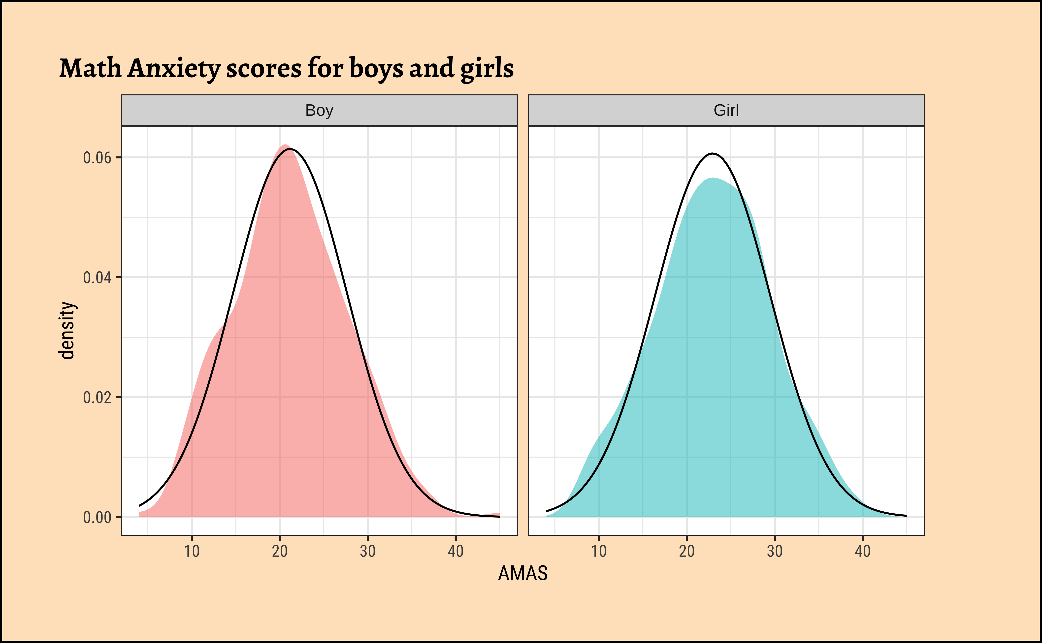
Let us split the dataset into subsets, to execute the normality check test (Shapiro-Wilk test):
    Shapiro-Wilk normality test

data:  boys_AMAS$AMAS
W = 0.99043, p-value = 0.03343
    Shapiro-Wilk normality test

data:  girls_AMAS$AMAS
W = 0.99074, p-value = 0.07835
The distributions for anxiety scores for boys and girls are almost normal, visually speaking. With the Shapiro-Wilk test we find that the scores for girls are normally distributed, but the boys scores are not so. Tch, tch. These boys.
Note
The p.value obtained in the shapiro.wilk test suggests the chances of the data being so, given the Assumption that they are normally distributed.
We see that MathAnxiety contains discrete-level scores for anxiety for the two variables (for Boys and Girls) anxiety scores. The boys score has a significant outlier, which we saw earlier and perhaps that makes that variable lose out, perhaps narrowly.
B.
Let us check if the two variables have similar variances: the var.test does this for us, with a NULL hypothesis that the variances are not significantly different:
[1] 1.254823The variances are quite similar as seen by the \(p.value = 0.82\). We also saw it visually when we plotted the overlapped distributions earlier.
Conditions:
- The two variables are not both normally distributed.
- The two variances are significantly similar.
- Parametric t.test
- Mann-Whitney Test
- Linear Model Interpretation
- Permutation Test
- Visual and by Hand t.test
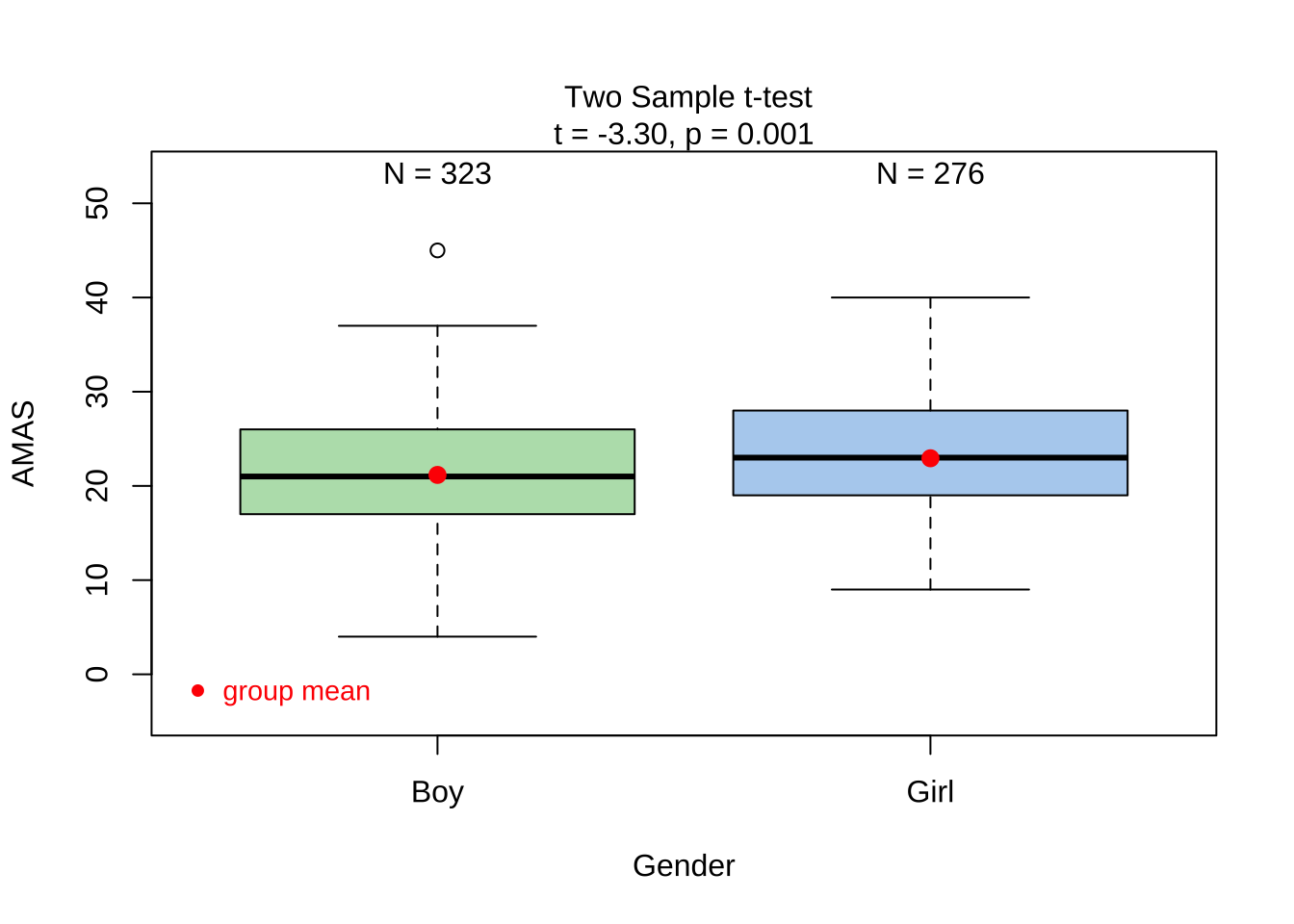
Since the data are not both normally distributed, though the variances similar, we typically cannot use a parametric t.test. However, we can still examine the results:
The p.value is \(0.001\) ! And the Confidence Interval does not straddle \(0\). So the t.test gives us good reason to reject the Null Hypothesis that the means are similar and that there is a significant difference between Boys and Girls when it comes to AMAS anxiety. But can we really believe this, given the non-normality of data?
Since the data variables do not satisfy the assumption of being normally distributed, and though the variances are similar, we use the classical wilcox.test (Type help(wilcox.test) in your Console.) which implements what we need here: the Mann-Whitney U test:1
The Mann-Whitney test as a test of mean ranks. It first ranks all your values from high to low, computes the mean rank in each group, and then computes the probability that random shuffling of those values between two groups would end up with the mean ranks as far apart as, or further apart, than you observed. No assumptions about distributions are needed so far. (emphasis mine)
\[ mean(rank(AMAS_{Girls})) - mean(rank(AMAS_{Boys})) = diff \]
\[ H_0: \mu_{Boys} - \mu_{Girls} = 0 \]
\[ H_a: \mu_{Boys} - \mu_{Girls} \ne 0 \]
Code
library(ggprism)
library(ggtext)
library(glue)
library(latex2exp)
# https://www.statology.org/r-geom_path-each-group-consists-of-only-one-observation/


# Set graph theme
theme_set(new = theme_custom())
#

MathAnxiety %>%
  gf_jitter(rank(AMAS) ~ Gender,
    color = ~Gender,
    show.legend = FALSE,
    width = 0.05, alpha = 0.25,
    ylab = "Ranks of AMAS anxiety scores",
    title = "Ranked Math Anxiety Scores for Boys and Girls"
  ) %>%
  gf_summary(
    group = ~1, # See the reference link above. Damn!!!
    fun = "mean", geom = "line", colour = "lightblue",
    lty = 1, linewidth = 2
  ) %>%
  gf_summary(fun = "mean", colour = "firebrick", size = 4, geom = "point") %>%
  gf_refine(scale_x_discrete(
    breaks = c("Boy", "Girl"),
    labels = c("Boy", "Girl"),
    guide = "prism_bracket"
  )) %>%
  # gf_annotate("label", label = TeX(r"(\textbf{Slope} $mu_{Rank Boys}-mu_{Rank Girls} \neq 0$ )"), y = 500, x = 1.5,
  #          color = "black", fill = "moccasin") %>%
  gf_annotate("label",
    label = "Mean Rank \nBoys Scores",
    y = 300, x = 0.75, inherit = FALSE
  ) %>%
  gf_annotate("label",
    label = "Mean Rank \nGirls Scores",
    y = 320, x = 2.25, inherit = FALSE
  )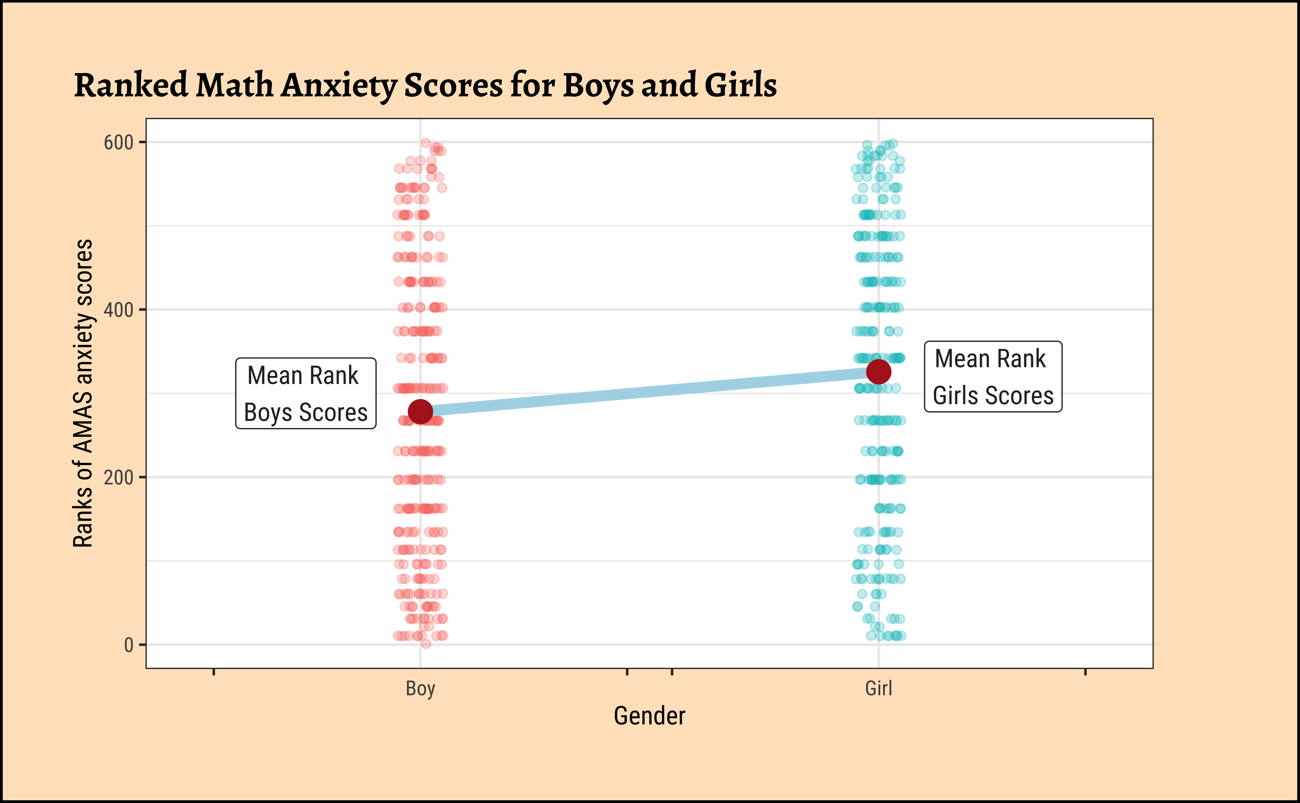
This is pretty similar to Figure 1 (b) with actual scores. Here we have plotted the ranks of the scores.
The p.value is very similar, \(0.00077\), and again the Confidence Interval does not straddle \(0\), and we are hence able to reject the NULL hypothesis that the means are equal and accept the alternative hypothesis that there is a significant difference in mean anxiety scores between Boys and Girls.
We can apply the linear-model-as-inference interpretation to the ranked data data to implement the non-parametric test as a Linear Model:
\[ lm(rank(AMAS) \sim gender) = \beta_0 + \beta_1 * gender \]
\[ H_0: \beta_1 = 0\\ \]
\[ H_a: \beta_1 \ne 0\\ \]
Code
library(ggprism)
library(ggtext)
library(glue)
library(latex2exp)
# https://www.statology.org/r-geom_path-each-group-consists-of-only-one-observation/
ggplot2::theme_set(new = theme_custom())
MathAnxiety %>%
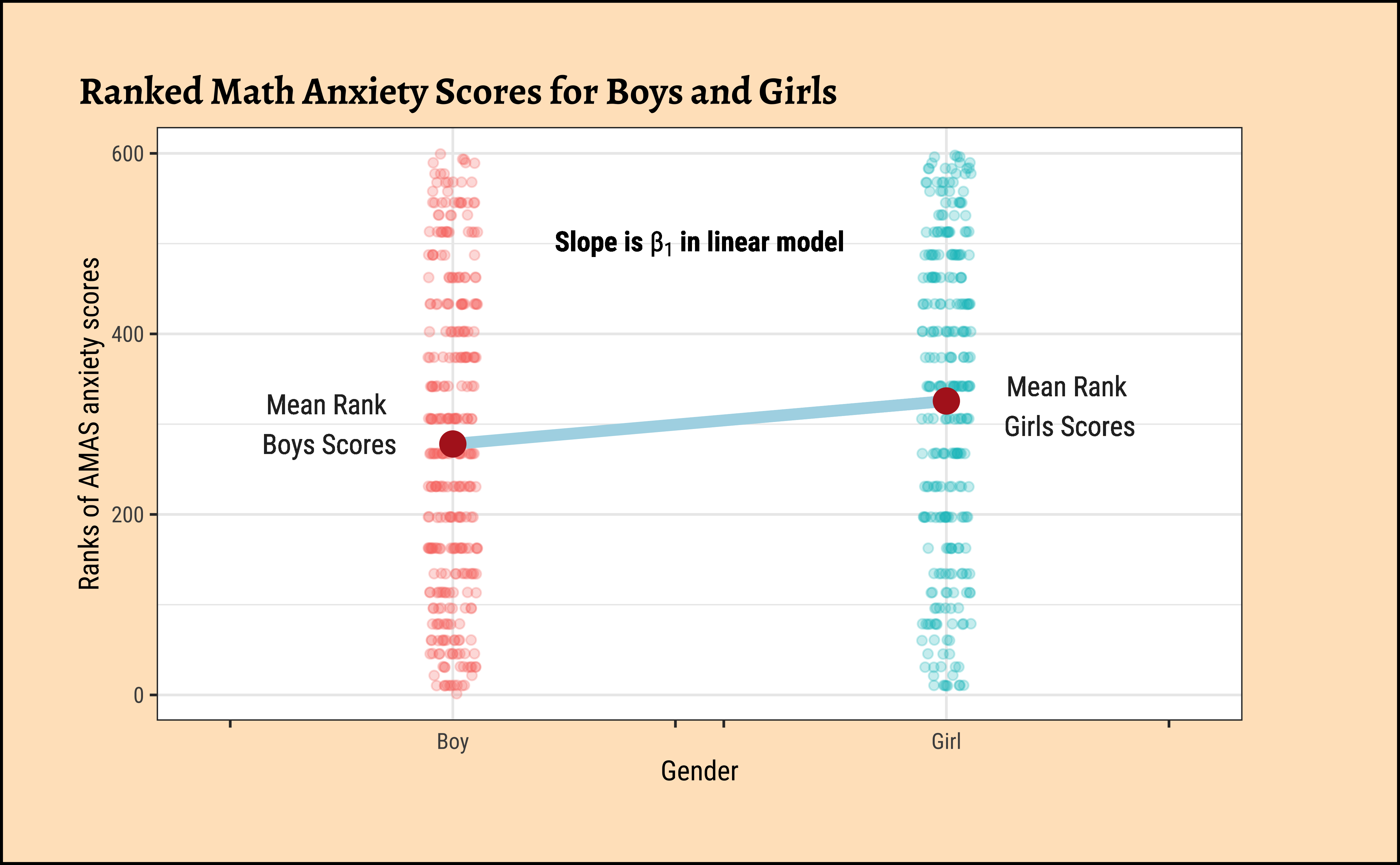
gf_jitter(rank(AMAS) ~ Gender,
color = ~Gender,
show.legend = FALSE,
width = 0.05, alpha = 0.25,
ylab = "Ranks of AMAS anxiety scores",
title = "Ranked Math Anxiety Scores for Boys and Girls"
) %>%
gf_summary(
group = ~1, # See the reference link above. Damn!!!
fun = "mean", geom = "line", colour = "lightblue",
lty = 1, linewidth = 2
) %>%
gf_summary(fun = "mean", colour = "firebrick", size = 4, geom = "point") %>%
gf_refine(scale_x_discrete(
breaks = c("Boy", "Girl"),
labels = c("Boy", "Girl"),
guide = "prism_bracket"
)) %>%
gf_text(
label = TeX(r"(\textbf{Slope is} $beta_1$ \textbf{in linear model})", output = "character"),
parse = TRUE, 500 ~ 1.5,
color = "black", fill = "moccasin"
) %>%
gf_text(
label = "Mean Rank \nBoys Scores",
300 ~ 0.75, inherit = FALSE
) %>%
gf_text(
label = "Mean Rank \nGirls Scores",
320 ~ 2.25, inherit = FALSE
)
Dummy Variables in lm
Note how the Qual variable was used here in Linear Regression! The Gender variable was treated as a binary “dummy” variable2.
Here too we see that the p.value for the slope term (“GenderGirl”) is significant at \(7.4*10^{-4}\).
We pretend that Gender has no effect on the AMAS anxiety scores. If this is our position, then the Gender labels are essentially meaningless, and we can pretend that any AMAS score belongs to a Boy or a Girl. This means we can mosaic::shuffle (permute) the Gender labels and see how uncommon our real data is. And we do not have to really worry about whether the data are normally distributed, or if their variances are nearly equal.
Important
The “pretend” position is exactly the NULL Hypothesis!! The “uncommon” part is the p.value under NULL!!
Code
ggplot2::theme_set(new = theme_custom())

gf_histogram(data = null_dist_amas, ~diffmean, bins = 25) %>%
  gf_vline(
    xintercept = obs_diff_amas,
    colour = "red", linewidth = 1,
    title = "Null Distribution by Permutation",
    subtitle = "Histogram"
  ) %>%
  gf_labs(x = "Difference in Means") %>%
  gf_refine(scale_y_continuous(expand = c(0, 0)))

###
gf_ecdf(
  data = null_dist_amas, ~diffmean,
  linewidth = 1
) %>%
  gf_vline(
    xintercept = obs_diff_amas,
    colour = "red", linewidth = 1,
    title = "Null Distribution by Permutation",
    subtitle = "Cumulative Density"
  ) %>%
  gf_labs(x = "Difference in Means") %>%
  gf_refine(scale_y_continuous(expand = c(0, 0)))
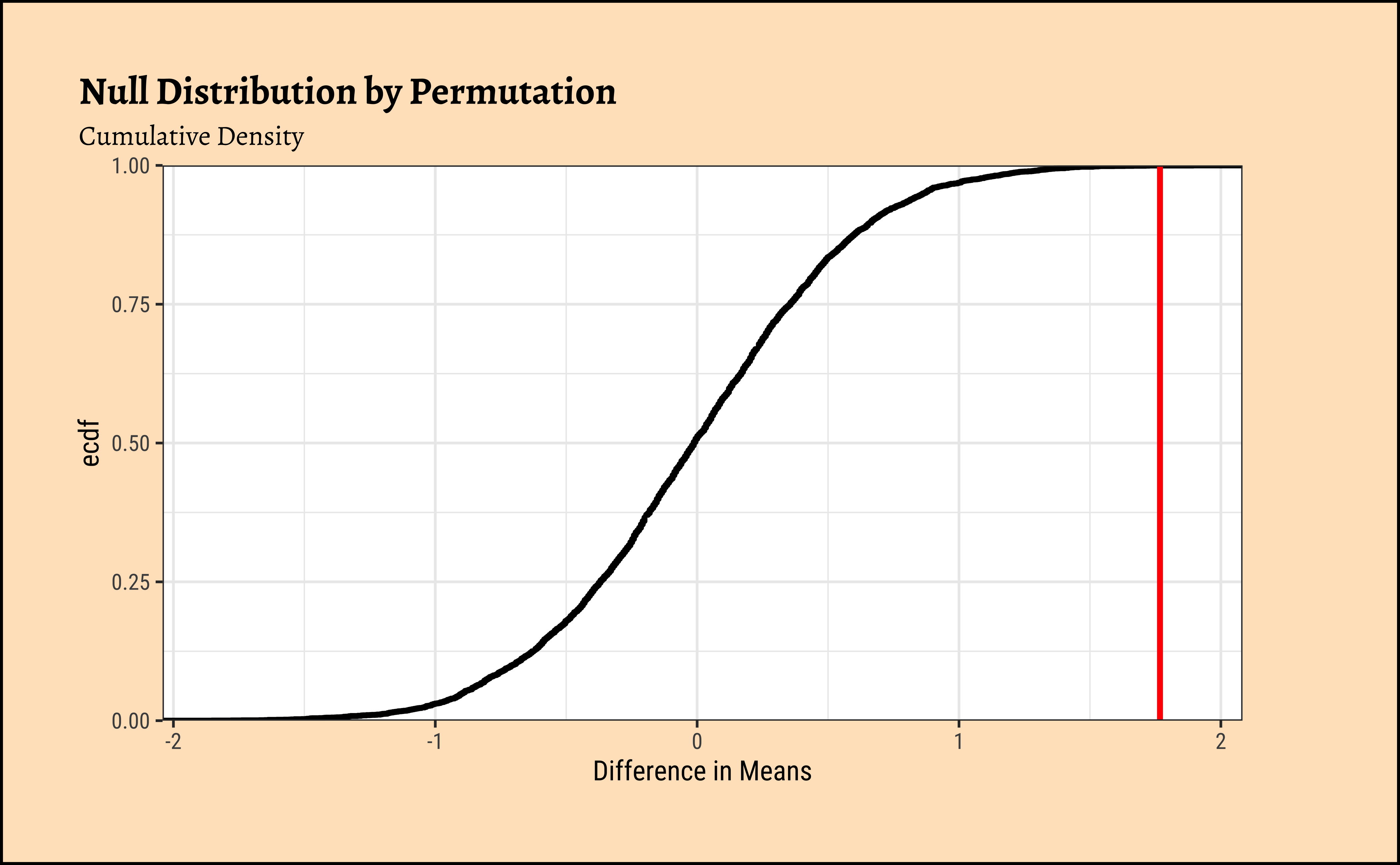
Clearly the observed_diff_amas is much beyond anything we can generate with permutations with gender! And hence there is a significant difference in weights across gender!
Here too, as with the Test for a Single Mean, the inner mechanism of the t-test is very similar, but for some important differences:
- Two Means: Calculate the
meanof the two samples \(\bar{x}\) and \(\bar{y}\). - Take the difference between the two sample means \(\bar{x} - \bar{y}\): \[ \text{Difference} = \bar{x} - \bar{y} \]
- Net Variance: Here we need to pool in the variances of both samples and compute the net variance
- Calculate the
standard error(using net-variance) as follows: \[ SE = \sqrt{\frac{s_x^2}{n_x} + \frac{s_y^2}{n_y}} \] where \(s_x\) and \(s_y\) are the standard deviations of the two samples, and \(n_x\) and \(n_y\) are their respective sample sizes. - Scale the difference by the
standard errorto get atest statistic\(t\). \[ t = \frac{\text{Difference}}{SE} \] - If the
test statisticis more than \(\pm 1.96\), we can say that it is beyond the theconfidence intervalof the sample mean difference \(\bar{x} - \bar{y}\) \[ \text{Confidence Interval} = \bar{x} - \bar{y} \pm 1.96 \times SE \] - Therefore if the actual difference is far beyond the confidence interval, hmm…we cannot think our belief is correct and we change our opinion that the two means \(\bar{x}\) and \(\bar{y}\) are the same.
Let us translate that mouthful into calculations!
(mean_diff_belief <- 0.0) # Assert our belief
(obs_diff_amas <- diffmean(AMAS ~ Gender, data = MathAnxiety) %>% as.numeric())
(MathAnxiety %>%
  dplyr::select(AMAS, Gender) %>%
  dplyr::group_by(Gender) %>%
  dplyr::summarize(variance = var(AMAS), n = n()) %>%
  dplyr::mutate(se_contribution = variance / n) %>%
  dplyr::summarise(std_error = sqrt(sum(se_contribution))) %>%
  as.numeric() -> std_error_diff)
(conf_int2 <- tibble(ci_low = obs_diff_amas - 1.96 * std_error_diff, ci_high = obs_diff_amas + 1.96 * std_error_diff))
(t <- (obs_diff_amas - mean_diff_belief) / std_error_diff)
[1] 0Null Hypothesis / Belief
[1] 1.7676Observed Difference in Means
[1] 0.5369636Standard Error
Confidence Intervals
[1] 3.291843Test Statistic
How can we visualize this? We are going to have to construct a difference dataset containing all possible differences between the two groups, and then plot the distribution of those differences. We can then visualize the observed difference in means, the confidence intervals, and the test statistic. Let’see if that works!
Code
ggplot2::theme_set(new = theme_custom())

boys_scores <- boys_AMAS %>% rename("boys" = AMAS)
girls_scores <- boys_AMAS %>% rename("girls" = AMAS)
all_diff <- expand_grid(boys_scores, girls_scores) %>% mutate(diff = boys - girls)
##
mosaic::xqnorm(
  p = c(0.025, 0.975),
  mean = obs_diff_amas, sd = std_error_diff,
  return = c("value"), verbose = T, plot = F
) -> xq1

xqnorm(
  p = c(0.025, 0.975),
  mean = obs_diff_amas, sd = std_error_diff,
  digits = 3, plot = TRUE, return = c("plot"),
  verbose = F, alpha = 0.5,
  colour = "black", pattern = "rings", system = "gg"
) %>%
  gf_dhistogram(~diff,
    data = all_diff, bins = 50,
    xlab = "Difference in Means",
    ylab = "Density", inherit = F
  ) %>% ## Very important!
  gf_fitdistr(~diff, data = all_diff, inherit = F) %>%
  gf_vline(xintercept = mean_diff_belief, colour = "red") %>%
  gf_vline(xintercept = obs_diff_amas, colour = "purple") %>%
  gf_refine(
    scale_y_continuous(limits = c(0, 0.9), expand = c(0, 0)),
    scale_x_continuous(
      limits = c(-7.5, 7.5),
      breaks = c(-10.0, -5.0, 0, 5, 10, obs_diff_amas),
      labels = scales::number_format(
        accuracy = 0.001,
        decimal.mark = "."
      )
    )
  ) %>%
  gf_annotate(
    geom = "label", x = -4.5, y = 0.15,
    label = "Sample-Difference Histogram\n and Density",
    colour = "black"
  ) %>%
  ## Observed Difference
  gf_annotate(
    geom = "label", x = obs_diff_amas, y = 0.8,
    label = "Observed Mean Difference", colour = "purple"
  ) %>%
  ## Null Hypothesis

  gf_annotate(
    geom = "label", x = mean_diff_belief, y = 0.7,
    label = "Null Hypothesis (Belief)"
  ) %>%
  ## Confidence Intervals
  gf_annotate("segment",
    x = conf_int2$ci_low, y = 0.0,
    xend = conf_int2$ci_low, yend = 0.5,
    color = "purple", linewidth = 0.5
  ) %>%
  gf_annotate("segment",
    x = conf_int2$ci_high, y = 0.0,
    xend = conf_int2$ci_high, yend = 0.5,
    color = "purple", linewidth = 0.5
  ) %>%
  gf_annotate("segment",
    x = conf_int2$ci_low, y = 0.35,
    xend = conf_int2$ci_high, yend = 0.35,
    color = "purple", linewidth = 0.5,
    arrow = arrow(length = unit(0.25, "cm"), ends = "both")
  ) %>%
  gf_annotate(
    geom = "label", x = obs_diff_amas, y = 0.4,
    label = "95% Confidence Interval",
    colour = "purple"
  ) %>%
  gf_labs(
    title = "Visualizing the t-test for Math Anxiety Scores",
    subtitle = "Difference in Means, Confidence Intervals, and Test Statistic"
  ) %>%
  gf_theme(theme_custom())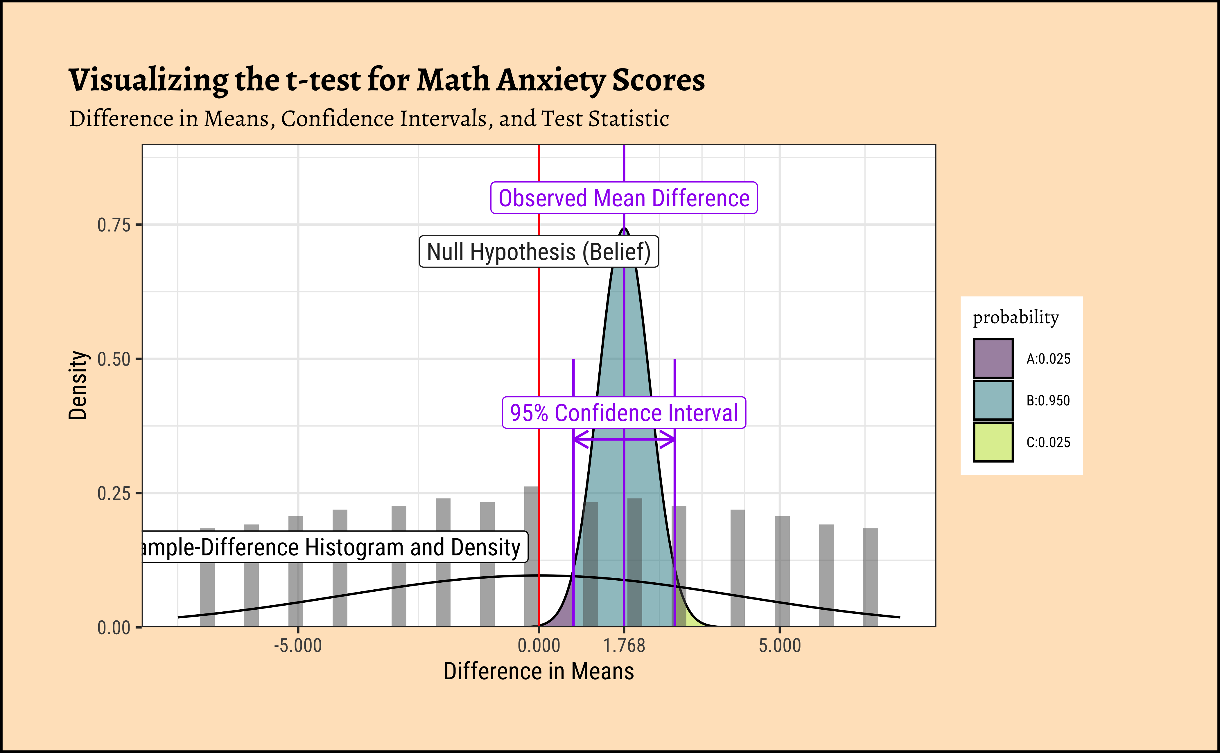
We see that the difference between means is 3.2918431 times the std_error! At a distance of \(1.96\) (either way) the probability of this data happening by chance already drops to \(2.5 \%\) !! At this distance of 3.2918431, we would have negligible probability of this data occurring by chance!
We can use the visStatistics package to run all the tests in one go, using the in-built decision tree. This is a very useful package for teaching statistics, and it can be used to run all the tests we have seen so far, and more. Here goes: we use the visstat function to run all the tests, and then we can summarize the results. The visstat function takes a dataset, a quantitative variable, a qualitative variable, and some options for the tests to run.
From the visStatistics package documentation:
visStatistics automatically selects and visualises appropriate statistical hypothesis tests between two column vectors of type of class “numeric”, “integer”, or “factor”. The choice of test depends on the class, distribution, and sample size of the vectors, as well as the user-defined ‘conf.level’. The main function
visstat()visualises the selected test with appropriate graphs (box plots, bar charts, regression lines with confidence bands, mosaic plots, residual plots, Q-Q plots), annotated with the main test results, including any assumption checks and post-hoc analyses.
Summary of visstat object

--- Named components ---
[1] "dependent variable (response)"    "independent variables (features)"
[3] "t-test-statistics"                "Shapiro-Wilk-test_sample1"
[5] "Shapiro-Wilk-test_sample2"

--- Contents ---

$dependent variable (response):
[1] "AMAS"

$independent variables (features):
[1] Boy  Girl
Levels: Boy Girl

$t-test-statistics:

    Two Sample t-test

data:  x1 and x2
t = -3.2951, df = 597, p-value = 0.001042
alternative hypothesis: true difference in means is not equal to 0
95 percent confidence interval:
 -2.8211291 -0.7140708
sample estimates:
mean of x mean of y
 21.16718  22.93478


$Shapiro-Wilk-test_sample1:

    Shapiro-Wilk normality test

data:  x
W = 0.99043, p-value = 0.03343


$Shapiro-Wilk-test_sample2:

    Shapiro-Wilk normality test

data:  x
W = 0.99074, p-value = 0.07835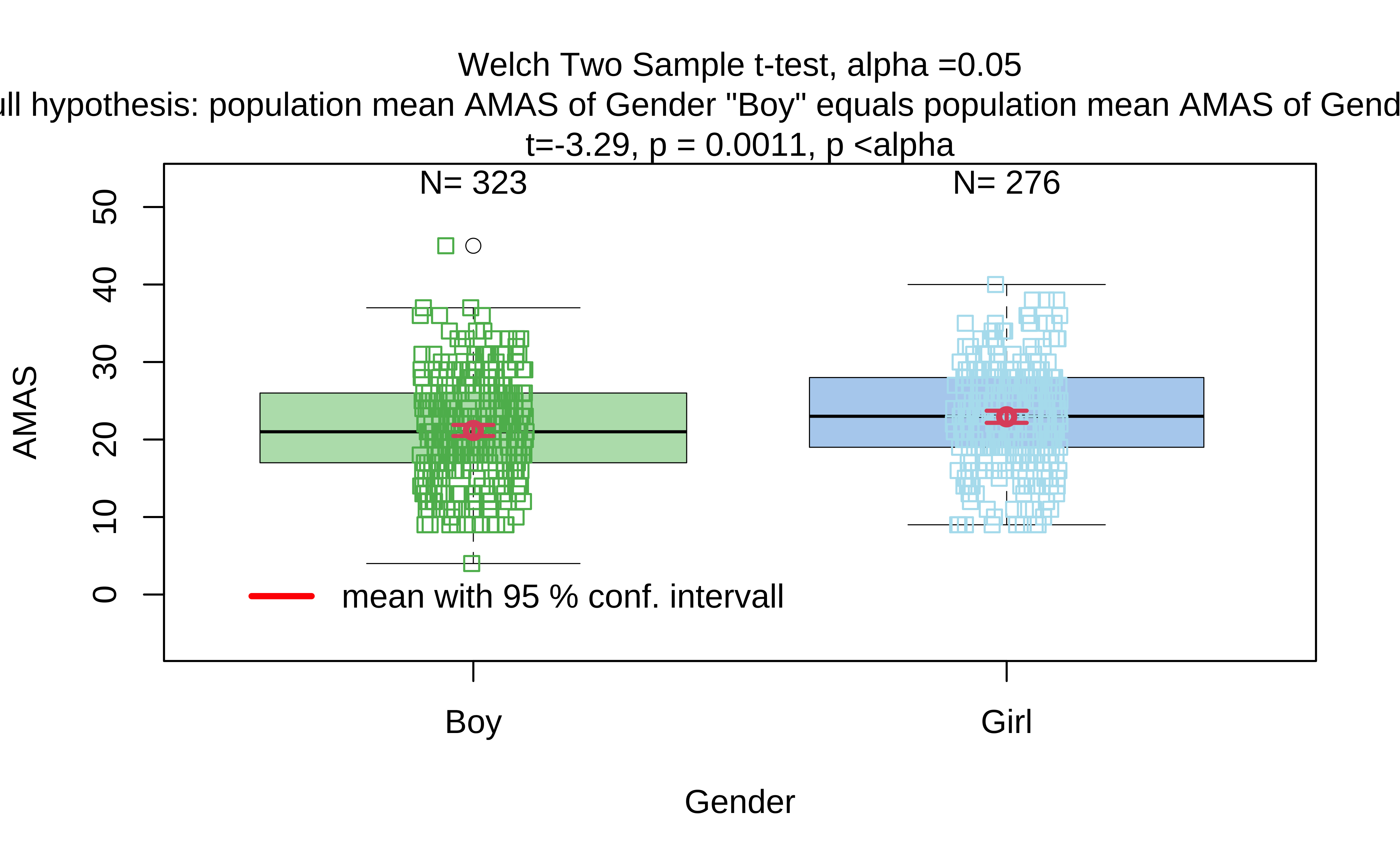
The tool runs the Welch t-test and declares the p-value to be significant. The Shapiro-Wilk test results here also confirm what we had performed earlier. Hence we can say that we may reject the NULL Hypothesis and state that there is a statistically significant difference in AMAS anxiety scores between Boys and Girls.
We have 13K data entries, and with 13 different variables, some Qual and some Quant. Many entries are missing too, typical of real-world data and something we will have to account for in our computations. The meaning of each variable can be found by bringing up the help file. Type help(yrbss) in your Console.
First, histograms, densities and counts of the variable we are interested in:
Code
ggplot2::theme_set(new = theme_custom())

yrbss_select_gender %>%
  gf_density(~weight,
    fill = ~gender, colour = ~gender,
    alpha = 0.3,
    title = "Highschoolers' Weights by Gender"
  ) %>%
  gf_refine(scale_fill_brewer(
    name = "Gender", palette = "Set1",
    aesthetics = c("colour", "fill")
  ))

###
yrbss_select_gender %>%
  gf_jitter(weight ~ gender,
    color = ~gender,
    show.legend = FALSE,
    width = 0.05, alpha = 0.25,
    ylab = "Weight",
    title = "Weights of Boys and Girls"
  ) %>%
  gf_summary(
    group = ~1, # See the reference link above. Damn!!!
    fun = "mean", geom = "line", colour = "lightblue",
    lty = 1, linewidth = 2
  ) %>%
  gf_summary(
    fun = "mean", colour = "black",
    size = 4, geom = "point"
  ) %>%
  gf_refine(scale_x_discrete(
    breaks = c("male", "female"),
    labels = c("male", "female"),
    guide = guide_prism_bracket(width = 0.1, outside = FALSE)
  )) %>%
  gf_annotate(
    x = 0.75, y = 60, geom = "text",
    label = "Mean\n Girls' Weights"
  ) %>%
  gf_annotate(
    x = 2.25, y = 60, geom = "text",
    label = "Mean\n Boys' Weights"
  ) %>%
  gf_annotate(
    x = 1.5, y = 100, geom = "label",
    label = "Slope indicates\n differences in mean",
    fill = "moccasin"
  ) %>%
  gf_refine(scale_colour_brewer(name = "Gender", palette = "Set1")) %>%
  gf_theme(theme(legend.position = "none", axis.line.x = element_line(linewidth = 1)))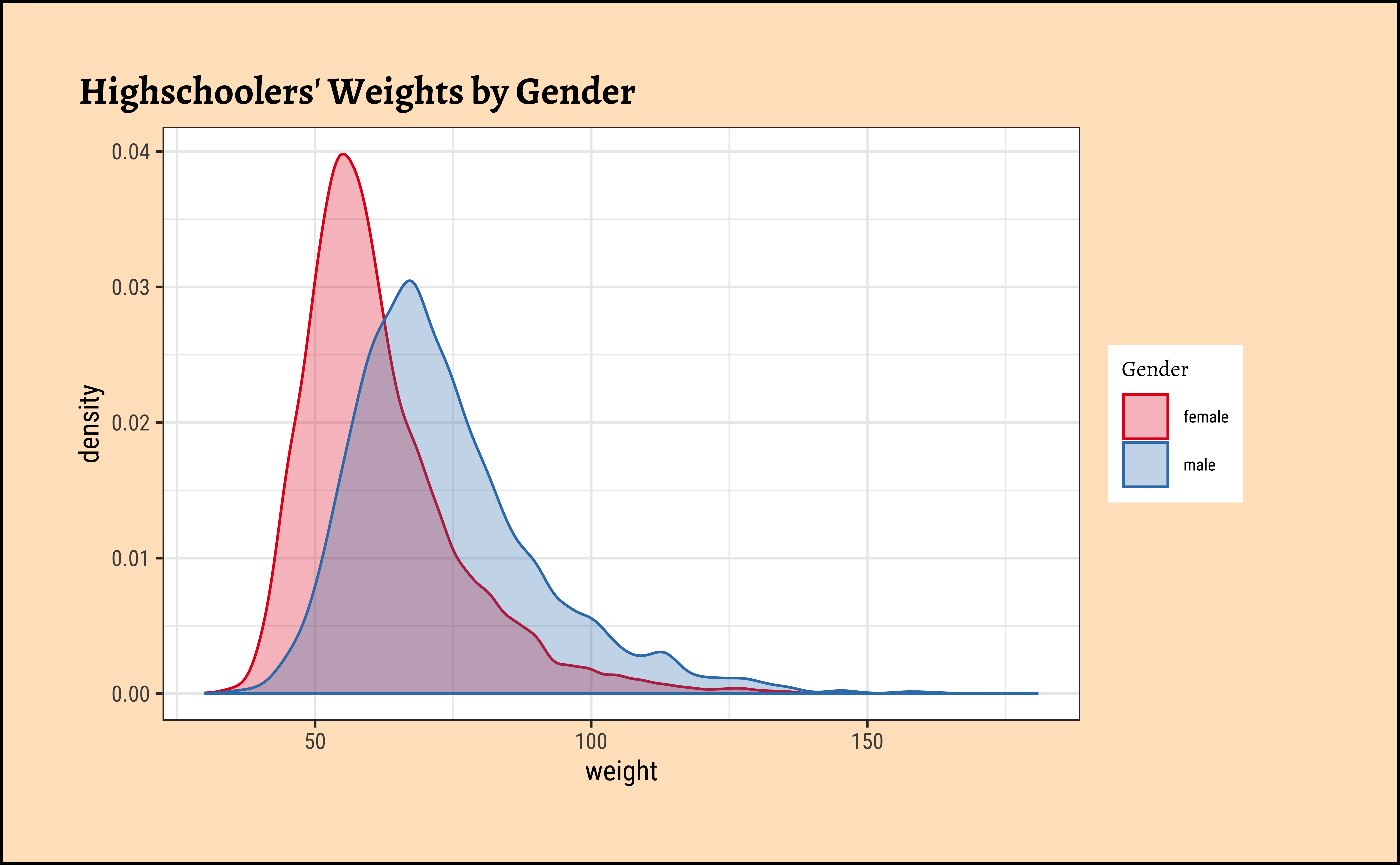
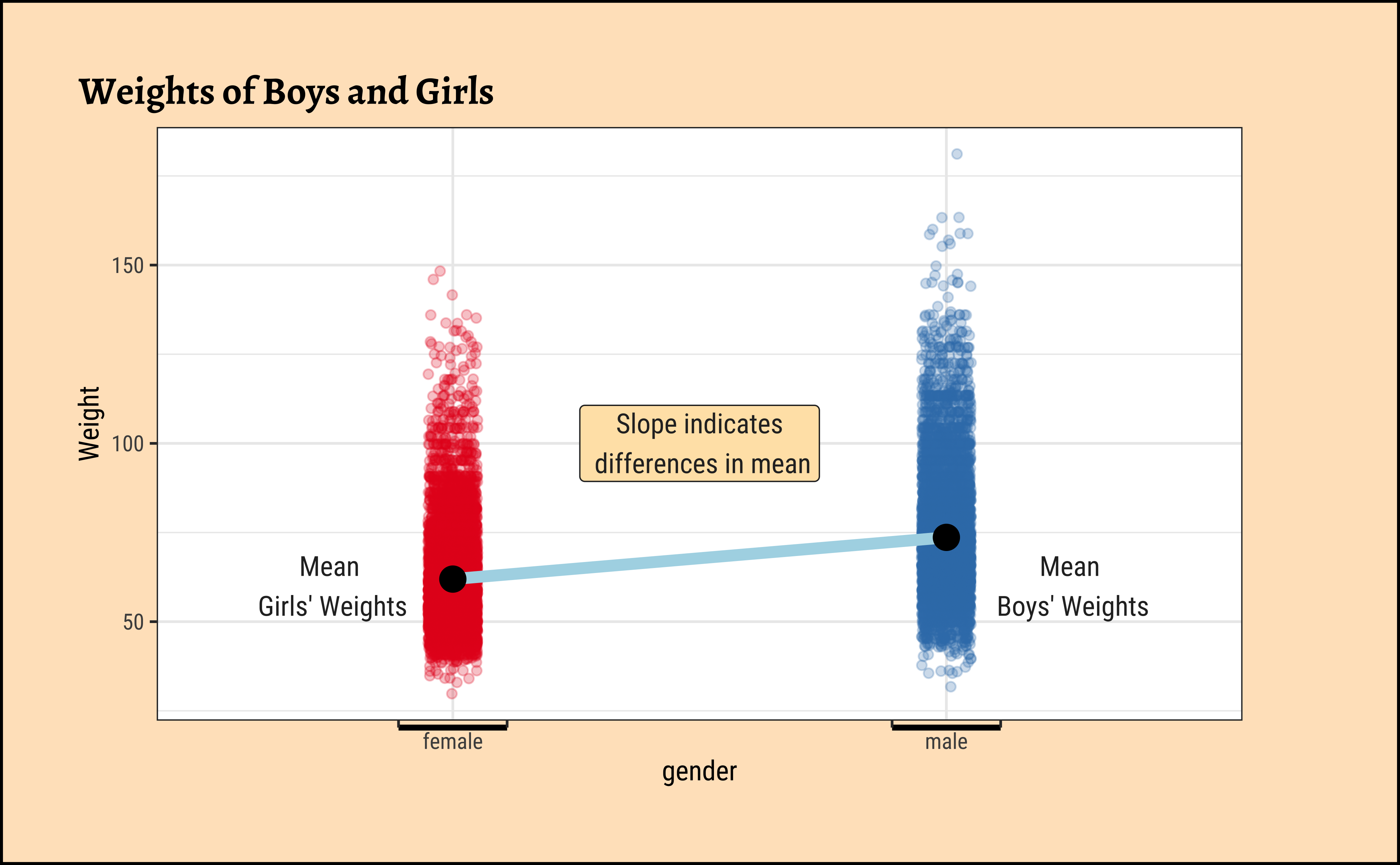
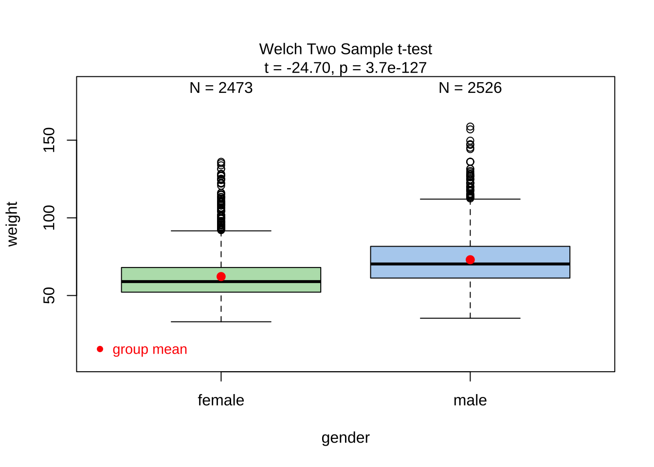
Overlapped Distribution plot shows some difference in the means; and the Jitter plots show visible difference in the means. In this Case Study, our research question is:
Research Question
Does weight of highschoolers in this dataset vary with gender?
Based on the graphs, how would we formulate our Hypothesis? We wish to infer whether there is difference in mean weight across gender. So accordingly:
\[ H_0: \mu_{weight-male} = \mu_{weight-female} \]
\[ H_a: \mu_{weight-male} \ne \mu_{weight-female} \]
A.
As stated before, statistical tests for means usually require a couple of checks:
- Are the data normally distributed?
- Are the data variances similar?
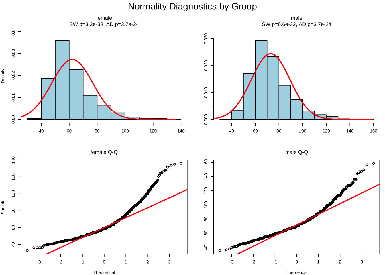
We will complete a visual check for normality with plots, and since we cannot do a shapiro.test (length(data) >= 5000) we can use the Anderson-Darling test.
Let us plot frequency distribution and Q-Q plots1 for both variables.
Code
ggplot2::theme_set(new = theme_custom())

male_student_weights <- yrbss_select_gender %>%
  filter(gender == "male") %>%
  select(weight)
##
female_student_weights <- yrbss_select_gender %>%
  filter(gender == "female") %>%
  select(weight)

# shapiro.test(male_student_weights$weight)
# shapiro.test(female_student_weights$weight)

yrbss_select_gender %>%
  gf_density(~weight,
    fill = ~gender, colour = ~gender,
    alpha = 0.3,
    title = "Highschoolers' Weights by Gender"
  ) %>%
  gf_facet_grid(~gender) %>%
  gf_fitdistr(dist = "dnorm") %>%
  gf_refine(scale_fill_brewer(name = "Gender", palette = "Set1", aesthetics = c("colour", "fill")))
##
yrbss_select_gender %>%
  gf_qqline(~ weight | gender, ylab = "weight", colour = ~gender) %>%
  gf_qq(title = "Q-Q Plots of Male and Female Weights") %>%
  gf_refine(scale_fill_brewer(name = "Gender", palette = "Set1", aesthetics = c("colour", "fill")))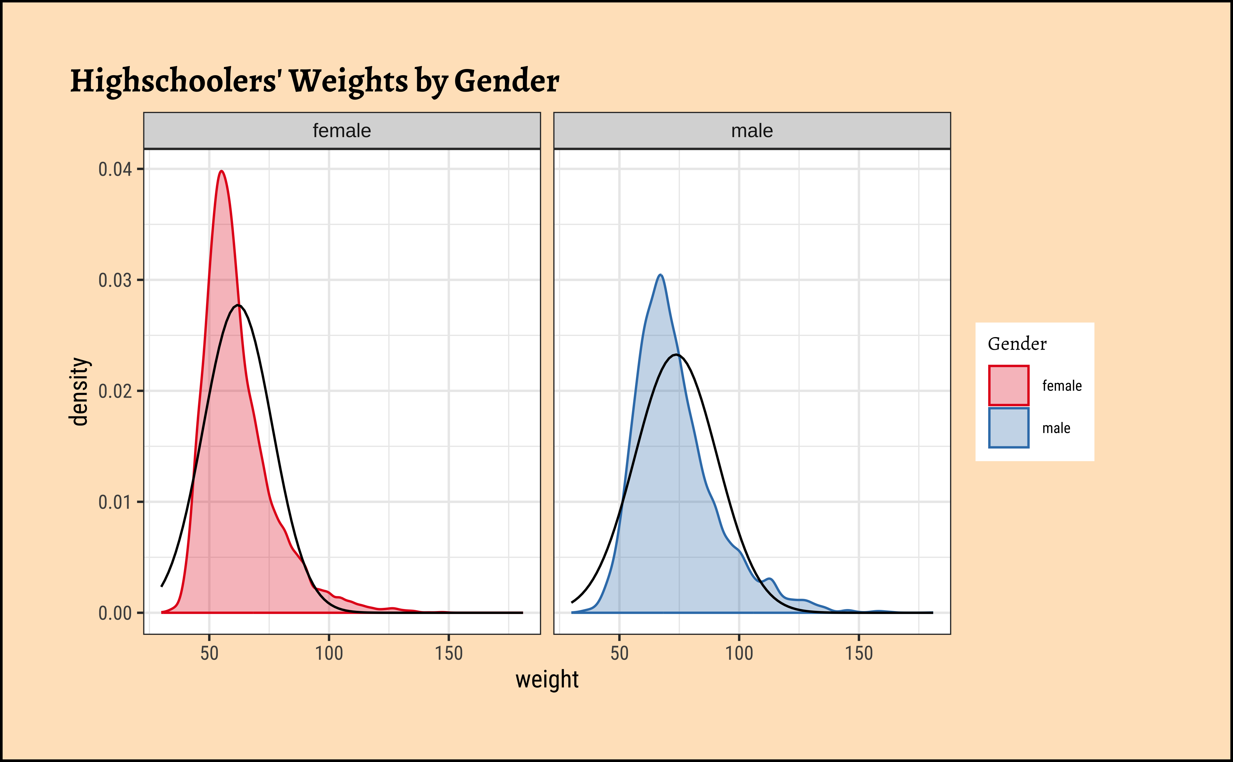
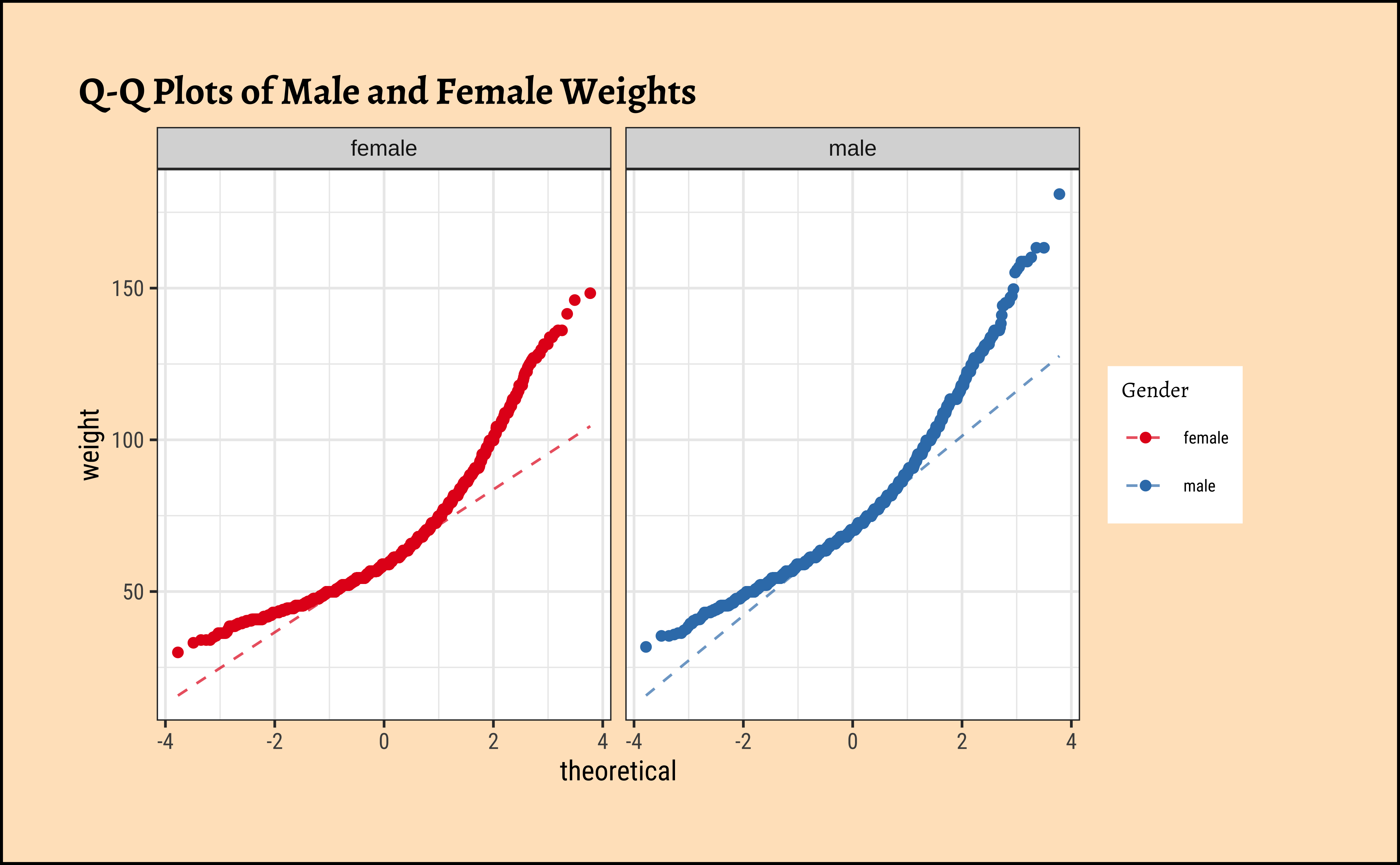
Distributions are not too close to normal…perhaps a hint of a rightward skew, suggesting that there are some obese students.
No real evidence (visually) of the variables being normally distributed.
    Anderson-Darling normality test

data:  male_student_weights$weight
A = 113.23, p-value < 2.2e-16
    Anderson-Darling normality test

data:  female_student_weights$weight
A = 157.17, p-value < 2.2e-16
p-values are very low and there is no reason to think that the data is normal.
B.
Let us check if the two variables have similar variances: the var.testdoes this for us, with a NULL hypothesis that the variances are not significantly different:
The p.value being so small, we are able to reject the NULL Hypothesis that the variances of weight are nearly equal across the two exercise regimes.
Conditions
- The two variables are not normally distributed.
- The two variances are also significantly different.
This means that the parametric t.test must be eschewed in favour of the non-parametric wilcox.test. We will use that, and also attempt linear models with rank data, and a final permutation test.
Since the data variables do not satisfy the assumption of being normally distributed, and the variances are significantly different, we use the classical wilcox.test, which implements what we need here: the Mann-Whitney U test,
Our model would be:
\[ mean(rank(Weight_{male})) - mean(rank(Weight_{female})) = \beta_1; \]
\[ H_0: \mu_{weight-male} = \mu_{weight-female} \]
\[ H_a: \mu_{weight-male} \ne \mu_{weight-female} \]
Recall the earlier graph showing ranks of anxiety-scores against Gender.
The p.value is negligible and we are able to reject the NULL hypothesis that the means are equal.
We can apply the linear-model-as-inference interpretation to the ranked data data to implement the non-parametric test as a Linear Model:
\[ lm(rank(weight) \sim gender) = \beta_0 + \beta_1 * gender \]
\[ H_0: \beta_1 = 0 \]
\[ H_a: \beta_1 \ne 0\\ \]
Dummy Variables in lm
Note how the Qual variable was used here in Linear Regression lm()! The gender variable was treated as a binary “dummy” variable1.
For the specific data at hand, we need to shuffle the gender and take the test statistic (difference in means) each time.
Code
ggplot2::theme_set(new = theme_custom())

null_dist_weight <-
  do(4999) * diffmean(
    data = yrbss_select_gender,
    weight ~ shuffle(gender)
  )
null_dist_weight
###
prop1(~ diffmean <= obs_diff_gender, data = null_dist_weight)
###
gf_histogram(
  data = null_dist_weight, ~diffmean,
  bins = 25
) %>%
  gf_vline(
    xintercept = obs_diff_gender,
    colour = "red", linewidth = 1,
    title = "Null Distribution by Permutation",
    subtitle = "Histogram"
  ) %>%
  gf_labs(x = "Difference in Means") %>%
  gf_refine(scale_y_continuous(expand = c(0, 0)))
###
gf_ecdf(
  data = null_dist_weight, ~diffmean,
  linewidth = 1
) %>%
  gf_vline(
    xintercept = obs_diff_gender,
    colour = "red", linewidth = 1,
    title = "Null Distribution by Permutation",
    subtitle = "Cumulative Density"
  ) %>%
  gf_labs(x = "Difference in Means") %>%
gf_refine(scale_y_continuous(expand = c(0, 0)))prop_TRUE
1 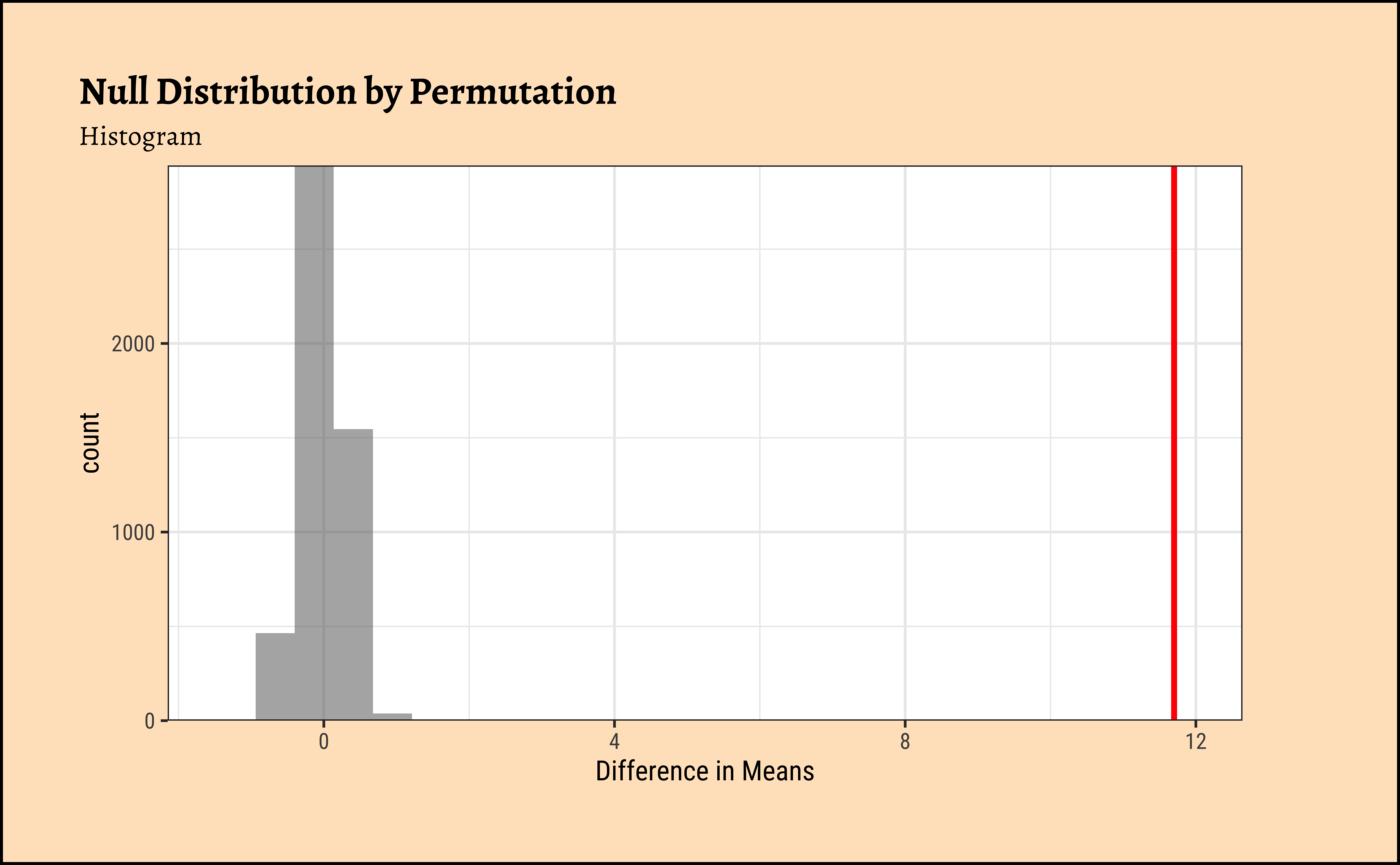
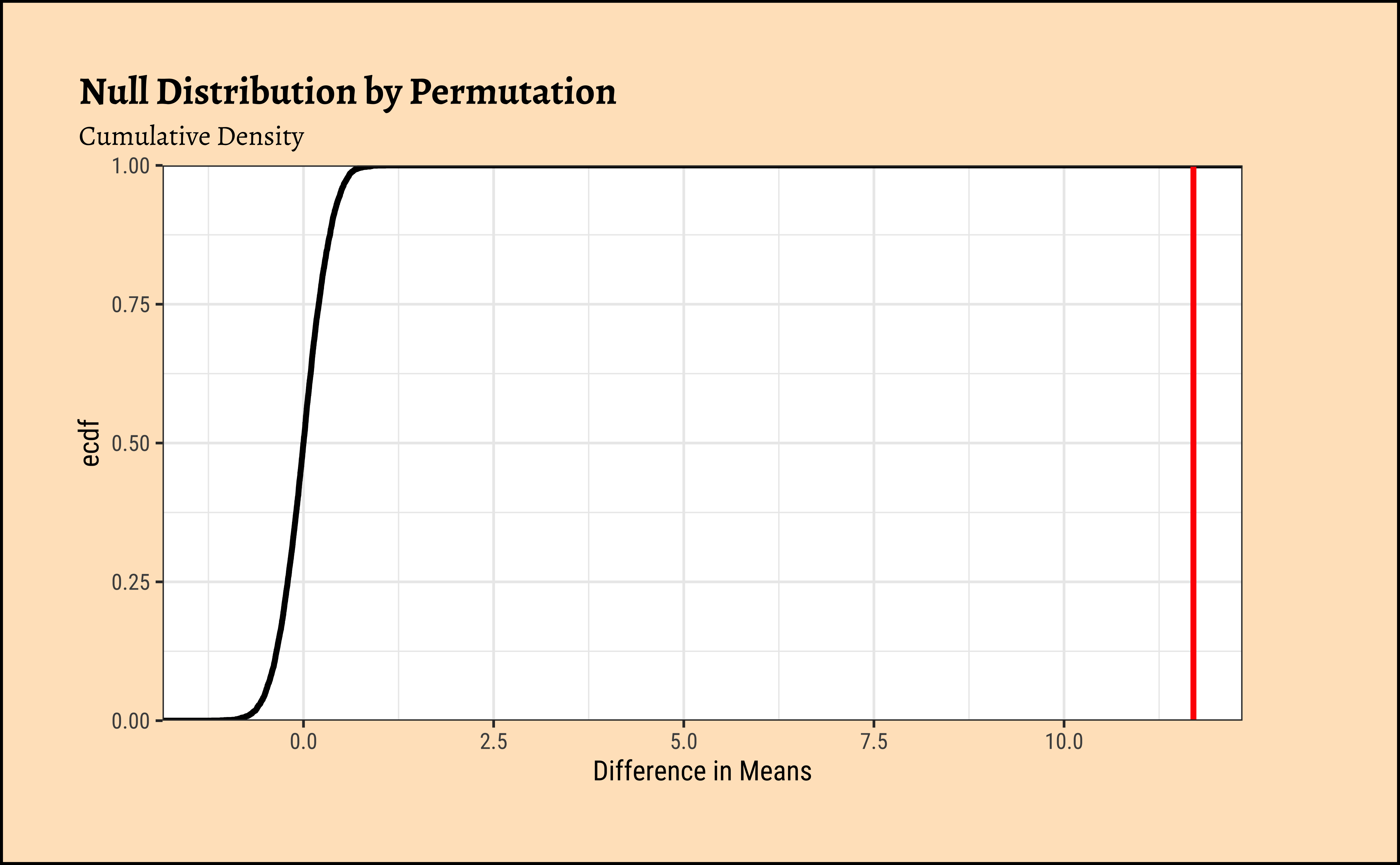
Clearly the observed_diff_weight is much beyond anything we can generate with permutations with gender! And hence there is a significant difference in weights across gender!
We need to use a smaller sample of the dataset yrbss_select_gender, for the (same) reason: visstat() defaults to using the shapiro.wilk test internally:
Summary of visstat object
--- Named components ---
[1] "dependent variable (response)" "independent variables (features)"
[3] "t-test-statistics" "Shapiro-Wilk-test_sample1"
[5] "Shapiro-Wilk-test_sample2"
--- Contents ---
$dependent variable (response):
[1] "weight"
$independent variables (features):
[1] female male
Levels: female male
$t-test-statistics:
Welch Two Sample t-test
data: x1 and x2
t = -24.965, df = 4930.3, p-value < 2.2e-16
alternative hypothesis: true difference in means is not equal to 0
95 percent confidence interval:
-12.05440 -10.29901
sample estimates:
mean of x mean of y
62.10030 73.27701
$Shapiro-Wilk-test_sample1:
Shapiro-Wilk normality test
data: x
W = 0.89523, p-value < 2.2e-16
$Shapiro-Wilk-test_sample2:
Shapiro-Wilk normality test
data: x
W = 0.9282, p-value < 2.2e-16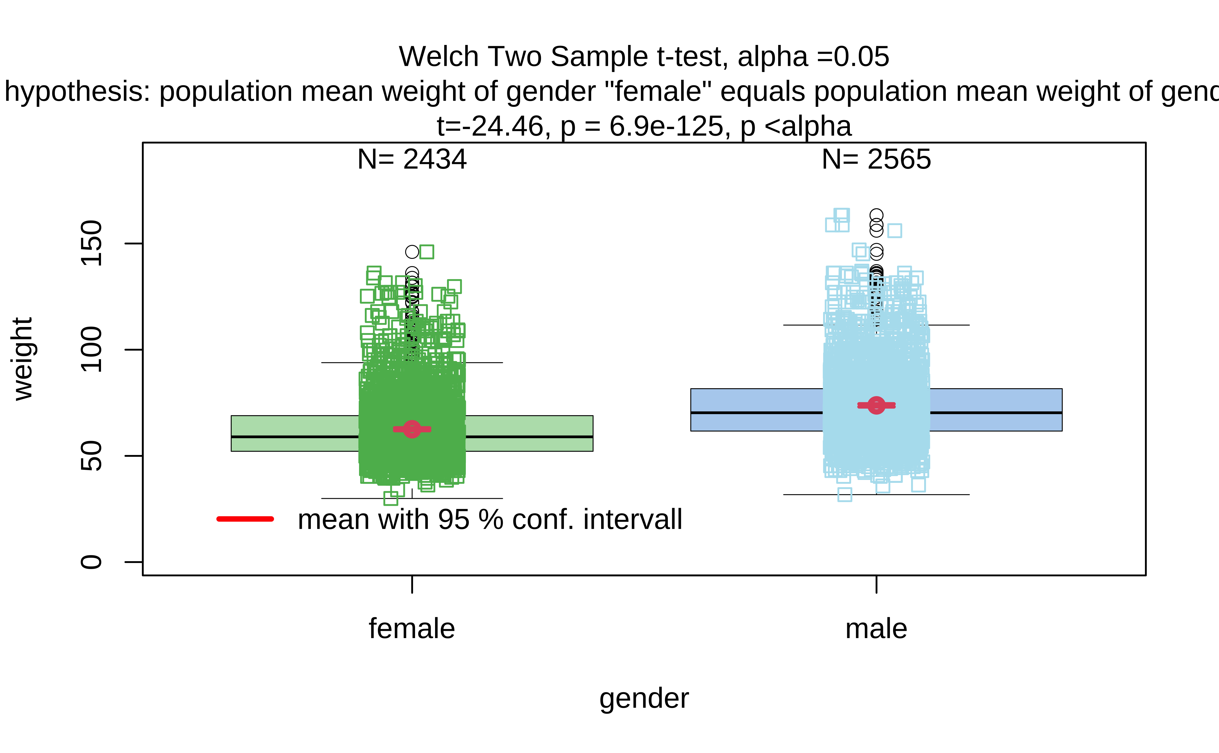
Compare these results with those calculated earlier!
We can make distribution plots for weight by physical_3plus:
Code
ggplot2::theme_set(new = theme_custom())
###
gf_density(~weight,
fill = ~physical_3plus, colour = ~physical_3plus,
data = yrbss_select_phy, alpha = 0.3,
title = "Highschoolers' Weights by Days of Exercise"
) %>%
gf_refine(scale_fill_viridis_d(
name = "Days of Exercise >=3",
option = "turbo",
aesthetics = c("colour", "fill")
))
##
yrbss_select_phy %>%
gf_jitter(weight ~ physical_3plus,
colour = ~physical_3plus,
width = 0.08, alpha = 0.2,
xlab = "Days of Exercise >=3",
title = "Student Weights vs Exercise Days"
) %>%
gf_summary(
group = ~1, # See the reference link above. Damn!!!
fun = "mean", geom = "line", colour = "lightblue",
lty = 1, linewidth = 2
) %>%
gf_summary(fun = "mean", geom = "point", size = 3, colour = "gold") %>%
gf_refine(scale_x_discrete(
breaks = c("no", "yes"),
labels = c("no", "yes"),
guide = guide_prism_bracket(width = 0.1, outside = FALSE)
)) %>%
gf_refine(
annotate(x = 0.65, y = 60, geom = "text", label = "Mean Weights\n No Exercise"),
annotate(x = 2.35, y = 60, geom = "text", label = "Mean Weights\nWith Exercise"),
annotate(x = 1.5, y = 100, geom = "label", label = "Slope indicates\n differences in mean", fill = "moccasin"),
scale_colour_viridis_d(name = "Days of Exercise >=3", option = "turbo")
) %>%
gf_theme(theme(legend.position = "none", axis.line.x = element_line(linewidth = 1)))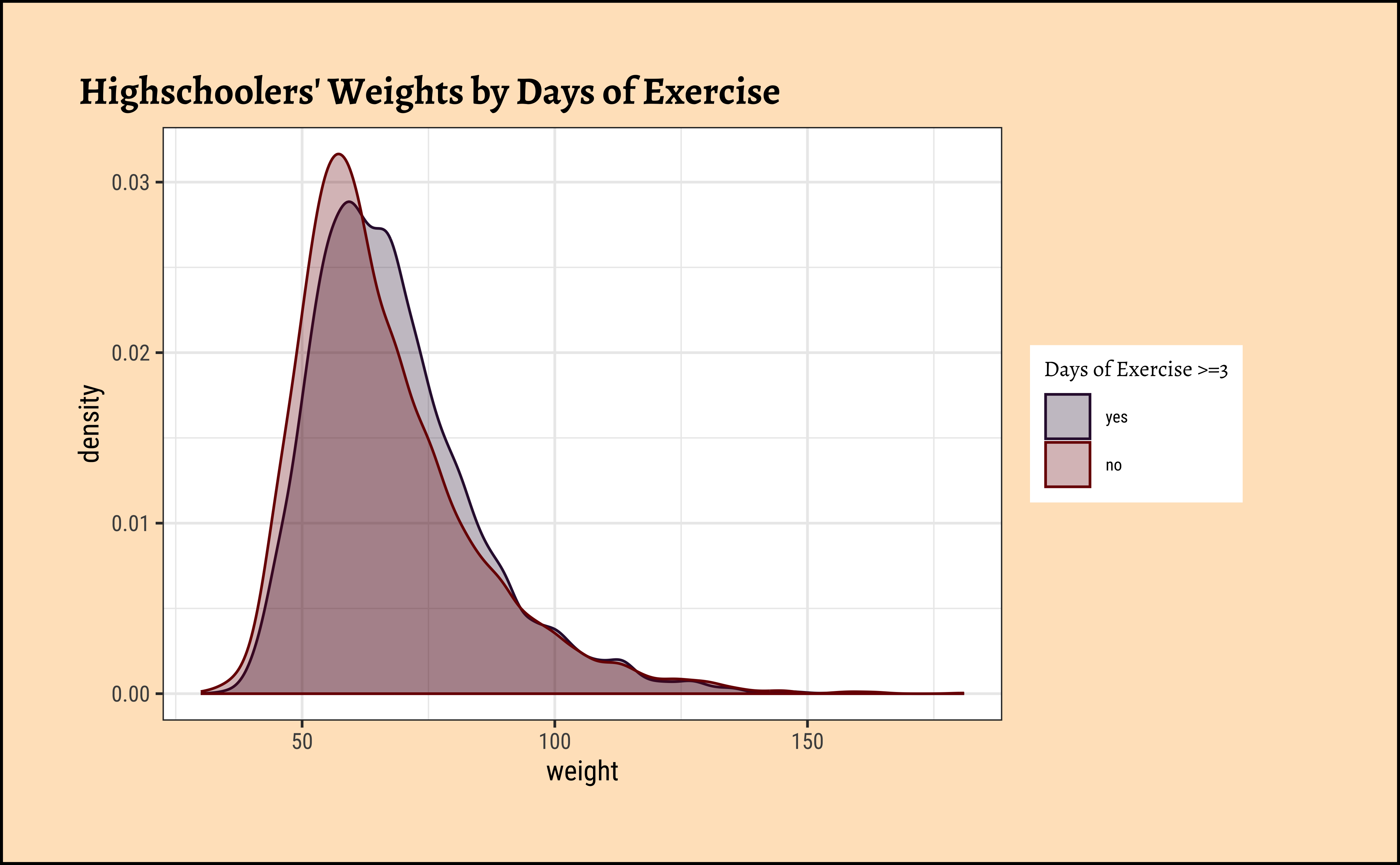
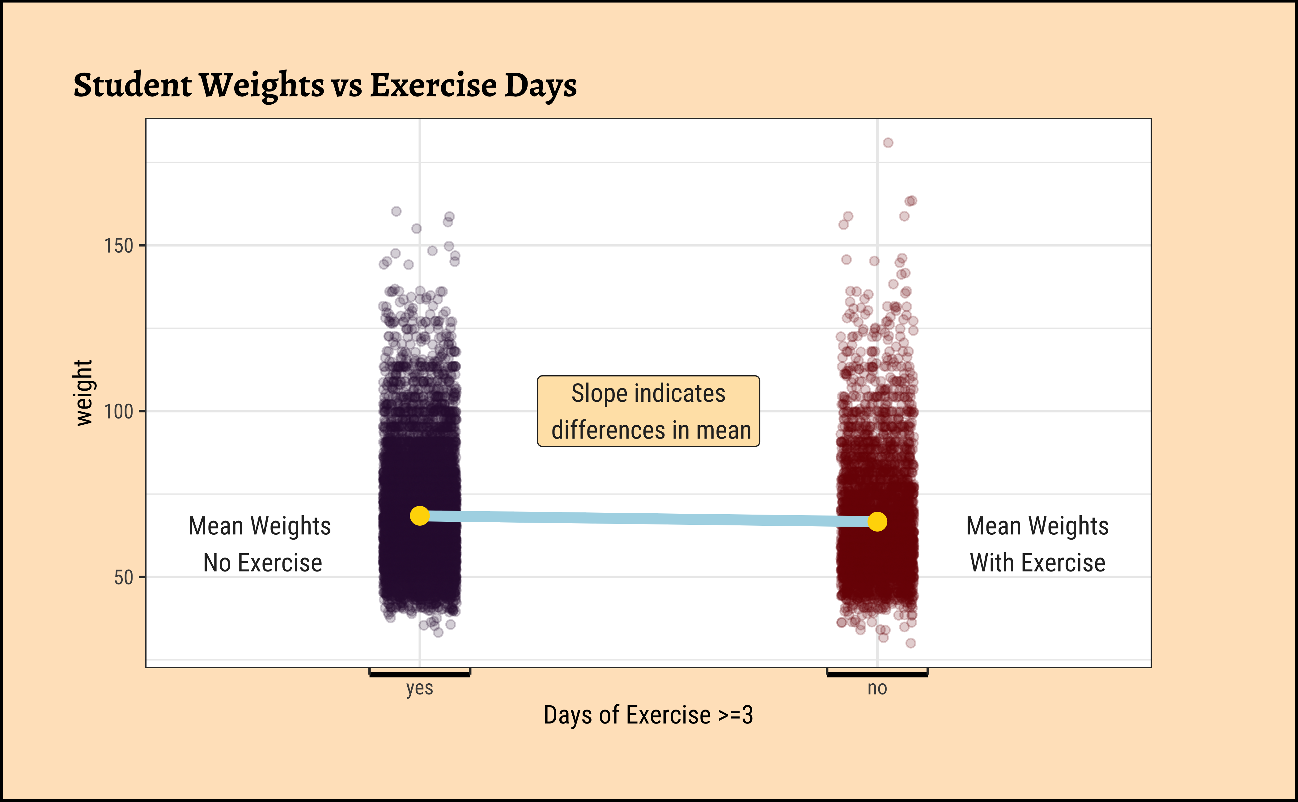
The jitter and density plots show the comparison between the two means. We can also compare the means of the distributions using the following to first group the data by the physical_3plus variable, and then calculate the mean weight in these groups using the mean function while ignoring missing values by setting the na.rm argument to TRUE.
There is an observed difference, but is this difference large enough to deem it “statistically significant”? In order to answer this question we will conduct a hypothesis test. But before that a few more checks on the data:
A.
As stated before, statistical tests for means usually require a couple of checks:
- Are the data normally distributed?
- Are the data variances similar?
Let us also complete a visual check for normality,with plots since we cannot do a shapiro.test:
Code
ggplot2::theme_set(new = theme_custom())
yrbss_select_phy %>%
gf_density(~weight,
fill = ~physical_3plus, color = ~physical_3plus,
alpha = 0.5,
title = "Highschoolers' Weights by Exercise Frequency"
) %>%
gf_facet_grid(~physical_3plus) %>%
gf_fitdistr(dist = "dnorm") %>%
gf_refine(scale_fill_viridis_d(
name = "Days of Exercise >=3",
option = "turbo",
aesthetics = c("colour", "fill")
))
##
yrbss_select_phy %>%
gf_qq(~ weight | physical_3plus,
color = ~physical_3plus,
title = "Q-Q Plots of Male and Female Weights"
) %>%
gf_qqline(ylab = "Weight") %>%
gf_refine(scale_fill_viridis_d(
name = "Days of Exercise >=3",
option = "turbo",
aesthetics = c("colour", "fill")
))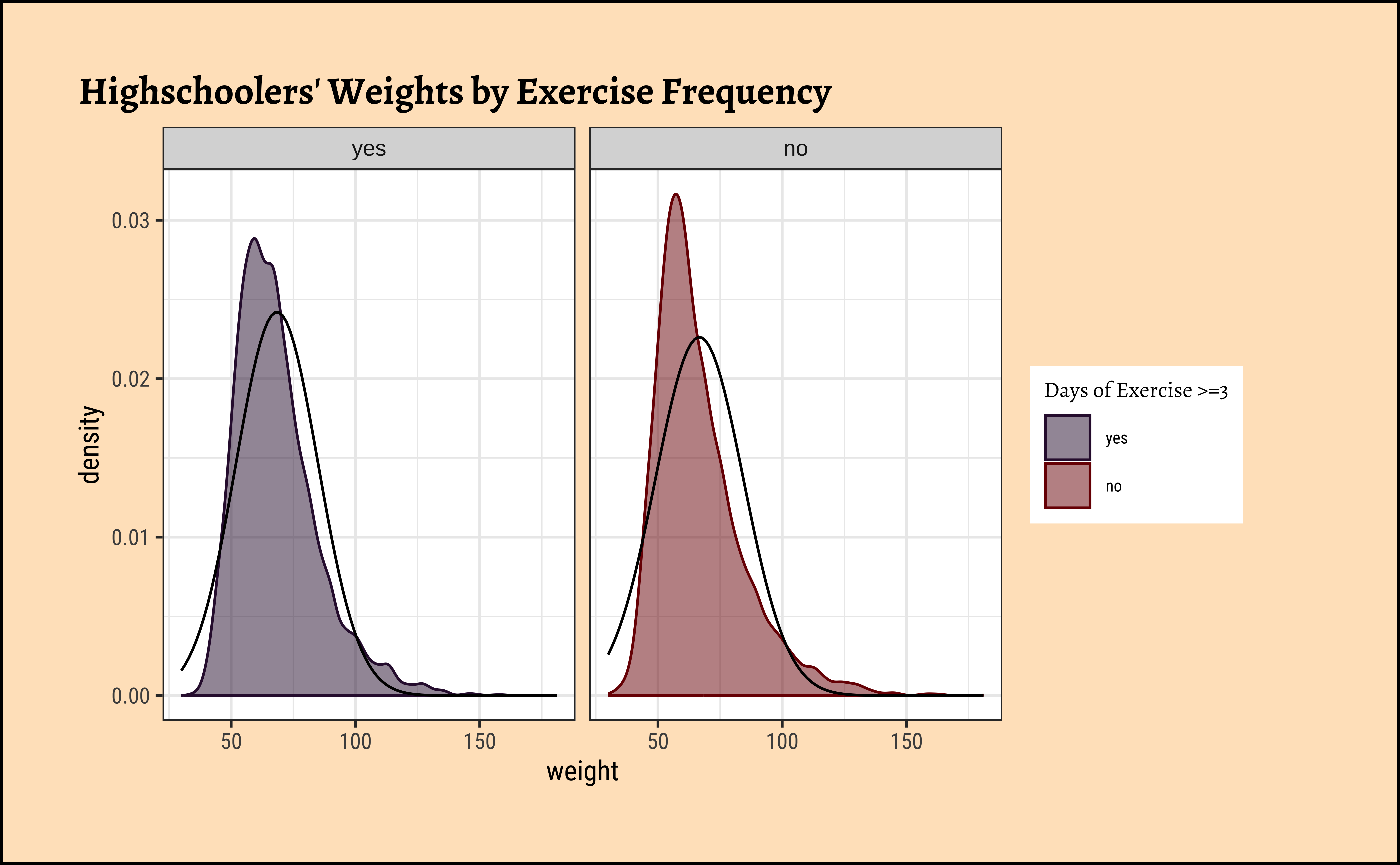
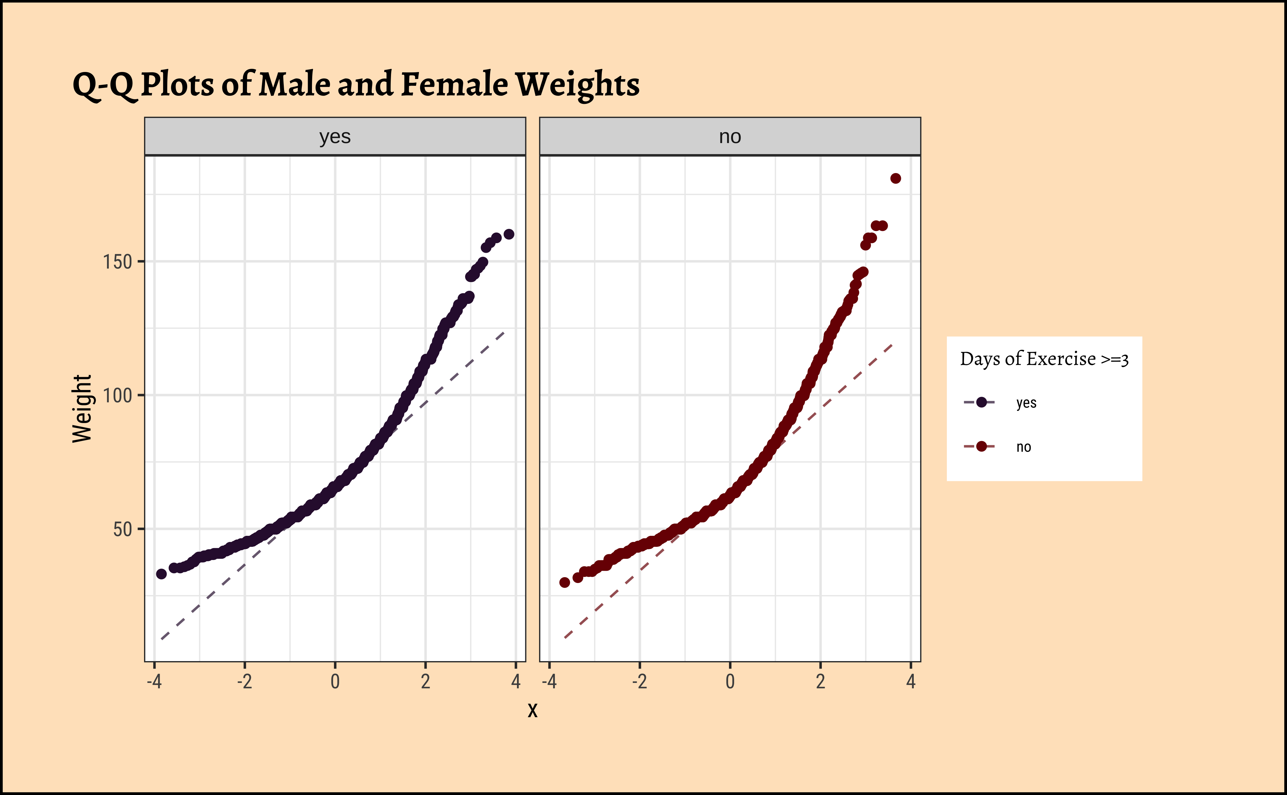
Again, not normally distributed…
B.
Let us check if the two variables have similar variances: the var.test does this for us, with a NULL hypothesis that the variances are not significantly different:
[1] 1.054398The p.value states the probability of the data being what it is, assuming the NULL hypothesis that variances were similar. It being so small, we are able to reject this NULL Hypothesis that the variances of weight are nearly equal across the two exercise frequencies. (Compare the statistic in the var.test with the critical F-value)
Conditions
- The two variables are not normally distributed.
- The two variances are also significantly different.
Hence we will have to use non-parametric tests to infer if the means are similar.
Permutation Tests
For this last Case Study, we will do this in two ways, just for fun: one using our familiar mosaic package, and the other using the package infer.
But first, we need to initialize the test, which we will save as obs_diff_**.
diffmean
-1.774584 diffmean
-1.774584 Important
Note that obs_diff_infer is a 1 X 1 dataframe; obs_diff_mosaic is a scalar!!
Next, we will work through creating a permutation distribution using tools from the infer package.
In infer, the specify() function is used to specify the variables you are considering (notated y ~ x), and you can use the calculate() function to specify the statistic you want to calculate and the order of subtraction you want to use. For this hypothesis, the statistic you are searching for is the difference in means, with the order being yes - no.
After you have calculated your observed statistic, you need to create a permutation distribution. This is the distribution that is created by shuffling the observed weights into new physical_3plus groups, labeled “yes” and “no”.
We will save the permutation distribution as null_dist.
The hypothesize() function is used to declare what the null hypothesis is. Here, we are assuming that student’s weight is independent of whether they exercise at least 3 days or not.
We should also note that the type argument within generate() is set to "permute". This ensures that the statistics calculated by the calculate() function come from a reshuffling of the data (not a resampling of the data)! Finally, the specify() and calculate() steps should look familiar, since they are the same as what we used to find the observed difference in means!
We can visualize this null distribution with the following code:
Code
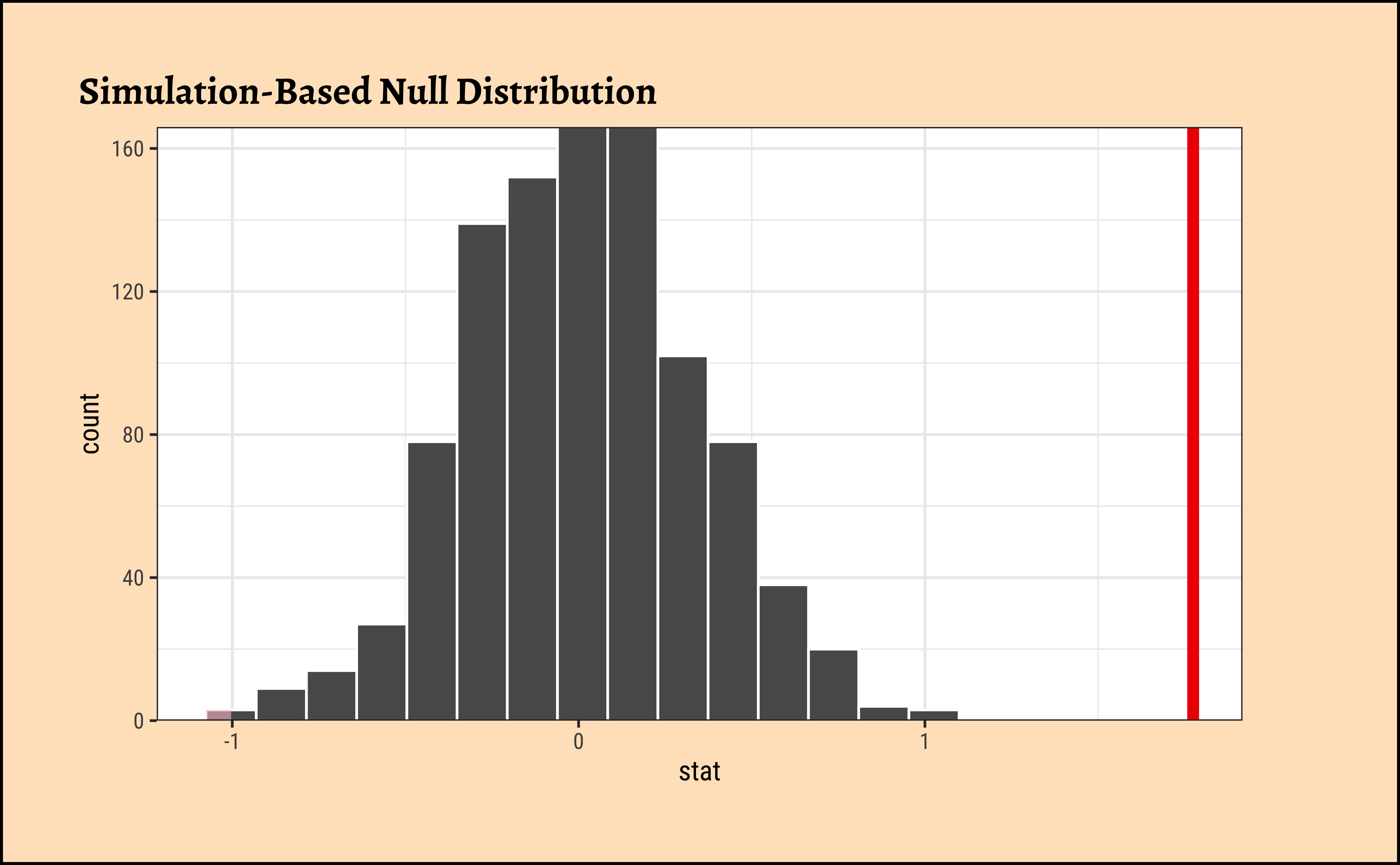
Now that you have calculated the observed statistic and generated a permutation distribution, you can calculate the p-value for your hypothesis test using the function get_p_value() from the infer package.
What warning message do you get? Why do you think you get this warning message? Let us construct and record a confidence interval for the difference between the weights of those who exercise at least three times a week and those who don’t, and interpret this interval in context of the data.
It does look like the observed_diff_infer is too far away from this confidence interval. Hence if there was no difference in weight caused by physical_3plus, we would never have observed it! Hence the physical_3plus does have an effect on weight!
We already have the observed difference, obs_diff_mosaic. Now we generate the null distribution using permutation, with mosaic:
We can also generate the histogram of the null distribution, compare that with the observed diffrence and compute the p-value and confidence intervals:
Code
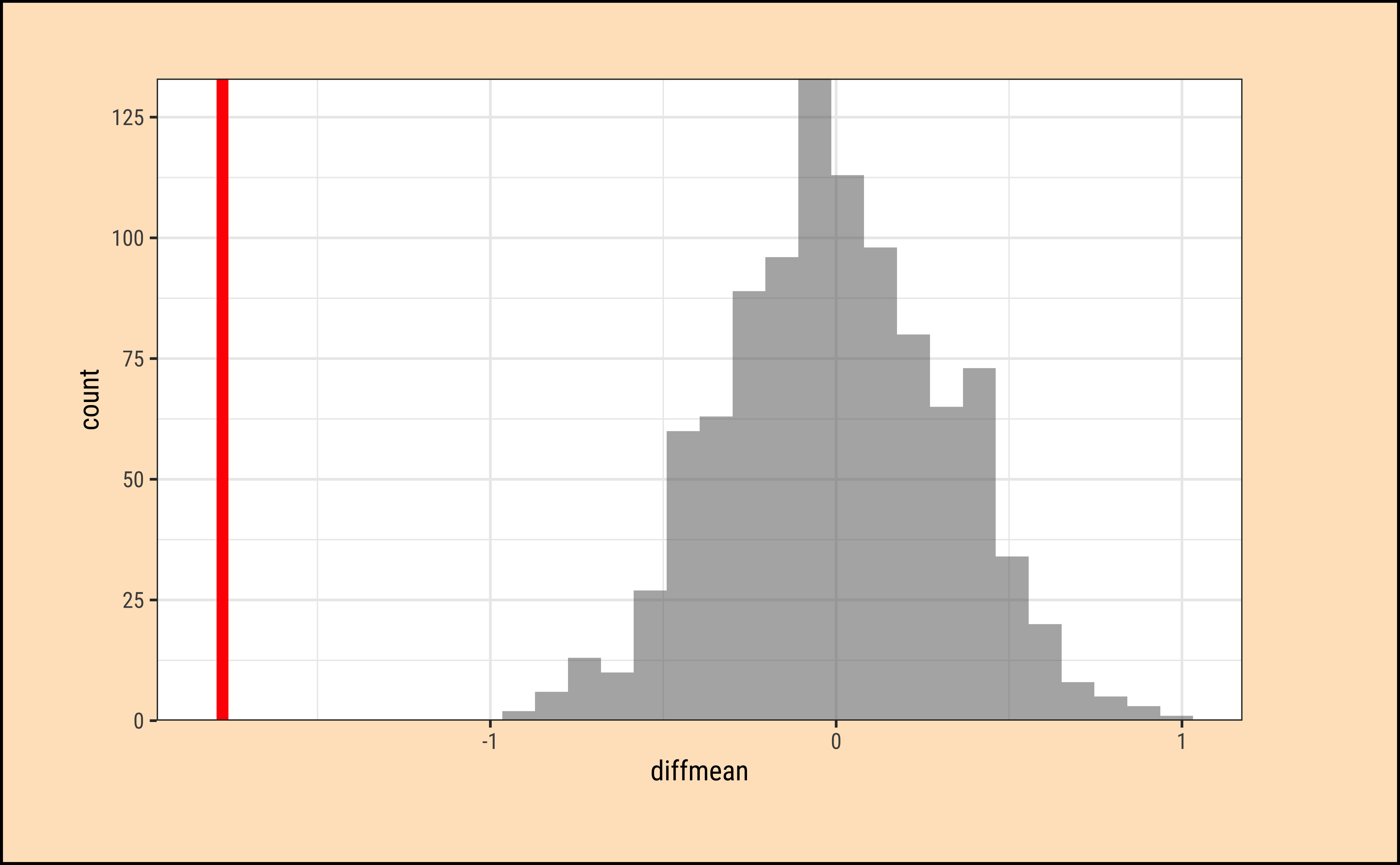
prop_TRUE
1 Again, it does look like the observed_diff_infer is too far away from this NULL distribution. Hence if there was no difference in weight caused by physical_3plus, we would never have observed it! Hence the physical_3plus does have an effect on weight!
Clearly there is a serious effect of Physical Exercise on the body weights of students in the population from which this dataset is drawn.
Arel-Bundock, Vincent. 2026. tinytable: Simple and Configurable Tables in “HTML,” “LaTeX,” “Markdown,” “Word,” “PNG,” “PDF,” and “Typst” Formats. https://doi.org/10.32614/CRAN.package.tinytable.
Çetinkaya-Rundel, Mine, David Diez, Andrew Bray, Albert Y. Kim, Ben Baumer, Chester Ismay, Nick Paterno, and Christopher Barr. 2024. openintro: Datasets and Supplemental Functions from “OpenIntro” Textbooks and Labs. https://doi.org/10.32614/CRAN.package.openintro.
Chihara, Laura M., and Tim C. Hesterberg. 2018. Mathematical Statistics with Resampling and r. John Wiley & Sons Hoboken NJ. https://github.com/lchihara/MathStatsResamplingR?tab=readme-ov-file.
Couch, Simon P., Andrew P. Bray, Chester Ismay, Evgeni Chasnovski, Benjamin S. Baumer, and Mine Çetinkaya-Rundel. 2021. “infer: An R Package for Tidyverse-Friendly Statistical Inference.” Journal of Open Source Software 6 (65): 3661. https://doi.org/10.21105/joss.03661.
Lange, Carsten. 2023. TeachHist: A Collection of Amended Histograms Designed for Teaching Statistics. https://doi.org/10.32614/CRAN.package.TeachHist.
Schilling, Sabine. 2026. visStatistics: Automated Selection and Visualisation of Statistical Hypothesis Tests. https://doi.org/10.32614/CRAN.package.visStatistics.
Snow, Greg. 2024. TeachingDemos: Demonstrations for Teaching and Learning. https://doi.org/10.32614/CRAN.package.TeachingDemos.