library(tidyverse) # Tidy data processing
library(ggformula) # Formula based plots
library(mosaic) # Data inspection and Statistical Inference
library(broom) # Tidy outputs from Statistical Analyses
library(infer) # Statistical Inference, Permutation/Bootstrap
library(supernova) # Beginner-Friendly ANOVA Tables
library(ggstatsplot) # Statistical Plots
library(ggcompare) # Improved p.value brackets on graphs
##
library(patchwork) # Arranging Plots
library(ggprism) # Interesting Categorical Axes
library(paletteer) # Color PalettesComparing Multiple Means with ANOVA
2023-03-28
Code
library(checkdown)
library(epoxy)
library(TeachHist)
library(TeachingDemos)
library(grateful)
library(restriktor)
library(tinytable) # Easy-to-make tables for data
##
library(latex2exp)
library(equatiomatic)
library(ggrepel)
library(marquee) # Marquee Text in HTML
##
library(ellmer) # Access LLMs from R
library(statlingua) # LLM-driven plain English statistical explanations
Code
library(systemfonts)
library(showtext)
## Clean the slate
systemfonts::clear_local_fonts()
systemfonts::clear_registry()
##
showtext_opts(dpi = 96) # set DPI for showtext
sysfonts::font_add(
  family = "Alegreya",
  regular = "../../../../../../fonts/Alegreya-Regular.ttf",
  bold = "../../../../../../fonts/Alegreya-Bold.ttf",
  italic = "../../../../../../fonts/Alegreya-Italic.ttf",
  bolditalic = "../../../../../../fonts/Alegreya-BoldItalic.ttf"
)

sysfonts::font_add(
  family = "Roboto Condensed",
  regular = "../../../../../../fonts/RobotoCondensed-Regular.ttf",
  bold = "../../../../../../fonts/RobotoCondensed-Bold.ttf",
  italic = "../../../../../../fonts/RobotoCondensed-Italic.ttf",
  bolditalic = "../../../../../../fonts/RobotoCondensed-BoldItalic.ttf"
)
showtext_auto(enable = TRUE) # enable showtext
##
theme_custom <- function() {
  theme_bw(base_size = 10) +

    # theme(panel.widths = unit(11, "cm"),
    #       panel.heights = unit(6.79, "cm")) + # Golden Ratio

    theme(
      plot.margin = margin_auto(t = 1, r = 2, b = 1, l = 1, unit = "cm"),
      plot.background = element_rect(
        fill = "bisque",
        colour = "black",
        linewidth = 1
      )
    ) +

    theme_sub_axis(
      title = element_text(
        family = "Roboto Condensed",
        size = 10
      ),
      text = element_text(
        family = "Roboto Condensed",
        size = 8
      )
    ) +

    theme_sub_legend(
      text = element_text(
        family = "Roboto Condensed",
        size = 6
      ),
      title = element_text(
        family = "Alegreya",
        size = 8
      )
    ) +

    theme_sub_plot(
      title = element_text(
        family = "Alegreya",
        size = 14, face = "bold"
      ),
      title.position = "plot",
      subtitle = element_text(
        family = "Alegreya",
        size = 10
      ),
      caption = element_text(
        family = "Alegreya",
        size = 6
      ),
      caption.position = "plot"
    )
}

## Use available fonts in ggplot text geoms too!
ggplot2::update_geom_defaults(geom = "text", new = list(
  family = "Roboto Condensed",
  face = "plain",
  size = 3.5,
  color = "#2b2b2b"
))
ggplot2::update_geom_defaults(geom = "label", new = list(
  family = "Roboto Condensed",
  face = "plain",
  size = 3.5,
  color = "#2b2b2b"
))

ggplot2::update_geom_defaults(geom = "marquee", new = list(
  family = "Roboto Condensed",
  face = "plain",
  size = 3.5,
  color = "#2b2b2b"
))
ggplot2::update_geom_defaults(geom = "text_repel", new = list(
  family = "Roboto Condensed",
  face = "plain",
  size = 3.5,
  color = "#2b2b2b"
))
ggplot2::update_geom_defaults(geom = "label_repel", new = list(
  family = "Roboto Condensed",
  face = "plain",
  size = 3.5,
  color = "#2b2b2b"
))

## Set the theme
ggplot2::theme_set(new = theme_custom())

## tinytable options
options("tinytable_tt_digits" = 2)
options("tinytable_format_num_fmt" = "significant_cell")
options(tinytable_html_mathjax = TRUE)


## Set defaults for flextable
flextable::set_flextable_defaults(font.family = "Roboto Condensed")
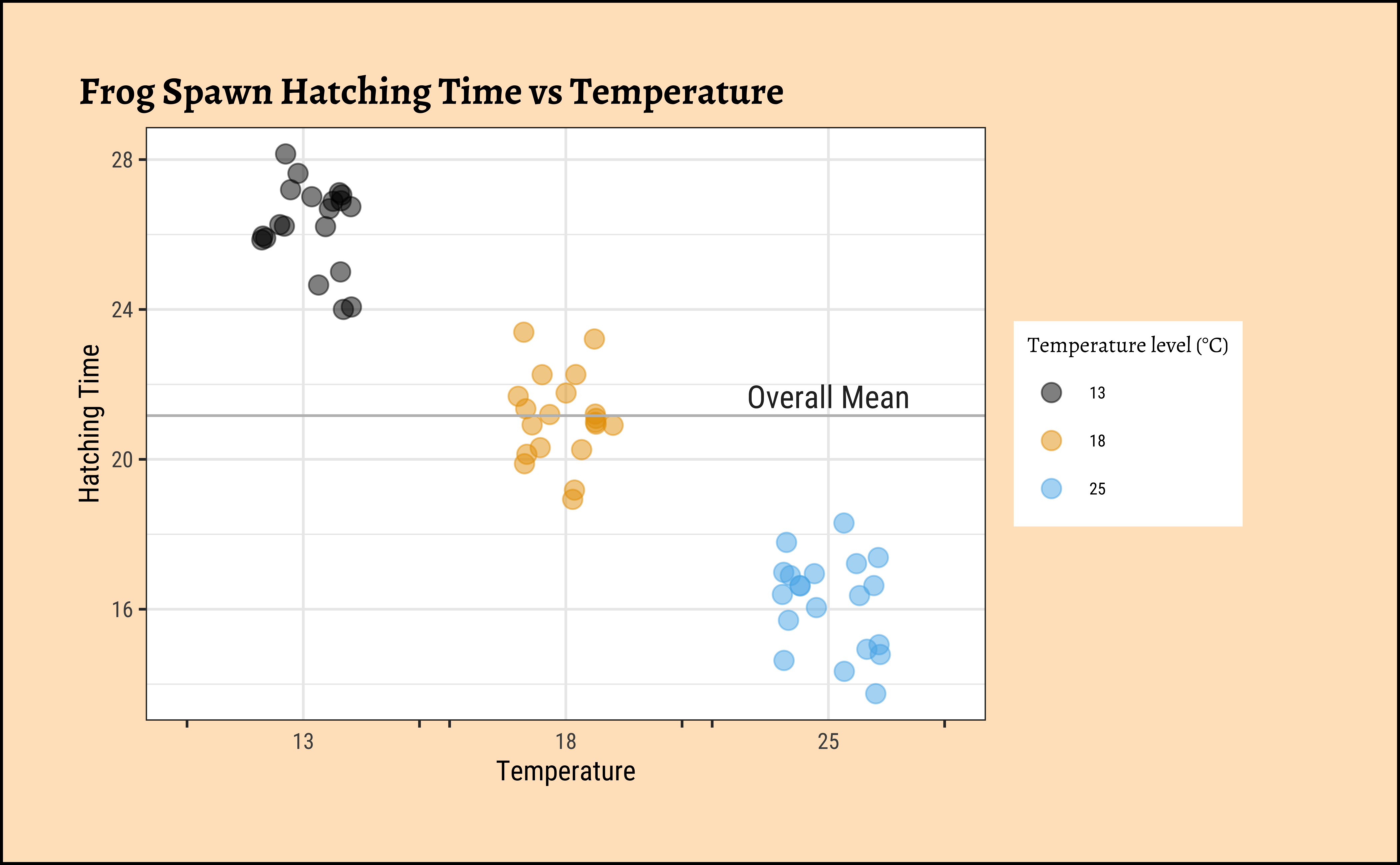
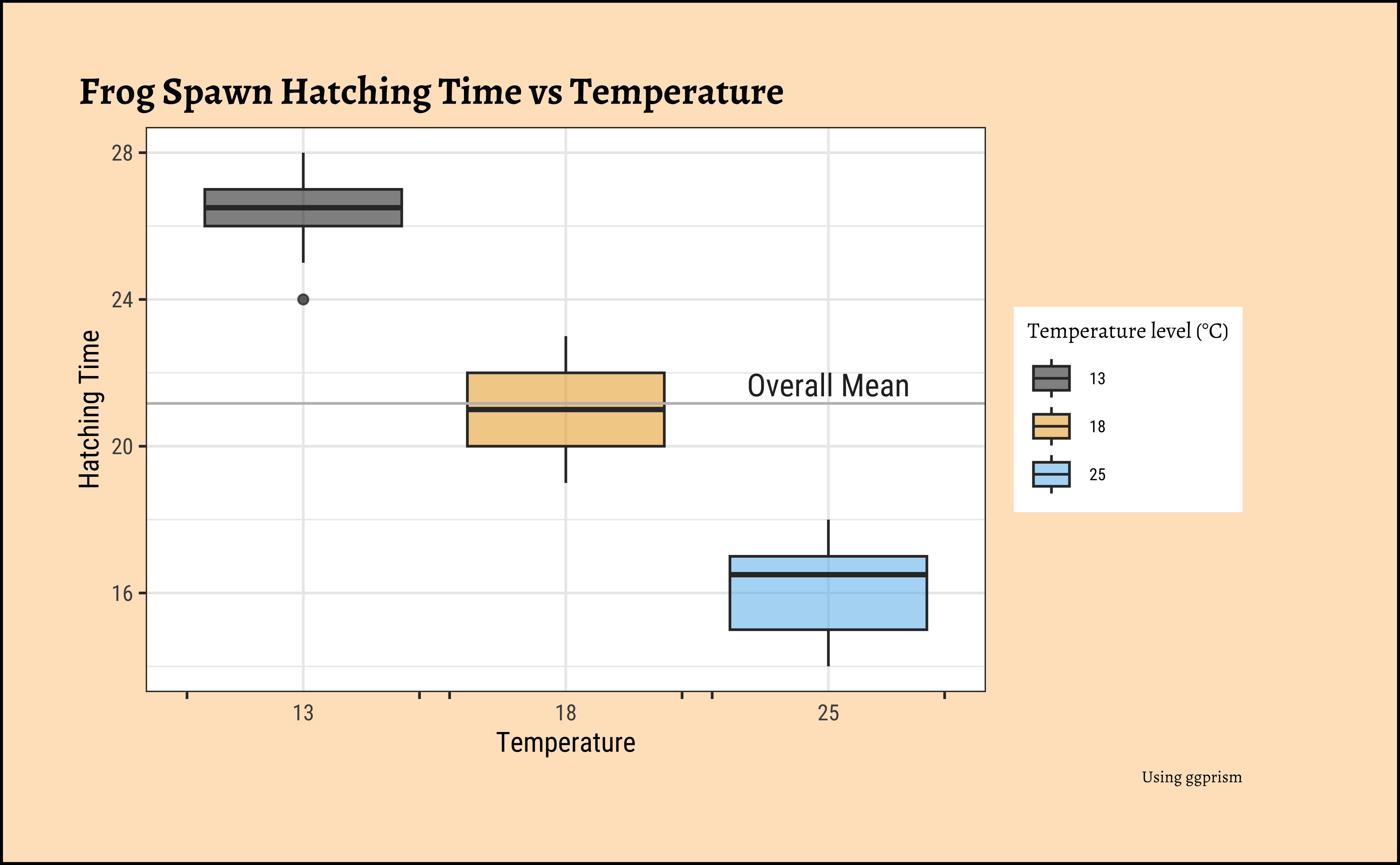
Let us plot jitter-plots, boxplots, and histograms of Hatching Time:
ggplot2::theme_set(new = theme_custom())

gf_jitter(Time ~ TempFac,
  color = ~TempFac, width = 0.2,
  data = frogs_long, size = 3, alpha = 0.5
) %>%
  gf_labs(
    title = "Frog Spawn Hatching Time vs Temperature",
    x = "Temperature", y = "Hatching Time"
  ) %>%
  gf_hline(yintercept = ~ mean(Time), color = "grey") %>%
  gf_annotate(geom = "text", label = "Overall Mean", x = 3, y = mean(frogs_long$Time) + 0.5, size = 4) %>%
  gf_refine(
    scale_color_paletteer_d("ggthemes::colorblind"),
    scale_x_discrete(guide = "prism_bracket"),
    guides(color = guide_legend(title = "Temperature level (°C)"))
  )
ggplot2::theme_set(new = theme_custom())

gf_boxplot(
  data = frogs_long,
  Time ~ TempFac,
  fill = ~TempFac,
  alpha = 0.5, orientation = "x"
) %>%
  gf_hline(yintercept = ~ mean(Time), color = "grey") %>%
  gf_labs(
    title = "Frog Spawn Hatching Time vs Temperature",
    x = "Temperature", y = "Hatching Time",
    caption = "Using ggprism"
  ) %>%
  gf_annotate(
    geom = "text", label = "Overall Mean", x = 3,
    y = mean(frogs_long$Time) + 0.5, size = 4
  ) %>%
  gf_refine(
    scale_fill_paletteer_d("ggthemes::colorblind"),
    scale_x_discrete(guide = "prism_bracket"),
    guides(fill = guide_legend(title = "Temperature level (°C)"))
  )
ggplot2::theme_set(new = theme_custom())

gf_histogram(~Time,
  fill = ~TempFac,
  data = frogs_long, alpha = 0.5
) %>%
  gf_vline(xintercept = ~ mean(frogs_long$Time)) %>%
  gf_labs(
    title = "Frog Spawn Hatching Time vs Temperature",
    x = "Hatching Time", y = "Count"
  ) %>%
  gf_annotate("text",
    y = 7, x = mean(frogs_long$Time) + 1.5,
    label = "Overall Mean", size = 4
  ) %>%
  gf_refine(
    scale_fill_paletteer_d("ggthemes::colorblind"),
    guides(fill = guide_legend(title = "Temperature level (°C)"))
  )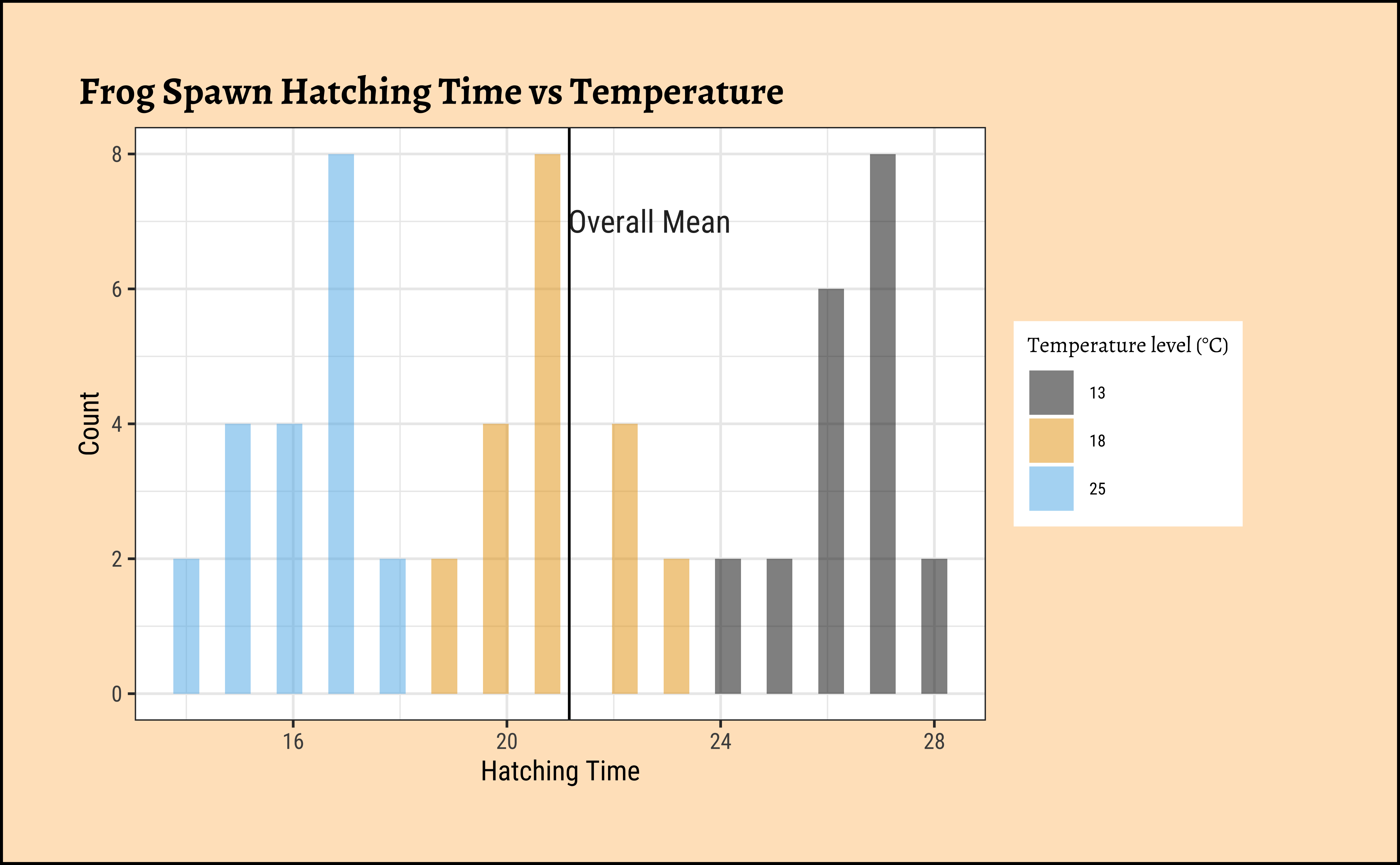
The histograms look well separated and the box plots also show very little overlap. So we can reasonably hypothesize that Temperature has a significant effect on Hatching Time.
The scatter plot seems to show that there are only a few fixed values of observed readings of Hatching Time for each setting of TempFac, which is a little unusual. But we will proceed nonetheless.
Let’s go ahead with our ANOVA test.
We will first execute the ANOVA test with code and evaluate the results. Then we will do an intuitive walkthrough of the process and finally, hand-calculate entire analysis for clear understanding. For now, a little faith!
R offers a very simple command aov to execute an ANOVA test: Note the familiar formula of stating the variables:
Call:
   aov(formula = Time ~ TempFac, data = frogs_long)

Terms:
                 TempFac Residuals
Sum of Squares  1020.933    75.400
Deg. of Freedom        2        57

Residual standard error: 1.150133
Estimated effects may be unbalanced
This creates an ANOVA model object, called frogs_anova; the output is still a little too terse for us. We can examine the ANOVA model object best with a package called supernova1:

 Analysis of Variance Table (Type III SS)
 Model: Time ~ TempFac

                               SS df      MS       F   PRE     p
 ----- --------------- | -------- -- ------- ------- ----- -----
 Model (error reduced) | 1020.933  2 510.467 385.897 .9312 .0000
 Error (from model)    |   75.400 57   1.323
 ----- --------------- | -------- -- ------- ------- ----- -----
 Total (empty model)   | 1096.333 59  18.582
The first table + error-bar plot gives us a comparison between each pair of the three groups of observations defined by TempFac. The differences in spawn hatching Time between each pair of TempFac settings are given by the diff column. Also shown are the confidence intervals for each of these differences (none of which include \(0\)); the p-values for each of these differences is also negligible. Thus we can conclude that the effect of temperature on hatching time is significant.
The supernova table is also very interesting and tells us that the model has reduced the error in our understanding of the data by a significant amount. What exactly that means, we will workout in the next section.
Note
To find which specific value of TempFac has the most effect will require pairwise comparison of the group means, using a standard t-test. The confidence level for such repeated comparisons will need what is called Bonferroni correction2 to prevent us from detecting a significant (pair-wise) difference simply by chance. To do this we take \(\alpha = 0.05\), the confidence level used and divide it by \(K\), the number of pair-wise comparisons we intend to make. This new value is used to decide on the significance of the estimated parameter. So the pairwise comparisons in our current data will have to use \(\alpha/3 = 0.0166\) as the confidence level. The supernova::pairwise() function did this for us very neatly!
There are also other ways, such as the “Tukey correction” for multiple tests.
All that is very well, but what is happening under the hood of the aov() command?
Consider a data set with a single Quant and a single Qual variable. The Qual variable has two levels, the Quant data has 20 observations per Qual level.
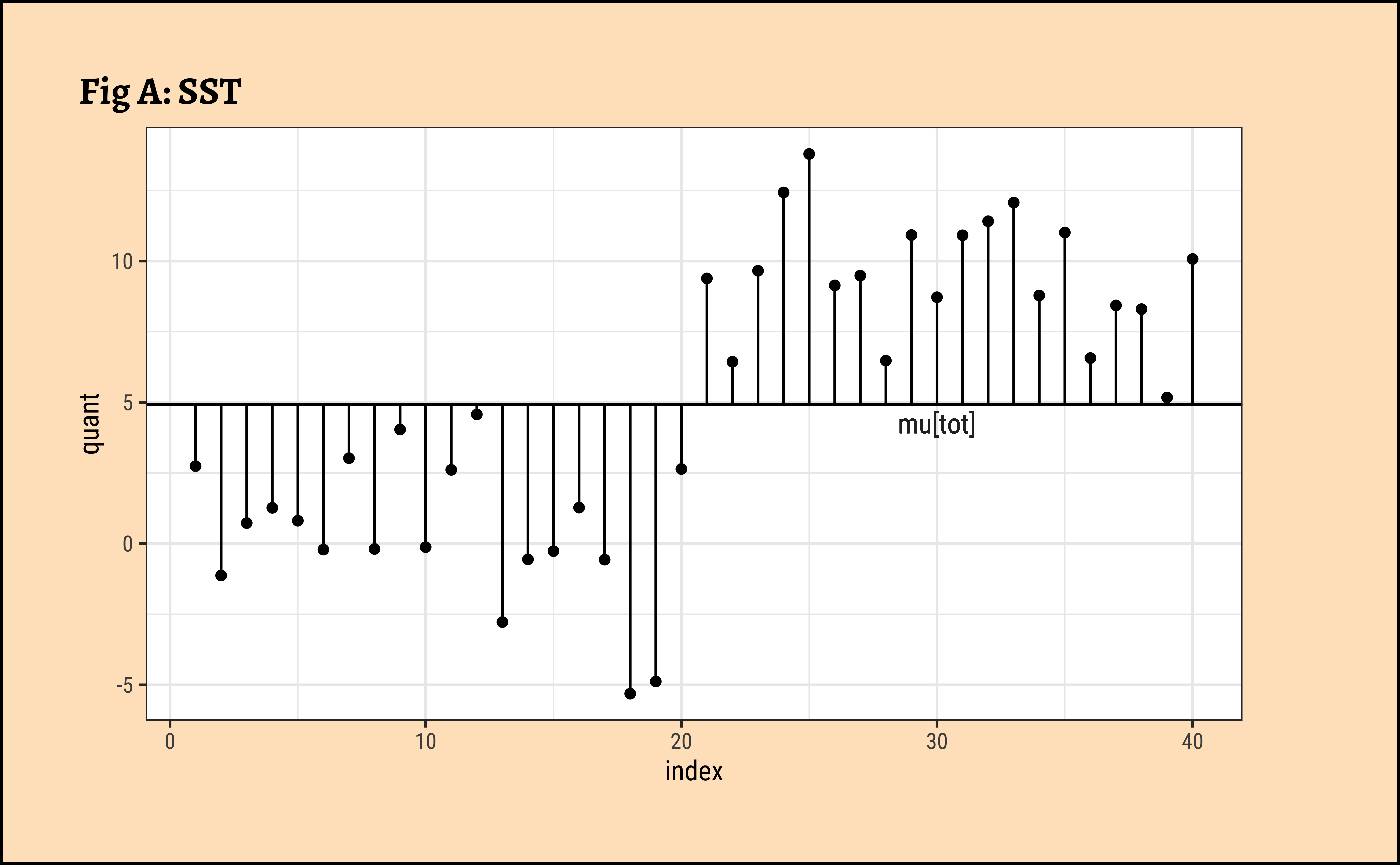
All Data: In Fig A, the horizontal black line is the overall mean of quant, denoted as \(\mu_{tot}\). The vertical black lines to the points show the departures of each point from this overall mean. The sum of squares of these vertical black lines in Fig A is called the Total Sum of Squares (SST).
\[ SST = \Sigma (y - \mu_{tot})^2 \tag{1}\]
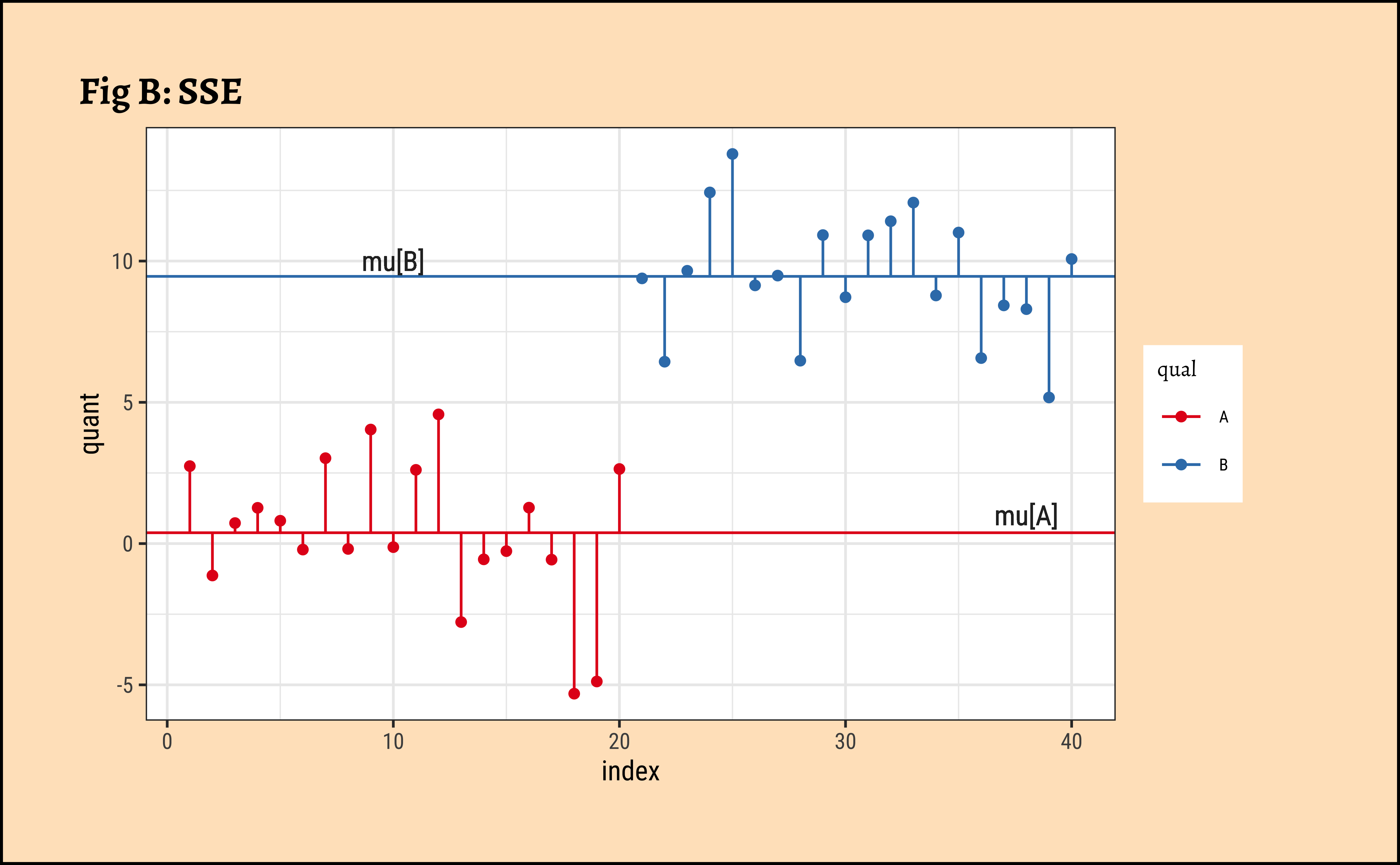
Grouped Data: In Fig B, the horizontal green and red lines are the means of the individual groups, respectively \(\mu_A\) and \(\mu_B\). The green and red vertical lines are the departures, or errors, of each point from its own group-mean. The sum of the squares of the green and red lines is called the Total Error Sum of Squares (SSE).
\[ SSE = \Sigma [(y - \mu_A)^2] + \Sigma (y - \mu_B)^2] \tag{2}\]
Improvement: We take the difference in the squared error sums:
\[ SSA = SST - SSE \tag{3}\]
\(SSA\) is called the Treatment Sum of Squares, the “improvement” in going from believing in one mean to believing in two.
Improvement Ratio: \(SSA/SSE\) might now help us decide whether two means are better than one.
Let us compute these numbers for our toy dataset:
 Analysis of Variance Table (Type III SS)
 Model: quant ~ qual

                               SS df      MS       F   PRE     p
 ----- --------------- | -------- -- ------- ------- ----- -----
 Model (error reduced) |  823.407  1 823.407 139.356 .7857 .0000
 Error (from model)    |  224.529 38   5.909
 ----- --------------- | -------- -- ------- ------- ----- -----
 Total (empty model)   | 1047.935 39  26.870
What do we see?
- All Data: \(SST = 1047.935\).
- Grouped Data: \(SSE = 224.529\).
- Improvement: \(SSA = SST-SSE\) = \(823.407\).
- Improvement Ratio: Before we set up this ratio, we must realize that each of these measures uses a different number of observations! So the comparison is done after scaling each of \(SSA\) and \(SSE\) by the number of observations influencing them. (a sort of per capita, or average, squared error, an idea we saw when we defined Standard Errors): \(F_{stat} = \frac{SSA / df_{SSA}}{SSE / df_{SSE}}\), where \(df_{SSA} = 1\) and \(df_{SSE} = 38\) are respectively the degrees of freedom in \(SSA\) and \(SSE\).
- Large Enough Ratio?: The value of the
F-statisticfrom the table above is \(\frac{823.407}{5.909} = 139.356\). Is this ratio big enough?F-statisticis compared with a critical value of theF-criticalto help us decide. (Here, it is.) - Belief: So we now believe in the idea of two means.
- Back to Mean Differences: Finally, in order to find which of the means is significantly different from others (if there are more than two!), we need to make a pair-wise comparison of the means, applying the
Bonferroni correctionas stated before. This means we divide the criticalp.valuewe expect by the number of comparisons we make between levels of the Qual variable.supernovadid this for us in the error-bar plot above.
Why “ANOVA”?
When divide each of \(SSA\) and \(SSE\) by their degrees of freedom, this gives us a ratio of variances, the F-statistic. And so we are in effect deciding if means are significantly different by analyzing (a ratio of) variances! Hence the name, AN-alysis O-f VA-riance, ANOVA.
So this may seem like a great Hero’s Journey, where we start with means and differences, go into sums of squares, differences and comparisons of error ratios, and return to the means where we started, only to know them properly now.
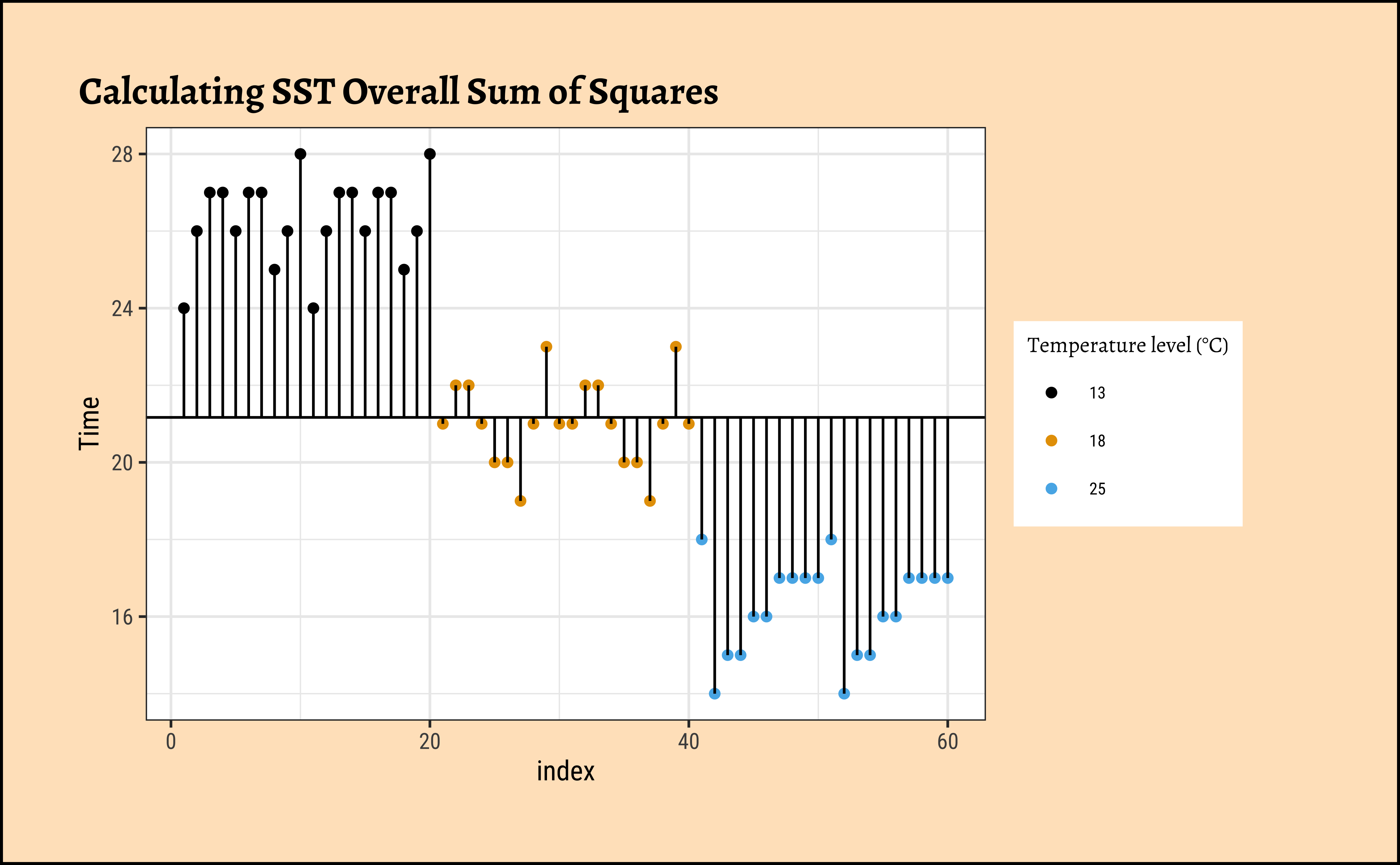
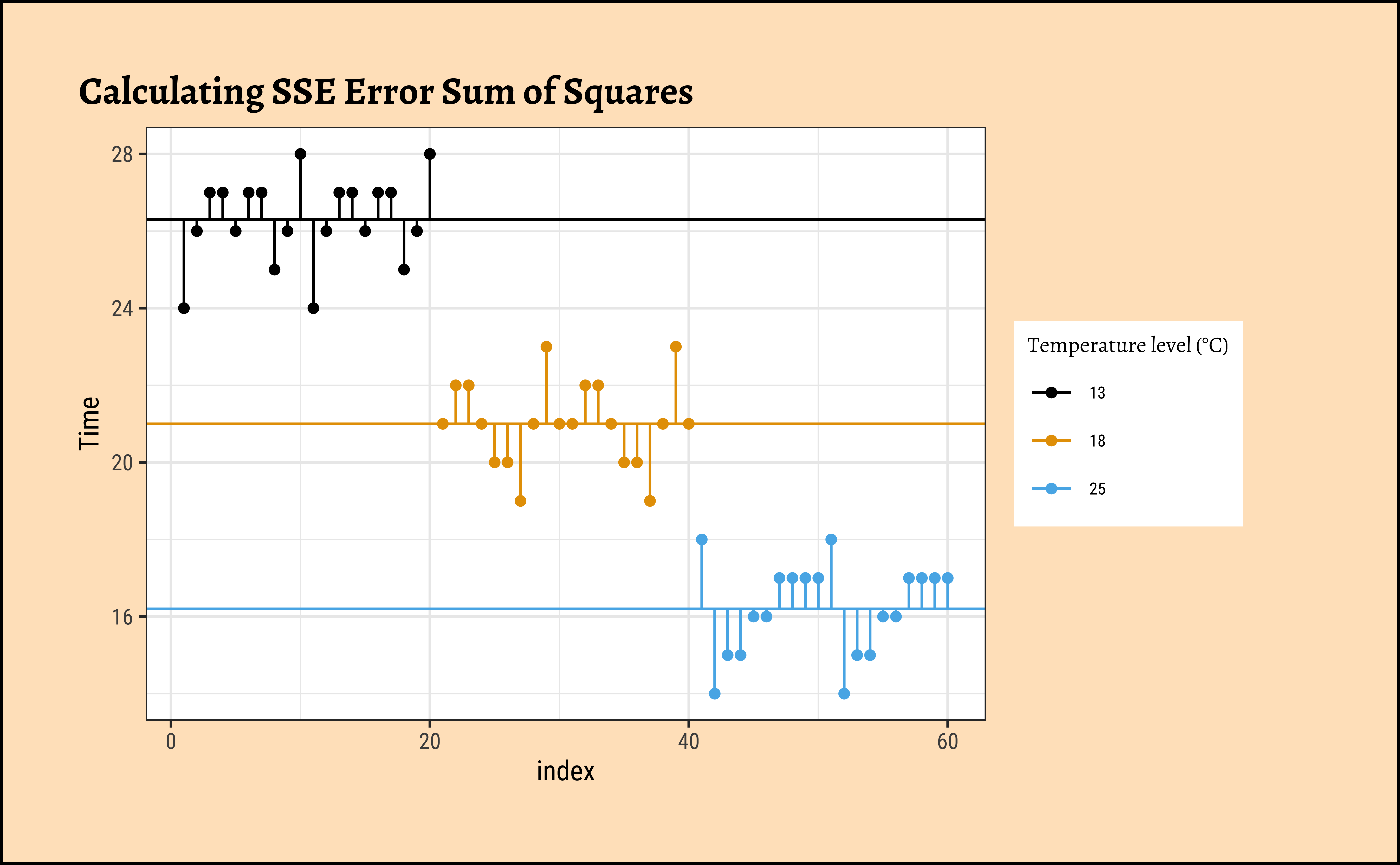
Now that we understand what aov() is doing, let us hand-calculate the numbers for our frogs dataset and check. Let us visualize our calculations first.
Code
ggplot2::theme_set(new = theme_custom())

frogs_plot <- frogs_long %>%
  arrange(TempFac) %>%
  rowid_to_column(var = "index")

frogs_mean <- frogs_long %>%
  summarise(overall_mean = mean(Time))

frogs_grouped_means <- frogs_long %>%
  group_by(TempFac) %>%
  summarise(grouped_means = mean(Time))

gf_point(Time ~ index,
  color = ~TempFac,
  data = frogs_plot, title = "Calculating SST Overall Sum of Squares"
) %>%
  gf_refine(
    scale_colour_paletteer_d("ggthemes::colorblind"),
    guides(colour = guide_legend(title = "Temperature level (°C)"))
  ) %>%
  gf_hline(
    yintercept = ~overall_mean,
    data = frogs_mean
  ) %>%
  gf_segment(
    data = frogs_plot,
    color = "black",
    frogs_mean$overall_mean + Time ~ index + index
  )
##
frogs_plot <- frogs_long %>%
  arrange(TempFac) %>%
  rowid_to_column(var = "index")
##
frogs_mean <- frogs_long %>%
  summarise(overall_mean = mean(Time))
##
frogs_grouped_means <- frogs_long %>%
  group_by(TempFac) %>%
  summarise(grouped_means = mean(Time))
##
gf_point(Time ~ index,
  group = ~TempFac,
  colour = ~TempFac,
  data = frogs_plot, title = "Calculating SSE Error Sum of Squares"
) %>%
  gf_refine(
    scale_colour_paletteer_d("ggthemes::colorblind"),
    guides(colour = guide_legend(title = "Temperature level (°C)"))
  ) %>%
  gf_hline(
    yintercept = ~grouped_means,
    colour = ~TempFac,
    data = frogs_grouped_means
  ) %>%
  gf_segment(
    data = frogs_plot %>% filter(TempFac == 13),
    frogs_grouped_means$grouped_means[1] + Time ~ index + index
  ) %>%
  gf_segment(
    data = frogs_plot %>% filter(TempFac == 18),
    frogs_grouped_means$grouped_means[2] + Time ~ index + index
  ) %>%
  gf_segment(
    data = frogs_plot %>% filter(TempFac == 25),
    frogs_grouped_means$grouped_means[3] + Time ~ index + index
  )
Let us get the ready table from supernova first, and then systematically calculate all numbers with understanding:
 Analysis of Variance Table (Type III SS)
 Model: Time ~ TempFac

                               SS df      MS       F   PRE     p
 ----- --------------- | -------- -- ------- ------- ----- -----
 Model (error reduced) | 1020.933  2 510.467 385.897 .9312 .0000
 Error (from model)    |   75.400 57   1.323
 ----- --------------- | -------- -- ------- ------- ----- -----
 Total (empty model)   | 1096.333 59  18.582
Here are the SST, SSE, and the SSA:
[1] 1096.333# Calculate sums of square errors *within* each group
# with respect to individual group means
frogs_within_groups <- frogs_long %>%
group_by(TempFac) %>%
summarise(
grouped_mean_time = mean(Time), # The Coloured Lines
grouped_variance_time = var(Time),
group_error_squares = sum((Time - grouped_mean_time)^2),
n = n()
)
frogs_within_groups
##
frogs_SSE <- frogs_within_groups %>%
summarise(SSE = sum(group_error_squares))
##
SSE <- frogs_SSE$SSE
SSE[1] 75.4We have \(SST = 1096\), \(SSE = 75.4\) and therefore \(SSA = 1020.9\).
In order to calculate the F-Statistic, we need to compute the variances, using these sum of squares. We obtain variances by dividing by their Degrees of Freedom:
\[ F_{stat} = \frac{SSA / df_{SSA}}{SSE / df_{SSE}} \]
where \(df_{SSA}\) and \(df_{SSE}\) are respectively the degrees of freedom in SSA and SSE.
Let us calculate these Degrees of Freedom.
With \(k = 3\) levels in the factor TempFac, and \(n = 20\) points per level, \(SST\) clearly has degree of freedom \(kn-1 = 3*20~ -1 = 59\), since it uses all observations but loses one degree to calculate the global mean. (If each level did not have the same number of points \(n\), we simply take all observations less one as the degrees of freedom for \(SST\)).
\(SSE\) has \(k*(n-1) = 3 * (20 -1) = 57\) as degrees of freedom, since each of the \(k\) groups there are \(n\) observations and each group loses one degree to calculate its own group mean.
And therefore \(SSA\), being their difference, has \(kn-1 -k*(n-1) = k-1 = 2\) degrees of freedom.
These are, of course, as shown in the df column in the supernova tabel above. We can still calculate these in R, for the sake of method and clarity (and pedantry):
# Error Sum of Squares SSE
df_SSE <- frogs_long %>%
  # Takes into account "unbalanced" situations
  # Where groups are not equal in size
  group_by(TempFac) %>%
  summarise(per_group_df_SSE = n() - 1) %>%
  summarise(df_SSE = sum(per_group_df_SSE)) %>%
  as.numeric()


## Overall Sum of Squares SST
df_SST <- frogs_long %>%
  summarise(df_SST = n() - 1) %>%
  as.integer()


# Treatment Sum of Squares SSA
k <- length(unique(frogs_long$TempFac))
df_SSA <- k - 1
The degrees of freedom for the quantities are:
[1] 59
[1] 57
[1] 2
Now we are ready to compute the F-statistic: dividing each sum-of-squares byt its degrees of freedom gives us variances which we will compare, using the F-statistic as a ratio:
[1] 1.322807[1] 510.4667[1] 385.8966The F-stat is compared with a critical value of the F-statistic, F_crit which is computed using the formula for the f-distribution in R. As with our hypothesis tests, we set the significance level to \(\alpha = 0.95\), but here with the Bonferroni correction, and quote the two relevant degrees of freedom as parameters to qf() which computes the critical F value F_critical as a quartile:
[1] 4.403048
[1] 385.8966
The F_crit value can also be seen in a plot3,4:
Code
ggplot2::theme_set(new = theme_custom())

mosaic::xpf(
  q = F_crit,
  df1 = df_SSA, df2 = df_SSE, method = "gg",
  log.p = FALSE, lower.tail = TRUE,
  return = "plot"
) %>%
  gf_vline(xintercept = F_crit) %>%
  gf_label(0.75 ~ F_crit,
    label = "F_critical",
    inherit = F, show.legend = F
  ) %>%
  gf_labs(
    title = "F distribution for Frogs Data",
    subtitle = "F_critical = 4.403"
  ) %>%
  gf_refine(
    scale_y_continuous(expand = c(0, 0)),
    scale_x_continuous(expand = c(0, 0))
  )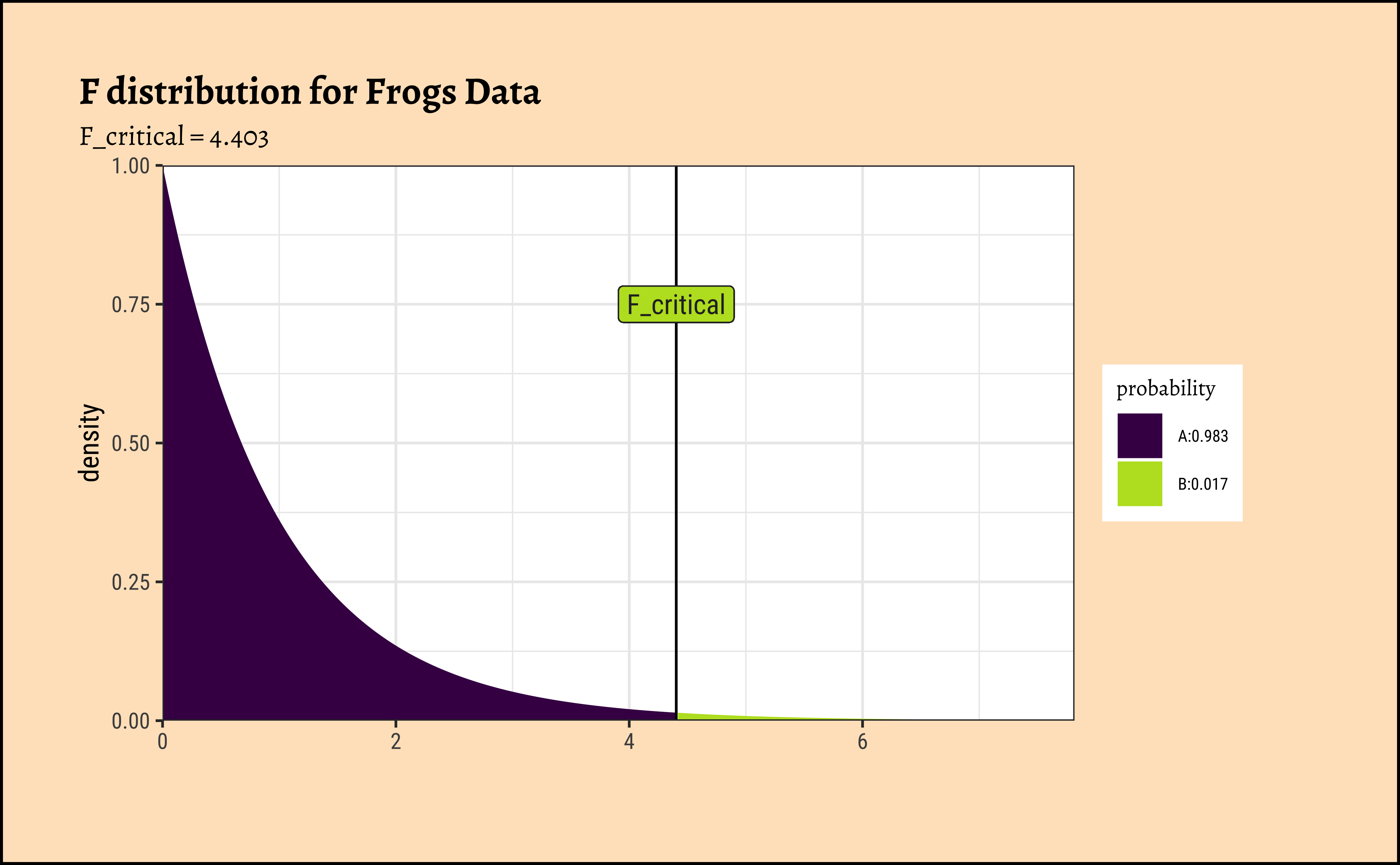
Any value of F more than the F_crit occurs with smaller probability than \(0.05/3 = 0.017\). Our F_stat is much higher than F_crit, by orders of magnitude! And so we can say with confidence that Temperature has a significant effect on spawn Time.
And that is how ANOVA computes!
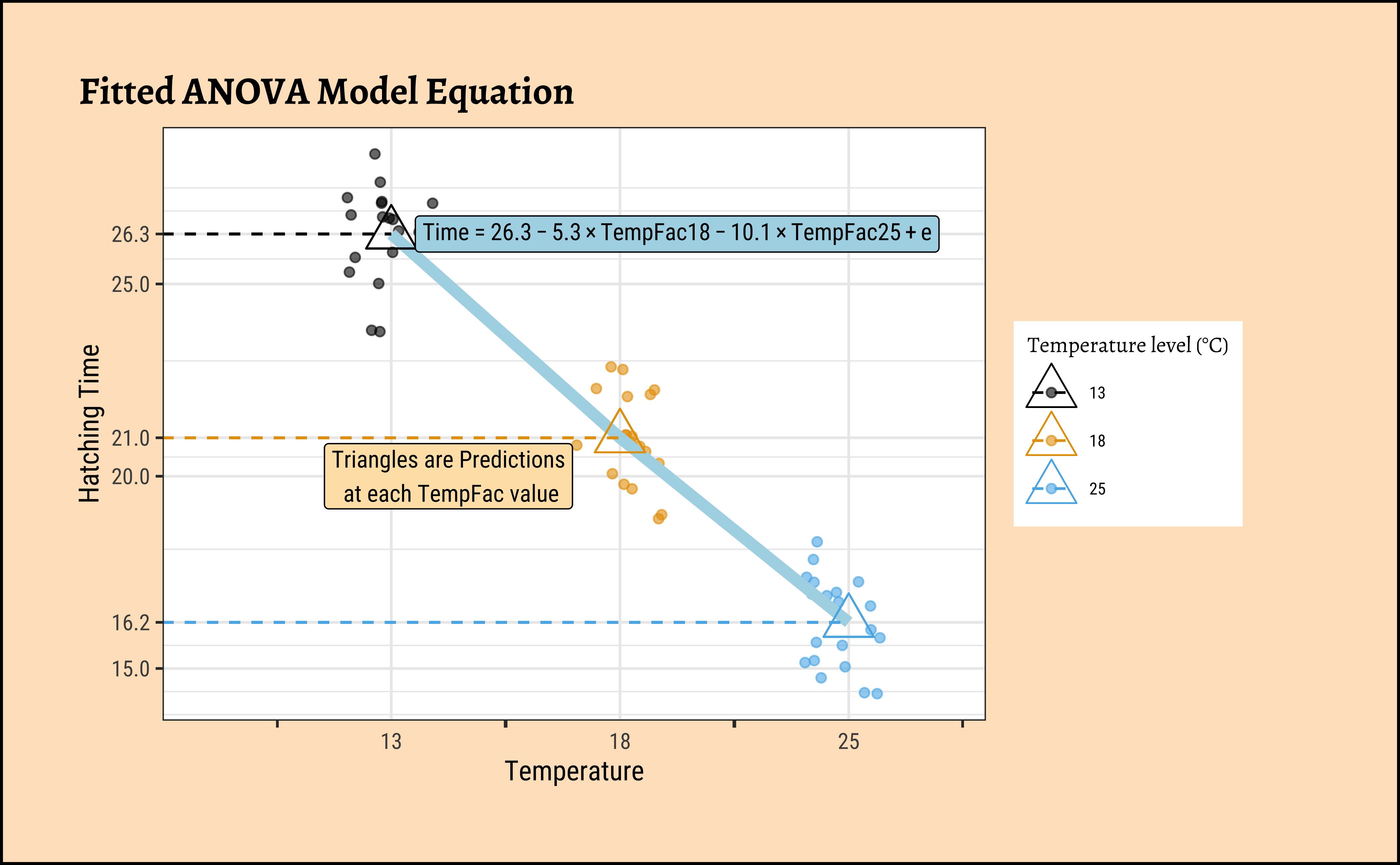
And supernova gives us a nice linear equation relating Hatching_Time to TempFac:
Fitted equation:
Time = 26.3 + -5.3*TempFac18 + -10.1*TempFac25 + e
TempFac18 and TempFac25 are binary {0,1} coded variables, representing the test situation. e is the remaining error. The equation models the means at each value of TempFac.
Code
# https://www.statology.org/r-geom_path-each-group-consists-of-only-one-observation/

## Plot the Equation over the Scatterplot
frogs_long %>%
  mutate(fitted = fitted(frogs_anova)) %>%
  gf_jitter(Time ~ TempFac,
    width = 0.2, alpha = 0.6,
    color = ~TempFac,
    data = .
  ) %>%
  gf_summary(
    group = ~1, # See the reference link above. Damn!!!
    fun = "mean", geom = "line", colour = "lightblue",
    lty = 1, linewidth = 2
  ) %>%
  gf_point(fitted ~ TempFac,
    color = ~TempFac,
    shape = 2,
    size = 6
  ) %>%
  gf_segment(fitted + fitted ~ 0 + TempFac, linetype = 2, color = ~TempFac) %>%
  gf_annotate("label",
    label = TeX(r"($Time = 26.3 - 5.3 \times TempFac18  -10.1 \times TempFac25 + e$)", output = "character"),
    parse = TRUE,
    y = 26.3, x = 2.25,
    size = 3, color = "black", fill = "lightblue"
  ) %>%
  gf_annotate("label",
    label = "Triangles are Predictions\n at each TempFac value", y = 20, x = 1.25,
    size = 3, color = "black", fill = "moccasin"
  ) %>%
  gf_labs(
    title = "Fitted ANOVA Model Equation",
    x = "Temperature", y = "Hatching Time"
  ) %>%
  gf_refine(
    scale_colour_paletteer_d("ggthemes::colorblind"),
    guides(colour = guide_legend(title = "Temperature level (°C)"))
  ) %>%
  gf_refine(
    scale_x_discrete(guide = "prism_bracket"),
    scale_y_continuous(breaks = c(10, 15, (26.3 - 10.1), 20, (26.3 - 5.3), 25, 26.3, 30, 35))
  )
The shapiro.wilk test tests if a vector of numeric data is normally distributed and rejects the hypothesis of normality when the p-value is less than or equal to 0.05.
    Shapiro-Wilk normality test

data:  frogs_long$Time
W = 0.92752, p-value = 0.001561
The p-value is very low and we cannot reject the (alternative) hypothesis that the overall data is not normal. How about *normality at each level of the TempFac factor?
Group-wise Normality
We will use an advanced dplyr technique to do this. We will first group the data by TempFac, then use dplyr::group_modify() to apply the shapiro.test() function to each of these groups. Finally we will use broom::tidy() to convert the output of shapiro.test() into a tidy dataframe. See the code below.
Code
The shapiro.wilk test makes a NULL Hypothesis that the data are normally distributed and estimates the probability that the given data could have happened by chance. Except for TempFac = 18 the p.values are less than 0.05 and we can reject the NULL hypothesis that each of these is normally distributed. Perhaps this is a sign that we need more than 20 samples per factor level. Let there be more frogs !!! இன்னும தவளைகள் வேண்டும்!! !!
We can also check the residuals post-model:
Code
ggplot2::theme_set(new = theme_custom())

frogs_anova$residuals %>%
  as_tibble() %>%
  gf_dhistogram(~value, data = .) %>%
  gf_labs(
    title = "Residuals Histogram",
    x = "Residuals", y = "Count"
  ) %>%
  gf_fitdistr()
##
frogs_anova$residuals %>%
  as_tibble() %>%
  gf_qq(~value, data = .) %>%
  gf_qqstep() %>%
  gf_labs(
    title = "Residuals Q-Q Plot",
    x = "Theoretical Quantiles", y = "Sample Quantiles"
  ) %>%
  gf_qqline()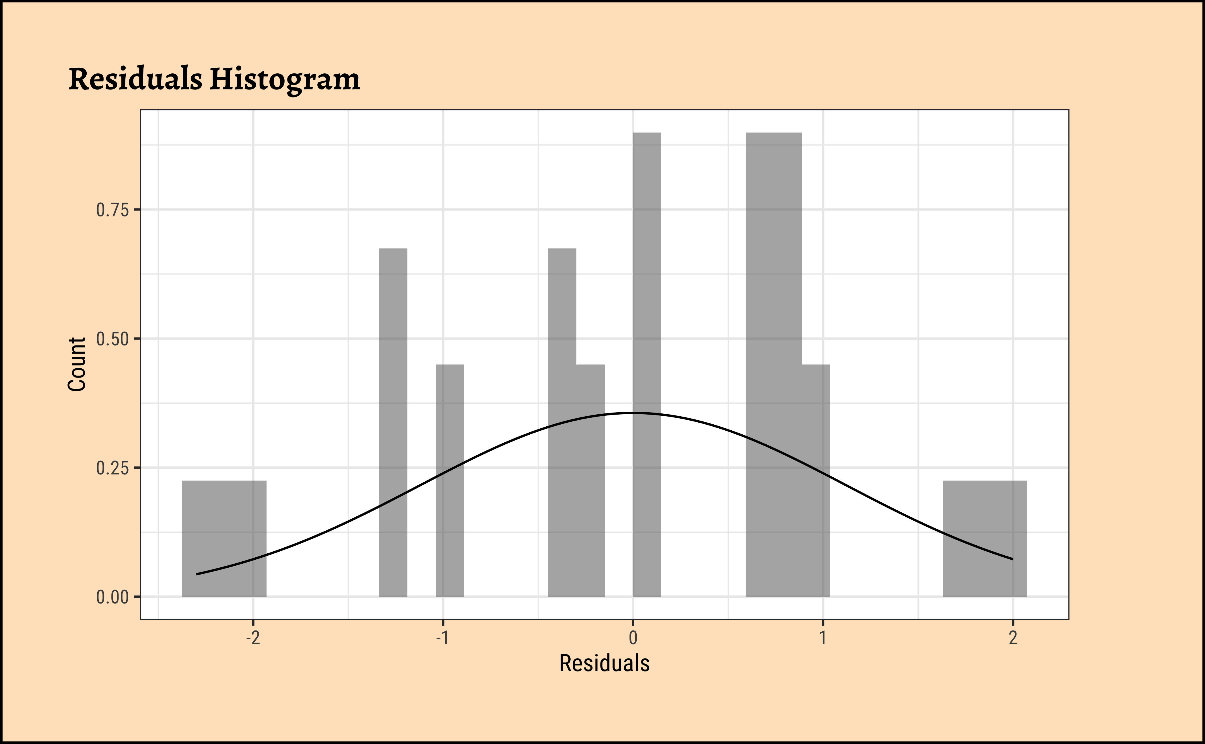
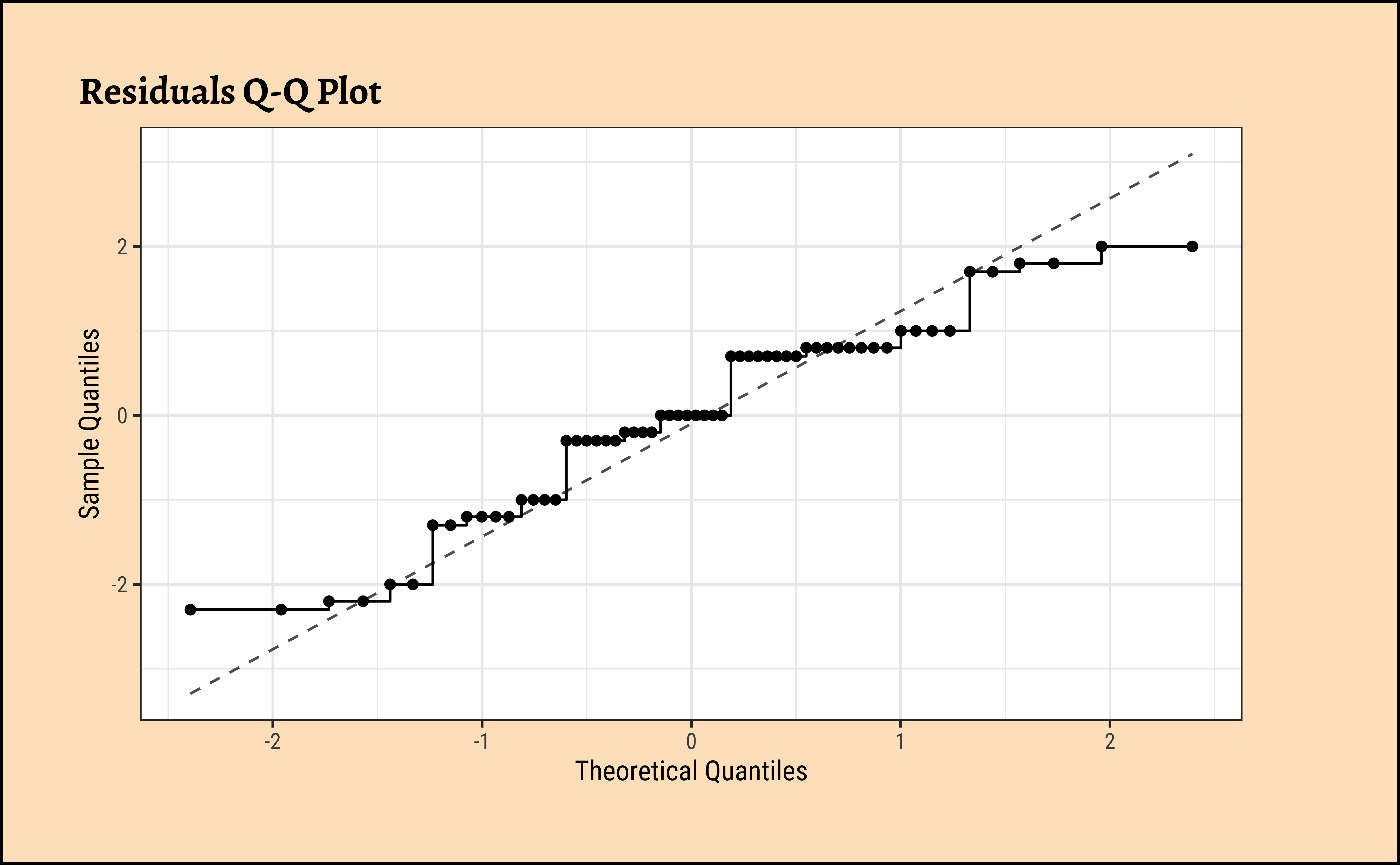
    Shapiro-Wilk normality test

data:  frogs_anova$residuals
W = 0.94814, p-value = 0.01275
Unsurprisingly, the residuals are also not normally distributed either. We really need more samples / observations!! But the differences in means are so large that we can still be confident of the results.
The simplest way to find the actual effect sizes detected by an ANOVA test is something we have already done, with the supernova package: Here is the table and plot again:
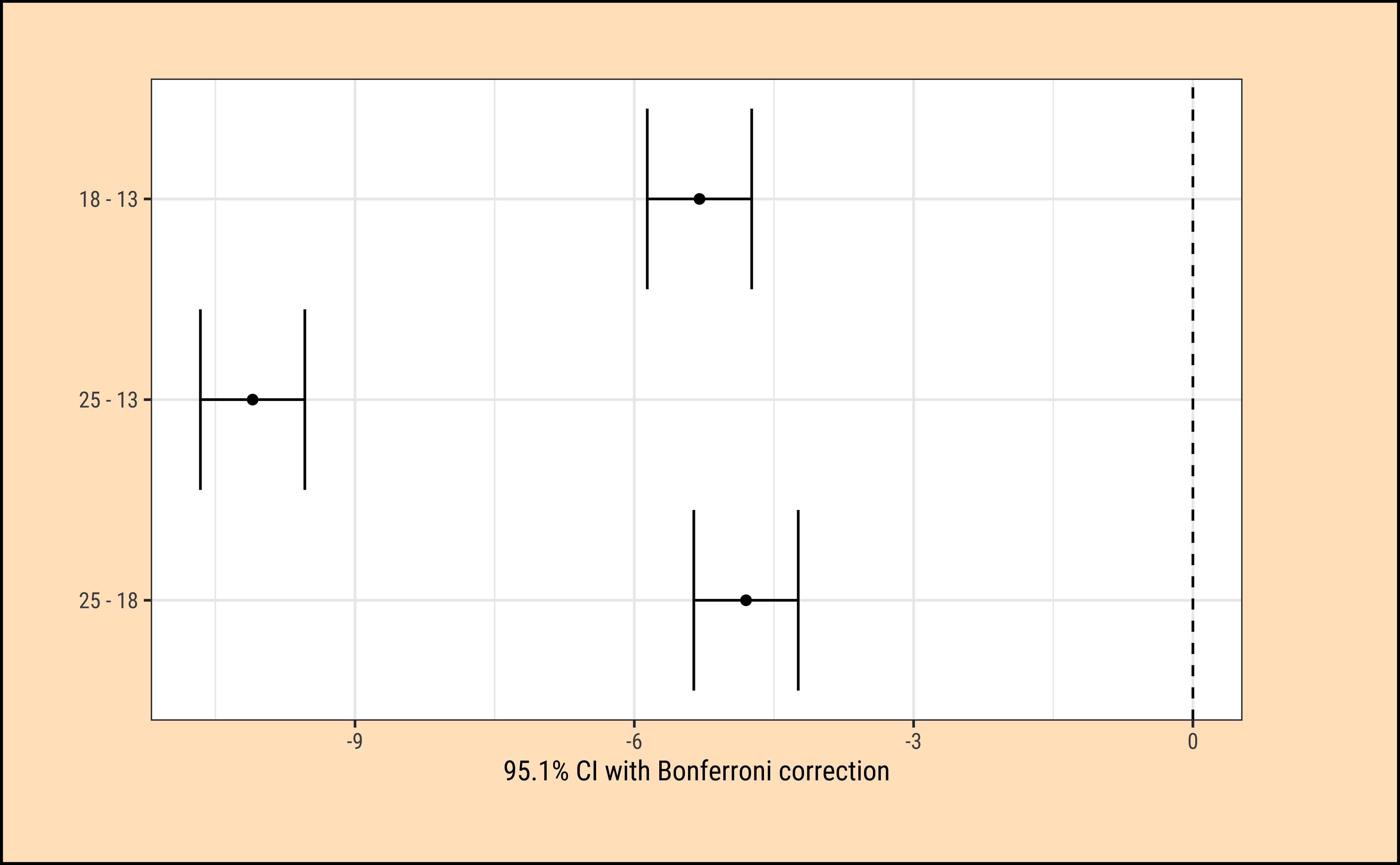
This table, the plot, and the equation we set up earlier all give us the sense of how the TempFac affects Time. The differences are given pair-wise between levels of the Qual factor, TempFac, and the standard error has been declared in pooled fashion (all groups together).
We can also use (paradoxically) the summary.lm() command:
It may take a bit of effort to understand this. First the TempFac is arranged in order of levels, and the mean at the \(TempFac = 13\) is titled Intercept. That is \(26.3\). The other two means for levels \(18\) and \(25\) are stated as differences from this intercept, \(-5.3\) and \(-10.1\) respectively. The p.value for all these effect sizes is well below the desired confidence level of \(0.05\).
Standard Errors
Observe that the std.error for the intercept is \(0.257\) while that for TempFac18 and TempFac25 is \(0.257 \times \sqrt2 = 0.363\) since the latter are differences in means, while the former is a single mean. The Variance of a difference is the sum of the individual variances, which are equal here.
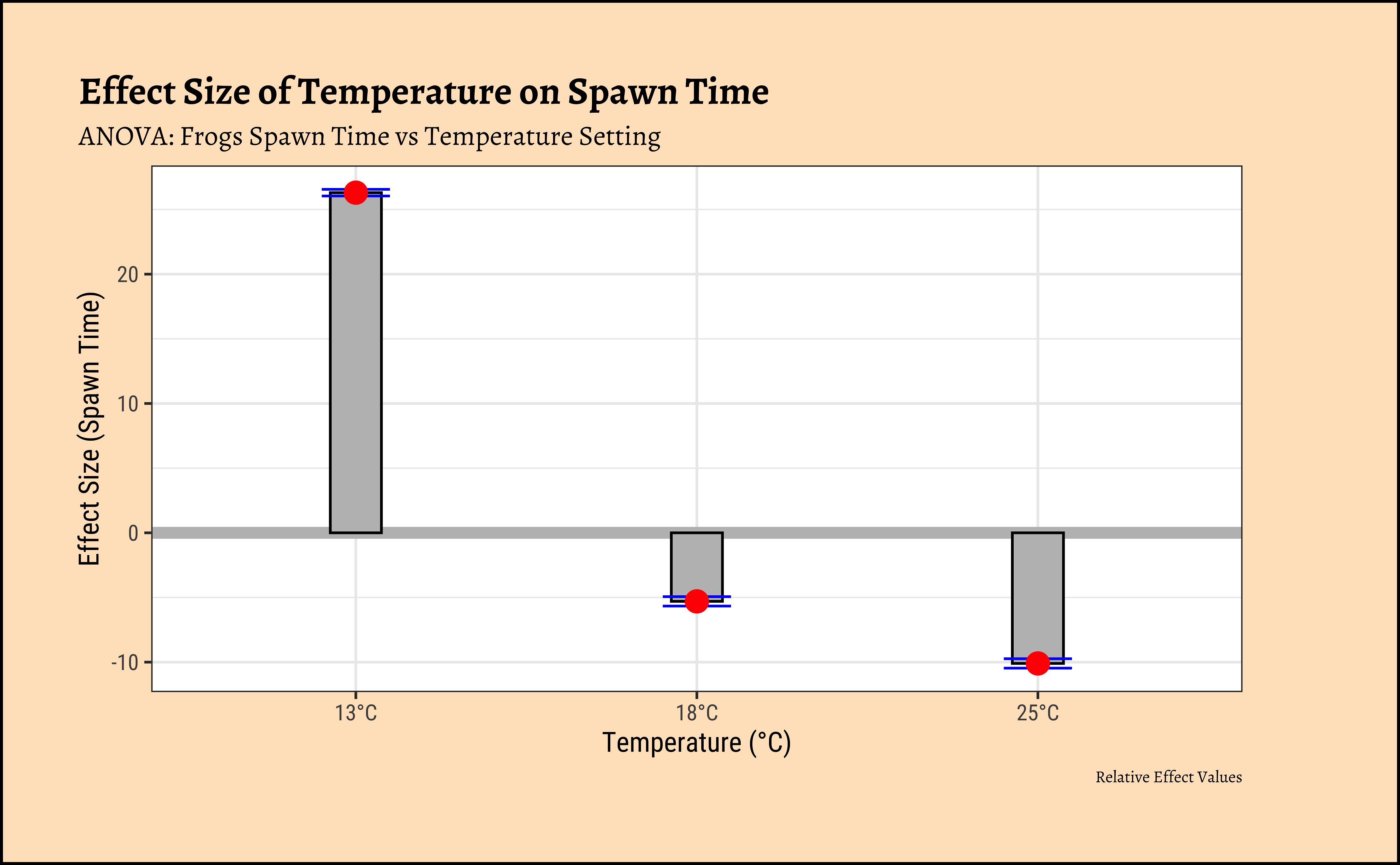
We can easily plot bar-chart with error bars for the effect size:
ggplot2::theme_set(new = theme_custom())

tidy_anova %>%
  mutate(
    hi = estimate + std.error,
    lo = estimate - std.error
  ) %>%
  gf_hline(
    data = ., yintercept = 0,
    colour = "grey",
    linewidth = 2
  ) %>%
  gf_col(estimate ~ term,
    fill = "grey",
    color = "black",
    width = 0.15
  ) %>%
  gf_errorbar(hi + lo ~ term,
    color = "blue",
    width = 0.2
  ) %>%
  gf_point(estimate ~ term,
    color = "red",
    size = 3.5
  ) %>%
  gf_refine(scale_x_discrete("Temperature (°C)",
    labels = c("13°C", "18°C", "25°C")
  )) %>%
  gf_labs(
    title = "Effect Size of Temperature on Spawn Time",
    subtitle = "ANOVA: Frogs Spawn Time vs Temperature Setting",
    caption = "Relative Effect Values",
    x = "Temperature (°C)", y = "Effect Size (Spawn Time)"
  )
If we want an “absolute value” plot for effect size, it needs just a little bit of work:
# Merging group averages with `std.error`
ggplot2::theme_set(new = theme_custom())

frogs_long %>%
  group_by(TempFac) %>%
  summarise(mean = mean(Time)) %>%
  cbind(std.error = tidy_anova$std.error) %>%
  mutate(
    hi = mean + std.error,
    lo = mean - std.error
  ) %>%
  gf_hline(
    data = ., yintercept = 0,
    colour = "grey",
    linewidth = 2
  ) %>%
  gf_col(mean ~ TempFac,
    fill = "grey",
    color = "black", width = 0.15
  ) %>%
  gf_errorbar(hi + lo ~ TempFac,
    color = "blue",
    width = 0.2
  ) %>%
  gf_point(mean ~ TempFac,
    color = "red",
    size = 3.5
  ) %>%
  gf_refine(scale_x_discrete("Temperature (°C)",
    labels = c("13°C", "18°C", "25°C")
  )) %>%
  gf_labs(
    title = "Effect Size of Temperature on Spawn Time",
    subtitle = "ANOVA: Frogs Spawn Time vs Temperature Setting",
    caption = "Absolute Effect Values",
    x = "Temperature (°C)", y = "Effect Size (Spawn Time)"
  )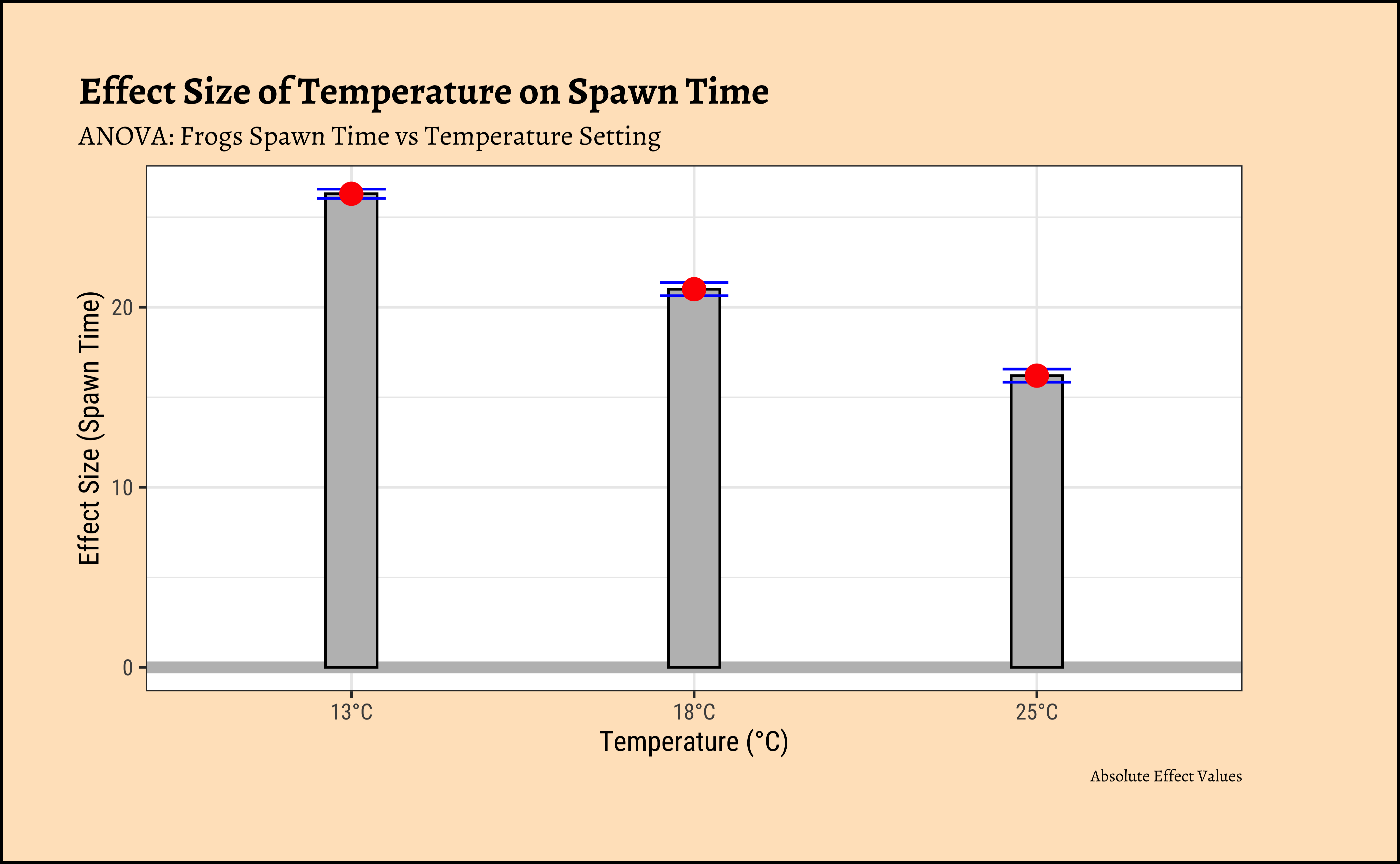
In both graphs, note the difference in the error-bar heights.
The ANOVA test does not tell us that the “treatments” (i.e. levels of TempFac) are equally effective. We need to use a multiple comparison procedure to arrive at an answer to that question. We compute the pair-wise differences in effect-size:
  Tukey multiple comparisons of means
    95% family-wise confidence level

Fit: aov(formula = Time ~ TempFac, data = frogs_long)

$TempFac
       diff        lwr       upr p adj
18-13  -5.3  -6.175224 -4.424776     0
25-13 -10.1 -10.975224 -9.224776     0
25-18  -4.8  -5.675224 -3.924776     0
We see that each of the pairwise differences in effect-size is significant, with p = 0 !
Using other packages : ggstatsplot
There is a very neat package called ggstatsplot1 that allows us to plot very comprehensive statistical graphs. Let us quickly do this:
Code
ggplot2::theme_set(new = theme_custom())

library(ggstatsplot)
frogs_long %>%
  ggstatsplot::ggbetweenstats(
    x = TempFac, y = Time,
    colour = TempFac, alpha = 0.8,
    type = "parametric",
    p.adjust.method = "bonferroni",
    conf.level = 0.95,
    # Remove the violin plots
    violin.args = list(width = 0.0)
  ) +

  scale_colour_paletteer_d("ggthemes::colorblind") +
  labs(
    title = "ANOVA : Frogs Spawn Time vs Temperature Setting",
    x = "Temperature (°C)", y = "Spawn Time (days)",
    subtitle = "", caption = ""
  )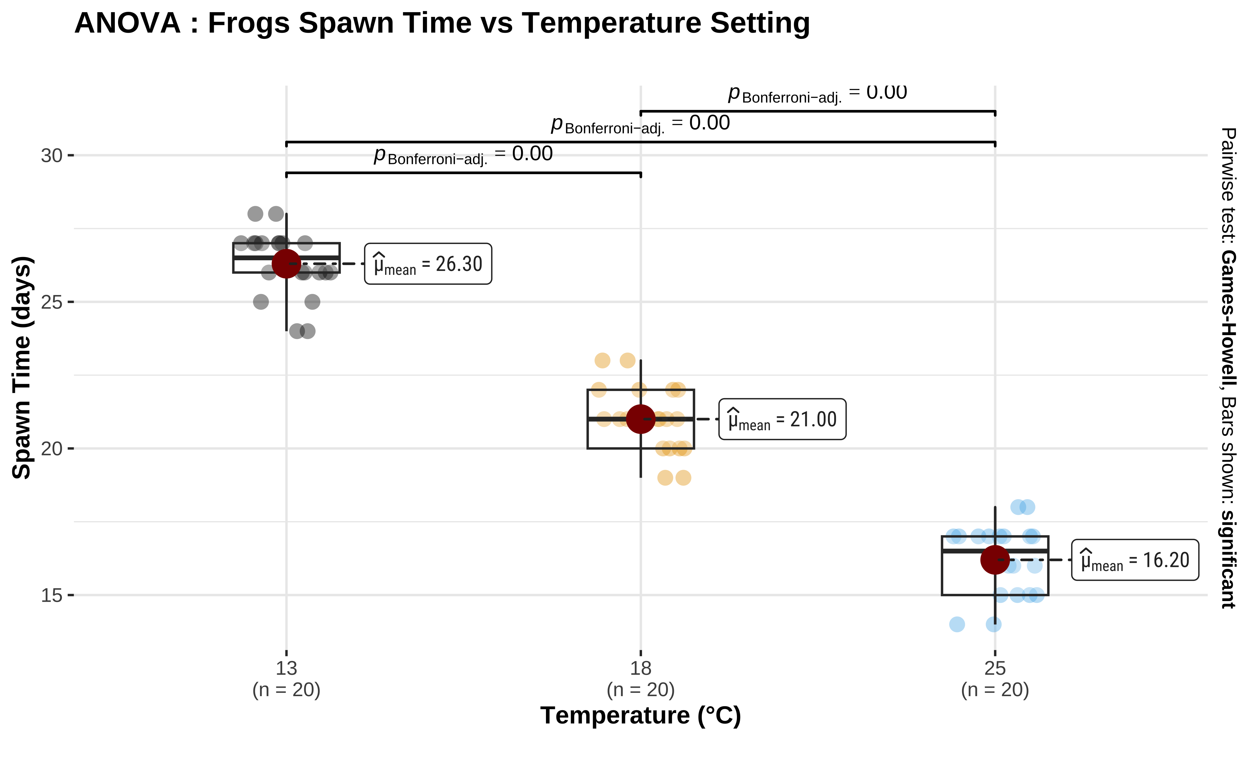
This plot also shows the \(p.value = 0\) for each pairwise comparison, attesting to its significance.
The ggstatsplot package is very useful for quick visualizations of statistical tests.
We wish to establish the significance of the effect size due to each of the levels in TempFac. From the normality tests conducted earlier we see that except at one level of TempFac, the times are are not normally distributed. Hence we opt for a Permutation Test to check for significance of effect.
As remarked in Ernst1, the non-parametric permutation test can be both exact and also intuitively easier for students to grasp.
We proceed with a Permutation Test for TempFac. We shuffle the levels (13, 18, 25) randomly between the Times and repeat the ANOVA test each time and calculate the F-statistic. The Null distribution is the distribution of the F-statistic over the many permutations and the p-value is given by the proportion of times the F-statistic equals or exceeds that observed.
We will use infer to do this: We calculate the observed F-stat with infer, which also has a very direct, if verbose, syntax for doing permutation tests:
We see that the observed F-Statistic is of course \(385.8966\) as before. Now we use infer to generate a NULL distribution using permutation of the factor TempFac:
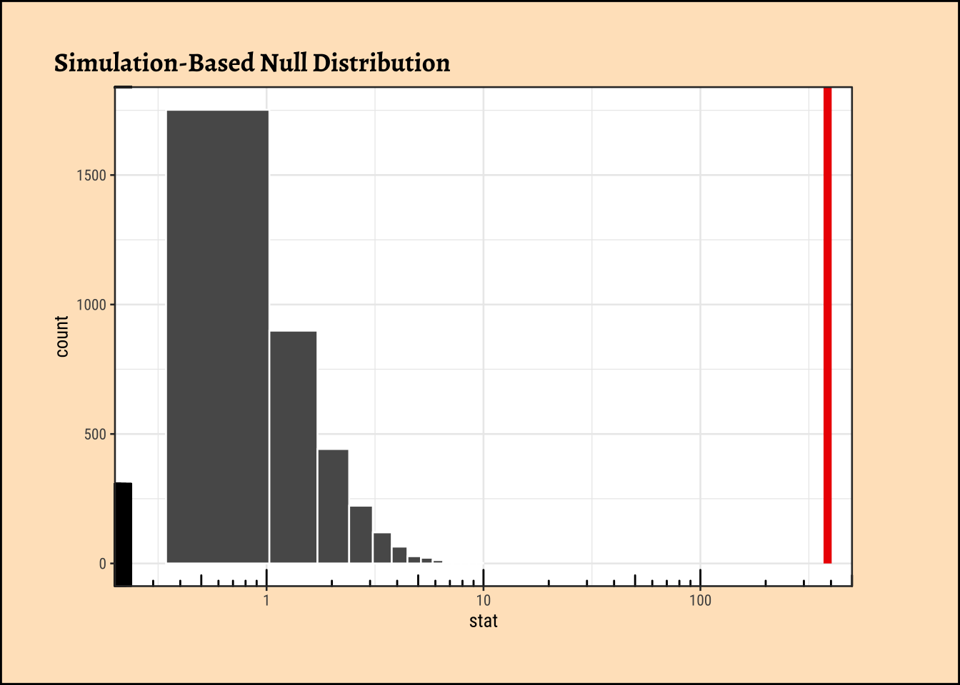
As seen, the infer based permutation test also shows that the permutationally generated F-statistics are nowhere near that which was observed. The effect of TempFac is very strong.
Blake, Adam, Jeff Chrabaszcz, Ji Son, and Jim Stigler. 2026. supernova: Judd, McClelland, & Ryan Formatting for ANOVA Output. https://doi.org/10.32614/CRAN.package.supernova.
Dawson, Charlotte. 2025. ggprism: A “ggplot2” Extension Inspired by “GraphPad Prism”. https://doi.org/10.32614/CRAN.package.ggprism.
Langsrud, Øyvind. 2003. Statistics and Computing 13 (2): 163–67. https://doi.org/10.1023/a:1023260610025.
Patil, Indrajeet. 2021. “Visualizations with statistical details: The ‘ggstatsplot’ approach.” Journal of Open Source Software 6 (61): 3167. https://doi.org/10.21105/joss.03167.
Signorell, Andri. 2025. DescTools: Tools for Descriptive Statistics. https://doi.org/10.32614/CRAN.package.DescTools.
Vanbrabant, Leonard, and Rebecca Kuiper. 2026. restriktor: Restricted Statistical Estimation and Inference for Linear Models. https://doi.org/10.32614/CRAN.package.restriktor.
Wang, Hao. 2026. ggcompare: Mean Comparison in “ggplot2”. https://doi.org/10.32614/CRAN.package.ggcompare.
Wilke, Claus O., and Brenton M. Wiernik. 2022. ggtext: Improved Text Rendering Support for “ggplot2”. https://doi.org/10.32614/CRAN.package.ggtext.