library(tidyverse) # Sine Qua Non
library(mosaic) # Our bag of tricks
library(broom) # Tidying model outputs
library(crosstable) # tabulated summary stats
library(openintro) # datasets and methods
library(resampledata3) # datasets
library(mosaicData) # datasets
library(statsExpressions) # datasets and methods
library(ggstatsplot) # special stats plots
library(ggExtra)

# Non-CRAN Packages
# remotes::install_github("easystats/easystats")
library(easystats)Inference for Correlation
2022-11-25
Plot Fonts and Theme
Code
library(systemfonts)
library(showtext)
## Clean the slate
systemfonts::clear_local_fonts()
systemfonts::clear_registry()
##
showtext_opts(dpi = 96) # set DPI for showtext
sysfonts::font_add(
  family = "Alegreya",
  regular = "../../../../../../fonts/Alegreya-Regular.ttf",
  bold = "../../../../../../fonts/Alegreya-Bold.ttf",
  italic = "../../../../../../fonts/Alegreya-Italic.ttf",
  bolditalic = "../../../../../../fonts/Alegreya-BoldItalic.ttf"
)

sysfonts::font_add(
  family = "Roboto Condensed",
  regular = "../../../../../../fonts/RobotoCondensed-Regular.ttf",
  bold = "../../../../../../fonts/RobotoCondensed-Bold.ttf",
  italic = "../../../../../../fonts/RobotoCondensed-Italic.ttf",
  bolditalic = "../../../../../../fonts/RobotoCondensed-BoldItalic.ttf"
)
showtext_auto(enable = TRUE) # enable showtext
##
theme_custom <- function() {
  theme_bw(base_size = 10) +

    # theme(panel.widths = unit(11, "cm"),
    #       panel.heights = unit(6.79, "cm")) + # Golden Ratio

    theme(
      plot.margin = margin_auto(t = 1, r = 2, b = 1, l = 1, unit = "cm"),
      plot.background = element_rect(
        fill = "bisque",
        colour = "black",
        linewidth = 1
      )
    ) +

    theme_sub_axis(
      title = element_text(
        family = "Roboto Condensed",
        size = 10
      ),
      text = element_text(
        family = "Roboto Condensed",
        size = 8
      )
    ) +

    theme_sub_legend(
      text = element_text(
        family = "Roboto Condensed",
        size = 6
      ),
      title = element_text(
        family = "Alegreya",
        size = 8
      )
    ) +

    theme_sub_plot(
      title = element_text(
        family = "Alegreya",
        size = 14, face = "bold"
      ),
      title.position = "plot",
      subtitle = element_text(
        family = "Alegreya",
        size = 10
      ),
      caption = element_text(
        family = "Alegreya",
        size = 6
      ),
      caption.position = "plot"
    )
}

## Use available fonts in ggplot text geoms too!
ggplot2::update_geom_defaults(geom = "text", new = list(
  family = "Roboto Condensed",
  face = "plain",
  size = 3.5,
  color = "#2b2b2b"
))
ggplot2::update_geom_defaults(geom = "label", new = list(
  family = "Roboto Condensed",
  face = "plain",
  size = 3.5,
  color = "#2b2b2b"
))

ggplot2::update_geom_defaults(geom = "marquee", new = list(
  family = "Roboto Condensed",
  face = "plain",
  size = 3.5,
  color = "#2b2b2b"
))
ggplot2::update_geom_defaults(geom = "text_repel", new = list(
  family = "Roboto Condensed",
  face = "plain",
  size = 3.5,
  color = "#2b2b2b"
))
ggplot2::update_geom_defaults(geom = "label_repel", new = list(
  family = "Roboto Condensed",
  face = "plain",
  size = 3.5,
  color = "#2b2b2b"
))

## Set the theme
ggplot2::theme_set(new = theme_custom())

## tinytable options
options("tinytable_tt_digits" = 2)
options("tinytable_format_num_fmt" = "significant_cell")
options(tinytable_html_mathjax = TRUE)


## Set defaults for flextable
flextable::set_flextable_defaults(font.family = "Roboto Condensed")
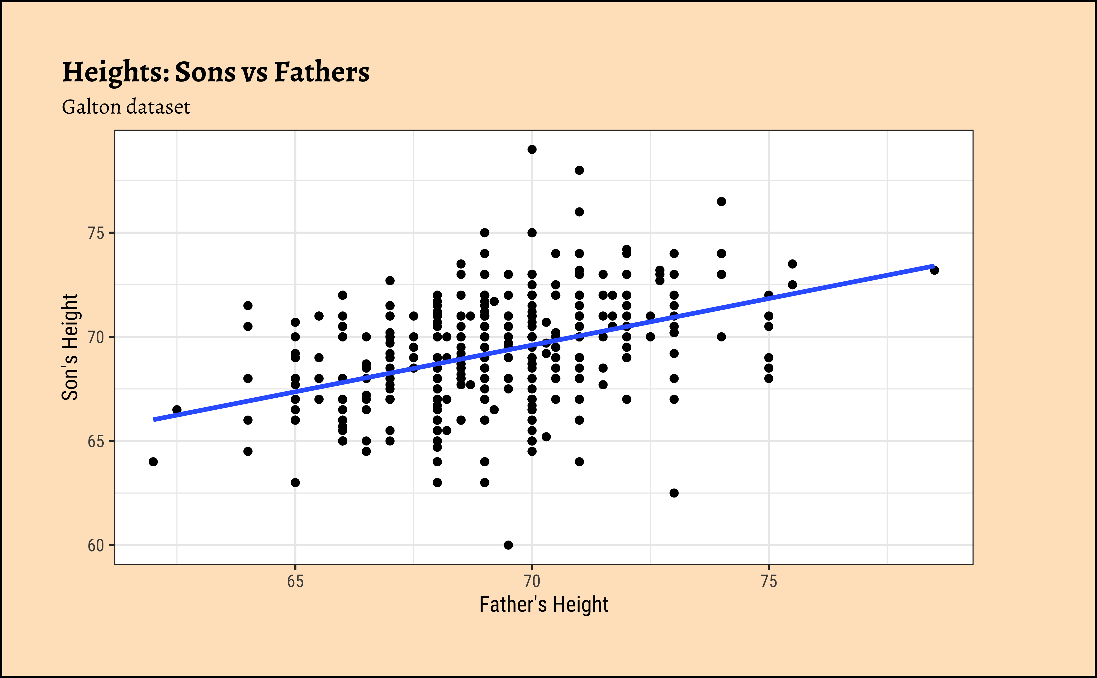
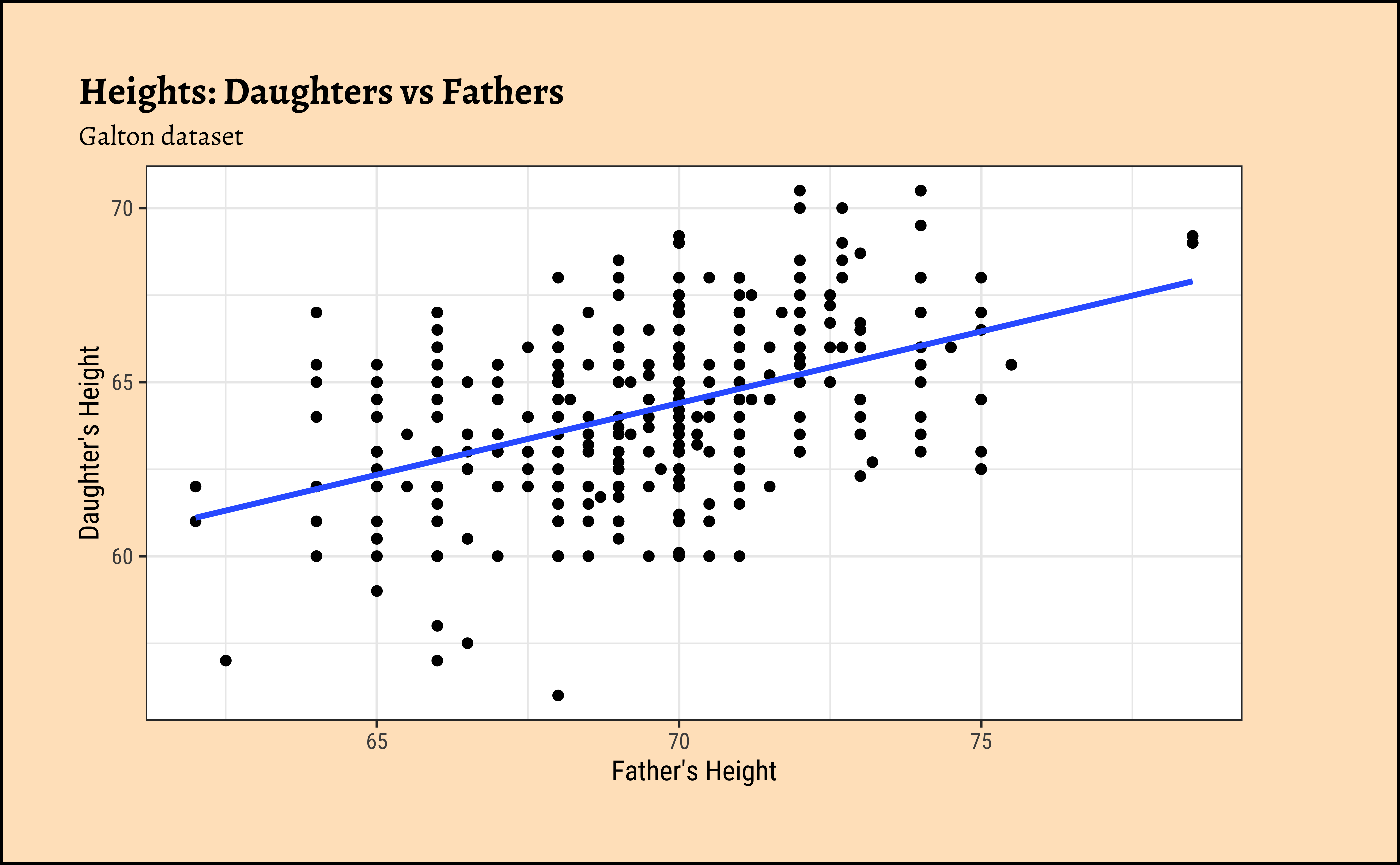
Let us first quickly plot a graph that is relevant to each of the two research questions.
Code
ggplot2::theme_set(new = theme_custom())

Galton_sons %>%
  gf_point(son ~ father) %>%
  gf_lm() %>%
  gf_labs(
    x = "Father's Height", y = "Son's Height",
    title = "Heights: Sons vs Fathers",
    subtitle = "Galton dataset"
  )
##
Galton_daughters %>%
  gf_point(daughter ~ father) %>%
  gf_lm() %>%
  gf_labs(
    x = "Father's Height", y = "Daughter's Height",
    title = "Heights: Daughters vs Fathers",
    subtitle = "Galton dataset"
  )
We might even plot the overall heights together and colour by sex of the child:
ggplot2::theme_set(new = theme_custom())

Galton %>%
  gf_point(height ~ father,
    group = ~sex, colour = ~sex
  ) %>%
  gf_lm() %>%
  gf_refine(scale_color_brewer(palette = "Set1")) %>%
  gf_labs(
    x = "Father's Height", y = "Children's Height",
    title = "Heights: Children vs Fathers",
    subtitle = "Galton dataset"
  )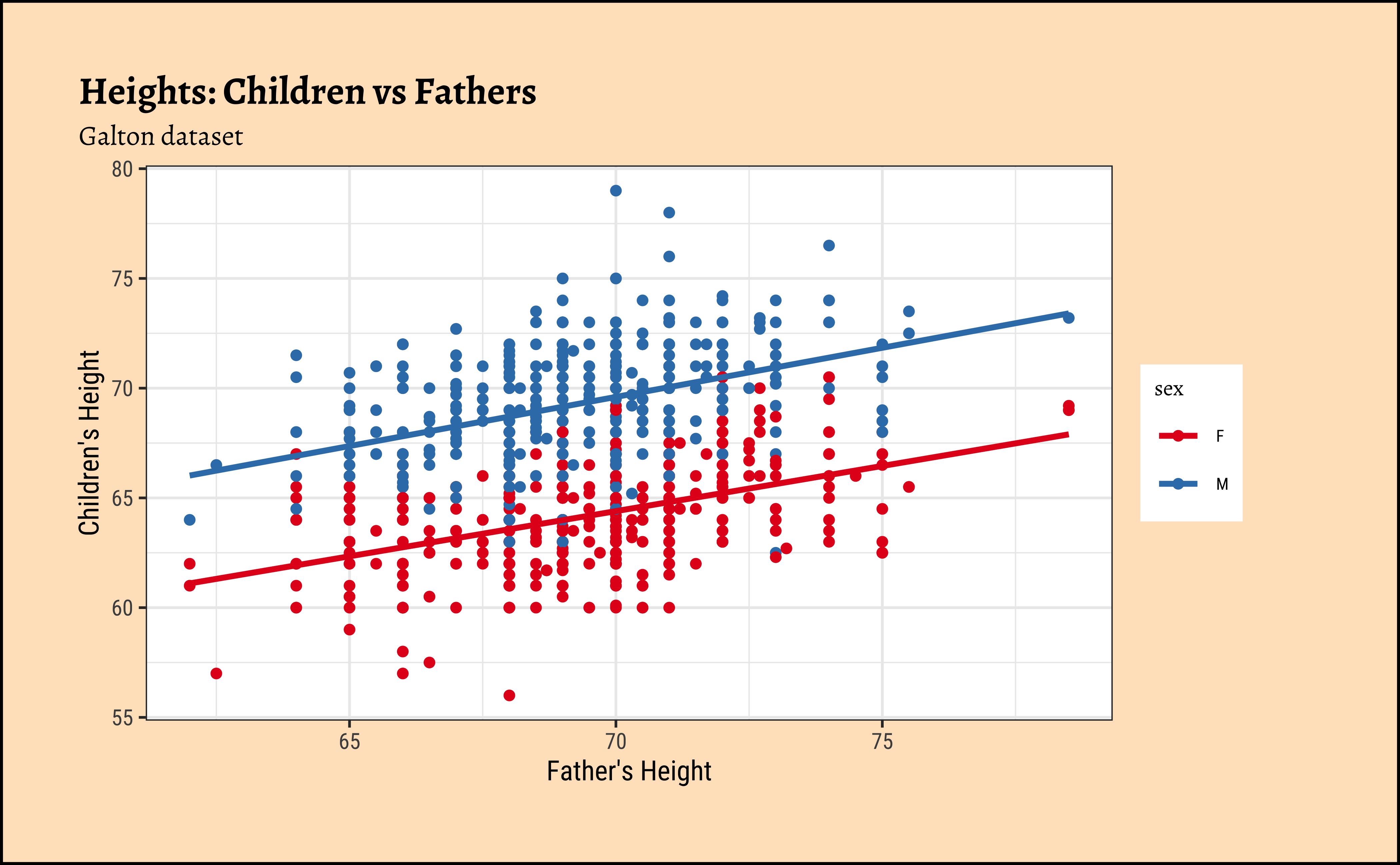
So daughters are shorter than sons, generally speaking, and both sets of heights seem related to that of the father.
For the classical correlation tests, we need that the variables are normally distributed. As before we check this with the shapiro.test:
    Shapiro-Wilk normality test

data:  Galton_sons$father
W = 0.98529, p-value = 0.0001191
    Shapiro-Wilk normality test

data:  Galton_sons$son
W = 0.99135, p-value = 0.008133
    Shapiro-Wilk normality test

data:  Galton_daughters$father
W = 0.98438, p-value = 0.0001297
Shapiro-Wilk normality test
data: Galton_daughters$daughter
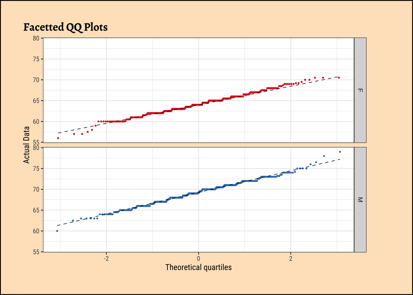
W = 0.99113, p-value = 0.01071Let us also check the densities and quartile plots of the heights in the dataset:
Code
ggplot2::theme_set(new = theme_custom())

Galton %>%
  group_by(sex) %>%
  gf_density(~height,
    group = ~sex,
    fill = ~sex
  ) %>%
  gf_fitdistr(dist = "dnorm") %>%
  gf_refine(scale_fill_brewer(palette = "Set1")) %>%
  gf_facet_grid(vars(sex)) %>%
  gf_labs(title = "Facetted Density Plots") %>%
  gf_theme(legend.position = "none") # Think!
##
Galton %>%
  group_by(sex) %>%
  gf_qq(~height,
    group = ~sex,
    colour = ~sex, size = 0.5
  ) %>%
  gf_qqline(colour = "black") %>%
  gf_refine(scale_color_brewer(palette = "Set1")) %>%
  gf_facet_grid(vars(sex)) %>%
  gf_labs(
    title = "Facetted QQ Plots",
    x = "Theoretical quartiles",
    y = "Actual Data"
  ) %>%
  gf_theme(legend.position = "none") # Think!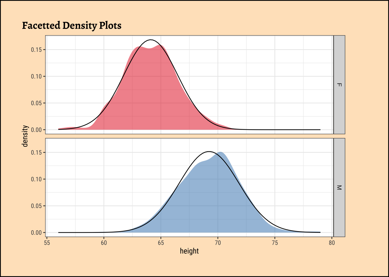
and the father’s heights:
Code
ggplot2::theme_set(new = theme_custom())

Galton %>%
  group_by(sex) %>%
  gf_density(~father,
    group = ~sex, # no this is not weird
    fill = ~sex
  ) %>%
  gf_fitdistr(dist = "dnorm") %>%
  gf_refine(scale_fill_brewer(name = "Sex of Child", palette = "Set1")) %>%
  gf_facet_grid(vars(sex)) %>%
  gf_labs(
    title = "Fathers: Facetted Density Plots",
    subtitle = "By Sex of Child"
  ) %>%
  gf_theme(legend.position = "none") # Think!

Galton %>%
  group_by(sex) %>%
  gf_qq(~father,
    group = ~sex, # no this is not weird
    colour = ~sex, size = 0.5
  ) %>%
  gf_qqline(colour = "black") %>%
  gf_facet_grid(vars(sex)) %>%
  gf_refine(scale_colour_brewer(name = "Sex of Child", palette = "Set1")) %>%
  gf_labs(
    title = "Fathers Heights: Facetted QQ Plots",
    subtitle = "By Sex of Child",
    x = "Theoretical quartiles",
    y = "Actual Data"
  ) %>%
  gf_theme(legend.position = "none") # Think!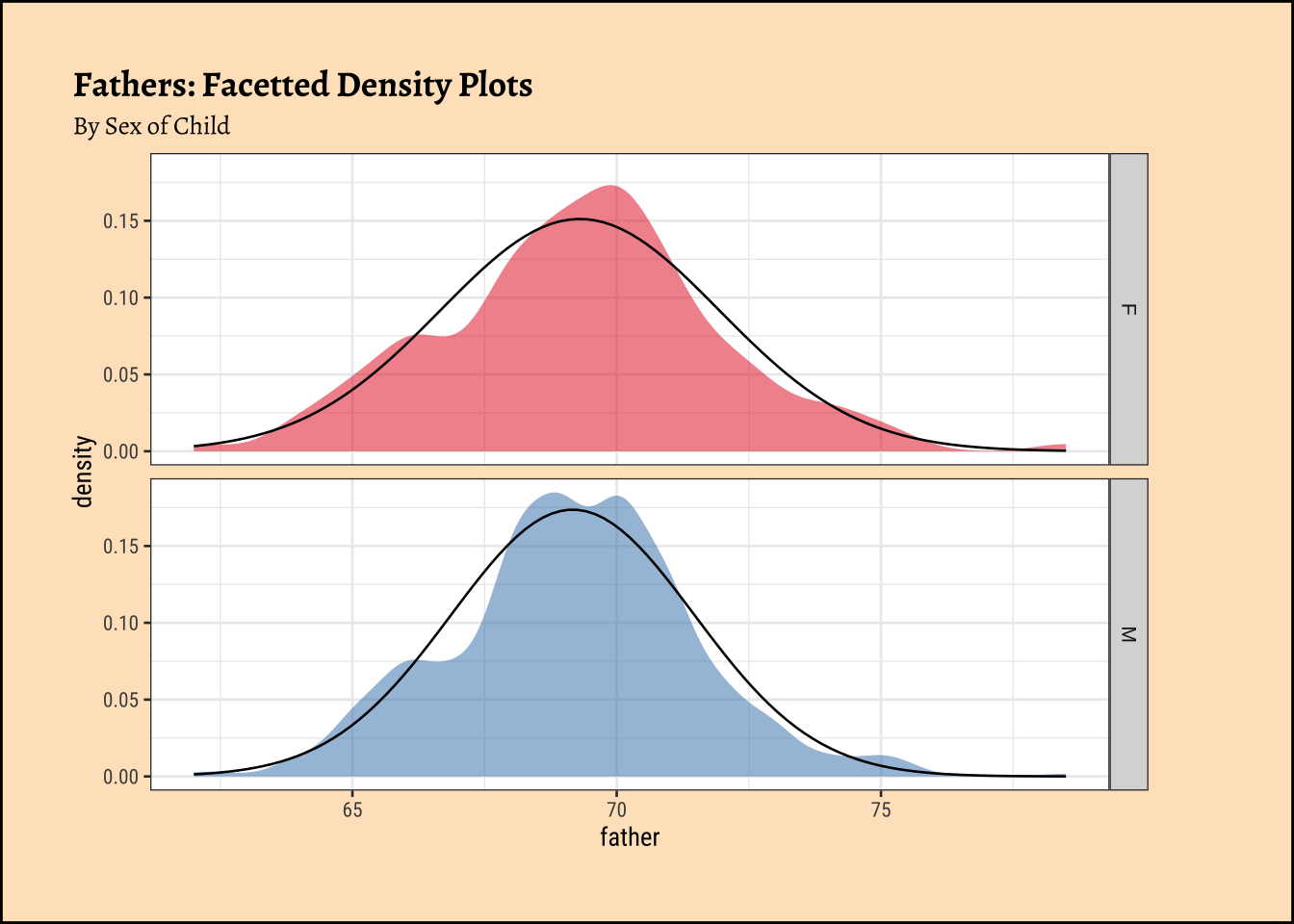
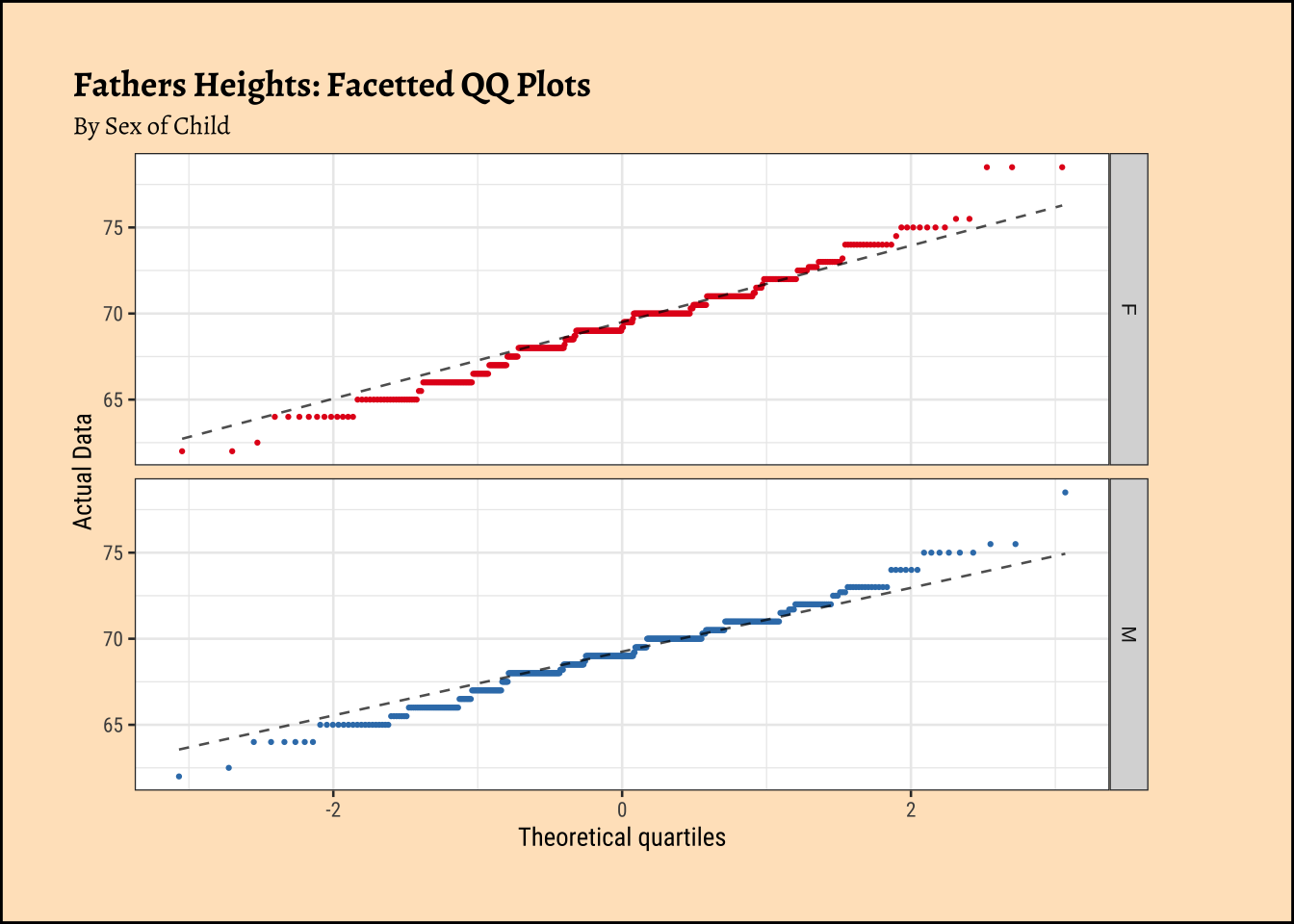
The shapiro.test informs us that the child-related height variables are not normally distributed; though visually there seems nothing much to complain about. Hmmm…
Dads are weird anyway, so we must not expect father heights to be normally distributed.
Let us now see how Correlation Tests can be performed based on this dataset, to infer patterns in the population from which this dataset/sample was drawn.
We will go with classical tests first, and then set up a permutation test that does not need any assumptions.
We perform the Pearson correlation test first: the data is not normal so we cannot really use this. We should use a non-parametric correlation test as well, using a Spearman correlation.
Both tests state that the correlation between son and father is significant.
Again both tests state that the correlation between daughter and father is significant.
What is happening under the hood in cor.test?
Given that the correlation coefficient \(r\) is a measure of the linear relationship between two variables, we can test its significance using a t-test. The formula for the t-value in a correlation test is derived from the relationship between the correlation coefficient and the t-distribution.
The formula for the t-value is given by: \[t = \frac{r \sqrt{n - 2}}{\sqrt{1 - r^2}} \tag{2}\] where:
- \(t\) is the t-statistic,
- \(r\) is the Pearson correlation coefficient,
- \(n\) is the number of paired observations (sample size).
- The degrees of freedom for this t-test is \(df = n - 2\).
The derivation of this t-statistic stems from the fact that the correlation coefficient can be expressed in terms of the slope of the regression line when one variable is regressed on the other. The t-test essentially tests whether the slope of this regression line is significantly different from zero, which would indicate a significant linear relationship between the two variables.
OK, if you like, you can stop here! But for you intrepid, beamish people who possess vorpal swords, here come the Dragons!!
In Linear Regression, we saw that the F-statistic is a ratio of variances, and that it follows an F-distribution. How does this relate to correlation?
- In regression we have a target variable (sons’
heights) and a predictor variable (fathers` heights), same as with our present study of correlation. - We look at how much one variable explains, or reduces the variance the other
- i.e. How much the variance of the target variable (sons’
heights) is reduced by the fact that we know the value(s) of a predictor variable (fathers` heights). - Our measure of how well this reduction is happening is a ratio: a ratio of variances, also denoted as \(r^2\), i.e. the square of the correlation coefficient.
- We take the variance of the target variable, and the variance of the target variable after we have accounted for the predictor variable.
- The ratio of variances follows an
F-distributionwith appropriate degrees of freedom - This gives us our
F-value, computed from our data.- We compare our computed
F-valuewith the critical F-valueF-critfor a probability of error of \(5\%\), given by theF-distributionwith appropriate degrees of freedom. - If our
F-valueis well aboveF_crit, we state there is there very low probability (i.e.p-value) that this reduction happened simply by change and accept the hypothesis that there is significant correlation between the two variables.
- We compare our computed
- We relate the idea of Regression to Correlation by noting that the
t-valuefor correlation must be simply the square root of theF-valuefor regression, since theF-distributionis for \(r^2\) and thet-distributionis for \(r\).
A Distribution for a Variance-Ratio??
Why does the variance-ratio have a distribution??? The two variances appear to be single numbers !!! Is there anything that is not random in statistics?
- Remember, we treat our data as a sample from a population, in order to estimate the
regression slopefor the population. - The sample is random, and hence the variance of the sample is also random.
- If we took another sample, we would get a different variance.
- So the variance of a sample is a random variable, and hence the ratio-of-variances also has a distribution. Phew!
The F-statistic and its Distribution
Why does the ratio-of-variances have an F-distribution?
- In our case, our residuals (deviations from the means) are assumed to be normal.
- The variance calculation squares these normally-distributed residuals, leading to a chi-square distribution for the individual variances.
- The ratio of these two independent chi-squared variables, each divided by their respective degrees of freedom, follows an F-distribution.
- This is a fundamental result in statistics that underpins the use of the F-test in statistical analysis.
To derive the formula for the t-value in a correlation test, starting with a ratio of variances, we need to focus on the t-test for the significance of the Pearson correlation coefficient. The t-value assesses whether the observed correlation coefficient \(r\) is significantly different from zero. Let’s proceed step-by-step, connecting the t-test to variances and ensuring a clear derivation.
Step 1: Understanding the Pearson Correlation Coefficient
The Pearson correlation coefficient \(r\) measures the linear relationship between two variables \(X\) and \(Y\). It is defined as:
\[ \begin{equation} \begin{split} r &= \frac{\text{Cov}(X, Y)}{\sqrt{\text{Var}(X) \text{Var}(Y)}}\\ &= \frac{\sum (x_i - \bar{x})(y_i - \bar{y}) / (n-1)}{\sqrt{\left( \sum (x_i - \bar{x})^2 / (n-1) \right) \left( \sum (y_i - \bar{y})^2 / (n-1) \right)}} \end{split} \end{equation} \] where:
\(\text{Cov}(X, Y)\) is the covariance of \(X\) and \(Y\), \(\text{Var}(X)\) and \(\text{Var}(Y)\) are the variances of \(X\) and \(Y\), \(x_i\) and \(y_i\) are the data points, \(\bar{x}\) and \(\bar{y}\) are the means, \(n\) is the sample size.
Simplifying, we get: \[r = \frac{\sum (x_i - \bar{x})(y_i - \bar{y})}{\sqrt{\sum (x_i - \bar{x})^2 \sum (y_i - \bar{y})^2}}\]
This formula shows \(r\) as a standardized measure of covariance relative to the product of standard deviations (square roots of variances).
Step 2: Hypothesis Testing for Correlation
To test whether the correlation is significantly different from zero, we use a t-test. The null hypothesis (\(H_0\)) is that the population correlation coefficient \(\rho = 0\), and the alternative hypothesis (\(H_a\)) is \(\rho \neq 0\) (for a two-tailed test). The t-statistic for testing the significance of \(r\) is commonly given as:
\[t = \frac{r \sqrt{n - 2}}{\sqrt{1 - r^2}} \tag{3}\]
This t-statistic follows a t-distribution with \(n - 2\) degrees of freedom under the null hypothesis. Our goal is to derive this formula, starting from a perspective involving variances.
Step 3: Connecting to Variances via Linear Regression
The t-test for the correlation coefficient is closely related to the t-test for the slope of a linear regression model. Suppose we regress \(Y\) on \(X\): \[Y = \beta_0 + \beta_1 X + \epsilon\] The slope \(\beta_1\) estimates the change in \(Y\) per unit change in \(X\). The sample slope \(\beta_1\) is: \[\beta_1 = \frac{\text{Cov}(X, Y)}{\text{Var}(X)} = \frac{\sum (x_i - \bar{x})(y_i - \bar{y})}{\sum (x_i - \bar{x})^2}\] Notice the relationship between \(b_1\) and \(r\). Since: \[r = \frac{\text{Cov}(X, Y)}{\sqrt{\text{Var}(X) \text{Var}(Y)}}\]
We can express the covariance as: \[\text{Cov}(X, Y) = r \sqrt{\text{Var}(X) \text{Var}(Y)}\] So: \[ \beta_1 = \frac{r \sqrt{\text{Var}(X) \text{Var}(Y)}}{\text{Var}(X)} = r \sqrt{\frac{\text{Var}(Y)}{\text{Var}(X)}} = r \frac{s_y}{s_x} \tag{4}\]
where \(s_x = \sqrt{\text{Var}(X)} = \sqrt{\sum (x_i - \bar{x})^2 / (n-1)}\) and \(s_y = \sqrt{\text{Var}(Y)}\) are the sample standard deviations.
Step 4: t-Test for the Regression Slope
To test \(H_0: \beta_1 = 0\), we use the t-statistic for the slope:
\[t = \frac{\beta_1}{\text{SE}(\beta_1)}\] where \(\text{SE}(\beta_1)\) is the standard error of the slope. The variance of the slope estimate is derived from the regression model. Assuming the errors \(\epsilon\) are normally distributed with variance \(\sigma^2\), the variance of \(\beta_1\) is:
\[\text{Var}(\beta_1) = \frac{\sigma^2}{\sum (x_i - \bar{x})^2}\] The standard error is: \[\text{SE}(b_1) = \sqrt{\frac{\sigma^2}{\sum (x_i - \bar{x})^2}}\] Since \(\sigma^2\) is unknown, we estimate it with the residual variance \(s^2\): \[s^2 = \frac{\sum (y_i - \hat{y}_i)^2}{n - 2}\] where \(\hat{y}_i = \bar{y} + b_1 (x_i - \bar{x})\) are the fitted values, and \(n - 2\) accounts for the degrees of freedom (two parameters estimated: \(\beta_0\) and \(\beta_1\)). Thus: \[\text{SE}(b_1) = \frac{s}{\sqrt{\sum (x_i - \bar{x})^2}}\] So the t-statistic is:
\[t = \frac{\beta_1 \sqrt{\sum (x_i - \bar{x})^2}}{s}\]
Step 5: Relating the Residual Variance to \(r\)
The residual sum of squares is: \[\sum (y_i - \hat{y}_i)^2 = \sum (y_i - \bar{y} - b_1 (x_i - \bar{x}))^2\]
To connect this to \(r\), consider the proportion of variance explained by the regression. The coefficient of determination \(r^2\) (for simple linear regression, this is the square of the correlation coefficient) is: \[r^2 = \frac{\text{SSR}}{\text{SST}} = 1 - \frac{\text{SSE}}{\text{SST}}\] where:
- \(\text{SSR} = \sum (\hat{y}_i - \bar{y})^2\) (sum of squares due to regression),
- \(\text{SSE} = \sum (y_i - \hat{y}_i)^2\) (sum of squares of errors),
- \(\text{SST} = \sum (y_i - \bar{y})^2\) (total sum of squares).
Since \(\hat{y}_i - \bar{y} = \beta_1 (x_i - \bar{x})\), we have:
\[\text{SSR} = \sum (\beta_1 (x_i - \bar{x}))^2 = \beta_1^2 \sum (x_i - \bar{x})^2\]
Substitute \(\beta_1 = r \frac{s_y}{s_x}\):
\[\beta_1^2 = r^2 \frac{s_y^2}{s_x^2} = r^2 \frac{\sum (y_i - \bar{y})^2 / (n-1)}{\sum (x_i - \bar{x})^2 / (n-1)} = r^2 \frac{\sum (y_i - \bar{y})^2}{\sum (x_i - \bar{x})^2}\]
So: \[\text{SSR} = r^2 \frac{\sum (y_i - \bar{y})^2}{\sum (x_i - \bar{x})^2} \cdot \sum (x_i - \bar{x})^2 = r^2 \sum (y_i - \bar{y})^2\] Thus: \[r^2 = \frac{\text{SSR}}{\text{SST}} = \frac{r^2 \sum (y_i - \bar{y})^2}{\sum (y_i - \bar{y})^2} = r^2\]
This confirms consistency. Now, the residual sum of squares is: \[\text{SSE} = \text{SST} (1 - r^2) = (1 - r^2) \sum (y_i - \bar{y})^2\]
The residual variance is: \[s^2 = \frac{\text{SSE}}{n - 2} = \frac{(1 - r^2) \sum (y_i - \bar{y})^2}{n - 2}\] So: \[s = \sqrt{\frac{(1 - r^2) \sum (y_i - \bar{y})^2}{n - 2}}\]
Step 6: Substitute into the t-Statistic
Recall: \[t = \frac{\beta_1 \sqrt{\sum (x_i - \bar{x})^2}}{s}\]
Substitute \(\beta_1 = r \frac{s_y}{s_x}\), where \(s_y = \sqrt{\sum (y_i - \bar{y})^2 / (n-1)}\), \(s_x = \sqrt{\sum (x_i - \bar{x})^2 / (n-1)}\):
\[\beta_1 = r \frac{\sqrt{\sum (y_i - \bar{y})^2 / (n-1)}}{\sqrt{\sum (x_i - \bar{x})^2 / (n-1)}} = r \sqrt{\frac{\sum (y_i - \bar{y})^2}{\sum (x_i - \bar{x})^2}}\]
Now compute: \[\beta_1 \sqrt{\sum (x_i - \bar{x})^2} = r \sqrt{\frac{\sum (y_i - \bar{y})^2}{\sum (x_i - \bar{x})^2}} \cdot \sqrt{\sum (x_i - \bar{x})^2} = r \sqrt{\sum (y_i - \bar{y})^2}\]
The standard error term involves: \[s = \sqrt{\frac{(1 - r^2) \sum (y_i - \bar{y})^2}{n - 2}}\]
So: \[t = \frac{r \sqrt{\sum (y_i - \bar{y})^2}}{\sqrt{\frac{(1 - r^2) \sum (y_i - \bar{y})^2}{n - 2}}} = \frac{r \sqrt{\sum (y_i - \bar{y})^2} \cdot \sqrt{n - 2}}{\sqrt{(1 - r^2) \sum (y_i - \bar{y})^2}}\]
The \(\sqrt{\sum (y_i - \bar{y})^2}\) terms cancel out: \[t = \frac{r \sqrt{n - 2}}{\sqrt{1 - r^2}}\]
Step 7: Linking to Ratio of Variances
Our inquiry started with a “ratio of variances.” In the context of the t-test, the t-statistic can be interpreted through the lens of explained versus unexplained variance. From the regression perspective: \[r^2 = \frac{\text{SSR}}{\text{SST}} = \frac{\text{Explained Variance}}{\text{Total Variance}}\] The unexplained variance is: \[1 - r^2 = \frac{\text{SSE}}{\text{SST}}\] The t-statistic can be related to the F-statistic for regression, where: \[F = \frac{\text{SSR}/1}{\text{SSE}/(n-2)} = \frac{r^2 / 1}{(1 - r^2)/(n-2)}\] For simple linear regression, the t-statistic for the slope is the square root of the F-statistic: \[t^2 = F\] Let’s compute: \[F = \frac{r^2 (n - 2)}{1 - r^2}\] \[t = \sqrt{F} = \sqrt{\frac{r^2 (n - 2)}{1 - r^2}} = \frac{r \sqrt{n - 2}}{\sqrt{1 - r^2}}\] This matches our derived t-statistic, confirming that the ratio of explained to unexplained variance underpins the test.
Summary
The t-value for testing the significance of the Pearson correlation coefficient \(r\), derived from the perspective of variances in a regression framework, is:
\[t = \frac{r \sqrt{n - 2}}{\sqrt{1 - r^2}}\] This formula arises from the ratio of explained to unexplained variance in the regression model, where \(r^2\) represents the proportion of variance in \(Y\) explained by \(X\), and \(1 - r^2\) represents the unexplained variance, adjusted by the degrees of freedom \(n - 2\).
\[\Large{\boxed{t = \frac{r \sqrt{n - 2}}{\sqrt{1 - r^2}}}}\]
On to the computations!
< WORK IN PROGRESS >
A. Data Dimensions
[1] 465 6Sons Data: n = 465
B. Variances
[1] 6.925288Variance of Sons’ Heights
B. Variances
[1] 5.289674Variance of Fathers’ Heights
C. Covariance
[1] 2.368441Covariance of Sons’ and Fathers’ Heights
E. Estimate
[1] 0.3913174Correlation Estimate for Sons
F. t-statistics
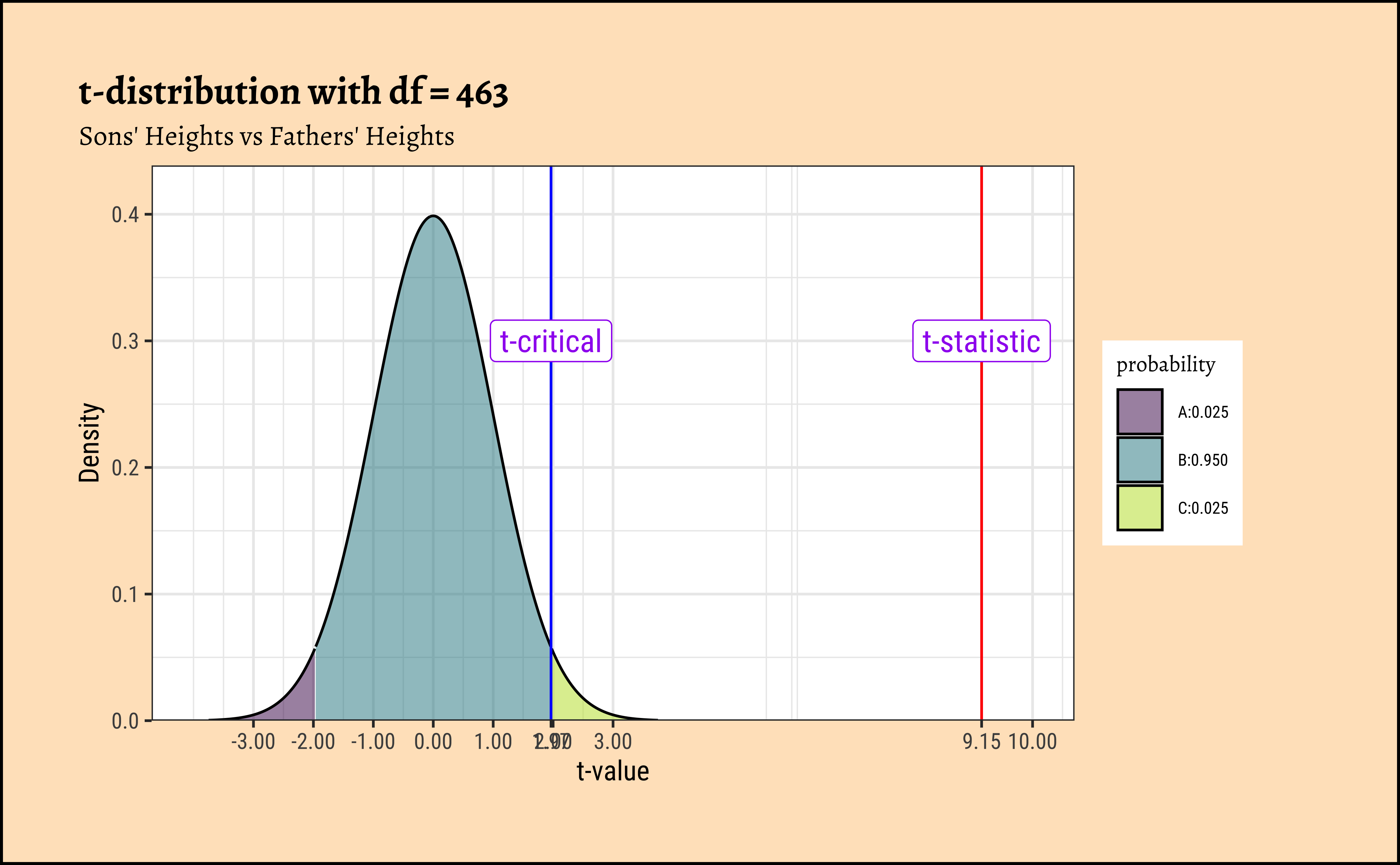
We can now compute the t-statistic using the formula: \[
t_{statistic} = \frac{r \sqrt{n - 2}}{\sqrt{1 - r^2}}
\] We can look up the critical value of t from the t-distribution with \(df = 463\) at a probability of error of \(5\%\):
[1] 9.149788F statistic for Sons
[1] 1.965101Critical t value for Sons
G. p-value
Finally we can compute the p-value for this t-statistic:
We see that the p-value is very small, and we can reject the null hypothesis of “no correlation” between son and father heights.
H. Plotting the t-distribution
Code
mosaic::xqt(
p = c(0.025, 0.975), df = 463,
return = c("plot"), alpha = 0.5,
pattern = "rings",
colour = "black", system = "gg"
) %>%
gf_vline(xintercept = t_statistic, color = "red") %>%
gf_vline(xintercept = t_critical, color = "blue") %>%
gf_annotate(
geom = "label", x = t_statistic, y = 0.3,
label = "t-statistic", colour = "purple", size = 4
) %>%
gf_annotate(
geom = "label", x = t_critical, y = 0.3,
label = "t-critical", colour = "purple", size = 4
) %>%
gf_labs(
title = "t-distribution with df = 463",
subtitle = "Sons' Heights vs Fathers' Heights",
x = "t-value", y = "Density"
) %>%
gf_refine(
scale_y_continuous(expand = expansion(mult = c(0, 0.1))),
scale_x_continuous(
breaks = c(-3, -2, -1, 0, 1, 2, 3, t_statistic, t_critical, 10),
limits = c(-4, 10),
labels = scales::number_format(accuracy = 0.01)
)
)
###
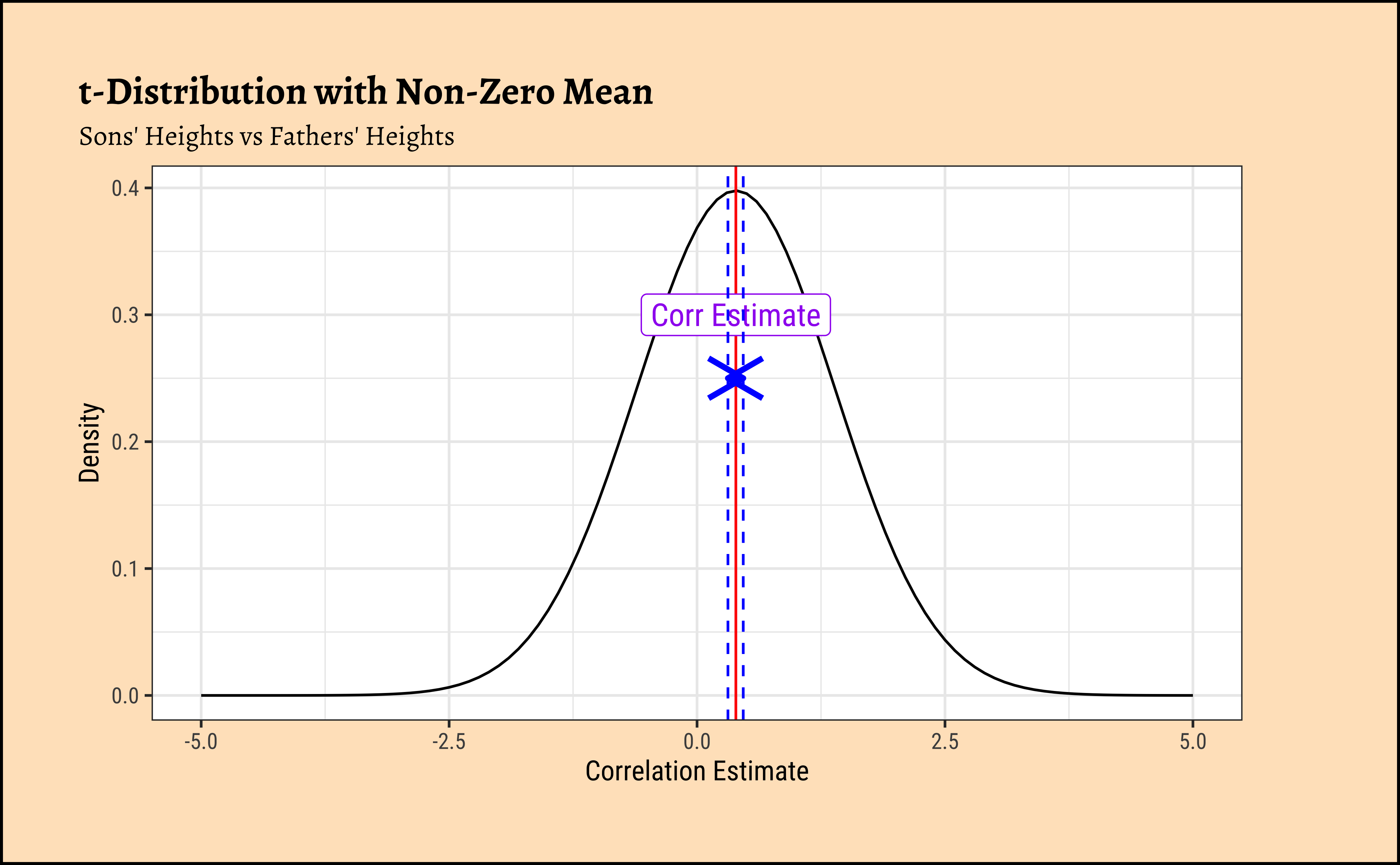
df_corr <- cor_son_pearson$parameter
mean_value <- cor_son_pearson$estimate
gf_fun(dt(
x = (x - mean_value) / sqrt(df_corr / (df_corr - 2)),
df = df_corr
) * (1 / sqrt(df_corr / (df_corr - 2))) ~ x, xlim = c(-5, 5)) %>%
gf_labs(
title = "t-Distribution with Non-Zero Mean",
subtitle = "Sons' Heights vs Fathers' Heights",
x = "Correlation Estimate", y = "Density"
) %>%
gf_vline(xintercept = mean_value, color = "red") %>%
gf_annotate(
geom = "label", x = mean_value, y = 0.3,
label = "Corr Estimate", colour = "purple", size = 4
) %>%
gf_vline(xintercept = cor_son_pearson$conf.low, color = "blue", linetype = "dashed") %>%
gf_vline(xintercept = cor_son_pearson$conf.high, color = "blue", linetype = "dashed") %>%
gf_annotate("segment",
x = cor_son_pearson$conf.low,
xend = cor_son_pearson$conf.high, y = 0.25, yend = 0.25,
arrow = arrow(ends = "both", length = unit(0.2, "inches")), color = "blue", size = 1
)
We can of course use a randomization based test for correlation. How would we mechanize this, what aspect would be randomize?
Correlation is calculated on a vector-basis: each individual observation of variable#1 is multiplied by the corresponding observation of variable#2. Look at Equation 1! So we might be able to randomize the order of this multiplication to see how uncommon this particular set of multiplications are. That would give us a p-value to decide if the observed correlation is close to the truth. So, onwards with our friend mosaic:
[1] 0.4587605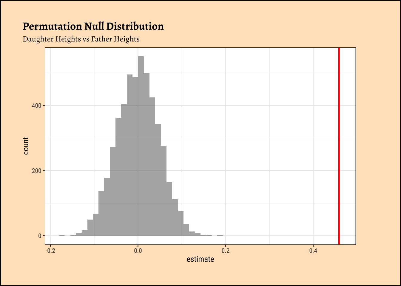
[1] 0We see that will all permutations of father, we are never able to hit the actual obs_daughter_corr! Hence there is a definite correlation between father height and daughter height.
The premise here is that many common statistical tests are special cases of the linear model. A linear model estimates the relationship between dependent variable or
“response” variable height and an explanatory variable or “predictor”, father. It is assumed that the relationship is linear. \(\beta_0\) is the intercept and \(\beta_1\) is the slope of the linear fit, that predicts the value of height based the value of father.
\[ height = \beta_0 + \beta_1 \times father \] The model for Pearson Correlation tests is exactly the Linear Model:
\[ \begin{aligned} height = \beta_0 + \beta_1 \times father\\ \\ H_0: Null\ Hypothesis\ => \beta_1 = 0\\\ H_a: Alternate\ Hypothesis\ => \beta_1 \ne 0\\ \end{aligned} \]
Using the linear model method we get:
Why are the respective \(r\)-s and \(\beta_1\)-s different, though the p-value-s is suspiciously the same!? Did we miss a factor of \(\frac{sd(son/daughter)}{sd(father)} = ??\) somewhere…??
Let us scale the variables to within {-1, +1} : (subtract the mean and divide by sd) and re-do the Linear Model with scaled versions of height and father:
Now you’re talking!! The estimate is the same in both the classical test and the linear model! So we conclude:
When both target and predictor have the same standard deviation, the slope from the linear model and the Pearson correlation are the same.
There is this relationship between the slope in the linear model and Pearson correlation:
\[ Slope\ \beta_1 = \frac{sd_y}{sd_x} * r \]
The slope is usually much more interpretable and informative than the correlation coefficient.
- Hence a linear model using
scale()for both variables will show slope = r.
Slope_Scaled: 0.4587605 = Correlation: 0.4587605
- Finally, the p-value for Pearson Correlation and that for the slope in the linear model is the same (\(0.04280043\)). Which means we cannot reject the NULL hypothesis of “no relationship” between
daughter-s andfather-s heights.
Can you complete this for the sons?
“Signed Rank” Values
Most statistical tests use the actual values of the data variables. However, in some non-parametric statistical tests, the data are used in rank-transformed sense/order. (In some cases the signed-rank of the data values is used instead of the data itself.)
Signed Rank is calculated as follows:
Take the absolute value of each observation in a sample
Place the ranks in order of (absolute magnitude). The smallest number has rank = 1 and so on. This gives is ranked data.
Give each of the ranks the sign of the original observation ( + or -). This gives us signed ranked data.
Plotting Original and Signed Rank Data
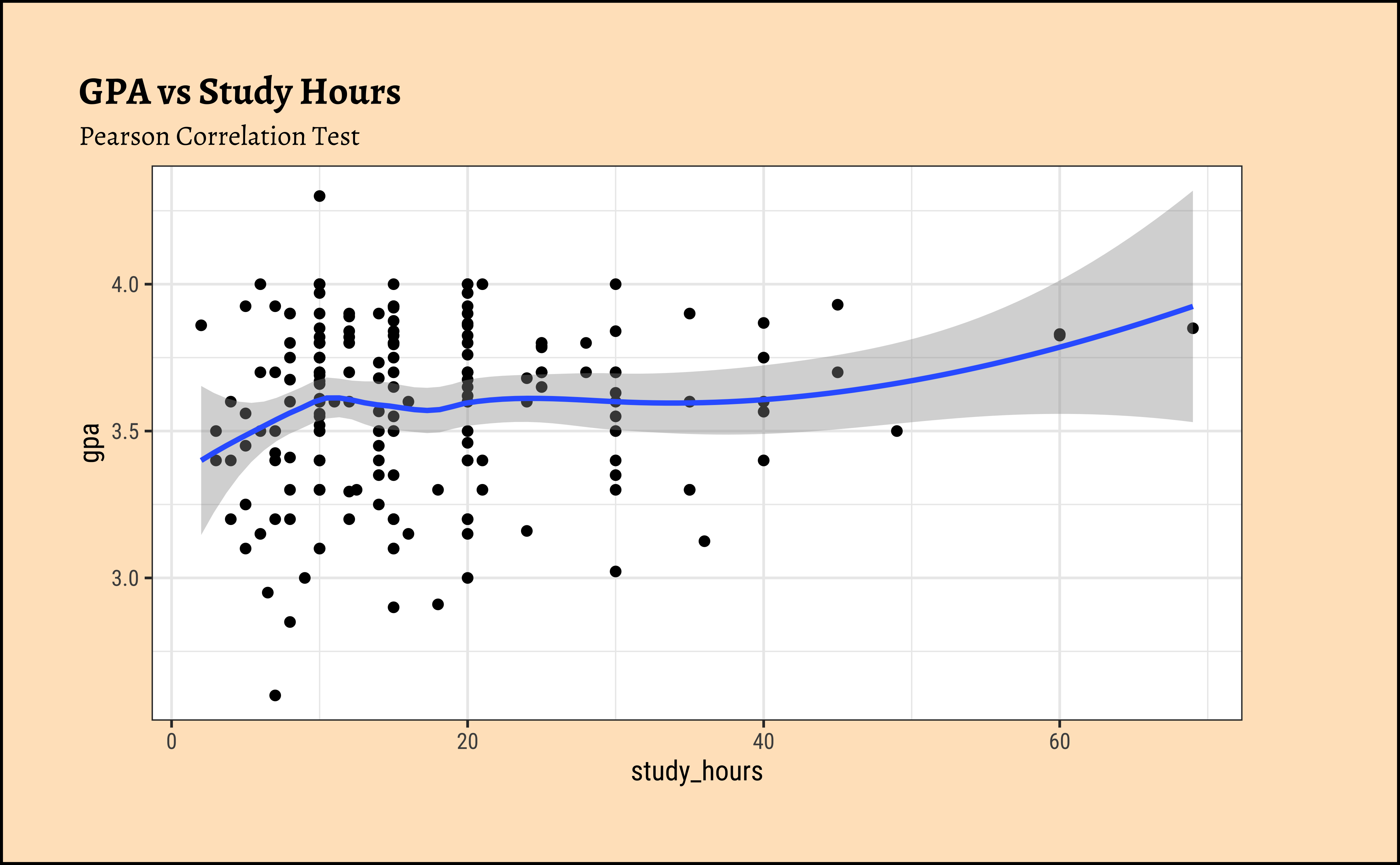
Let us see how this might work by comparing data and its signed-rank version…A quick set of plots:
So the means of the ranks three separate variables seem to be in the same order as the means of the data variables themselves.
How about associations between data? Do ranks reflect well what the data might?
The slopes are almost identical, \(0.25\) for both original data and ranked data for \(y1\sim x\). So maybe ranked and even sign_ranked data could work, and if it can work despite LINE assumptions not being satisfied, that would be nice!
How does Sign-Rank data work?
TBD: need to add some explanation here.
Spearman correlation = Pearson correlation using the rank of the data observations. Let’s check how this holds for a our x and y1 data:
So the Linear Model for the Ranked Data would be:
\[ \begin{aligned} y = \beta_0 + \beta_1 \times rank(x)\\ \\ H_0: Null\ Hypothesis\ => \beta_1 = 0\\\ H_a: Alternate\ Hypothesis\ => \beta_1 \ne 0\\ \end{aligned} \]
Code
Notes:
When ranks are used, the slope of the linear model (\(\beta_1\)) has the same value as the Spearman correlation coefficient ( \(\rho\) ).
Note that the slope from the linear model now has an intuitive interpretation: the number of ranks y changes for each change in rank of x. ( Ranks are “independent” of
sd)
Example
We examine the cars93 data, where the numeric variables of interest are weight and price.
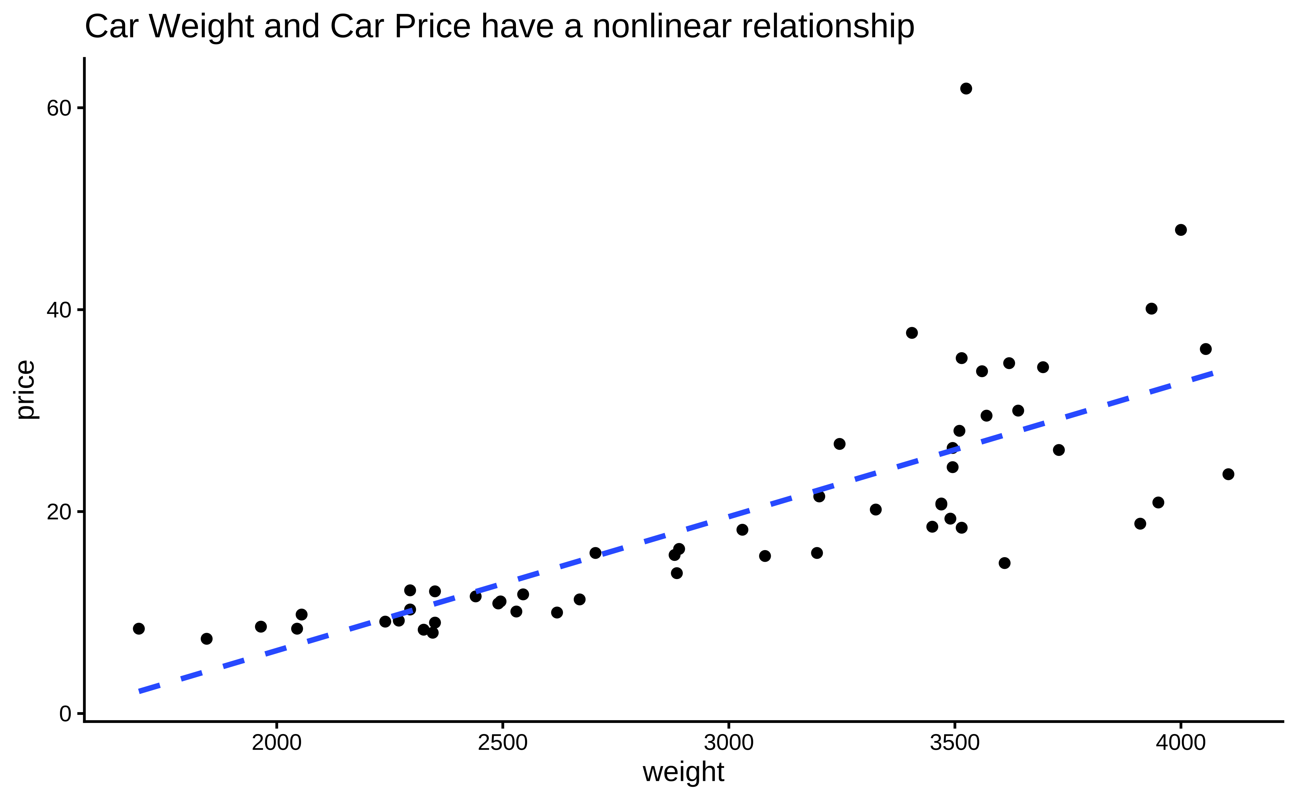
Let us try a Spearman Correlation score for these variables, since the data are not linearly related and the variance of price also is not constant over weight
Call:
lm(formula = rank(price) ~ rank(weight), data = cars93)

Residuals:
     Min       1Q   Median       3Q      Max
-20.0676  -3.0135   0.7815   3.6926  20.4099

Coefficients:
             Estimate Std. Error t value Pr(>|t|)
(Intercept)   3.22074    2.05894   1.564    0.124
rank(weight)  0.88288    0.06514  13.554   <2e-16 ***
---
Signif. codes:  0 '***' 0.001 '**' 0.01 '*' 0.05 '.' 0.1 ' ' 1

Residual standard error: 7.46 on 52 degrees of freedom
Multiple R-squared:  0.7794,    Adjusted R-squared:  0.7751
F-statistic: 183.7 on 1 and 52 DF,  p-value: < 2.2e-16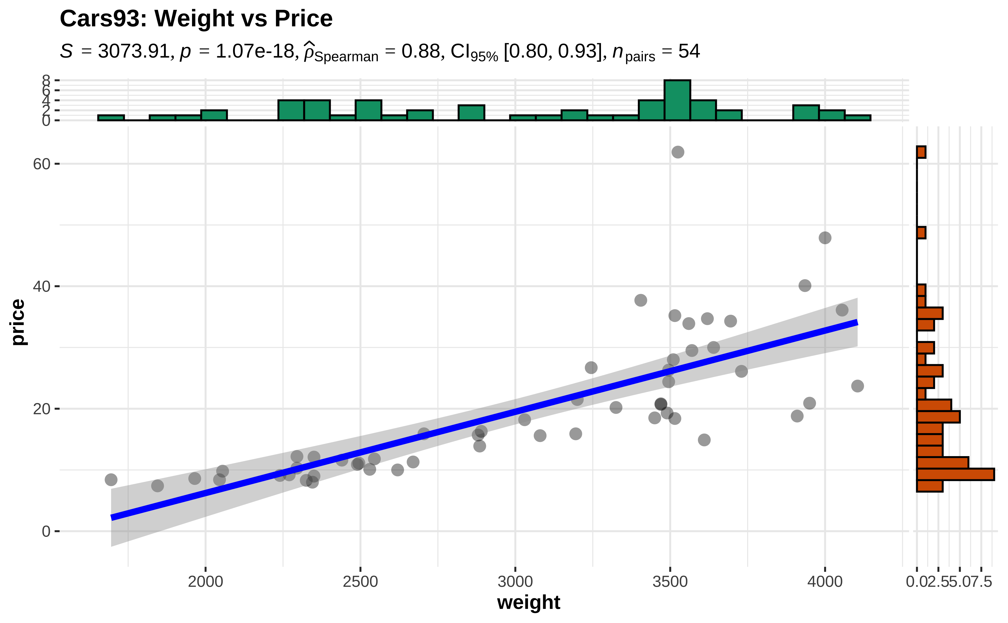
We see that using ranks of the price variable, we obtain a Spearman’s \(\rho = 0.882\) with a p-value that is very small. Hence we are able to reject the NULL hypothesis and state that there is a relationship between these two variables. The linear relationship is evaluated as a correlation of 0.882.