Testing a Single Proportion
2022-11-10
Code
library(checkdown)
library(epoxy)
library(TeachHist)
library(TeachingDemos)
library(grateful)
library(restriktor)
# devtools::install_github("nicolash2/ggbrace")
library(ggbrace)
library(tinytable) # Easy-to-make tables for data
##
library(latex2exp)
library(equatiomatic)
library(ggrepel)
library(marquee) # Marquee Text in HTML
##
library(ellmer) # Access LLMs from R
library(statlingua) # LLM-driven plain English statistical explanations
Code
library(systemfonts)
library(showtext)
## Clean the slate
systemfonts::clear_local_fonts()
systemfonts::clear_registry()
##
showtext_opts(dpi = 96) # set DPI for showtext
sysfonts::font_add(
  family = "Alegreya",
  regular = "../../../../../../fonts/Alegreya-Regular.ttf",
  bold = "../../../../../../fonts/Alegreya-Bold.ttf",
  italic = "../../../../../../fonts/Alegreya-Italic.ttf",
  bolditalic = "../../../../../../fonts/Alegreya-BoldItalic.ttf"
)

sysfonts::font_add(
  family = "Roboto Condensed",
  regular = "../../../../../../fonts/RobotoCondensed-Regular.ttf",
  bold = "../../../../../../fonts/RobotoCondensed-Bold.ttf",
  italic = "../../../../../../fonts/RobotoCondensed-Italic.ttf",
  bolditalic = "../../../../../../fonts/RobotoCondensed-BoldItalic.ttf"
)
showtext_auto(enable = TRUE) # enable showtext
##
theme_custom <- function() {
  theme_bw(base_size = 10) +

    # theme(panel.widths = unit(11, "cm"),
    #       panel.heights = unit(6.79, "cm")) + # Golden Ratio

    theme(
      plot.margin = margin_auto(t = 1, r = 2, b = 1, l = 1, unit = "cm"),
      plot.background = element_rect(
        fill = "bisque",
        colour = "black",
        linewidth = 1
      )
    ) +

    theme_sub_axis(
      title = element_text(
        family = "Roboto Condensed",
        size = 10
      ),
      text = element_text(
        family = "Roboto Condensed",
        size = 8
      )
    ) +

    theme_sub_legend(
      text = element_text(
        family = "Roboto Condensed",
        size = 6
      ),
      title = element_text(
        family = "Alegreya",
        size = 8
      )
    ) +

    theme_sub_plot(
      title = element_text(
        family = "Alegreya",
        size = 14, face = "bold"
      ),
      title.position = "plot",
      subtitle = element_text(
        family = "Alegreya",
        size = 10
      ),
      caption = element_text(
        family = "Alegreya",
        size = 6
      ),
      caption.position = "plot"
    )
}

## Use available fonts in ggplot text geoms too!
ggplot2::update_geom_defaults(geom = "text", new = list(
  family = "Roboto Condensed",
  face = "plain",
  size = 3.5,
  color = "#2b2b2b"
))
ggplot2::update_geom_defaults(geom = "label", new = list(
  family = "Roboto Condensed",
  face = "plain",
  size = 3.5,
  color = "#2b2b2b"
))

ggplot2::update_geom_defaults(geom = "marquee", new = list(
  family = "Roboto Condensed",
  face = "plain",
  size = 3.5,
  color = "#2b2b2b"
))
ggplot2::update_geom_defaults(geom = "text_repel", new = list(
  family = "Roboto Condensed",
  face = "plain",
  size = 3.5,
  color = "#2b2b2b"
))
ggplot2::update_geom_defaults(geom = "label_repel", new = list(
  family = "Roboto Condensed",
  face = "plain",
  size = 3.5,
  color = "#2b2b2b"
))

## Set the theme
ggplot2::theme_set(new = theme_custom())

## tinytable options
options("tinytable_tt_digits" = 2)
options("tinytable_format_num_fmt" = "significant_cell")
options(tinytable_html_mathjax = TRUE)


## Set defaults for flextable
flextable::set_flextable_defaults(font.family = "Roboto Condensed")Visualizing a Single Proportion
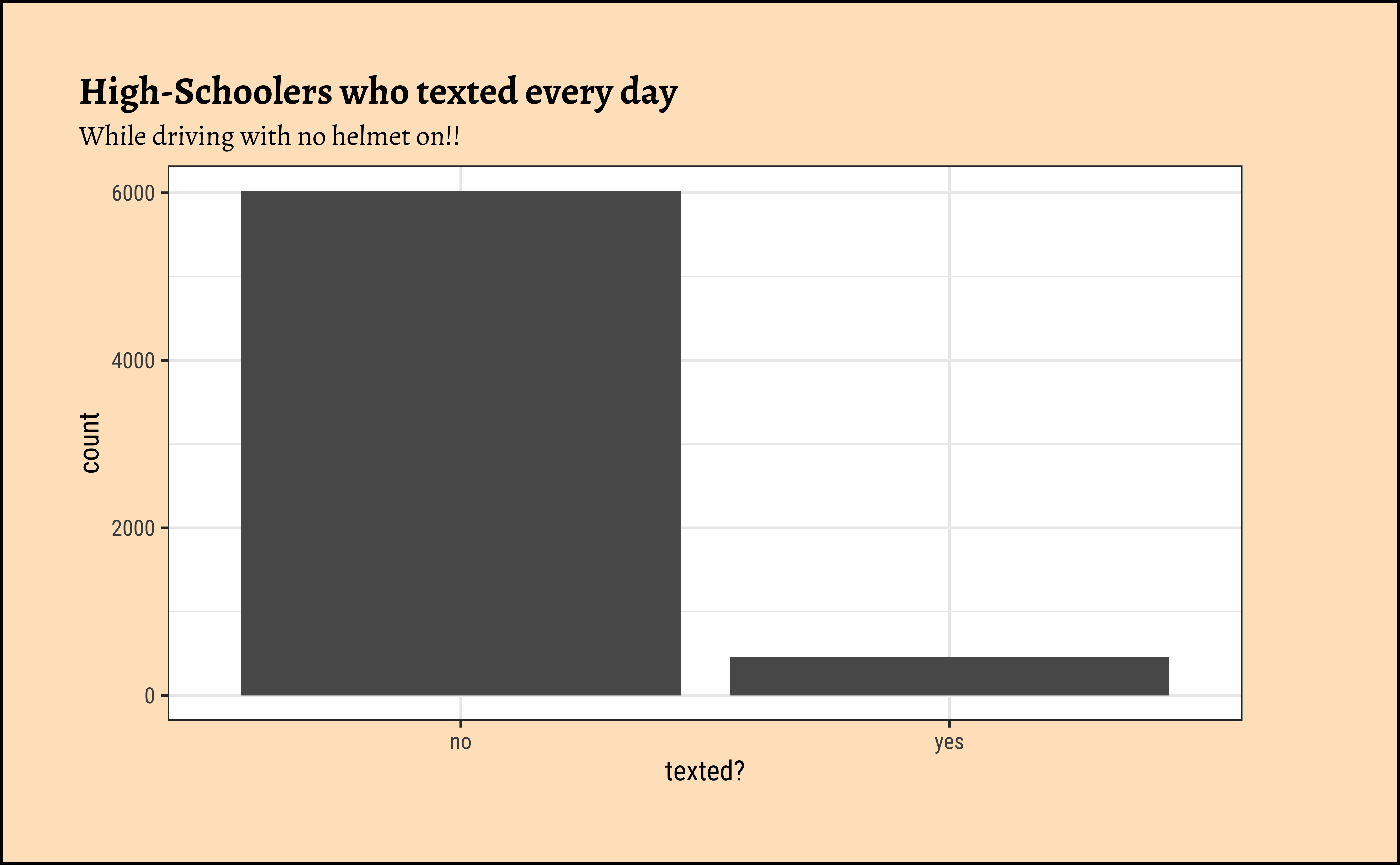
We can quickly plot this, just for the sake of visual understanding of the proportions:
Hypothesis Testing for a Single Proportion
Consider the inference we did for a single mean. What was our NULL Hypothesis? That the population mean \(\mu = 0\). For two means? That they might be equal. What might a suitable NULL Hypothesis be for a single proportion? What attitude of ain’t nothing happenin’ might we adopt?
Important
With proportions, we usually look for a “no difference” situation, i.e. a ratio of unity!! So our NULL hypothesis would be a ratio of 1:1 for texters and no-texters, so a proportion of \(0.5\)!!
The simplest test in R for a single proportion is the binom.test:
data:  no_helmet_text$text_ind  [with success = yes]
number of successes = 463, number of trials = 6503, p-value < 2.2e-16
alternative hypothesis: true probability of success is not equal to 0.5
95 percent confidence interval:
 0.06506429 0.07771932
sample estimates:
probability of success
0.07119791 How do we understand this result? That the sample tells us the \(\hat{p} = 0.07119\) and that based on this the population proportion of those who text while driving without a helmet is also not 0.5, since the p-value is \(2.2e-16\). So we reject the NULL hypothesis and accept the alternative hypothesis, that the proportion is not 0.5 and more like 0.07119.
The Confidence Intervals from the binom.test inform us about our population proportion estimate: It lies within the interval [0.06506429, 0.07771932]. We know that this is also given by:
\[ \begin{eqnarray} CI &=& \hat{p} ~ \pm 1.96*SE\\ &=& \hat{p} ~ \pm 1.96*\sqrt{\hat{p}* (1-\hat{p})/n}\\ &=& 0.0711 \pm 1.96*\sqrt{0.0711 * (1- 0.0711)/6847}\\ &=& 0.0711 \pm 0.006\\ &=& [0.065, 0.771] \end{eqnarray} \]
The inferential tools for estimating a single population proportion are analogous to those used for estimating single population means: the bootstrap confidence interval and the hypothesis test.
Note that since the goal is to construct an interval estimate for a proportion, it’s necessary to both include the success argument within specify, which accounts for the proportion of non-helmet wearers than have consistently texted while driving the past 30 days, in this example, and that stat within calculate is here “prop”, signaling that we are trying to do some sort of inference on a proportion.