Inference Test for Two Proportions
2022-11-10
Code
library(checkdown)
library(epoxy)
library(TeachHist)
library(TeachingDemos)
library(grateful)
library(tinytable) # Easy-to-make tables for data
##
library(latex2exp)
library(equatiomatic)
library(ggrepel)
library(marquee) # Marquee Text in HTML
##
library(ellmer) # Access LLMs from R
library(statlingua) # LLM-driven plain English statistical explanations
Code
library(systemfonts)
library(showtext)
## Clean the slate
systemfonts::clear_local_fonts()
systemfonts::clear_registry()
##
showtext_opts(dpi = 96) # set DPI for showtext
sysfonts::font_add(
  family = "Alegreya",
  regular = "../../../../../../fonts/Alegreya-Regular.ttf",
  bold = "../../../../../../fonts/Alegreya-Bold.ttf",
  italic = "../../../../../../fonts/Alegreya-Italic.ttf",
  bolditalic = "../../../../../../fonts/Alegreya-BoldItalic.ttf"
)

sysfonts::font_add(
  family = "Roboto Condensed",
  regular = "../../../../../../fonts/RobotoCondensed-Regular.ttf",
  bold = "../../../../../../fonts/RobotoCondensed-Bold.ttf",
  italic = "../../../../../../fonts/RobotoCondensed-Italic.ttf",
  bolditalic = "../../../../../../fonts/RobotoCondensed-BoldItalic.ttf"
)
showtext_auto(enable = TRUE) # enable showtext
##
theme_custom <- function() {
  theme_bw(base_size = 10) +

    # theme(panel.widths = unit(11, "cm"),
    #       panel.heights = unit(6.79, "cm")) + # Golden Ratio

    theme(
      plot.margin = margin_auto(t = 1, r = 2, b = 1, l = 1, unit = "cm"),
      plot.background = element_rect(
        fill = "bisque",
        colour = "black",
        linewidth = 1
      )
    ) +

    theme_sub_axis(
      title = element_text(
        family = "Roboto Condensed",
        size = 10
      ),
      text = element_text(
        family = "Roboto Condensed",
        size = 8
      )
    ) +

    theme_sub_legend(
      text = element_text(
        family = "Roboto Condensed",
        size = 6
      ),
      title = element_text(
        family = "Alegreya",
        size = 8
      )
    ) +

    theme_sub_plot(
      title = element_text(
        family = "Alegreya",
        size = 14, face = "bold"
      ),
      title.position = "plot",
      subtitle = element_text(
        family = "Alegreya",
        size = 10
      ),
      caption = element_text(
        family = "Alegreya",
        size = 6
      ),
      caption.position = "plot"
    )
}

## Use available fonts in ggplot text geoms too!
ggplot2::update_geom_defaults(geom = "text", new = list(
  family = "Roboto Condensed",
  face = "plain",
  size = 3.5,
  color = "#2b2b2b"
))
ggplot2::update_geom_defaults(geom = "label", new = list(
  family = "Roboto Condensed",
  face = "plain",
  size = 3.5,
  color = "#2b2b2b"
))

ggplot2::update_geom_defaults(geom = "marquee", new = list(
  family = "Roboto Condensed",
  face = "plain",
  size = 3.5,
  color = "#2b2b2b"
))
ggplot2::update_geom_defaults(geom = "text_repel", new = list(
  family = "Roboto Condensed",
  face = "plain",
  size = 3.5,
  color = "#2b2b2b"
))
ggplot2::update_geom_defaults(geom = "label_repel", new = list(
  family = "Roboto Condensed",
  face = "plain",
  size = 3.5,
  color = "#2b2b2b"
))

## Set the theme
ggplot2::theme_set(new = theme_custom())

## tinytable options
options("tinytable_tt_digits" = 2)
options("tinytable_format_num_fmt" = "significant_cell")
options(tinytable_html_mathjax = TRUE)


## Set defaults for flextable
flextable::set_flextable_defaults(font.family = "Roboto Condensed")
Many experiments gather qualitative data across different segments of a population, for example, opinion about a topic among people who belong to different income groups, or who live in different parts of a city. This should remind us of the Likert Plots that we plotted earlier. In this case the two variables, dependent and independent, are both Qualitative, and we can calculate counts and proportions.
How does one Qual variable affect the other? How do counts/proportions of the dependent variable vary with the levels of the independent variable? This is our task for this module.
Here is a quick example of the kind of data we might look at here, taken from the British Medical Journal:
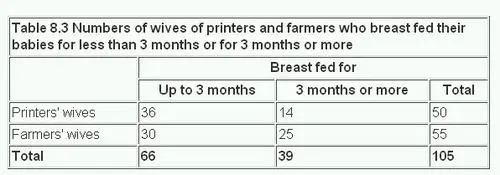
Clearly, we can see differences in counts/proportions of women who breast-fed their babies for three months or more, based on whether they were “printers wives” or “farmers’ wives”!
Is there a doctor in the House?
Contingency Table Plots
The Contingency Table can be plotted using a mosaic plot using two packages, as we have seen. Let us do a quick recap:
Code
# Computing the Contingency Table with rows and columns swapped
# For plotting purposes
gss_vcd_table <- vcd::structable(DeathPenalty ~ Education, data = GSS2002_modified)
gss_vcd_table %>%
  vcd::mosaic(
    gp = shading_hsv, direction = "v",
    main = "GSS2002 Education vs Death Penalty Mosaic Chart",
    legend = TRUE,
    labeling = labeling_border(
      varnames = c("F", "F"), # Remove variable name labels
      rot_labels = c(90, 0, 0, 0), # t,r,b,l?
      just_labels = c(
        "left", # Top Side. How?
        "left", # Right side
        "left", # Bottom side
        "right"
      )
    )
  ) # Left side. How?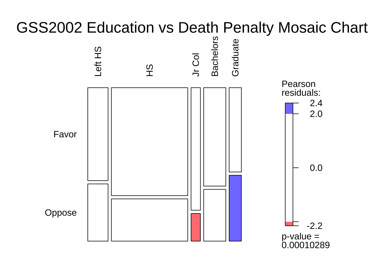
Business Insights
We see that:
- the proportion of people in favour of the Death Penalty decreases with increasing levels of Education.
- there are some imbalances in the counts of people with different levels of Education (vertical divisions are not straight), which we will need to account for in our analysis.
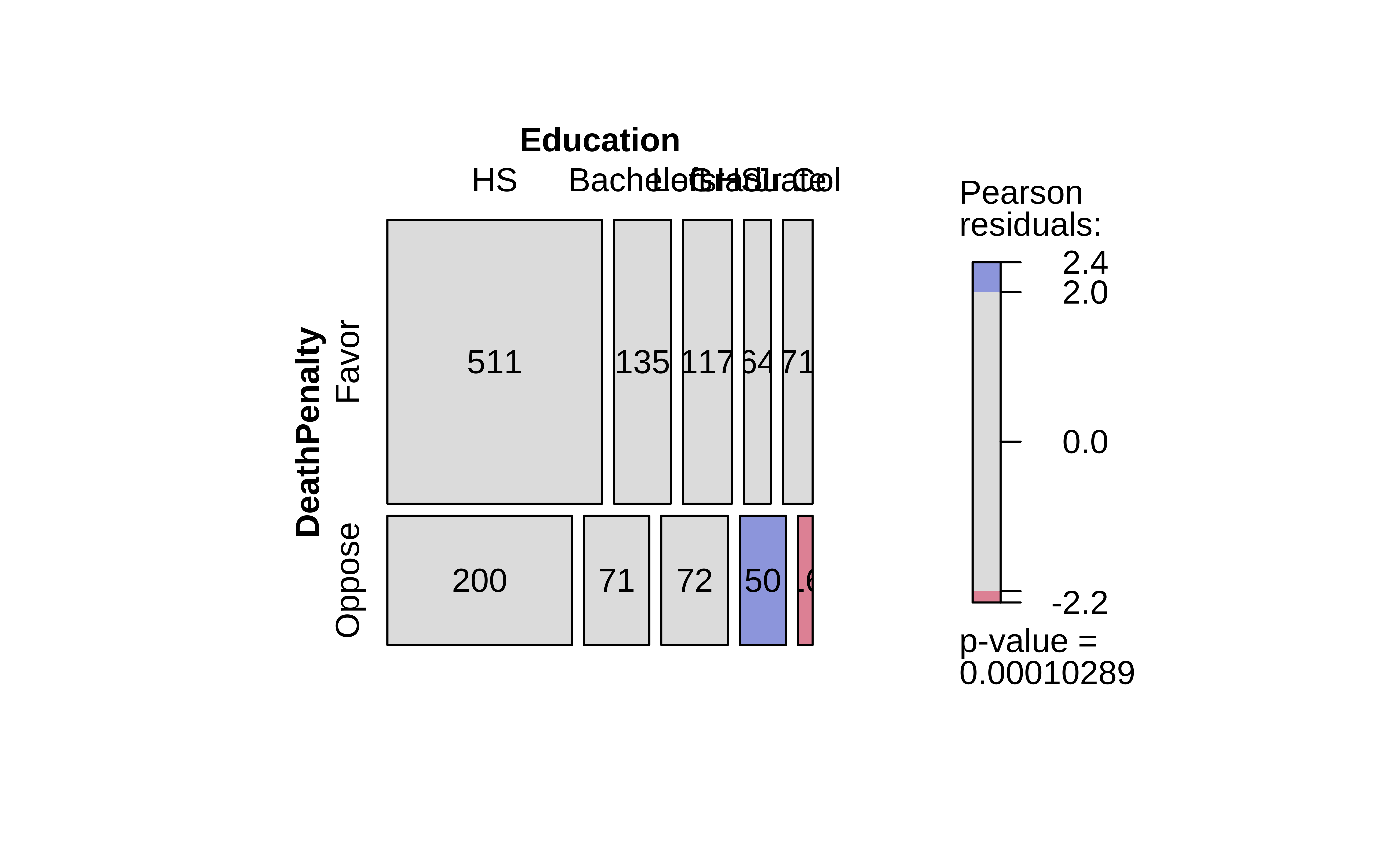
As discussed in the Descriptive Analysis on Proportions, visStatistics is a recent package that allows a very wide variety of statistical charts to be created auto-magically based on the variables chosen. Let us plot a mosaic chart directly with this package: with one function visstats(), we obtain mosaic and bar charts, as well as a statistical analysis of the data. We will discuss this analysis shortly.
Summary of visstat object

--- Named components ---
 [1] "statistic"    "parameter"    "p.value"      "method"       "data.name"
 [6] "observed"     "expected"     "residuals"    "stdres"       "mosaic_stats"

--- Contents ---

$statistic:
X-squared
 23.45093

$parameter:
df
 4

$p.value:
[1] 0.0001028891

$method:
[1] "Pearson's Chi-squared test"

$data.name:
[1] "counts"

$observed:
            Education
DeathPenalty  HS Bachelors Left HS Graduate Jr Col
      Favor  511       135     117       64     71
      Oppose 200        71      72       50     16

$expected:
            Education
DeathPenalty       HS Bachelors   Left HS Graduate   Jr Col
      Favor  488.5065 141.53634 129.85616 78.32594 59.77506
      Oppose 222.4935  64.46366  59.14384 35.67406 27.22494

$residuals:
            Education
DeathPenalty         HS  Bachelors    Left HS   Graduate     Jr Col
      Favor   1.0177047 -0.5494154 -1.1281841 -1.6187145  1.4518580
      Oppose -1.5079895  0.8140992  1.6716928  2.3985389 -2.1512983

$stdres:
            Education
DeathPenalty        HS Bachelors   Left HS  Graduate    Jr Col
      Favor   2.694093 -1.070092 -2.180585 -3.028754  2.686322
      Oppose -2.694093  1.070092  2.180585  3.028754 -2.686322

$mosaic_stats:
             Education  HS Bachelors Left HS Graduate Jr Col
DeathPenalty
Favor                  511       135     117       64     71
Oppose                 200        71      72       50     16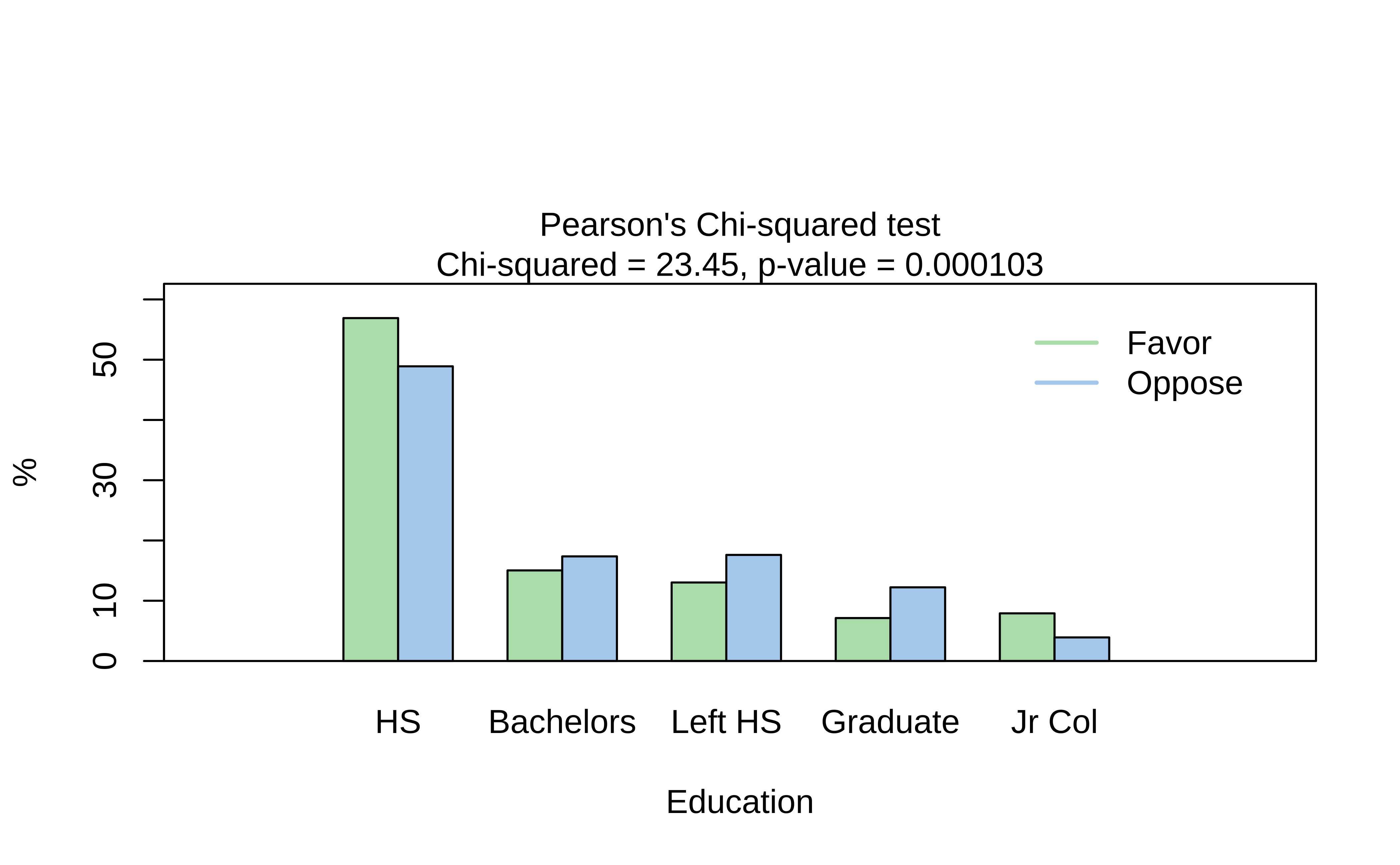
            Education
DeathPenalty  HS Bachelors Left HS Graduate Jr Col
      Favor  511       135     117       64     71
Oppose 200 71 72 50 16 Education
DeathPenalty HS Bachelors Left HS Graduate Jr Col
Favor 488.5065 141.53634 129.85616 78.32594 59.77506
Oppose 222.4935 64.46366 59.14384 35.67406 27.22494 Education
DeathPenalty HS Bachelors Left HS Graduate Jr Col
Favor 2.694093 -1.070092 -2.180585 -3.028754 2.686322
Oppose -2.694093 1.070092 2.180585 3.028754 -2.686322This is a very comprehensive output, with just one line of code. We obtain:
- The original Contingency Table
- the Expected Contingency Table ( if the two variables were independent )
- the z-scores/residuals from each cell that contributes to the overall Chi-Square statistic
- the test statistic, degrees of freedom and p-value
- a mosaic plot
- a dodged bar plot
We will use all of these results to obtain a clear understanding of the test.
Ordering of levels between vcd and visstat
The ordering of the levels (Left HS, HS, Jr Col, Bachelors, Graduate) is different between the two packages. This is because vcd orders the levels in the order they appear in the (munged) data, while visStatistics orders them in alphabetical strange order. If we attempt to munge the data into ordinal factors ( ordered = TRUE), visStatistics does not accept it at all, and wants plain factors. Aargh!
We will therefore continue to use the outputs from vcd.
Let us now perform the base chisq test: We need a contingency table and then the xchisq test: We will calculate the observed-chi-squared value, and compare it with the critical value. ( The xchisq function is from the mosaic package, and is a wrapper around the base chisq.test function. It provides more verbose output, which is easier to work with. )
    Pearson's Chi-squared test

data:  x
X-squared = 23.451, df = 4, p-value = 0.0001029

  117      511       71      135       64
(129.86) (488.51) ( 59.78) (141.54) ( 78.33)
 [1.27]   [1.04]   [2.11]   [0.30]   [2.62]
<-1.13>  < 1.02>  < 1.45>  <-0.55>  <-1.62>

   72      200       16       71       50
( 59.14) (222.49) ( 27.22) ( 64.46) ( 35.67)
 [2.79]   [2.27]   [4.63]   [0.66]   [5.75]
< 1.67>  <-1.51>  <-2.15>  < 0.81>  < 2.40>

key:
    observed
    (expected)
    [contribution to X-squared]
<Pearson residual>[1] 23.45093We have the Chi-Square Test and the quite verbose test results, which we will examine shortly.
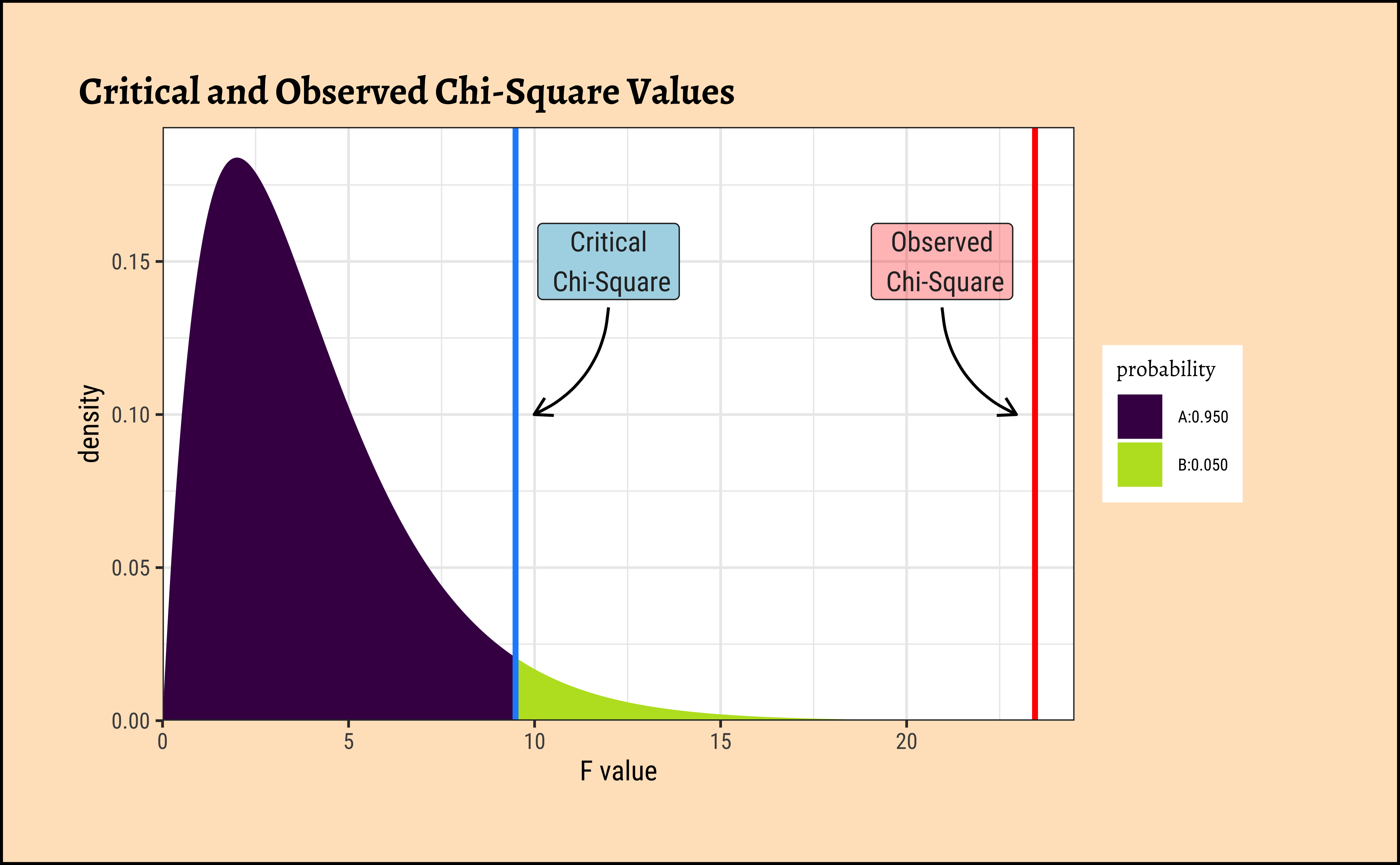
Let us also evaluate the critical value for the Chi-Square distribution, with alpha = 0.05 and df = (nrows-1)*(ncols-1) = (5-1)*(2-1) = 4:
[1] 9.487729We see that our observed \(X^2_{obs} = 23.45\); the critical value \(X^2_{crit} = 9.48\), which is much smaller! The p-value is \(0.0001029\), very low as we would expect, indicating that the NULL Hypothesis should be rejected in favour of the alternate hypothesis, that proportions of DeathPenalty (opinion) are affected by Education.
As always, we analyze our plots, and plot our analysis. Here is a plot for this test:
Code
ggplot2::theme_set(new = theme_custom())

mosaic::xqchisq(
  p = 0.95, df = 4,
  return = c("plot"), verbose = F,
  system = "gg"
) %>%
  gf_labs(
    x = "F value", title = "Critical and Observed Chi-Square Values",
    x = ""
  ) %>%
  gf_vline(
    xintercept = X_squared_observed,
    color = "red", linewidth = 1
  ) %>%
  gf_vline(
    xintercept = X_squared_critical,
    color = "dodgerblue",
    linewidth = 1
  ) %>%
  gf_annotate(
    x = X_squared_observed - 2.5, y = 0.15,
    geom = "label", label = "Observed\n Chi-Square",
    fill = "red", alpha = 0.3
  ) %>%
  gf_annotate("curve", X_squared_observed - 2.5,
    y = 0.135, yend = 0.10,
    xend = X_squared_observed - 0.5,
    linewidth = 0.5, curvature = 0.3,
    arrow = arrow(length = unit(0.25, "cm"))
  ) %>%
  gf_annotate(
    x = X_squared_critical + 2.5, y = 0.15,
    geom = "label", label = "Critical\n Chi-Square",
    fill = "lightblue"
  ) %>%
  gf_annotate("curve", X_squared_critical + 2.5,
    y = 0.135, yend = 0.10,
    xend = X_squared_critical + 0.5,
    linewidth = 0.5, curvature = -0.3,
    arrow = arrow(length = unit(0.25, "cm"))
  ) %>%
  gf_refine(
    scale_y_continuous(expand = expansion(add = c(0, 0.01))),
    scale_x_continuous(expand = expansion(add = c(0, 1)))
  )
Let us now dig into that cryptic-looking table above!
Let us once again look at the output of the xchisq.test() function:
    Pearson's Chi-squared test

data:  x
X-squared = 23.451, df = 4, p-value = 0.0001029

  117      511       71      135       64
(129.86) (488.51) ( 59.78) (141.54) ( 78.33)
 [1.27]   [1.04]   [2.11]   [0.30]   [2.62]
<-1.13>  < 1.02>  < 1.45>  <-0.55>  <-1.62>

   72      200       16       71       50
( 59.14) (222.49) ( 27.22) ( 64.46) ( 35.67)
 [2.79]   [2.27]   [4.63]   [0.66]   [5.75]
< 1.67>  <-1.51>  <-2.15>  < 0.81>  < 2.40>

key:
    observed
    (expected)
    [contribution to X-squared]
    <Pearson residual>
As per the key above, this is actually four 2-row tables interleaved together into one. The first row is the Observed counts, the second row is the Expected counts, if the two variables were independent. The last row is the Pearson Residuals or z-score per cell, which we will explain shortly. The third row is the Contribution of each cell to the overall Chi-Square statistic, given by \(z.score^2\).
Let us plot these tables and develop first a visual intuition, and then a mathematical one. If we pull apart the four tables, here are the mosaic plots for the actual and expected Contingency Tables, along with the association plot showing the differences, as we did when plotting Proportions:
Code
# Flipping the Contingency Table for Exposition
gss_vcd_table <- vcd::structable(DeathPenalty ~ Education, # cols ~ rows
  data = GSS2002_modified
)

vcd::mosaic(gss_vcd_table,
  gp = shading_max, legend = TRUE, direction = "v",
  labeling = labeling_border(
    varnames = c("F", "F"), # Remove variable name labels
    rot_labels = c(90, 0, 0, 0), # t,r,b,l?
    just_labels = c(
      "left", # Top Side. How?
      "left", # Right side
      "left", # Bottom side
      "right"
    )
  )
) # Left side. How?
vcd::mosaic(gss_vcd_table,
  type = "expected", gp = shading_max, legend = TRUE, direction = "v",
  labeling = labeling_border(
    varnames = c("F", "F"), # Remove variable name labels
    rot_labels = c(90, 0, 0, 0), # t,r,b,l?
    just_labels = c(
      "left", # Top Side. How?
      "left", # Right side
      "left", # Bottom side
      "right"
    )
  )
) # Left side. How?)
vcd::assoc(contingency_table,
  gp = shading_max, legend = TRUE, direction = "v",
  labeling = labeling_border(
    varnames = c("F", "F"), # Remove variable name labels
    rot_labels = c(90, 0, 0, 0), # t,r,b,l?
    just_labels = c(
      "left", # Top Side. How?
      "left", # Right side
      "left", # Bottom side
      "right"
    )
  )
) # Left side. How?)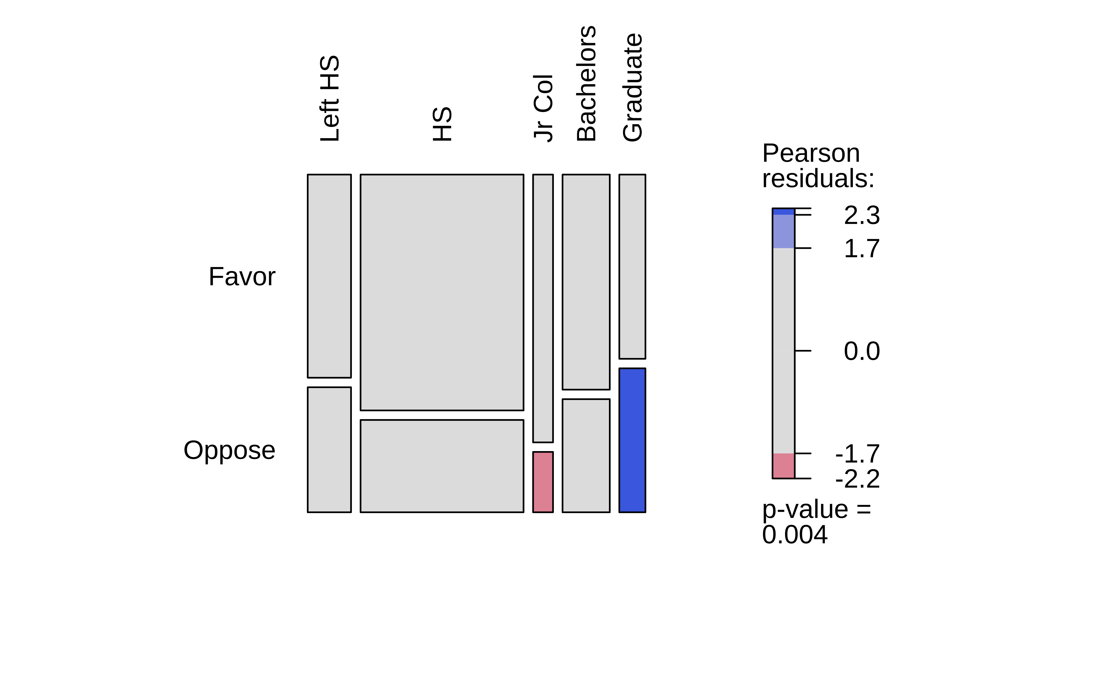
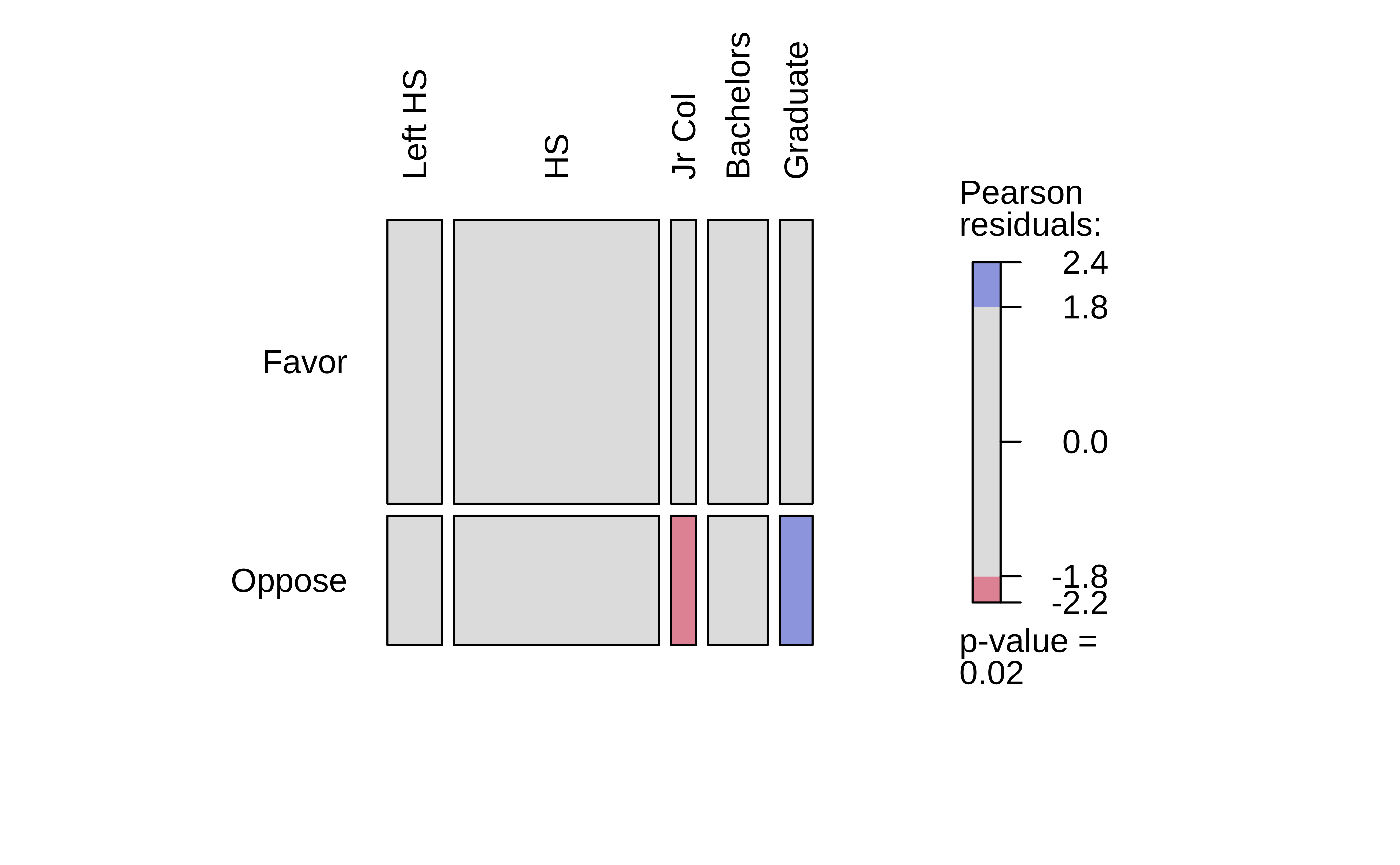
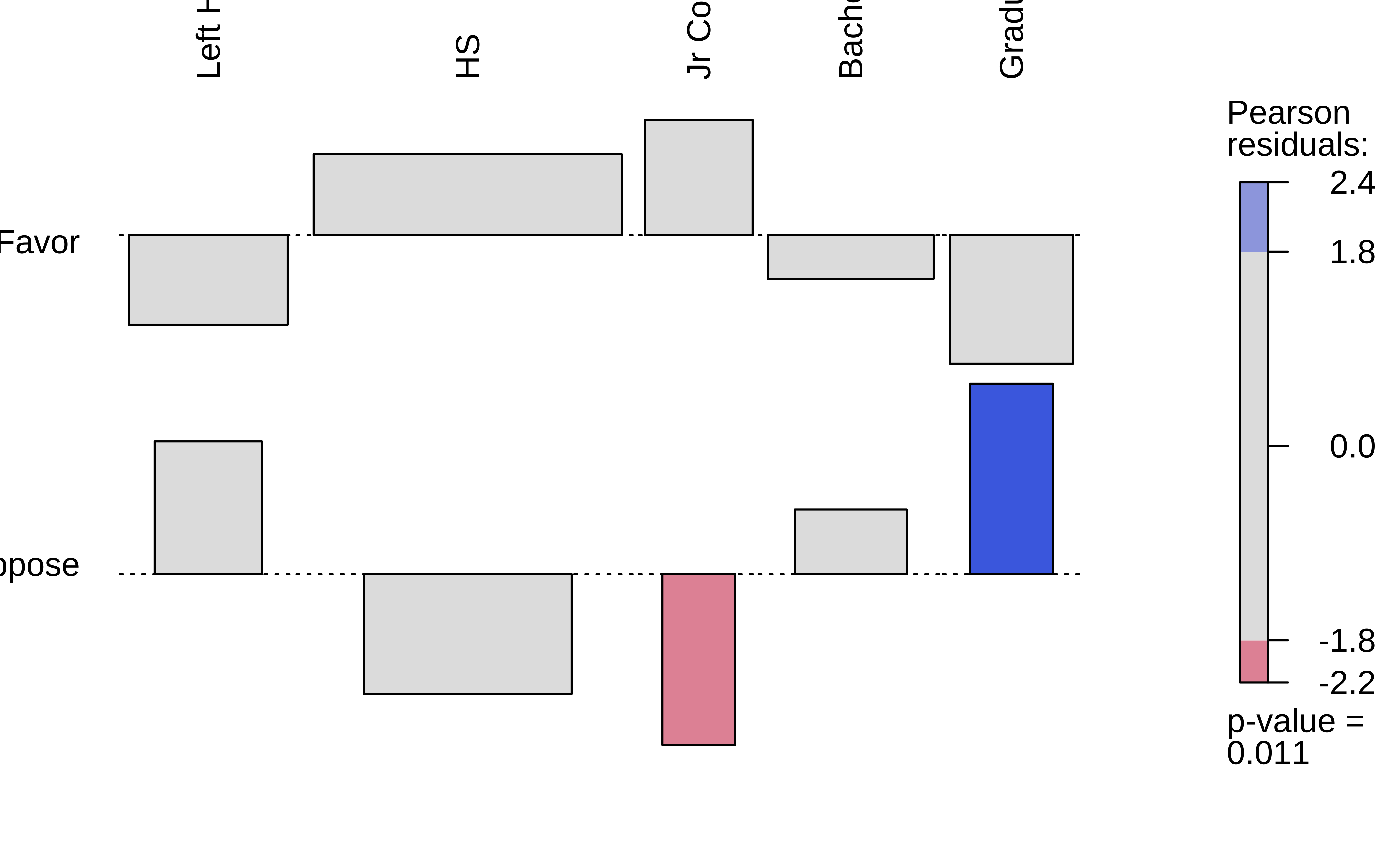
In Figure 5 (a), we have the Observed Contingency Table as a mosaic, with its imbalances. The horizontal slice-line provides the overall proportion Favour::Oppose. The vertical slice-lines tell us that this proportion is not the same across levels of Education.
What if we straighten out the vertical slice-lines?
Figure 5 (b) does exactly this: we have a fictitious mosaic plot of an Expected Contingency Table, with straight vertical divisions, as if Education had no effect on the Favour::Oppose proportion. (NULL hypothesis!!)
The third plot, Figure 5 (c), is a tile-plot of the tile-wise differences between the two tables, which Contribute to the overall X-statistic. The blue tiles indicate that the Actual count is higher than the Expected count, and the red tiles indicate that the Actual count is lower than the Expected count. The intensity of the colour indicates the magnitude of the difference.
When we scale these differences by the standard deviation of each cell, we get the Pearson Residuals, which we will explain next.
Let us perform these computations manually, to see how this works. Let us look at the fairly complex R-object the xq_test_object is:
 [1] "statistic"    "parameter"    "p.value"      "method"       "data.name"
 [6] "observed"     "expected"     "residuals"    "stdres"       "contribution"
It should be fairly clear (oh yeah?) that observed, expected, residuals and contribution, and stdres are contingency-table like structures; the rest are simple scalars / text. Use xq_test_object %>% str() in your Console to find check!!
Here are all the first four of the above tables, side by side: (Are you tired of these yet?)
Code
xq_test_object$observed %>%
  addmargins() %>%
  as_tibble(rownames = "DeathPenalty") %>% # Convert to tibble; ensure row names!
  tt(digits = 3, caption = "Observed") %>%
  style_tt(color = "grey20") %>%
  style_tt(i = 1, j = 2, color = "black", bold = TRUE, background = "yellow") %>%
  style_tt(i = 2, j = 5, color = "black", bold = TRUE, background = "yellow") %>%
  style_tt(i = 3, j = 1:7, color = "black", bold = TRUE, background = "palegreen") %>%
  style_tt(j = 7, i = 1:3, color = "black", bold = TRUE, background = "palegreen")
##
xq_test_object$expected %>%
  addmargins() %>%
  as_tibble(rownames = "DeathPenalty") %>% # Convert to tibble; ensure row names!
  tt(digits = 3, caption = "Expected") %>%
  style_tt(color = "grey20") %>%
  style_tt(i = 1, j = 2, color = "black", bold = TRUE, background = "yellow") %>%
  style_tt(i = 2, j = 5, color = "black", bold = TRUE, background = "yellow") %>%
  style_tt(i = 3, j = 1:7, color = "black", bold = TRUE, background = "palegreen") %>%
  style_tt(j = 7, i = 1:3, color = "black", bold = TRUE, background = "palegreen")
##
xq_test_object$residuals %>%
  addmargins() %>%
  as_tibble(rownames = "DeathPenalty") %>% # Convert to tibble; ensure row names!
  tt(digits = 3, caption = "Pearson Residuals") %>%
  style_tt(color = "grey20") %>%
  style_tt(i = 1, j = 2, color = "black", bold = TRUE, background = "yellow") %>%
  style_tt(i = 2, j = 5, color = "black", bold = TRUE, background = "yellow") %>%
  style_tt(i = 3, j = 1:7, color = "black", bold = TRUE, background = "palegreen") %>%
  style_tt(j = 7, i = 1:3, color = "black", bold = TRUE, background = "palegreen")
##
xq_test_object$contribution %>%
  as.matrix() %>%
  as_tibble(rownames = "DeathPenalty") %>% # Convert to tibble; ensure row names!
  tt(digits = 3, caption = "Contribution to Chi-Square Statistic") %>%
  style_tt(color = "grey20") %>%
  style_tt(i = 1, j = 2, color = "black", bold = TRUE, background = "yellow") %>%
style_tt(i = 2, j = 5, color = "black", bold = TRUE, background = "yellow")| DeathPenalty | Left HS | HS | Jr Col | Bachelors | Graduate | Sum |
|---|---|---|---|---|---|---|
| Favor | 117 | 511 | 71 | 135 | 64 | 898 |
| Oppose | 72 | 200 | 16 | 71 | 50 | 409 |
| Sum | 189 | 711 | 87 | 206 | 114 | 1307 |
| DeathPenalty | Left HS | HS | Jr Col | Bachelors | Graduate | Sum |
|---|---|---|---|---|---|---|
| Favor | 130 | 489 | 59.8 | 142 | 78.3 | 898 |
| Oppose | 59.1 | 222 | 27.2 | 64.5 | 35.7 | 409 |
| Sum | 189 | 711 | 87 | 206 | 114 | 1307 |
| DeathPenalty | Left HS | HS | Jr Col | Bachelors | Graduate | Sum |
|---|---|---|---|---|---|---|
| Favor | -1.13 | 1.02 | 1.45 | -0.549 | -1.62 | -0.827 |
| Oppose | 1.67 | -1.51 | -2.15 | 0.814 | 2.4 | 1.23 |
| Sum | 0.544 | -0.49 | -0.699 | 0.265 | 0.78 | 0.398 |
| DeathPenalty | Left HS | HS | Jr Col | Bachelors | Graduate |
|---|---|---|---|---|---|
| Favor | 1.27 | 1.04 | 2.11 | 0.302 | 2.62 |
| Oppose | 2.79 | 2.27 | 4.63 | 0.663 | 5.75 |
A. Expected Counts
How would we calculate the Expected table? The numbers that we might expect (under independence) in each cell there is the probability of an entry landing in that square times the total number of entries:
\[ \begin{align} \text{Expected Value[1,1]} &= p_{row_1} * p_{col_1} * Total~Scores\\\ &= \Large{\frac{\sum_{r_{1}}}{\sum_{r_{all}c_{all}}} * \frac{\sum_{c_{1}}}{\sum_{r_{all}c_{all}}} * \sum_{r_{all}c_{all}}} \\ &= \frac{898}{1307} * \frac{189}{1307} * 1307\\\ &= 130 \end{align} \]
Proceeding in this way for all the 15 entries in the Contingency Table, we get the “Expected” Contingency Table. Remember expect is another way of saying mean !!
B. Pearson Residuals
Now, the Pearson Residual in each cell is equivalent to the z-score of that cell. Recall the z-score idea: we subtract the mean and divide by the std. deviation to get the z-score.
To get a
z-score, we need the value, themean, andsd.Now, the mean is the
Expectedvalue, as stated, and thevalueis theActualvalue.What of the
sd? In the Contingency Table, we have counts which are usually modeled as an (integer-valued) Poisson distribution, for which mean and variance are identical. And \(sd = \sqrt{variance}\). Thus we get thez-scoresaka Pearson Residuals as:\[ r_{i,j} = \frac{(Actual - Expected)}{\sqrt{\displaystyle Expected}} \tag{3}\]
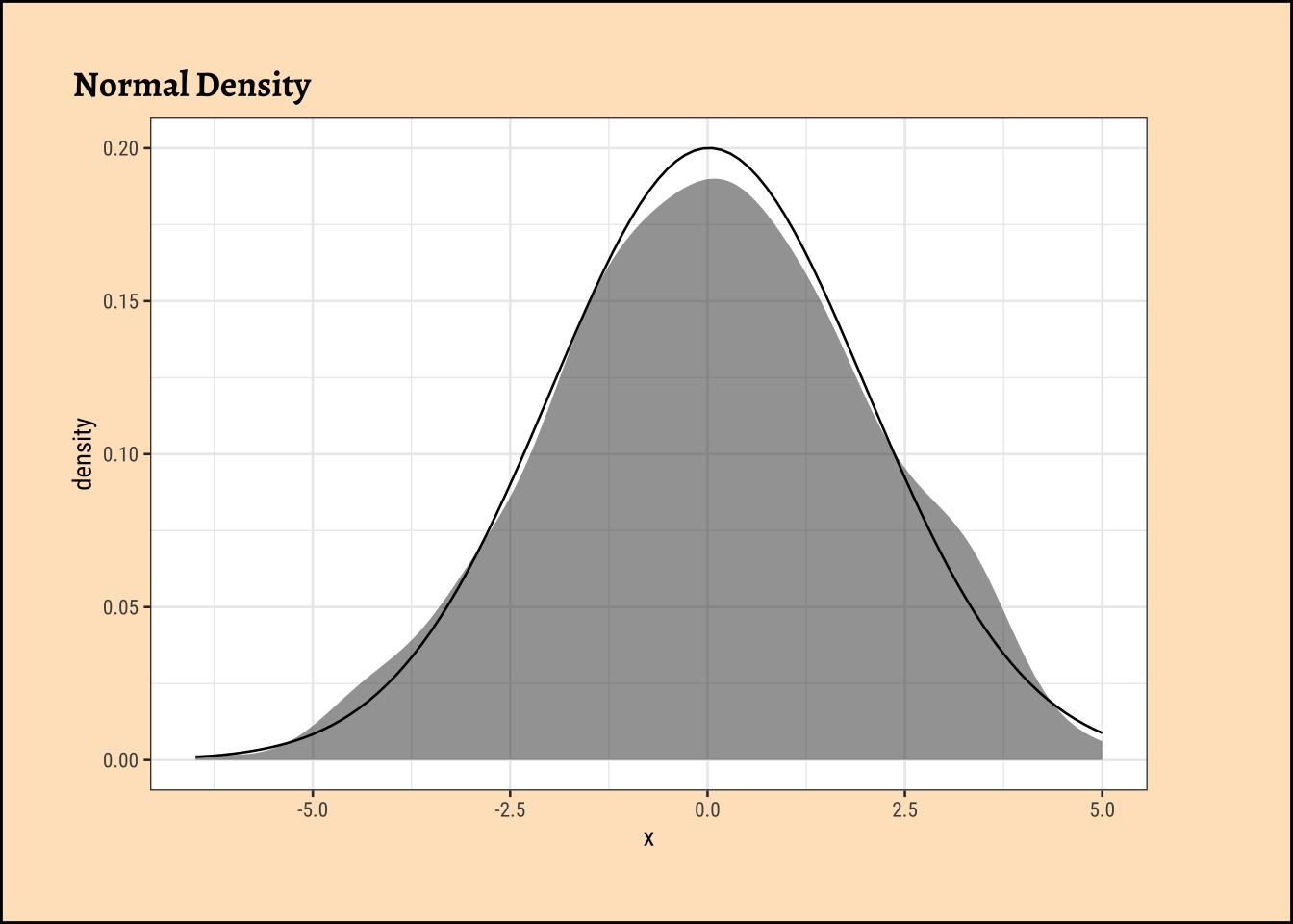
The sum of all the squared Pearson residuals is the chi-square statistic, χ2, upon which the inferential analysis follows. We square them because we want to measure the magnitude of the difference, not the direction ( + or - ):
\[ χ2 = \sum_{i=1}^R\sum_{j=1}^C{r_{i,j}^2} \tag{4}\]
where R and C are number of rows and columns in the Contingency Table, the levels in the two Qual variables. So for cell-location [1,1], its contribution to χ2 would be: \((117-130)^2/130 = -1.13\). Do try to compute all of these and the \(X^2\) statistic by hand !!
How did this \(X^2\) distribution come from? Here is a lovely, brief explanation from this StackOverflow Post:
- In a Contingency Table the Null Hypothesis states that the variables in the rows and the variable in the columns are independent.
- The (each) cell counts \(E_{ij}\) are assumed to be Poisson distributed with mean = \(E_{ij}\) and as they are Poisson, their variance is also \(E_{ij}\).
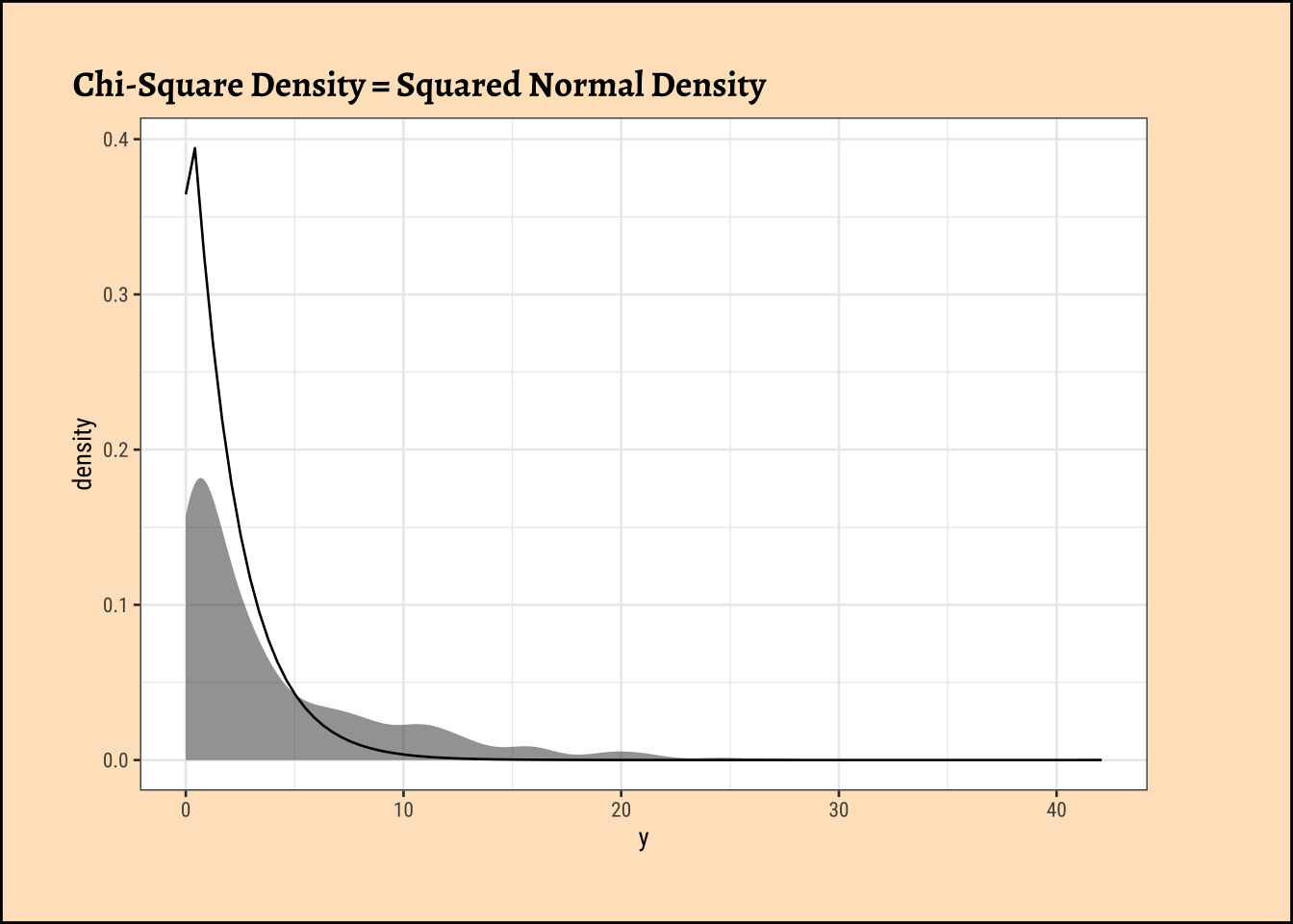
- Asymptotically (when cell counts are large) the Poisson distribution approaches the normal distribution, with mean = \(E_{ij}\) and standard deviation with \(\sqrt{E_{ij}}\) so, asymptotically \(\large{\frac{(X_{ij} - E_{ij})}{\sqrt{E_{ij}}}}\) is approximately standard normal \(N(0,1)\).
- If you square standard normal variables and sum these squares then the result is a chi-square random variable so \(\sum_{i,j}\left(\frac{(X_{ij}-E_{ij})}{\sqrt{E_{ij}}}\right)^2\) has a (asymptotically) a chi-square distribution.
- Asymptotics must hold and that is why most textbooks state that the result of the test is valid when all expected cell counts \(E_{ij}\) are larger than 5, but that is just a rule of thumb that makes the approximation ‘’good enough’’.
Hence, after all this calculation, we have the \(X^2\) statistic, which we can compare with the critical value, and make our inference.
Permutation Test for Education
We will now perform the permutation test for the difference between proportions. We will first get an intuitive idea of the permutation, and then perform it using both mosaic and infer.
We saw from the diagram created by Allen Downey that there is only one test! We will now use this philosophy to develop a technique that allows us to mechanize several Statistical Models in that way, with nearly identical code. We will first look visually at a permutation exercise. We will create dummy data that contains the following case study:
A set of identical resumes was sent to male and female evaluators. The candidates in the resumes were of both genders. We wish to see if there was difference in the way resumes were evaluated, by male and female evaluators. (We use just one male and one female evaluator here, to keep things simple!)
Code
set.seed(123456)
data1 <- tibble(
  evaluator = rep(x = "F", times = 24),
  candidate_selected = sample(c(0, 1),
    size = 24,
    replace = T,
    prob = c(0.1, 0.9)
  )
) %>%
  mutate(evaluator = as_factor(evaluator))

data2 <- tibble(
  evaluator = rep(x = "M", times = 24),
  candidate_selected = sample(c(0, 1),
    size = 24,
    replace = T,
    prob = c(0.6, 0.4)
  )
) %>%
  mutate(evaluator = as_factor(evaluator))

# data1
# data2

data <- rbind(data1, data2) %>%
  as_tibble() %>%
  # Create a 4*12 matrix of integer coordinates
  cbind(expand.grid(x = 1:4, y = seq(4, 48, 4))) %>%
  mutate(evaluator = as_factor(evaluator))

data <- data %>%
  dplyr::select(evaluator, candidate_selected) %>%
  as_tibble()
data
summary <- data %>%
  dplyr::group_by(evaluator) %>%
  dplyr::summarise(
    selection_ratio = mean(candidate_selected == 0),
    count = sum(candidate_selected == 0),
    n = dplyr::n()
  )
summary
Code
ggplot2::theme_set(new = theme_custom())

obs_difference <-
  diff(mean(candidate_selected ~ evaluator, data = data))
obs_difference
###
p0 <- data %>%
  # knock off the coordinates prior to shuffle
  select(evaluator, candidate_selected) %>%
  # mutate(candidate_selected = shuffle(candidate_selected, replace = FALSE)) %>%
  arrange(evaluator, candidate_selected) %>%
  # reassign coordinates
  cbind(., expand.grid(x = 1:4, y = seq(4, 24, 4))) %>% # Not 48!!

  ggplot(data = ., aes(
    x = x,
    y = y,
    group = evaluator,
    fill = as_factor(candidate_selected)
  )) +
  geom_point(shape = 21, size = 8) +
  scale_fill_manual(
    name = NULL,
    values = c("orangered", "dodgerblue"),
    labels = c("Rejected", "Selected")
  ) +

  # Very important to have scales = "free" !!
  facet_wrap(~evaluator, ncol = 1, scales = "free") +
  ggplot2::theme_void(base_family = "Alegreya", base_size = 14) +
  theme(
    legend.position = "top",
    strip.background = element_blank(),
    strip.text.x = element_blank(),
    plot.title = element_text(hjust = 0.5)
  ) +
  expand_limits(y = c(0, 28)) +

  # Need to give stat_brace two pairs x values and y values
  # as there are two facets
  ggbrace::stat_brace(
    aes( # x = c(4.5, 5.5, 4.5, 5.5),
      # What a hack this is!!
      # y = c(4, 24, 5, 24),
      label = evaluator
    ),
    rotate = 90,
    labelrotate = 0,
    labelsize = 4,
    inherit.aes = TRUE
  )
p0
M
-0.3333333 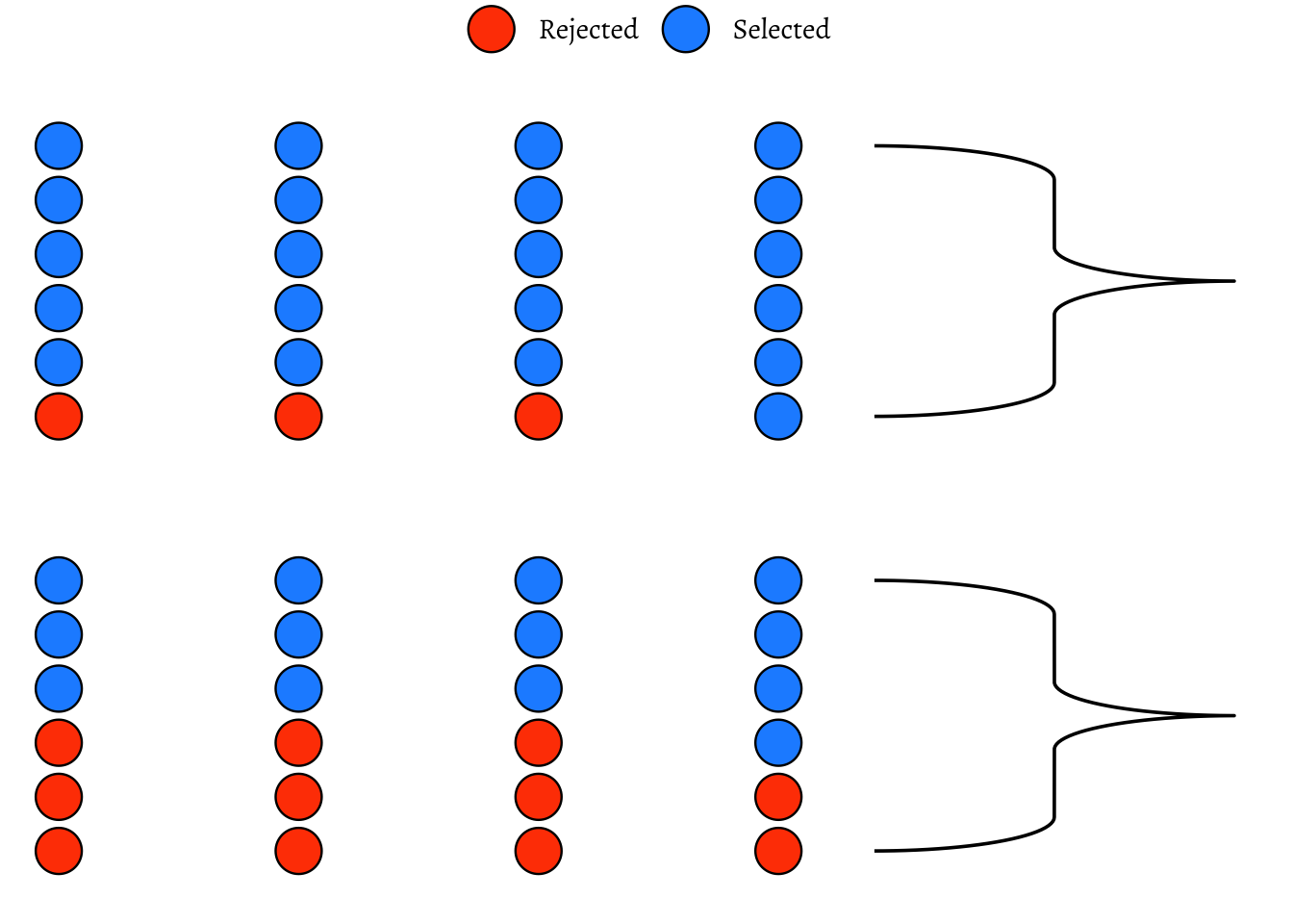
So, we have a solid disparity in percentage of selection between the two evaluators! Now we pretend that there is no difference between the selections made by either set of evaluators. So we can just:
- Pool up all the evaluations
- Arbitrarily re-assign a given candidate(selected or rejected) to either of the two sets of evaluators, by permutation.
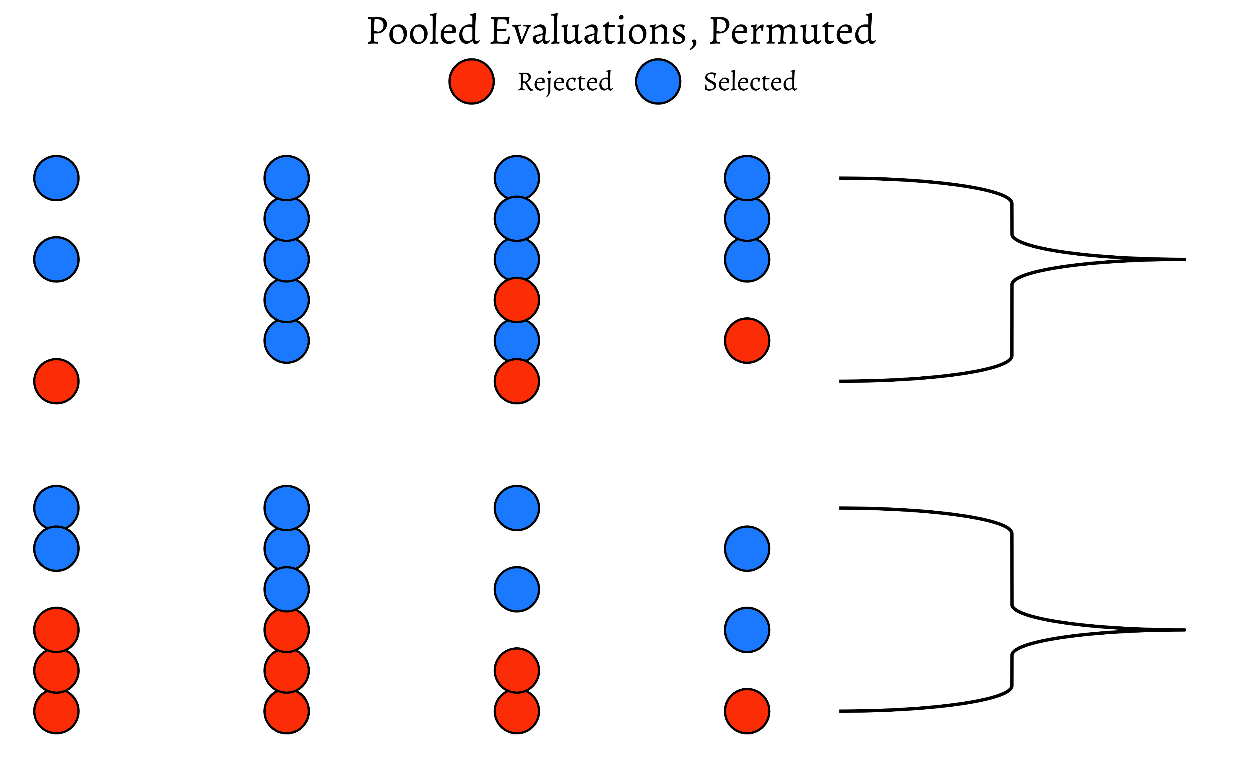
How would that pooled shuffled set of evaluations look like?
Code
set.seed(1947)
data_shuffled <- data %>%
  # knock off the coordinates prior to shuffle
  select(evaluator, candidate_selected) %>%
  # mutate(candidate_selected = shuffle(candidate_selected, replace = FALSE)) %>%
  arrange(evaluator, candidate_selected) %>%
  # reassign coordinates
  cbind(., expand.grid(x = 1:4, y = seq(4, 24, 4))) %>% # Not 48!!
  mutate(evaluator = shuffle(evaluator))
# data_shuffled %>% select(evaluator, candidate)
data_shuffled %>%
  group_by(evaluator) %>%
  dplyr::summarise(
    selection_ratio = mean(candidate_selected == "0"),
    count = sum(candidate_selected == "0"),
    n = dplyr::n()
)Code
ggplot2::theme_set(new = theme_custom())

data_shuffled %>%
  group_by(evaluator, candidate_selected) %>%
  ggplot(aes(
    x = x, y = y,
    group = evaluator,
    fill = as_factor(candidate_selected)
  )) +
  geom_point(shape = 21, size = 8) +
  scale_fill_manual(
    name = NULL,
    values = c("orangered", "dodgerblue"),
    labels = c("Rejected", "Selected")
  ) +
  ggplot2::theme_void(base_family = "Alegreya", base_size = 14) +
  facet_wrap(~evaluator, ncol = 1, scales = "free") +
  expand_limits(y = c(0, 28)) +
  ggbrace::stat_brace(aes(label = evaluator),
    rotate = 90,
    labelrotate = 0,
    labelsize = 4,
    inherit.aes = TRUE
  ) +
  theme(
    legend.position = "top",
    strip.background = element_blank(),
    strip.text.x = element_blank(),
    plot.title = element_text(hjust = 0.5)
  ) +
  ggtitle(label = "Pooled Evaluations, Permuted")
data_shuffled %>%
  # knock off the coordinates
  # Do not use "group_by"!! Why not?
  select(evaluator, candidate_selected) %>%
  arrange(evaluator, candidate_selected) %>%
  # reassign coordinates
  cbind(., expand.grid(x = 1:4, y = seq(4, 24, 4))) %>% # Not 48!!

  ggplot(data = ., aes(
    x = x, y = y,
    group = evaluator,
    fill = as_factor(candidate_selected)
  )) +
  geom_point(shape = 21, size = 8) + # plot circles with borders
  scale_fill_manual(
    name = NULL,
    values = c("orangered", "dodgerblue"),
    labels = c("Rejected", "Selected")
  ) +

  # Very important to have scales = "free" !!
  facet_wrap(~evaluator, ncol = 1, scales = "free") +
  expand_limits(y = c(0, 28)) +
  ggbrace::stat_brace(aes(label = evaluator),
    rotate = 90,
    labelrotate = 0,
    labelsize = 4,
    inherit.aes = TRUE
  ) +
  ggplot2::theme_void(base_family = "Alegreya", base_size = 14) +
  theme(
    legend.position = "top",
    strip.background = element_blank(),
    strip.text.x = element_blank(),
    plot.title = element_text(hjust = 0.5)
  ) +
  ggtitle(label = "Permuted Evaluations, Grouped")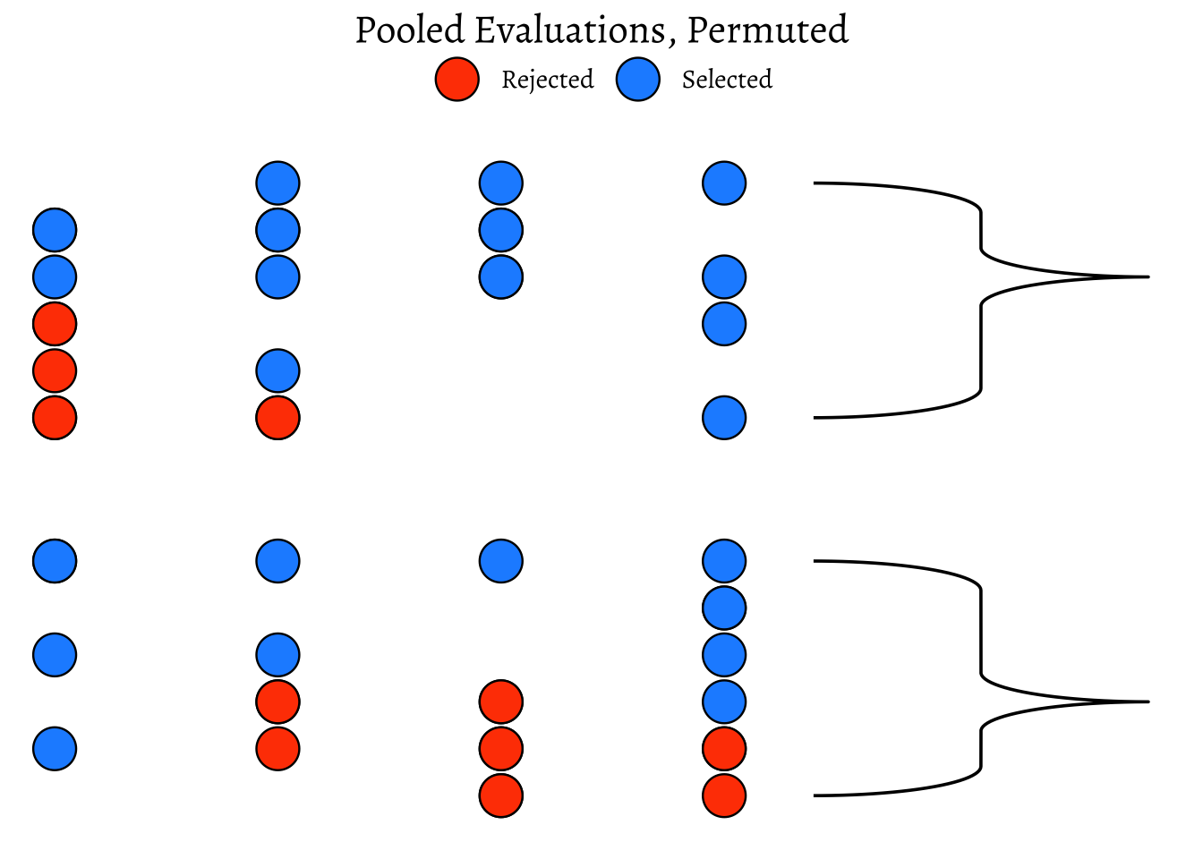
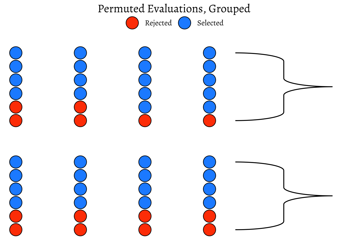
As can be seen, the ratio is different!
We can now check out our Hypothesis that there is no bias. We can shuffle the data many many times, calculating the ratio each time, and plot the distribution of the differences in selection ratio and see how that artificially created distribution compares with the originally observed figure from Mother Nature.
Code
ggplot2::theme_set(new = theme_custom())

null_dist <- do(4999) * diff(mean(
  candidate_selected ~ shuffle(evaluator),
  data = data
))
# null_dist %>% names()
null_dist %>%
  gf_histogram(~M,
    fill = ~ (M <= obs_difference),
    bins = 25, show.legend = FALSE,
    xlab = "Bias Proportion",
    ylab = "How Often?",
    title = "Permutation Test on Difference between Groups",
    subtitle = ""
  ) %>%
  gf_vline(xintercept = ~obs_difference, color = "red") %>%
  gf_label(500 ~ obs_difference,
    label = "Observed\n Bias",
    show.legend = FALSE
  )
mean(~ M <= obs_difference, data = null_dist)
[1] 0.0020004We see that the artificial data can hardly ever (\(p = 0.0022\)) mimic what the real world experiment is showing. Hence we had good reason to reject our NULL Hypothesis that there is no bias.
We should now repeat the test with permutations on Education:
gf_histogram(~X.squared, data = null_chisq) %>%
  gf_vline(
    xintercept = X_squared_observed,
    color = "red"
  ) %>%
  gf_labs(
    title = "Permutation Test on Chi-Square Statistic",
    x = "Chi-Square Statistic",
    y = "How Often?"
  ) %>%
  gf_annotate(
    geom = "label", y = 500, x = X_squared_observed,
    label = "Observed\n Chi-Square", fill = "moccasin"
  ) %>%
  gf_refine(
    scale_x_continuous(
      breaks = c(0, 5, 10, 15, 20, round(X_squared_observed, 2)),
      expand = expansion(mult = c(0, .1))
    ),
    scale_y_continuous(expand = c(0, 0))
  )
prop_TRUE
    2e-04
The p-value is well below our threshold of \(0.05\), so we would conclude that Education has a significant effect on DeathPenalty opinion!
| Package | Version | Citation |
|---|---|---|
| ggmosaic | 0.4.0 | Jeppson, Hofmann, and Cook (2023); Jeppson and Hofmann (2023) |
| resampledata | 0.3.2 | Chihara and Hesterberg (2018) |
| scales | 1.4.0 | Wickham, Pedersen, and Seidel (2025) |
| vcd | 1.4.13 | Meyer, Zeileis, and Hornik (2006); Zeileis, Meyer, and Hornik (2007); Meyer et al. (2024) |