library(tidyverse)
library(mosaic)
library(ggformula)
library(skimr)
library(janitor) # Data cleaning and tidying package
library(visdat) # Visualize whole dataframes for missing data
library(naniar) # Clean missing data
library(DT) # Interactive Tables for our data
library(tinytable) # Elegant Tables for our data
library(ggrepel) # Repel overlapping text labels in ggplot
library(marquee) # Annotations in ggplot
Outliers and other Crazy Things
2024-06-24
“In keeping silent about evil, in burying it so deep within us that no sign of it appears on the surface, we are implanting it, and it will rise up a thousand fold in the future.”
— Aleksandr Solzhenitsyn
Plot Fonts and Theme
Code
library(systemfonts)
library(showtext)
## Clean the slate
systemfonts::clear_local_fonts()
systemfonts::clear_registry()
##
showtext_opts(dpi = 96) # set DPI for showtext
sysfonts::font_add(
family = "Alegreya",
regular = "../../../../../../fonts/Alegreya-Regular.ttf",
bold = "../../../../../../fonts/Alegreya-Bold.ttf",
italic = "../../../../../../fonts/Alegreya-Italic.ttf",
bolditalic = "../../../../../../fonts/Alegreya-BoldItalic.ttf"
)
sysfonts::font_add(
family = "Roboto Condensed",
regular = "../../../../../../fonts/RobotoCondensed-Regular.ttf",
bold = "../../../../../../fonts/RobotoCondensed-Bold.ttf",
italic = "../../../../../../fonts/RobotoCondensed-Italic.ttf",
bolditalic = "../../../../../../fonts/RobotoCondensed-BoldItalic.ttf"
)
showtext_auto(enable = TRUE) # enable showtext
##
theme_custom <- function() {
theme_bw(base_size = 10) +
# theme(panel.widths = unit(11, "cm"),
# panel.heights = unit(6.79, "cm")) + # Golden Ratio
theme(
plot.margin = margin_auto(t = 1, r = 2, b = 1, l = 1, unit = "cm"),
plot.background = element_rect(
fill = "bisque",
colour = "black",
linewidth = 1
)
) +
theme_sub_axis(
title = element_text(
family = "Roboto Condensed",
size = 10
),
text = element_text(
family = "Roboto Condensed",
size = 8
)
) +
theme_sub_legend(
text = element_text(
family = "Roboto Condensed",
size = 6
),
title = element_text(
family = "Alegreya",
size = 8
)
) +
theme_sub_plot(
title = element_text(
family = "Alegreya",
size = 14, face = "bold"
),
title.position = "plot",
subtitle = element_text(
family = "Alegreya",
size = 10
),
caption = element_text(
family = "Alegreya",
size = 6
),
caption.position = "plot"
)
}
## Use available fonts in ggplot text geoms too!
ggplot2::update_geom_defaults(geom = "text", new = list(
family = "Roboto Condensed",
face = "plain",
size = 3.5,
color = "#2b2b2b"
))
ggplot2::update_geom_defaults(geom = "label", new = list(
family = "Roboto Condensed",
face = "plain",
size = 3.5,
color = "#2b2b2b"
))
ggplot2::update_geom_defaults(geom = "marquee", new = list(
family = "Roboto Condensed",
face = "plain",
size = 3.5,
color = "#2b2b2b"
))
ggplot2::update_geom_defaults(geom = "text_repel", new = list(
family = "Roboto Condensed",
face = "plain",
size = 3.5,
color = "#2b2b2b"
))
ggplot2::update_geom_defaults(geom = "label_repel", new = list(
family = "Roboto Condensed",
face = "plain",
size = 3.5,
color = "#2b2b2b"
))
## Set the theme
ggplot2::theme_set(new = theme_custom())
## tinytable options
options("tinytable_tt_digits" = 2)
options("tinytable_format_num_fmt" = "significant_cell")
options(tinytable_html_mathjax = TRUE)
## Set defaults for flextable
flextable::set_flextable_defaults(font.family = "Roboto Condensed")
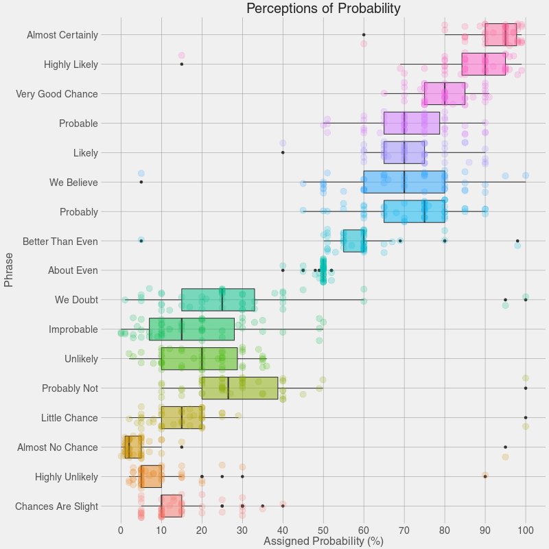
Alice said, “I say what I mean and I mean what I say!” Are the rest of us so sure? What do we mean when we use any of the phrases above? How definite are we? There is a range of “sureness” and “unsureness”…and this is where we can use box plots like Figure 1 to show that range of opinion.
Maybe it is time for a box plot on uh, shades1 of meaning for Jane Austen Gen-Z phrases! Bah.
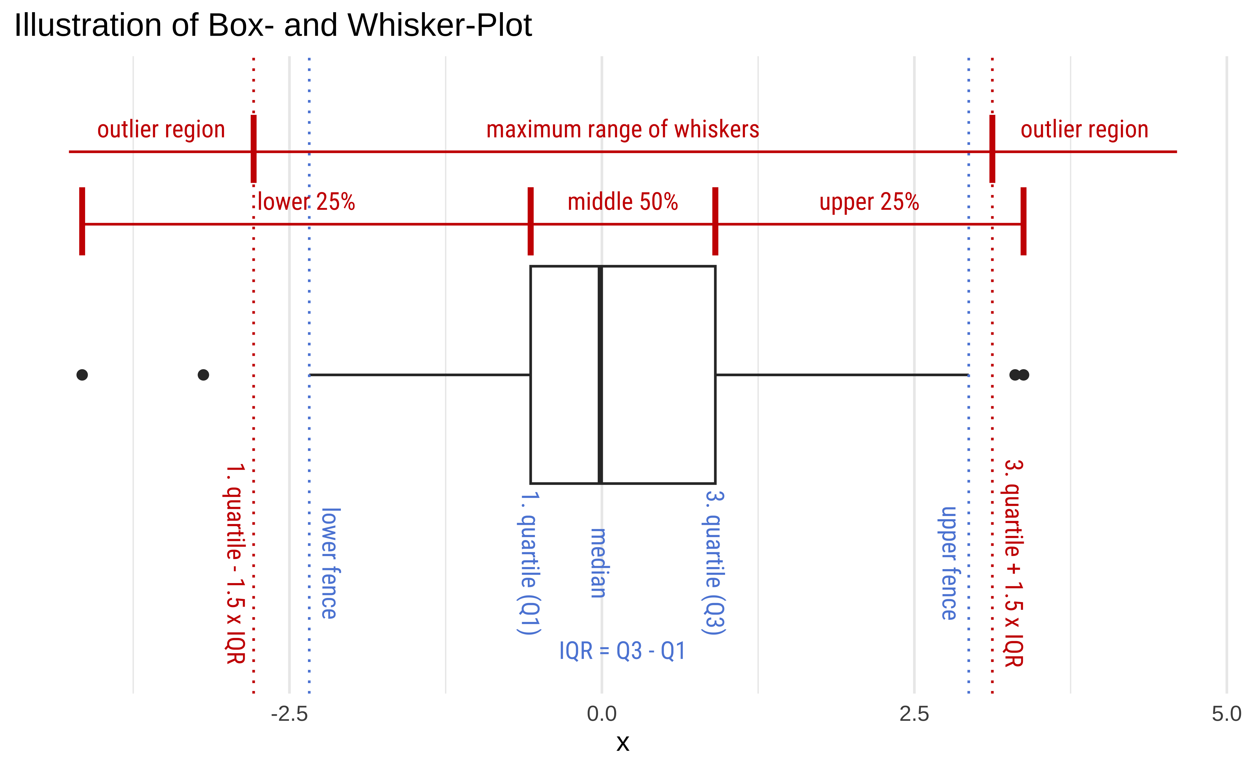
Box Plots are an extremely useful data visualization that gives us an idea of the distribution of a Quant variable, for each level of another Qual variable.
Box Plots and Skewness
Boxplots can be symmetric or show evidence of skew in the data. In such cases the box will typically the two halves of different “sizes”, since these two Quartiles span different ranges in value.
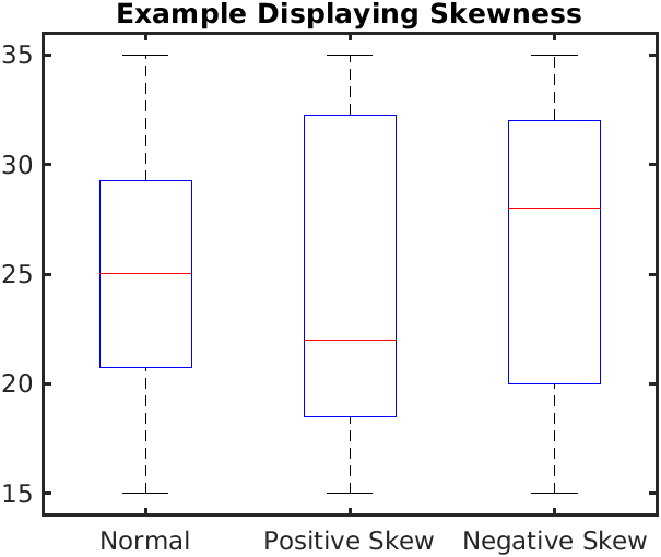
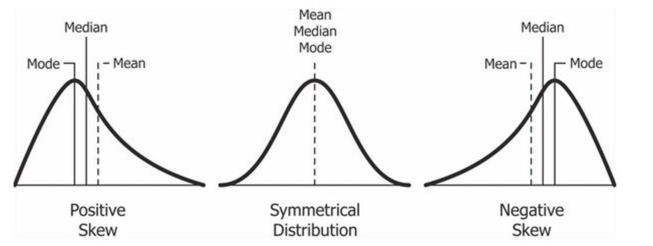
In the Figure 3 (a), we see the difference between boxplots that show symmetric and skewed distributions. The “lid” and the “bottom” of the box are not of similar width in distributions with significant skewness.
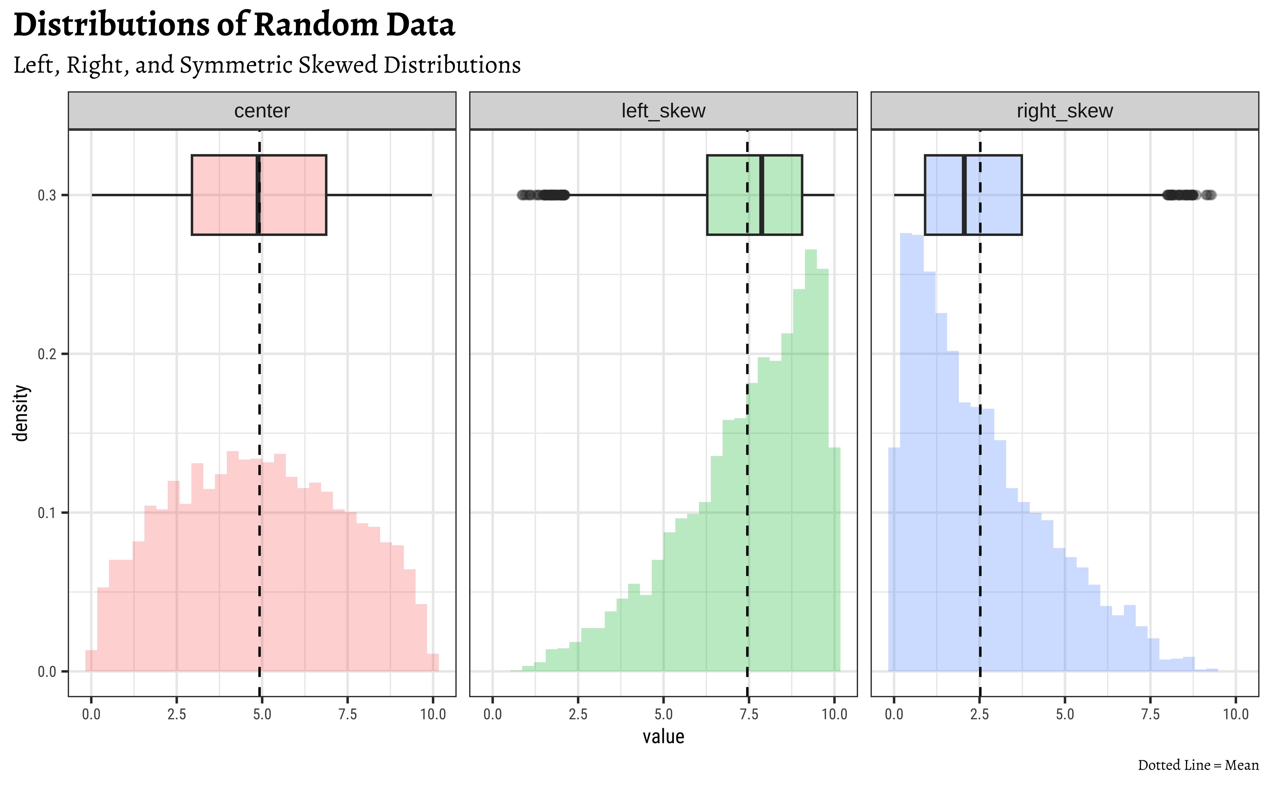
Compare these with the corresponding distributions in Figure 3 (b).
Box Plots and Outliers
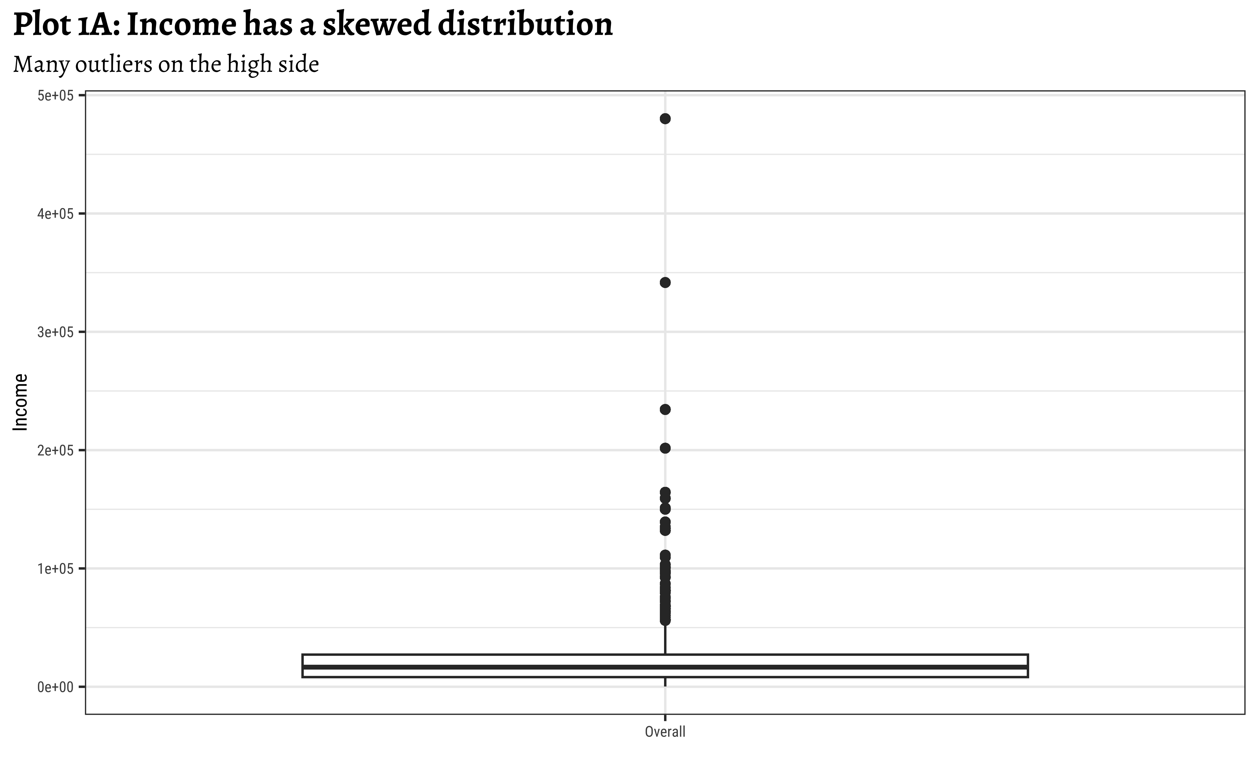
Box plots can show the presence of outliers in distributions, with a large number of outliers on one side, as in Figure 4.
realrinc?

wages %>%
janitor::clean_names(case = "snake") %>%
janitor::remove_empty(which = c("rows", "cols")) %>%
tidyr::drop_na(realrinc) %>%
gf_boxplot(realrinc ~ "Income",orientation = "x") %>% # Dummy X-axis "variable"
gf_labs(title = "Plot 1A: Income has a skewed distribution",
subtitle = "Many outliers on the high side")
##
wages %>%
janitor::clean_names(case = "snake") %>%
janitor::remove_empty(which = c("rows", "cols")) %>%
tidyr::drop_na(realrinc) %>%
ggplot() +
geom_boxplot(aes(y = realrinc, x = "Income")) + # Dummy X-axis "variable"
labs(title = "Plot 1A: Income has a skewed distribution",
subtitle = "Many outliers on the high side")- Income is a very skewed distribution, as might be expected.
- Presence of many higher-side outliers is noted.
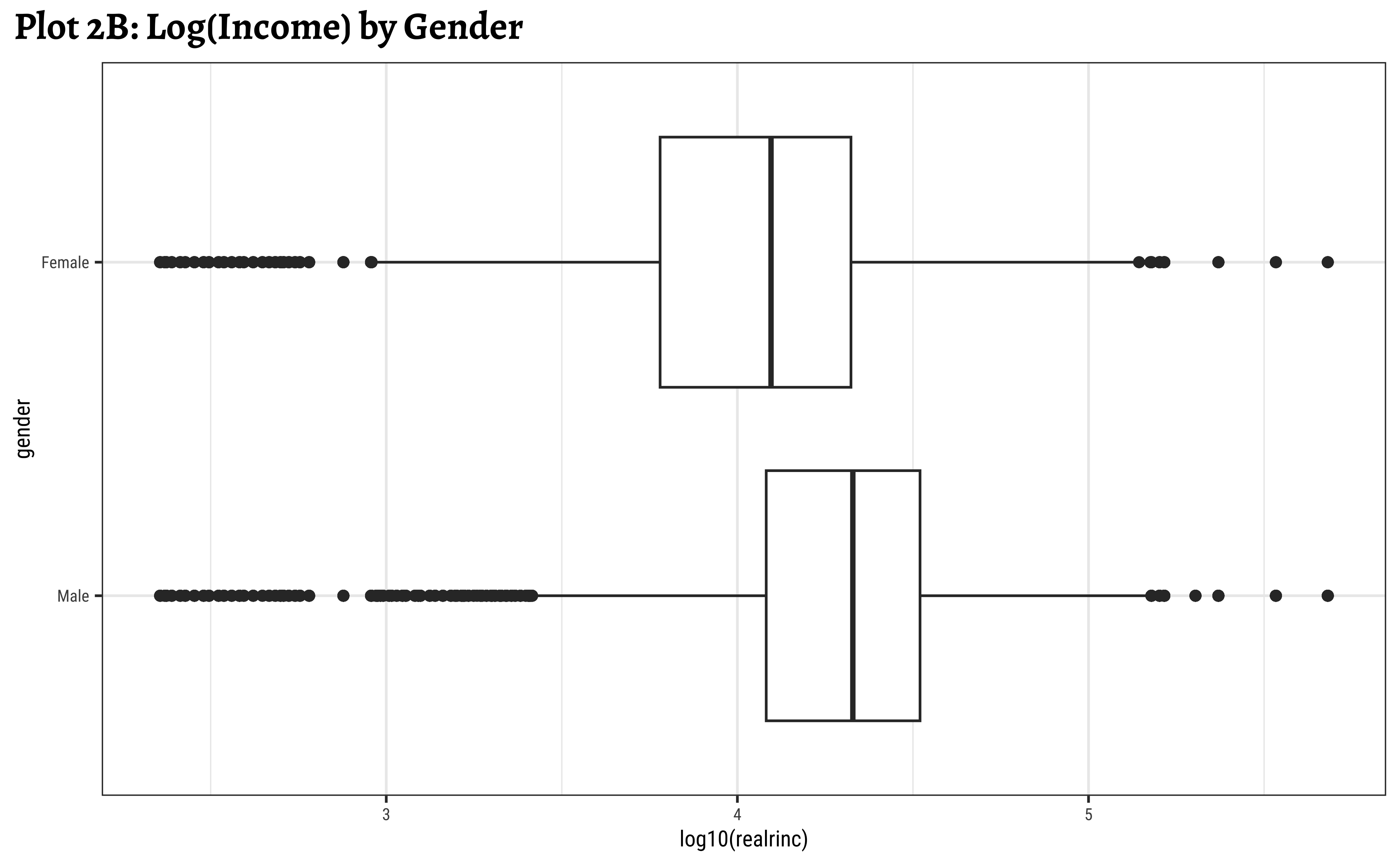
realrinc affected by gender?


ggplot2::theme_set(new = theme_custom())
wages_clean %>%
ggplot() +
geom_boxplot(aes(y = gender, x = realrinc)) +
labs(title = "Plot 2A: Income by Gender")
##
wages_clean %>%
ggplot() +
geom_boxplot(aes(y = gender, x = log10(realrinc))) +
labs(title = "Plot 2B: Log(Income) by Gender")
##
wages_clean %>%
ggplot() +
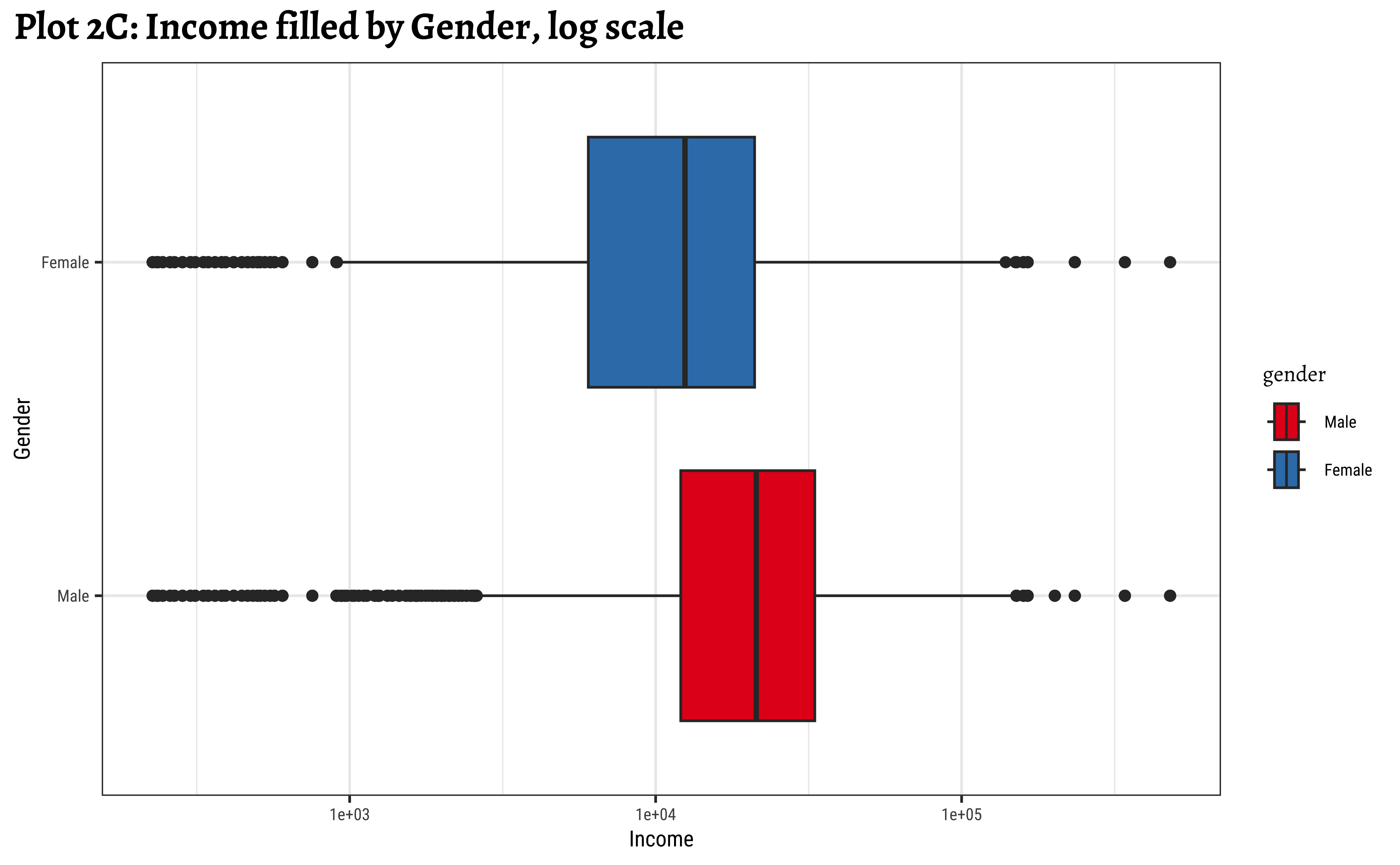
geom_boxplot(aes(y = gender, x = realrinc, fill = gender)) +
scale_x_log10() +
scale_fill_brewer(palette = "Set1") +
labs(title = "Plot 2C: Income filled by Gender, log scale")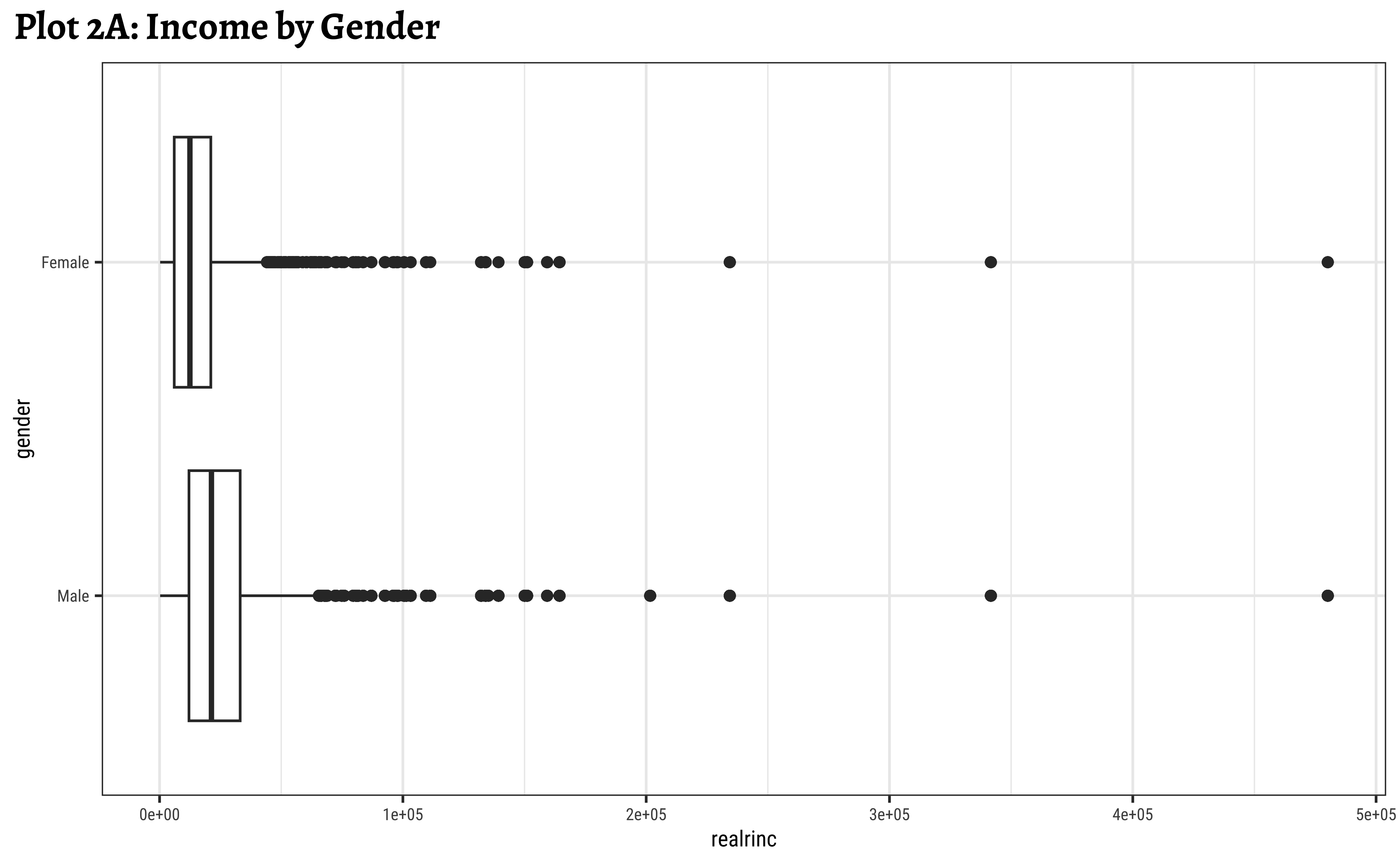

wages %>%
janitor::clean_names(case = "snake") %>%
janitor::remove_empty(which = c("rows", "cols")) %>%
tidyr::drop_na(realrinc) %>%
gf_boxplot(gender ~ realrinc,orientation = "y") %>%
gf_labs(title = "Plot 2A: Income by Gender")
##
wages %>%
janitor::clean_names(case = "snake") %>%
janitor::remove_empty(which = c("rows", "cols")) %>%
tidyr::drop_na(realrinc) %>%
gf_boxplot(gender ~ log10(realrinc),orientation = "y") %>%
gf_labs(title = "Plot 2B: Log(Income) by Gender")
##
wages %>%
janitor::clean_names(case = "snake") %>%
janitor::remove_empty(which = c("rows", "cols")) %>%
tidyr::drop_na(realrinc) %>%
gf_boxplot(gender ~ realrinc, fill = ~ gender,orientation = "y") %>%
gf_refine(scale_x_log10(), scale_fill_brewer(palette = "Set1")) %>%
gf_labs(title = "Plot 2C: Income filled by Gender, log scale")- Even when split by
gender,realincomepresents a skewed set of distributions. - The IQR for
males is smaller than the IQR forfemales. There is less variation in the middle ranges ofrealrincfor men. - log10 transformation helps to view and understand the regions of low
realrinc. - There are outliers on both sides, indicating that there may be many people who make very small amounts of money and large amounts of money in both
genders.
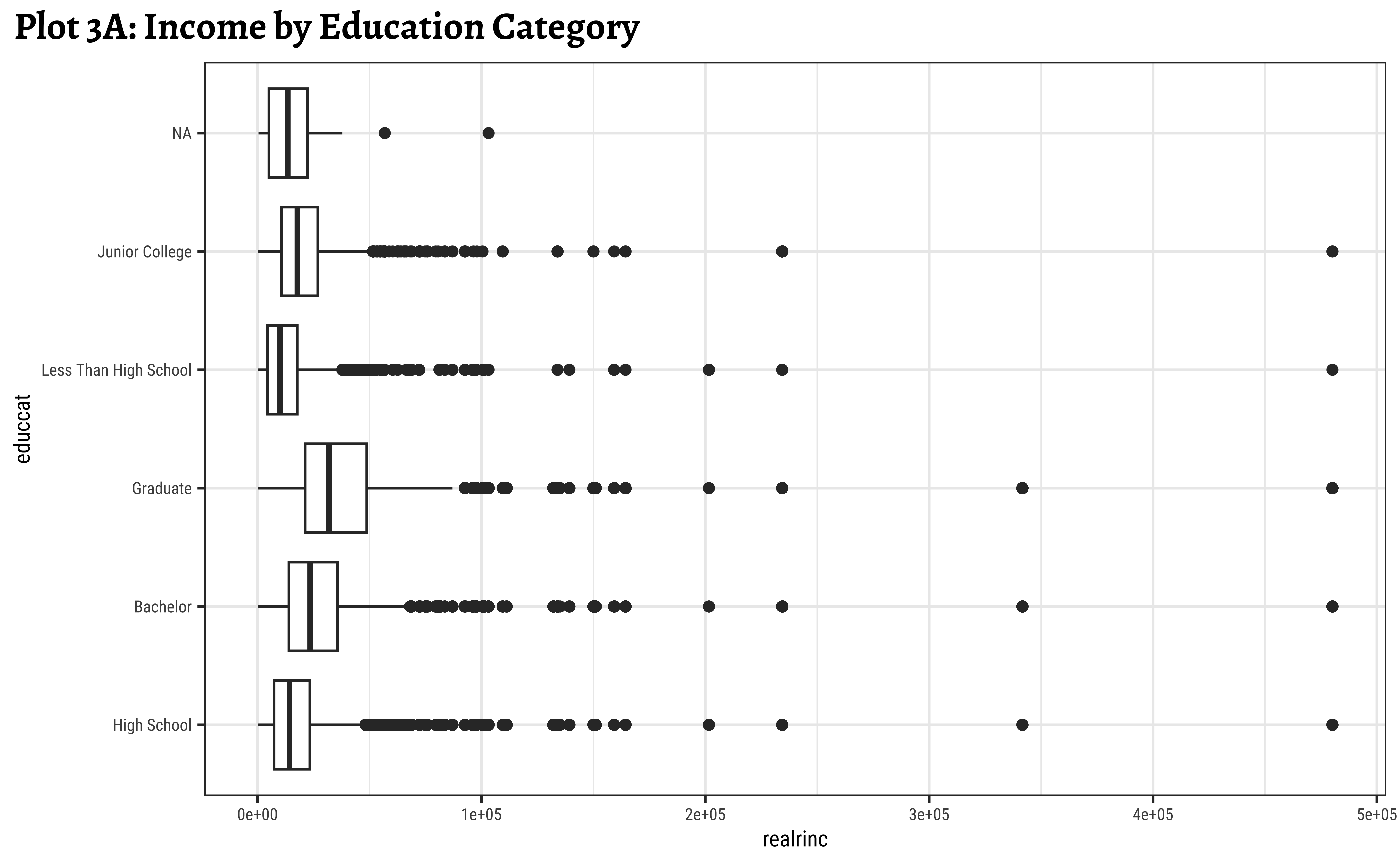
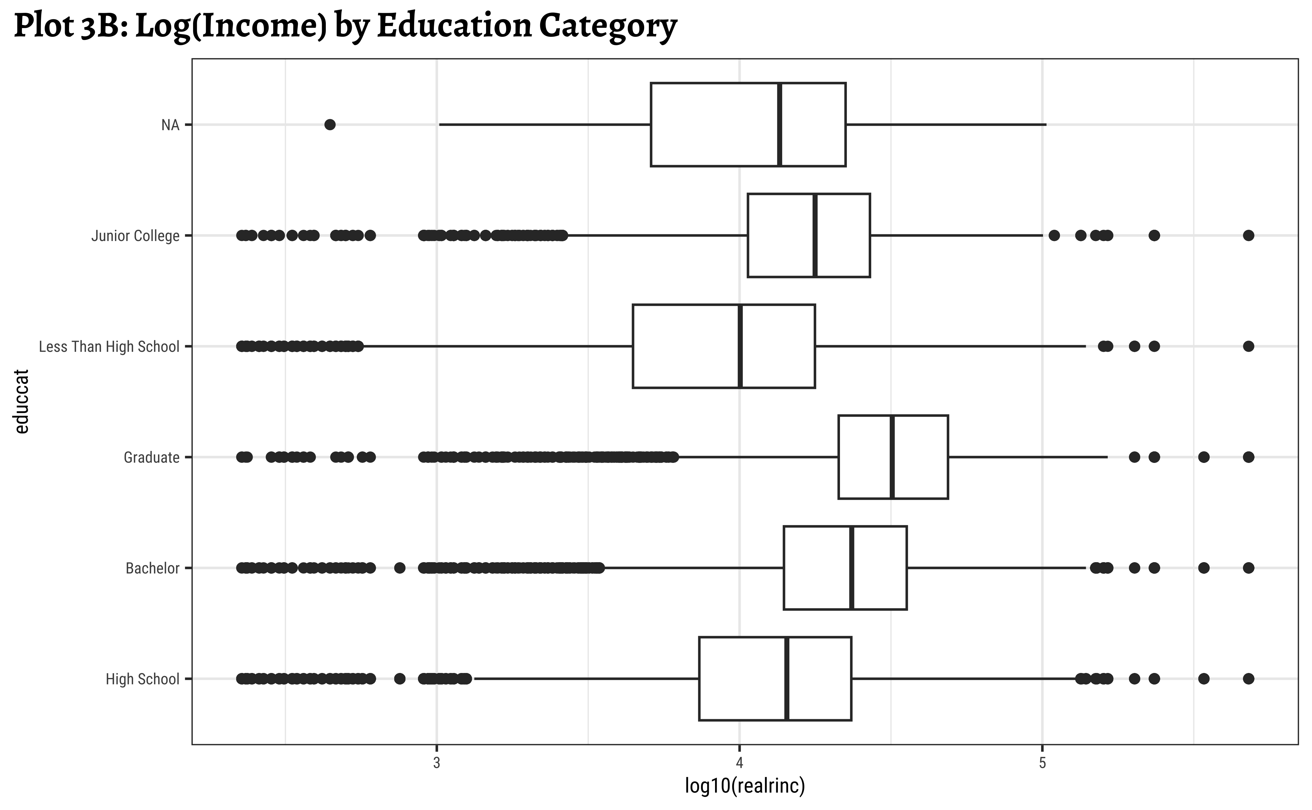
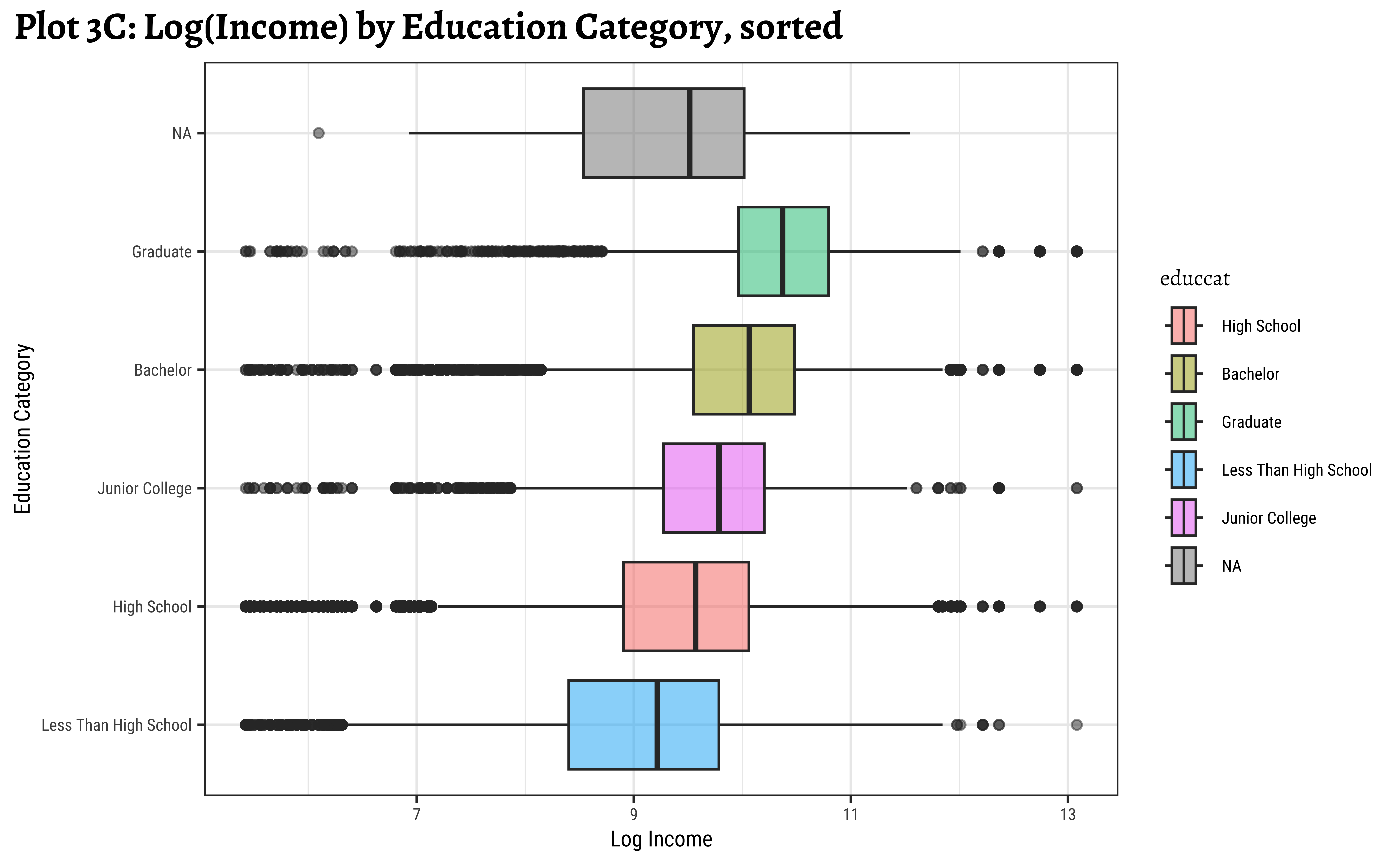
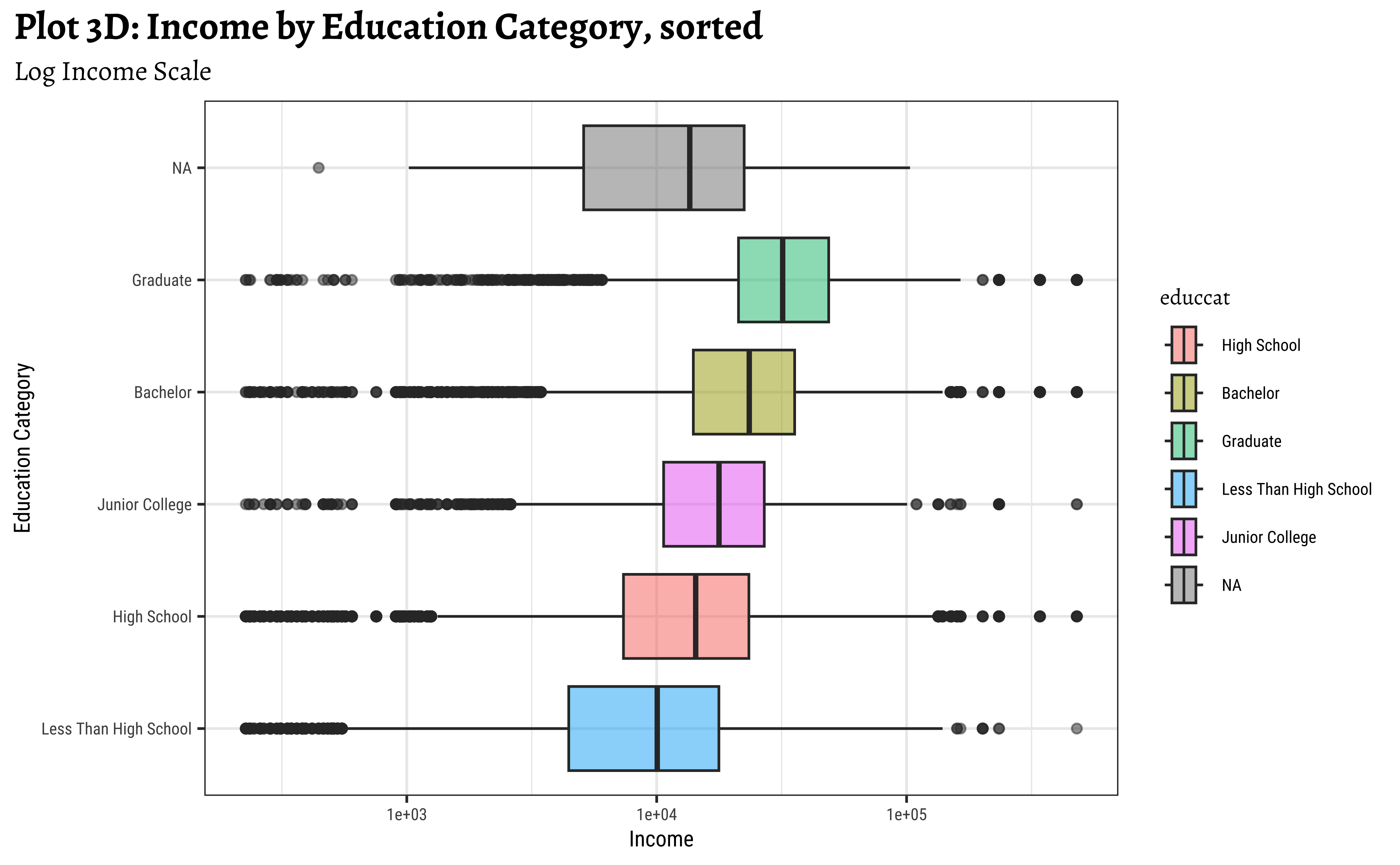
realrinc affected by educcat?


ggplot2::theme_set(new = theme_custom())
wages_clean %>%
gf_boxplot(
reorder(educcat, realrinc, FUN = median) ~ log(realrinc),
fill = ~educcat, alpha = 0.5, orientation = "y"
) %>%
gf_labs(
title = "Plot 3C: Log(Income) by Education Category, sorted",
x = "Log Income",
y = "Education Category"
) %>%
gf_refine(scale_fill_brewer(palette = "Set1"))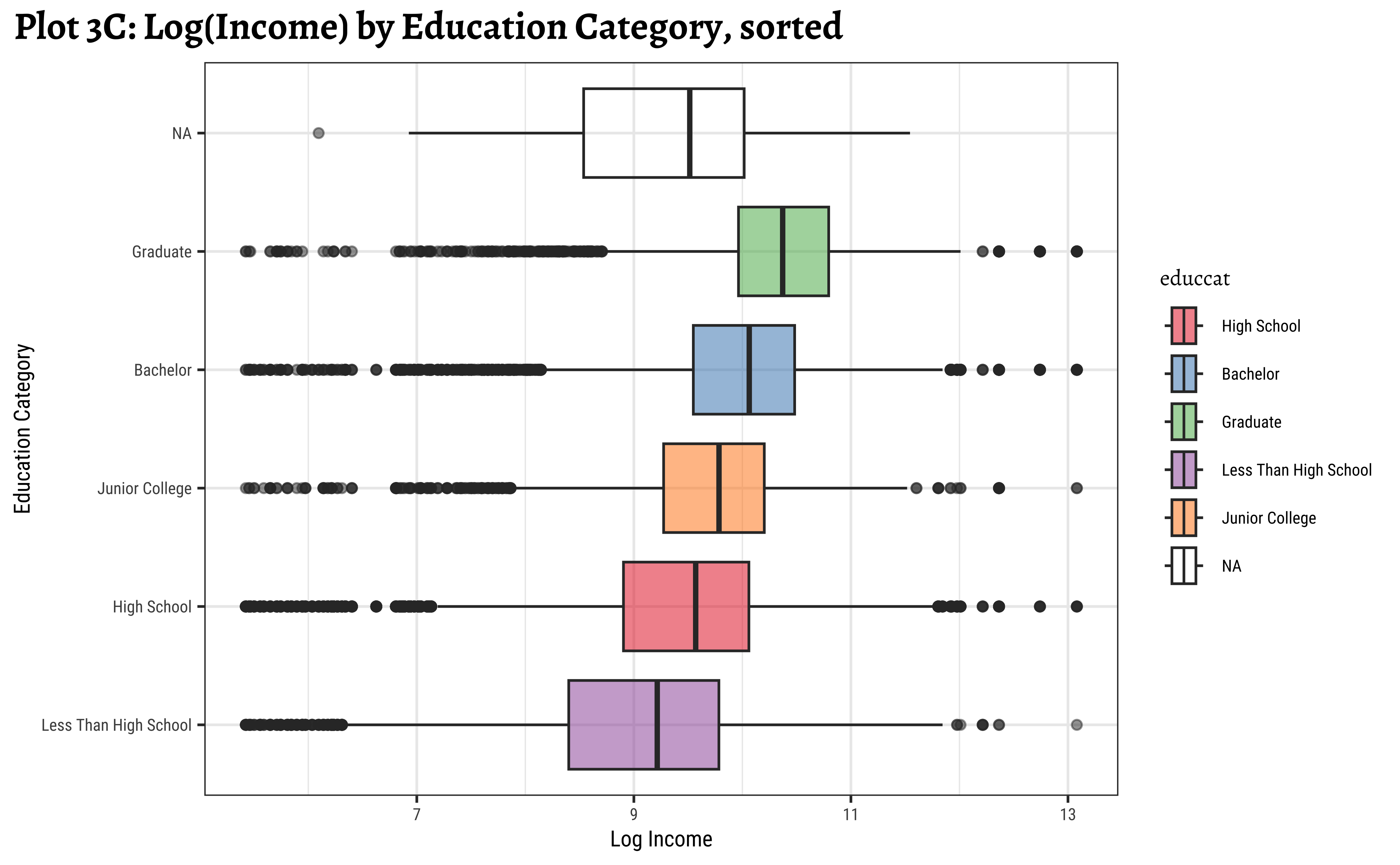
ggplot2::theme_set(new = theme_custom())
wages_clean %>%
gf_boxplot(reorder(educcat, realrinc, FUN = median) ~ realrinc,
fill = ~educcat, orientation = "y",
alpha = 0.5
) %>%
gf_refine(scale_x_log10()) %>%
gf_labs(
title = "Plot 3D: Income by Education Category, sorted",
subtitle = "Log Income",
x = "Income",
y = "Education Category"
) %>%
gf_refine(scale_fill_brewer(palette = "Set1"))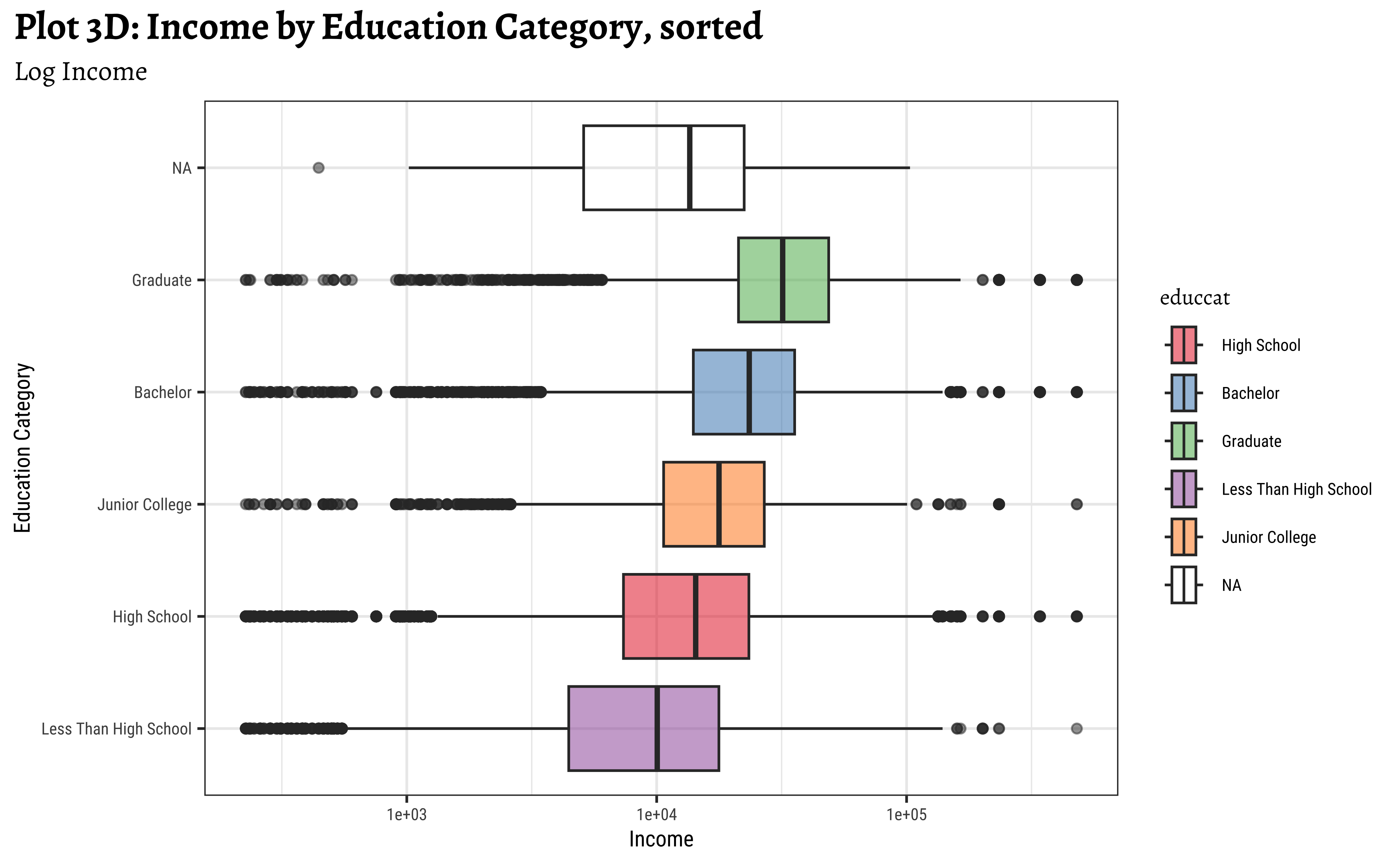
Note that educcat has been sorted in the last two plots, by the median value of realrinc in each category. This makes it easier to see the trend. And that educcat has a “NA” level as well, that indicates people who did not report their education level. This is plotted at one end of the box plot by default. (regardless of how the boxplots are sorted. Try reordering in desc() order to see what happens!)
ggplot2::theme_set(new = theme_custom())
wages_clean %>%
ggplot() +
geom_boxplot(aes(realrinc, educcat)) + # (x,y) format
labs(title = "Plot 3A: Income by Education Category")
##
wages_clean %>%
ggplot() +
geom_boxplot(aes(log10(realrinc), educcat)) +
labs(title = "Plot 3B: Log(Income) by Education Category")
##
wages_clean %>%
ggplot() +
geom_boxplot(
aes(log(realrinc),
reorder(educcat, realrinc, FUN = median),
fill = educcat
),
alpha = 0.5
) +
labs(
title = "Plot 3C: Log(Income) by Education Category, sorted",
x = "Log Income", y = "Education Category"
)
##
wages_clean %>%
ggplot() +
geom_boxplot(
aes(realrinc,
reorder(educcat, realrinc, FUN = median),
fill = educcat
),
alpha = 0.5
) +
scale_x_log10() +
labs(
title = "Plot 3D: Income by Education Category, sorted",
subtitle = "Log Income Scale",
x = "Income", y = "Education Category"
)
wages %>%
janitor::clean_names(case = "snake") %>%
janitor::remove_empty(which = c("rows", "cols")) %>%
tidyr::drop_na(realrinc) %>%
gf_boxplot(educcat ~ realrinc,orientation = "y") %>%
gf_labs(title = "Plot 3A: Income by Education Category")
##
wages %>%
janitor::clean_names(case = "snake") %>%
janitor::remove_empty(which = c("rows", "cols")) %>%
tidyr::drop_na(realrinc) %>%
gf_boxplot(educcat ~ log10(realrinc),orientation = "y") %>%
gf_labs(title = "Plot 3B: Log(Income) by Education Category")
##
wages %>%
janitor::clean_names(case = "snake") %>%
janitor::remove_empty(which = c("rows", "cols")) %>%
tidyr::drop_na(realrinc) %>%
gf_boxplot(reorder(educcat, realrinc, FUN = median) ~ log(realrinc),
fill = ~ educcat, orientation = "y",
alpha = 0.5) %>%
gf_labs(title = "Plot 3C: Log(Income) by Education Category, sorted",
x = "Log Income", y = "Education Category")
##
wages %>%
janitor::clean_names(case = "snake") %>%
janitor::remove_empty(which = c("rows", "cols")) %>%
tidyr::drop_na(realrinc) %>%
gf_boxplot(reorder(educcat, realrinc, FUN = median) ~ realrinc,
fill = ~ educcat,orientation = "y",
alpha = 0.5) %>%
gf_refine(scale_x_log10()) %>%
gf_labs(title = "Plot 3D: Income by Education Category, sorted",
subtitle = "Log Income Scale",
x = "Income", y = "Education Category")realrincrises witheduccat, which is to be expected.- However, there are people with very low and very high income in all categories of
educcat - Hence
educcatalone may not be a good predictor forrealrinc.
We can do similar work with the other Qual variables. Let us now see how we can use more than one Qual variable and answer the last hypothesis, Question 4.
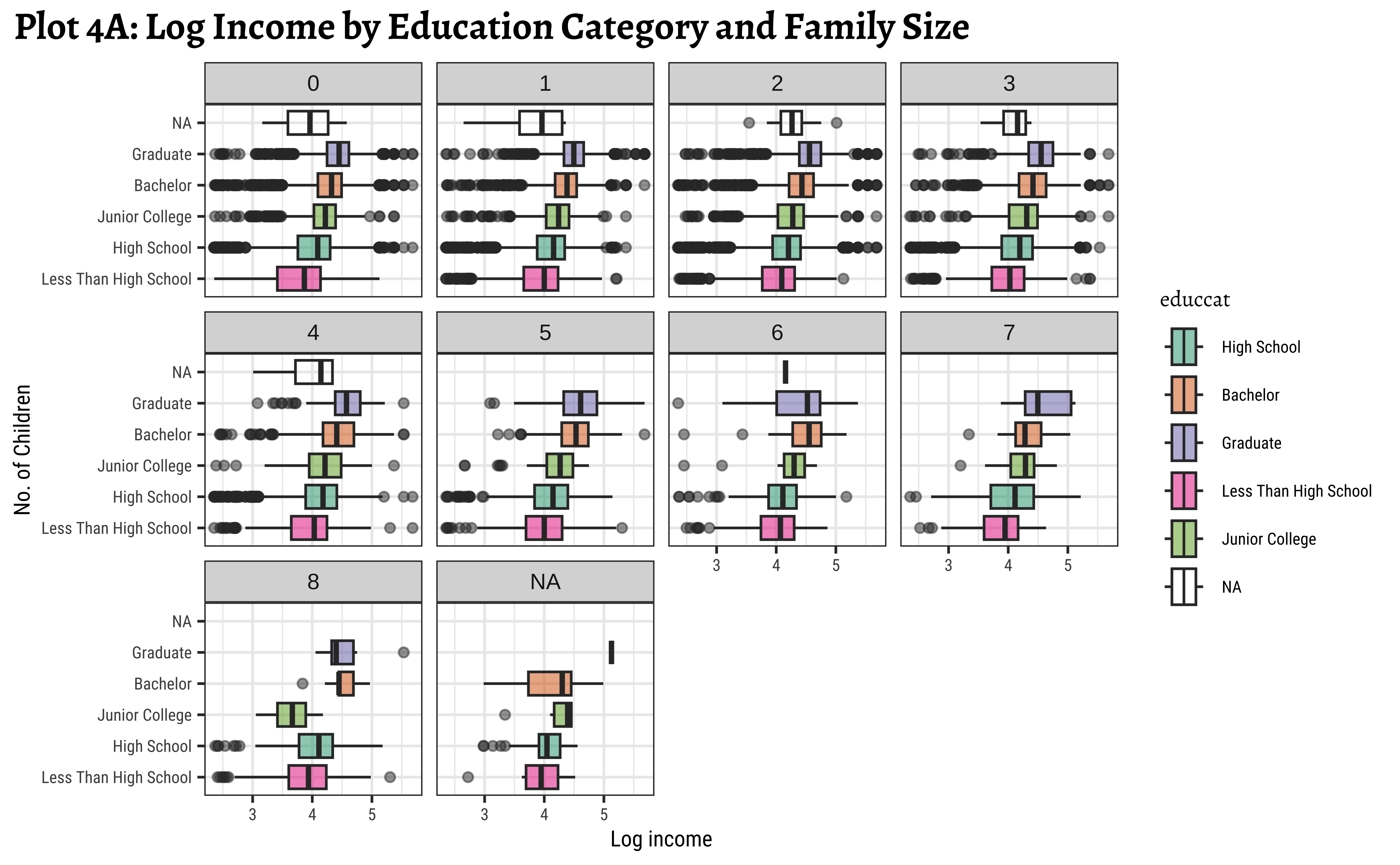
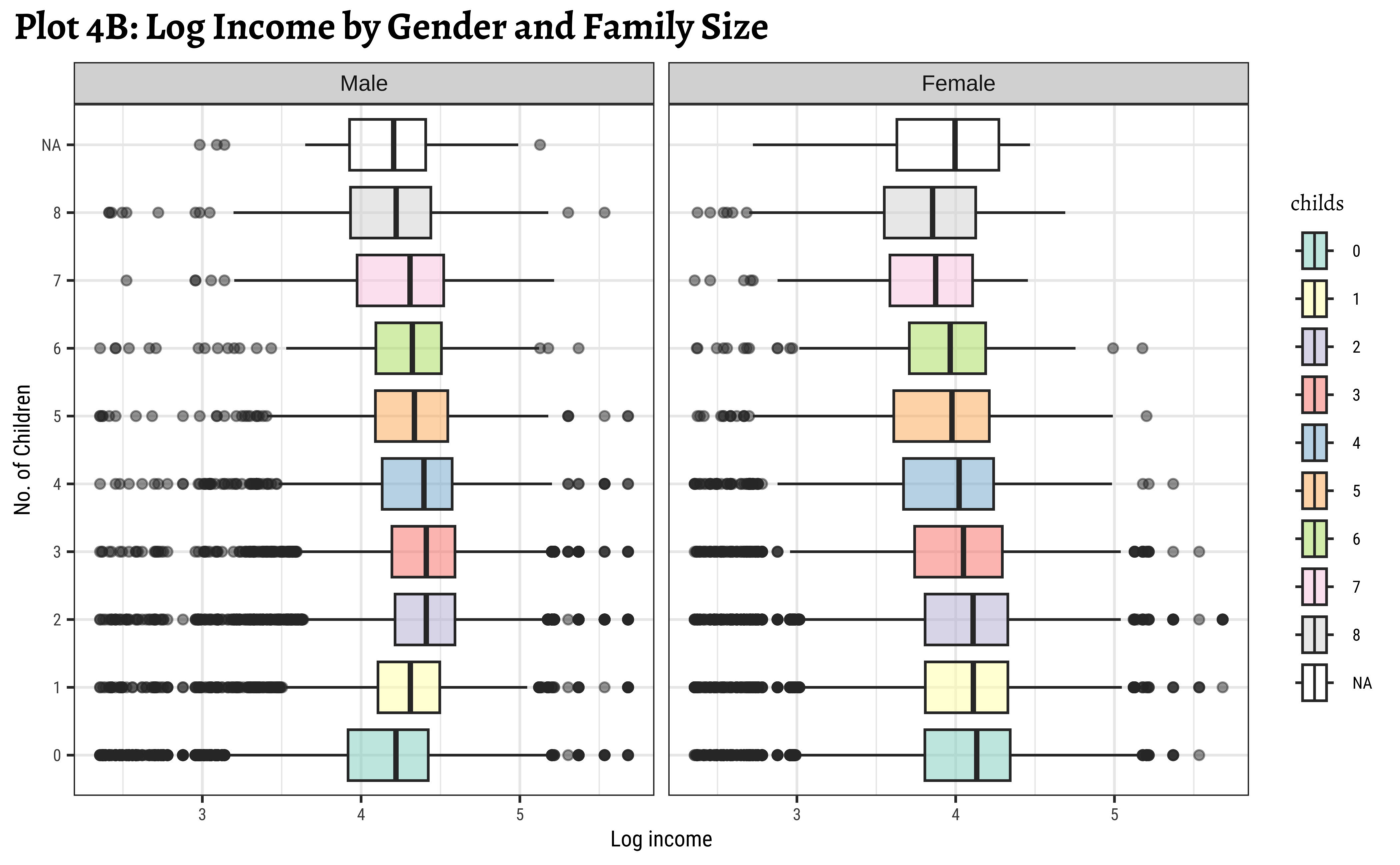
Question-4: Is realrinc affected by combinations of factors?
ggplot2::theme_set(new = theme_custom())
wages_clean %>%
gf_boxplot(reorder(educcat, realrinc) ~ log10(realrinc),
fill = ~educcat, orientation = "y",
alpha = 0.5
) %>%
gf_facet_wrap(vars(childs)) %>%
gf_refine(scale_fill_brewer(type = "qual", palette = "Dark2")) %>%
gf_labs(
title = "Plot 4A: Log Income by Education Category and Family Size",
x = "Log income",
y = "No. of Children"
)
ggplot2::theme_set(new = theme_custom())
wages_clean %>%
mutate(childs = as_factor(childs)) %>%
gf_boxplot(childs ~ log10(realrinc),
group = ~childs,
fill = ~childs, orientation = "y",
alpha = 0.5
) %>%
gf_facet_wrap(~gender) %>%
gf_refine(scale_fill_brewer(type = "qual", palette = "Set3")) %>%
gf_labs(
title = "Plot 4B: Log Income by Gender and Family Size",
x = "Log income",
y = "No. of Children"
)
ggplot2::theme_set(new = theme_custom())
wages_clean %>%
ggplot() +
geom_boxplot(
aes(log10(realrinc), reorder(educcat, realrinc),
fill = educcat
), # aes() closes here
alpha = 0.5
) +
facet_wrap(vars(childs)) +
scale_fill_brewer(type = "qual", palette = "Dark2") +
labs(title = "Plot 4A: Log Income by Education Category and Family Size", x = "Log income", y = "No. of Children")
##
wages_clean %>%
mutate(childs = as_factor(childs)) %>%
ggplot() +
geom_boxplot(
aes(log10(realrinc), childs,
group = childs,
fill = childs
), # aes() closes here
alpha = 0.5
) +
facet_wrap(vars(gender)) +
scale_fill_brewer(type = "qual", palette = "Set3") +
labs(
title = "Plot 4B: Log Income by Gender and Family Size",
x = "Log income",
y = "No. of Children"
)
#| label: fig-income-by-educcat-childs-webr
wages %>%
janitor::clean_names(case = "snake") %>%
janitor::remove_empty(which = c("rows", "cols")) %>%
drop_na() %>%
gf_boxplot(reorder(educcat, realrinc) ~ log10(realrinc),
fill = ~ educcat, orientation = "y",
alpha = 0.5) %>%
gf_facet_wrap(vars(childs)) %>%
gf_refine(scale_fill_brewer(type = "qual", palette = "Dark2")) %>%
gf_labs(title = "Plot 4A: Log Income by Education Category and Family Size", x = "Log income", y = "No. of Children")
##
wages %>%
janitor::clean_names(case = "snake") %>%
janitor::remove_empty(which = c("rows", "cols")) %>%
drop_na() %>%
dplyr::mutate(childs = as_factor(childs)) %>%
gf_boxplot(childs ~ log10(realrinc),orientation = "y",
group = ~ childs,
fill = ~ childs,
alpha = 0.5) %>%
gf_facet_wrap(~ gender) %>%
gf_refine(scale_fill_brewer(type = "qual", palette = "Set3")) %>%
gf_labs(title = "Plot 4B: Log Income by Gender and Family Size",
x = "Log income",
y = "No. of Children")- We see that
realrincincreases witheduccat, across (almost) all family sizeschilds. - However, this trend breaks a little when family sizes
childsis large, say >= 7. Be aware that the data observations for such large families may be sparse and this inference may not be necessarily valid. - We see that the effect of
childsonrealrincis different for eachgender! For females, the income steadily drops with the number of children, whereas for males it actually increases up to a certain family size before decreasing again.