library(tidyverse)
library(mosaic)
library(ggformula)
library(skimr)
##
# install.packages("remotes")
# library(remotes)
# remotes::install_github("wilkelab/ggridges")
library(ggridges) # Ridge Density Plots
##
library(janitor) # Data cleaning and tidying package
library(visdat) # Visualize whole dataframes for missing data
library(naniar) # Clean missing data
library(DT) # Interactive Tables for our data
library(tinytable) # Elegant Tables for our data
library(ggrepel) # Repel overlapping text labels in ggplot2
library(marquee) # Annotations in ggplot2
The Hills are Shadows, said Tennyson
2024-06-22
Plot Fonts and Theme
Code
library(systemfonts)
library(showtext)
## Clean the slate
systemfonts::clear_local_fonts()
systemfonts::clear_registry()
##
showtext_opts(dpi = 96) # set DPI for showtext
sysfonts::font_add(
  family = "Alegreya",
  regular = "../../../../../../fonts/Alegreya-Regular.ttf",
  bold = "../../../../../../fonts/Alegreya-Bold.ttf",
  italic = "../../../../../../fonts/Alegreya-Italic.ttf",
  bolditalic = "../../../../../../fonts/Alegreya-BoldItalic.ttf"
)

sysfonts::font_add(
  family = "Roboto Condensed",
  regular = "../../../../../../fonts/RobotoCondensed-Regular.ttf",
  bold = "../../../../../../fonts/RobotoCondensed-Bold.ttf",
  italic = "../../../../../../fonts/RobotoCondensed-Italic.ttf",
  bolditalic = "../../../../../../fonts/RobotoCondensed-BoldItalic.ttf"
)
showtext_auto(enable = TRUE) # enable showtext
##
theme_custom <- function() {
  theme_bw(base_size = 10) +

    # theme(panel.widths = unit(11, "cm"),
    #       panel.heights = unit(6.79, "cm")) + # Golden Ratio

    theme(
      plot.margin = margin_auto(t = 1, r = 2, b = 1, l = 1, unit = "cm"),
      plot.background = element_rect(
        fill = "bisque",
        colour = "black",
        linewidth = 1
      )
    ) +

    theme_sub_axis(
      title = element_text(
        family = "Roboto Condensed",
        size = 10
      ),
      text = element_text(
        family = "Roboto Condensed",
        size = 8
      )
    ) +

    theme_sub_legend(
      text = element_text(
        family = "Roboto Condensed",
        size = 6
      ),
      title = element_text(
        family = "Alegreya",
        size = 8
      )
    ) +

    theme_sub_plot(
      title = element_text(
        family = "Alegreya",
        size = 14, face = "bold"
      ),
      title.position = "plot",
      subtitle = element_text(
        family = "Alegreya",
        size = 10
      ),
      caption = element_text(
        family = "Alegreya",
        size = 6
      ),
      caption.position = "plot"
    )
}

## Use available fonts in ggplot text geoms too!
ggplot2::update_geom_defaults(geom = "text", new = list(
  family = "Roboto Condensed",
  face = "plain",
  size = 3.5,
  color = "#2b2b2b"
))
ggplot2::update_geom_defaults(geom = "label", new = list(
  family = "Roboto Condensed",
  face = "plain",
  size = 3.5,
  color = "#2b2b2b"
))

ggplot2::update_geom_defaults(geom = "marquee", new = list(
  family = "Roboto Condensed",
  face = "plain",
  size = 3.5,
  color = "#2b2b2b"
))
ggplot2::update_geom_defaults(geom = "text_repel", new = list(
  family = "Roboto Condensed",
  face = "plain",
  size = 3.5,
  color = "#2b2b2b"
))
ggplot2::update_geom_defaults(geom = "label_repel", new = list(
  family = "Roboto Condensed",
  face = "plain",
  size = 3.5,
  color = "#2b2b2b"
))

## Set the theme
ggplot2::theme_set(new = theme_custom())

## tinytable options
options("tinytable_tt_digits" = 2)
options("tinytable_format_num_fmt" = "significant_cell")
options(tinytable_html_mathjax = TRUE)


## Set defaults for flextable
flextable::set_flextable_defaults(font.family = "Roboto Condensed")
Code
April is the cruelest month, said T.S Eliot. But December in Nebraska must be tough.
We will restrict ourselves to some of the variables that pertain, by and large, to the body dimensions of our penguins:
Qualitative Data
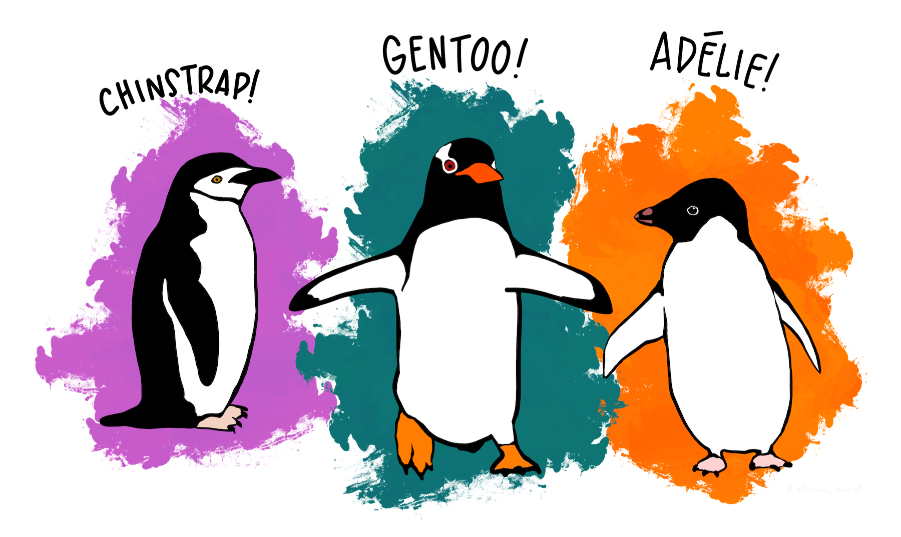
sex: male and female penguinsspecies: Three adorable types!island: they have islands to themselves!!region: Antarctica, duh!! Hmmm….
Quantitative Data
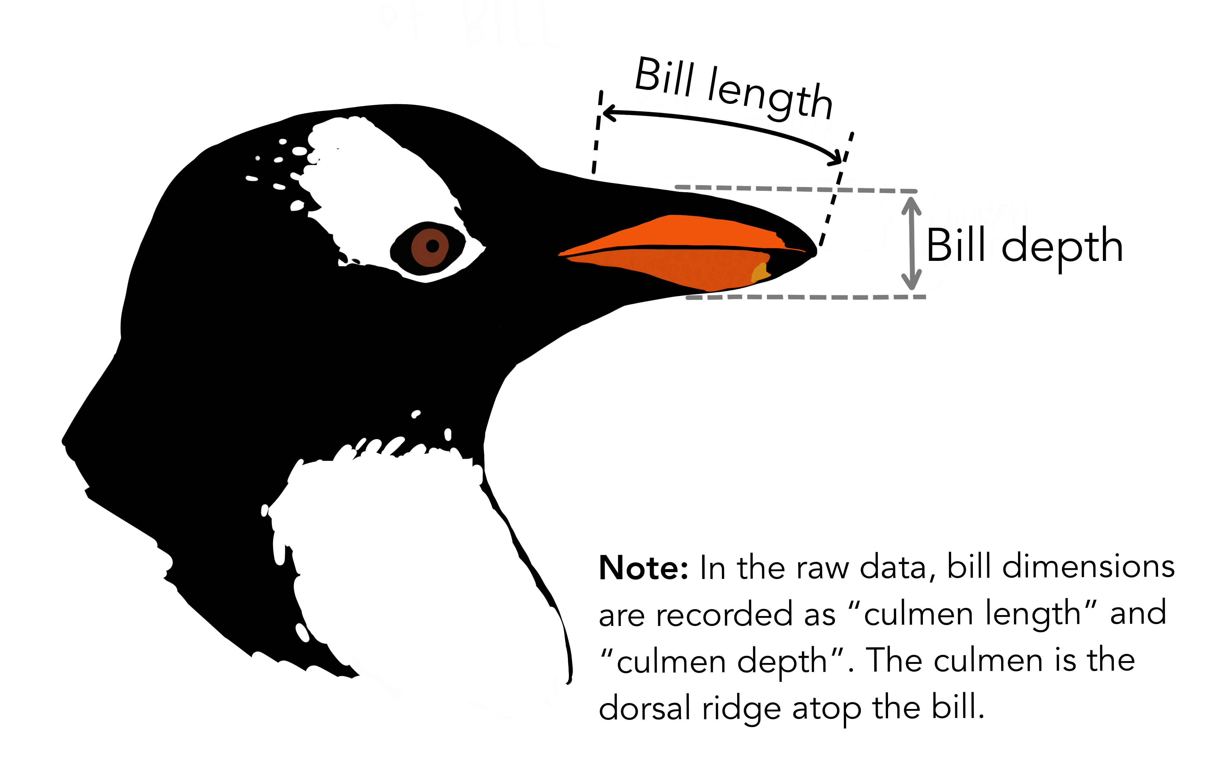
bill_length_mm: The length of the penguins’ billsbill_depth_mm: See the picture!!flipper_length_mm: Flippers! Penguins have “hands”!!body_mass_g: Mass in grams. Grams? Grams??? Why, these penguins are like human babies!!❤️culmen_depth_mm: Depth of the culmen (the upper ridge of the bill)culmen_length_mm: Length of the culmen
Business Insights on Examining the penguins dataset
- This is a smallish dataset (344 rows, 8 columns).
- They define the various physical dimensions of the penguins, along with other variables pertaining to their study.
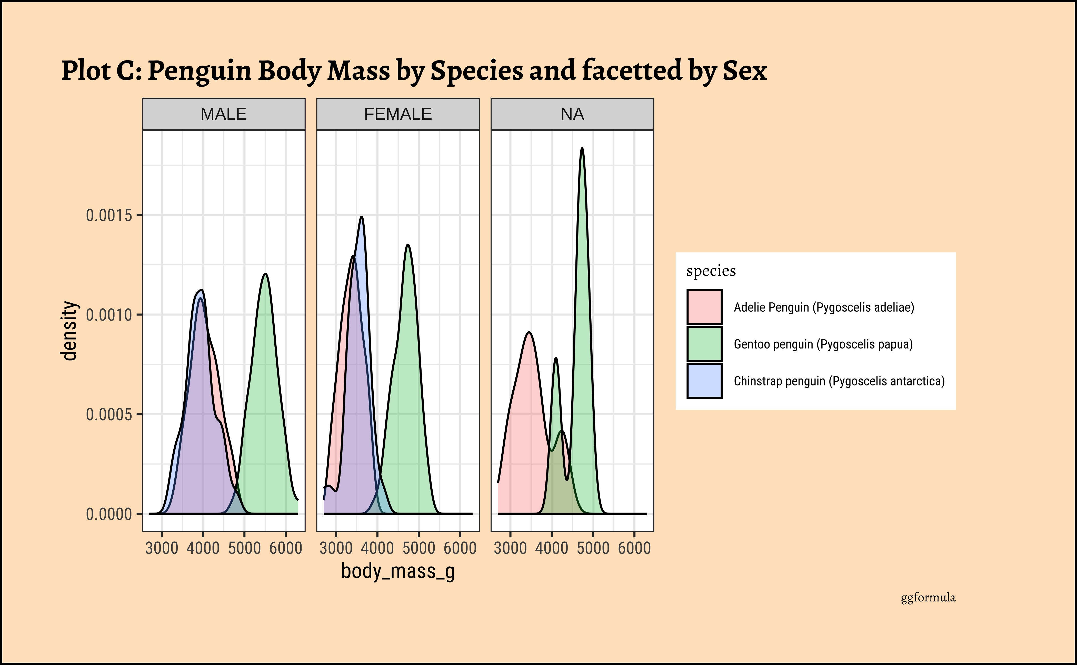
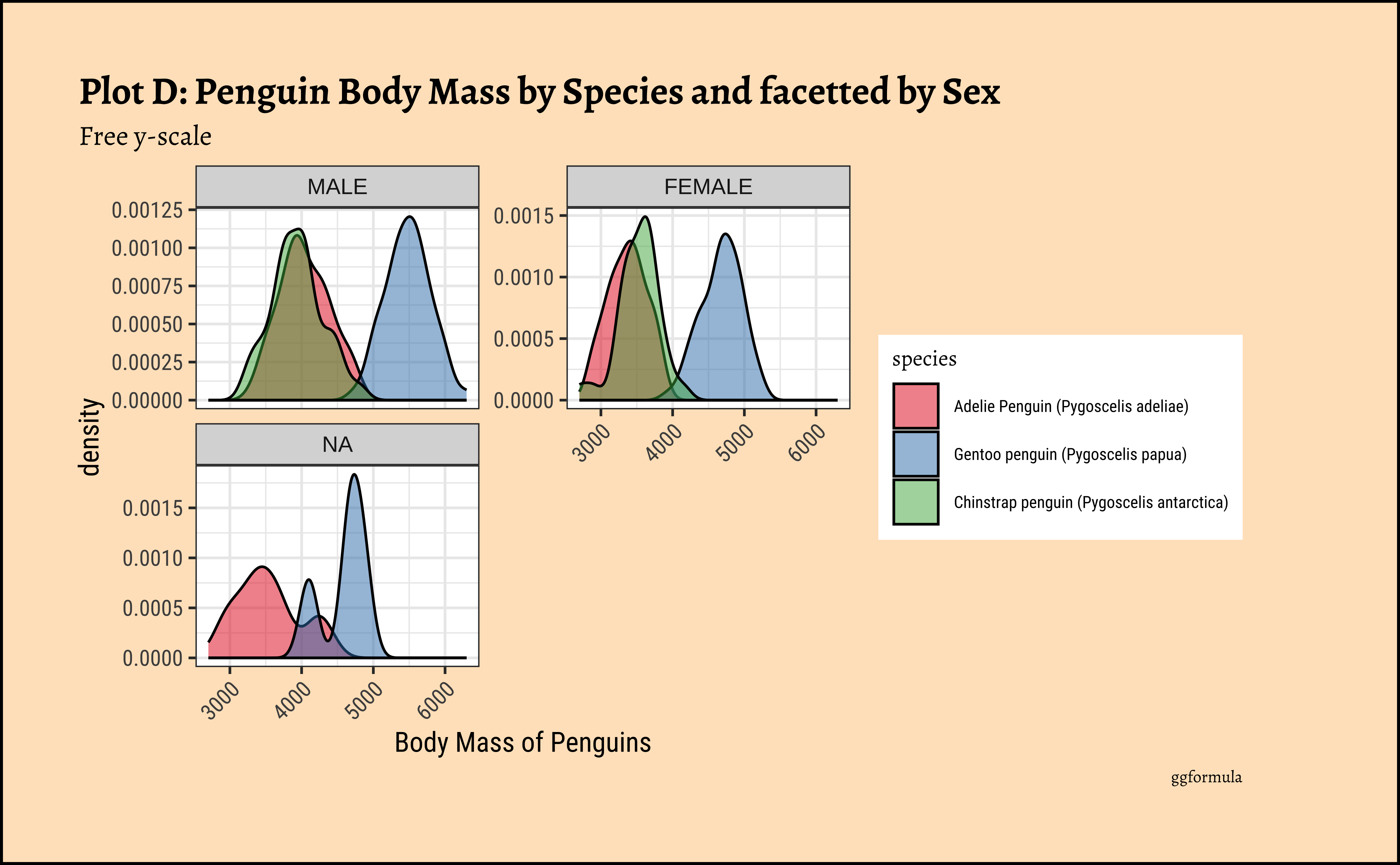
ggplot2::theme_set(new = theme_custom())

penguins_clean %>%
  gf_density(~body_mass_g, fill = ~species, color = "black") %>%
  gf_facet_wrap(vars(sex), scales = "free_y", nrow = 2) %>%
  gf_labs(
    x = "Body Mass of Penguins", title = "Plot D: Penguin Body Mass by Species and facetted by Sex",
    subtitle = "Free y-scale",
    caption = "ggformula"
  ) %>%
  gf_refine(scale_fill_brewer(palette = "Set1")) %>%
  gf_theme(theme(axis.text.x = element_text(
    angle = 45,
    hjust = 1
  )))
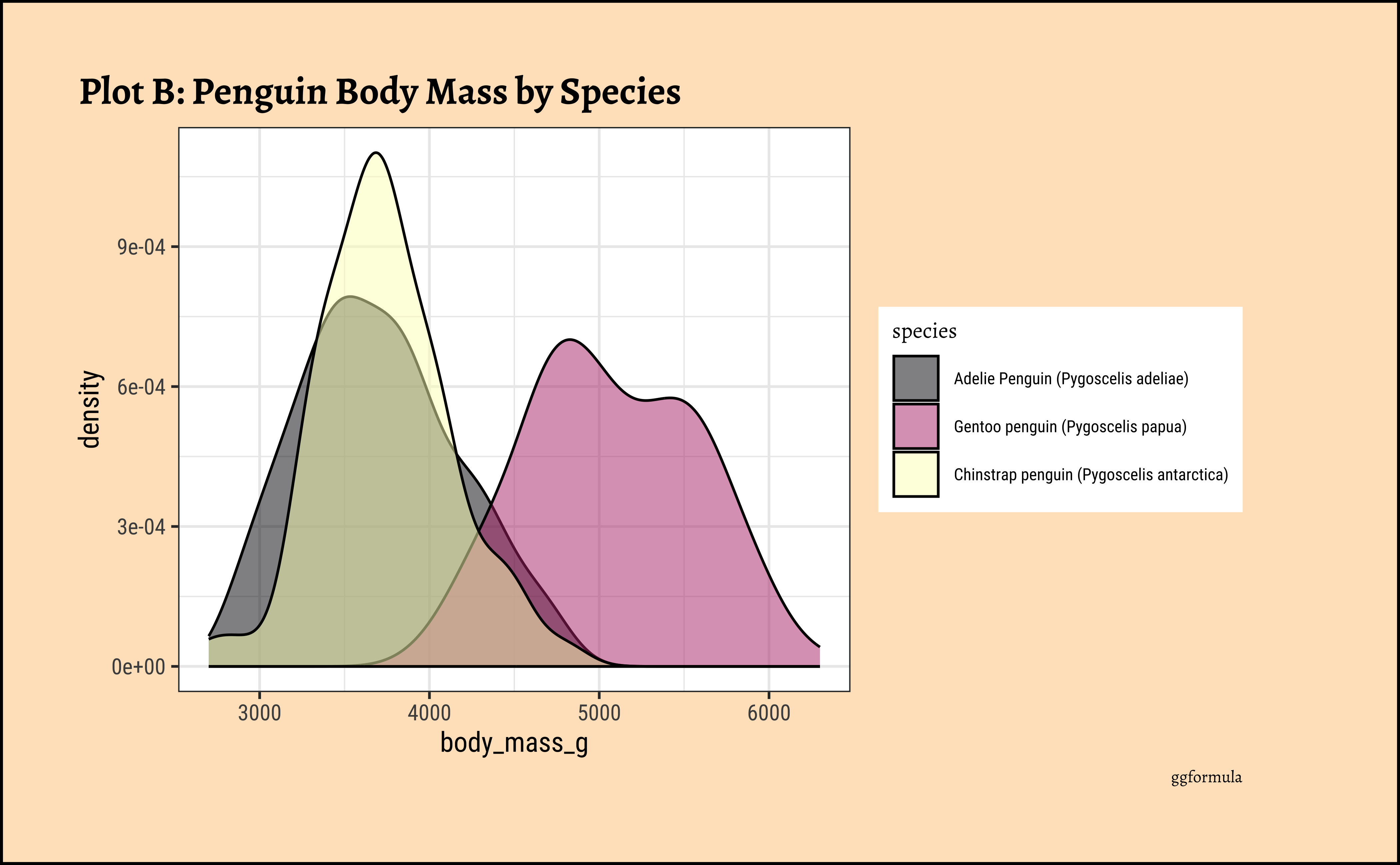
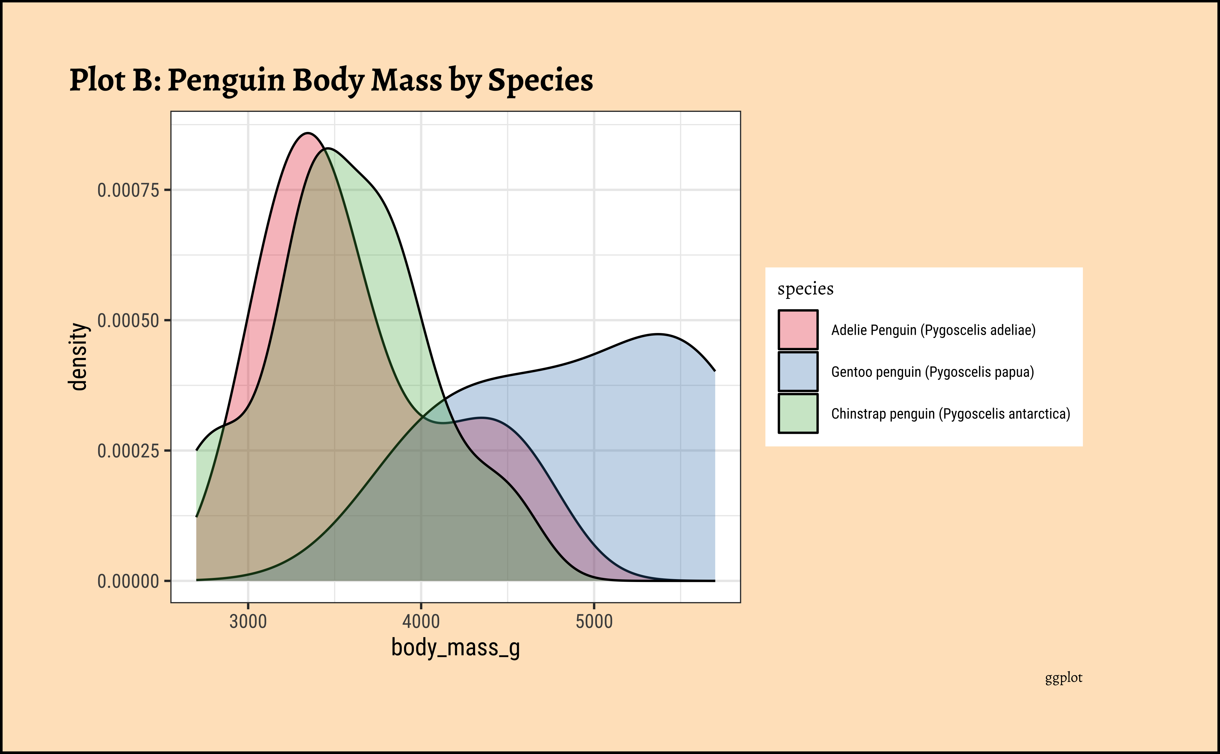
ggplot2::theme_set(new = theme_custom())
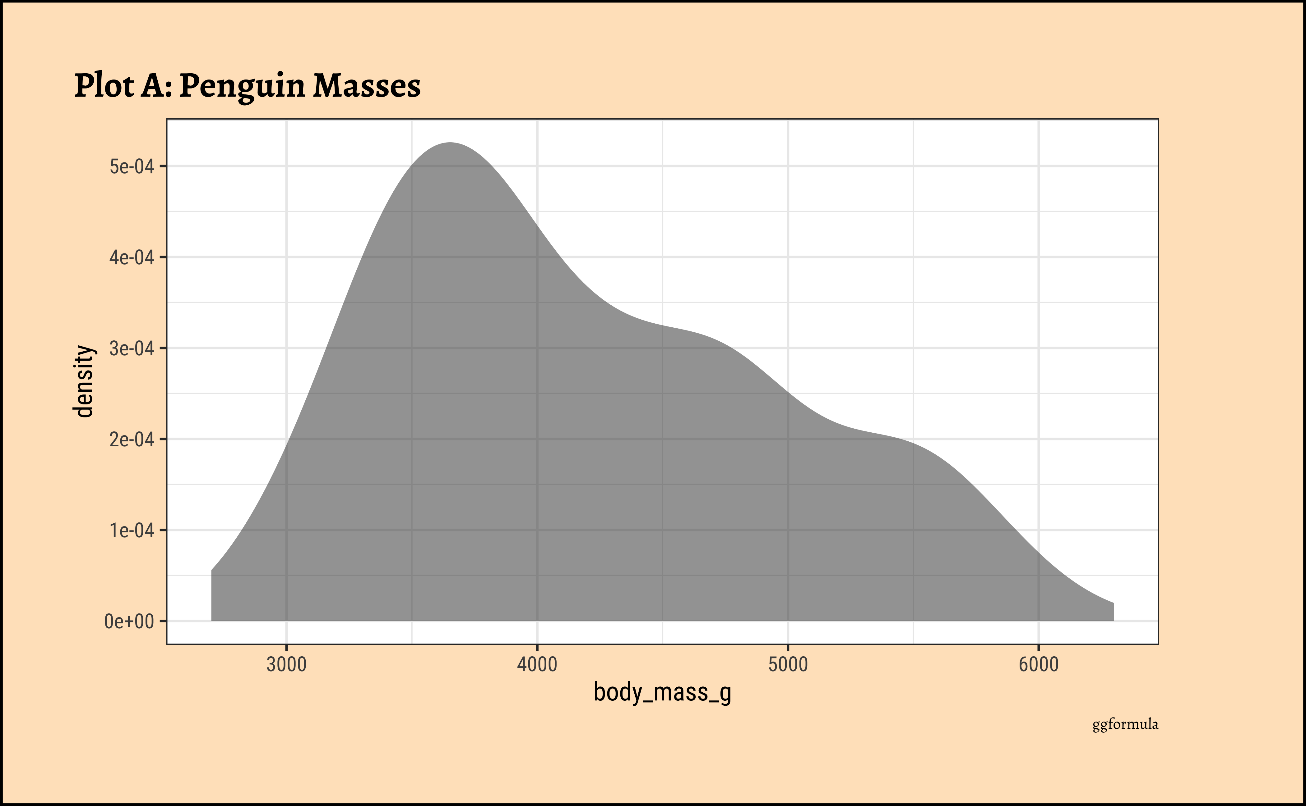
penguins_clean %>%
ggplot() +
geom_density(aes(x = body_mass_g, fill = species),
alpha = 0.3,
color = "black"
) +
scale_color_brewer(
palette = "Set1",
aesthetics = c("colour", "fill")
) +
labs(
title = "Plot B: Penguin Body Mass by Species",
caption = "ggplot"
)
ggplot2::theme_set(new = theme_custom())

penguins_clean %>% ggplot() +
  geom_density(aes(x = body_mass_g, fill = species),
    alpha = 0.3,
    color = "black"
  ) +
  facet_wrap(vars(sex), scales = "free_y", nrow = 2) +
  labs(
    title = "Plot D: Penguin Body Mass by Species and facetted by Sex",
    subtitle = "Free y-scale", caption = "ggplot"
  ) +
  scale_fill_brewer(palette = "Set1") +
  theme(theme(axis.text.x = element_text(angle = 45, hjust = 1)))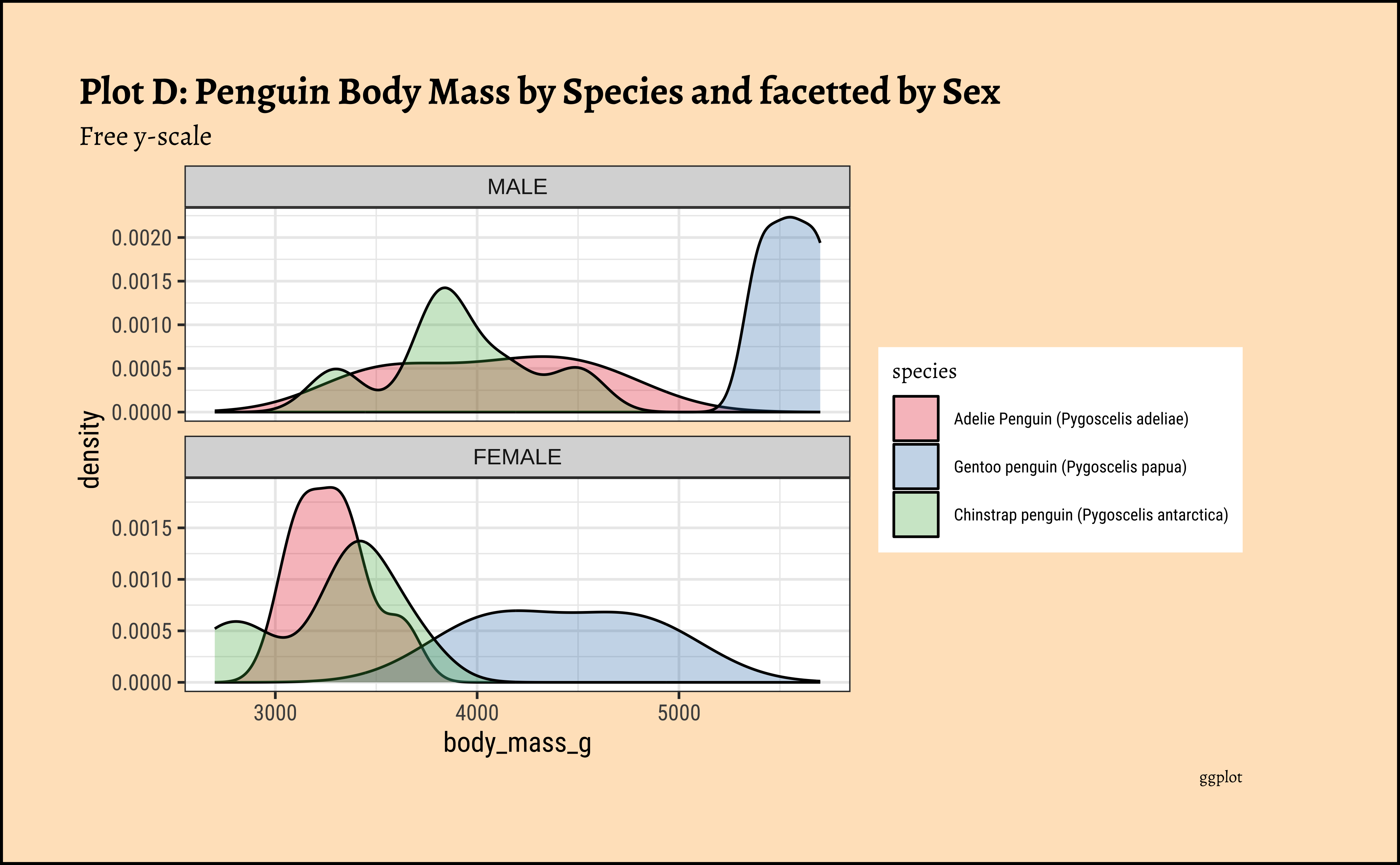
penguins_modified %>%
drop_na() %>%
  gf_density( ~ body_mass_g, fill = ~ species, color = "black") %>%
  gf_facet_wrap(vars(sex), scales = "free_y", nrow = 2) %>%
  gf_labs(title = "Plot D: Penguin Body Mass by Species and facetted by Sex",
          subtitle = "Free y-scale",
          caption = "ggformula") %>%
  gf_theme(theme(axis.text.x = element_text(angle = 45, hjust = 1)))
penguins_modified %>%
  drop_na() %>%
  ggplot() +
  geom_density(aes(x = body_mass_g, fill = species),
                   color = "black") +
  facet_wrap(vars(sex), scales = "free_y", nrow = 2) +
  labs(title = "Plot D: Penguin Body Mass by Species and facetted by Sex",
       subtitle = "Free y-scale", caption = "ggplot") %>%
  theme(theme(axis.text.x = element_text(angle = 45,hjust = 1)))
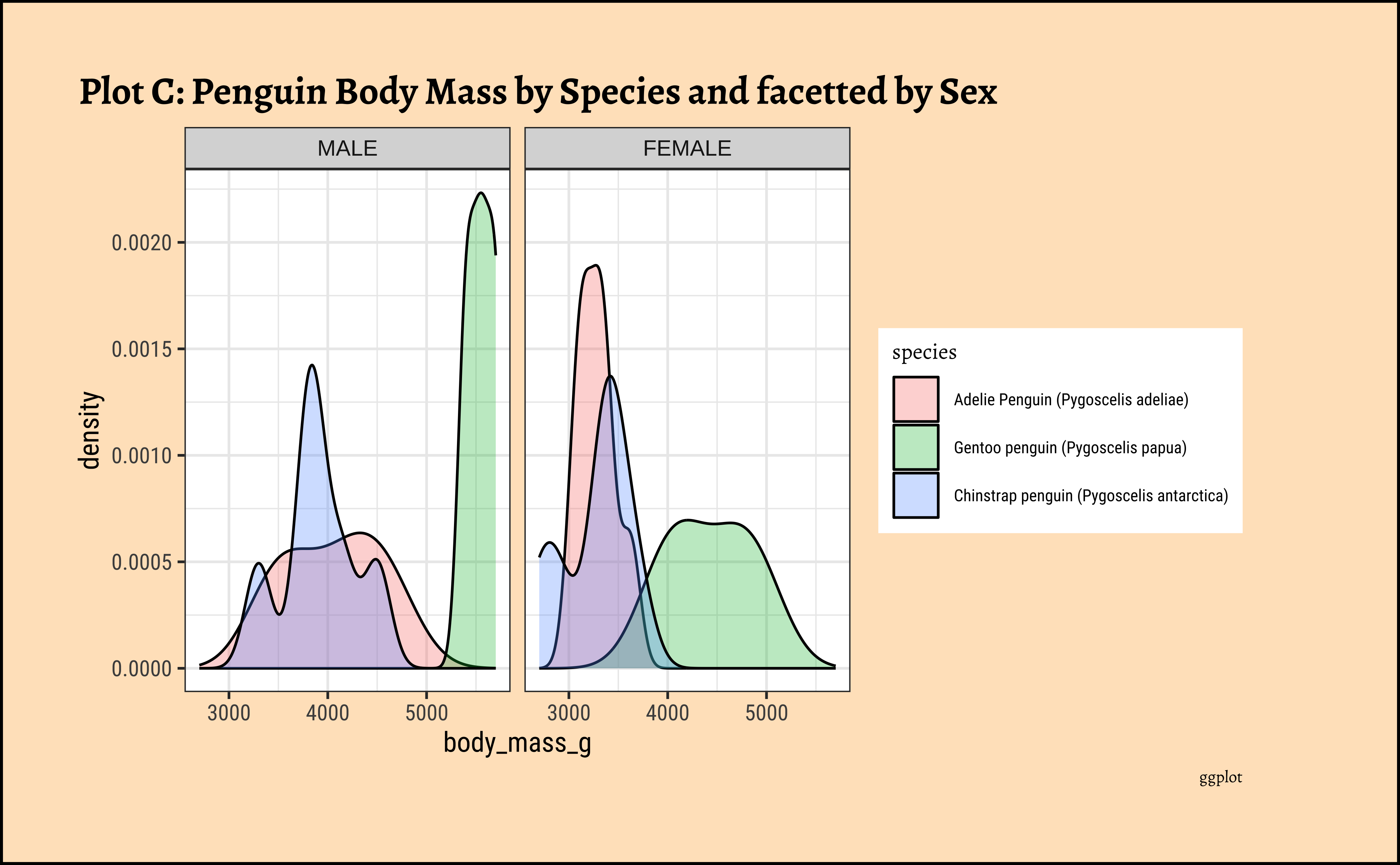
Business Insights from penguin Densities
Pretty much similar conclusions as with histograms. Although densities may not be used much in business contexts, they are better than histograms when comparing multiple distributions! So you should use them!
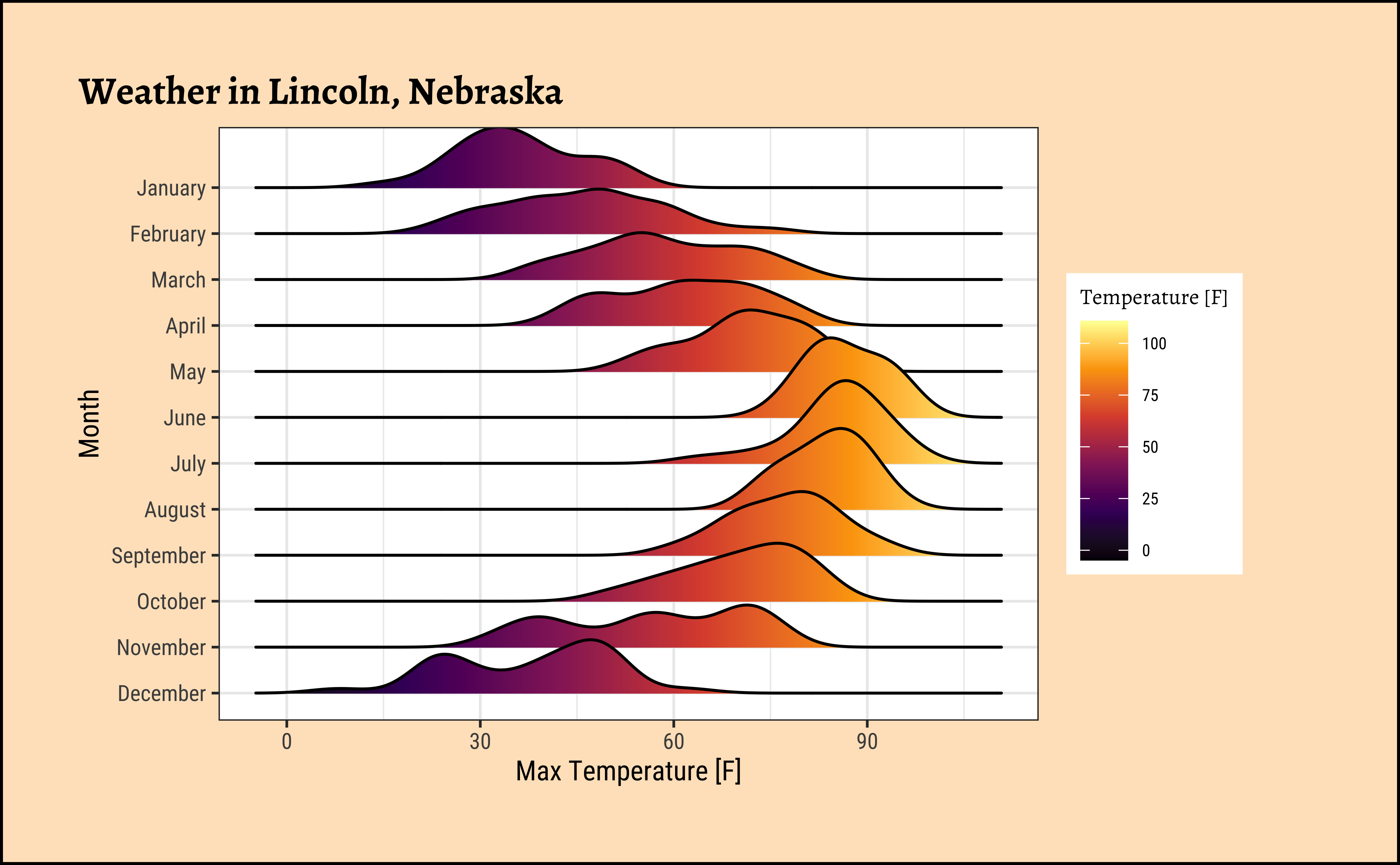
Sometimes we may wish to show the distribution/density of a Quant variable, against several levels of a Qual variable. For instance, the prices of different items of furniture, based on the furniture “style” variable. Or the sales of a particular line of products, across different shops or cities. We did this with both histograms and densities, by colouring based on a Qual variable, and by facetting using a Qual variable. There is a third way, using what is called a ridge plot. {ggformula} supports this plot by importing/depending upon the {ggridges} package. {ggridges} provides direct support for ridge plots, and can be used as an extension to {ggplot2} and {ggformula}.
ggplot2::theme_set(new = theme_custom())

gf_density_ridges(drv ~ hwy,
  fill = ~drv,
  alpha = 0.5, # colour saturation
  data = mpg
) %>%
  gf_refine(scale_fill_brewer(
    name = "Drive Type",
    palette = "Spectral"
  )) %>%
  gf_labs(
    title = "Mileage vs Drive Type",
    subtitle = "Ridge Plot",
    x = "Highway Mileage",
    y = "Drive Type"
  )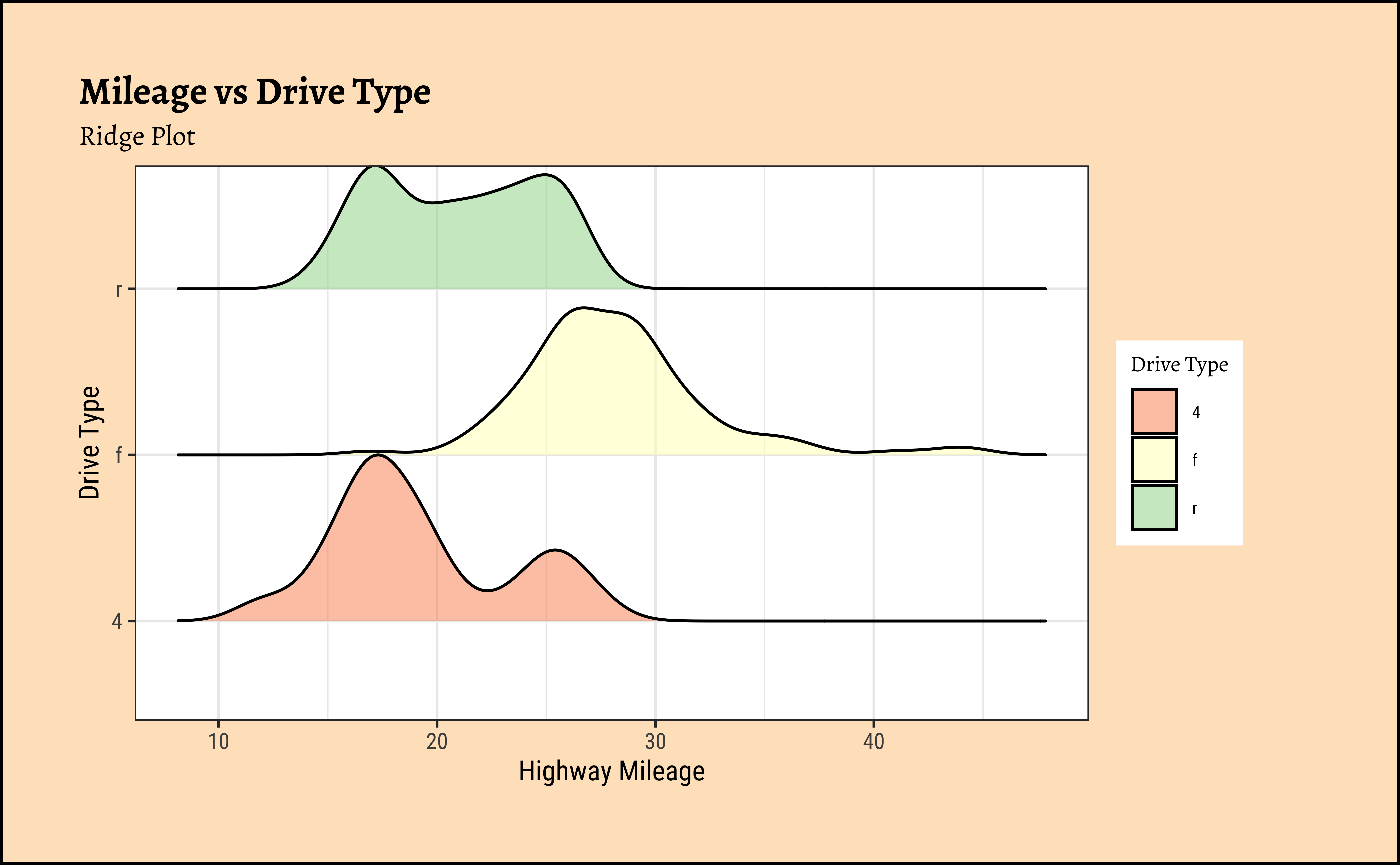
ggplot2::theme_set(new = theme_custom())

ggplot(data = mpg, mapping = aes(x = hwy, y = drv, fill = drv)) +
  geom_density_ridges(alpha = 0.5) +
  scale_fill_brewer(name = "Drive Type", palette = "Spectral") +
  labs(
    title = "Mileage vs Drive Type",
    subtitle = "Ridge Plot",
    x = "Highway Mileage",
    y = "Drive Type"
  )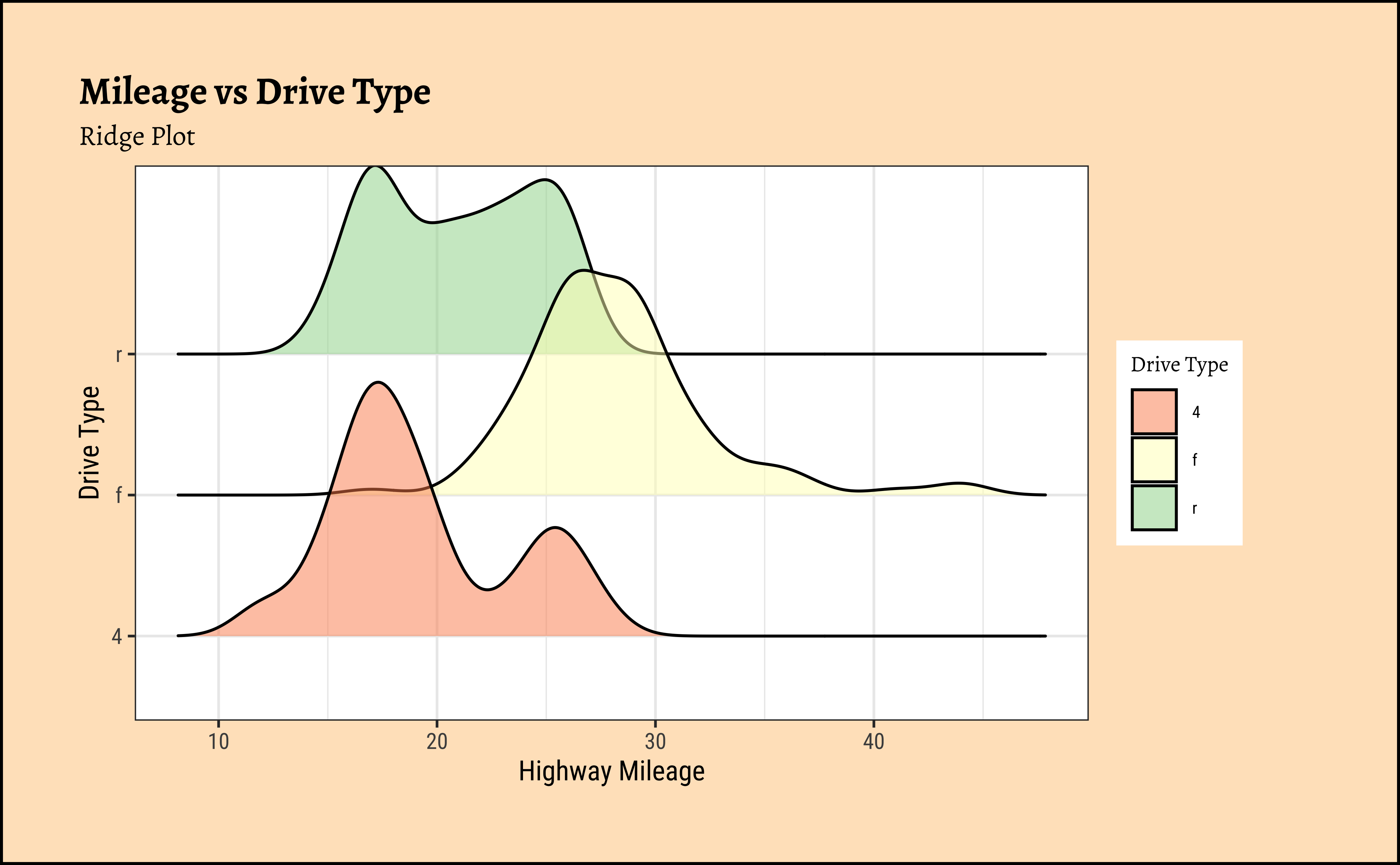
Business Insights from mpg Ridge Plots
This is another way of visualizing multiple distributions, of a Quant variable at different levels of a Qual variable. We see that the distribution of hwy mileage varies substantially with drv type.
| Package | Version | Citation |
|---|---|---|
| ggridges | 0.5.7 | Wilke (2025) |
| NHANES | 2.1.0 | Pruim (2015) |
| resampledata3 | 1.0 | Chihara and Hesterberg (2022) |
| rtrek | 0.5.2 | Leonawicz (2025) |
| TeachHist | 0.2.1 | Lange (2023) |
| TeachingDemos | 2.13 | Snow (2024) |
| tidyplots | 0.4.0 | Engler (2025) |
| tinyplot | 0.6.1 | McDermott, Arel-Bundock, and Zeileis (2026) |
| tinytable | 0.16.0 | Arel-Bundock (2026) |
| visualize | 4.5.0 | Balamuta (2023) |
Arel-Bundock, Vincent. 2026. tinytable: Simple and Configurable Tables in “HTML,” “LaTeX,” “Markdown,” “Word,” “PNG,” “PDF,” and “Typst” Formats. https://doi.org/10.32614/CRAN.package.tinytable.
Balamuta, James. 2023. visualize: Graph Probability Distributions with User Supplied Parameters and Statistics. https://doi.org/10.32614/CRAN.package.visualize.
Chihara, Laura, and Tim Hesterberg. 2022. Resampledata3: Data Sets for “Mathematical Statistics with Resampling and R” (3rd Ed). https://doi.org/10.32614/CRAN.package.resampledata3.
Engler, Jan Broder. 2025. “Tidyplots Empowers Life Scientists with Easy Code-Based Data Visualization.” iMeta, e70018. https://doi.org/10.1002/imt2.70018.
Lange, Carsten. 2023. TeachHist: A Collection of Amended Histograms Designed for Teaching Statistics. https://doi.org/10.32614/CRAN.package.TeachHist.
Leonawicz, Matthew. 2025. rtrek: Data Analysis Relating to Star Trek. https://doi.org/10.32614/CRAN.package.rtrek.
McDermott, Grant, Vincent Arel-Bundock, and Achim Zeileis. 2026. tinyplot: Lightweight Extension of the Base r Graphics System. https://doi.org/10.32614/CRAN.package.tinyplot.
Pruim, Randall. 2015. NHANES: Data from the US National Health and Nutrition Examination Study. https://doi.org/10.32614/CRAN.package.NHANES.
Snow, Greg. 2024. TeachingDemos: Demonstrations for Teaching and Learning. https://doi.org/10.32614/CRAN.package.TeachingDemos.
Wilke, Claus O. 2025. ggridges: Ridgeline Plots in “ggplot2”. https://doi.org/10.32614/CRAN.package.ggridges.