library(tidyverse) # Tidy data processing and plotting
library(ggformula) # Formula based plots
library(mosaic) # Our go-to package
library(skimr) # Another Data inspection package

library(GGally) # Corr plots
library(broom) # Clean reports from Stats / ML outputs

# library(devtools)
# devtools::install_github("rpruim/Lock5withR")
library(Lock5withR) # Datasets

library(easystats) # Easy Statistical Analysis and Charts
library(correlation) # Different Types of Correlations

library(janitor) # Data cleaning and tidying package
library(visdat) # Visualize whole dataframes for missing data
library(naniar) # Clean missing data
library(DT) # Interactive Tables for our data
library(tinytable) # Elegant Tables for our data
library(ggrepel) # Repelled Text Labels in ggplot
library(marquee) # Marquee Text Labels in ggplot
Correlations
2022-11-22
Plot Fonts and Theme
Code
library(systemfonts)
library(showtext)
## Clean the slate
systemfonts::clear_local_fonts()
systemfonts::clear_registry()
##
showtext_opts(dpi = 96) # set DPI for showtext
sysfonts::font_add(
  family = "Alegreya",
  regular = "../../../../../../fonts/Alegreya-Regular.ttf",
  bold = "../../../../../../fonts/Alegreya-Bold.ttf",
  italic = "../../../../../../fonts/Alegreya-Italic.ttf",
  bolditalic = "../../../../../../fonts/Alegreya-BoldItalic.ttf"
)

sysfonts::font_add(
  family = "Roboto Condensed",
  regular = "../../../../../../fonts/RobotoCondensed-Regular.ttf",
  bold = "../../../../../../fonts/RobotoCondensed-Bold.ttf",
  italic = "../../../../../../fonts/RobotoCondensed-Italic.ttf",
  bolditalic = "../../../../../../fonts/RobotoCondensed-BoldItalic.ttf"
)
showtext_auto(enable = TRUE) # enable showtext
##
theme_custom <- function() {
  theme_bw(base_size = 10) +

    # theme(panel.widths = unit(11, "cm"),
    #       panel.heights = unit(6.79, "cm")) + # Golden Ratio

    theme(
      plot.margin = margin_auto(t = 1, r = 2, b = 1, l = 1, unit = "cm"),
      plot.background = element_rect(
        fill = "bisque",
        colour = "black",
        linewidth = 1
      )
    ) +

    theme_sub_axis(
      title = element_text(
        family = "Roboto Condensed",
        size = 10
      ),
      text = element_text(
        family = "Roboto Condensed",
        size = 8
      )
    ) +

    theme_sub_legend(
      text = element_text(
        family = "Roboto Condensed",
        size = 6
      ),
      title = element_text(
        family = "Alegreya",
        size = 8
      )
    ) +

    theme_sub_plot(
      title = element_text(
        family = "Alegreya",
        size = 14, face = "bold"
      ),
      title.position = "plot",
      subtitle = element_text(
        family = "Alegreya",
        size = 10
      ),
      caption = element_text(
        family = "Alegreya",
        size = 6
      ),
      caption.position = "plot"
    )
}

## Use available fonts in ggplot text geoms too!
ggplot2::update_geom_defaults(geom = "text", new = list(
  family = "Roboto Condensed",
  face = "plain",
  size = 3.5,
  color = "#2b2b2b"
))
ggplot2::update_geom_defaults(geom = "label", new = list(
  family = "Roboto Condensed",
  face = "plain",
  size = 3.5,
  color = "#2b2b2b"
))

ggplot2::update_geom_defaults(geom = "marquee", new = list(
  family = "Roboto Condensed",
  face = "plain",
  size = 3.5,
  color = "#2b2b2b"
))
ggplot2::update_geom_defaults(geom = "text_repel", new = list(
  family = "Roboto Condensed",
  face = "plain",
  size = 3.5,
  color = "#2b2b2b"
))
ggplot2::update_geom_defaults(geom = "label_repel", new = list(
  family = "Roboto Condensed",
  face = "plain",
  size = 3.5,
  color = "#2b2b2b"
))

## Set the theme
ggplot2::theme_set(new = theme_custom())

## tinytable options
options("tinytable_tt_digits" = 2)
options("tinytable_format_num_fmt" = "significant_cell")
options(tinytable_html_mathjax = TRUE)


## Set defaults for flextable
flextable::set_flextable_defaults(font.family = "Roboto Condensed")
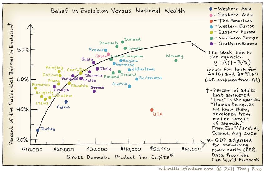
Does belief in Evolution depend upon the GSP of of the country? Where is the US in all of this? Does the Bible Belt tip the scales here?
And India?
Which are the numeric variables in movies?
Now let us plot their relationships. We will use scatter plots whose shape shows us if there is a relationship between the two variables at hand. In general, if the “cloud of points” is tipped toward one side (up or down), then there is a possible relationship between the two variables. If the points are scattered all over the place, then there is no relationship between the two variables.
We can split some of the scatter plots using one or other of the Qual variables. For instance, is the relationship between the two ratings the same, regardless of movie genre?

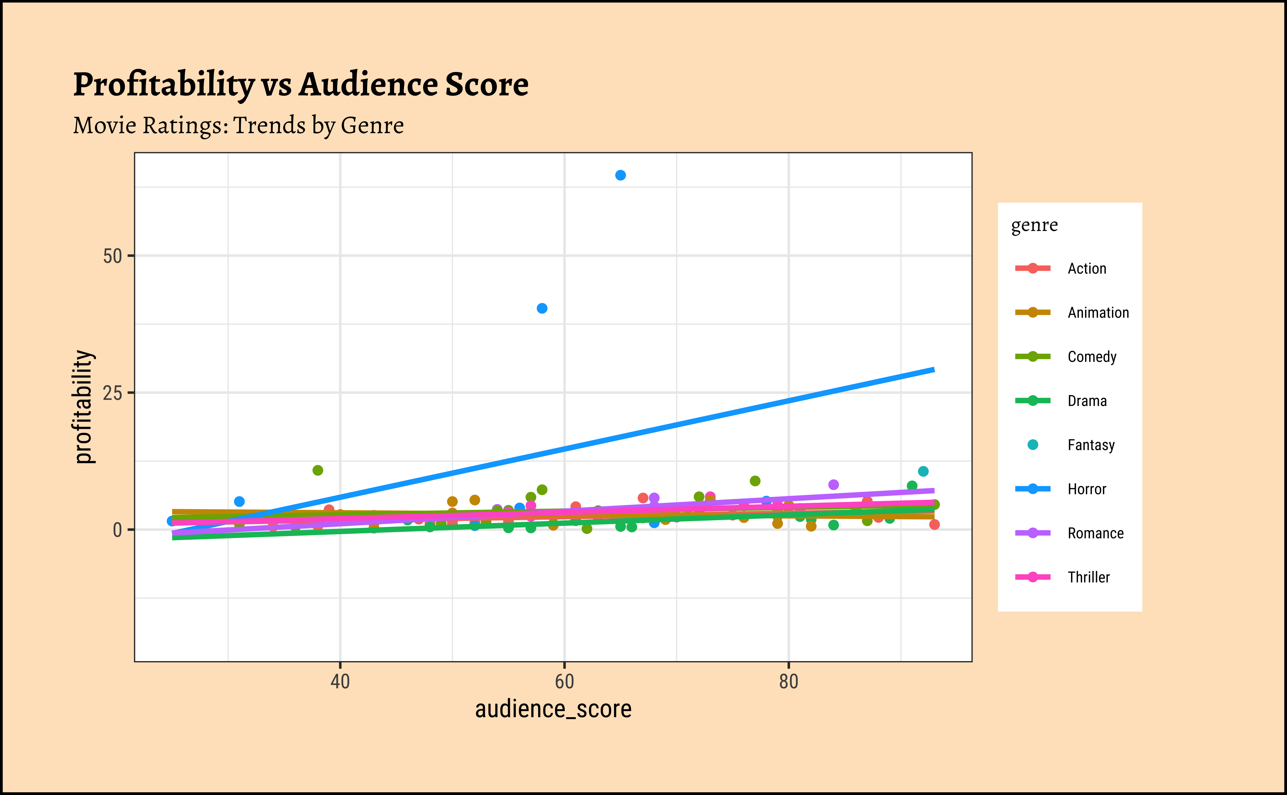
## We can split some of the scatter plots using one or other of the Qual variables. For instance, is the relationship between the two ratings the same, regardless of movie genre?

movies_modified %>%
  drop_na() %>%
  gf_point(profitability ~ audience_score,
           color = ~ genre) %>%
  gf_lm() %>%
  gf_labs(title = "Profitability vs Audience Score",
          subtitle = "Movie Ratings: Trends by Genre")
Business Insight from movies scatter plots
We have fitted a trend line to each of the scatter plots.
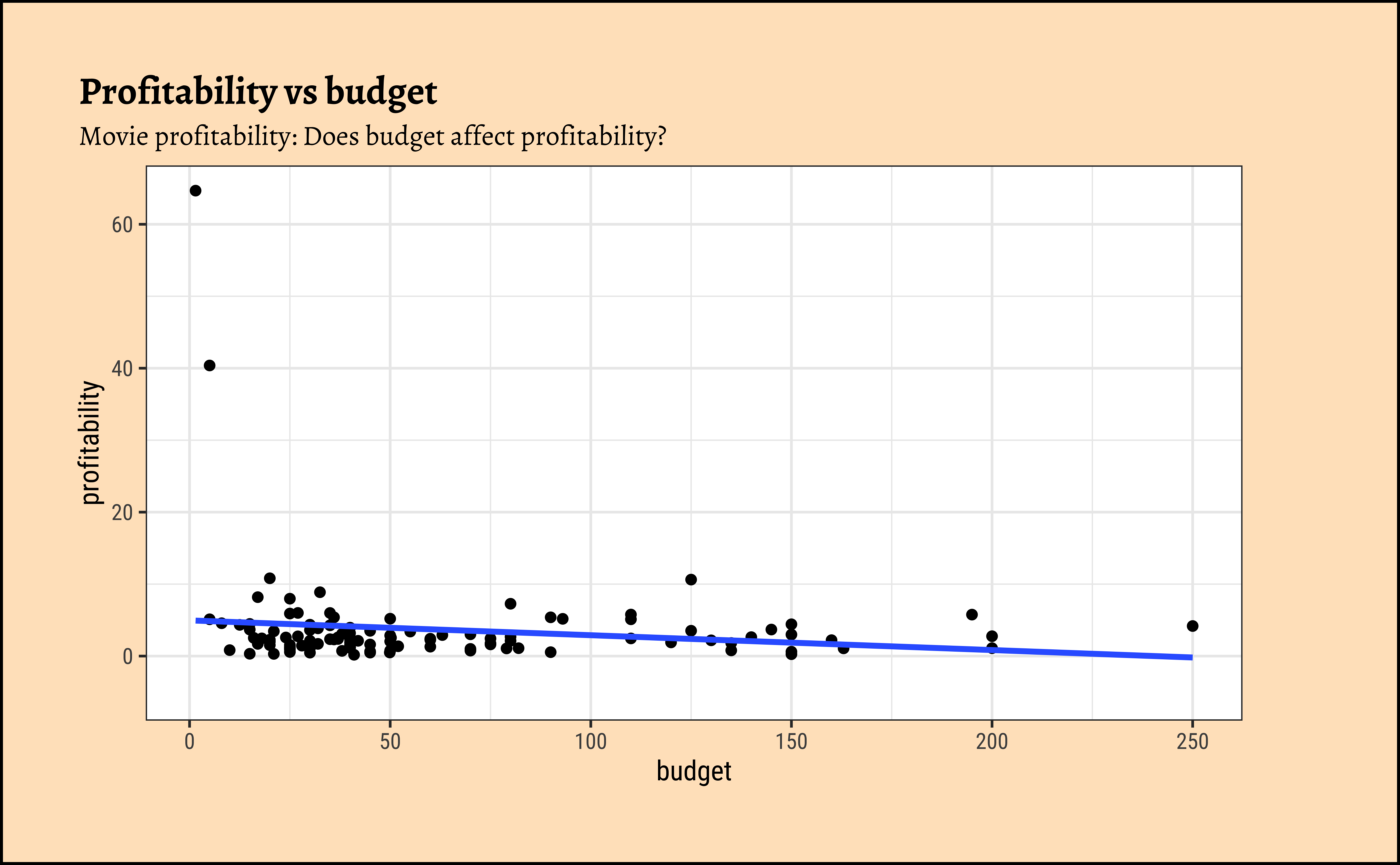
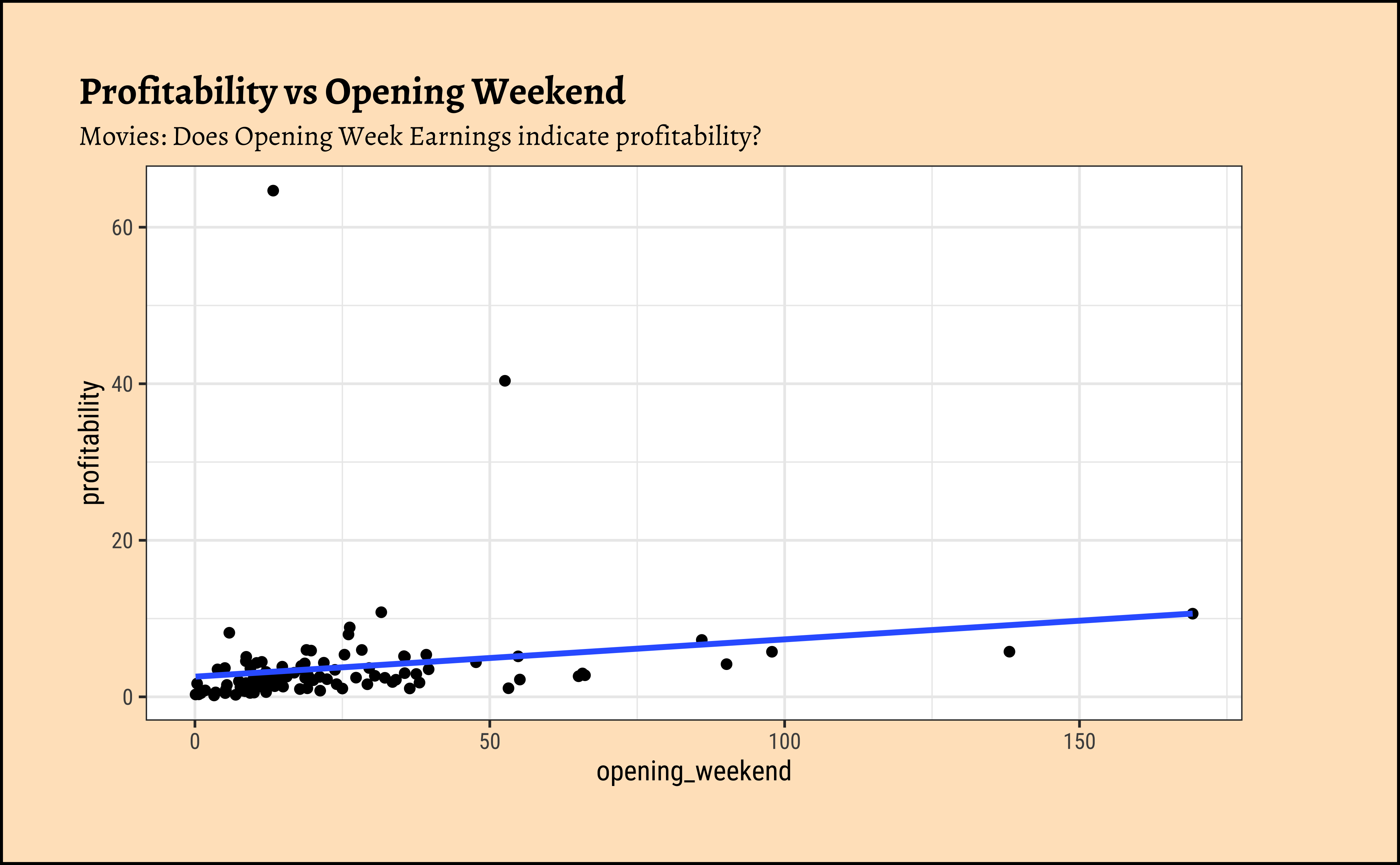
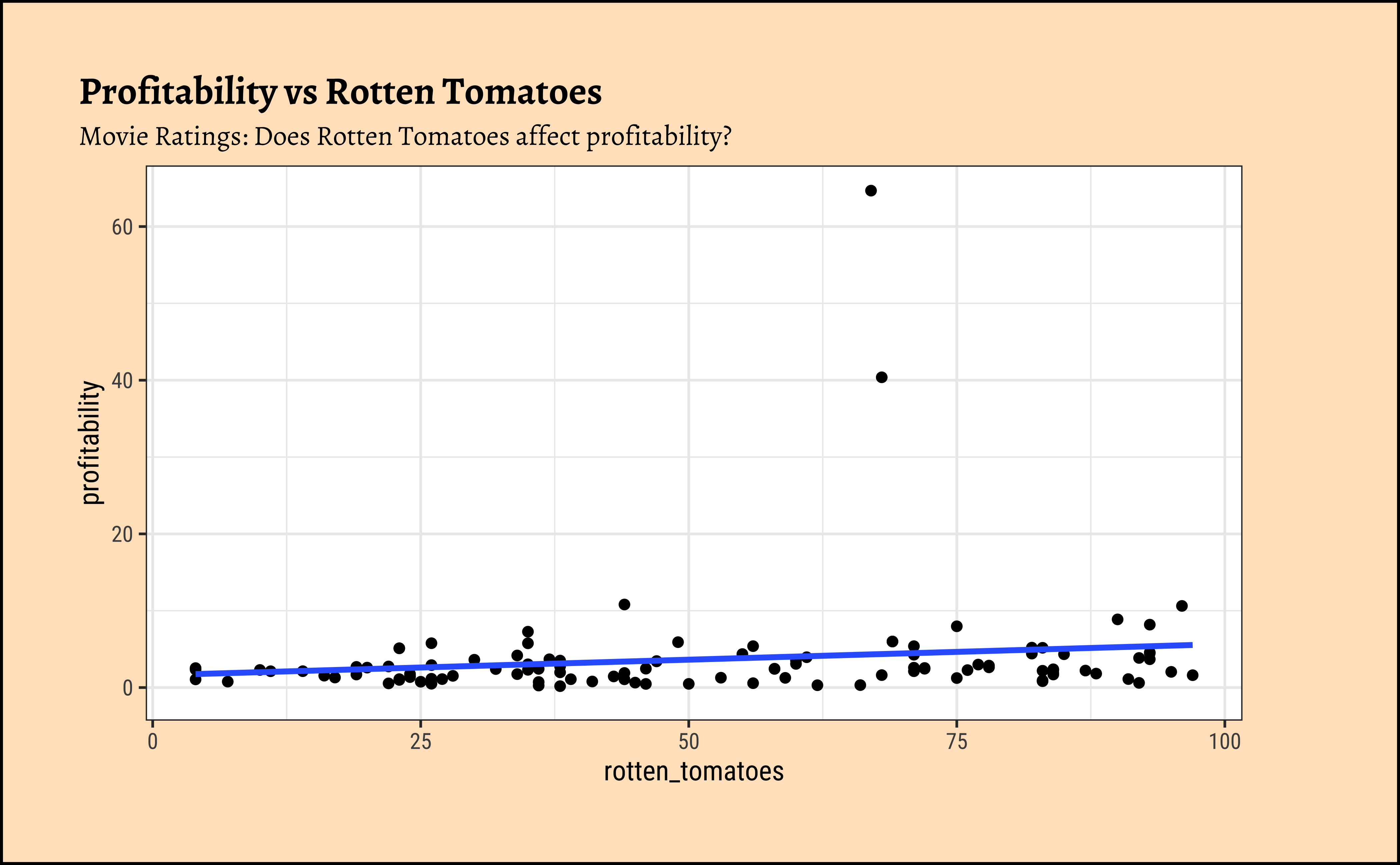
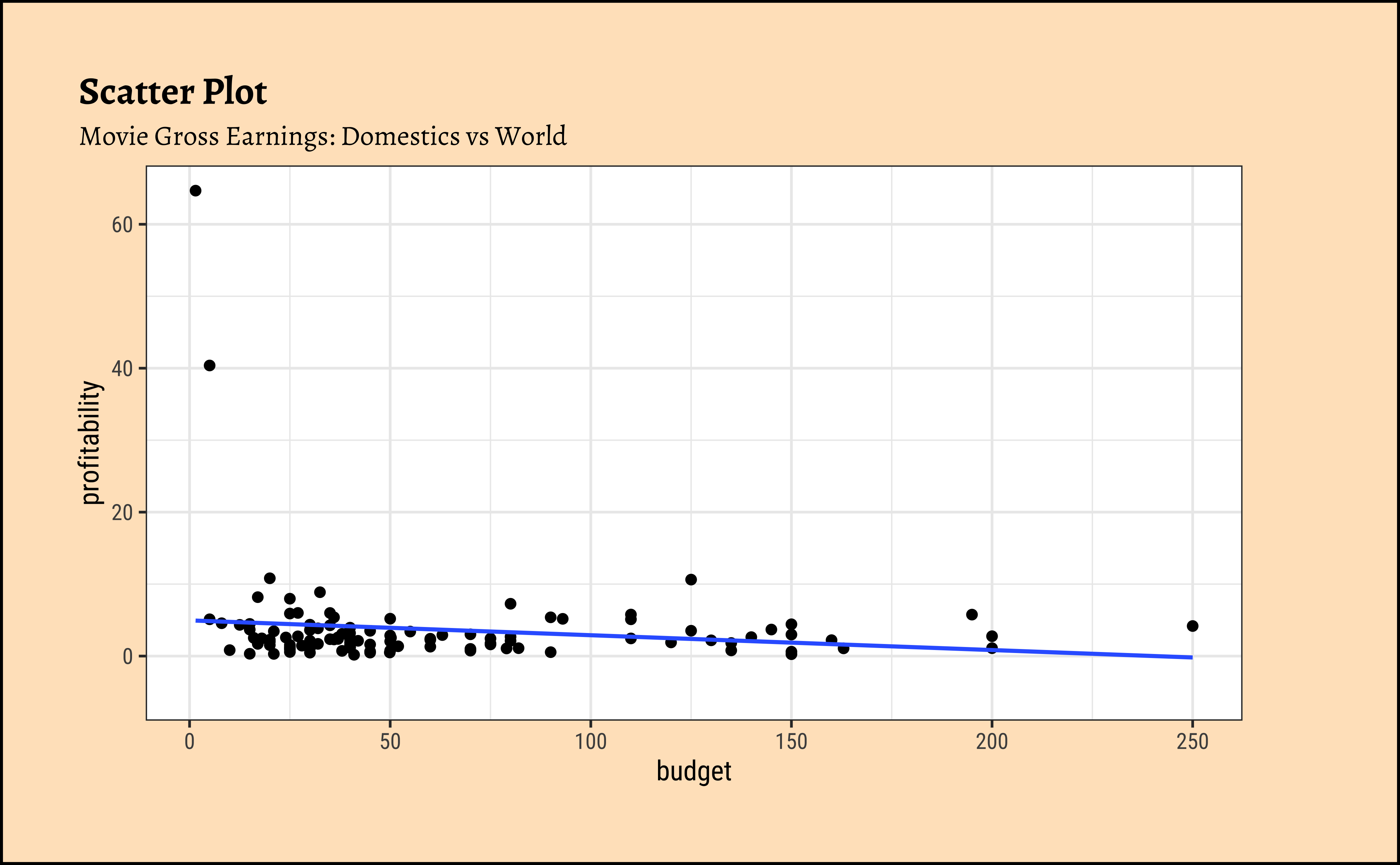
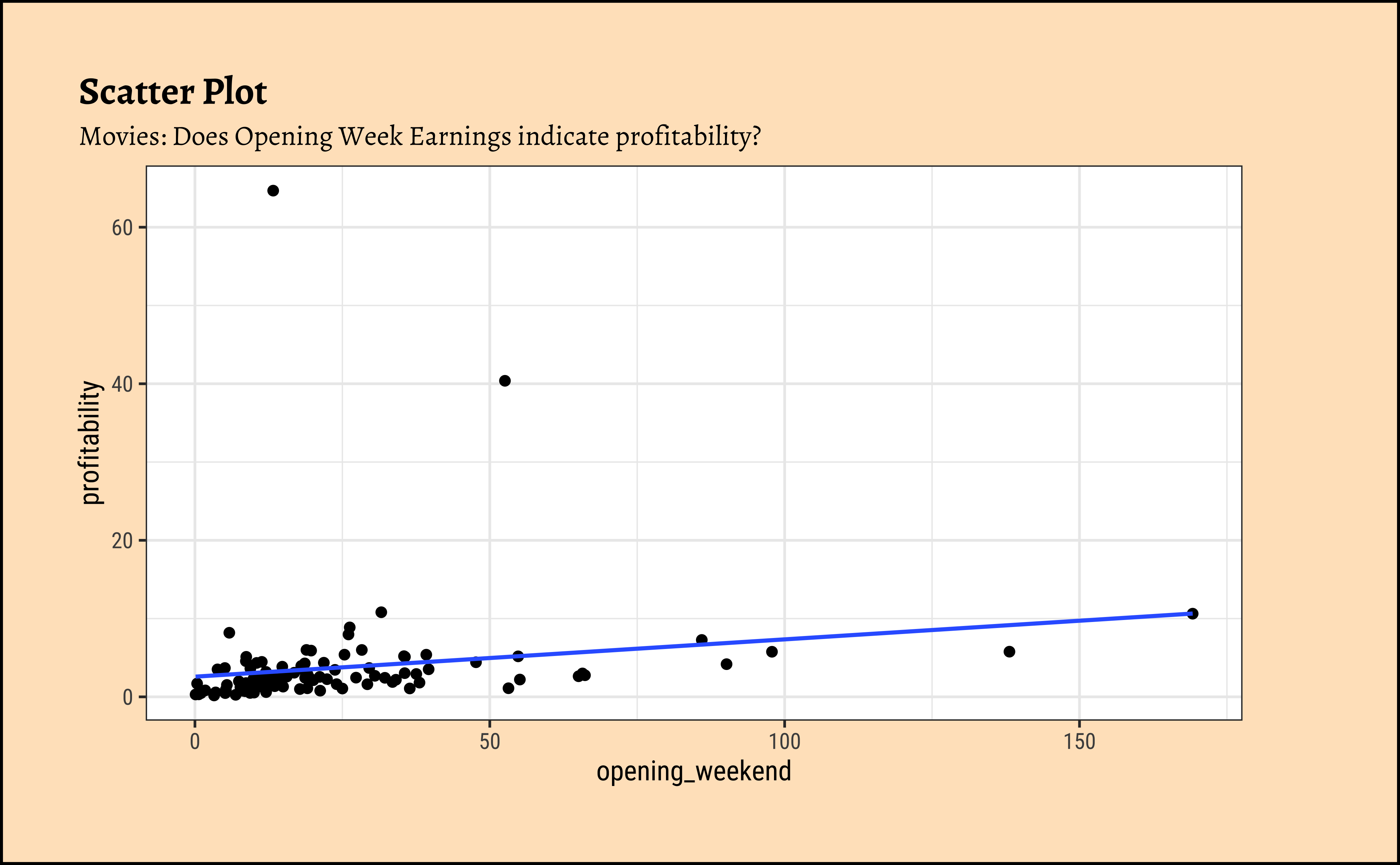
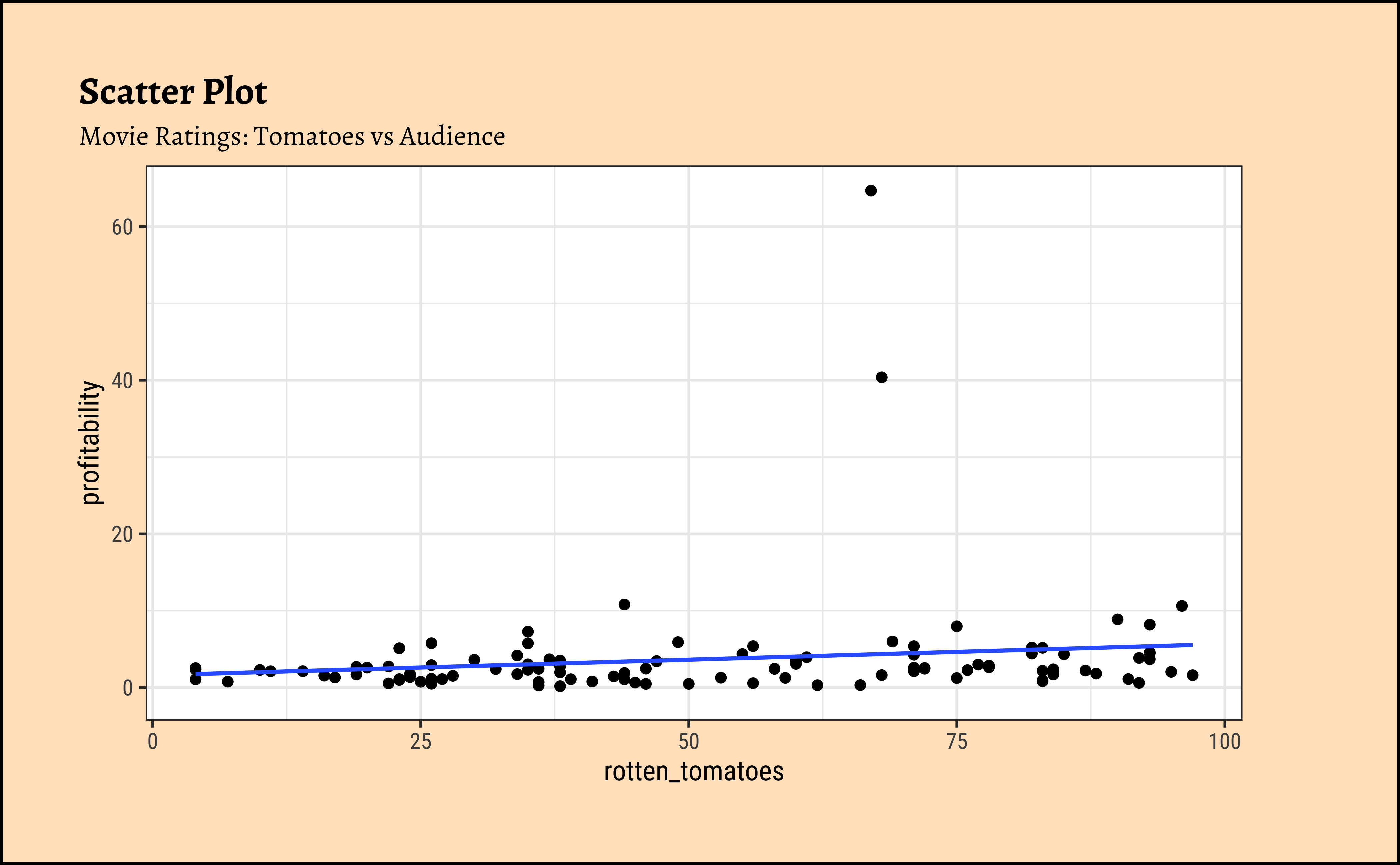
profitabilityandbudget: The trend line is mildly negative…seeming to suggest that increasing thebudgetdoes not necessarily increase theprofitability. In fact, it seems to suggest that increasing thebudgetdecreases theprofitability! But is this a significant trend? We will see later.profitabilityandopening_weekend: The trend line is positive, suggesting that increasing theopening_weekendearnings increases theprofitability. This is a good sign for movie makers! But again, not a very markedly upward trend, so we need to check if this is significant.profitabilityandrotten_tomatoes: The trend line is positive, suggesting that increasing therotten_tomatoesrating increases theprofitability. Yet again, not a very markedly upward trend, so we need to check if this is significant.profitabilityandaudience_score: The trend lines are mostly flat, suggesting that increasing theaudience_scoredoes not do much forprofitability. The slope for Horror is higher than that for the othergenre-s ! Oh hell…people are paying to be scared witless???
Note that there are two horror movies that have been hugely successful. However, these are outliers, and are also located, in the dataset, at a place where they do not tip the trend line too much. They have limited influence, concept that becomes important with Regression Analysis.
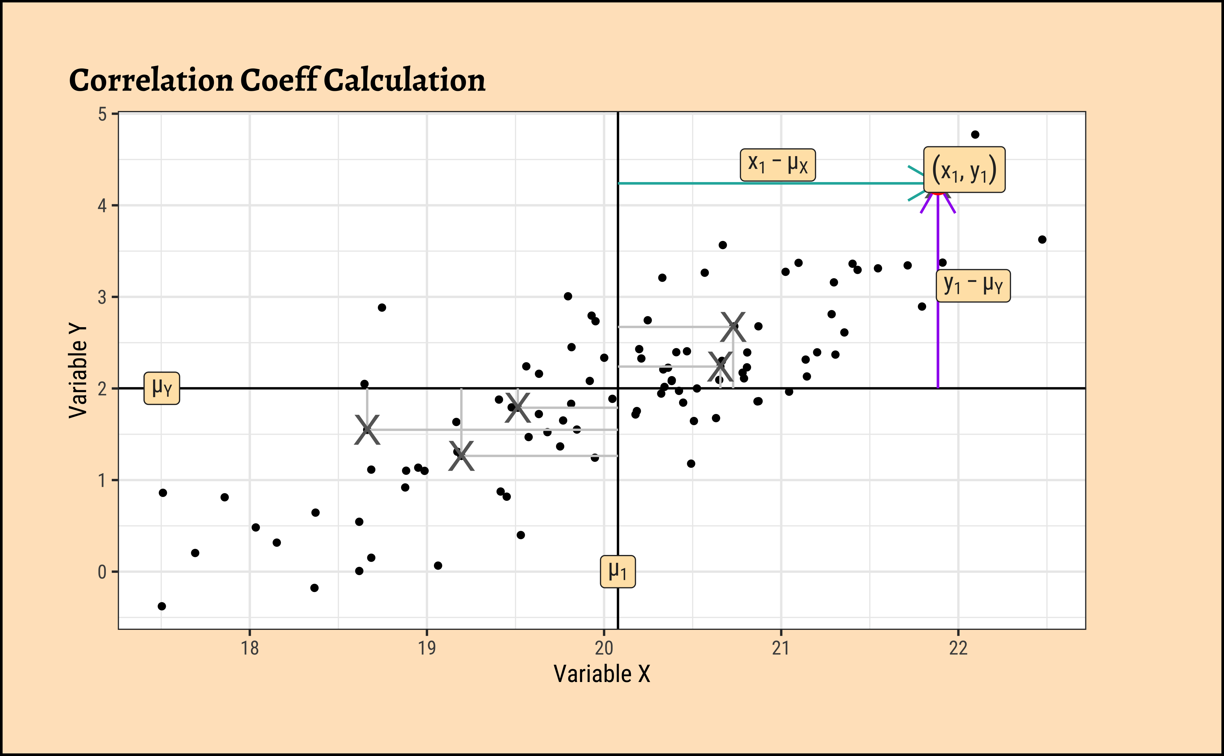
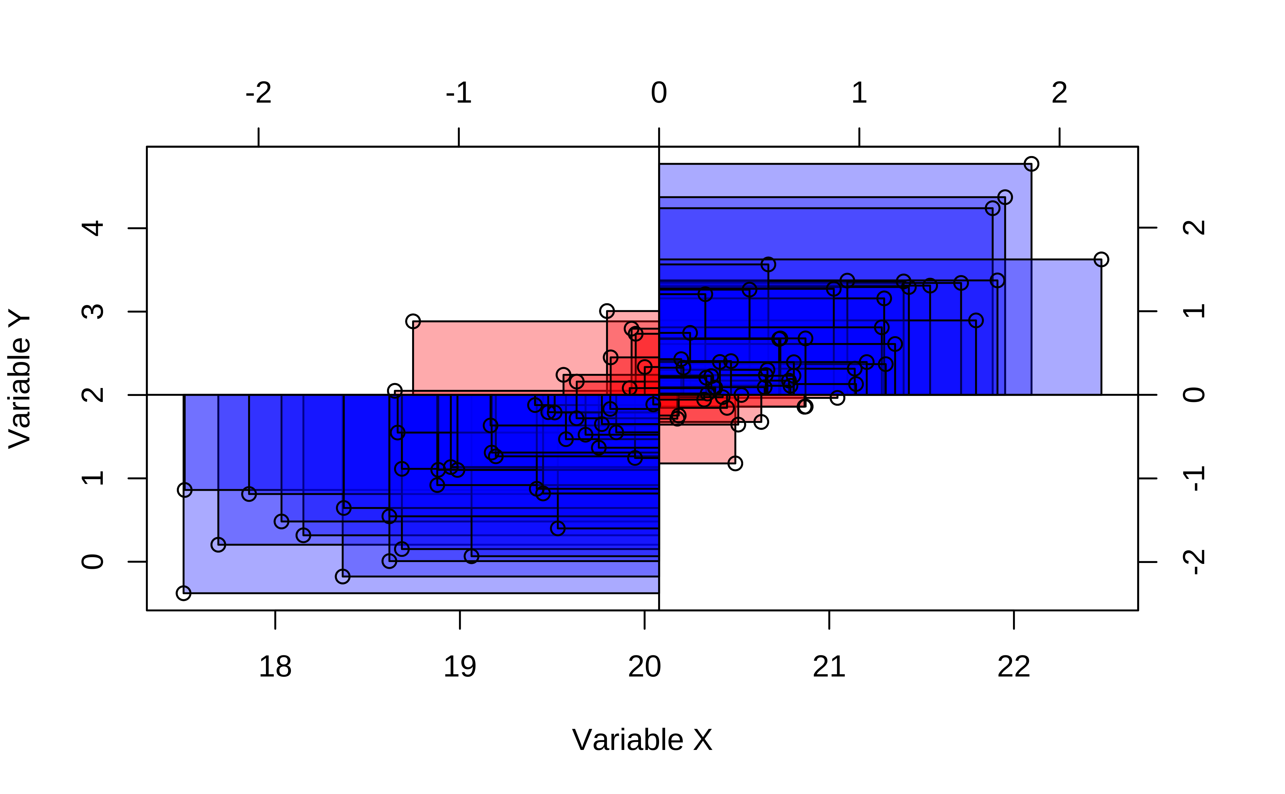
The degree of association is measured by a correlation coefficient, denoted by r. It is sometimes called Pearson’s correlation coefficient after its originator and is a measure of linear association. (If a curved line is needed to express the relationship, other and more complicated measures of the correlation must be used.)
The correlation coefficient is measured on a scale that varies from + 1 through 0 to – 1. Complete correlation between two variables is expressed by either + 1 or -1. When one variable increases as the other increases the correlation is positive; when one decreases as the other increases it is negative.
In formal terms, the correlation between two variables \(x\) and \(y\) is defined as:
\[ \rho = E\left[\frac{(x - \mu_{x}) * (y - \mu_{y})}{(\sigma_x)*(\sigma_y)}\right] \tag{1}\]
where \(E\) is the expectation operator ( i.e taking mean ). Think of this as the average of the products of two scaled residuals.
Pearson Correlation uses z-scores
We can see \((x-\mu_x)/\sigma_x\) is a centering and scaling of the variable \(x\). Recall from our discussion on Quantities that this is called the z-score of x.
Pearson correlation assumes that the relationship between the two variables is linear. There are of course many other types of correlation measures: some which work when this is not so. Type vignette("types", package = "correlation") in your Console to see the vignette from the {correlation} package that discusses various types of correlation measures.
OK, so how do we calculate this correlation coefficient? And how do we visualize it too? ( Remember: we want to visualize our analysis! )
Using GGally
By default, GGally::ggpairs() provides:
- two different comparisons of each pair of columns
- displays either the density or count of the respective variable along the diagonal.
- With different parameter settings, the diagonal can be replaced with the axis values and variable labels.
ggplot2::theme_set(new = theme_bw(base_family = "Roboto Condensed", base_size = 14))

GGally::ggpairs(
  movies_modified %>% drop_na(),
  # Select Quant variables only for now
  columns = c(
    "profitability", "budget", "domestic_gross", "foreign_gross"
  ),
  switch = "both",
  # axis labels in more traditional locations(left and bottom)

  progress = FALSE,
  # no compute progress messages needed

  # Choose the diagonal graphs (always single variable! Think!)
  diag = list(continuous = "barDiag"),
  # choosing histogram,not density

  # Choose lower triangle graphs, two-variable graphs
  lower = list(continuous = wrap("smooth", alpha = 0.3, se = FALSE)),
  title = "Movies Data Correlations Plot #1"
)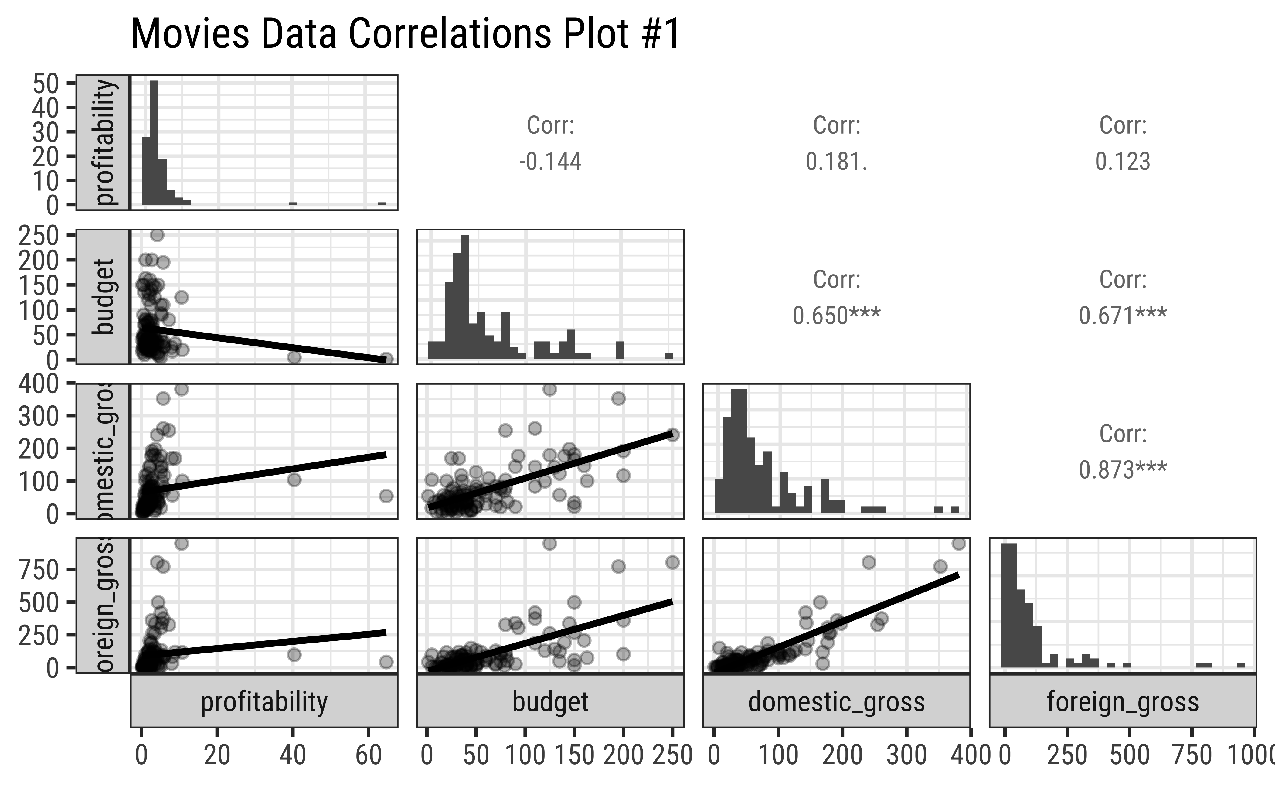
Business Insight from Pairs Plot #1
profitabilityandbudgethave a very slight negative correlation, but this does not appear to be significant.profitabilityhas low correlation scores with bothDomesticGross(\(.181\)) and also withForeignGross(\(0.123\)).DomesticGrossandForeignGrosshave a very high correlation score (\(0.96\)), which is expected, since most movies are released in both markets, and the earnings are usually similar. However, as noted, neither influencesprofitabilitymuch. Sigh.- Note in passing that the
profitabilityand both the “Gross” related variables have highly skewed distributions. That is the nature of the movie business!
Using cor_test
We must always keep in mind that we are looking at a dataset, a sample, and not the entire population. So, we need to be careful about making claims about the population based on our sample. What this means is that our sample-estimated correlation scores \(r\) are not the final word on the correlation between two population-variables, \(\rho\).
We need to conduct a statistical test to see if the correlation is significant, i.e. if it is likely to be true for the entire population from which our sample was drawn, and also assign numbers to the uncertainty that we must have in our correlation estimate.
Both correlations scores, and the uncertainty we have can be obtained by conducting a formal test in R. We will use the mosaic function cor_test to get these results:
| estimate | statistic | p.value | parameter | conf.low | conf.high | method | alternative |
|---|---|---|---|---|---|---|---|
| -0.08 | -0.96 | 0.34 | 132 | -0.25 | 0.09 | Pearson’s product-moment correlation | two.sided |
| estimate | statistic | p.value | parameter | conf.low | conf.high | method | alternative |
|---|---|---|---|---|---|---|---|
| 0.7 | 11.06 | 0 | 131 | 0.6 | 0.77 | Pearson’s product-moment correlation | two.sided |
| estimate | statistic | p.value | parameter | conf.low | conf.high | method | alternative |
|---|---|---|---|---|---|---|---|
| 0.69 | 10.22 | 0 | 118 | 0.58 | 0.77 | Pearson’s product-moment correlation | two.sided |
Business Insights from Correlation Tests
The budget and profitability are not well correlated, sadly. We see this from the p.value which is \(0.34\) and the confidence values for the correlation estimate which also cover \(0\).
However, both DomesticGross and ForeignGross are well correlated with budget.
Look at the conf.low and conf.high coloumns: these are calculated uncertainty limits on the estimated correlation. If these *do not straddle \(0\), then we m-a-y infer that the correlation is significant. More when we study Inference for Correlation in a later module.
As stated earlier, in our dataset we have a specific dependent or target variable, which represents the outcome of our experiment or our business situation. The remaining variables are usually independent or predictor variables. A very useful thing to know, and to view, would be the correlations of all independent variables. Using the {correlation} package from the {easystats} family of R packages, this can be very easily achieved. Let us quickly do this for the familiar mtcars dataset: we will quickly glimpse it, identify the target variable, and plot the correlations:
Rows: 32
Columns: 11
$ mpg  <dbl> 21.0, 21.0, 22.8, 21.4, 18.7, 18.1, 14.3, 24.4, 22.8, 19.2, 17.8,…
$ cyl  <dbl> 6, 6, 4, 6, 8, 6, 8, 4, 4, 6, 6, 8, 8, 8, 8, 8, 8, 4, 4, 4, 4, 8,…
$ disp <dbl> 160.0, 160.0, 108.0, 258.0, 360.0, 225.0, 360.0, 146.7, 140.8, 16…
$ hp   <dbl> 110, 110, 93, 110, 175, 105, 245, 62, 95, 123, 123, 180, 180, 180…
$ drat <dbl> 3.90, 3.90, 3.85, 3.08, 3.15, 2.76, 3.21, 3.69, 3.92, 3.92, 3.92,…
$ wt   <dbl> 2.620, 2.875, 2.320, 3.215, 3.440, 3.460, 3.570, 3.190, 3.150, 3.…
$ qsec <dbl> 16.46, 17.02, 18.61, 19.44, 17.02, 20.22, 15.84, 20.00, 22.90, 18…
$ vs   <dbl> 0, 0, 1, 1, 0, 1, 0, 1, 1, 1, 1, 0, 0, 0, 0, 0, 0, 1, 1, 1, 1, 0,…
$ am   <dbl> 1, 1, 1, 0, 0, 0, 0, 0, 0, 0, 0, 0, 0, 0, 0, 0, 0, 1, 1, 1, 0, 0,…
$ gear <dbl> 4, 4, 4, 3, 3, 3, 3, 4, 4, 4, 4, 3, 3, 3, 3, 3, 3, 4, 4, 4, 3, 3,…
$ carb <dbl> 4, 4, 1, 1, 2, 1, 4, 2, 2, 4, 4, 3, 3, 3, 4, 4, 4, 1, 2, 1, 1, 2,…We see correlation between all pairs of variables. We need to choose just those with target variable mpg:
ggplot2::theme_set(new = theme_custom())

cor %>%
  # Filter for target variable `mpg` and plot
  filter(Parameter1 == "mpg") %>%
  gf_errorbar(CI_low + CI_high ~ reorder(Parameter2, r),
    width = 0.5
  ) %>%
  gf_point(r ~ reorder(Parameter2, r), size = 4, color = "red") %>%
  gf_hline(yintercept = 0, color = "grey", linewidth = 2) %>%
  gf_labs(
    title = "Correlation Errorbar Chart",
    subtitle = "Target variable: mpg",
    x = "Predictor Variable",
    y = "Correlation Score with mpg"
  )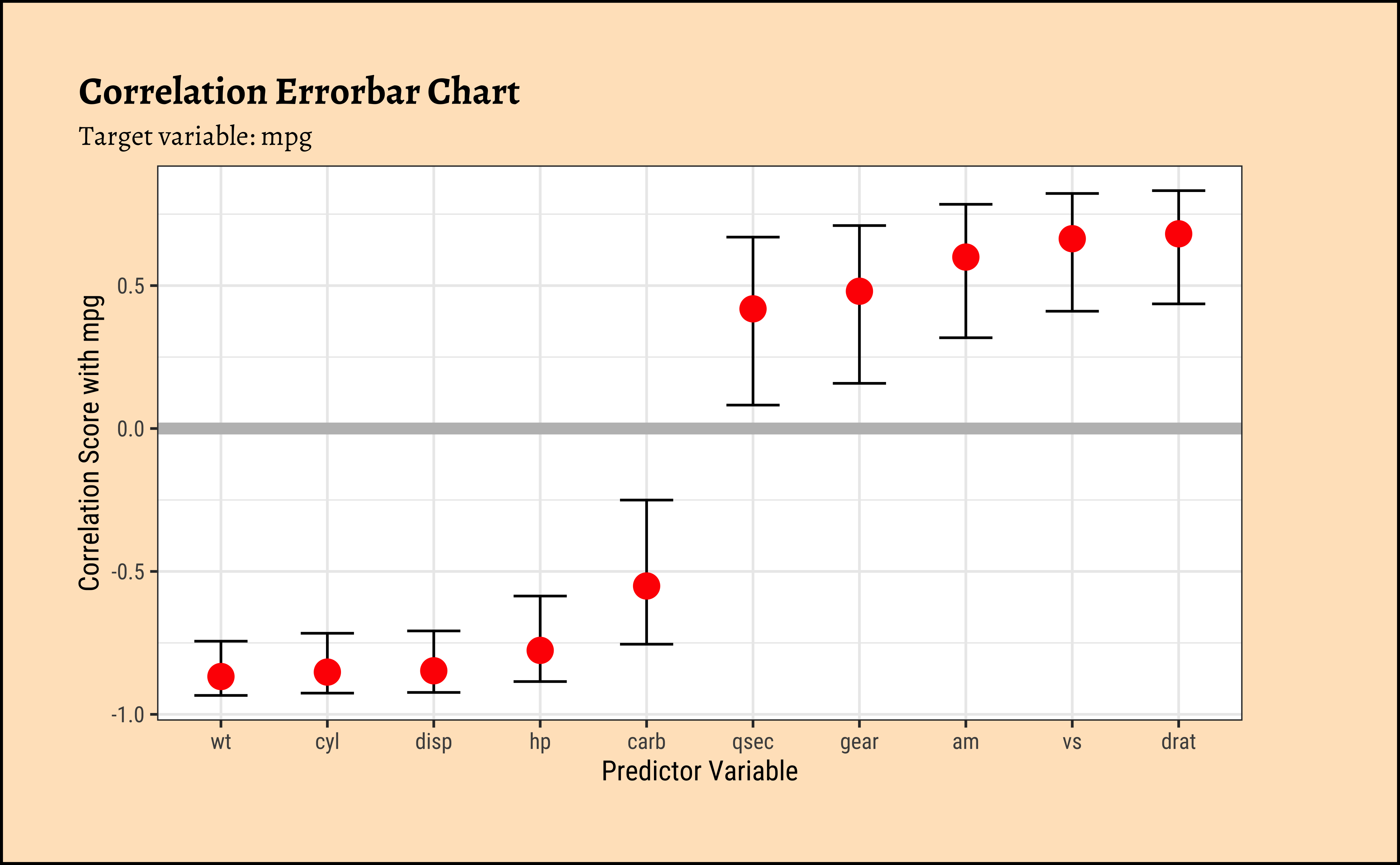
Business Insights from ErrorBar Plot
- Several variables are negatively correlated and some are positively correlated with ’mpg`. (The grey line shows “zero correlation”)
- Since none of the error bars straddle zero, the correlations are mostly significant.
- Scatter Plots, when they show “linear” clouds, tell us that there is some relationship between two Quant variables we have just plotted
- If so, then if one is the target variable you are trying to design for, then the other independent, or controllable, variable is something you might want to design with.
Important
Target variables are usually plotted on the Y-axis, while Predictor variables are on the X-Axis, in a Scatter Plot. Why? Because \(y = mx + c\) !
- Correlation scores are good indicators of things that are, well, related. While one variable may not necessarily cause another, a good correlation score may indicate how to chose a good predictor.
- That is something we will see when we examine Linear Regression
- Always, always, plot and test your data! Both numerical summaries as tables, and graphical summaries as charts, are necessary! See below!!
And How about these datasets?
| dataset | mean_x | mean_y | std_dev_x | std_dev_y | corr_x_y |
|---|---|---|---|---|---|
| away | 54 | 48 | 17 | 27 | -0.064 |
| bullseye | 54 | 48 | 17 | 27 | -0.069 |
| circle | 54 | 48 | 17 | 27 | -0.068 |
| dino | 54 | 48 | 17 | 27 | -0.064 |
| dots | 54 | 48 | 17 | 27 | -0.06 |
| h_lines | 54 | 48 | 17 | 27 | -0.062 |
| high_lines | 54 | 48 | 17 | 27 | -0.069 |
| slant_down | 54 | 48 | 17 | 27 | -0.069 |
| slant_up | 54 | 48 | 17 | 27 | -0.069 |
| star | 54 | 48 | 17 | 27 | -0.063 |
| v_lines | 54 | 48 | 17 | 27 | -0.069 |
| wide_lines | 54 | 48 | 17 | 27 | -0.067 |
| x_shape | 54 | 48 | 17 | 27 | -0.066 |
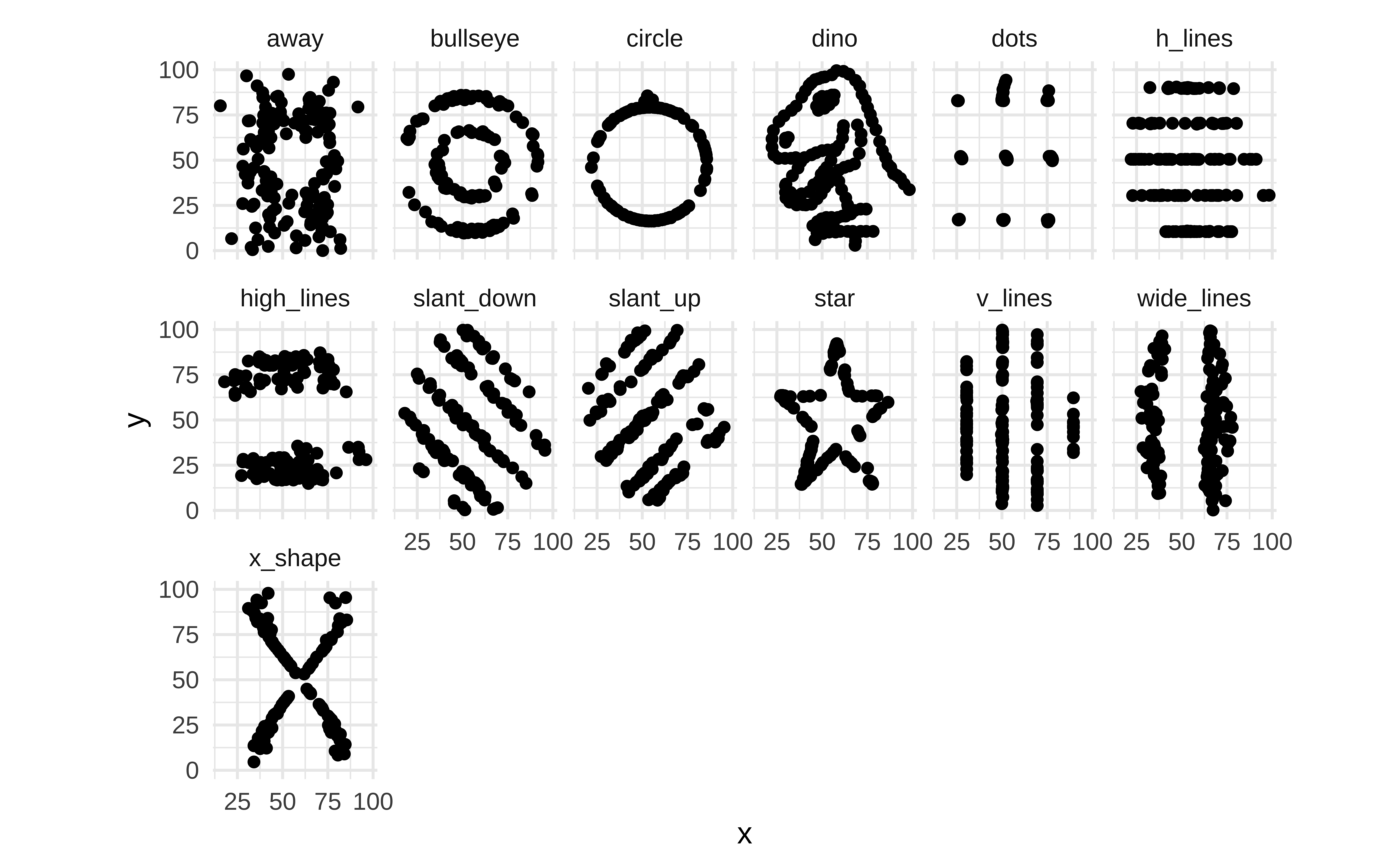
Yes, you did want to plot that cute T-Rex, didn’t you? Here is the data then!!
Warning
- Can selling more ice-cream make people drown?
- Use your head about pairs of variables. Do not fall into this trap)
Attali, Dean, and Christopher Baker. 2025. ggExtra: Add Marginal Histograms to “ggplot2,” and More “ggplot2” Enhancements. https://doi.org/10.32614/CRAN.package.ggExtra.
Gillespie, Colin, Steph Locke, Rhian Davies, and Lucy D’Agostino McGowan. 2025. datasauRus: Datasets from the Datasaurus Dozen. https://doi.org/10.32614/CRAN.package.datasauRus.
Meschiari, Stefano. 2026. Latex2exp: Use LaTeX Expressions in Plots. https://doi.org/10.32614/CRAN.package.latex2exp.
Robinson, David, Alex Hayes, Simon Couch, and Emil Hvitfeldt. 2026. broom: Convert Statistical Objects into Tidy Tibbles. https://doi.org/10.32614/CRAN.package.broom.
Schloerke, Barret, Di Cook, Joseph Larmarange, Francois Briatte, Moritz Marbach, Edwin Thoen, Amos Elberg, and Jason Crowley. 2025. GGally: Extension to “ggplot2”. https://doi.org/10.32614/CRAN.package.GGally.
Wei, Taiyun, and Viliam Simko. 2024. R Package “corrplot”: Visualization of a Correlation Matrix. https://github.com/taiyun/corrplot.