Modelling with Logistic Regression
2023-04-13
Plot Fonts and Theme
Code
library(systemfonts)
library(showtext)
## Clean the slate
systemfonts::clear_local_fonts()
systemfonts::clear_registry()
##
showtext_opts(dpi = 96) # set DPI for showtext
sysfonts::font_add(
  family = "Alegreya",
  regular = "../../../../../../fonts/Alegreya-Regular.ttf",
  bold = "../../../../../../fonts/Alegreya-Bold.ttf",
  italic = "../../../../../../fonts/Alegreya-Italic.ttf",
  bolditalic = "../../../../../../fonts/Alegreya-BoldItalic.ttf"
)

sysfonts::font_add(
  family = "Roboto Condensed",
  regular = "../../../../../../fonts/RobotoCondensed-Regular.ttf",
  bold = "../../../../../../fonts/RobotoCondensed-Bold.ttf",
  italic = "../../../../../../fonts/RobotoCondensed-Italic.ttf",
  bolditalic = "../../../../../../fonts/RobotoCondensed-BoldItalic.ttf"
)
showtext_auto(enable = TRUE) # enable showtext
##
theme_custom <- function() {
  theme_bw(base_size = 10) +

    # theme(panel.widths = unit(11, "cm"),
    #       panel.heights = unit(6.79, "cm")) + # Golden Ratio

    theme(
      plot.margin = margin_auto(t = 1, r = 2, b = 1, l = 1, unit = "cm"),
      plot.background = element_rect(
        fill = "bisque",
        colour = "black",
        linewidth = 1
      )
    ) +

    theme_sub_axis(
      title = element_text(
        family = "Roboto Condensed",
        size = 10
      ),
      text = element_text(
        family = "Roboto Condensed",
        size = 8
      )
    ) +

    theme_sub_legend(
      text = element_text(
        family = "Roboto Condensed",
        size = 6
      ),
      title = element_text(
        family = "Alegreya",
        size = 8
      )
    ) +

    theme_sub_plot(
      title = element_text(
        family = "Alegreya",
        size = 14, face = "bold"
      ),
      title.position = "plot",
      subtitle = element_text(
        family = "Alegreya",
        size = 10
      ),
      caption = element_text(
        family = "Alegreya",
        size = 6
      ),
      caption.position = "plot"
    )
}

## Use available fonts in ggplot text geoms too!
ggplot2::update_geom_defaults(geom = "text", new = list(
  family = "Roboto Condensed",
  face = "plain",
  size = 3.5,
  color = "#2b2b2b"
))
ggplot2::update_geom_defaults(geom = "label", new = list(
  family = "Roboto Condensed",
  face = "plain",
  size = 3.5,
  color = "#2b2b2b"
))

ggplot2::update_geom_defaults(geom = "marquee", new = list(
  family = "Roboto Condensed",
  face = "plain",
  size = 3.5,
  color = "#2b2b2b"
))
ggplot2::update_geom_defaults(geom = "text_repel", new = list(
  family = "Roboto Condensed",
  face = "plain",
  size = 3.5,
  color = "#2b2b2b"
))
ggplot2::update_geom_defaults(geom = "label_repel", new = list(
  family = "Roboto Condensed",
  face = "plain",
  size = 3.5,
  color = "#2b2b2b"
))

## Set the theme
ggplot2::theme_set(new = theme_custom())

## tinytable options
options("tinytable_tt_digits" = 2)
options("tinytable_format_num_fmt" = "significant_cell")
options(tinytable_html_mathjax = TRUE)


## Set defaults for flextable
flextable::set_flextable_defaults(font.family = "Roboto Condensed")Linear Models for Categorical Targets?
Recall that we spoke of dummy-encoded Qualitative **predictor** variables for our linear models and how we would dummy encode them using numerical values, such as 0 and 1, or +1 and -1. Could we try the same way for a target categorical variable?
\[ Y_i = \beta_0 + \beta_1*X_i + \epsilon_i\\ \nonumber \] \[ where\\\ \]
\[ \begin{align} Y_i &= 0 ~ if ~~~"No"\\ \nonumber &= 1 ~ if ~~~ "Yes" \nonumber \end{align} \]
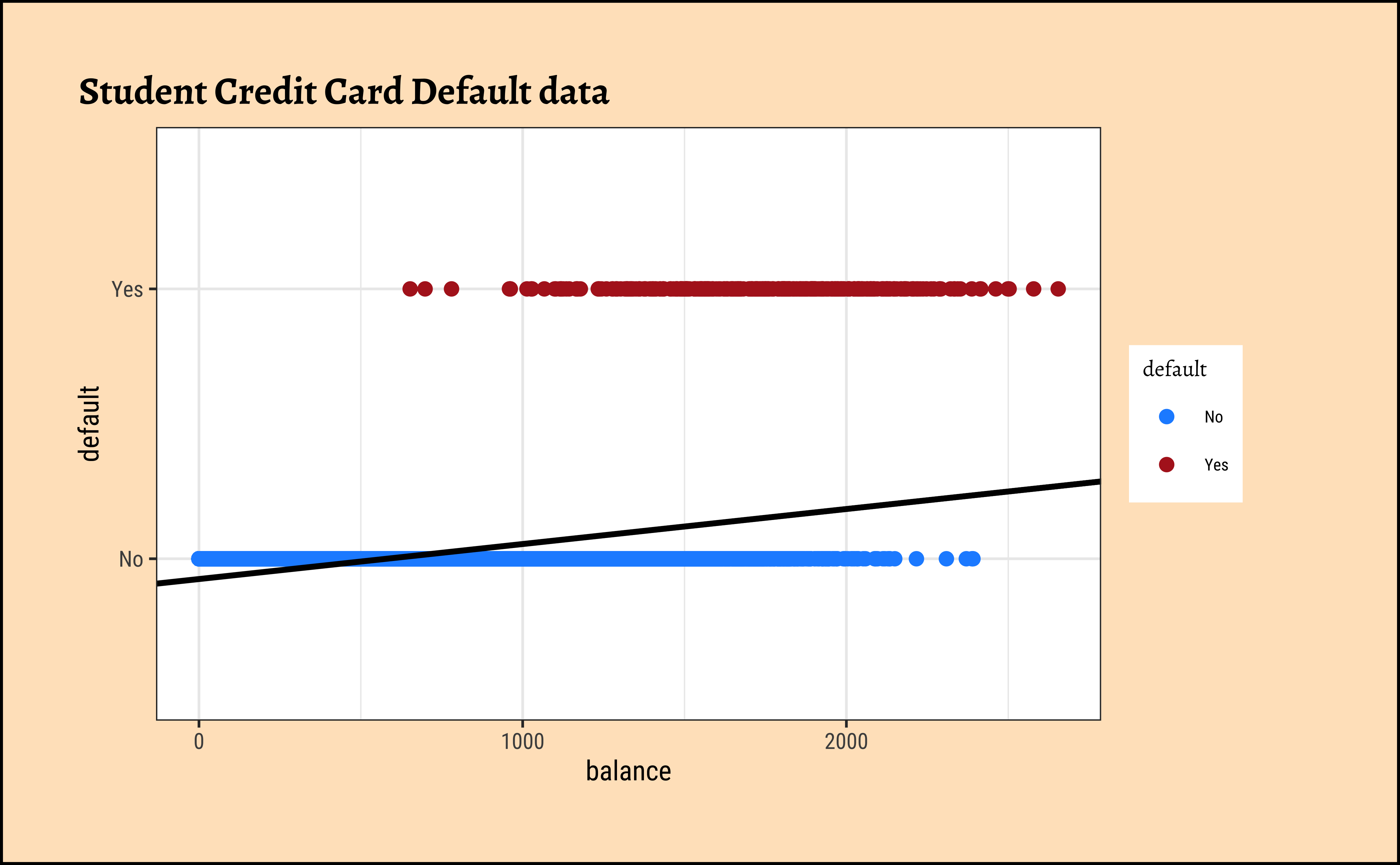
Sadly this seems to not work for categorical dependent variables using a simple linear model as before. Consider the Credit Card Default data from the package ISLR.
We see balance and income are quantitative predictors; student is a qualitative predictor, and default is a qualitative target variable. If we naively use a linear model equation as model = lm(default ~ balance, data = Default) and plot it, then…
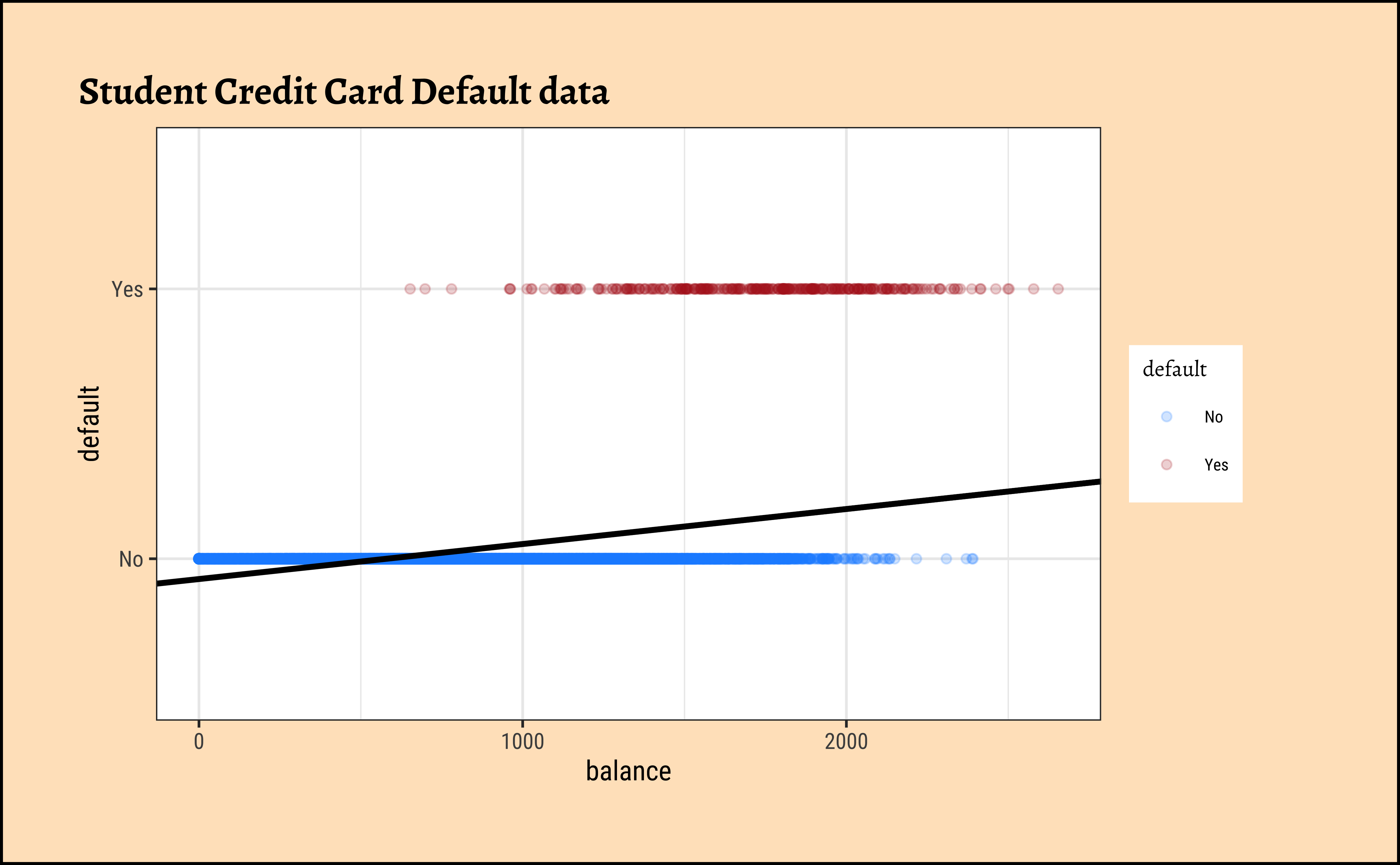
…it is pretty much clear from Figure 1 that something is very odd. (no pun intended! See below!) If the only possible values for default are \(No = 0\) and \(Yes = 1\), how could we interpret predicted value of, say, \(Y_i = 0.25\) or \(Y_i = 1.55\), or perhaps \(Y_i = -0.22\)? Anything other than Yes/No is hard to interpret!
Where do we go from here?
1. Model Equation:
Let us state what we might desire of our model: despite this setback, we would still like our model to be as close as possible to the familiar linear model equation.
\[ Y_i = \beta_0 + \beta_1*X_i + \epsilon_i\\ \nonumber \] \[ where\\\ \]
\[ \begin{align} Y_i &= 0 ~ if ~~~"No"\\ \nonumber &= 1 ~ if ~~~ "Yes" \nonumber \end{align} \tag{2}\]
2. Predictors and Weights:
We have quantitative predictors so we still want to use a linear-weighted sum for the RHS (i.e predictor side) of the model equation. What can we try to make this work? Especially for the LHS (i.e the target side)?
3. Making the LHS continuous?
What can we try? In dummy encoding our target variable, we found a range of [0,1], which is the same as the range for a probability value! Could we try to use probability of the outcome as our target, even though we are interested in binary outcomes themselves? This would still leave us with a range of \([0,1]\) for the target variable, as before.
Binomially distributed target variable
If we map our Categorical/Qualitative target variable into a Quantitative probability, we need immediately to look at the LINE assumptions in linear regression.
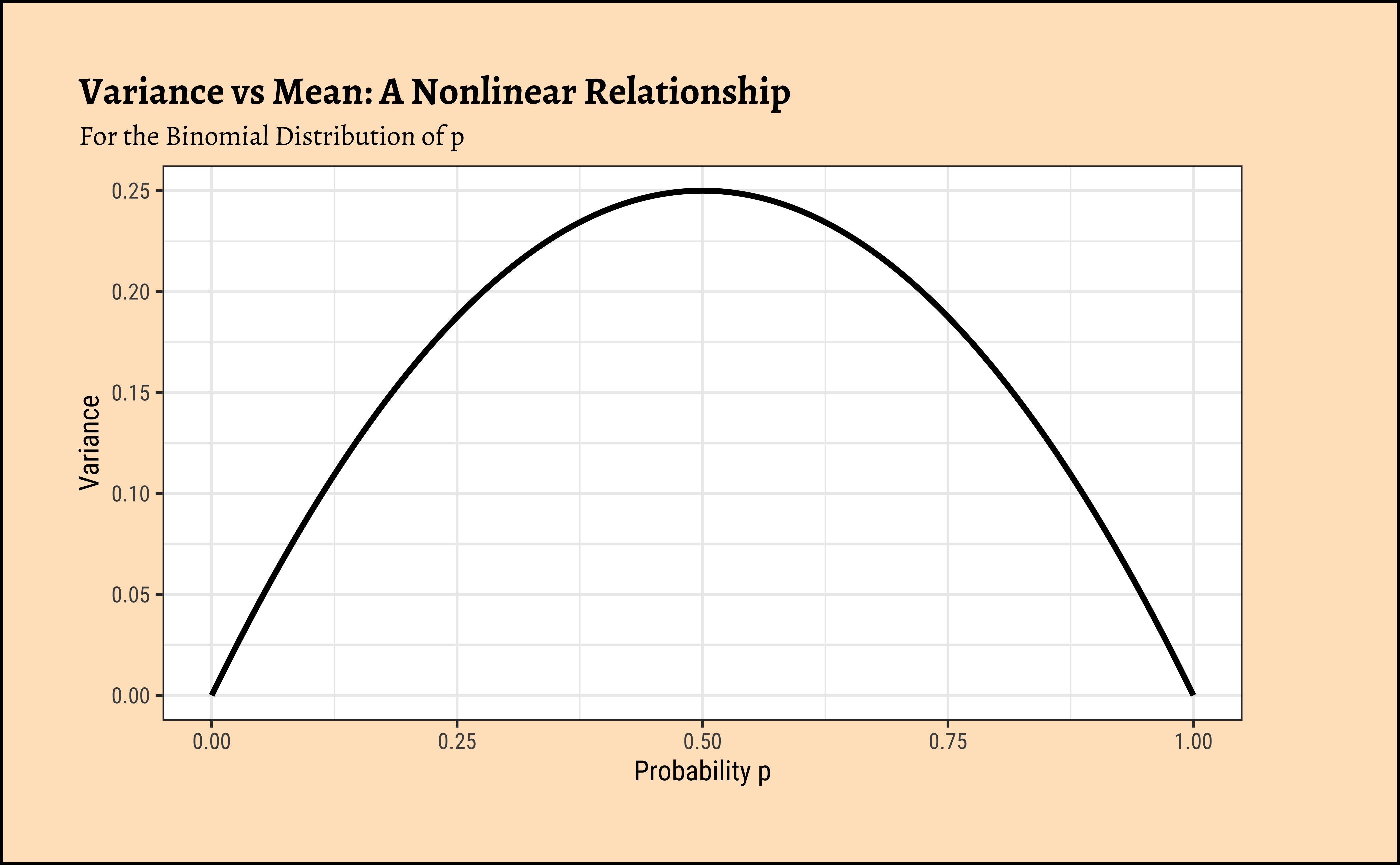
In linear regression, we assume a normally distributed target variable, i.e. the residuals/errors around the predicted value are normally distributed. With a categorical target variable with two levels \(0\) and \(1\) it would be impossible for the errors \(e_i = Y_i - \hat{Y_i}\) to have a normal distribution, as assumed for the statistical tests to be valid. The errors are bounded by \([0,1]\)! One candidate for the error distribution in this case is the binomial distribution, whose mean and variance are p and np(1-p) respectively.
Note immediately that the binomial variance moves with the mean! The LINE assumption of normality is clearly violated. And from the figure above, extreme probabilities (near 1 or 0) are more stable (i.e., have less error variance) than middle probabilities. So the model has “built-in” heteroscedasticity, which we need to counter with transformations such as the \(log()\) function. More on this very shortly!
4. Odds?
How would one “extend” the range of a target variable from [0,1] to \([-\infty, \infty]\) ? One step would be to try the odds of the outcome, instead of trying to predict the outcomes directly (Yes or No), or even their probabilities \([0,1]\).
Odds
Odds of an event with probability p of occurrence is defined as \(Odds = p/(1-p)\). As can be seen, the odds are the ratio of two probabilities, that of the event and its complement. In the Default dataset just considered, the odds of default and the odds of non-default can be calculated as:
\[ \begin{align} p(Default) &= 333/(333 + 9667)\\ \nonumber &= 0.333\\ \nonumber \end{align} \]
therefore:
\[ \begin{align} Odds~of~Default &=p(Default)/(1-p(Default))\\ \nonumber &= 0.333/(1-0.333)\\ \nonumber &= 0.5\\ \end{align} \]
and
\[ Odds~No~Default = 0.9667/(1-0.9667) = 29 \].
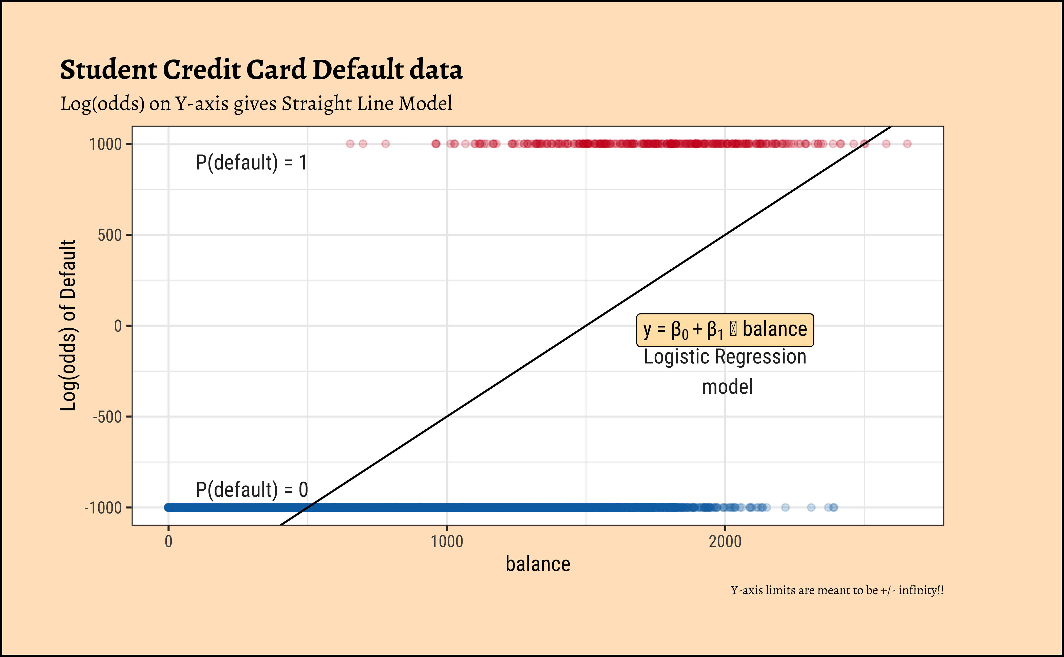
Now, odds cover half of real number line, i.e. \([0, \infty]\) ! Clearly, when the probability p of an event is \(0\), the odds are \(0\)…and when it nears \(1\), the odds tend to \(\infty\). So we have transformed a simple probability that lies between \([0,1]\) to odds lying between \([0, \infty]\). That’s one step towards making a linear model possible; we have “removed” one of the limits on our linear model’s prediction range by using Odds as our target variable.
5. Transformation using log()?
We need one more leap of faith: how do we convert a \([0, \infty]\) range to a \([-\infty, \infty]\)? Can we try a log transformation?
\[ log([0, \infty]) ~ = ~ [-\infty, \infty] \]
This extends the range of our Qualitative target to the same as with a Quantitative target!
There is an additional benefit if this log() transformation: the Error/Residual Distributions with Odds targets. See the plot below. Odds are a necessarily nonlinear function of probability; the slope of Odds ~ probability also depends upon the probability itself, as we saw with the probability curve earlier.
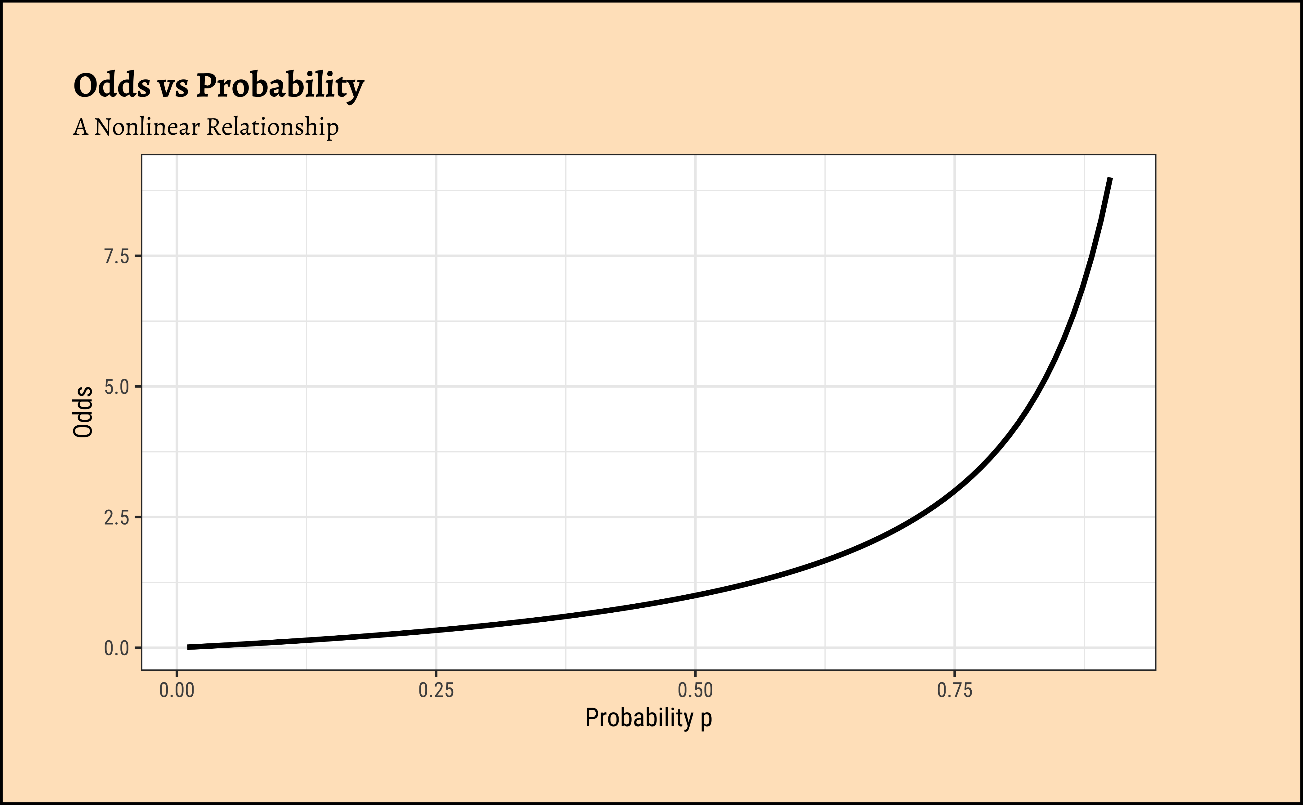
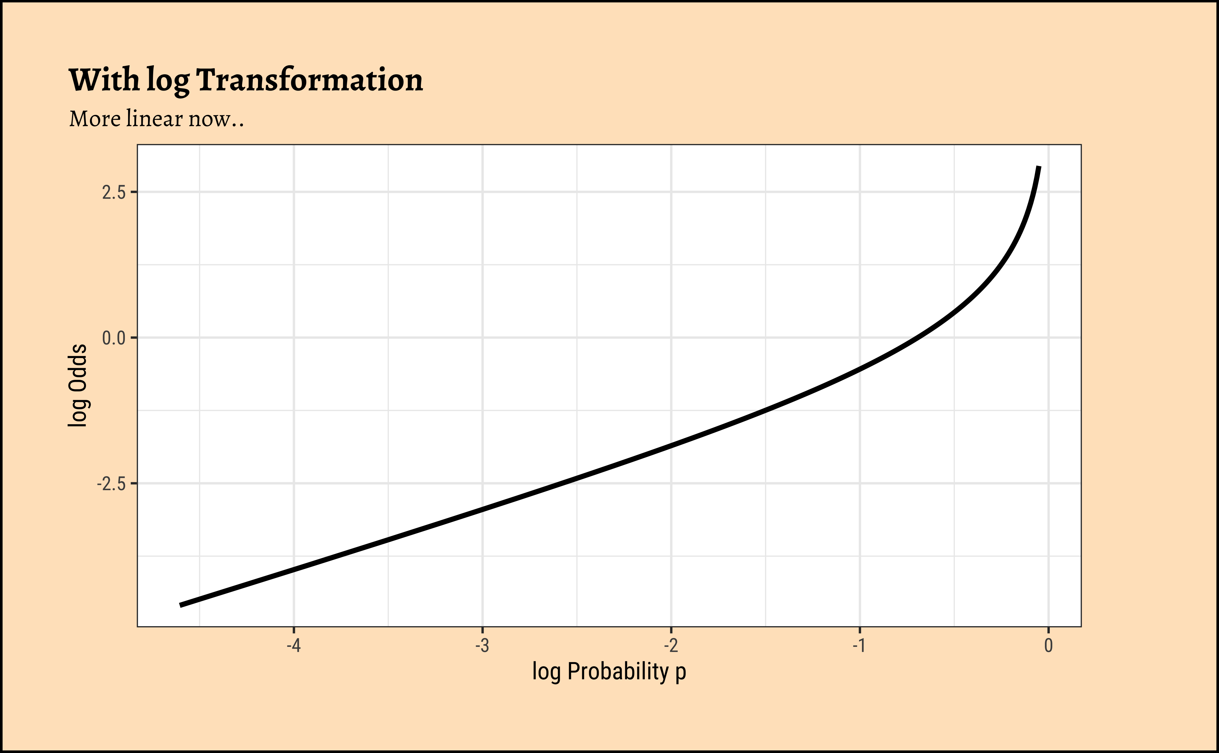
To understand this issue intuitively, consider what happens to, say, a 5% change in the odds ratio near 1.0. If the odds ratio is \(1.0\), then the probabilities p and 1-p are \(0.5\), and \(0.5\). A 20% increase in the odds ratio to \(1.20\) would correspond to probabilities of \(0.545\) and \(0.455\). However, if the original probabilities were \(0.9\) and \(0.1\) for an odds ratio \(9\), then a 20% increase (in odds ratio) to \(10.8\) would correspond to probabilities of \(0.915\) and \(0.085\), a much smaller change in the probabilities. The basic curve is non-linear and the log transformation flattens this out to provide a more linear relationship, which is what we desire.
6. Putting it all together: Logistic Regression
So finally in our model, instead of modeling levels/labels of the Qual target variable events (i.e Yes / No ), we will use \(log(odds)\) of the events themselves, also known as the logit, defined as:
\[ \begin{align} log(odds_i) &= log\bigg[p_i/(1-p_i)\bigg]\\ \nonumber &= logit(p_i)\\ \end{align} \tag{3}\]
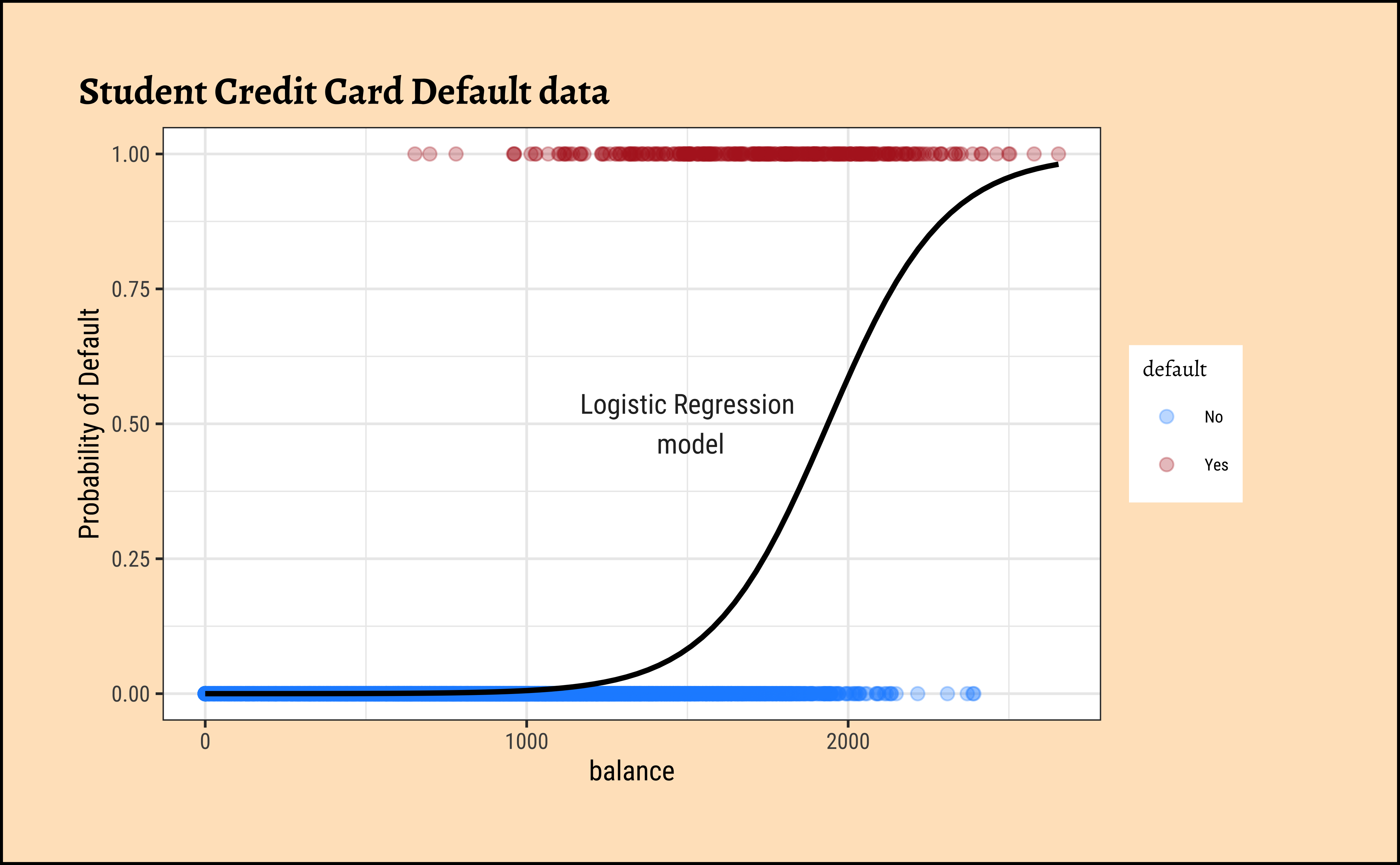
This is our Logistic Regression Model, which uses a Quantitative Predictor variable to predict a Categorical target variable. We write the model as ( for the Default dataset ) :
\[ \Large{logit(default) = \beta_0 + \beta_1 * balance} \tag{4}\]
This means that:
\[ log(p(default)/(1-p(default))) = \beta_0+\beta_1 * balance \] and therefore:
\[ \begin{align} p(default) &= \frac{exp(\beta_0 + \beta_1 * balance)}{1 + exp(\beta_0 + \beta_1 * balance)}\\ &= \frac{1}{1 + exp^{-(\beta_0 + \beta_1 * balance)}} \end{align} \tag{5}\]
From the Equation 4 above it should be clear that a unit increase in balance should increase the odds of default by \(\beta_1\) units. The RHS of Equation 5 is a sigmoid function of the weighted sum of predictors and is limited to the range [0,1].
If we were to include income also as a predictor variable in the model, we might obtain something like:
\[ \begin{align} p(default) &= \frac{exp(\beta_0 + \beta_1 * balance + \beta_2 * income)}{1 + exp(\beta_0 + \beta_1 * balance + \beta_2 * income)}\\ &= \frac{1}{1 + exp^{-(\beta_0 + \beta_1 * balance + \beta_2 * income)}} \end{align} \tag{6}\]
This model Equation 6 is plotted a little differently, since it includes three variables. We’ll see this shortly, with code. The thing to note is that the formula inside the exp() is a linear combination of the predictors!
7. Estimation of Model Parameters:
The parameters \(\beta_i\) now need to be estimated. How might we do that? This last problem is that because we have made so many transformations to get to the logits that we want to model, the logic of minimizing the sum of squared errors(SSE) is no longer appropriate.
Infinite SSE!!
The probabilities for default are \(0\) and \(1\). At these values the log(odds) will map respectively to \(-\infty\) and \(\infty\) 🙀. So if we naively try to take residuals, we will find that they are all \(\infty\) !! Hence the Sum of Squared Errors \(SSE\) cannot be computed and we need another way to assess the quality of our model.
Instead, we will have to use maximum likelihood estimation(MLE) to estimate the models. The maximum likelihood method maximizes the probability of obtaining the data at hand against every choice of model parameters \(\beta_i\). (And compare that method with the \(X^2\) (“chi-squared”) test and statistic instead of t and F to evaluate the model comparisons)
Let us use GGally to plot a set of combo-plots for our modified dataset:
Code
ggplot2::theme_set(new = theme_custom())

cancer_modified %>%
  select(diagnosis, radius_mean, concave_points_mean) %>%
  GGally::ggpairs(
    mapping = aes(colour = diagnosis),
    switch = "both",
    # axis labels in more traditional locations(left and bottom)

    progress = FALSE,
    # no compute progress messages needed

    # Choose the diagonal graphs (always single variable! Think!)
    diag = list(continuous = "densityDiag", alpha = 0.3),
    # choosing density

    # Choose lower triangle graphs, two-variable graphs
    lower = list(continuous = wrap("points", alpha = 0.3)),
    title = "Cancer Pairs Plot #1"
  ) +
  scale_color_brewer(
    palette = "Set1", direction = -1,
    aesthetics = c("color", "fill")
  )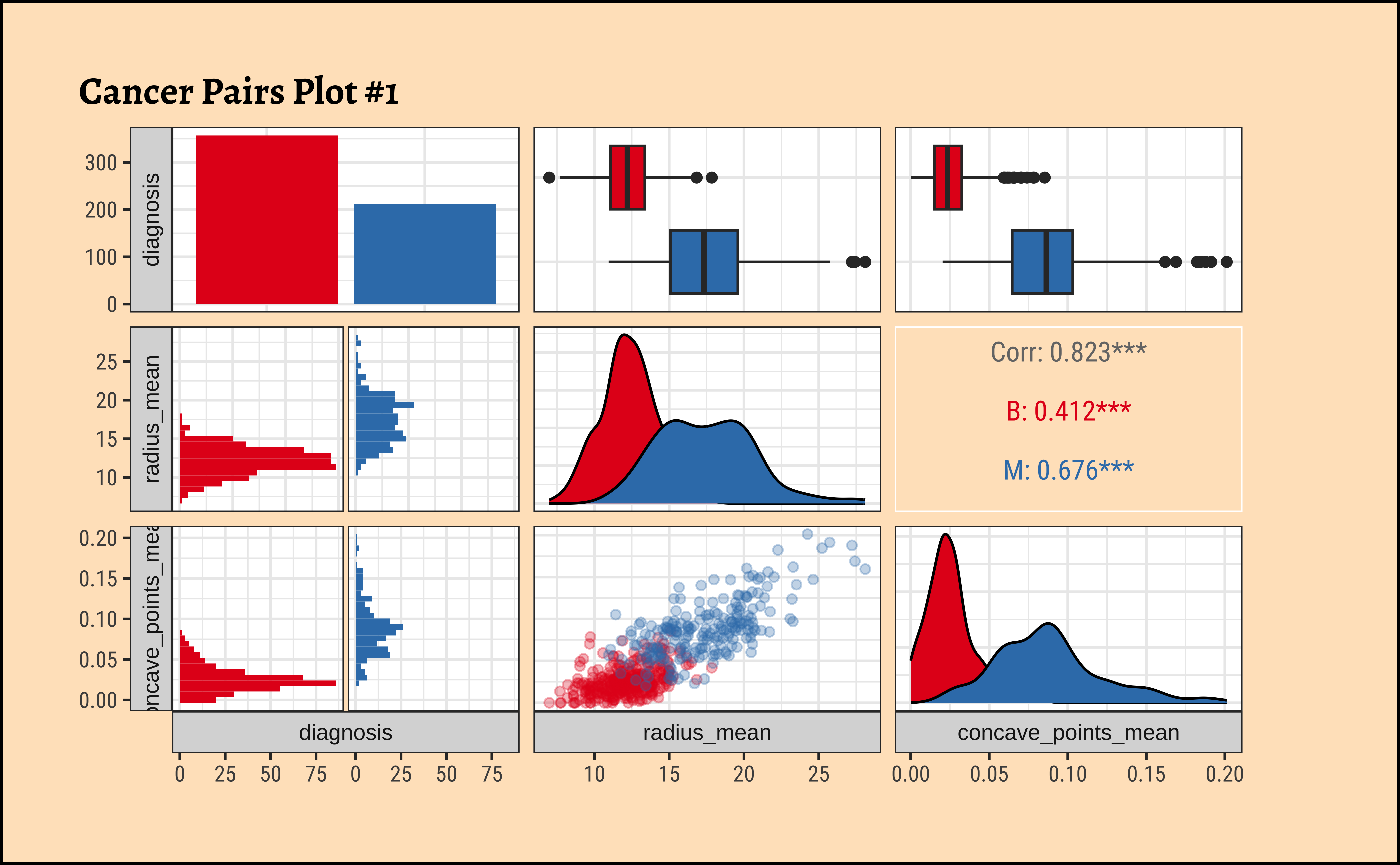
Business Insights from GGally::ggpairs
- The counts for “B” and “M” are not terribly unbalanced; and both the
radius_meanandconcave_pts_meanappear to have well-separated box plot distributions for “B” and “M”. - Given the visible separation of the box-plots for both variables
radius_meanandconcave_pts_mean, we can believe that these will be good choices as predictors. - Interestingly,
radius_meanandconcave_pts_meanare also mutually well-correlated, with a \(\rho = 0.823\); we may wish (later) to choose (a pair of) predictor variables that are less strongly correlated.
Model Code Workflow: Model Checking and Diagnostics Workflow: Checks for Uncertainty Logistic Regression Models as Hypothesis Tests
Let us code two models, using one and then both the predictor variables:
Code
The equation for the simple model is:
\[ \begin{aligned} \operatorname{diagnosis\_malignant} &\sim Bernoulli\left(\operatorname{prob}_{\operatorname{diagnosis\_malignant} = \operatorname{1}}= \hat{P}\right) \\ \log\left[ \frac { \hat{P} }{ 1 - \hat{P} } \right] &= -15.25 + 1.03(\operatorname{radius\_mean}) \end{aligned} \tag{7}\]
Increasing radius_mean by one unit changes the log odds by \(\hat{\beta_1} = 1.033\) or equivalently it multiplies the odds by \(exp(\hat{\beta_1}) = 2.809\). We can plot the model as shown below:
Code
ggplot2::theme_set(new = theme_custom())

qthresh <- c(0.2, 0.5, 0.8)
beta01 <- coef(cancer_fit_1)[1]
beta11 <- coef(cancer_fit_1)[2]
decision_point <- (log(qthresh / (1 - qthresh)) - beta01) / beta11
##
cancer_modified %>%
  gf_point(
    diagnosis_malignant ~ radius_mean,
    colour = ~diagnosis,
    title = "diagnosis ~ radius_mean",
    xlab = "Average radius",
    ylab = "Diagnosis (1=malignant)", size = 3, show.legend = F
  ) %>%
  # gf_fun(exp(1.033 * radius_mean - 15.25) / (1 + exp(1.033 * radius_mean - 15.25)) ~ radius_mean, xlim = c(1, 30), linewidth = 3, colour = "red") %>%
  gf_smooth(
    method = glm,
    method.args = list(family = "binomial"),
    se = FALSE,
    color = "black"
  ) %>%
  gf_vline(xintercept = decision_point, linetype = "dashed") %>%
  gf_refine(annotate(
    "text",
    label = paste0("q = ", qthresh),
    x = decision_point + 0.45,
    y = 0.4,
    angle = -90
  ), scale_color_brewer(palette = "Set1", direction = -1)) %>%
  gf_hline(yintercept = 0.5) %>%
  gf_theme(theme(plot.title.position = "plot")) %>%
  gf_refine(xlim(5, 30))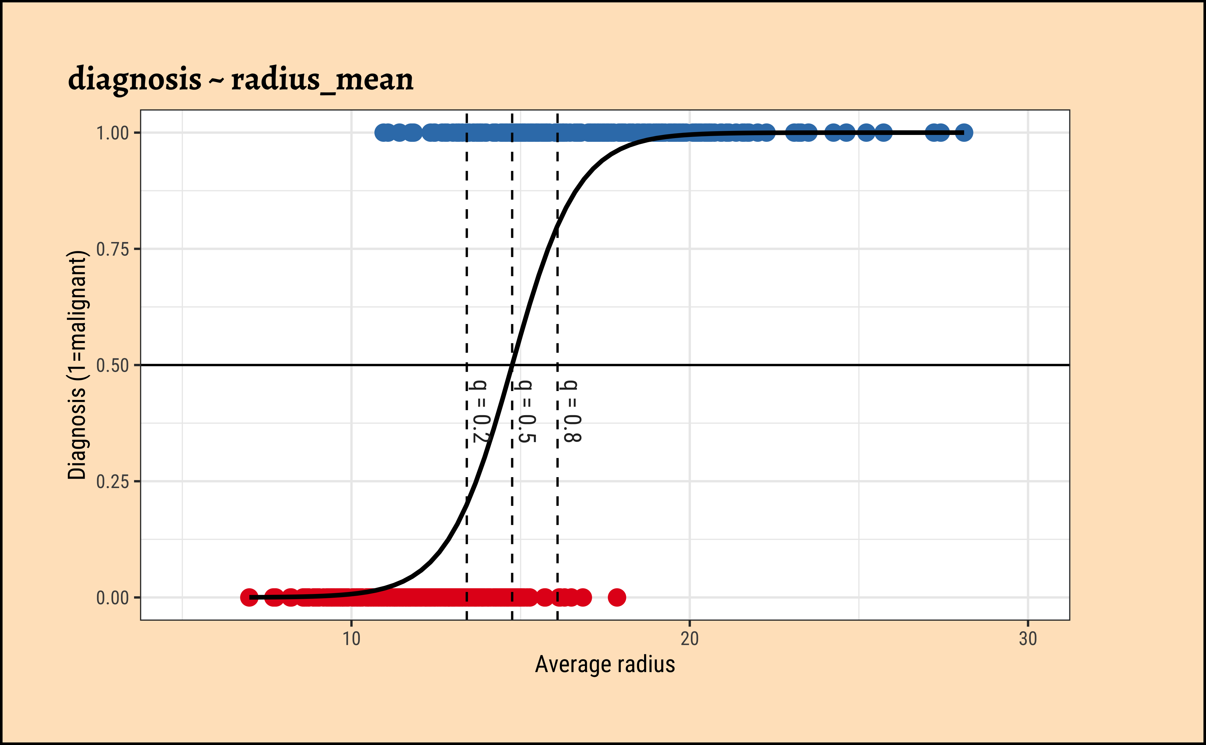
The dotted lines show how the model can be used to classify the data in to two classes (“B” and “M”) depending upon the threshold probability \(q\).
Taking both predictor variables, we obtain the model:
Code
The equation for the more complex model is:
\[ \begin{aligned} \operatorname{diagnosis\_malignant} &\sim Bernoulli\left(\operatorname{prob}_{\operatorname{diagnosis\_malignant} = \operatorname{1}}= \hat{P}\right) \\ \log\left[ \frac { \hat{P} }{ 1 - \hat{P} } \right] &= -13.7 + 0.64(\operatorname{radius\_mean}) + 84.22(\operatorname{concave\_points\_mean}) \end{aligned} \tag{8}\]
Increasing radius_mean by one unit changes the log odds by \(\hat{\beta_1} = 0.6389\) or equivalently it multiplies the odds by \(exp(\hat{\beta_1}) = 1.894\), provided concave_points_mean is held fixed.
We can plot the model as shown below: we create a scatter plot of the two predictor variables. The superimposed diagonal lines are lines for several constant values of threshold probability \(q\).
Code
ggplot2::theme_set(new = theme_custom())

beta02 <- coef(cancer_fit_2)[1]
beta12 <- coef(cancer_fit_2)[2]
beta22 <- coef(cancer_fit_2)[3]
##
decision_intercept <- 1 / beta22 * (log(qthresh / (1 - qthresh)) - beta02)
decision_slope <- -beta12 / beta22
##
cancer_modified %>%
  gf_point(concave_points_mean ~ radius_mean,
    color = ~diagnosis, shape = ~diagnosis,
    size = 3, alpha = 0.5
  ) %>%
  gf_labs(
    x = "Average radius",
    y = "Average concave\nportions of the\ncontours",
    color = "Diagnosis",
    shape = "Diagnosis",
    title = "diagnosis ~ radius_mean + concave_points_mean"
  ) %>%
  gf_abline(
    slope = decision_slope, intercept = decision_intercept,
    linetype = "dashed"
  ) %>%
  gf_refine(
    scale_color_brewer(palette = "Set1", direction = -1),
    annotate("text", label = paste0("q = ", qthresh), x = 10, y = c(0.08, 0.1, 0.115), angle = -17.155)
  ) %>%
  gf_theme(theme(plot.title.position = "plot"))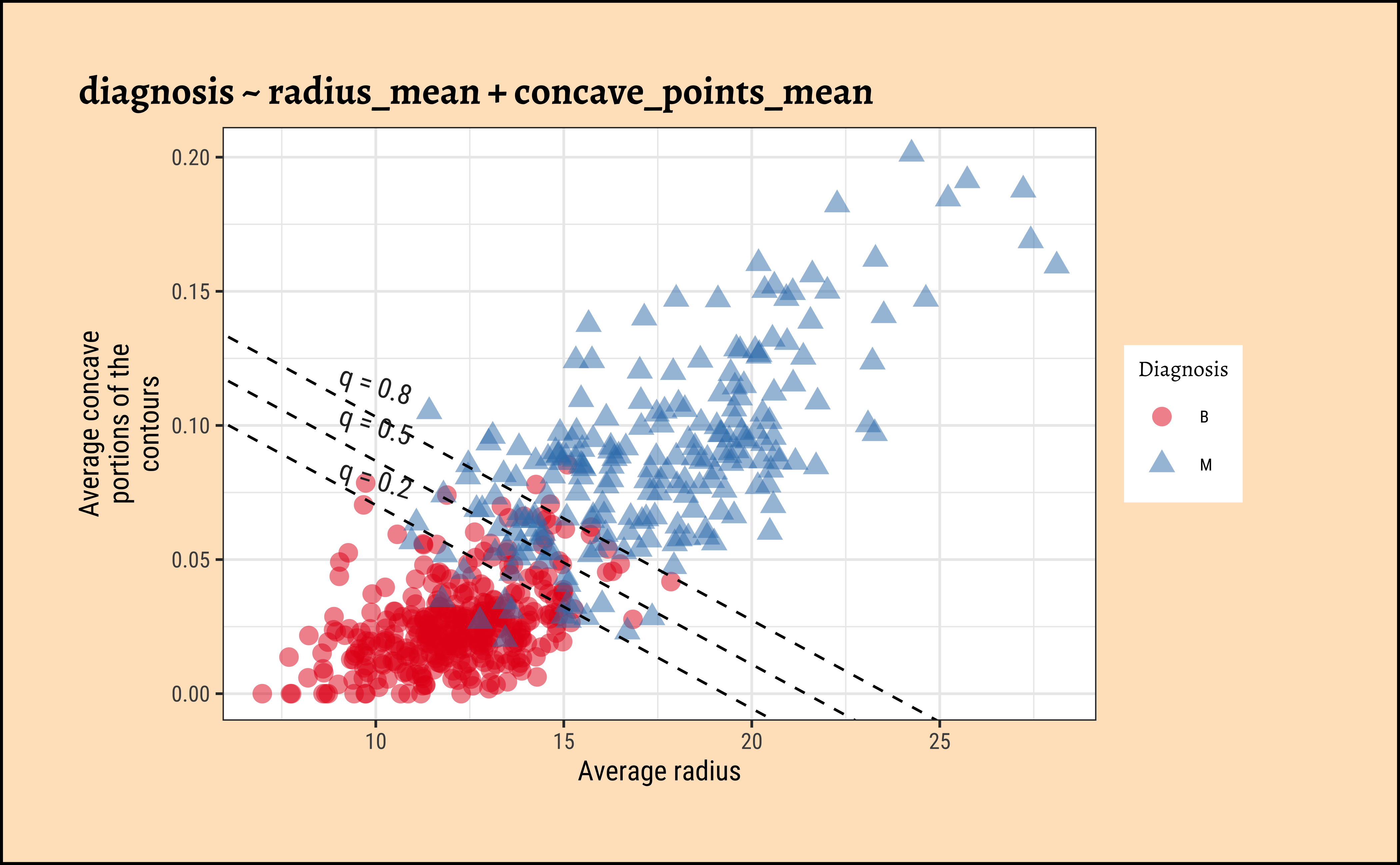
To Be Written Up. Yeah, sure.
To Be Written Up. Hmph.
To Be Written Up. (This is becoming a joke.)
Likelihood Function
Let us visualize the variations and computations from step(5). For the sake of clarity:
- we will take a small sample of the original dataset
- we take several different values for \(\beta_0\) and \(\beta_1\)
- Use these get a set of regression curves
- which we superimpose on the scatter plot of the sample
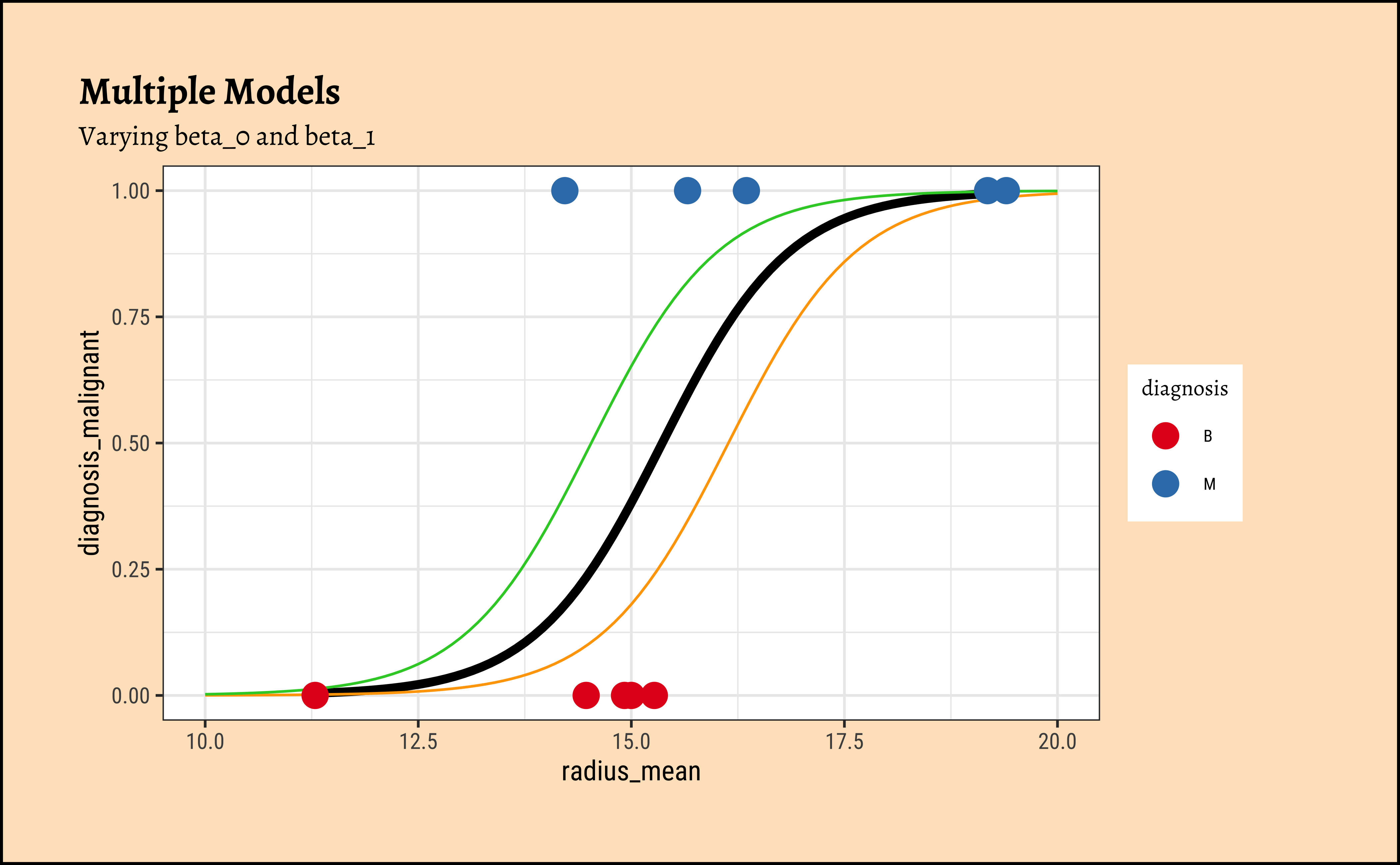
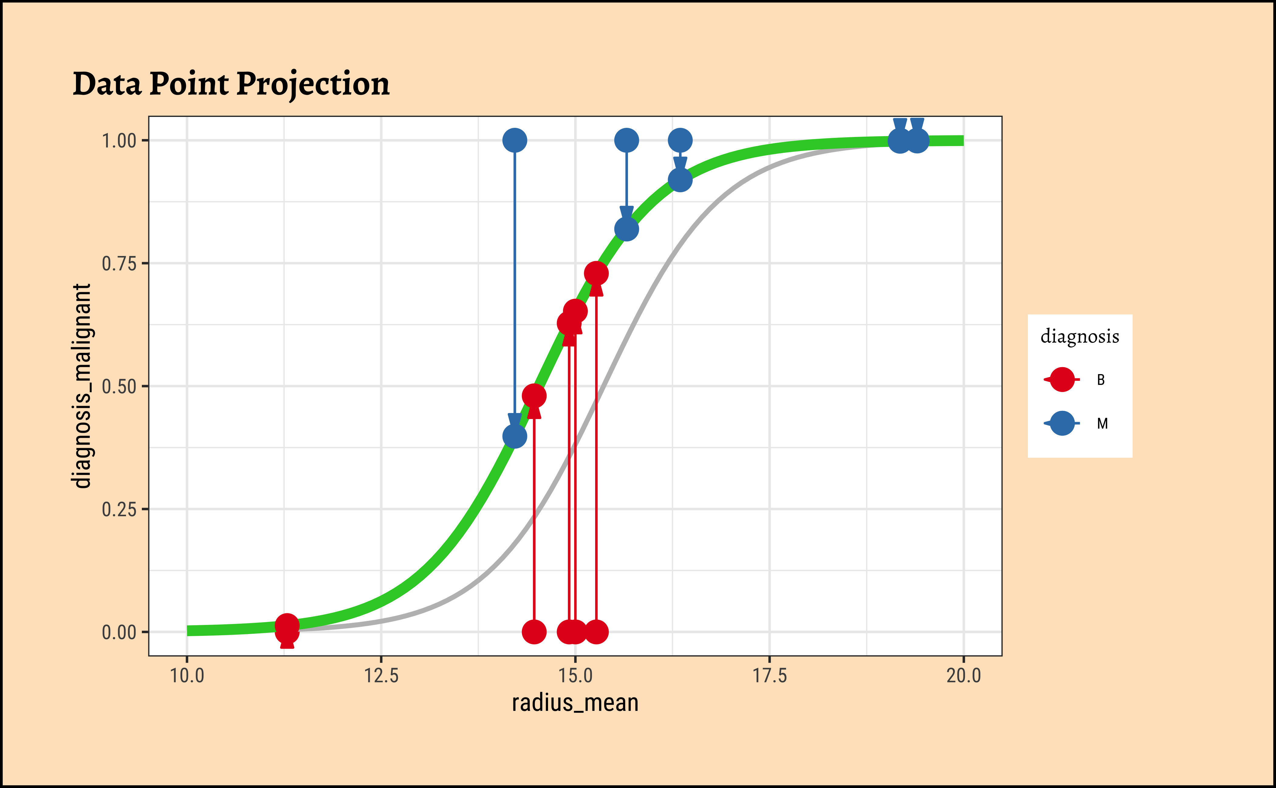
In Figure 8, we see three models: the “optimum” one in black, and two others in green and orange respectively.
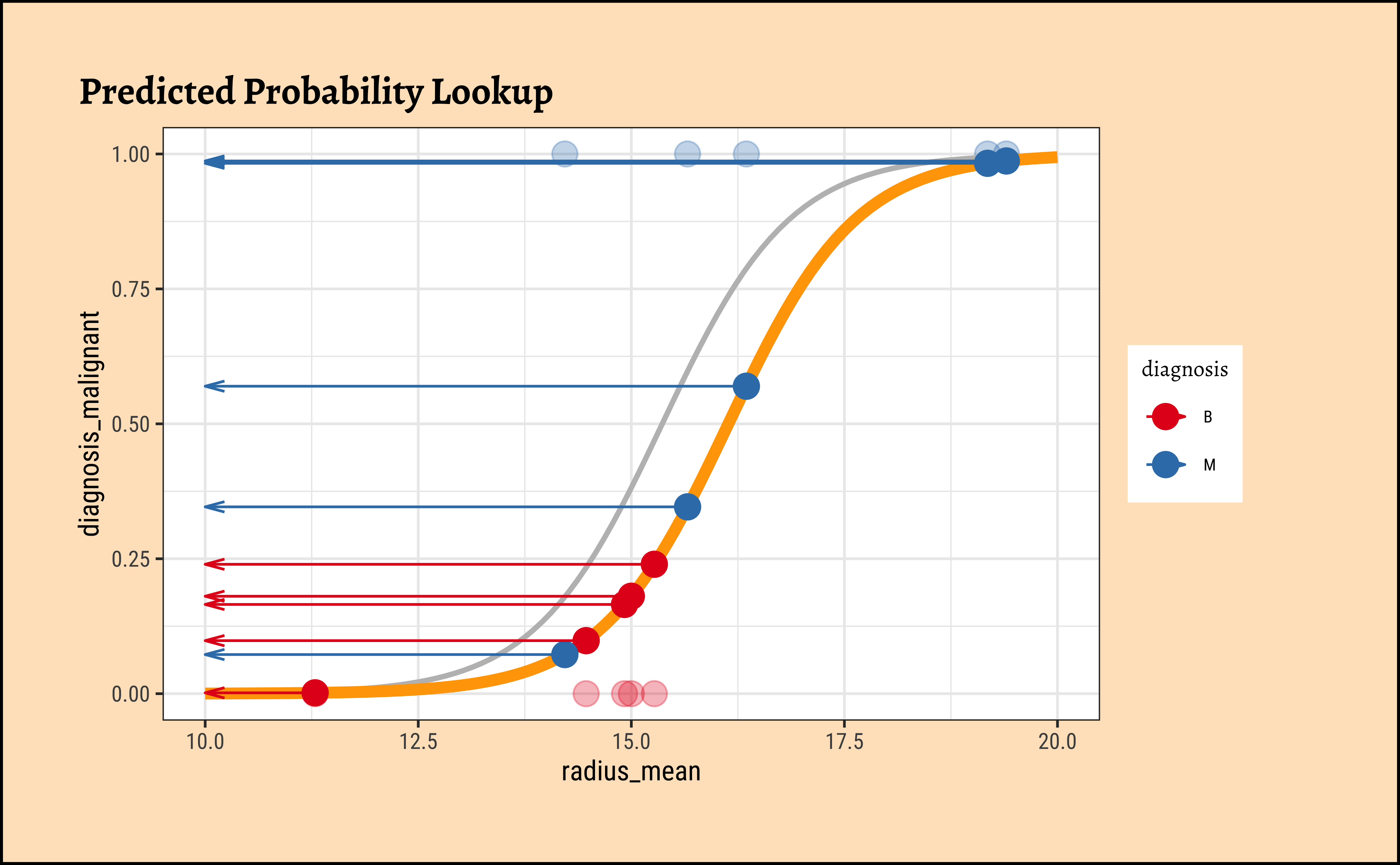
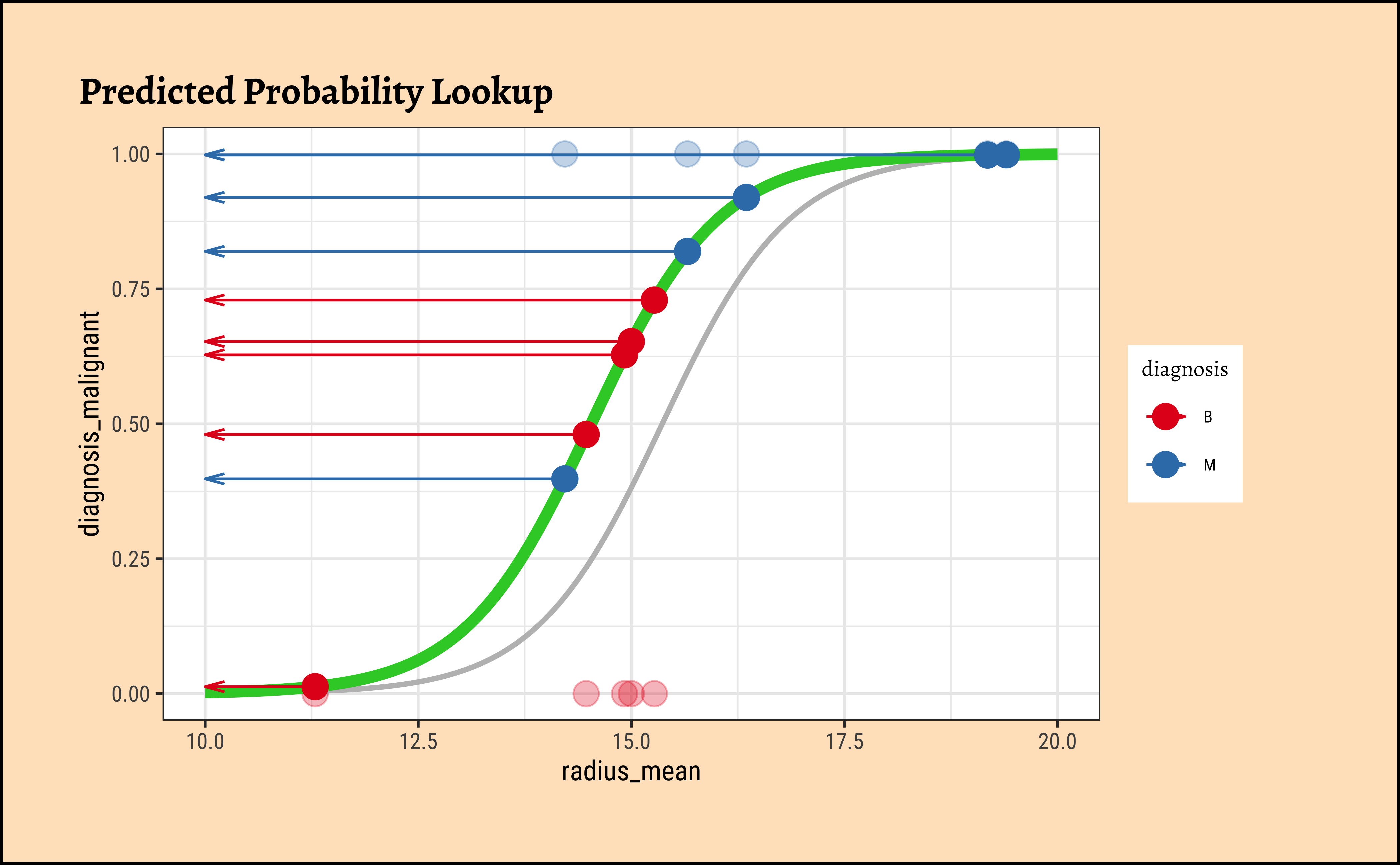
We now project the actual points on to the regression curve, to obtain the predicted probability for each point.
Code
ggplot2::theme_set(new = theme_custom())

plot_dat <- cancer_modified_sample %>%
  mutate(
    curve1 = ilogit(radius_mean * (beta1_sample - 0.002) + beta0_sample - 1),
    curve2 = ilogit(radius_mean * (beta1_sample + 0.0075) + beta0_sample + 1)
  )
# plot_dat
## Now plot the two steps for each regression curve
## 1. Point projection
plot_dat %>%
  gf_point(diagnosis_malignant ~ radius_mean,
    colour = ~diagnosis, size = 4, title = "Data Point Projection"
  ) %>%
  gf_smooth(
    method = glm,
    method.args = list(family = "binomial"),
    se = FALSE,
    color = "grey"
  ) %>%
  gf_refine(scale_color_brewer(palette = "Set1", direction = -1)) %>%
  ## Overlaid regression curves
  gf_fun(ilogit(x * (beta1_sample - 0.002) + beta0_sample - 1) ~ x, xlim = c(10, 20), color = "orange", linewidth = 2) %>%
  gf_point(curve1 ~ radius_mean, size = 4) %>%
  gf_segment(curve1 + diagnosis_malignant ~ radius_mean + radius_mean, arrow = arrow(ends = "first", angle = 15, type = "closed", length = unit(0.125, "inches")))

# %>%
# gf_segment(curve1 + curve1 ~ radius_mean + 0)

## 2. probability lookup
plot_dat %>%
  gf_point(diagnosis_malignant ~ radius_mean,
    colour = ~diagnosis, size = 4, alpha = 0.3,
    title = "Predicted Probability Lookup"
  ) %>%
  gf_smooth(
    method = glm,
    method.args = list(family = "binomial"),
    se = FALSE,
    color = "grey"
  ) %>%
  gf_refine(scale_color_brewer(palette = "Set1", direction = -1)) %>%
  gf_fun(ilogit(x * (beta1_sample - 0.002) + beta0_sample - 1) ~ x,
    xlim = c(10, 20), color = "orange", linewidth = 2
  ) %>%
  gf_point(curve1 ~ radius_mean, size = 4) %>%
  # gf_segment(curve1 + diagnosis_malignant ~ radius_mean + radius_mean) %>%
  gf_segment(curve1 + curve1 ~ radius_mean + 10,
    arrow = arrow(
      ends = "last", angle = 15,
      length = unit(0.1, "inches")
    )
  )


### Curve 2
## Now plot the two steps for each regression curve
## 1. Point projection
plot_dat %>%
  gf_point(diagnosis_malignant ~ radius_mean,
    colour = ~diagnosis, size = 4, title = "Data Point Projection"
  ) %>%
  gf_smooth(
    method = glm,
    method.args = list(family = "binomial"),
    se = FALSE,
    color = "grey"
  ) %>%
  gf_refine(scale_color_brewer(palette = "Set1", direction = -1)) %>%
  ## Overlaid regression curves
  gf_fun(ilogit(x * (beta1_sample + 0.0075) + beta0_sample + 1) ~ x, xlim = c(10, 20), color = "limegreen", linewidth = 2) %>%
  gf_point(curve2 ~ radius_mean, size = 4) %>%
  gf_segment(curve2 + diagnosis_malignant ~ radius_mean + radius_mean) %>%
  gf_segment(curve2 + diagnosis_malignant ~ radius_mean + radius_mean, arrow = arrow(ends = "first", angle = 15, type = "closed", length = unit(0.125, "inches")))

## 2. probability lookup
plot_dat %>%
  gf_point(diagnosis_malignant ~ radius_mean,
    colour = ~diagnosis, size = 4, alpha = 0.3,
    title = "Predicted Probability Lookup"
  ) %>%
  gf_refine(scale_color_brewer(palette = "Set1", direction = -1)) %>%
  gf_smooth(
    method = glm,
    method.args = list(family = "binomial"),
    se = FALSE,
    color = "grey"
  ) %>%
  gf_fun(ilogit(x * (beta1_sample + 0.0075) + beta0_sample + 1) ~ x, xlim = c(10, 20), color = "limegreen", linewidth = 2) %>%
  gf_point(curve2 ~ radius_mean, size = 4) %>%
  # gf_segment(curve2 + diagnosis_malignant ~ radius_mean + radius_mean) %>%
  gf_segment(curve2 + curve2 ~ radius_mean + 10, arrow = arrow(ends = "last", angle = 15, length = unit(0.1, "inches")))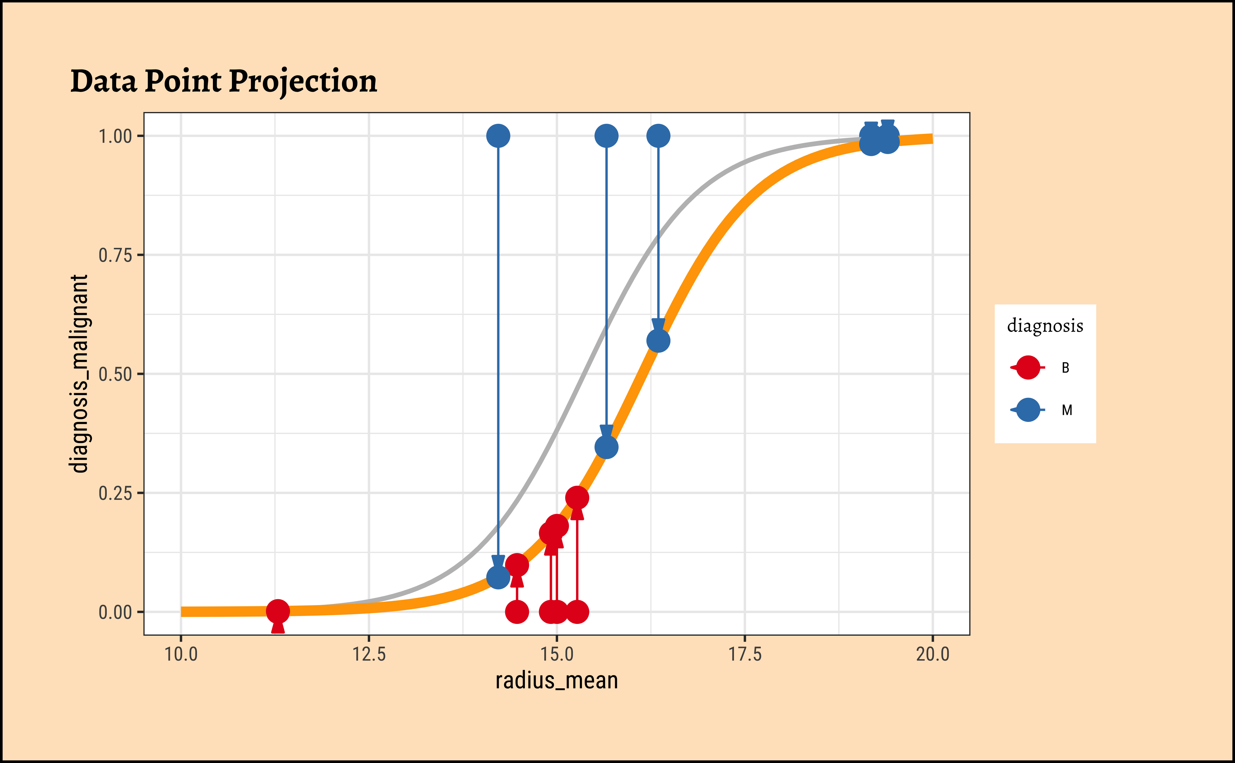
The predicted probability \(p_i\) for each datum(radius_mean) is for the tumour being Malignant. If the datum corresponds to a tumour that is Benign, we must take \(1-p_i\). Each datum point is assumed to be independent, so we can calculate the likelihood as a product of probabilities, as follows: In this way, we calculate the likelihood of the data, give the model parameters as:
\[ \large{ \begin{equation} \begin{aligned} likelihood &= \prod_{Malignant}^{}p_i ~ \times ~ \prod_{Benign}^{}(1 - p_i)\\ &= \prod_{}^{}p_i^{y_{Malignant = 1}} ~ \times ~ (1-p_i)^{y_{Benign = 1}}\\ &= \prod_{}^{}(p_i)^{y_i} ~\times~ (1-p_i)^{1-y_i}// ~since~labels~y_i~are~binary~1~or~0// \end{aligned} \end{equation} } \]
Lastly, since this is a product of small numbers, it can lead to inaccuracies, so we take the log of the whole thing to make it into an addition, obtaining the log-likelihood (LL):
\[ \large{ \begin{equation} \begin{aligned} log~likelihood ~~ ll(\beta_i) &= log\prod_{}^{}(p_i)^{y_i} * (1-p_i)^{1-y_i}\\ &= \sum_{}^{} y_i * log (p_i) + (1-y_i) * log(1 - p_i)\\ \end{aligned} \end{equation} } \tag{9}\]
Maximum Likelihood Estimation
We now need to find the (global) maximum of this quantity and determine the \(\beta_i\). Flipping this problem around, we find the maximum likelihood by minimizing the slope/gradient of of the LL!! And, to minimize the slope of the LL, we use the Newton-Raphson method or equivalent. Phew!
The Newton-Raphson Method
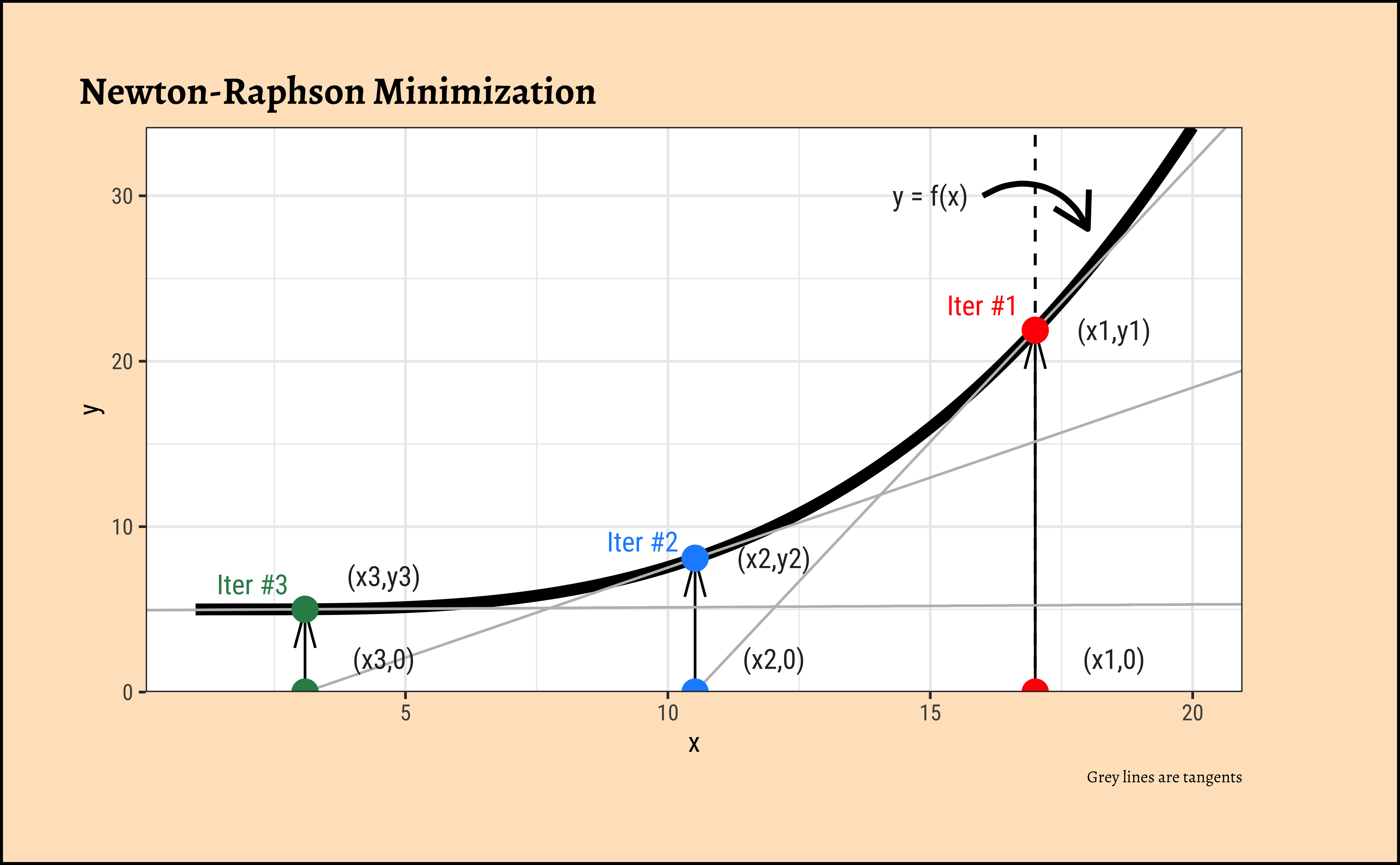
- The black curve \(y = fx)\) is the function to be minimized, i.e. it is the gradient of the LL function.
- We start with any arbitrary starting value of \(x = x1, y1 = f(x1)\) and calculate the tangent/slope/gradient equation \(f'(x1)\) at point \((x1, y1) = (x1, f(x1))\).
- The tangent \(f'(x1)\) cuts the \(x-axis\) at \(x2\).(Grey line).
- Repeat.
- Stop when the gradient becomes very small and \(x_i\) changes very in successive iterations.
How do we calculate the next value of x using the tangent?
- At \((x1,y1)\), the tangent equation is: \(y = y1 - slope1 * (x - x1)\).
- This equation applies at point \((x2,0\)), so \(0 = y1 - slope1 *(x2 - x1)\). (NOTE: Imagine that this is obtained by temporarily moving the y-axis to \(x = x1\) (dotted line), so \(y1\) in effect is the “c” in \(y = mx + c\))
- Solving for \(x2\), we get: \(x2 = y1/slope1 - x1 = f(x1)/f'(x1)\)
- Since \(f(x)\) is already the gradient of LL, we have: \(x2 = x1 - ll'(x1)/ll''(x1)\) !!