Modelling with Linear Regression
2023-04-13
Plot Fonts and Theme
Code
library(systemfonts)
library(showtext)
## Clean the slate
systemfonts::clear_local_fonts()
systemfonts::clear_registry()
##
showtext_opts(dpi = 96) # set DPI for showtext
sysfonts::font_add(
  family = "Alegreya",
  regular = "../../../../../../fonts/Alegreya-Regular.ttf",
  bold = "../../../../../../fonts/Alegreya-Bold.ttf",
  italic = "../../../../../../fonts/Alegreya-Italic.ttf",
  bolditalic = "../../../../../../fonts/Alegreya-BoldItalic.ttf"
)

sysfonts::font_add(
  family = "Roboto Condensed",
  regular = "../../../../../../fonts/RobotoCondensed-Regular.ttf",
  bold = "../../../../../../fonts/RobotoCondensed-Bold.ttf",
  italic = "../../../../../../fonts/RobotoCondensed-Italic.ttf",
  bolditalic = "../../../../../../fonts/RobotoCondensed-BoldItalic.ttf"
)
showtext_auto(enable = TRUE) # enable showtext
##
theme_custom <- function() {
  theme_bw(base_size = 10) +

    # theme(panel.widths = unit(11, "cm"),
    #       panel.heights = unit(6.79, "cm")) + # Golden Ratio

    theme(
      plot.margin = margin_auto(t = 1, r = 2, b = 1, l = 1, unit = "cm"),
      plot.background = element_rect(
        fill = "bisque",
        colour = "black",
        linewidth = 1
      )
    ) +

    theme_sub_axis(
      title = element_text(
        family = "Roboto Condensed",
        size = 10
      ),
      text = element_text(
        family = "Roboto Condensed",
        size = 8
      )
    ) +

    theme_sub_legend(
      text = element_text(
        family = "Roboto Condensed",
        size = 6
      ),
      title = element_text(
        family = "Alegreya",
        size = 8
      )
    ) +

    theme_sub_plot(
      title = element_text(
        family = "Alegreya",
        size = 14, face = "bold"
      ),
      title.position = "plot",
      subtitle = element_text(
        family = "Alegreya",
        size = 10
      ),
      caption = element_text(
        family = "Alegreya",
        size = 6
      ),
      caption.position = "plot"
    )
}

## Use available fonts in ggplot text geoms too!
ggplot2::update_geom_defaults(geom = "text", new = list(
  family = "Roboto Condensed",
  face = "plain",
  size = 3.5,
  color = "#2b2b2b"
))
ggplot2::update_geom_defaults(geom = "label", new = list(
  family = "Roboto Condensed",
  face = "plain",
  size = 3.5,
  color = "#2b2b2b"
))

ggplot2::update_geom_defaults(geom = "marquee", new = list(
  family = "Roboto Condensed",
  face = "plain",
  size = 3.5,
  color = "#2b2b2b"
))
ggplot2::update_geom_defaults(geom = "text_repel", new = list(
  family = "Roboto Condensed",
  face = "plain",
  size = 3.5,
  color = "#2b2b2b"
))
ggplot2::update_geom_defaults(geom = "label_repel", new = list(
  family = "Roboto Condensed",
  face = "plain",
  size = 3.5,
  color = "#2b2b2b"
))

## Set the theme
ggplot2::theme_set(new = theme_custom())

## tinytable options
options("tinytable_tt_digits" = 2)
options("tinytable_format_num_fmt" = "significant_cell")
options(tinytable_html_mathjax = TRUE)


## Set defaults for flextable
flextable::set_flextable_defaults(font.family = "Roboto Condensed")
The premise here is that many common statistical tests are special cases of the linear model.
A linear model estimates the relationship between one continuous or ordinal variable (dependent variable or “response”) and one or more other variables (explanatory variable or “predictors”). It is assumed that the relationship is linear:1
\[ \Large{y_i \sim \beta_1*x_i + \beta_0\\} \tag{1}\]
or
\[ y_1 \sim exp(\beta_1)*x_i + \beta_0 \]
but not:
\[ \color{red}{y_i \sim \beta_1*exp(\beta_2*x_i) + \beta_0\\} \]
or
\[ \color{red}{y_i \sim \beta_1 *x^{\beta_2} + \beta_0} \]
In Equation 1, \(\beta_0\) is the intercept and \(\beta_1\) is the slope of the linear fit, that predicts the value of y based the value of x. Each prediction leaves a small “residual” error between the actual and predicted values. \(\beta_0\) and \(\beta_1\) are calculated based on minimizing the sum of squares of these residuals, and hence this method is called “ordinary least squares” (OLS) regression.
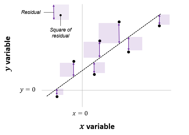
The net area of all the shaded squares is minimized in the calculation of \(\beta_0\) and \(\beta_1\). As per Lindoloev, many statistical tests, going from one-sample t-tests to two-way ANOVA, are special cases of this system. Also see Jeffrey Walker “A linear-model-can-be-fit-to-data-with-continuous-discrete-or-categorical-x-variables”.
Philosophical Word
Why would we want to add (weighted) variables together to predict a target variable? Isn’t that a strange occupation? Think of how we may consult different people when we are embarked on making a decision. Do all opinions or inputs amount to the same? No; we attach more significance to the opinions of people we trust, and whose advice correlates with our (past) success, and less so to the opinions of other people. Hence a weighted average seems to be a very natural thing, a converting the Wisdom of the Crowds to a wisdom of the variables.
When does a Linear Model work? We can write the assumptions in Linear Regression Models as an acronym, LINE:
1. L: \(\color{blue}{linear}\) relationship between variables 2. I: Errors are independent (across observations)
3. N: \(y\) is \(\color{red}{normally}\) distributed at each “level” of \(x\).
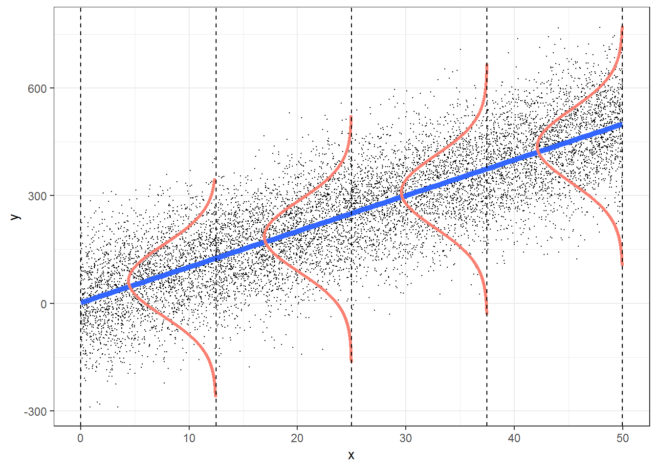
4. E: \(y\) has the same variance at all levels of \(x\). No heteroscedasticity.
Hence a very concise way of expressing the Linear Model is:
\[ \Large{y \sim N(x_i^T * \beta, ~~\sigma^2)} \tag{2}\]
where \(N(mean, variance)\) is the Normal distribution with given mean
General Linear Models
The target variable \(y\) is modelled as a normally distribute variable whose mean depends upon a linear combination of predictor variables \(x\), and whose variance is \(\sigma^2\).
In order to fit the linear model, we need to choose predictor variables that have strong correlations with the target variable. We will first do this with GGally, and then with the tidyverse itself. Both give us a very unique view into the correlations that exist within this dataset.
Let us select a few sets of Quantitative and Qualitative features, along with the target variable cmedv and do a pairs-plots with them:
Code
ggplot2::theme_set(new = theme_custom())
housing %>%
# Target variable cmedv
# Predictors Rooms / Age / Distance to City Centres / Radial Highway Access
select(cmedv, rm, age, dis) %>%
GGally::ggpairs(
title = "Plot 1",
progress = FALSE,
lower = list(continuous = wrap("smooth",
alpha = 0.2
))
)
housing %>%
# Target variable cmedv
# Predictors: Access to Radial Highways, / Resid. Land Proportion / proportion of non-retail business acres / full-value property-tax rate per USD 10,000
select(cmedv, rad, zn, indus, tax) %>%
GGally::ggpairs(
title = "Plot 2",
progress = FALSE,
lower = list(continuous = wrap("smooth",
alpha = 0.2
))
)
housing %>%
# Target variable cmedv
# Predictors Crime Rate / Nitrous Oxide / Black Population / Lower Status Population
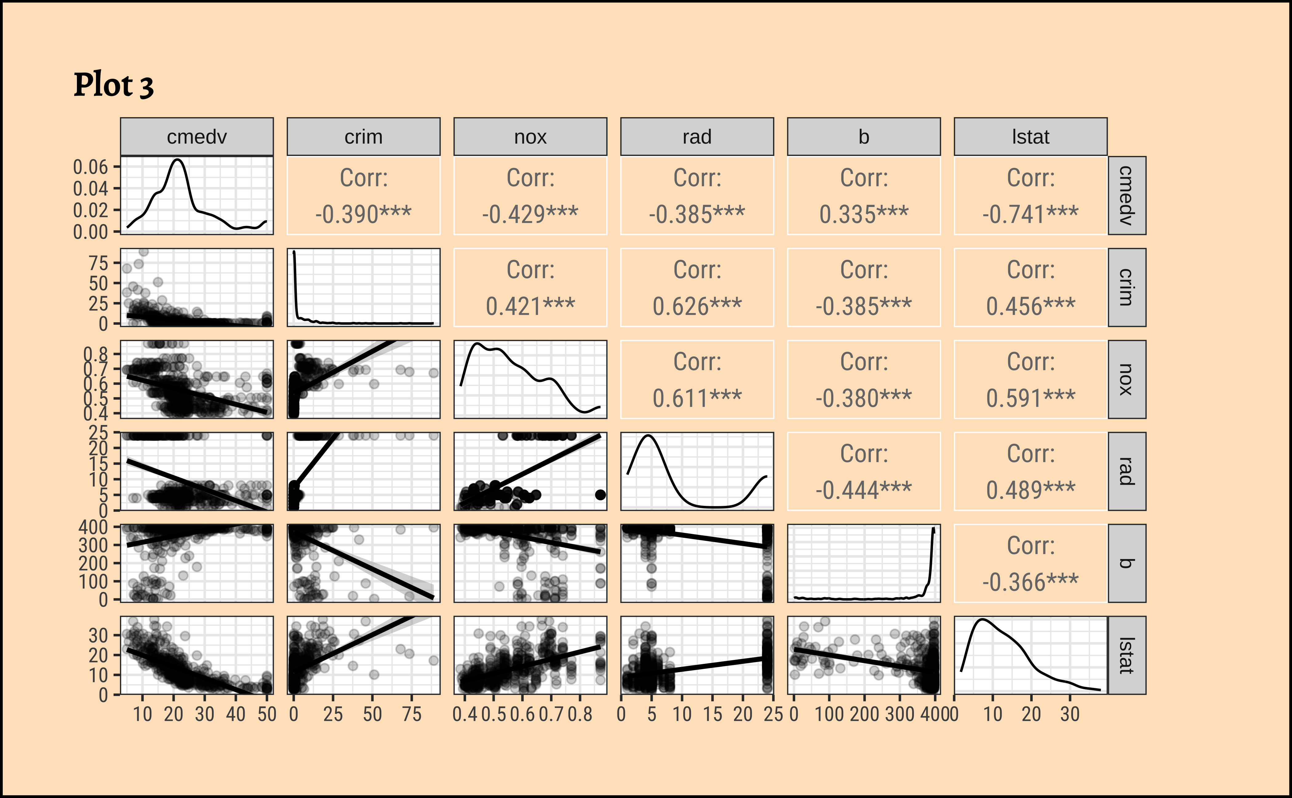
select(cmedv, crim, nox, rad, b, lstat) %>%
GGally::ggpairs(
title = "Plot 3",
progress = FALSE,
lower = list(continuous = wrap("smooth",
alpha = 0.2
))
)
housing %>%
# Target variable cmedv
# Predictor Access to Charles River
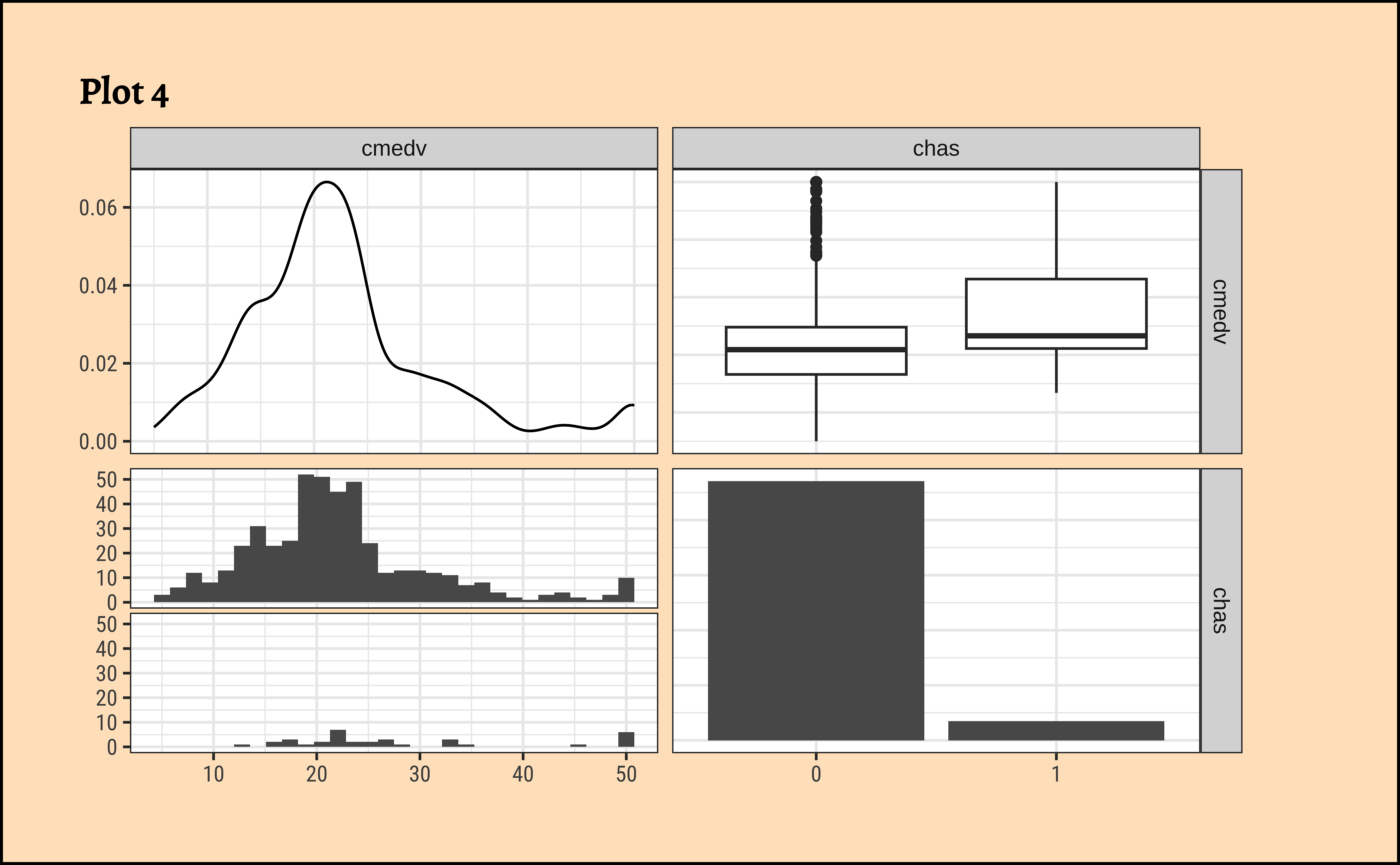
select(cmedv, chas) %>%
GGally::ggpairs(
title = "Plot 4",
progress = FALSE,
lower = list(continuous = wrap("smooth",
alpha = 0.2
))
)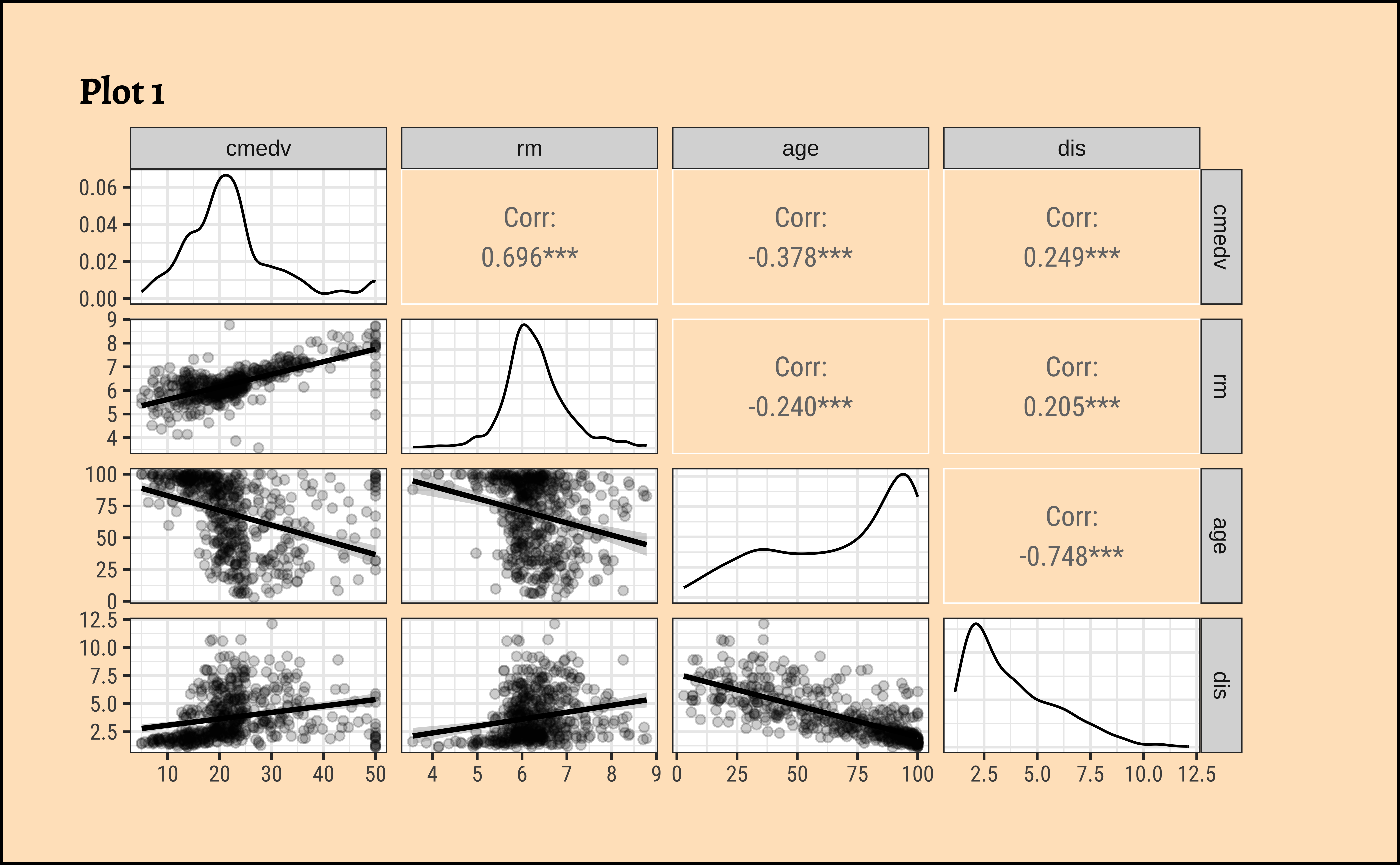
See Figure 3 (a). Clearly, rm (avg. number of rooms) is a big determining feature for median price cmedv. This we infer based on the large correlation of rm withcmedv, \(0.696\). The variableage (proportion of owner-occupied units built prior to 1940) may also be a significant influence on cmedv, with a correlation of \(-0.378\).
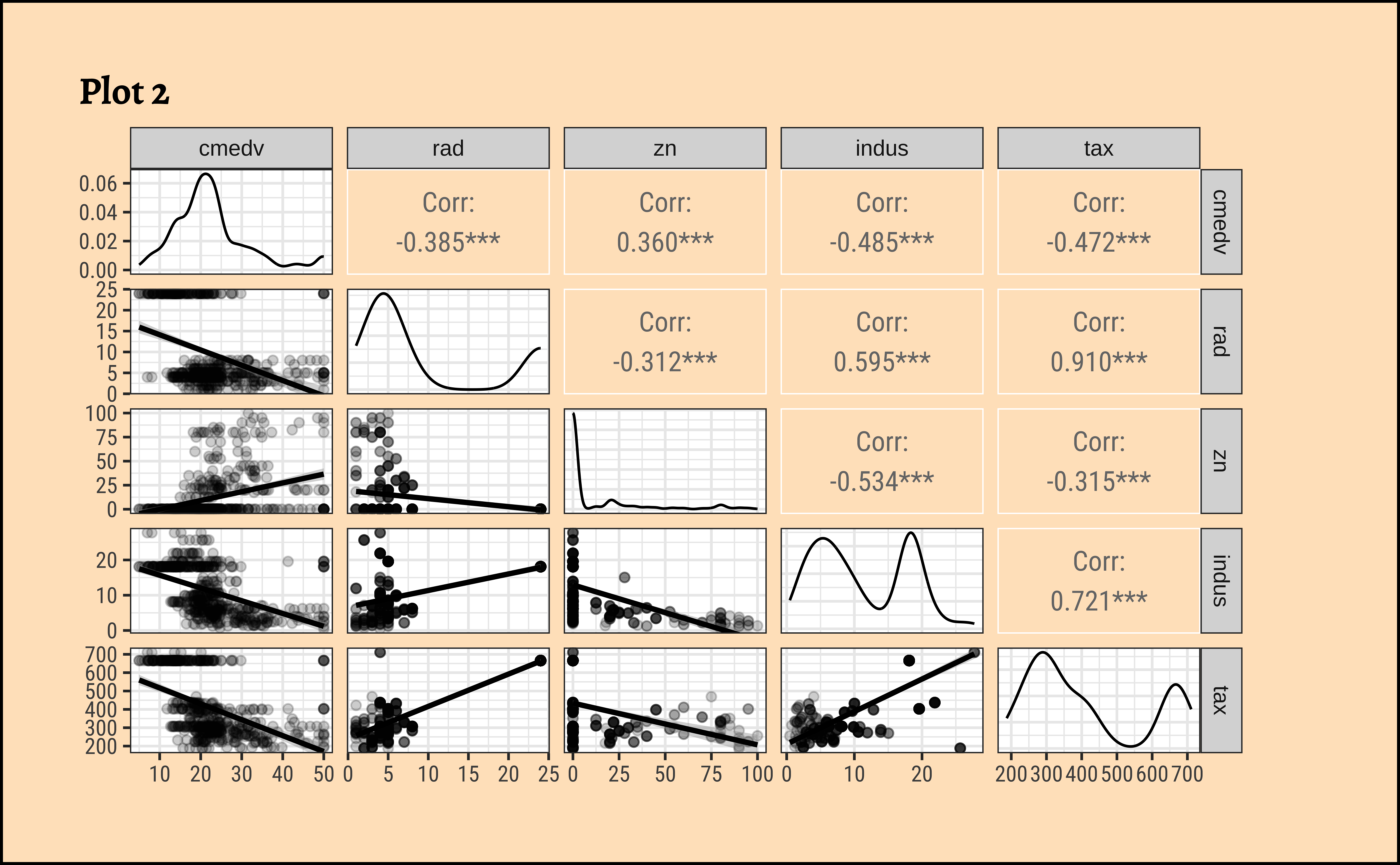
From Figure 3 (b), none of the Quant variables rad, zn, indus, tax have a overly strong correlation with cmedv. .
From Figure 3 (c), the variable lstat (proportion of lower classes in the neighbourhood) as expected, has a strong (negative) correlation with cmedv; rad(index of accessibility to radial highways), nox(nitrous oxide) and crim(crime rate) also have fairly large correlations with cmedv, as seen from the pairs plots.
Among the Qualitative predictor variables, access to the Charles river (chas) does seem to affect the prices somewhat, as seen from Figure 3 (d). While not too many properties can be near the Charles River (for obvious reasons) the box plots do seem to show some dependency of cmedv on chas.
Note
Qualitative predictors for a Quantitative target can be included in the model using what is called dummy variables, where each level of the Qualitative variable is given a one-hot kind of encoding. See for example https://www.statology.org/dummy-variables-regression/
Correlation Scores and Uncertainty
Recall that cor.test reports a correlation score and the p-value for the same. There is also a confidence interval reported for the correlation score, an interval within which we are 95% sure that the true correlation value is to be found.
Note that GGally too reports the significance of the correlation scores using stars, *** or **. This indicates the p-value in the scores obtained by GGally; Presumably, there is an internal cor.test that is run for each pair of variables and the p-value and confidence levels are also computed internally.
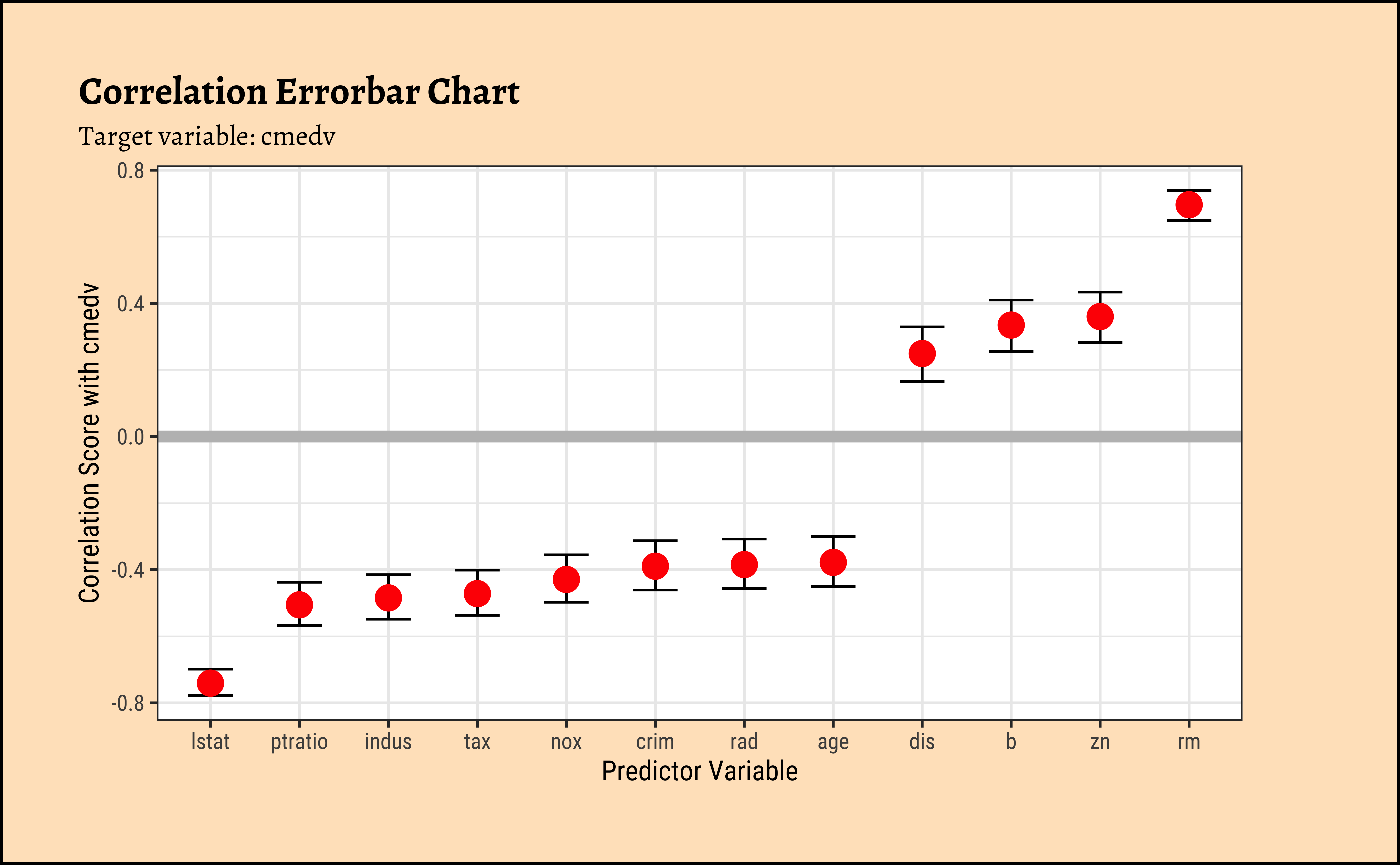
As we did with understanding Change and Correlations, we can quickly calculate all correlations of predictor variables with the target variable cmedv and plot these in an error-bar plot. This gives us a quick overview of which predictor variables have strong correlations with the target variable.
Code
correlation::correlation(housing %>%
  select(where(is.numeric))) %>%
  filter(Parameter1 == "cmedv") %>%
  gf_errorbar(CI_low + CI_high ~ reorder(Parameter2, r),
    width = 0.5
  ) %>%
  gf_point(r ~ reorder(Parameter2, r), size = 4, color = "red") %>%
  gf_hline(yintercept = 0, color = "grey", linewidth = 2) %>%
  gf_labs(
    title = "Correlation Errorbar Chart",
    subtitle = "Target variable: cmedv",
    x = "Predictor Variable",
    y = "Correlation Score with cmedv"
  )
We will first execute the lm test with code and evaluate the results. Then we will do an intuitive walk through of the process and finally, hand-calculate entire analysis for clear understanding.
R offers a very simple command lm to execute an Linear Model: Note the familiar formula of stating the variables: ( \(y \sim x\); where \(y\) = target, \(x\) = predictor)
Call:
lm(formula = cmedv ~ rm, data = housing)
Residuals:
Min 1Q Median 3Q Max
-23.336 -2.425 0.093 2.918 39.434
Coefficients:
Estimate Std. Error t value Pr(>|t|)
(Intercept) -34.6592 2.6421 -13.12 <2e-16 ***
rm 9.0997 0.4178 21.78 <2e-16 ***
---
Signif. codes: 0 '***' 0.001 '**' 0.01 '*' 0.05 '.' 0.1 ' ' 1
Residual standard error: 6.597 on 504 degrees of freedom
Multiple R-squared: 0.4848, Adjusted R-squared: 0.4838
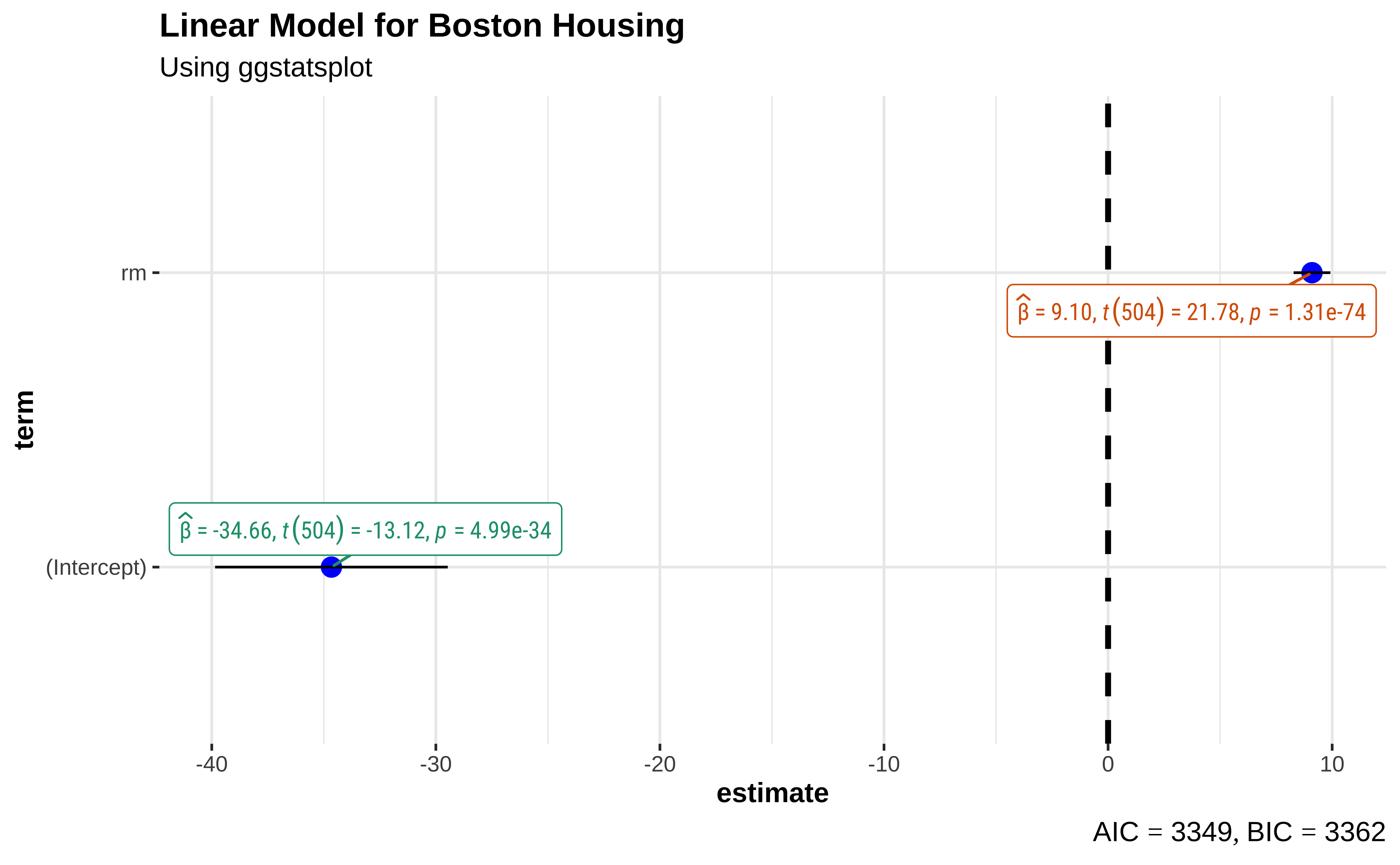
F-statistic: 474.3 on 1 and 504 DF, p-value: < 2.2e-16The model can be presented in tidy form using the broom package:
The model for \(\widehat{cmedv}\) , the prediction for cmedvcan be written in the form of \(y = mx + c\), as:
\[ \widehat{cmedv} \sim -34.65924 + 9.09967* rm \tag{3}\]
Important
- The effect size of
rmon predictingcmedva (slope) value of \(9.09967\) which is significant at p-value of \(<2.2e-16\); for every one room increase inrm, we have a USD \(90997\) increase in median pricecmedv. - The F-statistic for the Linear Model is given by \(F = 474.3\), which is very high. (We will use the F-statistic again when we do Multiple Regression.)
- The
R-squaredvalue is \(R^2 = 0.48\) which means thatrmis able to explain about half of the trend incmedv; there is substantial variation incmedvthat is still left to explain, an indication that we should perhaps use a richer model, with more predictors. These aspects are explored in the Tutorials.
In practice, we use the broom package functions (tidy, glance and augment) to obtain a clear view of the model parameters and predictions of cmedv for all existing values of rm. We see estimates for the intercept and slope (rm) for the linear model, along with the standard errors and p.values for these estimated parameters. And we see the fitted values of cmedv for the existing rm; these values will naturally lie on the straight-line depicting the model.
To predict cmedv with new values of rm, we use predict. Let us now try to make predictions with some new data:
Code
new <- tibble(rm = seq(3, 10)) # must be named "rm"
new %>% mutate(
  predictions =
    stats::predict(
      object = housing_lm,
      newdata = .,
      se.fit = FALSE
    )
)
housing_lm_augment <-
  housing_lm %>%
  broom::augment(
    se_fit = TRUE,
    interval = "confidence"
  )
housing_lm_augment
##
intercept <-
  housing_lm_tidy %>%
  filter(term == "(Intercept)") %>%
  select(estimate) %>%
  as.numeric()
##
slope <-
  housing_lm_tidy %>%
  filter(term == "rm") %>%
  select(estimate) %>%
as.numeric()Note that “negative values” for predicted cmedv would have no meaning!
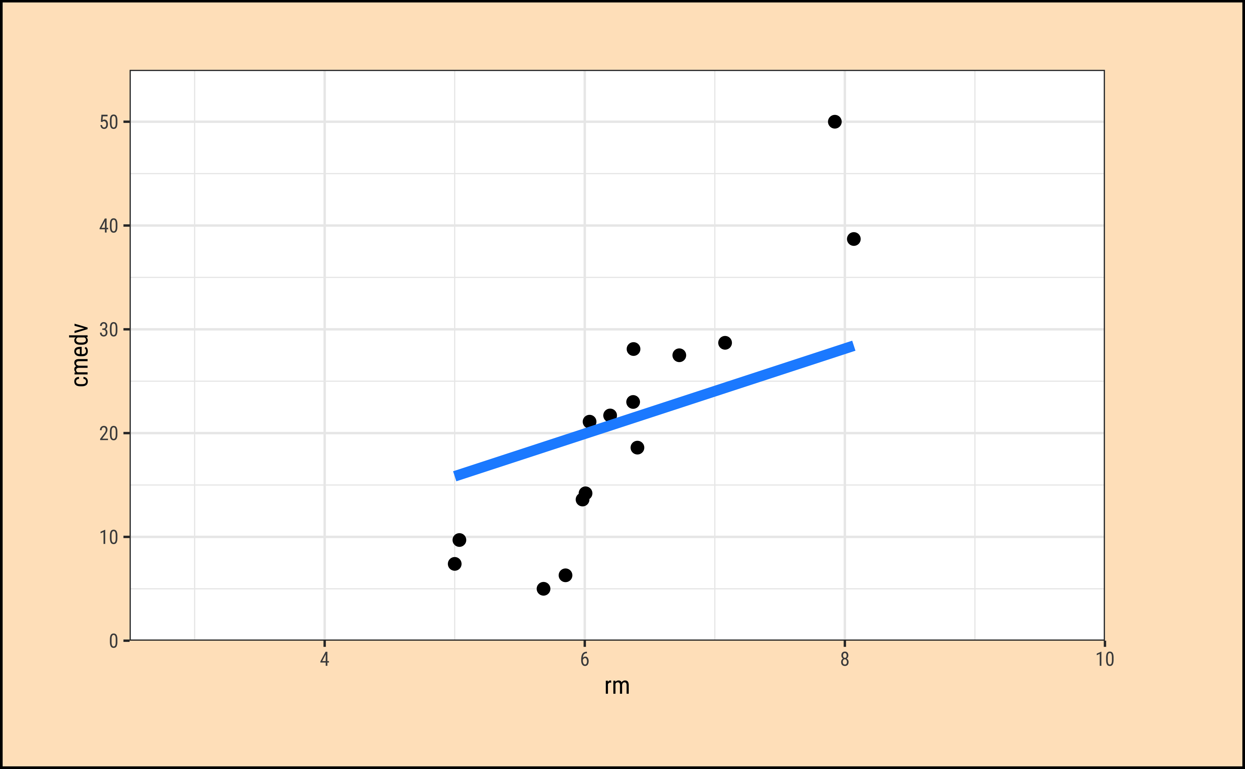
We can plot the scatter plot of these two variables with the model also over-plotted.
Code
ggplot2::theme_set(new = theme_custom())
set.seed(44) # for reproducibility

housing_lm_augment %>%
  slice_sample(n = 20) %>%
  gf_point(
    cmedv ~ rm,
    title = "Price vs Average no. of Rooms",
    ylab = "Median Price",
    xlab = "Avg. No. of Rooms",
    caption = "Showing only a sample of the Data"
  ) %>%
  # Plot the model equation
  gf_abline(
    slope = slope, intercept = intercept,
    colour = "lightcoral",
    linewidth = 2
  ) %>%
  # Plot the model prediction points on the line
  gf_point(.fitted ~ rm,
    shape = ~"fitted", size = 4,
    color = "grey30"
  ) %>%
  gf_annotate(
    geom = "segment",
    y = 0, yend = 29, x = 7, xend = 7, # manually calculated
    color = "dodgerblue",
    arrow = arrow(
      angle = 30,
      length = unit(0.25, "inches"),
      ends = "last",
      type = "open"
    )
  ) %>%
  gf_annotate(
    geom = "segment",
    y = 29, yend = 29, x = 2.5, xend = 7, # manually calculated
    arrow = arrow(
      angle = 30,
      length = unit(0.25, "inches"),
      ends = "first",
      type = "open"
    ),
    color = "dodgerblue"
  ) %>%
  gf_refine(
    scale_x_continuous(
      limits = c(2.5, 10),
      expand = c(0, 0)
    ),
    scale_shape_manual(
      values = c(fitted = 9),
      name = "Model Predictions"
    ),
    # removes plot panel margins
    scale_y_continuous(
      limits = c(0, 55),
      expand = c(0, 0)
    )
  )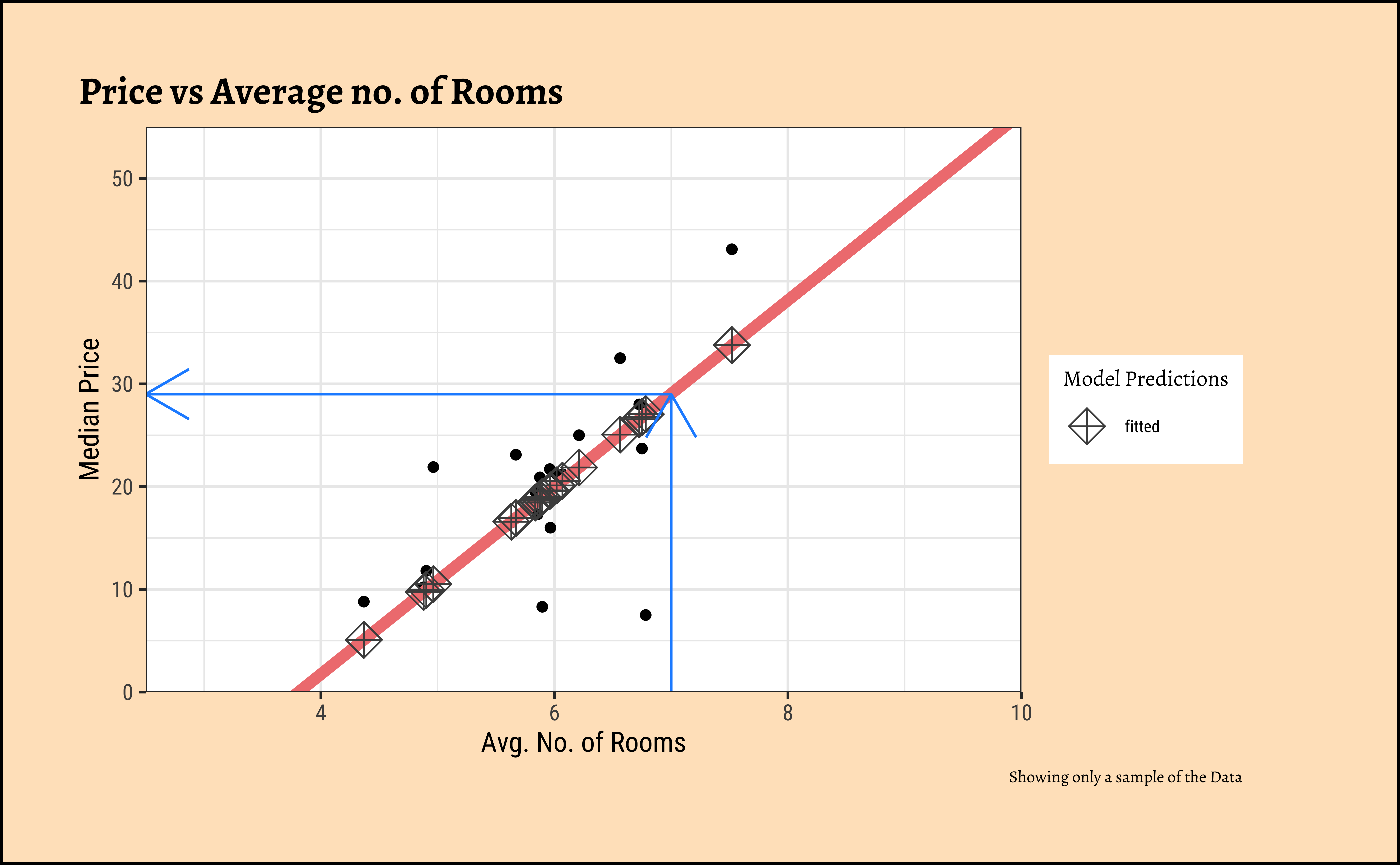
For any new value of rm, we go up to the vertical blue line and read off the predicted median price by following the horizontal blue line. That is how the model is used (by hand).
All that is very well, but what is happening under the hood of the lm command? Consider the cmedv (target) variable and the rm feature/predictor variable. What we do is:
- Plot a scatter plot
gf_point(cmedv ~ rm, housing) - Find a line that, in some way, gives us some prediction of
cmedvfor any givenrm - Calculate the errors in prediction and use those to find the “best” line.
- Use that “best” line henceforth as a model for prediction.
How does one fit the “best” line? Consider a choice of “lines” that we can use to fit to the data. Here are 6 lines of varying slopes (and intercepts ) that we can try as candidates for the best fit line:
Code
ggplot2::theme_set(new = theme_custom())

set.seed(1234)
housing_sample <- housing_lm_augment %>%
  slice_sample(n = 15)
mean_cmedv_sample <-
  mean(~cmedv, na.rm = TRUE, data = housing_sample)
mean_rm_sample <- mean(~rm, na.rm = TRUE, data = housing_sample)

lm_sample <- tibble(
  slope = slope + c(5, 2, 0, -2, -5, -slope),
  intercept = intercept + c(-30, -15, 0, 10, 30, -intercept + mean_cmedv_sample),
  # List column containing `housing_sample`
  # No repetition needed !!!
  # Auto recycle for each of slope + intercept
  sample = list(housing_sample)
)

lm_sample <- lm_sample %>%
  mutate(line = pmap(
    .l = list(intercept, slope, sample),
    .f = \(intercept, slope, sample)
    tibble(
      pred = intercept + slope * sample$rm,
      rm = sample$rm
    )
  )) %>%
  mutate(graphs = pmap(
    .l = list(sample, line),
    .f = \(sample, line)
    gf_point(cmedv ~ rm, data = sample, size = 2) %>%
      gf_line(
        pred ~ rm,
        data = line,
        color = "dodgerblue",
        linewidth = 2
      ) %>%
      gf_refine(
        scale_x_continuous(
          limits = c(2.5, 10),
          expand = c(0, 0)
        ),
        # removes plot panel margins
        scale_y_continuous(
          limits = c(0, 55),
          expand = c(0, 0)
        )
      )
  ))

lm_sample %>% pluck("graphs", 1)
lm_sample %>% pluck("graphs", 2)
lm_sample %>% pluck("graphs", 3)
lm_sample %>% pluck("graphs", 4)
lm_sample %>% pluck("graphs", 5)
lm_sample %>% pluck("graphs", 6)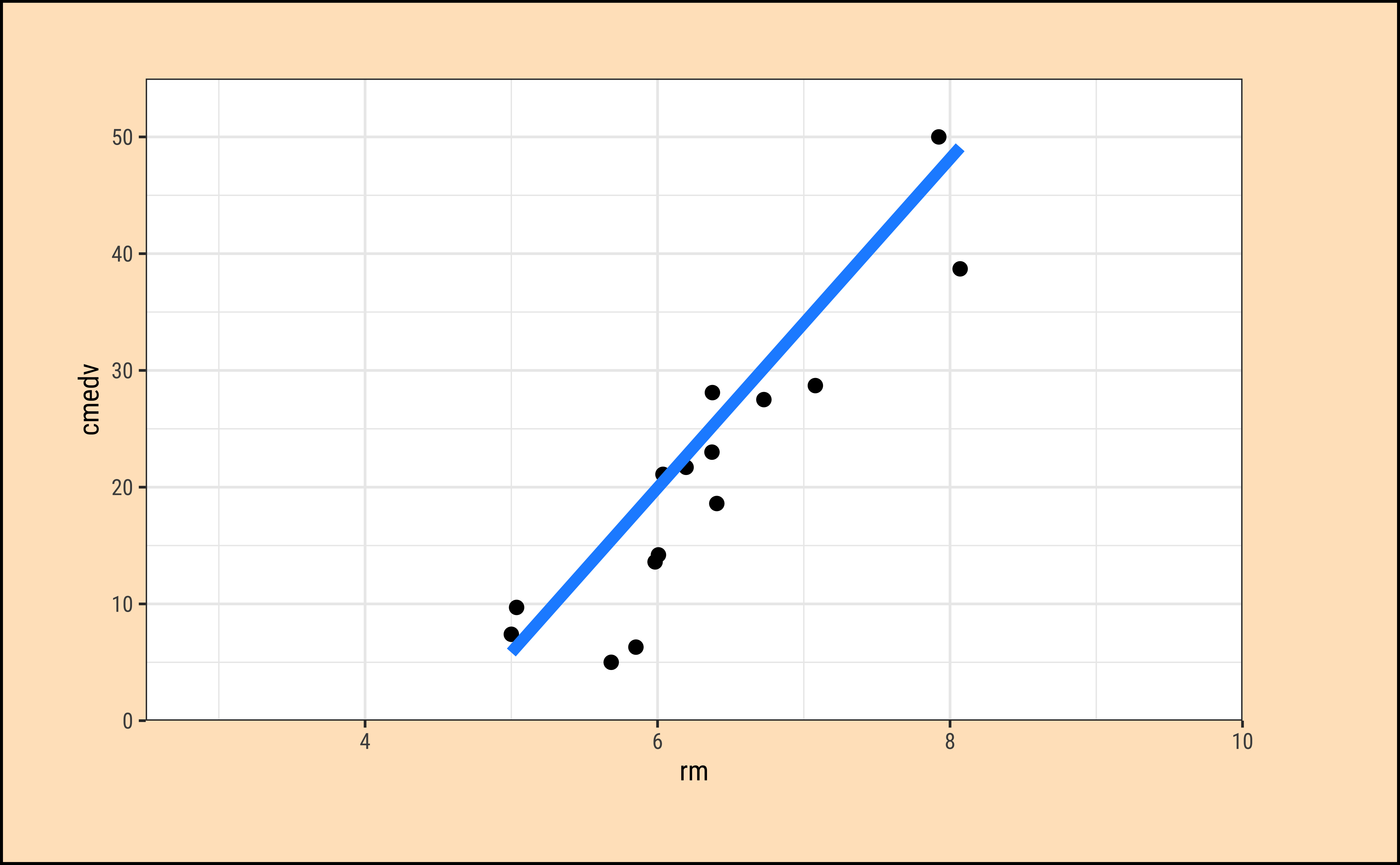
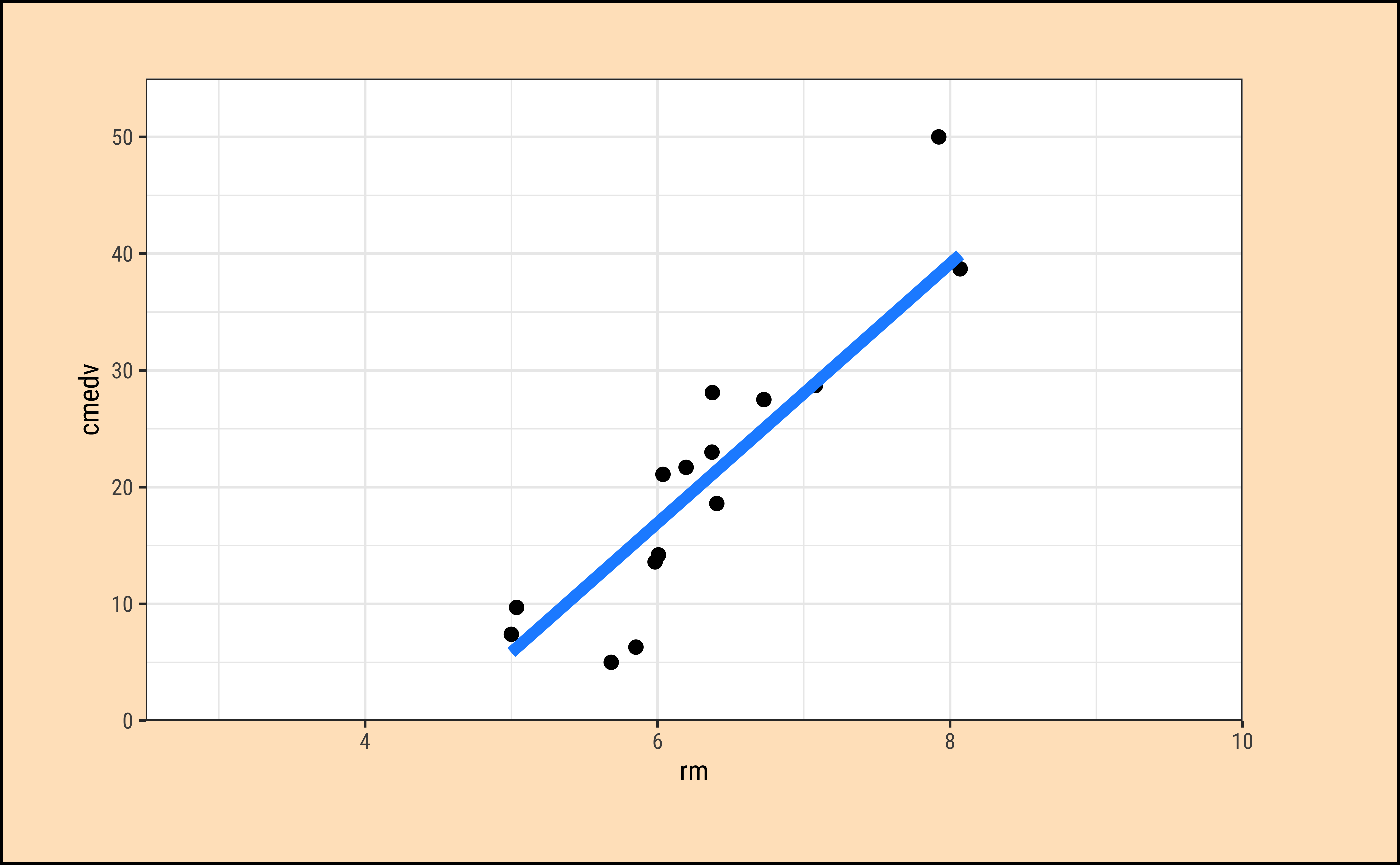
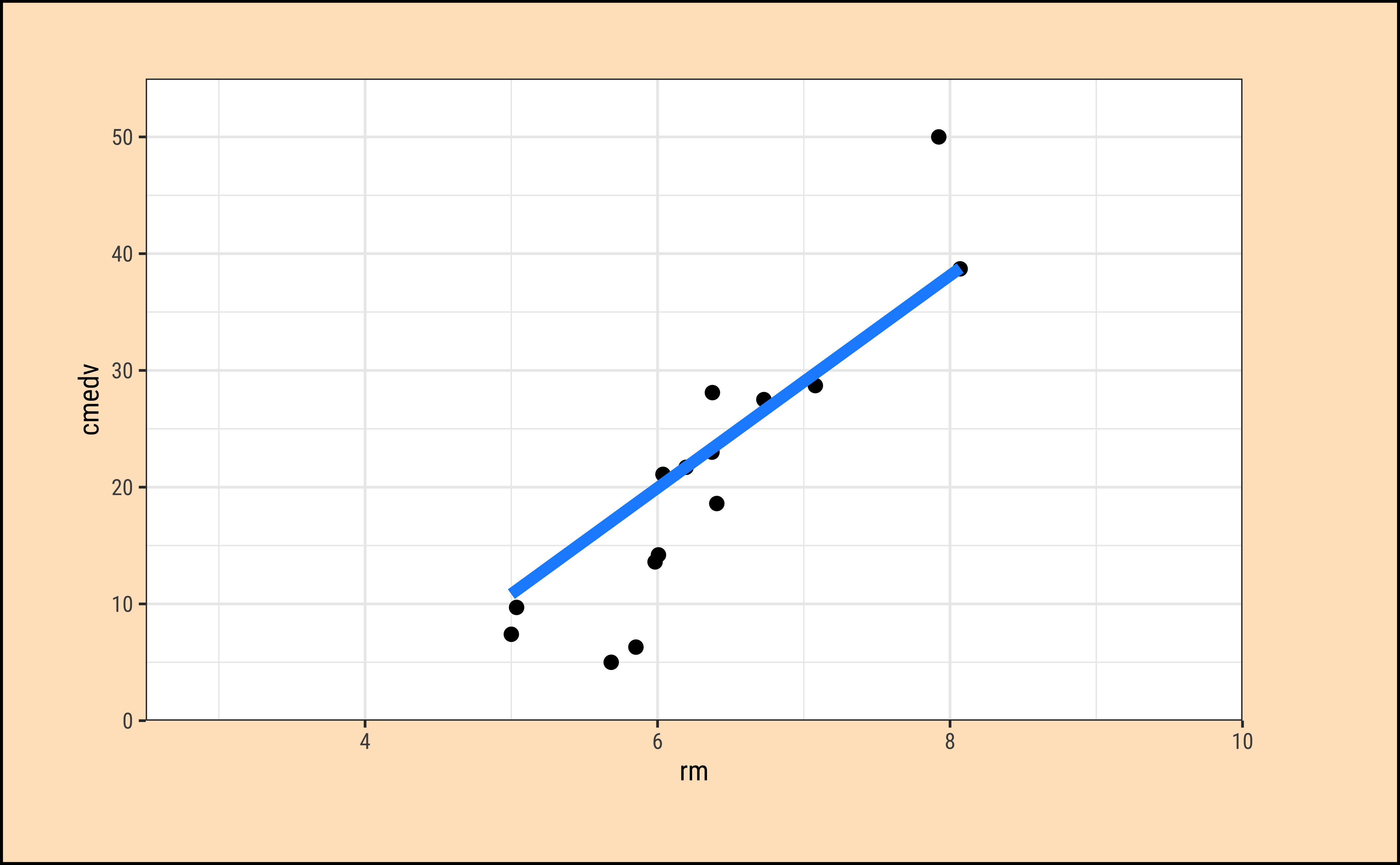
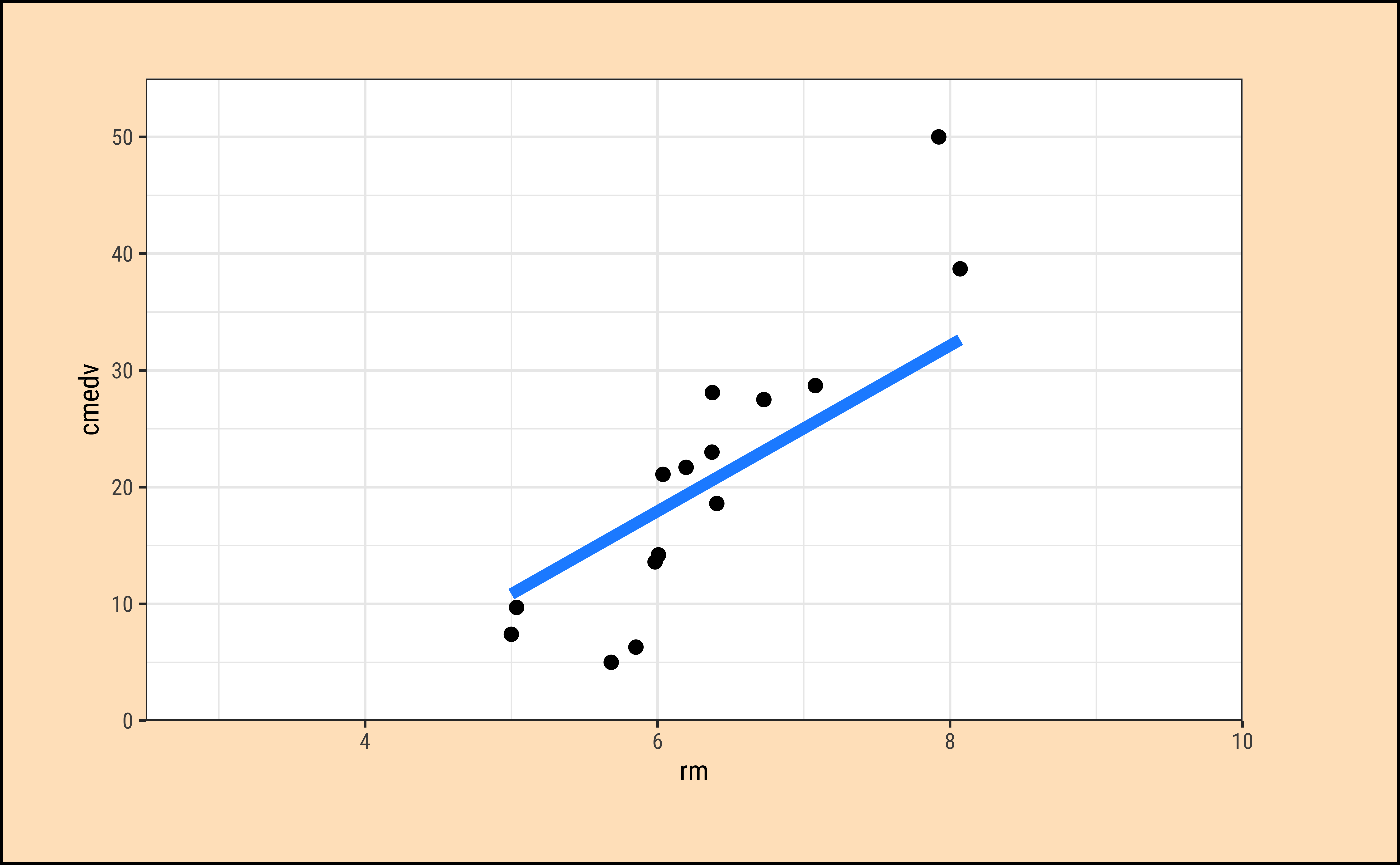
It should be apparent that while we cannot determine which line may be the best, the worst line seems to be the one in the final plot, which ignores the x-variable rm altogether. This corresponds to the NULL Hypothesis, that there is no relationship between the two variables. Any of the other lines could be a decent candidate, so how do we decide?
Code
ggplot2::theme_set(new = theme_custom())
housing_sample %>%
gf_hline(
yintercept = ~mean_cmedv_sample,
color = "dodgerblue", linewidth = 2
) %>%
gf_segment(
color = "springgreen3", linewidth = 2,
mean_cmedv_sample + cmedv ~ rm + rm,
title = "Fig A: Price vs \nAverage no. of Rooms",
subtitle = "NULL Hypothesis",
ylab = "cmedv (Median Price)",
xlab = "rm (Avg. No. of Rooms)"
) %>%
gf_point(cmedv ~ rm, size = 3) %>%
gf_annotate(
geom = "label",
y = mean_cmedv_sample - 2, x = 7.5,
label = "Overall Mean of cmedv",
inherit = F
)
##
housing_sample %>%
gf_segment(
.fitted + cmedv ~ rm + rm,
color = "orangered1", linewidth = 2,
title = "Fig B: Price vs \nAverage no. of Rooms",
subtitle = "Alternative Hypothesis",
ylab = "cmedv (Median Price)",
xlab = "rm (Avg. No. of Rooms)"
) %>%
gf_abline(
slope = slope,
intercept = intercept,
colour = "purple", linewidth = 2
) %>%
gf_point(cmedv ~ rm, size = 3)
##
housing_sample %>%
gf_hline(
yintercept = ~mean_cmedv_sample,
color = "dodgerblue", linewidth = 2
) %>%
gf_abline(
slope = slope,
intercept = intercept,
colour = "purple", linewidth = 2
) %>%
gf_segment(
.fitted + mean_cmedv_sample ~ rm + rm,
color = "grey50", linewidth = 2,
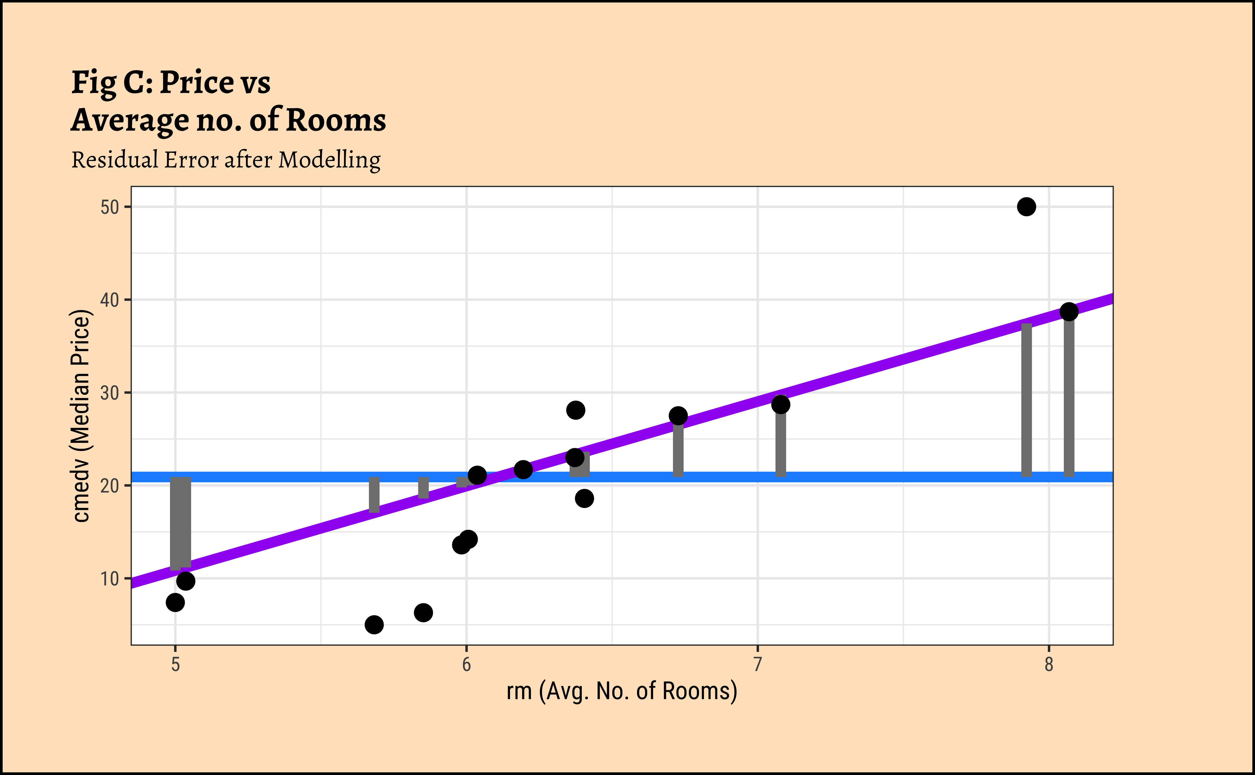
title = "Fig C: Price vs \nAverage no. of Rooms",
subtitle = "Residual Error after Modelling",
ylab = "cmedv (Median Price)",
xlab = "rm (Avg. No. of Rooms)"
) %>%
gf_point(cmedv ~ rm, size = 3)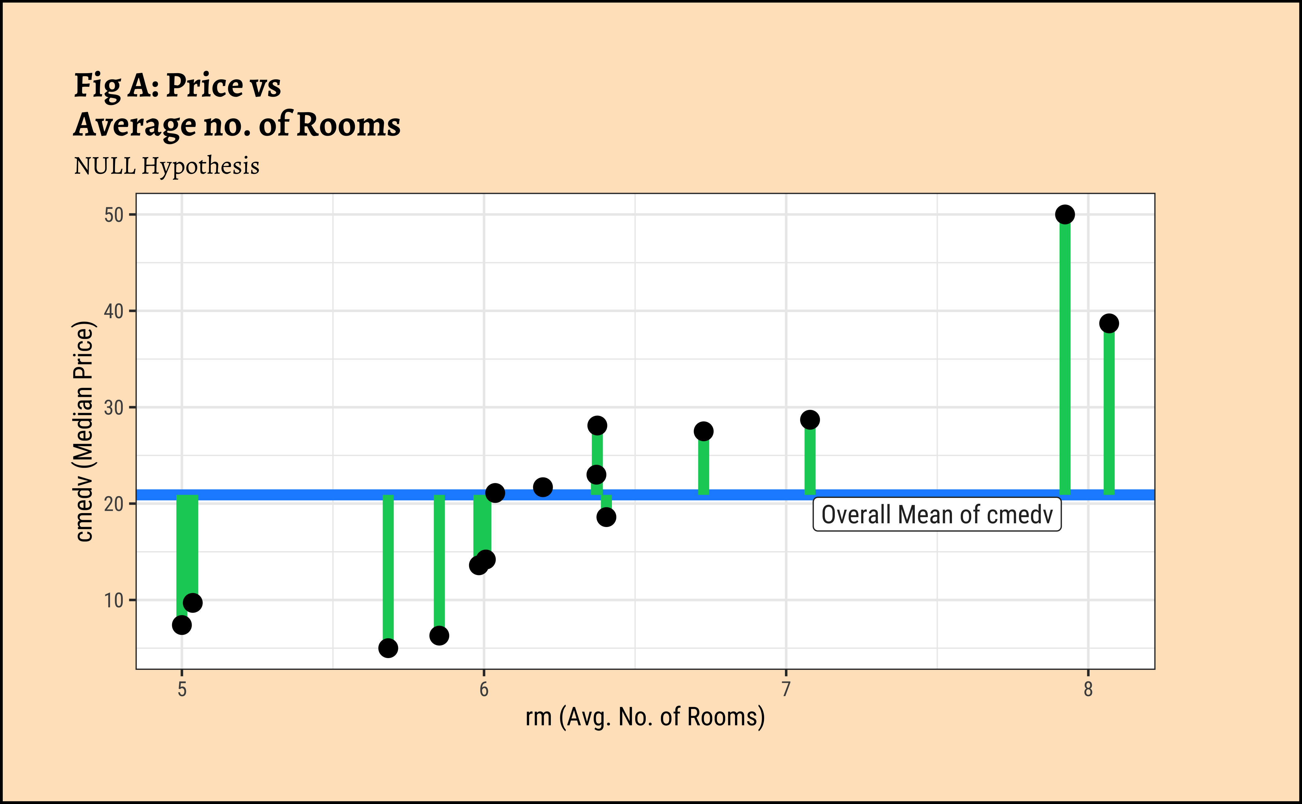
In Figure 7 (a) the horizontal blue line is the overall mean of cmedv, denoted as \(\mu_{tot}\). The vertical green lines to the points show the departures of each point from this overall mean, called residuals. The sum of squares of these residuals in Figure 7 (a) is called the Total Sum of Squares (SST).
\[ SST = \Sigma (y - \mu_{tot})^2 \tag{4}\]
In Figure 7 (b), the vertical red lines are the residuals of each point from the potential line of fit. The sum of the squares of these lines is called the Total Error Sum of Squares (SSE).
\[ SSE = \Sigma [(y - a - b * rm)^2] \tag{5}\]
And in Figure 7 (c), the vertical grey lines are the residuals (of each point) from the model line to the overall mean. The sum of the squares of these lines is called the Regression Sum of Squares (SSR). \[ SSR = \Sigma [(\hat{y} - \mu_{tot})^2] \tag{6}\]
It is straightforward to derive and show that: \[ SST = SSR + SSE \tag{7}\]
and that if there is any positive linear relationship between cmedv and rm, then \(SSE < SST\) i.e. \(SSR \ge 0\).
How do we get the optimum slope + intercept? If we plot the \(SSE\) as a function of varying slope, we get:
Code
ggplot2::theme_set(new = theme_custom())

sim_model <- tibble(
  b = slope + seq(-5, 5),
  a = intercept,
  dat = list(tibble(
    cmedv = housing_sample$cmedv,
    rm = housing_sample$rm
  ))
) %>%
  mutate(r_squared = pmap_dbl(
    .l = list(a, b, dat),
    .f = \(a, b, dat) sum((dat$cmedv - (b * dat$rm + a))^2)
  ))
min_r_squared <- sim_model %>%
  select(r_squared) %>%
  min()
min_slope <- sim_model %>%
  filter(r_squared == min_r_squared) %>%
  select(b) %>%
  as.numeric()
sim_model %>%
  gf_point(r_squared ~ b, data = ., size = 2) %>%
  gf_line(ylab = "SSE", xlab = "slope", title = "Error vs Slope", caption = "X-Axis drawn lower down for clarity") %>%
  gf_hline(yintercept = min_r_squared, color = "red") %>%
  gf_segment(min_r_squared + (-2000) ~ min_slope + min_slope,
    colour = "red",
    arrow = arrow(ends = "last", length = unit(4, "mm"))
  ) %>%
  gf_refine(
    coord_cartesian(expand = FALSE),
    expand_limits(y = c(-2000, 20000), x = c(3.5, 15))
  )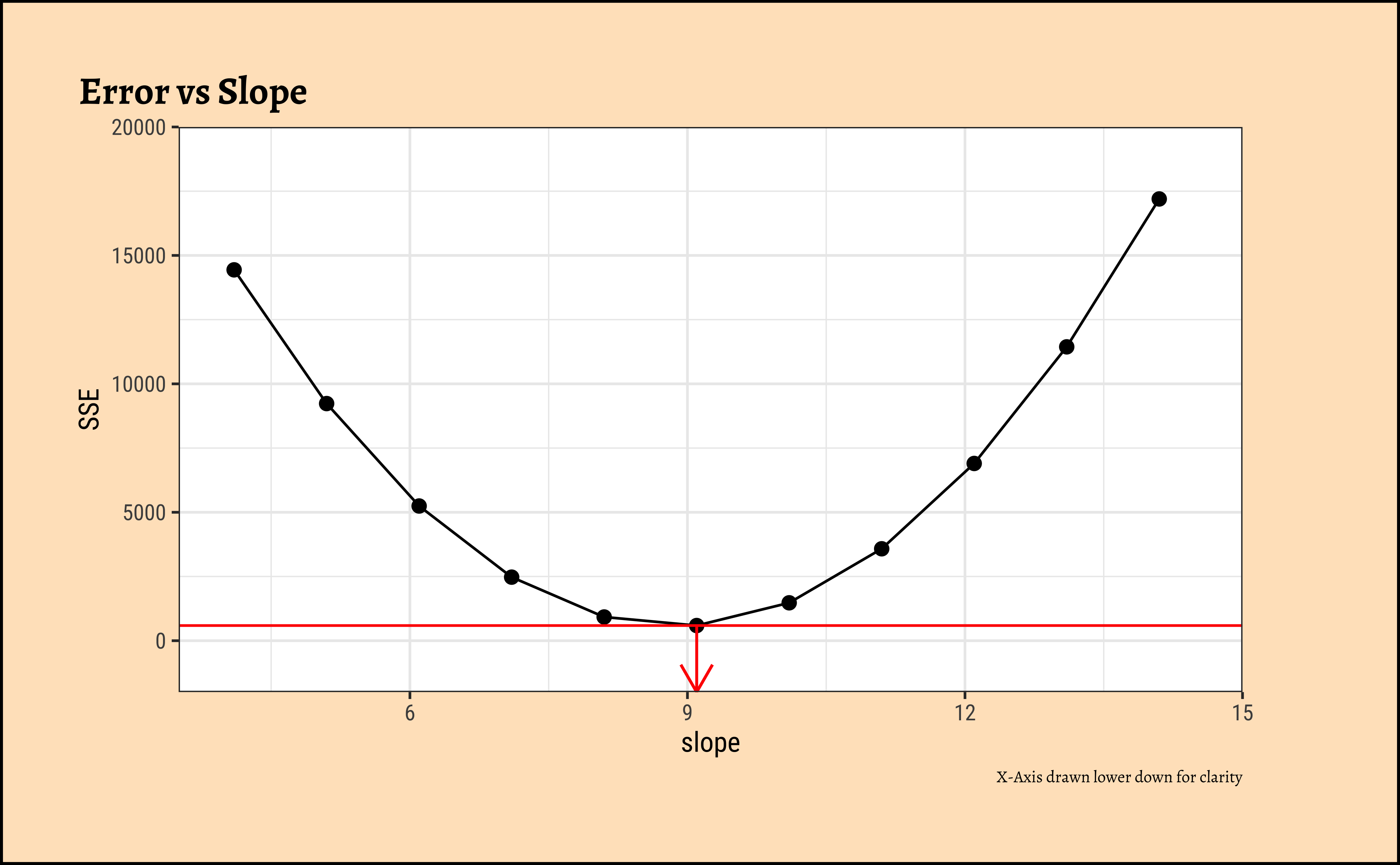
We see that there is a quadratic minimum \(SSE\) at the optimum value of slope and at all other slopes, the \(SSE\) is higher. We can use this to find the optimum slope, which is what the function lm does.
To be written up. We can use the F-statistic to test the hypothesis that there is a linear relationship between cmedv and rm. The Null Hypothesis is that there is no relationship, and the Alternate Hypothesis is that there is a linear relationship.
Let us hand-calculate the numbers so we know what the test is doing. Here is the SST: we pretend that there is no relationship between cmedv ans rm and compute a NULL model:
And here is the SSE:
Given that the model leaves unexplained variations in cmedv to the extent of \(SSE\), we can compute the \(SSR\), the Regression Sum of Squares, the amount of variation in cmedv that the linear model does explain:
We have \(SST = 42577.74\), \(SSE = 21934.39\) and therefore \(SSR = 20643.35\).
In order to calculate the F-Statistic, we need to compute the variances, using these sum of squares. We obtain variances by dividing by their Degrees of Freedom:
\[ F_{stat} = \frac{SSR / df_{SSR}}{SSE / df_{SSE}} \tag{8}\]
where \(df_{SSR}\) and \(df_{SSE}\) are respectively the degrees of freedom in SSR and SSE.
Let us calculate these Degrees of Freedom. If we have \(n=\) 506 observations of data, then:
- \(SST\) clearly has degree of freedom \(n-1 = 505\), since it uses all observations but loses one degree to calculate the global mean.
- \(SSE\) was computed using the slope and intercept, so it has \((n-2) = 504\) as degrees of freedom.
- And therefore \(SSR\) being their difference has just \(1\) degree of freedom.
Now we are ready to compute the F-statistic:
[1] 474.3349The F-stat is compared with a critical value of the F-statistic, which is computed using the formula for the f-distribution in R.
Distribution of F
Why does the statistic \(F\) have an F-distribution? This is because the F-distribution is the distribution of the ratio of two scaled Chi-squared distributions. In our case, both \(SSR/df_{SSR}\) and \(SSE/df_{SSE}\) are scaled Chi-squared distributions, as they are sums of squares of normally distributed variables (the residuals). The ratio of these two independent Chi-squared variables, each divided by their respective degrees of freedom, follows an F-distribution with degrees of freedom \(df_1 = df_{SSR}\) and \(df_2 = df_{SSE}\). This is a fundamental result in statistics that underpins the use of the F-test in regression analysis.
As with our hypothesis tests, we set the significance level to 0.95, and quote the two relevant degrees of freedom as parameters to qf() which computes the critical F value as a quartile:
[1] 3.859975[1] 474.3349The F_crit value can also be seen in a plot1:
Code
mosaic::xpf(
  q = F_crit,
  df1 = df_SSR, df2 = df_SSE, digits = 3, plot = TRUE,
  return = c("plot"), verbose = F, alpha = 0.5, colour = "black",
  system = "gg"
) %>%
  gf_vline(xintercept = F_crit, color = "red") %>%
  gf_annotate(
    geom = "label", x = 3, y = 1.6, size = 4,
    label = "F Critical Value = 3.86", colour = "purple"
  ) %>%
  gf_annotate("curve",
    x = 3, y = 1.5,
    xend = F_crit - 0.025, yend = 1, curvature = 0.5,
    color = "purple", linewidth = 0.5,
    arrow = arrow(length = unit(0.25, "cm"))
  ) %>%
  gf_labs(
    title = "F Distribution",
    subtitle = paste("df1 =", df_SSR, ", df2 =", df_SSE),
    x = "F value", y = "Density"
  ) %>%
  gf_refine(
    scale_x_continuous(limits = c(0, 5), expand = c(0, 0)),
    scale_y_continuous(limits = c(0, 1.7), expand = c(0, 0))
  )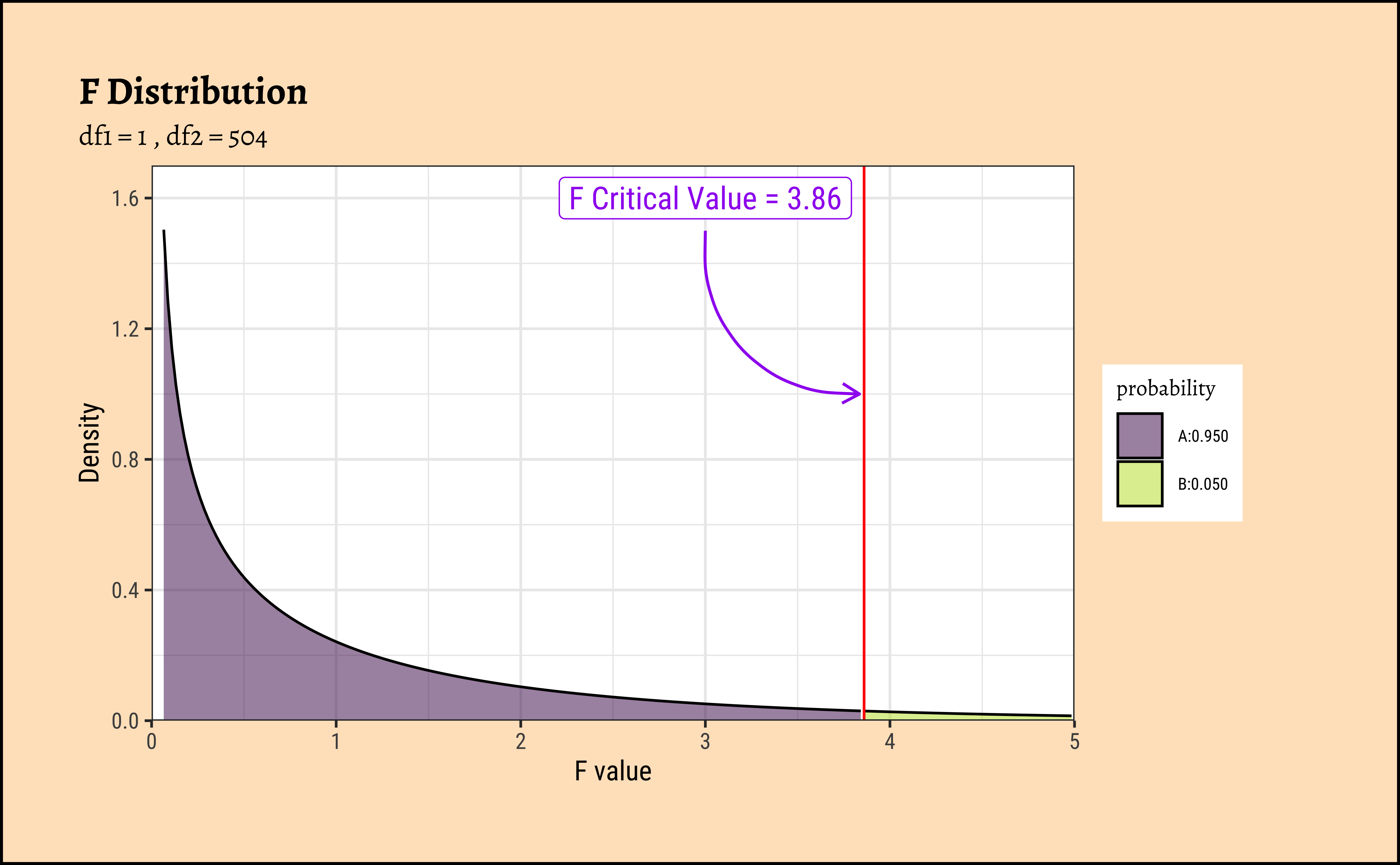
Any value of F more than the \(F_{crit}\) occurs with smaller probability than 0.05. Our F_stat is much higher than \(F_{crit}\), by orders of magnitude! And so we can say with confidence that rm has a significant effect on cmedv.
The value of R.squared is also calculated from the previously computed sums of squares:
\[ R.squared = \frac{SSR}{SST} = \frac{SSY-SSE}{SST} \tag{9}\]
[1] 0.484839So R.squared = 0.484839
The value of Slope and Intercept are computed using a maximum likelihood derivation and the knowledge that the means square error is a minimum at the optimum slope: for a linear model \(y \sim mx + c\)
\[ slope = \frac{\Sigma[(y - y_{mean})*(x - x_{mean})]}{\Sigma(x - x_{mean})^2} \]
Tip
Note that the slope is equal to the ratio of the covariance of x and y to the variance of x.
and
\[ Intercept = y_{mean} - slope * x_{mean} \]
[1] 9.09967[1] -34.65924So, there we are! All of this is done for us by one simple formula, lm()!
Let us first look at the uncertainties in the estimates of slope and intercept. These are most easily read off from the broom::tidy-ed model:
Plotting this is simple too:
Code
ggplot2::theme_set(new = theme_custom())

housing_lm_tidy %>%
  gf_col(estimate ~ term, fill = ~term, width = 0.25) %>%
  gf_hline(yintercept = 0) %>%
  gf_errorbar(conf.low + conf.high ~ term,
    width = 0.1,
    title = "Model Bar Plot for Estimates with Confidence Intervals"
  ) %>%
  gf_theme(theme = theme_custom())
##
housing_lm_tidy %>%
  gf_pointrange(estimate + conf.low + conf.high ~ term,
    title = "Model Point-Range Plot for Estimates with Confidence Intervals"
  ) %>%
  gf_hline(yintercept = 0) %>%
  gf_theme(theme = theme_custom())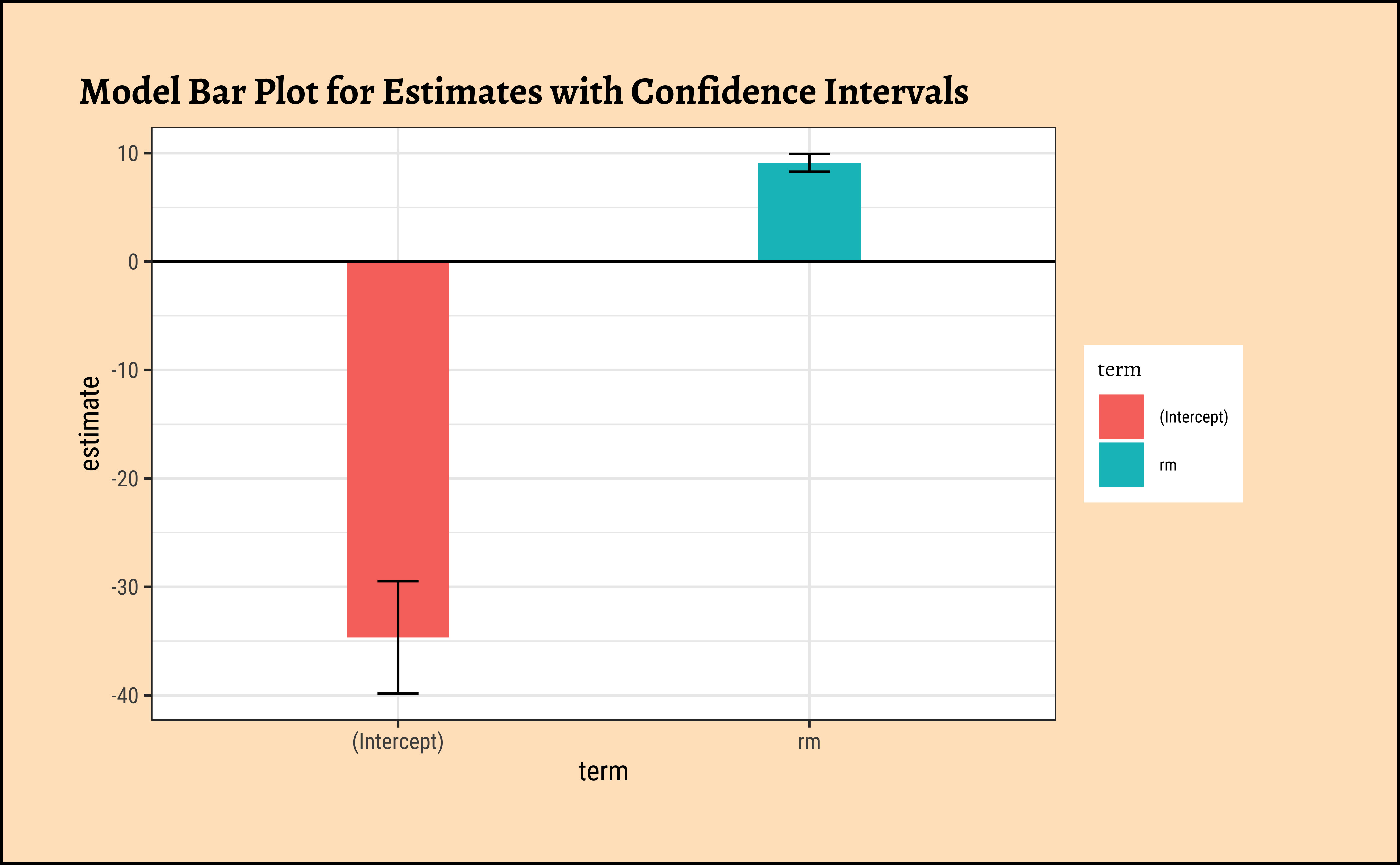
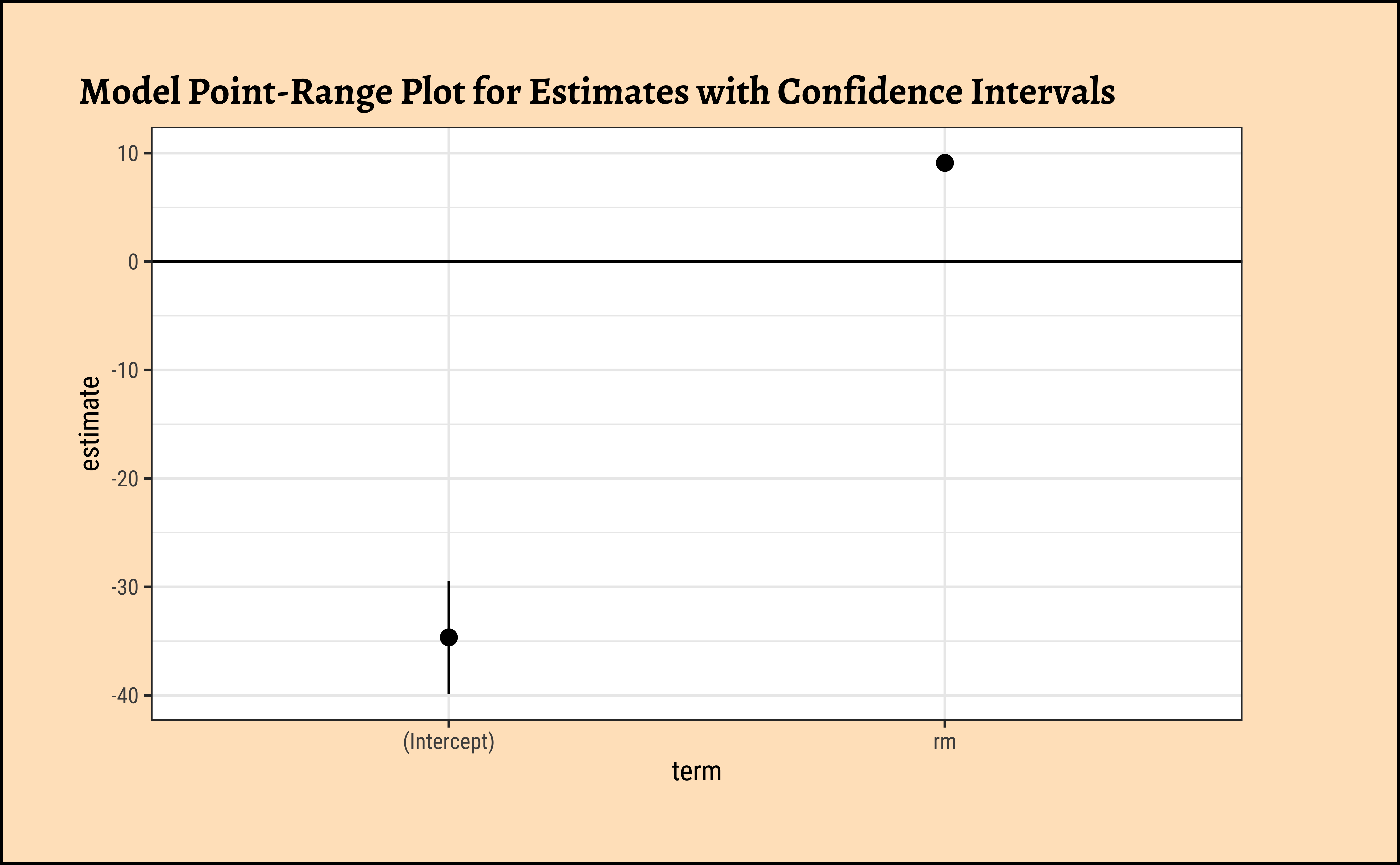
The point-range plot helps to avoid what has been called “within-the-bar bias”. The estimate is just a value, which we might plot as a bar or as a point, with uncertainty error-bars.
Values within the bar are not more likely!! This is the bias that the point-range plot avoids.
Linear Modelling makes 4 fundamental assumptions:(“LINE”)
- Linear relationship between y and x
- Observations are independent.
- Residuals are normally distributed
- Variance of the
yvariable is equal at all values ofx.
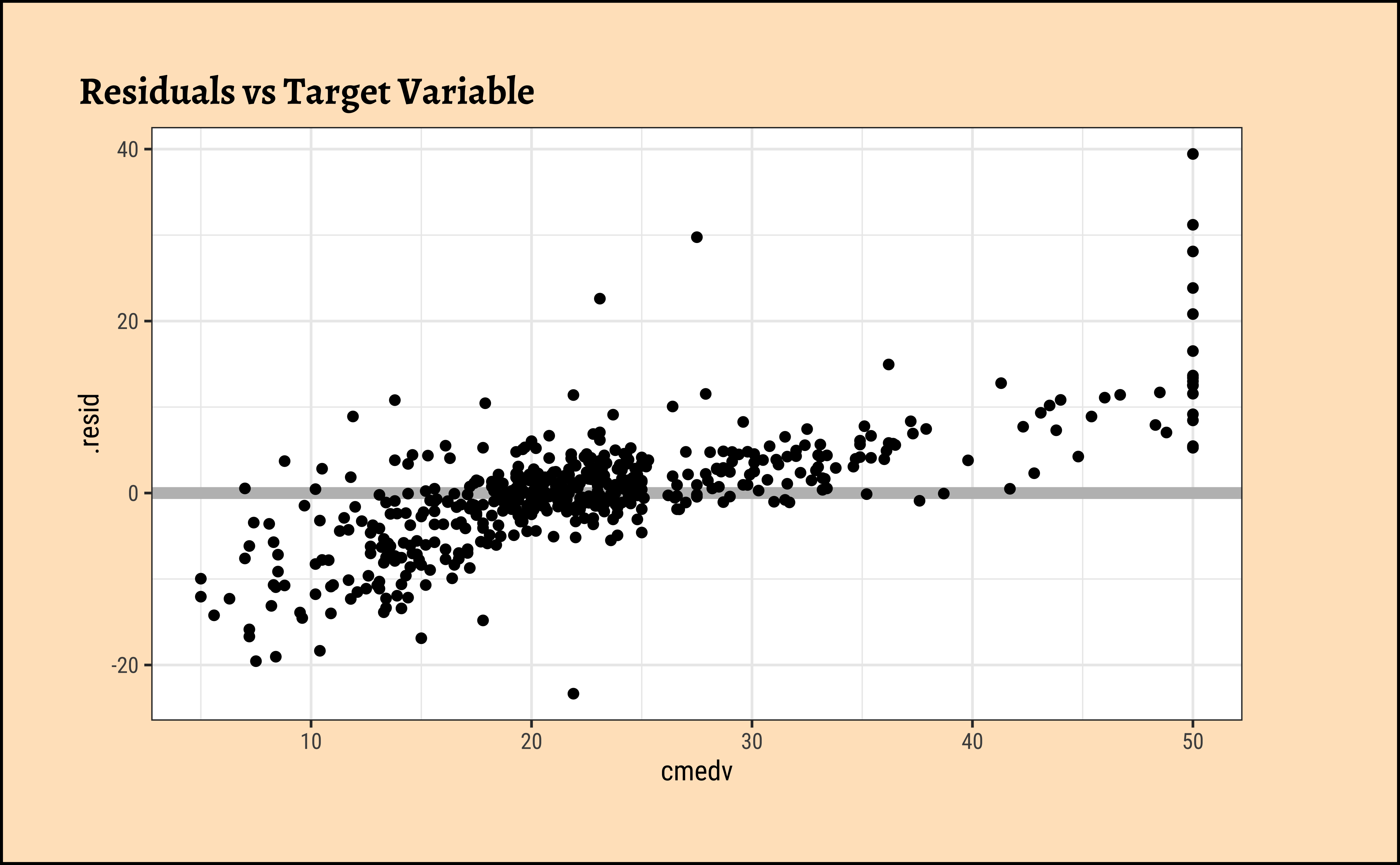
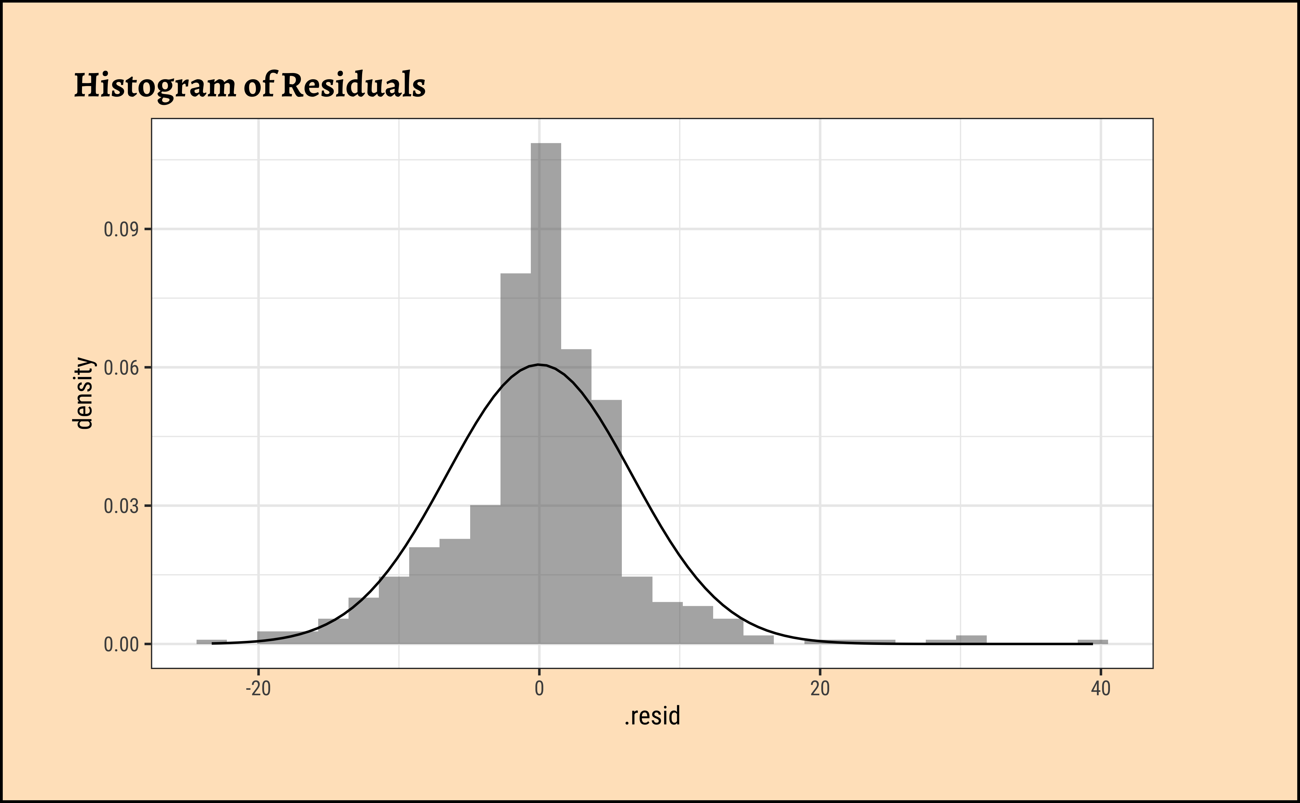
We can check these using checks and graphs: Here we plot the residuals against the independent/feature variable and see if there is a gross variation in their range:
Code
ggplot2::theme_set(new = theme_custom())
housing_lm_augment %>%
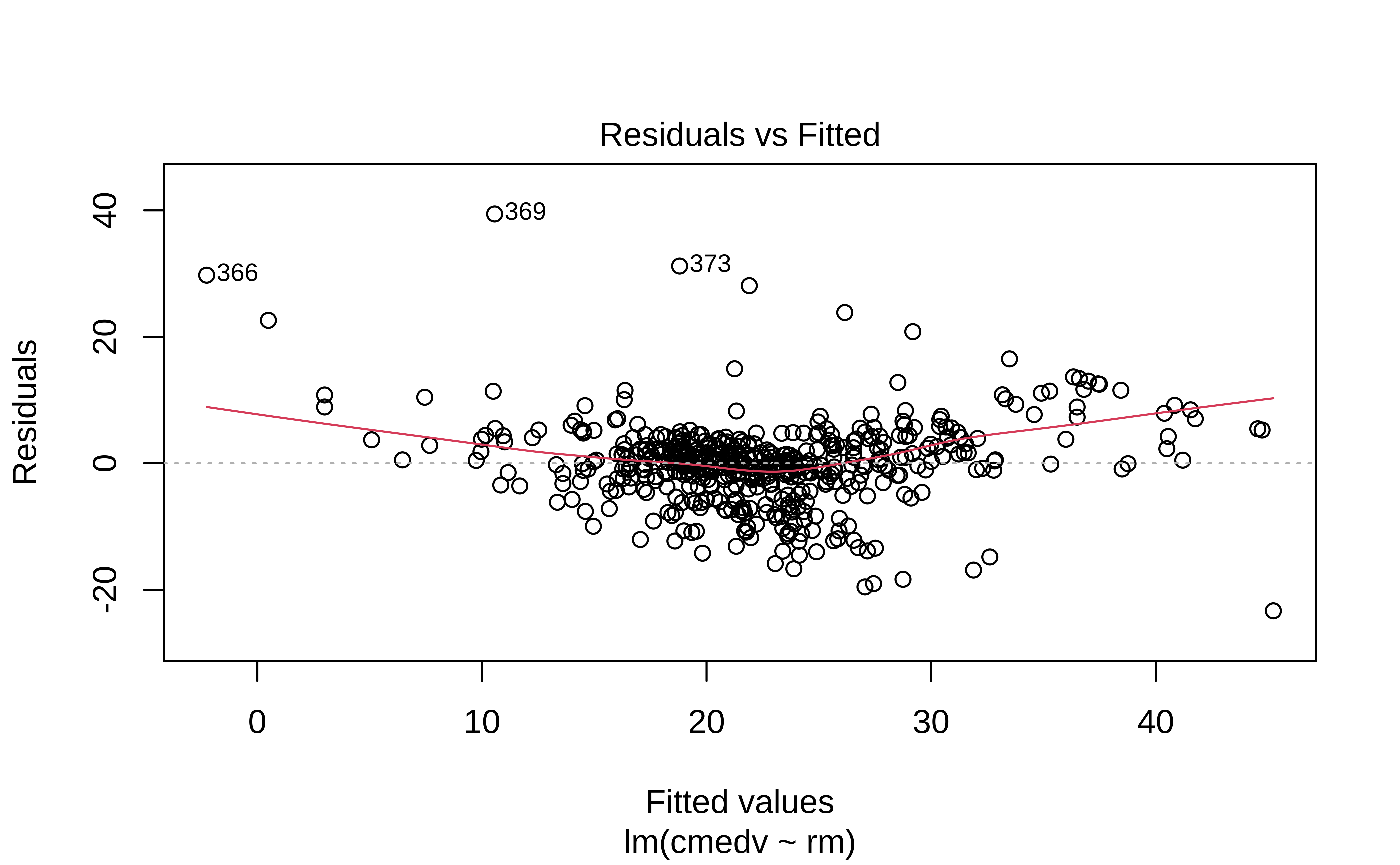
gf_point(.resid ~ .fitted, title = "Residuals vs Fitted") %>%
gf_smooth(method = "loess")
housing_lm_augment %>%
gf_hline(yintercept = 0, colour = "grey", linewidth = 2) %>%
gf_point(.resid ~ cmedv, title = "Residuals vs Target Variable")
housing_lm_augment %>%
gf_dhistogram(~.resid, title = "Histogram of Residuals") %>%
gf_fitdistr()
housing_lm_augment %>%
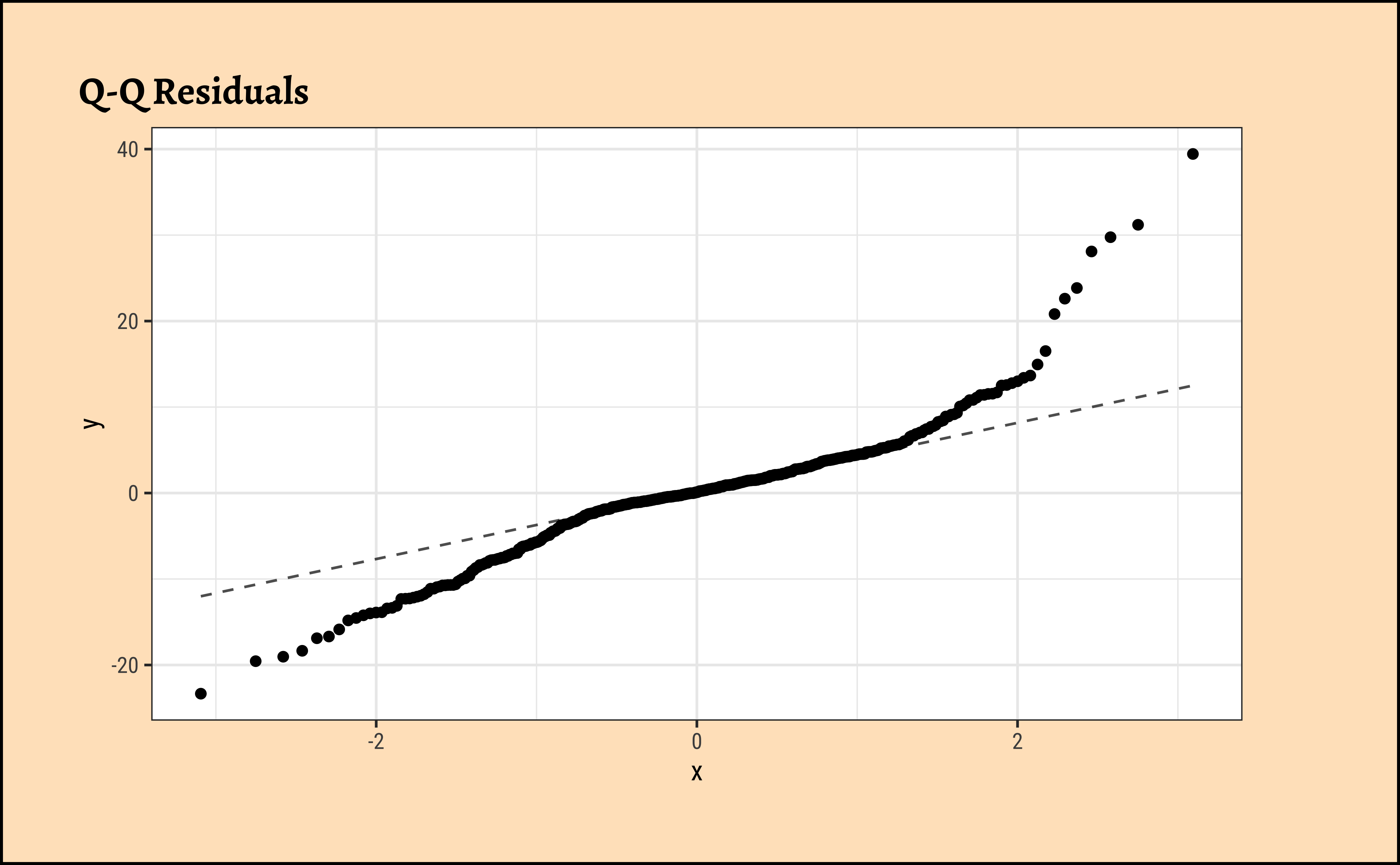
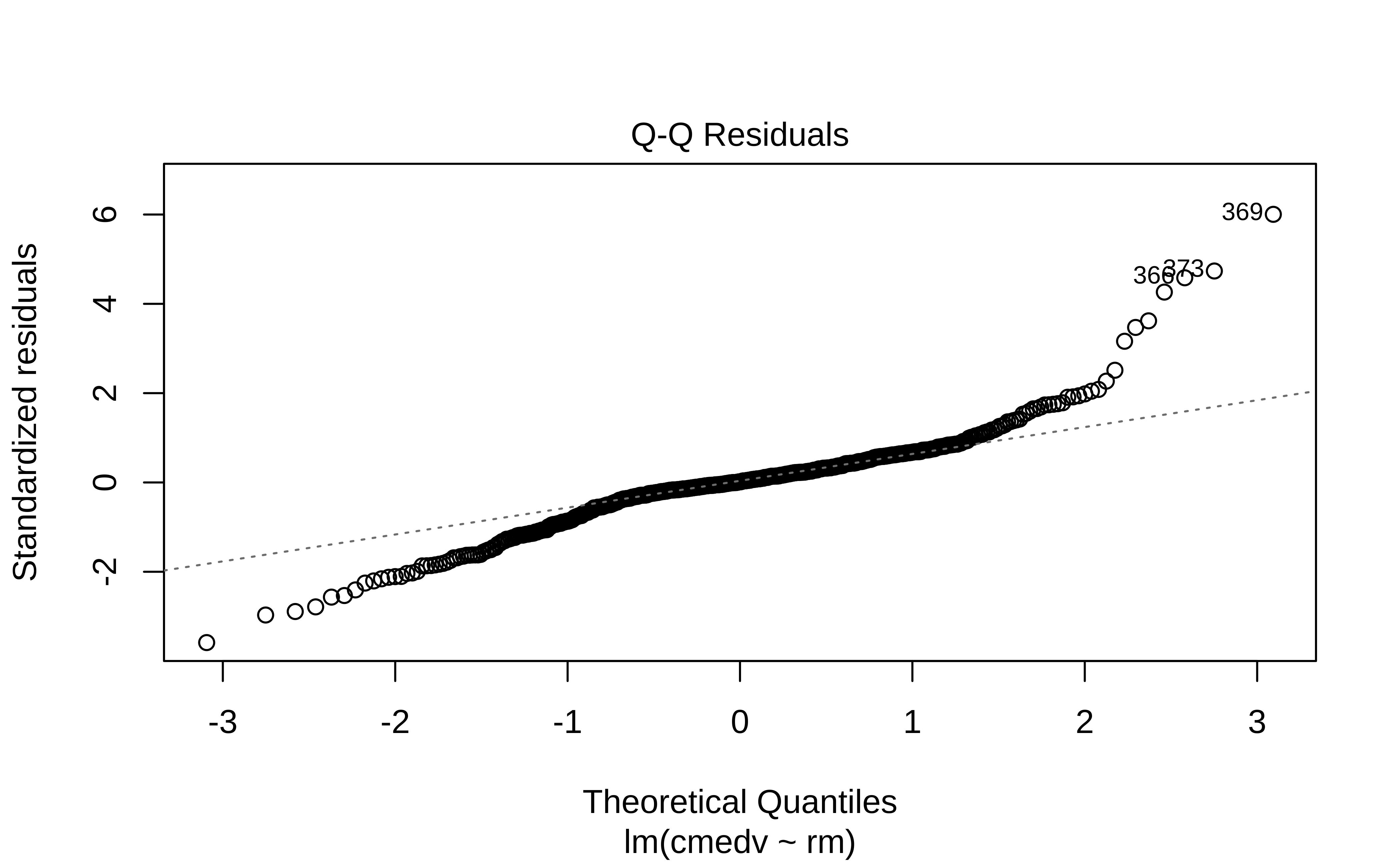
gf_qq(~.resid, title = "Q-Q Residuals") %>%
gf_qqline()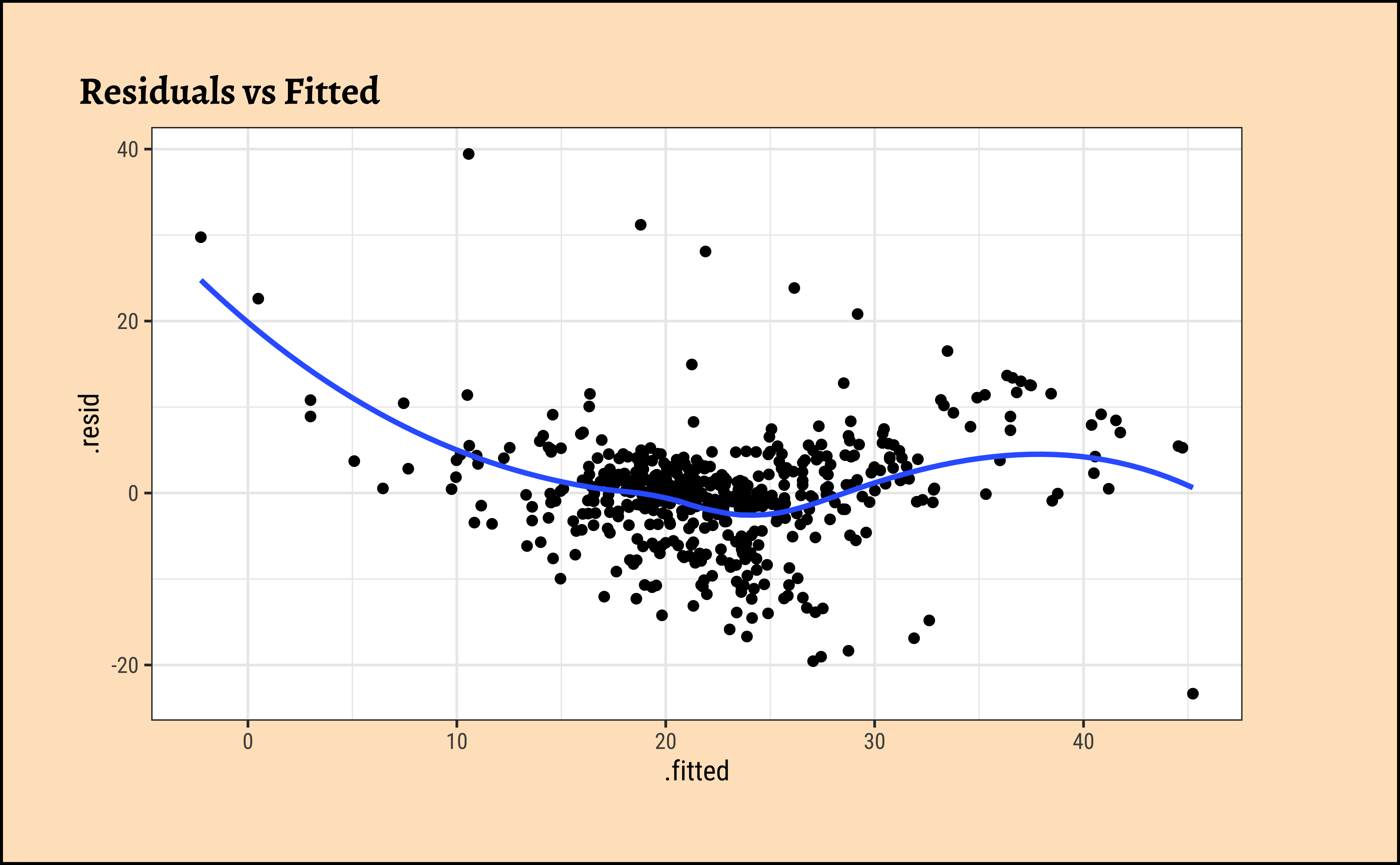
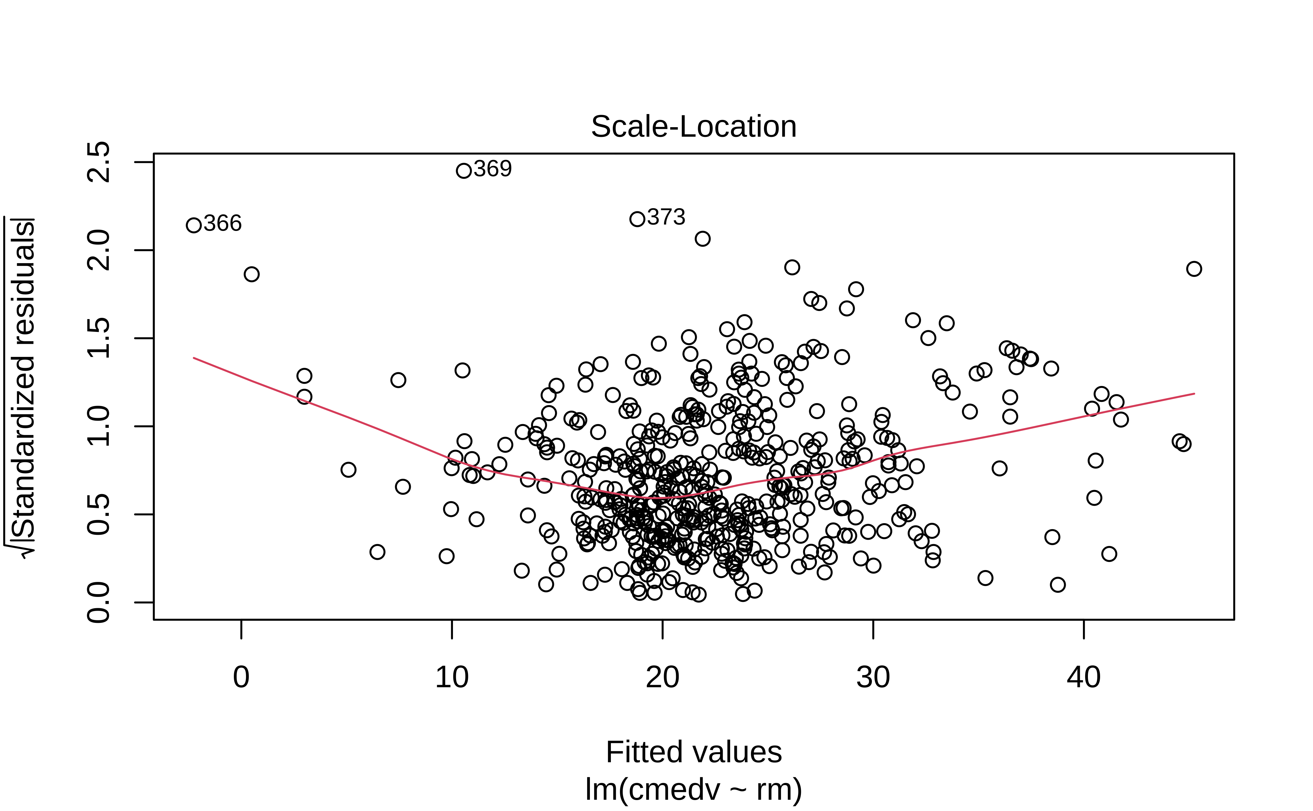
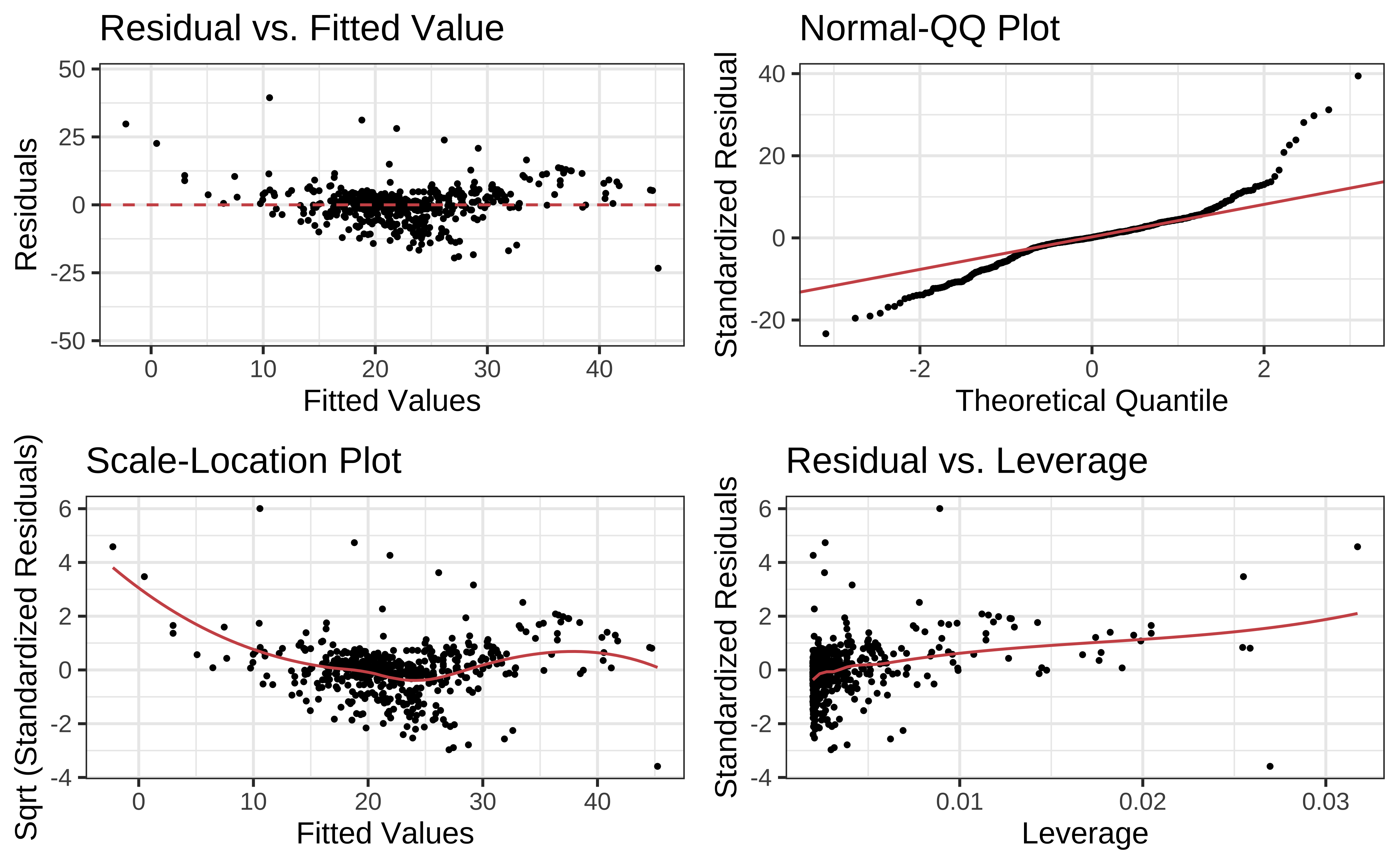
The residuals Figure 10 (a) are not quite “like the night sky”, i.e. not random enough; there seems to be some pattern still in them. These point to the need for a richer model, with more predictors.
The “trend line” of residuals vs predictors Figure 10 (a) shows a U-shaped pattern, indicating significant nonlinearity: there is a curved relationship in the graph. The solution can be a nonlinear transformation of the predictor variables, such as \(\sqrt(X)\), \(log(X)\), or even \(X^2\). For instance, we might try a model for cmedv using \(rm^2\) instead of just rm as we have done. This will still be a linear model!
The Q-Q plot of residuals Figure 10 (d) has significant deviations from the normal quartiles.
Apropos, the r-squared for a model lm(cmedv ~ rm^2) shows some improvement:
[1] 0.5501221
There is a very neat package called ggstatsplot3 that allows us to plot very comprehensive statistical graphs. Let us quickly do this:
This chart shows the estimates for the intercept and rm along with their error bars, the t-statistic, degrees of freedom, and the p-value.
We can also obtain crisp-looking model tables from the new supernova package 4, which is based on the methods discussed in Judd et al.
 Analysis of Variance Table (Type III SS)
 Model: cmedv ~ rm

                                SS  df        MS       F   PRE     p
 ----- --------------- | --------- --- --------- ------- ----- -----
 Model (error reduced) | 20643.347   1 20643.347 474.335 .4848 .0000
 Error (from model)    | 21934.392 504    43.521
 ----- --------------- | --------- --- --------- ------- ----- -----
 Total (empty model)   | 42577.739 505    84.312
This table is very neat in that it gives the Sums of Squares for both the NULL (empty) model, and the current model for comparison. The PRE entry is the Proportional Reduction in Error, a measure that is identical with r.squared, which shows how much the model reduces the error compared to the NULL model(48%). The PRE idea is nicely discussed in Judd et al.
Tip
One of the ggplot extension packages named {lindia} also has a crisp command to plot these diagnostic graphs.
Multiple Regression
Multiple Regression
It is also possible that there is more than one explanatory variable: this is multiple regression.
\[ y = \beta_0 + \beta_1*x_1 + \beta_2*x_2 ...+ \beta_n*x_n \tag{10}\]
where each of the \(\beta_i\) are slopes defining the relationship between y and \(x_i\). Note that this is a vector dot-product, or inner-product, taken with a vector of input variables \(x_i\) and a vector of weights, \(\beta_i\). Together, the RHS of that equation defines an n-dimensional hyperplane. The model is linear in the parameters \(\beta_i\), e.g. these are OK:
\[ \color{black}{ \begin{cases} & y_i = \pmb\beta_0 + \pmb\beta_1x_1 + \pmb\beta_2x_1^2 + \epsilon_i\\ & y_1 = \pmb\beta_0 + \pmb\gamma_1\pmb\delta_1x_1 + exp(\pmb\beta_2)x_2+ \epsilon_i\\ \end{cases} } \]
but not, for example, these:
\[ \color{red}{ \begin{cases} & y_i = \pmb\beta_0 + \pmb\beta_1x_1^{\beta_2} + \epsilon_i\\ & y_i = \pmb\beta_0 + exp(\pmb\beta_1x_1) + \epsilon_i\\ \end{cases} } \]
There are three ways5 to include more predictors:
- Backward Selection: We would typically start with a maximal model6 and progressively simplify the model by knocking off predictors that have the least impact on model accuracy.
- Forward Selection: Start with no predictors and systematically add them one by one to increase the quality of the model
- Mixed Selection: Wherein we start with no predictors and add them to gain improvement, or remove them at as their significance changes based on other predictors that have been added.
The first two are covered in the Section 1; Mixed Selection we will leave for a more advanced course. But for now we will first use just one predictor rm(Avg. no. of Rooms) to model housing prices.
| Package | Version | Citation |
|---|---|---|
| broom | 1.0.13 | Robinson et al. (2026) |
| corrgram | 1.15 | Wright (2026) |
| corrplot | 0.95 | Wei and Simko (2024) |
| geomtextpath | 0.2.0 | Cameron and van den Brand (2025) |
| GGally | 2.4.0 | Schloerke et al. (2025) |
| ggstatsplot | 1.0.0 | Patil (2021) |
| ISLR | 1.4 | James et al. (2021) |
| janitor | 2.2.1 | Firke (2024) |
| lindia | 0.10 | Lee and Ventura (2023) |
| reghelper | 1.1.2 | Hughes and Beiner (2023) |
| supernova | 3.0.2 | Blake et al. (2026) |