library(vcd)# Michael Friendly's package, Visualizing Categoricallibrary(vcdExtra)# Categorical Data Setslibrary(resampledata)# More datasetslibrary(visStatistics)# Comprehensive all-in-one stats viz/test package# install.packages("devtools")# devtools::install_github("haleyjeppson/ggmosaic") # removed from CRANlibrary(ggmosaic)# Tidy Mosaic Plotslibrary(ggpubr)# Colours, Themes and new geometries in ggplot##library(janitor)# Data Cleaning and Tidyinglibrary(visdat)# Visualize whole dataframes for missing datalibrary(naniar)# Clean missing datalibrary(DT)# Interactive Tables for our datalibrary(tinytable)# Elegant Tables for our datalibrary(ggrepel)# Repelling Text Labels in ggplotlibrary(marquee)# Marquee Text in ggplot
Plot Fonts and Theme
Since we will not use the ggplot system, we do not need this code chunk.
2 What graphs will we see today?
Variable #1
Variable #2
Chart Names
Chart Shape
Qual
Qual
Pies, and Mosaic Charts
3 What kind of Data Variables will we choose?
Which Variables?
No
Pronoun
Answer
Variable/Scale
Example
What Operations?
3
How, What Kind, What Sort
A Manner / Method, Type or Attribute from a list, with list items in some " order" ( e.g. good, better, improved, best..)
Qualitative/Ordinal
Socioeconomic status (Low income, Middle income, High income),Education level (HighSchool, BS, MS, PhD),Satisfaction rating(Very much Dislike, Dislike, Neutral, Like, Very Much Like)
Median,Percentile
4 Introduction
To recall, a categorical variable is one for which the possible measured or assigned values consist of a discrete set of categories, which may be ordered or unordered. Some typical examples are:
Gender, with categories “Male,” “Female.”
Marital status, with categories “Never married,” “Married,” “Separated,” “Divorced,” “Widowed.”
Fielding position (in baseball cricket), with categories “Slips,”Cover “,”Mid-off “Deep Fine Leg”, “Close-in”, “Deep”…
Side effects (in a pharmacological study), with categories “None,” “Skin rash,” “Sleep disorder,” “Anxiety,” . . ..
Political attitude, with categories “Left,” “Center,” “Right.”
Party preference (in India), with categories “BJP” “Congress,” “AAP,” “TMC”…
Treatment outcome, with categories “no improvement,” “some improvement,” or “marked improvement.”
Number of children, with categories 0, 1, 2, . . . .
As these examples suggest, categorical variables differ in the number of categories: we often distinguish binary variables (or dichotomous variables) such as Gender from those with more than two categories (called polytomous variables).
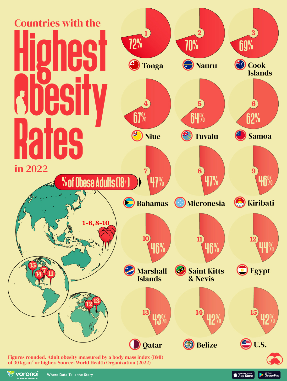
From Figure 1 (a), it is seen that Egypt, Qatar, and the United States are the only countries with a population greater than 1 million on this list. Poor food habits are once again a factor, with some cultural differences. In Egypt, high food inflation has pushed residents to low-cost high-calorie meals. To combat food insecurity, the government subsidizes bread, wheat flour, sugar and cooking oil, many of which are the ingredients linked to weight gain. In Qatar, a country with one of the highest per capita GDPs in the world, a genetic predisposition towards obesity and sedentary lifestyles worsen the impact of rich diets. And in the U.S., bigger portions are one of the many reasons cited for rampant adult and child obesity. For example, Americans ate 20% more calories in the year 2000 than they did in 1983. They consume 195 lbs of meat annually compared to 138 lbs in 1953. And their grain intake has increased 45% since 1970.
It’s worth noting however that this dataset is based on BMI values, which do not fully account for body types with larger bone and muscle mass.
We saw with Bar Charts that when we deal with single Qual variables, we perform counts for each level of the variable. For a single Qual variable, even with multiple levels ( e.g. Education Status: High school, College, Post-Graduate, PhD), we can count the observations as with Bar Charts and plot Pies.
We can also plot Pie Charts when the number of levels in a single Qual variable are not too many. Almost always, a Bar chart is preferred. The problem is that humans are pretty bad at reading angles. This ubiquitous chart is much vilified in the industry and bar charts that we have seen earlier, are viewed as better options. On the other hand, pie charts are ubiquitous in design and business circles, and are very much accepted! Do also read this spirited defense of pie charts here. https://speakingppt.com/why-tufte-is-flat-out-wrong-about-pie-charts/
What if there are two Quals? Or even more? The answer is to take them pair-wise, make all combinations of levels for both and calculate counts for these. This is called a Contingency Table. Then we plot that table. We’ll see.
7 Categorical Data
From the {vcd} vignette:
The first thing you need to know is that categorical data can be represented in three different forms in R, and it is sometimes necessary to convert from one form to another, for carrying out statistical tests, fitting models or visualizing the results.
In many circumstances, data is recorded on each individual or experimental unit. Data in this form is called case data, or data in case form. Containing individual observations with one or more categorical factors, used as classifying variables. The total number of observations is nrow(X), and the number of variables is ncol(X).
# Tibble as HTML for presentationArthritis%>%head(10)%>%knitr::kable(theme ="striped", caption ="Arthritis Treatments and Effects<br> First 10 Observations", centering =TRUE)
Arthritis Treatments and Effects First 10 Observations
ID
Treatment
Sex
Age
Improved
57
Treated
Male
27
Some
46
Treated
Male
29
None
77
Treated
Male
30
None
17
Treated
Male
32
Marked
36
Treated
Male
46
Marked
23
Treated
Male
58
Marked
75
Treated
Male
59
None
39
Treated
Male
59
Marked
33
Treated
Male
63
None
55
Treated
Male
63
None
The Arthritis data set has three factors and two integer variables. One of the three factors Improved is an ordered factor.
ID:` integer; a unique identifier for each case
Treatment: a factor; Placebo or Treated
Sex: a factor, M / F
Age: integer; age of the patient
Improved: Ordinal factor; None < Some < Marked
Each row in the Arthritis dataset is a separate case or observation.
Data in frequency form has already been tabulated and aggregated by counting over the (combinations of) categories of the table variables. When the data are in case form, we can always trace any observation back to its individual identifier or data record, since each row is a unique observation or case; the reverse, with the Frequency Form is rarely possible.
Frequency Data is usually a data frame, with columns of categorical variables and at least one column containing frequency or count information.
str(GSS)# Tibble as HTML for presentationGSS%>%knitr::kable(theme ="striped", caption ="General Social Survey", centering =TRUE)
Respondents in the GSS survey were classified by sex and party identification. As can be seen, there is a count for every combination of the two categorical variables, sex and party. This is still a data.frame.
Table Form Data can be a matrix, array or table object, whose elements are the frequencies in an n-way table. The variable names (factors) and their levels are given by dimnames(X).
, , Sex = Male

       Eye
Hair    Brown Blue Hazel Green
  Black    32   11    10     3
  Brown    53   50    25    15
  Red      10   10     7     7
  Blond     3   30     5     8

, , Sex = Female

       Eye
Hair    Brown Blue Hazel Green
  Black    36    9     5     2
  Brown    66   34    29    14
  Red      16    7     7     7
  Blond     4   64     5     8
[1] "table"
HairEyeColor is a “two-way” table, consisting of two tables, one for Sex = Female and the other for Sex = Male. The total number of observations is sum(X). The number of dimensions of the table is length(dimnames(X)), and the table sizes are given by sapply(dimnames(X), length). The data looks like a n-dimensional cube and needs n-way tables to represent.
A good way to think of tabular data is to think of a Rubik’s Cube.
Rubik’s Cube model for Multi-Table Data
TipRubik’s Cube and Categorical Data Tables
Each of the edges is an Ordinal Variable, each segment represents a level in the variable. So each face of the Cube represents two ordinal variables. Any segment is at the intersection of two (independent) levels of two variables, and the colour may be visualized as a count. This array of counts on a face is a 2D or 2-Way Table.
Since we can only print 2D tables, we hold one face in front and the image we see is a 2-Way Table. Turning the Cube by 90 degrees gives us another face with 2 variables, with one variable in common with the previous face. If we consider two faces together, we get two 2-way tables, effectively allowing us to contemplate 3 categorical variables.
Multiple 2-Way tables ( such as HairEyeColor) can be flattened into a single long table that contains all counts for all combinations of categorical variables. This can be visualized as “opening up” and laying flat the Rubik’s cube, as with a cardboard model of it.
            Sex Male Female
Hair  Eye
Black Brown       32     36
      Blue        11      9
      Hazel       10      5
      Green        3      2
Brown Brown       53     66
      Blue        50     34
      Hazel       25     29
      Green       15     14
Red   Brown       10     16
      Blue        10      7
      Hazel        7      7
      Green        7      7
Blond Brown        3      4
      Blue        30     64
      Hazel        5      5
      Green        8      8
Converting these (multiple) tables into a data frame or tibble:
## Convert the two tables into a data frameHairEyeColor%>%as_tibble()# Tibble as HTML for presentationHairEyeColor%>%as_tibble()%>%# Convertknitr::kable(theme ="striped", caption ="Hair Eye and Color<br> as a Data Frame", centering =TRUE)
Hair Eye and Color as a Data Frame
Hair
Eye
Sex
n
Black
Brown
Male
32
Brown
Brown
Male
53
Red
Brown
Male
10
Blond
Brown
Male
3
Black
Blue
Male
11
Brown
Blue
Male
50
Red
Blue
Male
10
Blond
Blue
Male
30
Black
Hazel
Male
10
Brown
Hazel
Male
25
Red
Hazel
Male
7
Blond
Hazel
Male
5
Black
Green
Male
3
Brown
Green
Male
15
Red
Green
Male
7
Blond
Green
Male
8
Black
Brown
Female
36
Brown
Brown
Female
66
Red
Brown
Female
16
Blond
Brown
Female
4
Black
Blue
Female
9
Brown
Blue
Female
34
Red
Blue
Female
7
Blond
Blue
Female
64
Black
Hazel
Female
5
Brown
Hazel
Female
29
Red
Hazel
Female
7
Blond
Hazel
Female
5
Black
Green
Female
2
Brown
Green
Female
14
Red
Green
Female
7
Blond
Green
Female
8
8 Simple Plots for Categorical Data
We have already examined Bar Charts. Pie Charts are discussed here.. These are both good for single Qual variables. Bars are more suited when there are many levels and/or when there is more than one Qual variable, as discussed earlier.
How do we deal with multiple Qual variables?
9 Plotting Nested Proportions
When we want to visualize proportions based on Multiple Qual variables, we are looking at what Claus Wilke calls nested proportions: groups within groups. Making counts with combinations of levels for two Qual variables gives us a data structure called a ContingencyTable , which we will use to build our plot for nested proportions. The Statistical tests for Proportions ( the \(\chi^2\) test ) also needs Contingency Tables. The Frequency Table we encountered earlier is very close to being a full-fledged Contingency Table; one only needs to add the margin counts! So what is a Contingency Table?
We can think of it as an a new intermediate tabular structure that will help us create a new kind of chart for our Qual data.
A contingency table, sometimes called a two-way frequency table, is a tabular mechanism with at least two rows and two columns used in statistics to present categorical data in terms of frequency counts. More precisely, an \(r \times c\) contingency table shows the observed frequency of two variables the observed frequencies of which are arranged into \(r\) rows and \(c\) columns. The intersection of a row and a column of a contingency table is called a cell.
9.1 Creating Contingency Tables
In this section we understand how to make Contingency Tables(CT) from each of the three forms. We will use base-R and the {vcd} package for our purposes. Then we will see how they can be visualized. In most cases, we will also see how we can create the Contingency Table as a tibbleor data frame for further analysis.
vcd: For Case Form data, vcd::structable() is a good option, as it can also add margins to the table. The Table can also be converted to a tibble, preserving the rownames.
Show the Code
Arthritis%>%class()vcd::structable(data =Arthritis, Improved~Treatment)vcd::structable(data =Arthritis, Improved~Treatment)%>%as.matrix()%>%# Convert to matrix; addmargins()%>%# Add margins to the table; matrix outputclass()vcd::structable(data =Arthritis, Improved~Treatment)%>%as.matrix()%>%# Convert to matrix;addmargins()%>%# Add margins to the table; matrix outputas_tibble(rownames ="Treatment")# Convert to tibble; ensure row names!
Table 1: Creating Contingency Tables from Case Form Data with vcd
Base R: Base R also provides very compact formula-based smethods for Case Form Data:
Show the Code
Arthritis%>%class()ftable(data =Arthritis, Improved~Treatment)%>%# Two-way tableas.matrix()%>%# ftable to matrix; # Keeps the names when margins are addedaddmargins()# Add margins to the tableftable(data =Arthritis, Improved~Treatment)%>%# Two-way tableas.matrix()%>%# ftable to matrix; # Keeps the names when margins are addedaddmargins()%>%# Add margins to the tableclass()ftable(data =Arthritis, Improved~Treatment)%>%# Two-way table)as.matrix()%>%# ftable to matrix; # Keeps the names when margins are addedaddmargins()%>%# Add margins to the tableas_tibble(rownames ="Treatment")# Convert to tibble; ensure row names!
[1] "data.frame"
         Improved
Treatment None Some Marked Sum
  Placebo   29    7      7  43
  Treated   13    7     21  41
  Sum       42   14     28  84
[1] "matrix" "array"
Table 2: Creating Contingency Tables from Case Form Data with base::ftable()
UCBAdmissions is already in Frequency Form i.e. a Contingency Table. But it is a set of (two-way) Contingency Tables. So let us try!
vcd: For Frequency Form data, vcd::structable() can again work nicely for us:
Table 3: Creating Contingency Tables from Frequency Form Data with vcd
Base R: Base R also provides a very compact method for Frequency Form Data:
Show the Code
UCBAdmissions%>%class()ftable(data =UCBAdmissions, Gender~Admit+Dept)ftable(data =UCBAdmissions, Gender~Admit+Dept)%>%class()ftable(data =UCBAdmissions, Gender~Admit+Dept)%>%as.matrix()%>%# Keeps the names when margins are addedaddmargins()%>%# Add margins to the tableas_tibble(rownames ="Admit-Dept")
[1] "table"
              Gender Male Female
Admit    Dept
Admitted A            512     89
         B            353     17
         C            120    202
         D            138    131
         E             53     94
         F             22     24
Rejected A            313     19
         B            207      8
         C            205    391
         D            279    244
         E            138    299
         F            351    317
[1] "ftable"
Figure 2: Creating Contingency Tables from Frequency Form Data with base::ftable()
How about a multi-table dataset, like HairEyeColor?
# HairEyeColor is in multiple table form dataHairEyeColorHairEyeColor%>%class()## Option#1 vcd:structable()vcd::structable(HairEyeColor)%>%as.matrix()%>%# Flattenaddmargins()# Add margins to the tablevcd::structable(data =HairEyeColor, Sex~Hair+Eye)%>%as.matrix()%>%addmargins()%>%# Add margins to the tableas_tibble(rownames ="Hair-Eye")# Convert to tibble; ensure row names!
, , Sex = Male

       Eye
Hair    Brown Blue Hazel Green
  Black    32   11    10     3
  Brown    53   50    25    15
  Red      10   10     7     7
  Blond     3   30     5     8

, , Sex = Female

       Eye
Hair    Brown Blue Hazel Green
  Black    36    9     5     2
  Brown    66   34    29    14
  Red      16    7     7     7
  Blond     4   64     5     8
            Sex Male Female
Hair  Eye
Black Brown       32     36
      Blue        11      9
      Hazel       10      5
      Green        3      2
Brown Brown       53     66
      Blue        50     34
      Hazel       25     29
      Green       15     14
Red   Brown       10     16
      Blue        10      7
      Hazel        7      7
      Green        7      7
Blond Brown        3      4
      Blue        30     64
      Hazel        5      5
      Green        8      8
Table 5: Creating Contingency Tables from Table Form Data with base::ftable()
ImportantWorkflow
So, it does seem that we could use mostly vcd::structable() or ftable() to create Contingency Tables, and then convert them to tibble form if needed. The usage is identical!
9.2 Mosaic Plots
All right then, how does one plot a set of data that looks like this, a matrix? No column is a single variable, nor is each row a single observation, which is what we understand with the idea of tidy data.
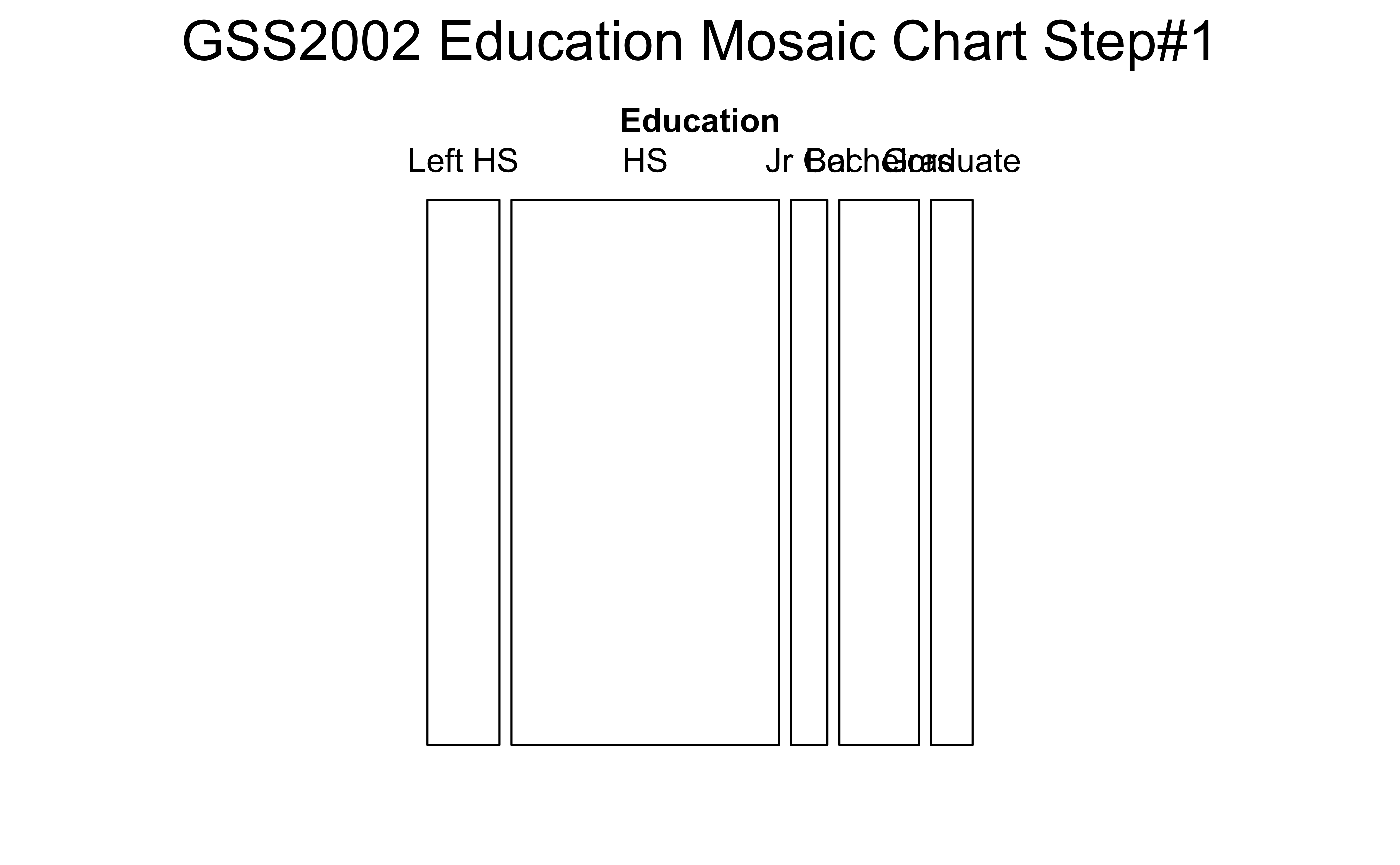
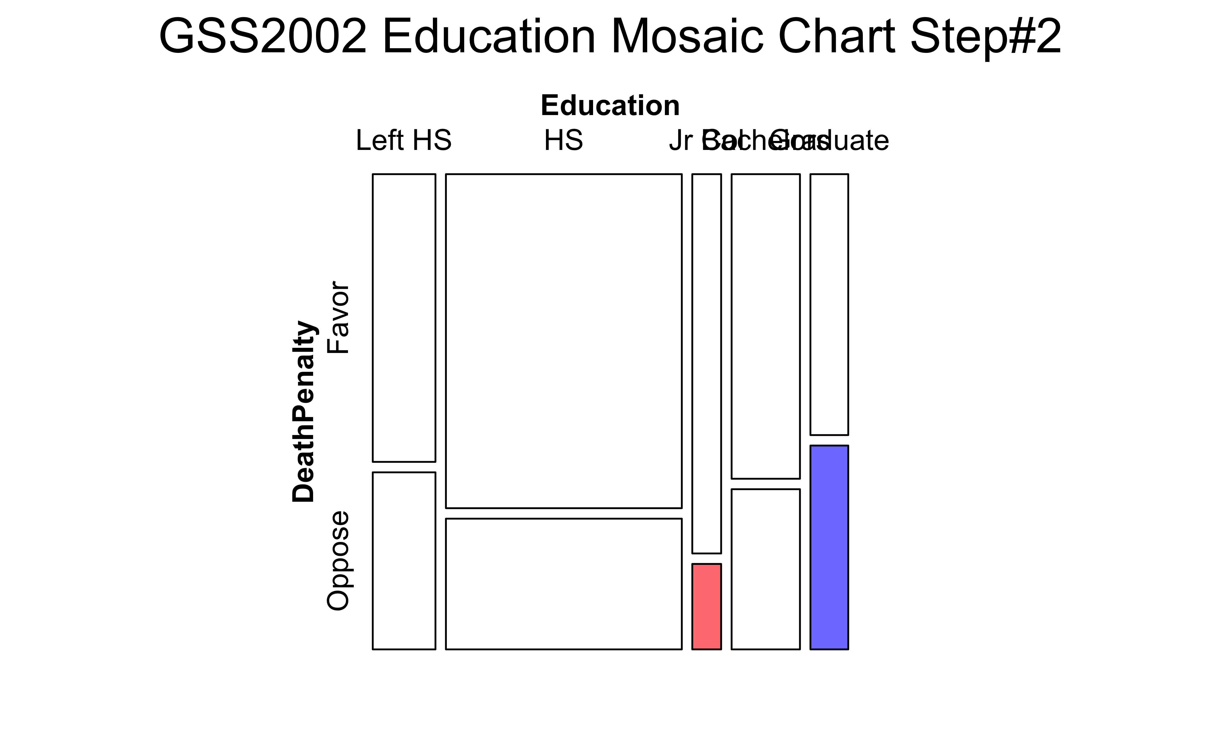
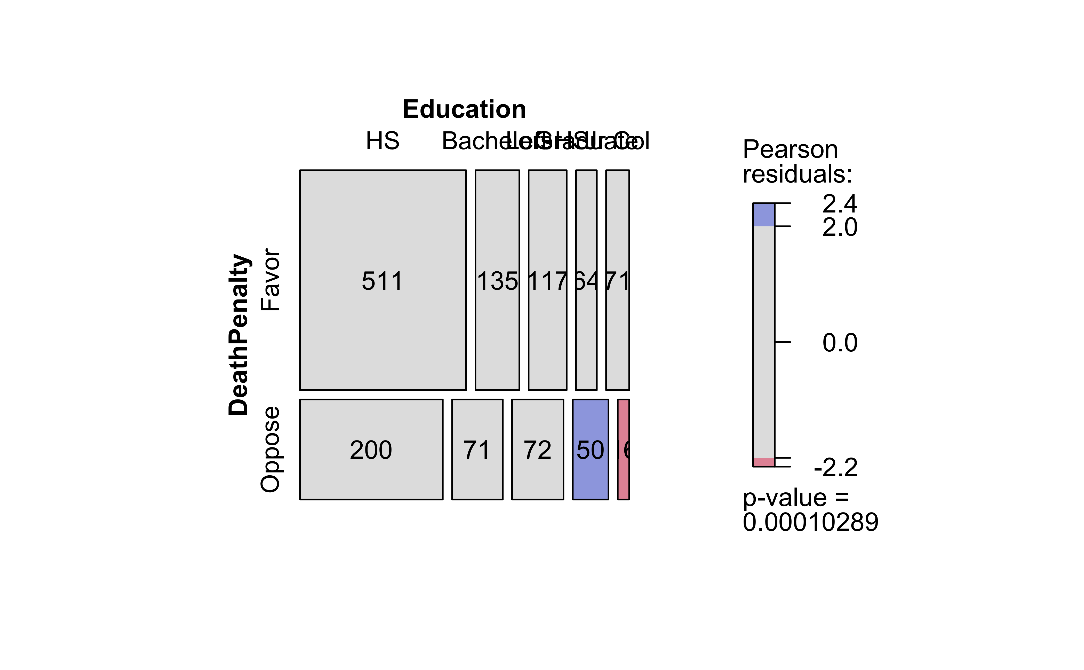
Let us take the GSS2002 dataset, and create a Contingency Table out of it. We will use the Education and DeathPenalty variables, which are both Qualitative. The GSS2002 dataset is a part of the resampledata package, and contains data from the General Social Survey (GSS) for the year 2002.
The answer is provided in the very shape of the CT: we plot this as a set of tiles, where \[ \pmb{area~of~tile \sim count} \] We recursively partition off a (usually) square area into vertical and horizontal pieces whose area is proportional to the count at a specific combination of levels of the two Qual variables. So we might follow the process as shown below:
Take the bottom row of the CT (i.e.per-column totals) and create vertical rectangles with these widths
Take the individual counts in the rows and partition each rectangle based in the counts in these rows.
(a) Step#1: Education
(b) Step#2: DeathPenalty
Figure 3: Mosaic Chart Steps for GSS2002 Data
The first split shows the various levels of Education and their counts as widths. Order is alphabetical! This splitting corresponds to the bottom ROW of the Table 7. HS is clearly the largest subgroup in Education.
In the second step, the columns from Figure 3 (a) are sliced horizontally into tiles, in proportion to the number of people in each Education category/level who support/do not support DeathPenalty. This is done in proportion to all the entries in each COLUMN, giving us Figure 3 (b).
Let us now make this plot with {vcd}, and with a new package called visStatistics, which allows us to create a wide variety of statistical charts, including Mosaic Charts, with very little code.
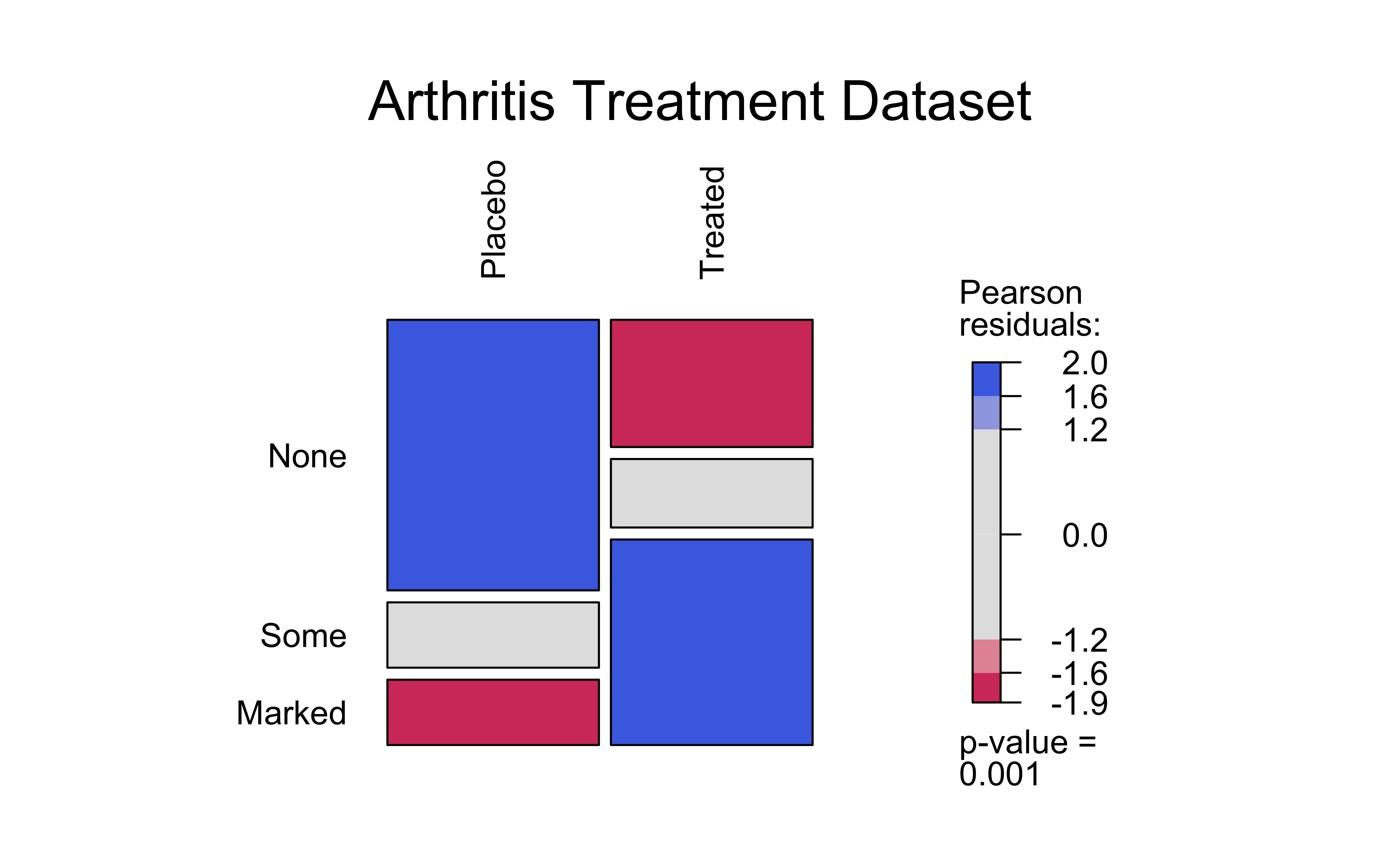
There are visible differences in the counts for the Improved variable, based on the Treatment variable. The Placebo treatment has a much lower count for Marked improvement, and a higher count for None improvement. The Treated group has a higher count for Marked improvement, and a lower count for None improvement. We can make a hypothesis that the Treatment variable is related to the Improved variable, and that the Treated group has a higher chance of improvement than the Placebo group.
Show the Code
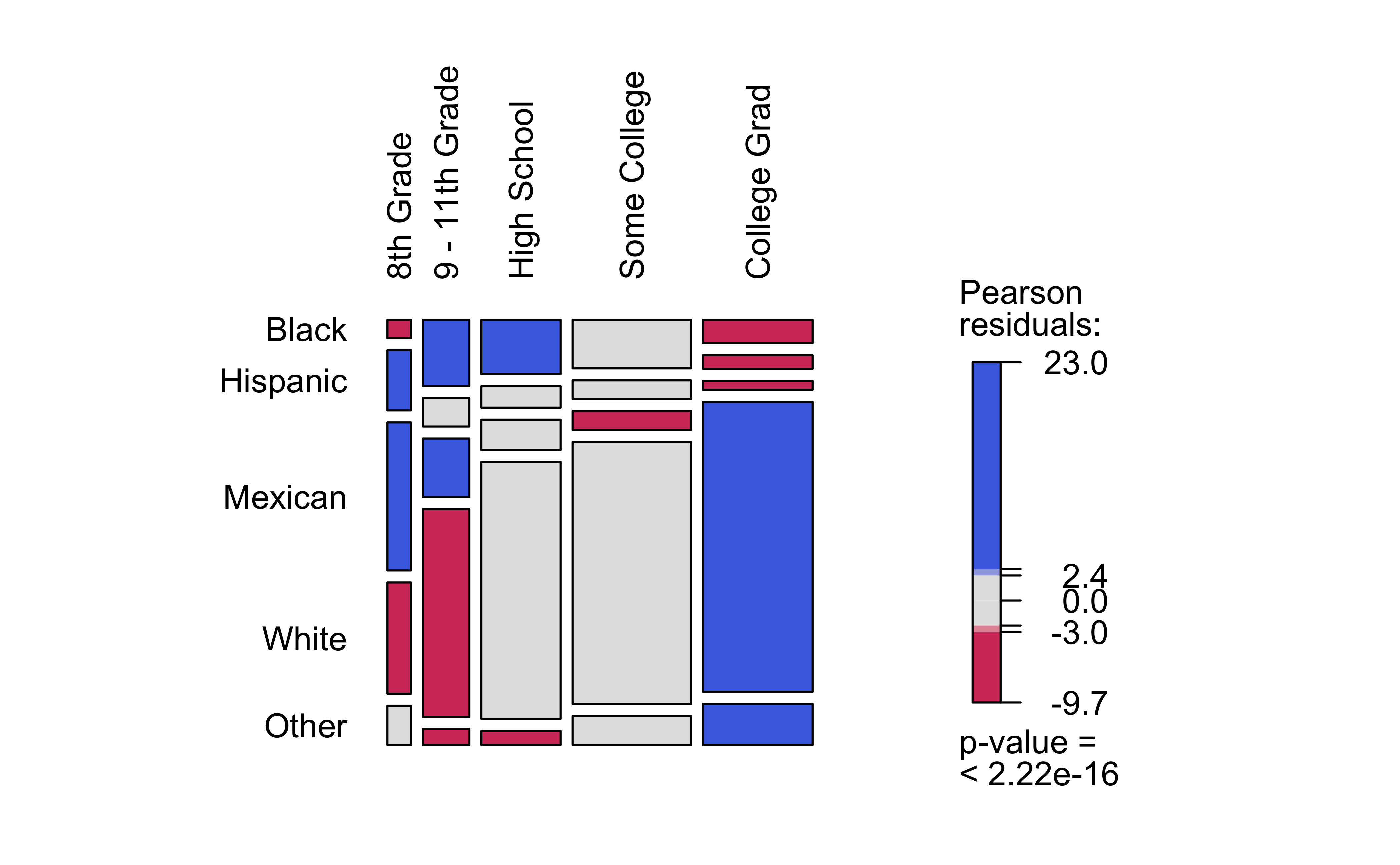
library(NHANES)nhanes_ct<-vcd::structable(data =NHANES, Race1~Education)nhanes_ctvcd::mosaic(nhanes_ct, gp =shading_max, direction ="v", main ="",labeling =labeling_border( varnames =c("F", "F"), rot_labels =c(90,0,0,0), # Rotation, t,r,b,l just_labels =c("left", # How?"center", # Don't Care"center", # Don't Care"right")))# How?
               Race1 Black Hispanic Mexican White Other
Education
8th Grade               22       72     177   133    47
9 - 11th Grade         156       67     138   489    38
High School            219       86     122  1033    57
Some College           292      112     114  1575   174
College Grad           130       76      50  1613   229
Figure 5: NHANES Mosaic Plot
Based on this mosaic chart, we can say that White people have had more College education than Black or Hispanic people, and that Black people have had more High School education than Hispanic people. The Hispanic group has the lowest count for College education. So we can hypothesize that the Qual variables Race1 and Education are related.
visStatistics is a recent package that allows a very wide variety of statistical charts to be created automagically based on the variables chosen. Let us plot a mosaic chart directly with this package:
# Plots the Bar Chart and Mosaic Chart visstat cannot take 'ordinal' variables# ;-OArthritis<-Arthritis%>%mutate(Improved =base::factor(Improved, ordered =FALSE))Arthritisvisstat(Arthritis$Improved, Arthritis$Treatment)
(a) Bar Chart
(b) Bar Chart
(c) Mosaic Chart
Figure 6: Mosaic and Bar Chart with visStatistics
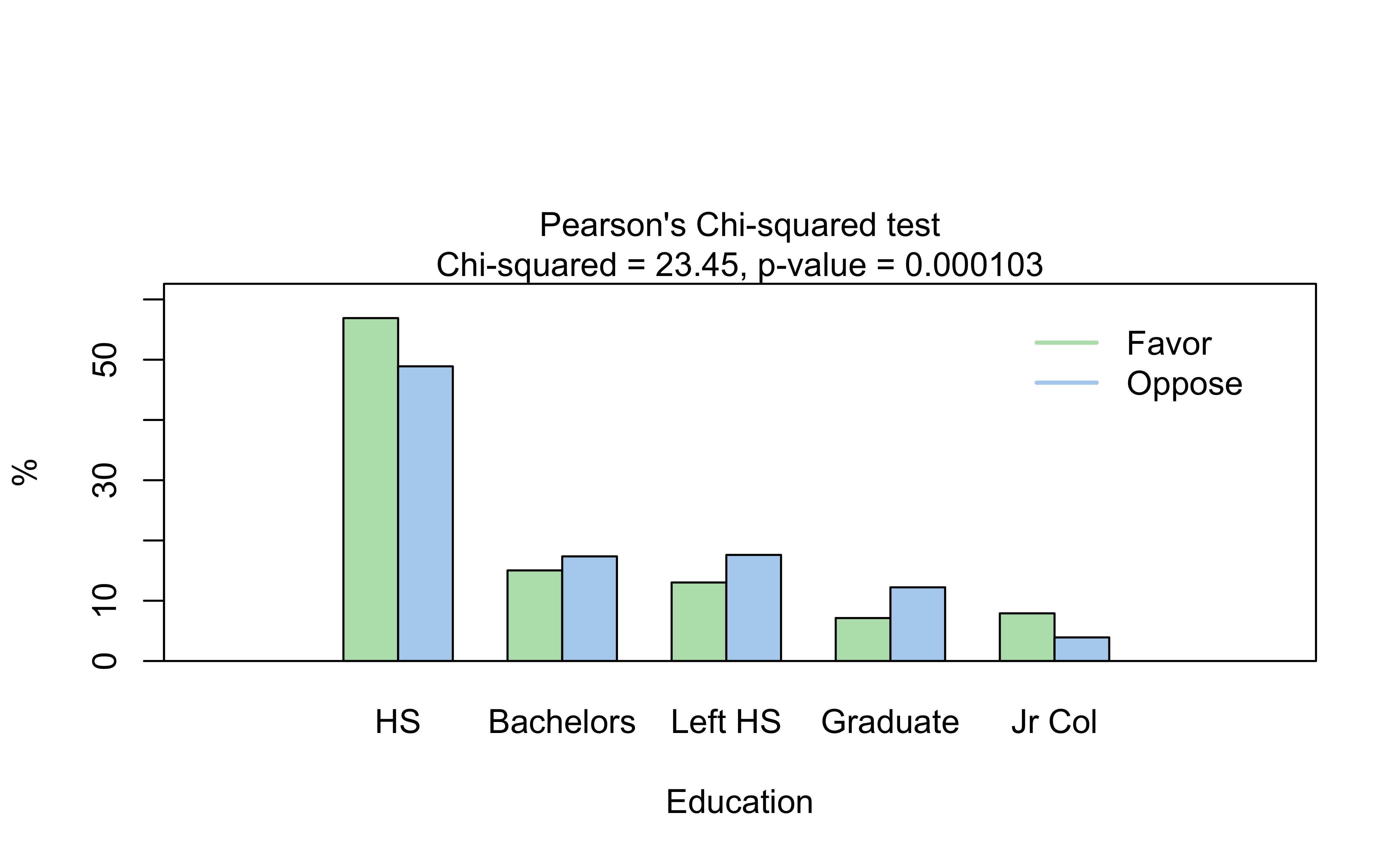
# Plots the Bar Chart and Mosaic Chartvisstat(GSS2002$DeathPenalty, GSS2002$Education)
(a) Bar Chart
(b) Mosaic Chart
Figure 7: Mosaic and Bar Chart with visStatistics
# Plots the Bar Chart and Mosaic Chartvisstat(NHANES$Race1, NHANES$Education)
(a) Bar Chart
(b) Mosaic Chart
Figure 8: Mosaic and Bar Chart with visStatistics
The visStatistics package is a very powerful package that can be used to create a wide variety of statistical charts, including Mosaic Charts, with very little code. This “universal” command visstat() computes a good many statistics and plots, all in one. NOTE: visstat() does need both its variables to be integers/numbers/factors: cannot handle ordinal (factor) variables.
Important
Note how one visstat() command gave us TWO plots! The output of visstat() is very interesting! So, for the fearless: Try doing an str() after this command to see what (else) it has computed. There is a wealth of information in the output object, including the Contingency Table, the Chi-Squared test results, and more. Type visstat(GSS2002$DeathPenalty, GSS2002$Education) %>% str() in the Console or your Quarto chunk to see this.
9.3 Coloured Tiles: Actual and Expected Contingency Tables
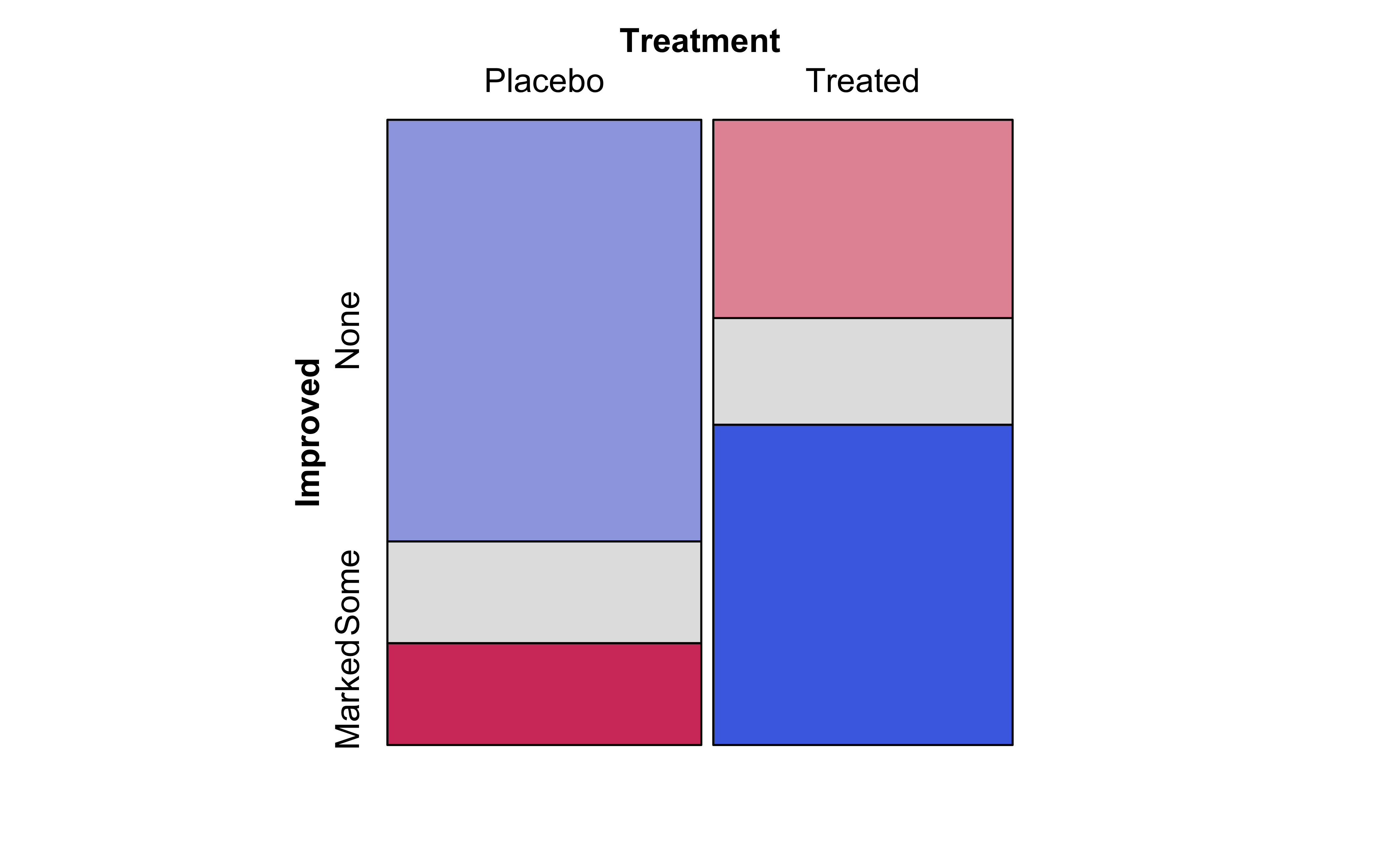
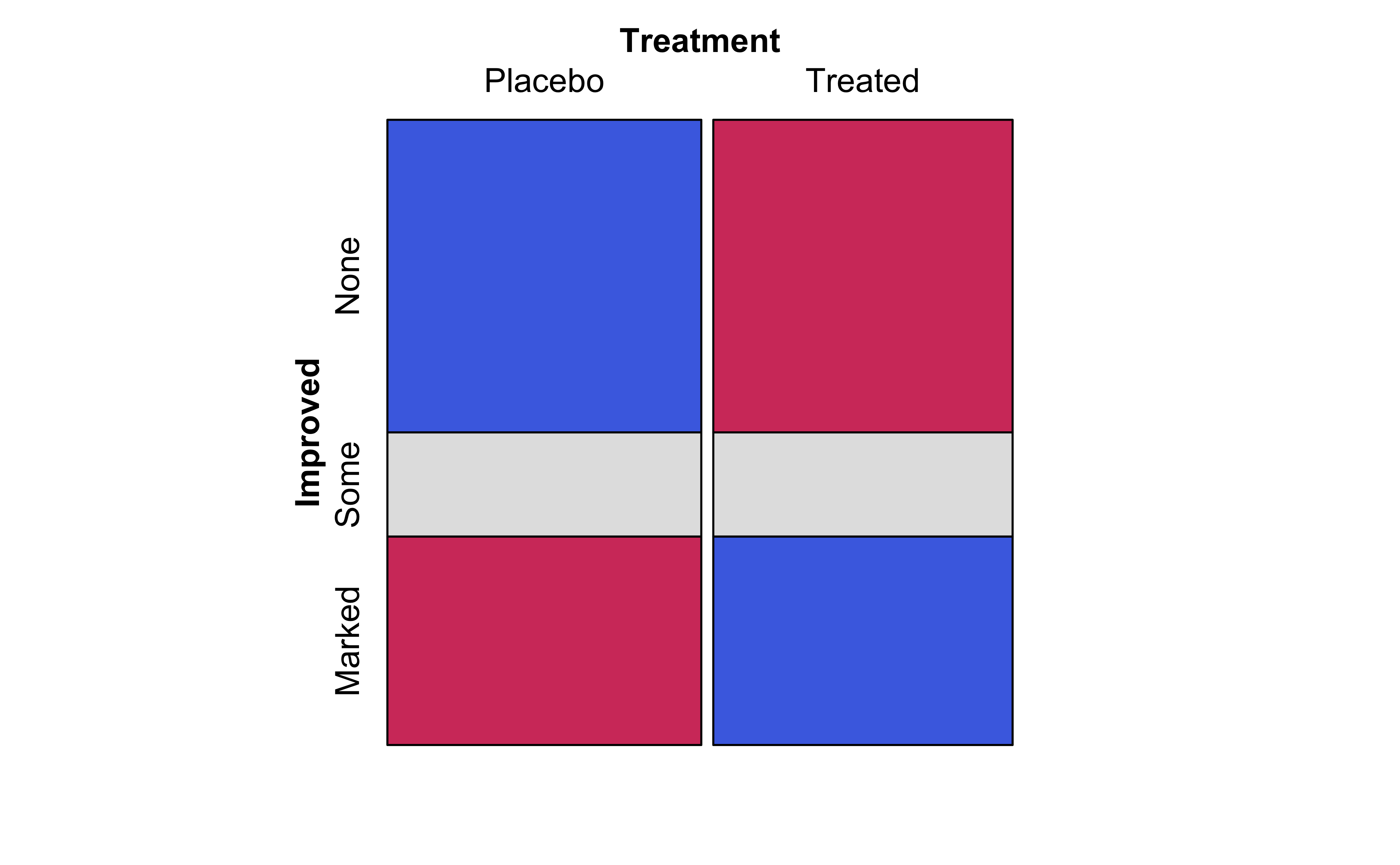
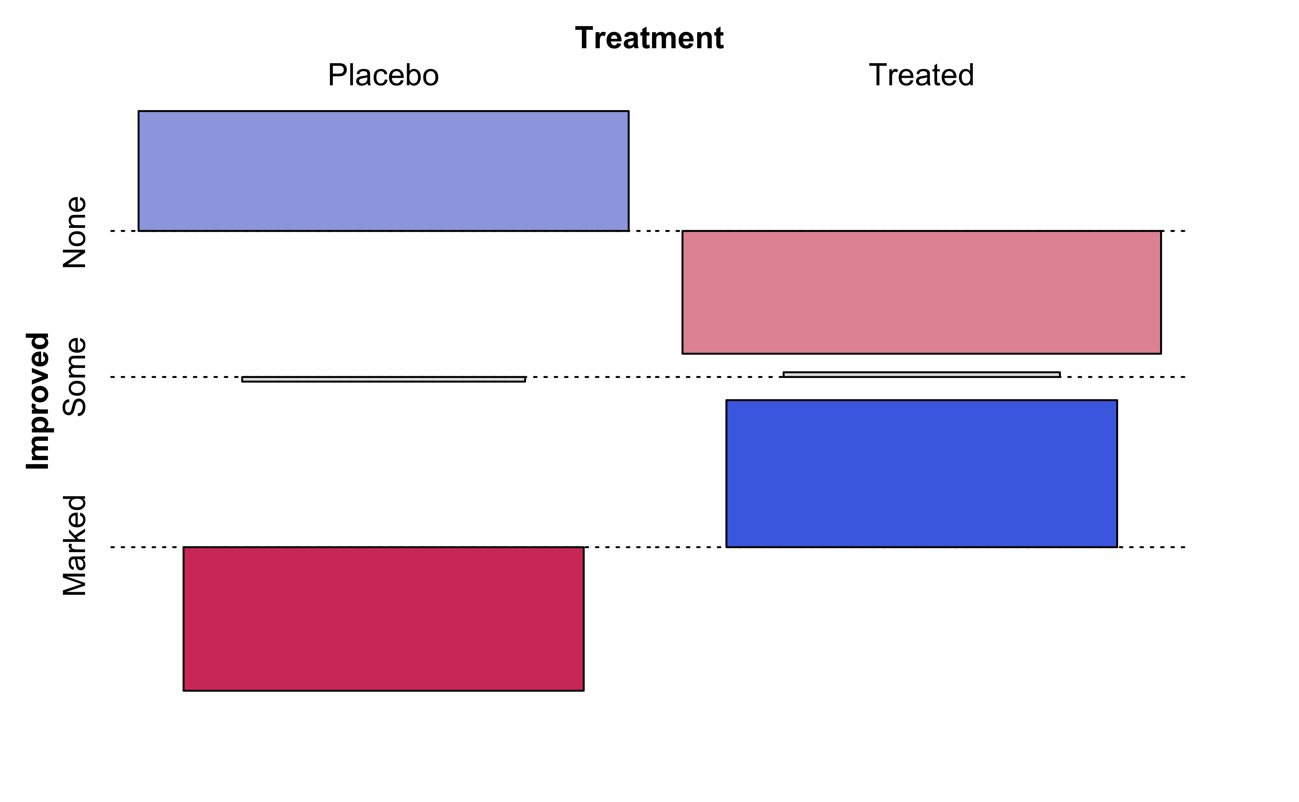
We notice that the mosaic plots have coloured some tiles blue and some red. Why was this done? Consider the set of mosaic plots below:
vcd::mosaic(Improved~Treatment, data =Arthritis, direction ="v", gp =shading_max, legend =FALSE)vcd::mosaic(Improved~Treatment, data =Arthritis, type ="expected", direction ="v", gp =shading_max, legend =FALSE)vcd::assoc(Treatment~Improved, # Note formula direction! data =Arthritis, gp =shading_max, legend =FALSE)
(a) Actual Contingency Table
(b) Expected Contingency Table
(c) Tile-Wise Differences
Figure 9: Contingency Table Plots
From an inspection of these plots, we see the (tile-wise) difference between situations when Qualitative variables are related to that when they not related.
The graph on the left Figure 9 (a) shows the mosaic plot of the actual Contingency Table.
The graph in the middle Figure 9 (b) shows a similar but fictitious plot but with the cuts neatly horizontal or vertical. This mosaic is what we would expect, if Education and the opinion on Death Penalty were independent!!
The graph on the right Figure 9 (c) shows the differences between the two plots, tile by tile.
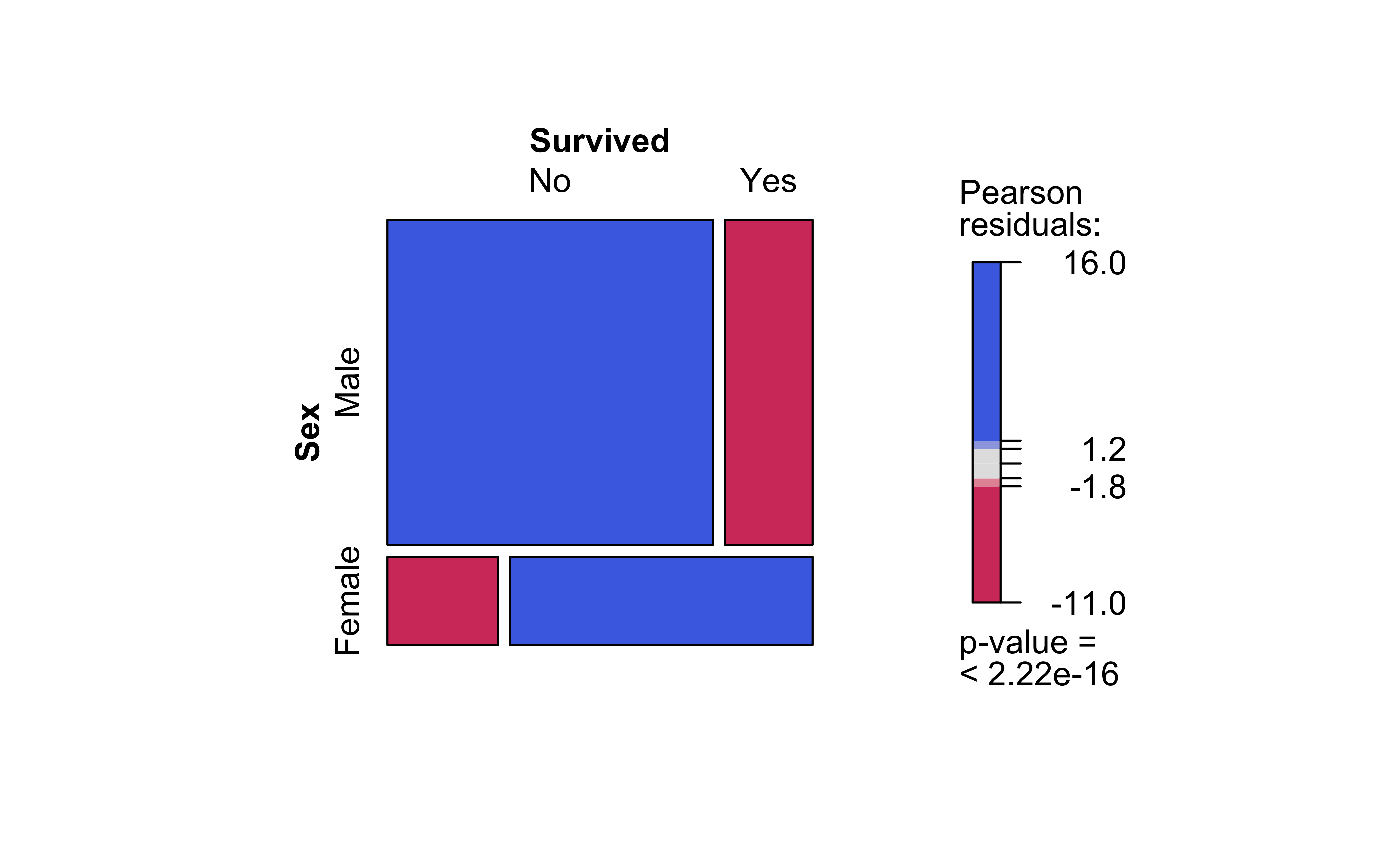
Clearly, there are differences in area of the corresponding tiles in the two mosaics, actual and expected, as shown in the graph on the right. Some differences are positive, and some negative. In the actual mosaic, Figure 9 (a), tiles with large positive differences are coloured blue, and those with large negative differences are coloured red. These are called the Pearson Residuals, and they indicate the extent to which the actual counts differ from the expected counts, if the two Qual variables were independent. The higher the absolute values of these differences, the greater the effect of one Qual on the other.
Note the huge imbalance in survived with sex: men have clearly perished in larger numbers than women. Which is why the colouring by the Pearson Residuals show large positive residuals for men who died, and large negative residuals for women who died.
So sadly Jack is far more likely to have died than Rose.
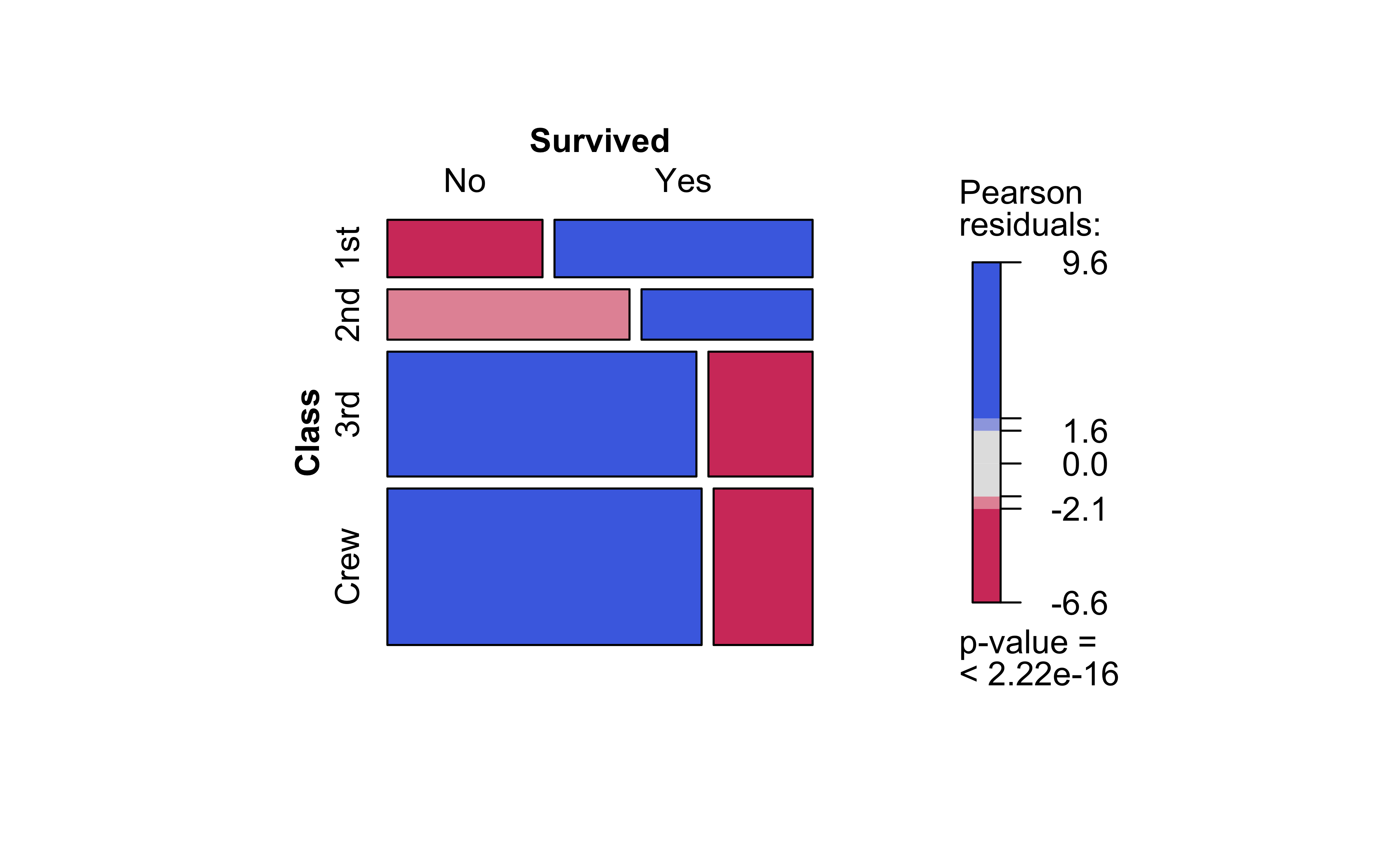
NoteQ.2. How does Survived depend upon Class?
vcd::structable(Survived~Class, data =titanic)%>%vcd::mosaic(gp =shading_max)
Crew has seen deaths in large numbers, as seen by the large negative residual for crew-survivals. First Class passengers have had speedy access to the boats and have survived in larger proportions than say second or third class. There is a large positive residual for first-class survivals.
Rose travelled first class and Jack was third class. So again the odds are stacked against him.
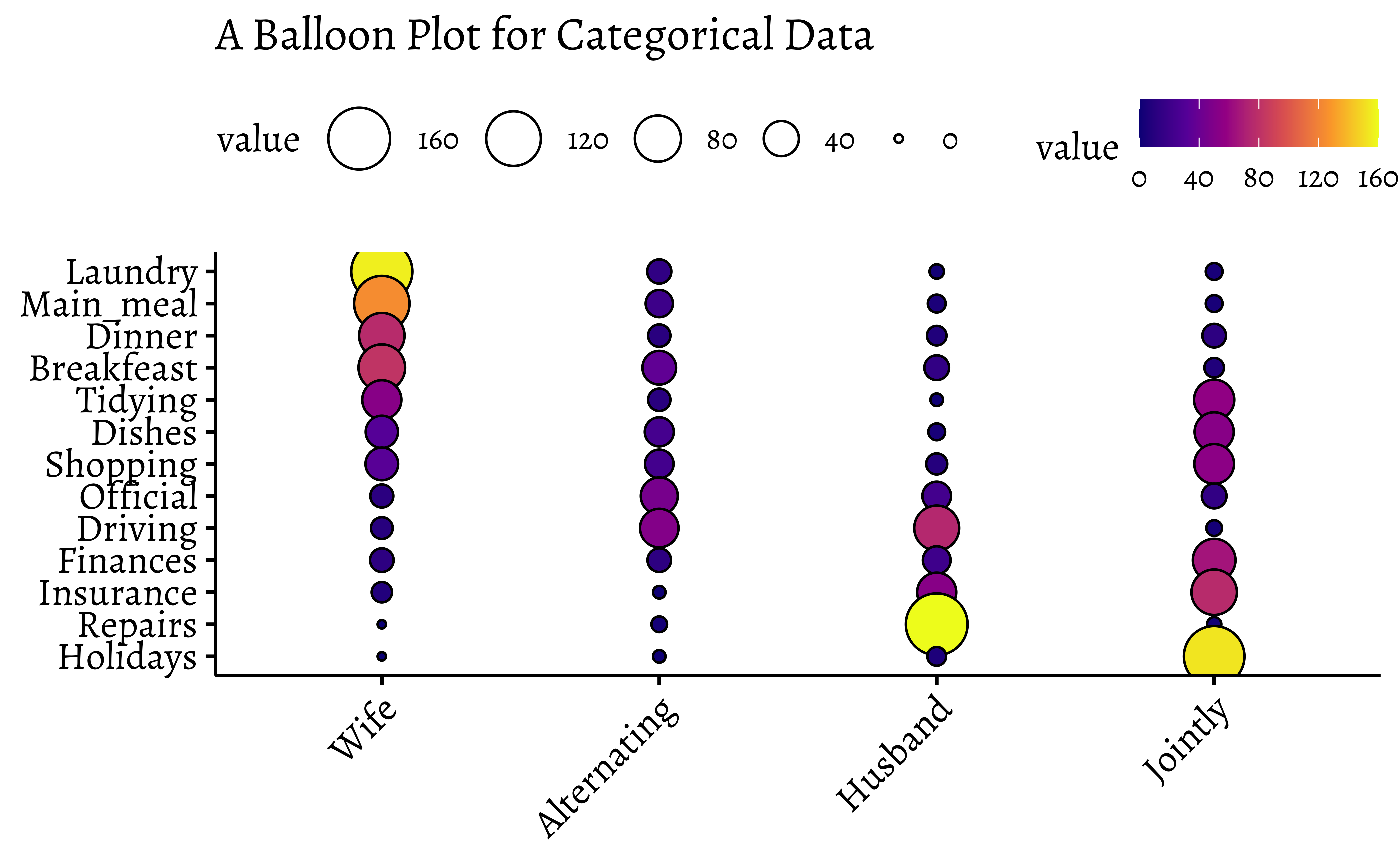
11 Balloon Plots
There is another visualization of Categorical Data, called a Balloon Plot. We will use the housetasks dataset from the package ggpubr.
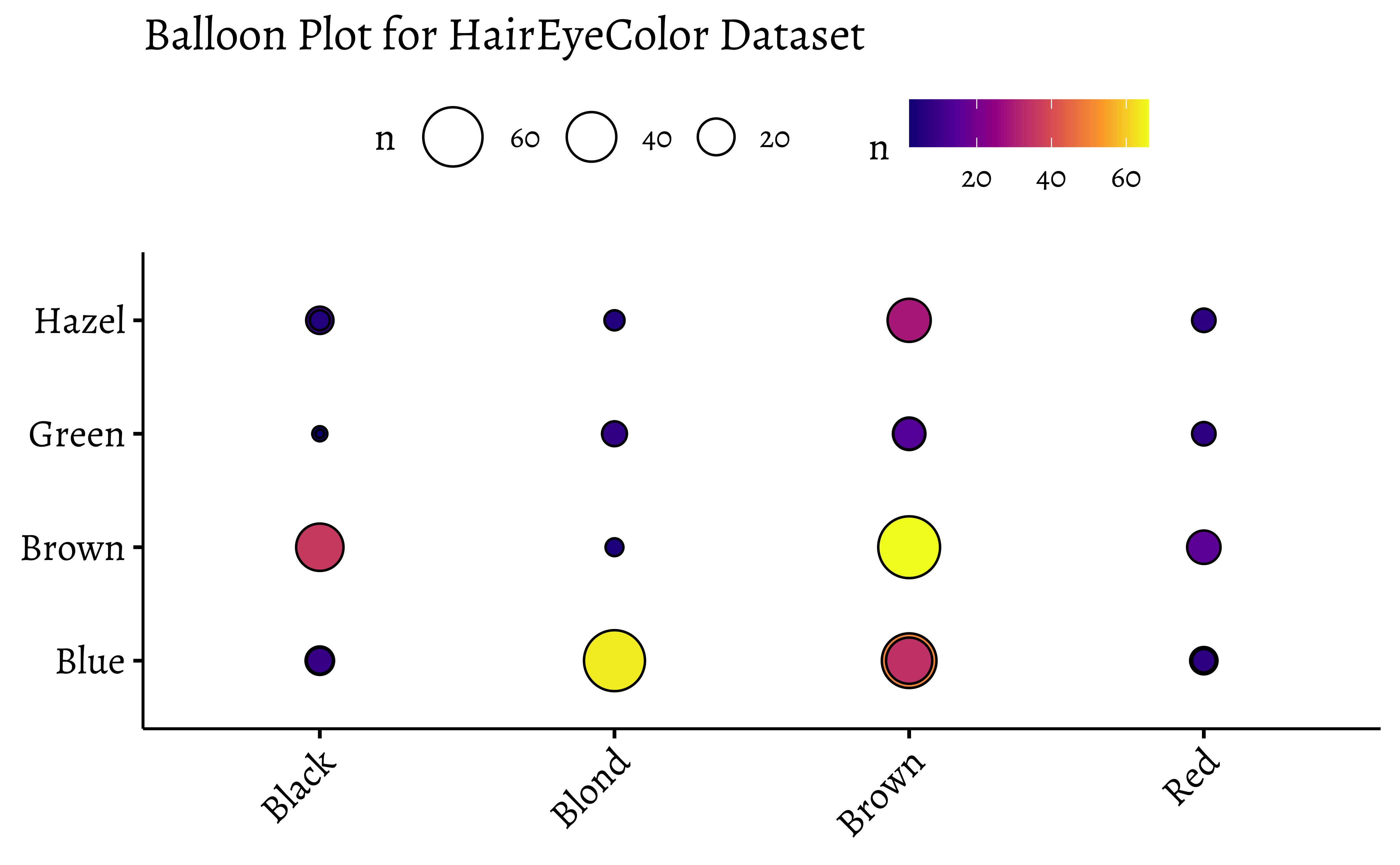
ggballoonplot(df, x ="Hair", y ="Eye", size ="n", fill ="n", ggtheme =theme_pubr(base_family ="Alegreya", base_size =14))+scale_fill_viridis_c(option ="C")+labs(title ="Balloon Plot for HairEyeColor Dataset")
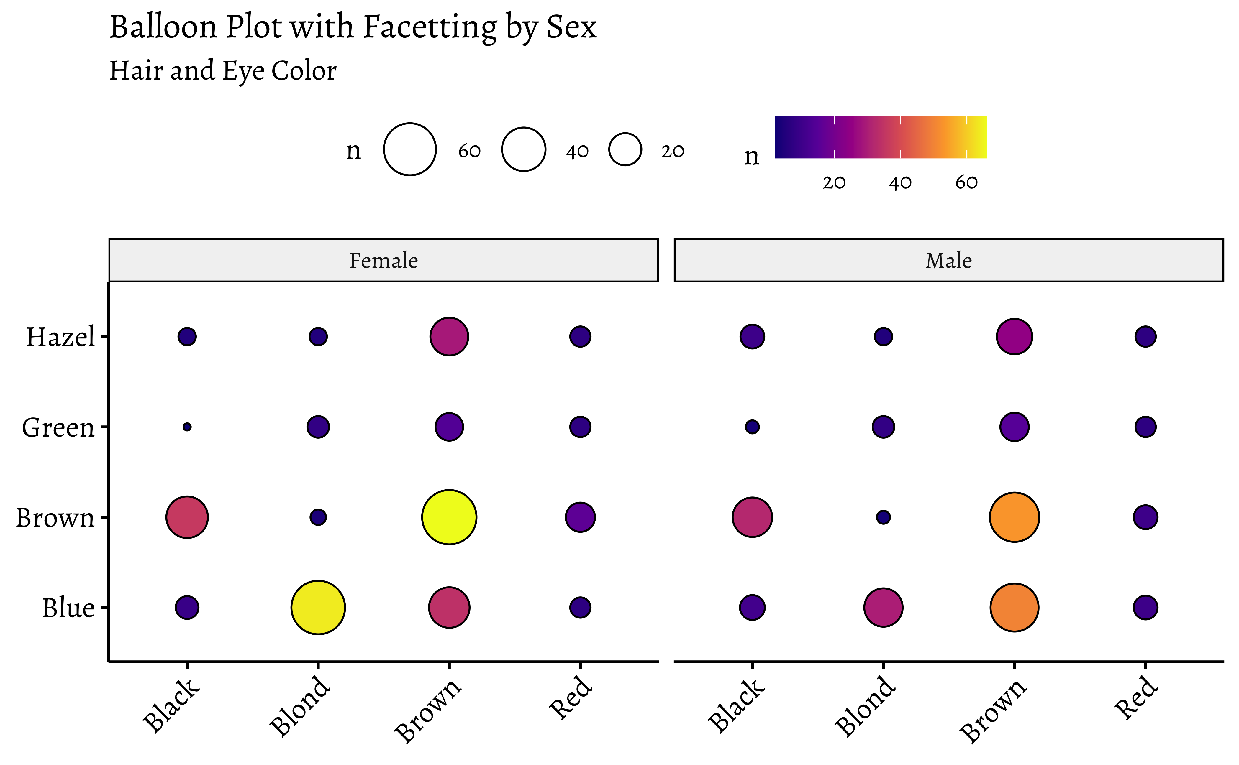
# Balloon Plot with facettingggballoonplot(df, x ="Hair", y ="Eye", size ="n", fill ="n", facet.by ="Sex", ggtheme =theme_pubr(base_family ="Alegreya"))+scale_fill_viridis_c(option ="C")+labs(title ="Balloon Plot with Facetting by Sex", subtitle ="Hair and Eye Color")
Note the somewhat different syntax with ggballoonplot: the variable names are enclosed in quotes.
Balloon Plots work because they use color and size aesthetics to represent categories and counts respectively.
You will need to justify whether the target variable is dependent upon the other Quals, and then to decide what to do about that.
13 Conclusion
How are the bar plots for categorical data different from histograms? Why don’t “regular” scatter plots simply work for Categorical data? Discuss!
There are quite a few things we can do with Qualitative/Categorical data:
Make simple bar charts with colours and facetting
Make Contingency Tables for a \(X^2\)-test
Make Mosaic Plots to show how the categories stack up
Make Balloon Charts as an alternative
Then, draw your inferences and tell the story!
14 Your Turn
Take some of the categorical datasets from the vcd and vcdExtra packages and recreate the plots from this module. Go to https://vincentarelbundock.github.io/Rdatasets/articles/data.html and type “vcd” in the search box. You can directly load CSV files from there, using read_csv("url-to-csv").
Try the housetasks dataset that we used for Balloon Plots, to create a mosaic plot with Pearson Residuals.
Are first names a basis for racial discrimination, in the US?
This dataset was generated as part of a landmark research study done by Marianne Bertrand and Senthil Mullainathan. Read the description therein to really understand how you can prove causality with a well-crafted research experiment.
15 AI Generated Summary and Podcast
This module focuses on the importance of understanding and visualizing categorical data. It discusses different ways to represent categorical data in R, including case data, frequency data, and cross-tabular count data. The text also explores various visualization techniques like bar plots, pie charts, mosaic plots, and balloon plots. It emphasizes the use of contingency tables for analyzing relationships between categorical variables, illustrating how to create them and visualize them using R packages. Additionally, the text delves into the concept of Pearson residuals, which help to identify associations between categorical variables and highlight deviations from independence.
Michael Friendly, Corrgrams: Exploratory displays for correlation matrices. The American Statistician August 19, 2002 (v1.5). https://www.datavis.ca/papers/corrgram.pdf
H. Riedwyl & M. Schüpbach (1994), Parquet diagram to plot contingency tables. In F. Faulbaum (ed.), Softstat ’93: Advances in Statistical Software, 293–299. Gustav Fischer, New York.
Arel-Bundock, Vincent. 2026. tinytable: Simple and Configurable Tables in “HTML,”“LaTeX,”“Markdown,”“Word,”“PNG,”“PDF,” and “Typst” Formats. https://doi.org/10.32614/CRAN.package.tinytable.
Jeppson, Haley, and Heike Hofmann. 2023. “The r Journal: Generalized Mosaic Plots in the Ggplot2 Framework.”The R Journal 14 (4): 50–78. https://doi.org/10.32614/RJ-2023-013.
Meyer, David, Achim Zeileis, and Kurt Hornik. 2006. “The Strucplot Framework: Visualizing Multi-Way Contingency Tables with Vcd.”Journal of Statistical Software 17 (3): 1–48. https://doi.org/10.18637/jss.v017.i03.
Zeileis, Achim, David Meyer, and Kurt Hornik. 2007. “Residual-Based Shadings for Visualizing (Conditional) Independence.”Journal of Computational and Graphical Statistics 16 (3): 507–25. https://doi.org/10.1198/106186007X237856.