library(tidyverse) # For tidy data processing and plotting
library(lubridate) # Deal with dates

library(mosaic) # Out go to package for everything

library(fpp3) # Robert Hyndman's time series analysis package
library(timetk) # Convert data frames to time series-specific objects
library(forecast) # Make forecasts and decompose time series

# devtools::install_github("FinYang/tsdl")
library(tsdl) # Time Series Data Library from Rob HyndmanAnalysis of Time Series in R
1
Plot Fonts and Theme
Show the Code
library(systemfonts)
library(showtext)
## Clean the slate
systemfonts::clear_local_fonts()
systemfonts::clear_registry()
##
showtext_opts(dpi = 96) # set DPI for showtext
sysfonts::font_add(
  family = "Alegreya",
  regular = "../../../../../../../../fonts/Alegreya-Regular.ttf",
  bold = "../../../../../../../../fonts/Alegreya-Bold.ttf",
  italic = "../../../../../../../../fonts/Alegreya-Italic.ttf",
  bolditalic = "../../../../../../../../fonts/Alegreya-BoldItalic.ttf"
)

sysfonts::font_add(
  family = "Roboto Condensed",
  regular = "../../../../../../../../fonts/RobotoCondensed-Regular.ttf",
  bold = "../../../../../../../../fonts/RobotoCondensed-Bold.ttf",
  italic = "../../../../../../../../fonts/RobotoCondensed-Italic.ttf",
  bolditalic = "../../../../../../../../fonts/RobotoCondensed-BoldItalic.ttf"
)
showtext_auto(enable = TRUE) # enable showtext
##
theme_custom <- function() {
  theme_bw(base_size = 10) +

    # theme(panel.widths = unit(11, "cm"),
    #       panel.heights = unit(6.79, "cm")) + # Golden Ratio

    theme(
      plot.margin = margin_auto(t = 1, r = 2, b = 1, l = 1, unit = "cm"),
      plot.background = element_rect(
        fill = "bisque",
        colour = "black",
        linewidth = 1
      )
    ) +

    theme_sub_axis(
      title = element_text(
        family = "Roboto Condensed",
        size = 10
      ),
      text = element_text(
        family = "Roboto Condensed",
        size = 8
      )
    ) +

    theme_sub_legend(
      text = element_text(
        family = "Roboto Condensed",
        size = 6
      ),
      title = element_text(
        family = "Alegreya",
        size = 8
      )
    ) +

    theme_sub_plot(
      title = element_text(
        family = "Alegreya",
        size = 14, face = "bold"
      ),
      title.position = "plot",
      subtitle = element_text(
        family = "Alegreya",
        size = 10
      ),
      caption = element_text(
        family = "Alegreya",
        size = 6
      ),
      caption.position = "plot"
    )
}

## Use available fonts in ggplot text geoms too!
ggplot2::update_geom_defaults(geom = "text", new = list(
  family = "Roboto Condensed",
  face = "plain",
  size = 3.5,
  color = "#2b2b2b"
))
ggplot2::update_geom_defaults(geom = "label", new = list(
  family = "Roboto Condensed",
  face = "plain",
  size = 3.5,
  color = "#2b2b2b"
))

ggplot2::update_geom_defaults(geom = "marquee", new = list(
  family = "Roboto Condensed",
  face = "plain",
  size = 3.5,
  color = "#2b2b2b"
))
ggplot2::update_geom_defaults(geom = "text_repel", new = list(
  family = "Roboto Condensed",
  face = "plain",
  size = 3.5,
  color = "#2b2b2b"
))
ggplot2::update_geom_defaults(geom = "label_repel", new = list(
  family = "Roboto Condensed",
  face = "plain",
  size = 3.5,
  color = "#2b2b2b"
))

## Set the theme
ggplot2::theme_set(new = theme_custom())

## tinytable options
options("tinytable_tt_digits" = 2)
options("tinytable_format_num_fmt" = "significant_cell")
options(tinytable_html_mathjax = TRUE)


## Set defaults for flextable
flextable::set_flextable_defaults(font.family = "Roboto Condensed")
2
We have seen how to plot different formats of time series, and how to create summary plots using packages like tsibble and timetk.
We will now see how a time series can be broken down to its components so as to systematically understand and analyze it. Thereafter, we examine how to model the timeseries, and make forecasts, a task more like synthesis.
We have to begin by answering fundamental questions such as:
- What are the types of time series?
- How does one process and analyze time series data?
- How does one plot time series?
- How to decompose it? How to extract a level, a trend, and seasonal components from a time series?
- What is auto correlation etc.
- What is a stationary time series?
3 timetk
Let us inspect what datasets are available in the package timetk. Type data(package = "timetk") in your Console to see what datasets are available.
Let us choose the Walmart Sales dataset. See here for more details: Walmart Recruiting - Store Sales Forecasting |Kaggle
glimpse(walmart_sales_weekly)
# Try this in your Console
# help("walmart_sales_weekly")
Rows: 1,001
Columns: 17
$ id <fct> 1_1, 1_1, 1_1, 1_1, 1_1, 1_1, 1_1, 1_1, 1_1, 1_1, 1_1, 1_…
$ Store <dbl> 1, 1, 1, 1, 1, 1, 1, 1, 1, 1, 1, 1, 1, 1, 1, 1, 1, 1, 1, …
$ Dept <dbl> 1, 1, 1, 1, 1, 1, 1, 1, 1, 1, 1, 1, 1, 1, 1, 1, 1, 1, 1, …
$ Date <date> 2010-02-05, 2010-02-12, 2010-02-19, 2010-02-26, 2010-03-…
$ Weekly_Sales <dbl> 24924.50, 46039.49, 41595.55, 19403.54, 21827.90, 21043.3…
$ IsHoliday <lgl> FALSE, TRUE, FALSE, FALSE, FALSE, FALSE, FALSE, FALSE, FA…
$ Type <chr> "A", "A", "A", "A", "A", "A", "A", "A", "A", "A", "A", "A…
$ Size <dbl> 151315, 151315, 151315, 151315, 151315, 151315, 151315, 1…
$ Temperature <dbl> 42.31, 38.51, 39.93, 46.63, 46.50, 57.79, 54.58, 51.45, 6…
$ Fuel_Price <dbl> 2.572, 2.548, 2.514, 2.561, 2.625, 2.667, 2.720, 2.732, 2…
$ MarkDown1 <dbl> NA, NA, NA, NA, NA, NA, NA, NA, NA, NA, NA, NA, NA, NA, N…
$ MarkDown2 <dbl> NA, NA, NA, NA, NA, NA, NA, NA, NA, NA, NA, NA, NA, NA, N…
$ MarkDown3 <dbl> NA, NA, NA, NA, NA, NA, NA, NA, NA, NA, NA, NA, NA, NA, N…
$ MarkDown4 <dbl> NA, NA, NA, NA, NA, NA, NA, NA, NA, NA, NA, NA, NA, NA, N…
$ MarkDown5 <dbl> NA, NA, NA, NA, NA, NA, NA, NA, NA, NA, NA, NA, NA, NA, N…
$ CPI <dbl> 211.0964, 211.2422, 211.2891, 211.3196, 211.3501, 211.380…
$ Unemployment <dbl> 8.106, 8.106, 8.106, 8.106, 8.106, 8.106, 8.106, 8.106, 7…The data is described as:
A tibble: 9,743 x 3
idFactor. Unique series identifier (4 total)StoreNumeric. Store ID.DeptNumeric. Department ID.DateDate. Weekly timestamp.Weekly_SalesNumeric. Sales for the given department in the given store.IsHolidayLogical. Whether the week is a “special” holiday for the store.TypeCharacter. Type identifier of the store.SizeNumeric. Store square-footageTemperatureNumeric. Average temperature in the region.Fuel_PriceNumeric. Cost of fuel in the region.MarkDown1, MarkDown2, MarkDown3, MarkDown4, MarkDown5Numeric. Anonymized data related to promotional markdowns that Walmart is running. MarkDown data is only available after Nov 2011, and is not available for all stores all the time. Any missing value is marked with an NA.CPINumeric. The consumer price index.UnemploymentNumeric. The unemployment rate in the region.
Very cool to know that dplyr::glimpse() identifies date variables separately!
NoteNot yet a time series!
This is still a tibble, with a time-oriented variable of course, but not yet a time-series object. The data frame has the YMD columns repeated for each Dept, giving us what is called “long” form data. To deal with this repetition, we will always need to split the Weekly_Sales by the Dept column before we plot or analyze.
#|label: walmart sales tsibble
walmart_tsibble <-
  walmart_sales_weekly %>%
  as_tsibble(
    index = Date, # Time Variable
    key = c(id, Store, Dept, Type)
  )

#  Identifies unique "subject" who are measures
#  All other variables such as Weekly_sales become "measured variable"
#  Each observation should be uniquely identified by index and key
walmart_tsibble
3.1
The easiest way is to use autoplot from the feasts package. You may need to specify the actual measured variable, if there is more than one numerical column:
timetk gives us interactive plots that may be more evocative than the static plot above. The basic plot function with timetk is plot_time_series. There are arguments for the date variable, the value you want to plot, colours, groupings etc.
Let us explore this dataset using timetk, using our trusted method of asking Questions:
Note
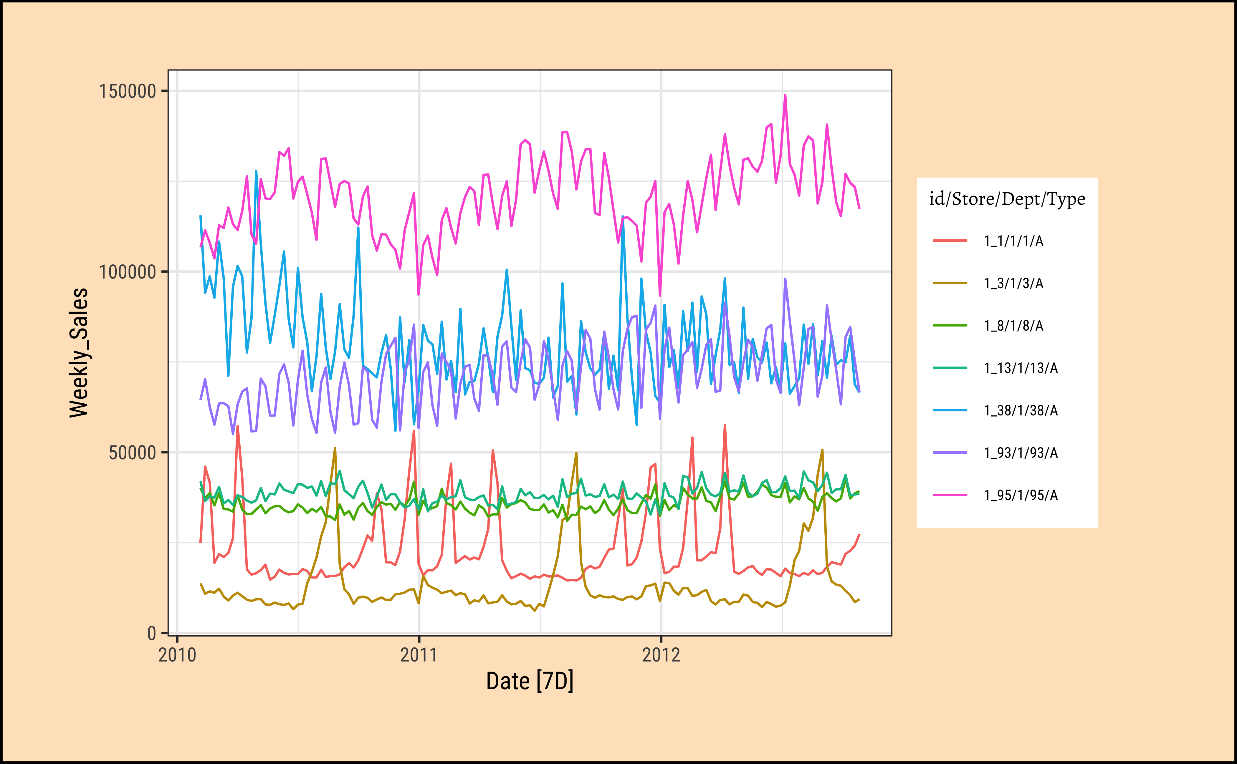
Q.1 How are the weekly sales different for each Department?
There are 7 number of Departments. So we should be fine plotting them and also facetting with them, as we will see in a bit:
walmart_tsibble %>%
  timetk::plot_time_series(
    .date_var = Date,
    .value = Weekly_Sales,
    .color_var = Dept,
    .legend_show = TRUE,
    .title = "Walmart Sales Data by Department",
    .smooth = FALSE
  )
Note
Q.2. What do the sales per Dept look like during the month of December (Christmas time) in 2012? Show the individual Depts as facets.
We can of course zoom into the interactive plot above, but if we were to plot it anyway:
# Only include rows from  1 to December 31, 2011
# Data goes only up to Oct 2012

walmart_tsibble %>%
  # Each side of the time_formula is specified as the character 'YYYY-MM-DD HH:MM:SS',
  timetk::filter_by_time(
    .date_var = Date,
    .start_date = "2011-12-01",
    .end_date = "2011-12-31"
  ) %>%
  plot_time_series(
    .date_var = Date,
    .value = Weekly_Sales,
    .color_var = Dept,
    .facet_vars = Dept,
    .facet_ncol = 2,
    .smooth = FALSE
  ) # Only 4 points per graph
Clearly the “unfortunate” Dept#13 has seen something of a Christmas drop in sales, as has Dept#38 ! The rest, all is well, it seems…
3.2
Note
Q.3 How do we smooth out some of the variations in the time series to be able to understand it better?
Sometimes there is too much noise in the time series observations and we want to take what is called a rolling average. For this we will use the function timetk::slidify to create an averaging function of our choice, and then apply it to the time series using regular dplyr::mutate
# Let's take the average of Sales for each month in each Department.
# Our **function** will be named "rolling_avg_month":

rolling_avg_month <- timetk::slidify(
  .period = 4, # every 4 weeks
  .f = mean, # The function to use
  .align = "center", # Aligned with middle of month
  .partial = TRUE
) # To catch any leftover half weeks
rolling_avg_month
function (...)
{
slider_2(..., .slider_fun = slider::pslide, .f = .f, .period = .period,
.align = .align, .partial = .partial, .unlist = .unlist)
}
<bytecode: 0x7f52305f0>
<environment: 0x7f5235bd0>OK, slidify creates a function! Let’s apply it to the Walmart Sales time series…
walmart_tsibble %>%
  # group_by(Dept) %>% # Is this needed?
  mutate(avg_monthly_sales = rolling_avg_month(Weekly_Sales)) %>%
  # ungroup() %>% # Is this needed?
  timetk::plot_time_series(Date, avg_monthly_sales,
    .color_var = Dept, # Does the grouping!
    .smooth = FALSE
  )
Curves are smoother now. Need to check whether the averaging was done on a per-Dept basis…should we have had a group_by(Dept) before the averaging, and ungroup() before plotting? Try it !!
3.3
Each data point (\(Y_t\)) at time \(t\) in a Time Series can be expressed as either a sum or a product of 4 components, namely, Seasonality(\(S_t\)), Trend(\(T_t\)), Cyclic, and Error(\(e_t\)) (a.k.a White Noise).
- Trend: pattern exists when there is a long-term increase or decrease in the data.
- Seasonal: pattern exists when a series is influenced by seasonal factors (e.g., the quarter of the year, the month, or day of the week).
- Cyclic: pattern exists when data exhibit rises and falls that are not of fixed period (duration usually of at least 2 years). Often combined with Trend into “Trend-Cycle”.
- Error or Noise: Random component
When data is non-seasonal this means breaking it up into only trend and irregular components. To estimate the trend component of a non-seasonal time series that can be described using an additive model, it is common to use a smoothing method, such as calculating the simple moving average of the time series.
timetk has the ability to achieve this: Let us plot the trend, seasonal, cyclic and irregular aspects of Weekly_Sales for Dept 38:
walmart_tsibble %>%
  filter(Dept == "38") %>%
  timetk::plot_stl_diagnostics(
    .data = .,
    .date_var = Date,
    .value = Weekly_Sales
  )
We can do this for all Depts using fable and fabletools:
# Set graph theme
theme_set(new = theme_custom())
##
walmart_decomposed <-
  walmart_tsibble %>%
  # If we want to filter, we do it here
  # filter(Dept == "38") %>%
  #

  fabletools::model(stl = STL(Weekly_Sales))

fabletools::components(walmart_decomposed)feasts::autoplot(components((walmart_decomposed)))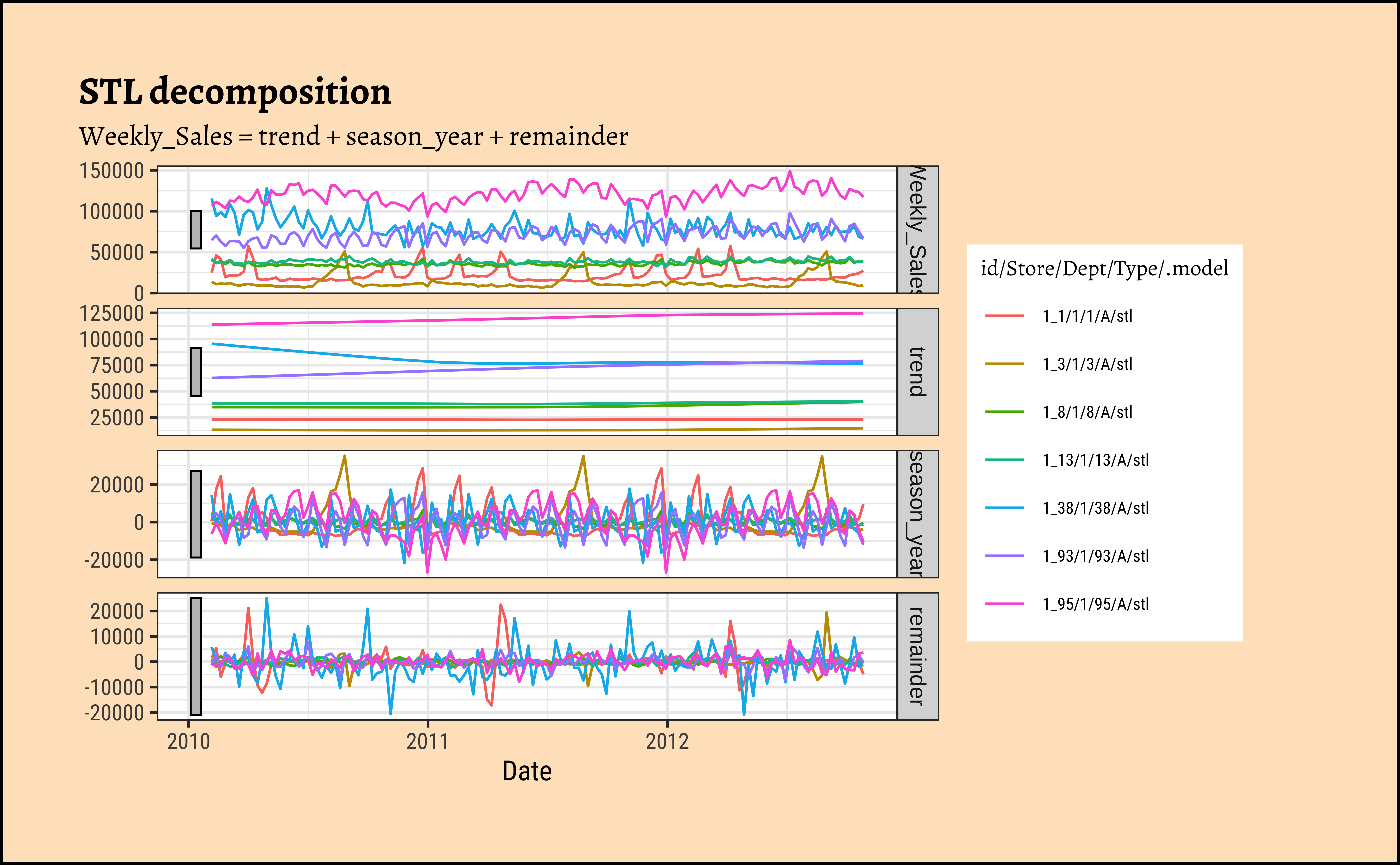
4 nycflights13
Let us try the flights dataset from the package nycflights13. Try data(package = "nycflights13") in your Console.
We have the following datasets in the nycflights13 package:
-
airlinesAirline names. -
airportsAirport metadata -
flightsFlights data -
planesPlane metadata. -
weatherHourly weather data
Let us analyze the flights data:
Rows: 336,776
Columns: 19
$ year           <int> 2013, 2013, 2013, 2013, 2013, 2013, 2013, 2013, 2013, 2…
$ month          <int> 1, 1, 1, 1, 1, 1, 1, 1, 1, 1, 1, 1, 1, 1, 1, 1, 1, 1, 1…
$ day            <int> 1, 1, 1, 1, 1, 1, 1, 1, 1, 1, 1, 1, 1, 1, 1, 1, 1, 1, 1…
$ dep_time       <int> 517, 533, 542, 544, 554, 554, 555, 557, 557, 558, 558, …
$ sched_dep_time <int> 515, 529, 540, 545, 600, 558, 600, 600, 600, 600, 600, …
$ dep_delay      <dbl> 2, 4, 2, -1, -6, -4, -5, -3, -3, -2, -2, -2, -2, -2, -1…
$ arr_time       <int> 830, 850, 923, 1004, 812, 740, 913, 709, 838, 753, 849,…
$ sched_arr_time <int> 819, 830, 850, 1022, 837, 728, 854, 723, 846, 745, 851,…
$ arr_delay      <dbl> 11, 20, 33, -18, -25, 12, 19, -14, -8, 8, -2, -3, 7, -1…
$ carrier        <chr> "UA", "UA", "AA", "B6", "DL", "UA", "B6", "EV", "B6", "…
$ flight         <int> 1545, 1714, 1141, 725, 461, 1696, 507, 5708, 79, 301, 4…
$ tailnum        <chr> "N14228", "N24211", "N619AA", "N804JB", "N668DN", "N394…
$ origin         <chr> "EWR", "LGA", "JFK", "JFK", "LGA", "EWR", "EWR", "LGA",…
$ dest           <chr> "IAH", "IAH", "MIA", "BQN", "ATL", "ORD", "FLL", "IAD",…
$ air_time       <dbl> 227, 227, 160, 183, 116, 150, 158, 53, 140, 138, 149, 1…
$ distance       <dbl> 1400, 1416, 1089, 1576, 762, 719, 1065, 229, 944, 733, …
$ hour           <dbl> 5, 5, 5, 5, 6, 5, 6, 6, 6, 6, 6, 6, 6, 6, 6, 5, 6, 6, 6…
$ minute         <dbl> 15, 29, 40, 45, 0, 58, 0, 0, 0, 0, 0, 0, 0, 0, 0, 59, 0…
$ time_hour <dttm> 2013-01-01 05:00:00, 2013-01-01 05:00:00, 2013-01-01 0…mosaic::inspect(flights)
categorical variables:
     name     class levels      n missing
1 carrier character     16 336776       0
2 tailnum character   4043 334264    2512
3  origin character      3 336776       0
4    dest character    105 336776       0
                                   distribution
1 UA (17.4%), B6 (16.2%), EV (16.1%) ...
2 N725MQ (0.2%), N722MQ (0.2%) ...
3 EWR (35.9%), JFK (33%), LGA (31.1%)
4 ORD (5.1%), ATL (5.1%), LAX (4.8%) ...

quantitative variables:
             name   class  min   Q1 median   Q3  max        mean          sd
1            year integer 2013 2013   2013 2013 2013 2013.000000    0.000000
2           month integer    1    4      7   10   12    6.548510    3.414457
3             day integer    1    8     16   23   31   15.710787    8.768607
4        dep_time integer    1  907   1401 1744 2400 1349.109947  488.281791
5  sched_dep_time integer  106  906   1359 1729 2359 1344.254840  467.335756
6       dep_delay numeric  -43   -5     -2   11 1301   12.639070   40.210061
7        arr_time integer    1 1104   1535 1940 2400 1502.054999  533.264132
8  sched_arr_time integer    1 1124   1556 1945 2359 1536.380220  497.457142
9       arr_delay numeric  -86  -17     -5   14 1272    6.895377   44.633292
10         flight integer    1  553   1496 3465 8500 1971.923620 1632.471938
11       air_time numeric   20   82    129  192  695  150.686460   93.688305
12       distance numeric   17  502    872 1389 4983 1039.912604  733.233033
13           hour numeric    1    9     13   17   23   13.180247    4.661316
14         minute numeric    0    8     29   44   59   26.230100   19.300846
        n missing
1  336776       0
2  336776       0
3  336776       0
4  328521    8255
5  336776       0
6  328521    8255
7  328063    8713
8  336776       0
9  327346    9430
10 336776       0
11 327346    9430
12 336776       0
13 336776       0
14 336776       0

time variables:
       name   class               first                last min_diff   max_diff
1 time_hour POSIXct 2013-01-01 05:00:00 2013-12-31 23:00:00   0 secs 25200 secs
       n missing
1 336776       0
We have time-related columns; Apart from year, month, day we have time_hour; and time-event numerical data such as arr_delay (arrival delay) and dep_delay (departure delay). We also have categorical data such as carrier, origin, dest, flight and tailnum of the aircraft. It is also a large dataset containing 330K entries. Enough to play with!!
Let us replace the NAs in arr_delay and dep_delay with zeroes for now, and convert it into a time-series object with tsibble:
flights_delay_ts <- flights %>%
  mutate(
    arr_delay = replace_na(arr_delay, 0),
    dep_delay = replace_na(dep_delay, 0)
  ) %>%
  select(
    time_hour, arr_delay, dep_delay,
    carrier, origin, dest,
    flight, tailnum
  ) %>%
  tsibble::as_tsibble(
    index = time_hour,
    # All the remaining identify unique entries
    # Along with index
    # Many of these variables are common
    # Need *all* to make unique entries!
    key = c(carrier, origin, dest, flight, tailnum),
    validate = TRUE
  ) # Making sure each entry is unique


flights_delay_ts
Note
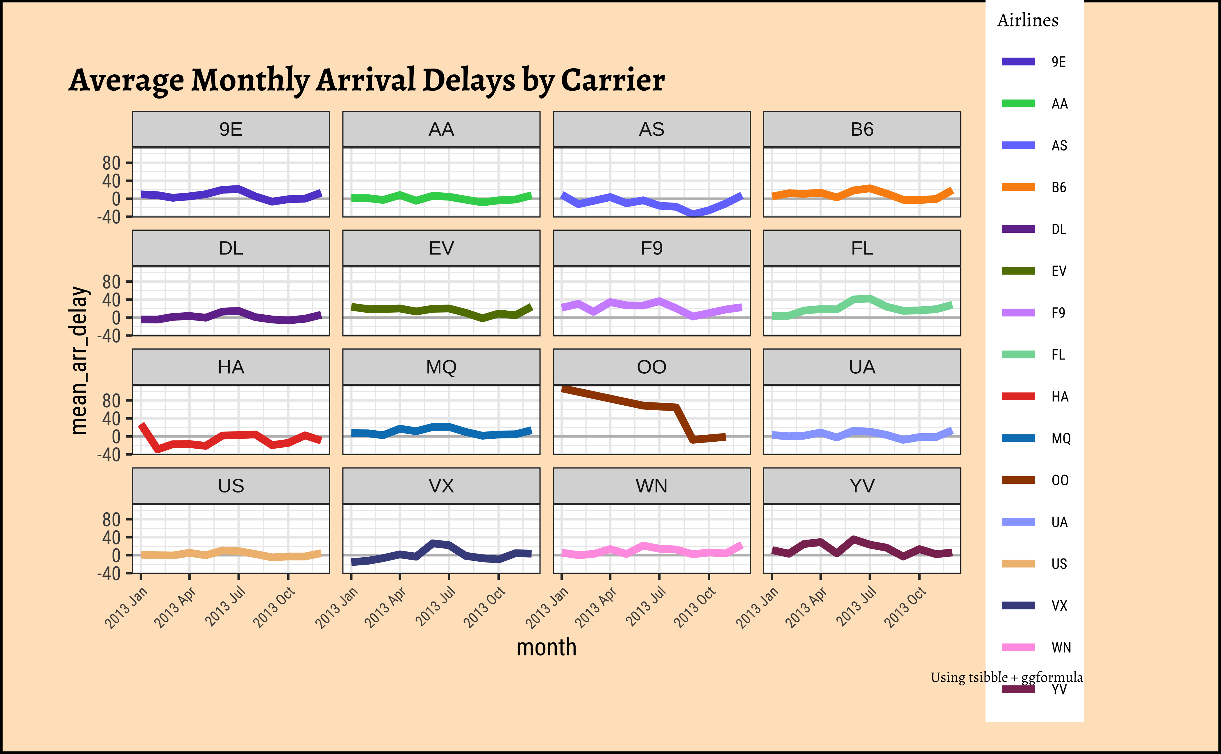
Q.1. Plot the monthly average arrival delay by carrier
# Set graph theme
theme_set(new = theme_custom())
#
mean_arr_delays_by_carrier <-
  flights_delay_ts %>%
  group_by(carrier) %>%
  index_by(month = ~ yearmonth(.)) %>%
  # index_by uses (year, yearquarter, yearmonth, yearweek, as.Date)
  # to create a new column to show the time-grouping
  # year / quarter / month/ week, or day...
  # which IS different from traditional dplyr

  summarise(
    mean_arr_delay =
      mean(arr_delay, na.rm = TRUE)
  )

mean_arr_delays_by_carrier
# colours from the "I want Hue" website
colour_values <- c(
  "#634bd1", "#35d25a", "#757bff", "#fa9011", "#72369a",
  "#617d00", "#d094ff", "#81d8a4", "#e63d2d", "#0080c0",
  "#9e4500", "#98a9ff", "#efbd7f", "#474e8c", "#ffa1e4",
  "#8a3261", "#a6c1f8", "#a16e96"
)

# Plotting with ggformula
mean_arr_delays_by_carrier %>%
  gf_hline(yintercept = 0, color = "grey") %>%
  gf_line(
    mean_arr_delay ~ month,
    group = ~carrier,
    color = ~carrier,
    linewidth = 1.5,
    title = "Average Monthly Arrival Delays by Carrier",
    caption = "Using tsibble + ggformula"
  ) %>%
  gf_facet_wrap(vars(carrier), nrow = 4) %>%
  gf_refine(scale_color_manual(
    name = "Airlines",
    values = colour_values
  )) %>%
  gf_theme(theme(axis.text.x = element_text(
    angle = 45,
    hjust = 1,
    size = 6
  )))
mean_arr_delays_by_carrier2 <-
  flights_delay_ts %>%
  as_tibble() %>%
  group_by(carrier) %>%
  # summarize_by_time REQUIRES a tibble
  # Cannot do this with a tsibble
  timetk::summarise_by_time(
    .date_var = time_hour,
    .by = "month",
    mean_arr_delay = mean(arr_delay)
  )


mean_arr_delays_by_carrier2
colour_values <- c(
  "#634bd1", "#35d25a", "#757bff", "#fa9011", "#72369a",
  "#617d00", "#d094ff", "#81d8a4", "#e63d2d", "#0080c0",
  "#9e4500", "#98a9ff", "#efbd7f", "#474e8c", "#ffa1e4",
  "#8a3261", "#a6c1f8", "#a16e96"
)
p <- mean_arr_delays_by_carrier2 %>%
  timetk::plot_time_series(
    # .data = .,
    .date_var = time_hour, # no change to time variable name!
    .value = mean_arr_delay,
    .color_var = carrier,
    .facet_vars = carrier,
    .smooth = FALSE,
    # .smooth_degree = 1,
    # keep .smooth off since it throws warnings if there are too few points
    # Like if we do quarterly or even yearly summaries
    # Use only for smaller values of .smooth_degree (0,1)
    .interactive = FALSE, .line_size = 2,
    .facet_ncol = 4, .legend_show = FALSE, .facet_scales = "fixed",
    .title = "Average Monthly Arrival Delays by Carrier",
    .y_lab = "Arrival Delays over Time", .x_lab = "Time"
  ) +
  geom_hline(yintercept = 0, color = "grey") +
  scale_colour_manual(
    name = "Airline",
    values = colour_values
  ) +
  theme_classic() +
  theme(axis.text.x = element_text(angle = 45, hjust = 1)) +
  labs(caption = "Using timetk")

# Reverse the layers in the plot
# Zero line BELOW, time series above
# https://stackoverflow.com/questions/20249653/insert-layer-underneath-existing-layers-in-ggplot2-object

p$layers <- rev(p$layers)
p
Insights: - Clearly airline OO has had some serious arrival delay problems in the first half of 2013… - most other delays are around the zero-line, with some variations in both directions
Note
Q.2. Plot a candlestick chart for total flight delays for a particular month for each origin across airlines!
# Set graph theme
theme_set(new = theme_custom())
##
flights_delay_ts %>%
  mutate(
    total_delay = arr_delay + dep_delay,
    month = lubridate::month(time_hour,
      # Makes ordinal factor with month labels
      label = TRUE
    )
  ) %>%
  filter(month == "Dec") %>%
  gf_boxplot(total_delay ~ .,
    color = ~origin,
    fill = ~origin, alpha = 0.3
  ) %>%
  gf_facet_wrap(vars(carrier), nrow = 3, scales = "free_y") %>%
  gf_theme(theme(axis.text.x = element_blank()))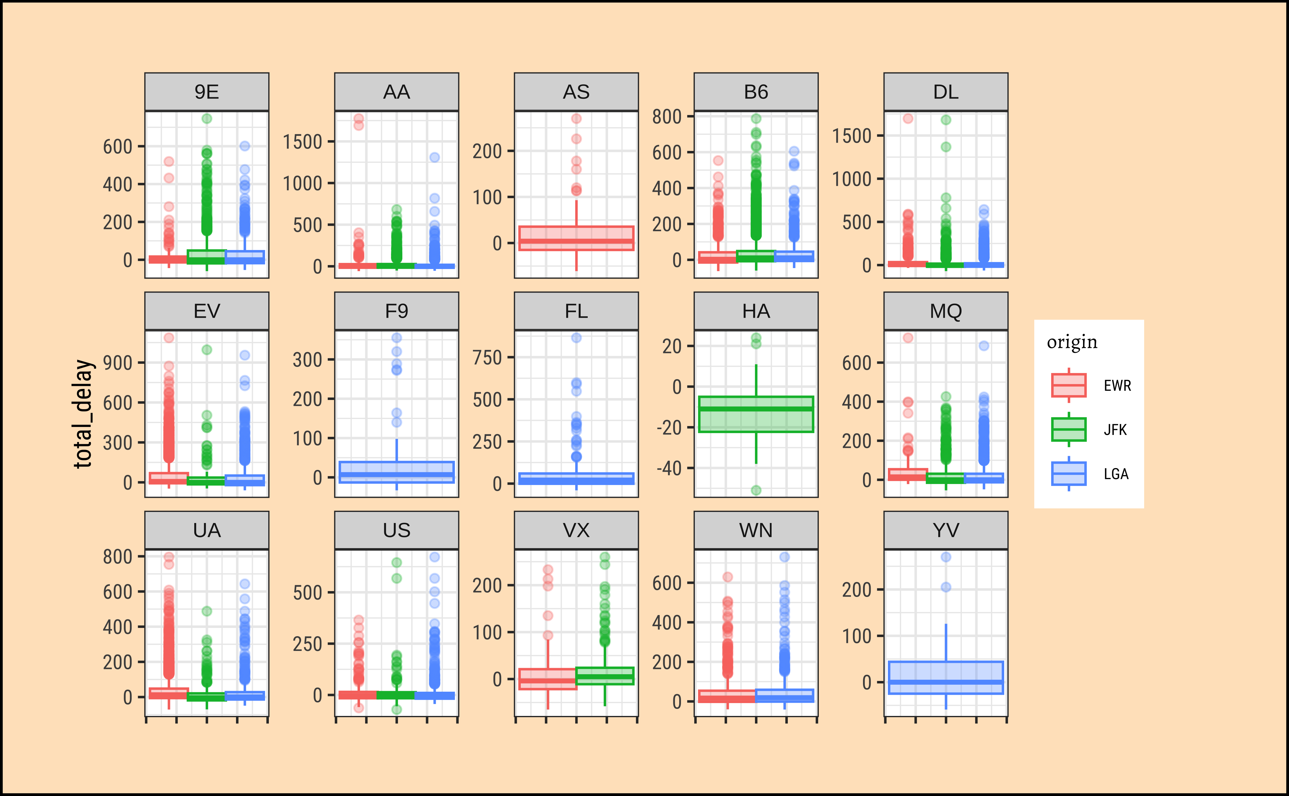
flights_delay_ts %>%
  mutate(total_delay = arr_delay + dep_delay) %>%
  timetk::filter_by_time(
    .start_date = "2013-12",
    .end_date = "2013-12"
  ) %>%
  timetk::plot_time_series_boxplot(
    .date_var = time_hour,
    .value = total_delay,
    .color_var = origin,
    .facet_vars = carrier,
    .period = "month",
    .interactive = FALSE,
    # .smooth_degree = 1,
    # keep .smooth off since it throws warnings if there are too few points
    # Like if we do quarterly or even yearly summaries
    # Use only for smaller values of .smooth_degree (0,1)
    .smooth = FALSE
  )
Insights: - JFK has more outliers in total_delay than EWR and LGA - Just a hint of more delays in April… and July?
Note
Q.3. Plot a heatmap chart for total flight delays by origin, aggregated by month
# Set graph theme
theme_set(new = theme_custom())
##
avg_delays_month <- flights_delay_ts %>%
  group_by(origin) %>%
  mutate(total_delay = arr_delay + dep_delay) %>%
  index_by(month = ~ yearmonth(.)) %>%
  # index_by uses (year, yearquarter, yearmonth, yearweek, as.Date)
  # to create a new column to show the time-grouping
  # year / quarter / month/ week, or day...
  # which IS different from traditional dplyr
  summarise(mean_monthly_delay = mean(total_delay, na.rm = TRUE))

avg_delays_month
# three origins 12 months therefore 36 rows
# Tsibble index_by + summarise also gives us a month` column
ggformula::gf_tile(origin ~ month,
fill = ~mean_monthly_delay,
color = "black", data = avg_delays_month,
title = "Mean Flight Delays from NY Airports in 2013"
) %>%
gf_theme(scale_fill_viridis_c(option = "A"))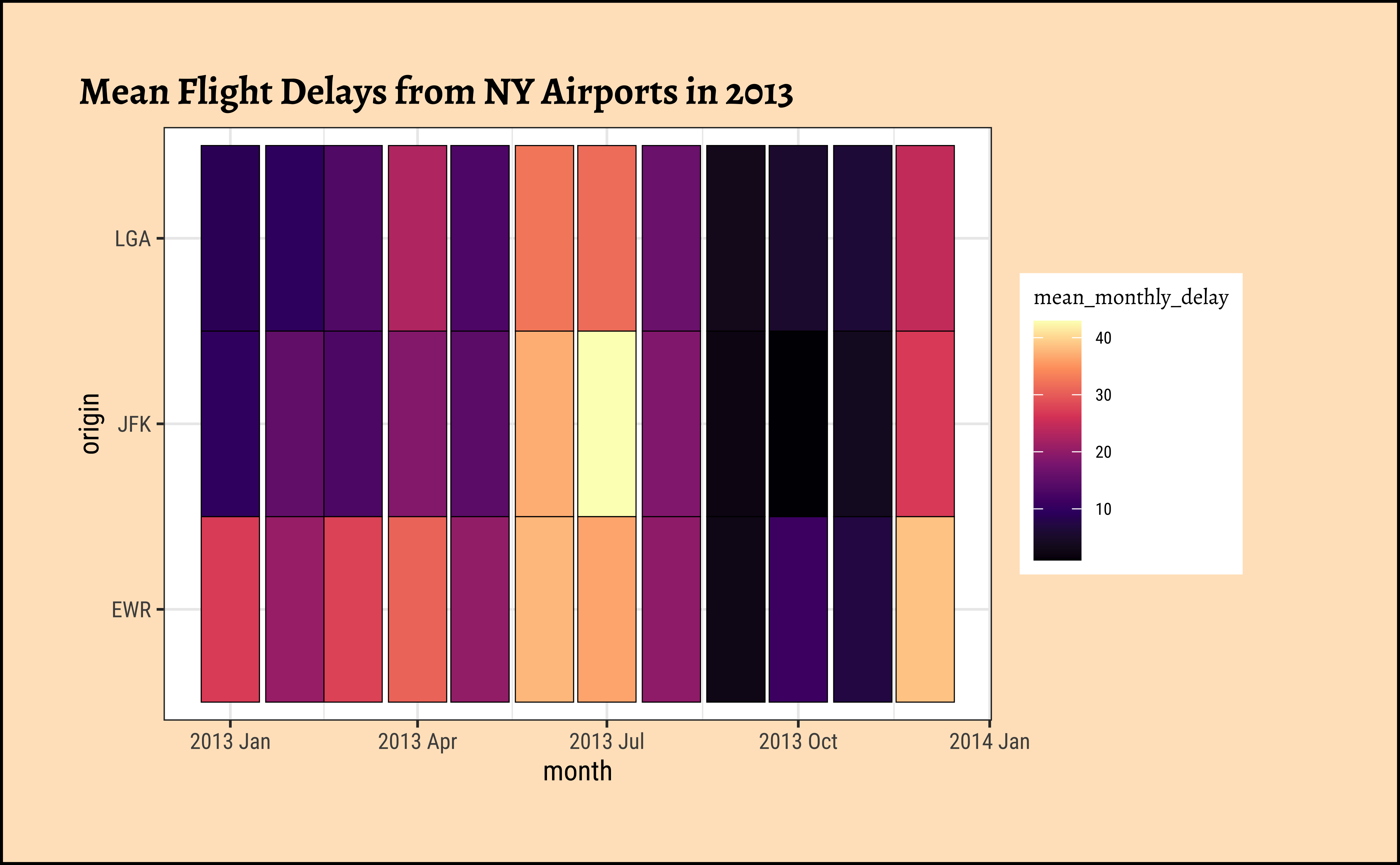
# "magma" (or "A") inferno" (or "B") "plasma" (or "C")
# "viridis" (or "D") "cividis" (or "E")
# "rocket" (or "F") "mako" (or "G") "turbo" (or "H")
Insights: - TBD - TBD
5
Here are how the different types of patterns in time series are as follows:
Trend: A trend exists when there is a long-term increase or decrease in the data. It does not have to be linear. Sometimes we will refer to a trend as “changing direction”, when it might go from an increasing trend to a decreasing trend.
Seasonal: A seasonal pattern occurs when a time series is affected by seasonal factors such as the time of the year or the day of the week. Seasonality is always of a fixed and known period. The monthly sales of drugs (with the PBS data) shows seasonality which is induced partly by the change in the cost of the drugs at the end of the calendar year.
Cyclic: A cycle occurs when the data exhibit rises and falls that are not of a fixed frequency. These fluctuations are usually due to economic conditions, and are often related to the “business cycle”. The duration of these fluctuations is usually at least 2 years.
The function feasts::STL allows us to create these decompositions.
Let us try to find and plot these patterns in Time Series.
births_2000_2014 <- read_csv("https://raw.githubusercontent.com/fivethirtyeight/data/master/births/US_births_2000-2014_SSA.csv")
##
births_tsibble <-
  births_2000_2014 %>%
  mutate(index = lubridate::make_date(
    year = year,
    month = month,
    day = date_of_month
  )) %>%
  tsibble::as_tsibble(index = index) %>%
  select(index, births)
##
births_STL_yearly <-
  births_tsibble %>%
  fabletools::model(STL(births ~ season(period = "year")))

fabletools::components(births_STL_yearly)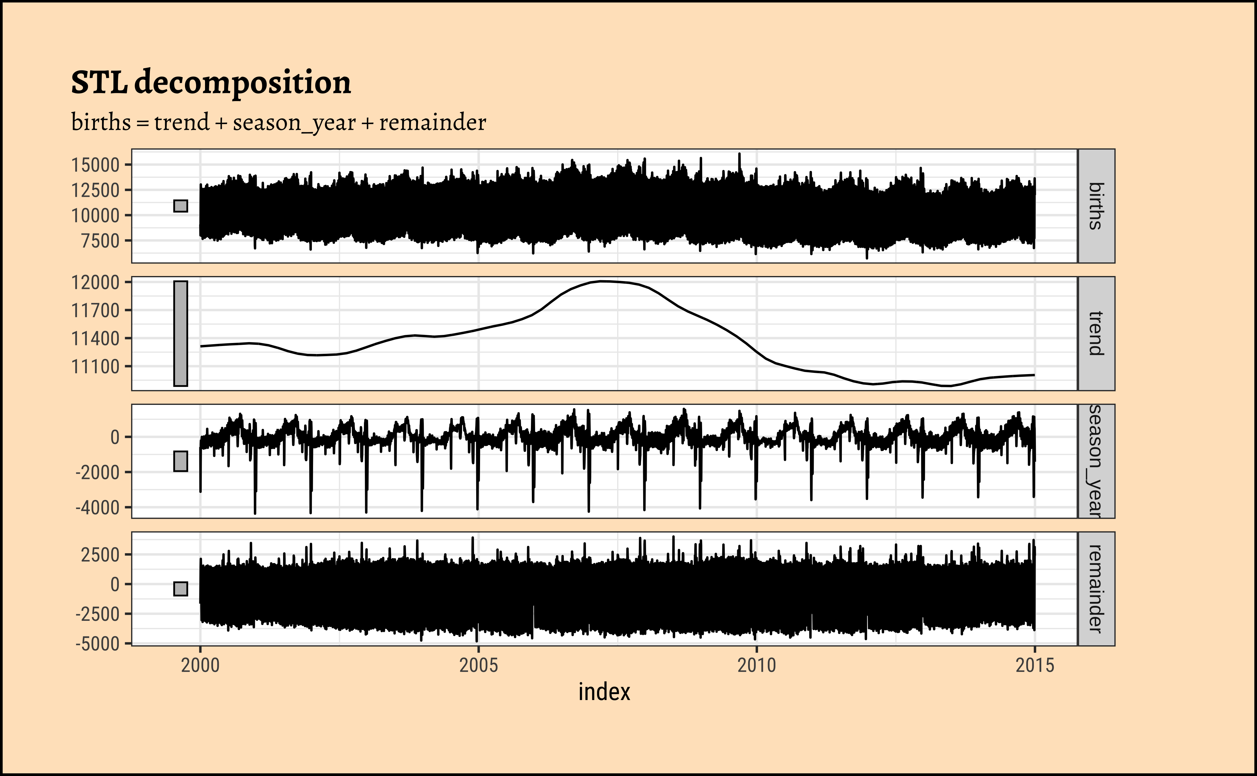
6
We can plot most of the common Time Series Plots with the help of the tidyverts packages: ( tsibble, feast, fable and fabletools) , along with timetk and ggformula.
There are other plot packages to investigate, such as dygraphs
Recall that we have used the tsibble format for the data. There are other formats such as ts, xts and others which are meant for time series analysis. But for our present purposes, we are able to do things with the capabilities of timetk.
7
Rob J Hyndman and George Athanasopoulos, Forecasting: Principles and Practice (3rd ed), Available Online https://otexts.com/fpp3/
Lange, Carsten. 2023. TeachHist: A Collection of Amended Histograms Designed for Teaching Statistics. https://doi.org/10.32614/CRAN.package.TeachHist.
Pruim, Randall. 2015. NHANES: Data from the US National Health and Nutrition Examination Study. https://doi.org/10.32614/CRAN.package.NHANES.
Snow, Greg. 2024. TeachingDemos: Demonstrations for Teaching and Learning. https://doi.org/10.32614/CRAN.package.TeachingDemos.
Wilke, Claus O. 2025. ggridges: Ridgeline Plots in “ggplot2”. https://doi.org/10.32614/CRAN.package.ggridges.
Citation
BibTeX citation:
@online{2022,
  author = {},
  title = {Analysis of {Time} {Series} in {R}},
  date = {2022-12-28},
  url = {https://madhatterguide.netlify.app/content/courses/Analytics/10-Descriptive/Modules/50-Time/files/analysis/timeseries-analysis.html},
  langid = {en}
}
For attribution, please cite this work as:
“Analysis of Time Series in R.” 2022. December 28, 2022. https://madhatterguide.netlify.app/content/courses/Analytics/10-Descriptive/Modules/50-Time/files/analysis/timeseries-analysis.html.