library(tidyverse)
library(mosaic)
library(ggformula) # Our Formula based graphing package
# Wrangling
library(lubridate) # Deal with dates. Part of the tidyverse anyway!
library(fpp3) # Robert Hyndman's textbook package, Loads all the core time series packages, see messages
# Plots
library(timetk) # Tidy Time series analysis and plots
library(tsbox) # Plotting and Time Series File Transformations
# library(TSstudio) # Plots, Decomposition, and Modelling with Time Series.
# Seems hard to get to work in Quarto ;-()
library(timetk) # Visualizing, Wrangling and Modelling Time Series by Matt Dancho
# Modelling
library(sweep) # New (07/2023) package to bring broom-like features to time series models
# devtools::install_github("FinYang/tsdl")
library(tsdl) # Time Series Data Library from Rob Hyndman🕔 Time Series
Time Series
CandleStick Graphs
Heatmap Graphs (over time)
Line Graphs
Time Series
Abstract
Events, Trends, Seasons, and Changes over Time
1
Plot Fonts and Theme
Show the Code
library(systemfonts)
library(showtext)
library(marquee)
library(ggrepel)
## Clean the slate
systemfonts::clear_local_fonts()
systemfonts::clear_registry()
##
showtext_opts(dpi = 96) # set DPI for showtext
sysfonts::font_add(
family = "Alegreya",
regular = "../../../../../../../../fonts/Alegreya-Regular.ttf",
bold = "../../../../../../../../fonts/Alegreya-Bold.ttf",
italic = "../../../../../../../../fonts/Alegreya-Italic.ttf",
bolditalic = "../../../../../../../../fonts/Alegreya-BoldItalic.ttf"
)
sysfonts::font_add(
family = "Roboto Condensed",
regular = "../../../../../../../../fonts/RobotoCondensed-Regular.ttf",
bold = "../../../../../../../../fonts/RobotoCondensed-Bold.ttf",
italic = "../../../../../../../../fonts/RobotoCondensed-Italic.ttf",
bolditalic = "../../../../../../../../fonts/RobotoCondensed-BoldItalic.ttf"
)
showtext_auto(enable = TRUE) # enable showtext
##
##
theme_custom <- function() {
theme_bw(base_size = 10) +
# theme(panel.widths = unit(11, "cm"),
# panel.heights = unit(6.79, "cm")) + # Golden Ratio
theme(
plot.margin = margin_auto(t = 1, r = 2, b = 1, l = 1, unit = "cm"),
plot.background = element_rect(
fill = "bisque",
colour = "black",
linewidth = 1
)
) +
theme_sub_axis(
title = element_text(
family = "Roboto Condensed",
size = 10
),
text = element_text(
family = "Roboto Condensed",
size = 8
)
) +
theme_sub_legend(
text = element_text(
family = "Roboto Condensed",
size = 6
),
title = element_text(
family = "Alegreya",
size = 8
)
) +
theme_sub_plot(
title = element_text(
family = "Alegreya",
size = 14, face = "bold"
),
title.position = "plot",
subtitle = element_text(
family = "Alegreya",
size = 10
),
caption = element_text(
family = "Alegreya",
size = 6
),
caption.position = "plot"
)
}
## Use available fonts in ggplot text geoms too!
ggplot2::update_geom_defaults(geom = "text", new = list(
family = "Roboto Condensed",
face = "plain",
size = 3.5,
color = "#2b2b2b"
))
ggplot2::update_geom_defaults(geom = "label", new = list(
family = "Roboto Condensed",
face = "plain",
size = 3.5,
color = "#2b2b2b"
))
ggplot2::update_geom_defaults(geom = "marquee", new = list(
family = "Roboto Condensed",
face = "plain",
size = 3.5,
color = "#2b2b2b"
))
ggplot2::update_geom_defaults(geom = "text_repel", new = list(
family = "Roboto Condensed",
face = "plain",
size = 3.5,
color = "#2b2b2b"
))
ggplot2::update_geom_defaults(geom = "label_repel", new = list(
family = "Roboto Condensed",
face = "plain",
size = 3.5,
color = "#2b2b2b"
))
## Set the theme
ggplot2::theme_set(new = theme_custom())
## tinytable options
options("tinytable_tt_digits" = 2)
options("tinytable_format_num_fmt" = "significant_cell")
options(tinytable_html_mathjax = TRUE)
## Set defaults for flextable
flextable::set_flextable_defaults(font.family = "Roboto Condensed")
1.1 mosaic and ggformula command template
Note the standard method for all commands from the mosaic and ggformula packages: goal( y ~ x | z, data = _____)
With ggformula, one can create any graph/chart using: gf_***(y ~ x | z, data = _____)
In practice, we often use: dataframe %>% gf_***(y ~ x | z) which has cool benefits such as “autocompletion” of variable names, as we shall see. The “***” indicates what kind of graph you desire: histogram, bar, scatter, density; the “___” is the name of your dataset that you want to plot with. :::
Tip
ggplot command template
The ggplot2 template is used to identify the dataframe, identify the x and y axis, and define visualized layers:
ggplot(data = ---, mapping = aes(x = ---, y = ---)) + geom_----()
Note: —- is meant to imply text you supply. e.g. function names, data frame names, variable names.
It is helpful to see the argument mapping, above. In practice, rather than typing the formal arguments, code is typically shorthanded to this:
dataframe %>% ggplot(aes(xvar, yvar)) + geom_----()
2
Any metric that is measured over regular time intervals forms a time series. Analysis of Time Series is commercially important because of industrial need and relevance, especially with respect to Forecasting (Weather data, sports scores, population growth figures, stock prices, demand, sales, supply…). For example, in the graph shown below are the temperatures over time in two US cities:
What can we do with Time Series? As with other datasets, we have to begin by answering fundamental questions, such as:
- What are the types of time series?
- How do we visualize time series?
- How might we summarize time series to get aggregate numbers, say by week, month, quarter or year?
- How do we decompose the time series into level, trend, and seasonal components?
- Hoe might we make a model of the underlying process that creates these time series?
- How do we make useful forecasts with the data we have?
We will first look at the multiple data formats for time series in R. Alongside we will look at the R packages that work with these formats and create graphs and measures using those objects. Then we examine data wrangling of time series, where we look at packages that offer dplyr-like ability to group and summarize time series using the time variable. We will finally look at obtaining the components of the time series and try our hand at modelling and forecasting.
3
There are multiple formats for time series data. The ones that we are likely to encounter most are:
The ts format: We may simply have a single series of measurements that are made over time, stored as a numerical vector. The
stats::ts()function will convert a numeric vector into an R time seriestsobject, which is the most basic time series object in R. The base-Rtsobject is used by established packagesforecastand is also supported by newer packages such astsbox.The tibble format: the simplest and most familiar data format is of course the standard tibble/data frame, with or without an explicit
timecolumn/variable to indicate that the other variables vary with time. The standard tibble object is used by many packages, e.g.timetk&modeltime.The modern tsibble format: this is a new modern format for time series analysis. The special
tsibbleobject (“time series tibble”) is used byfable,feastsand others from thetidyvertsset of packages.
There are many other time-oriented data formats too…probably too many, such a tibbletime and TimeSeries objects. For now the best way to deal with these, should you encounter them, is to convert them (Using tsbox) to a tibble or a tsibble and work with these.

To start, we will use simple ts data first, and then do another with tibble format that we can plot as is. We will then do more after conversion to tsibble format, and then a third example with a ground-up tsibble dataset.
3.1 ts format data
There are a few datasets in base R that are in ts format already.
AirPassengers Jan Feb Mar Apr May Jun Jul Aug Sep Oct Nov Dec
1949 112 118 132 129 121 135 148 148 136 119 104 118
1950 115 126 141 135 125 149 170 170 158 133 114 140
1951 145 150 178 163 172 178 199 199 184 162 146 166
1952 171 180 193 181 183 218 230 242 209 191 172 194
1953 196 196 236 235 229 243 264 272 237 211 180 201
1954 204 188 235 227 234 264 302 293 259 229 203 229
1955 242 233 267 269 270 315 364 347 312 274 237 278
1956 284 277 317 313 318 374 413 405 355 306 271 306
1957 315 301 356 348 355 422 465 467 404 347 305 336
1958 340 318 362 348 363 435 491 505 404 359 310 337
1959 360 342 406 396 420 472 548 559 463 407 362 405
1960 417 391 419 461 472 535 622 606 508 461 390 432str(AirPassengers) Time-Series [1:144] from 1949 to 1961: 112 118 132 129 121 135 148 148 136 119 ...This can be easily plotted using base R and other more recent packages:
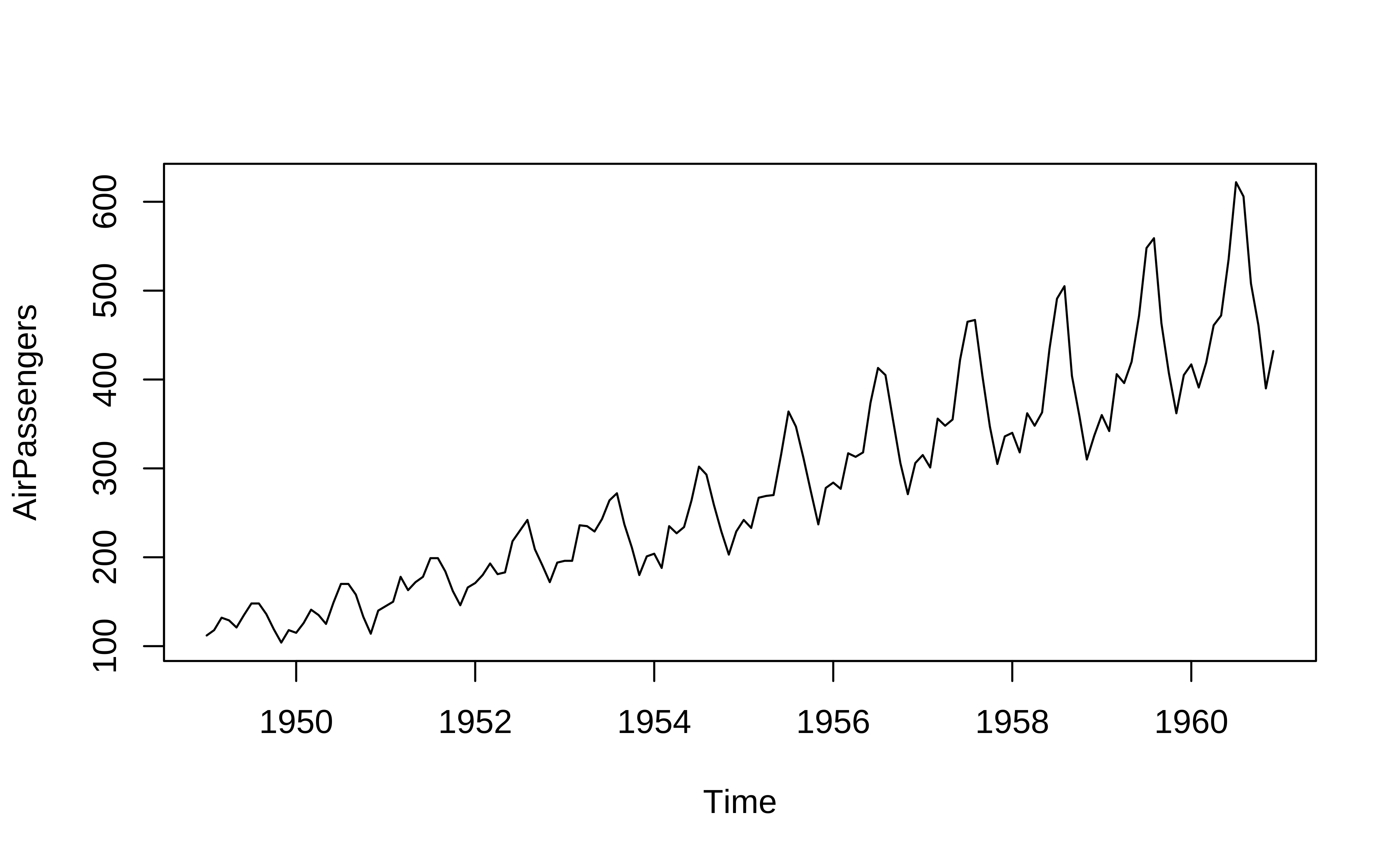
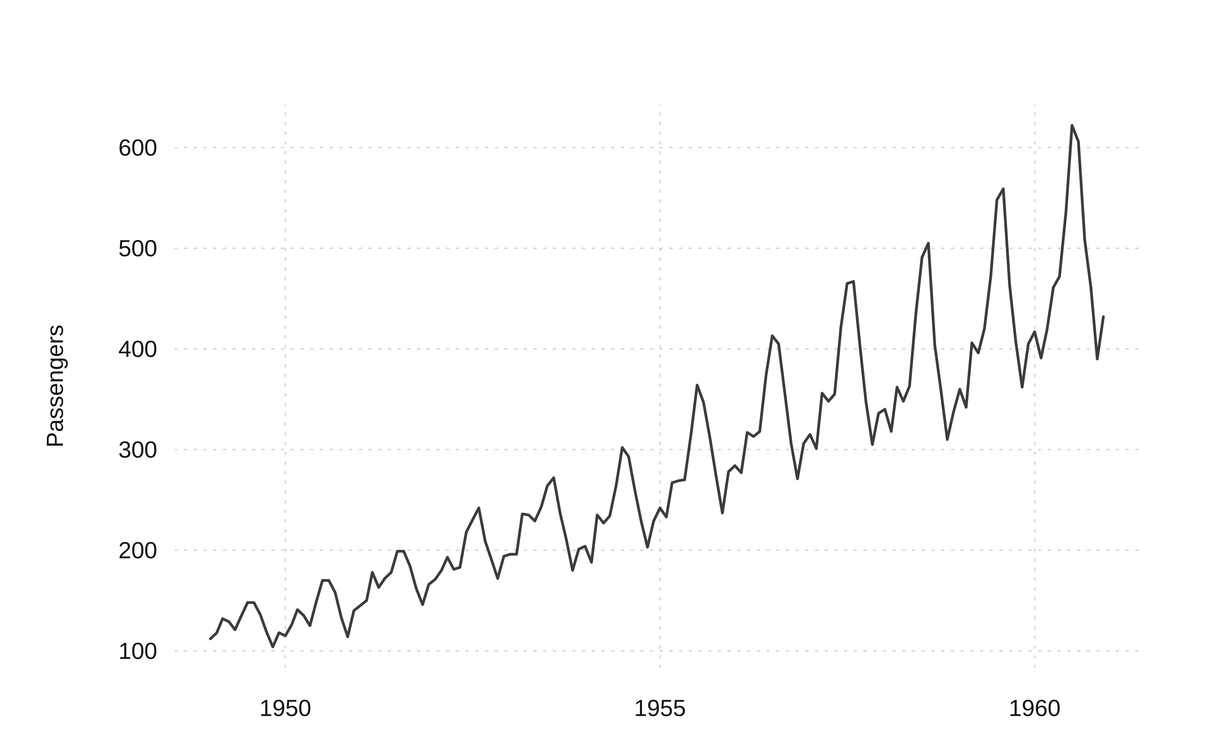
One can see that there is an upward trend and also seasonal variations that also increase over time. This is an example of a multiplicative time series, which we will discuss later.
Let us take data that is “time oriented” but not in ts format. We use the command ts to convert a numeric vector to ts format: the syntax of ts() is:
Syntax: objectName <- ts(data, start, end, frequency), where,
-
data: represents the data vector -
start: represents the first observation in time series -
end: represents the last observation in time series -
frequency: represents number of observations per unit time. For example 1=annual, 4=quarterly, 12=monthly, 7=weekly, etc.
We will pick simple numerical vector data ( i.e. not a time series ) ChickWeight:
Time-Series [1:12] from 1 to 6.5: 42 51 59 64 76 93 106 125 149 171 ...Now we can plot this in many ways:
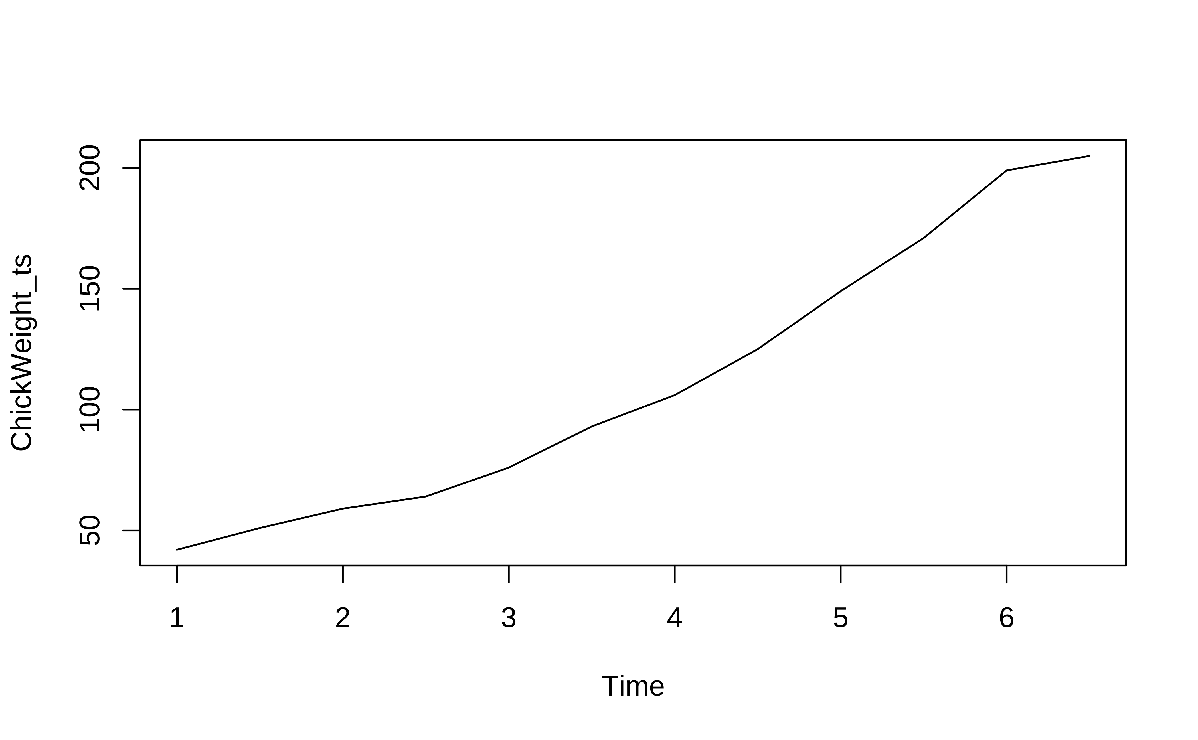
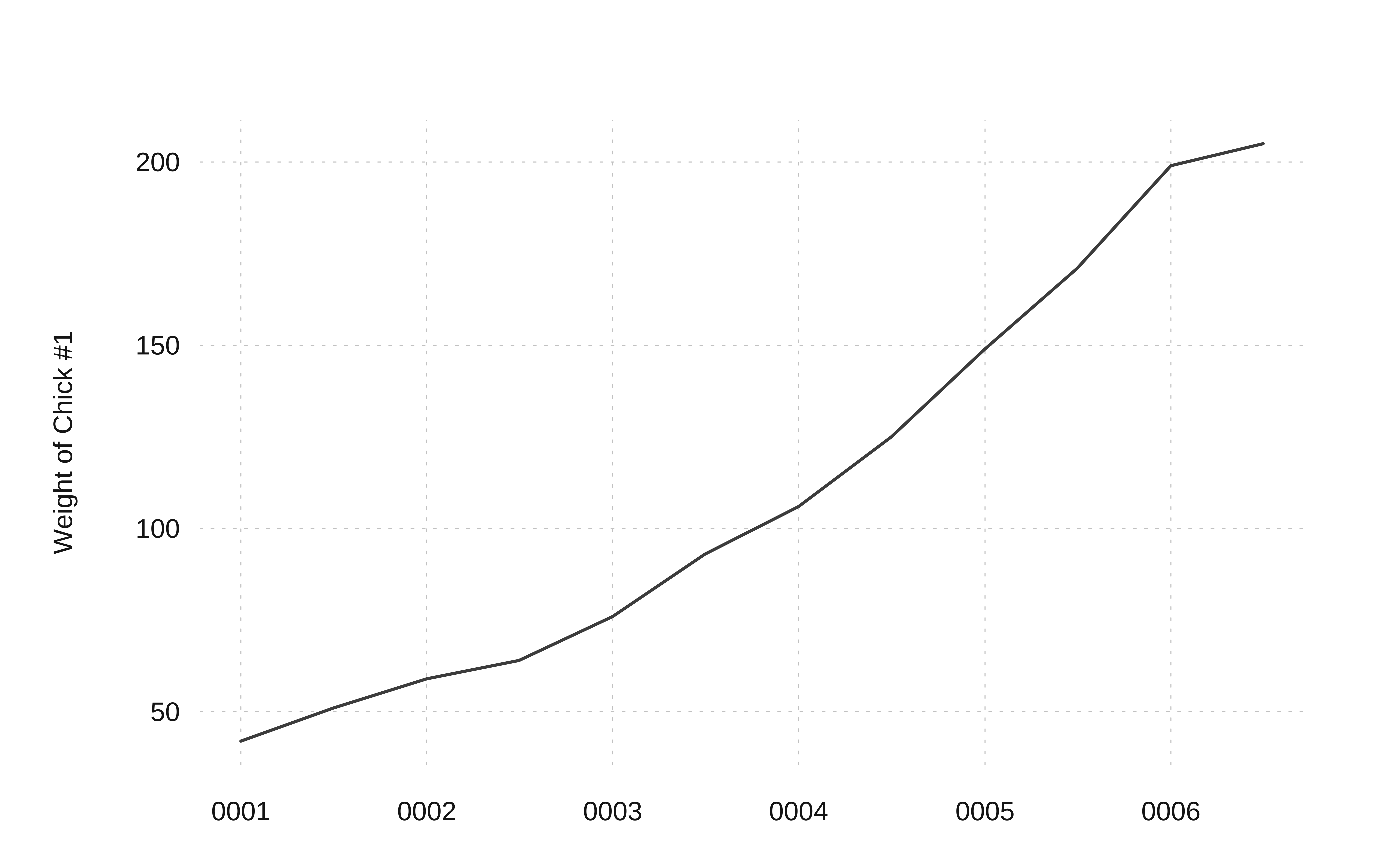
# Using TSstudio
TSstudio::ts_plot(ChickWeight_ts,
Xtitle = "Time",
Ytitle = "Weight of Chick #1"
)We see that the weights of a young chick specimen increases over time.
3.2 tibble data
The ts data format can handle only one time series. If we want multiple time series, based on say Qualitative variables, we need other data formats. Using the familiar tibble structure opens up new possibilities.
- We can have multiple time series within a tibble (think of numerical time-series data like
GDP,Population,Imports,Exportsfor multiple countries as with thegapminder1data we saw earlier).
- It also allows for data processing with
dplyrsuch as filtering and summarizing.
gapminder data
Let us read and inspect in the US births data from 2000 to 2014. Download this data by clicking on the icon below, and saving the downloaded file in a sub-folder called data inside your project.
Read this data in:
births_2000_2014 <- read_csv("../data/US_births_2000-2014_SSA.csv")Error:
! '../data/US_births_2000-2014_SSA.csv' does not exist in current
working directory:
'/Users/arvindv/RWork/MyWebsites/madhatter/content/courses/Analytics/10-Descriptive/Modules/50-Time/files/interactive'.glimpse(births_2000_2014)Error:
! object 'births_2000_2014' not foundinspect(births_2000_2014)Error:
! object 'births_2000_2014' not foundbirths_2000_2014Error:
! object 'births_2000_2014' not foundThis is just a tibble containing a single data variable births that varies over time. All other variables, although depicting time, are numerical columns. There are no Qualitative variables (yet!).
Plotting tibble time series
We will now plot this using ggformula. Using the separate year/month/week and day_of_week / day_of_month columns, we can plot births over time, colouring by day_of_week, for example:
# grouping by day_of_week
births_2000_2014 %>%
gf_line(births ~ year,
group = ~day_of_week,
color = ~day_of_week
) %>%
gf_point(title = "By Day of Week") %>%
gf_theme(scale_colour_distiller(palette = "Paired"))
# Grouping by date_of_month
births_2000_2014 %>%
gf_line(births ~ year,
group = ~date_of_month,
color = ~date_of_month
) %>%
gf_point(title = "By Date of Month") %>%
gf_theme(scale_colour_distiller(palette = "Paired"))Error:
! object 'births_2000_2014' not foundError:
! object 'births_2000_2014' not foundNot particularly illuminating. This is because the data is daily and we have considerable variation over time, and here we have too much data to visualize. Summaries will help, so we could calculate the the mean births on a month basis in each year and plot that:
births_2000_2014_monthly <- births_2000_2014 %>%
# Convert month to factor/Qual variable!
# So that we can have discrete colours for each month
# Using base::factor()
# Could use forcats::as_factor() also
mutate(month = base::factor(month, labels = month.abb)) %>%
# `month.abb` is a built-in dataset containing names of months.
group_by(year, month) %>%
summarise(mean_monthly_births = mean(births, na.rm = TRUE))
births_2000_2014_monthly
births_2000_2014_monthly %>%
gf_line(mean_monthly_births ~ year,
group = ~month,
colour = ~month, linewidth = 1
) %>%
gf_point(size = 1.5, title = "Summaries of Monthly Births over the years") %>%
# palette for 12 colours
gf_theme(scale_colour_brewer(palette = "Paired"))Error:
! object 'births_2000_2014' not foundError:
! object 'births_2000_2014_monthly' not foundError:
! object 'births_2000_2014_monthly' not found
Note
These are graphs for the same month each year: we have a January graph and a February graph and so on. So…average births per month were higher in all months during 2005 to 2007 and have dropped since.
We can do similar graphs using day_of_week as our basis for grouping, instead of month:
births_2000_2014_weekly <- births_2000_2014 %>%
mutate(day_of_week = base::factor(day_of_week,
levels = c(1, 2, 3, 4, 5, 6, 7),
labels = c("Mon", "Tue", "Wed", "Thu", "Fri", "Sat", "Sun")
)) %>%
group_by(year, day_of_week) %>%
summarise(mean_daily_births = mean(births, na.rm = TRUE))
births_2000_2014_weekly
births_2000_2014_weekly %>%
gf_line(mean_daily_births ~ year,
group = ~day_of_week,
colour = ~day_of_week,
linewidth = 1,
data = .
) %>%
gf_point(size = 2) %>%
# palette for 12 colours
gf_theme(scale_colour_brewer(palette = "Paired"))Error:
! object 'births_2000_2014' not foundError:
! object 'births_2000_2014_weekly' not foundError:
! object 'births_2000_2014_weekly' not found
NoteWhy are fewer babies born on weekends?
Looks like an interesting story here…there are significantly fewer births on average on Sat and Sun, over the years! Why? Should we watch Grey’s Anatomy ?
Important
Note that this is still using just tibble data, without converting it or using it as a time series. So far we are simply treating the year/month/day variables are simple variables and using dplyr to group and summarize. We have not created an explicit time or date variable.
Let us create a time variable in our dataset now:
-
tsbox::ts_plotneeds just thedateand thebirthscolumns to plot with and not be confused by the other numerical columns, so let us create a singledatecolumn from these three, but retain them for now. -
TSstudio::ts_plotalso needs adatecolumn.
So there are several numerical variables for year, month, and day_of_month, day_of_week, and of course the births on a daily basis.
We use the lubridate package from the tidyverse:
Error:
! object 'births_2000_2014' not foundbirths_timeseriesError:
! object 'births_timeseries' not found
TipExtract from
help(tsbox)
In data frames, i.e., in a data.frame, a data.table, or a tibble, tsbox stores one or multiple time series in the ‘long’ format. tsbox detects a value, a time column, and zero, one or several id columns. Column detection is done in the following order:
- Starting on the right, the first first numeric or integer column is used as
valuecolumn.
- Using the remaining columns and starting on the right again, the first Date, POSIXct, numeric or character column is used as
timecolumn. character strings are parsed by anytime::anytime(). The timestamp, time, indicates the beginning of a period.
-
All remaining columns are
idcolumns. Each unique combination of id columns points to a (unique) time series.
Alternatively, the time column and the value column to be explicitly named as time and value. If explicit names are used, the column order will be ignored. If columns are detected automatically, a message is returned.
Plotting this directly, after selecting the relevant variables, so that they will be auto-detected:
Error:
! object 'births_timeseries' not foundError:
! object 'births_timeseries' not foundQuite messy, as before. We need use the summarised data, as before. We will do this in the next section.
We will now plot this using ggplot for completeness. Using the separate year/month/week and day_of_week / day_of_month columns, we can plot births over time, colouring by day_of_week, for example:
# grouping by day_of_week
births_2000_2014 %>%
ggplot(aes(year, births,
group = day_of_week,
color = day_of_week
)) +
geom_line() +
geom_point() +
labs(title = "By Day of Week") +
scale_colour_distiller(palette = "Paired")
# Grouping by date_of_month
births_2000_2014 %>% ggplot(aes(year, births,
group = date_of_month,
color = date_of_month
)) +
geom_line() +
geom_point() +
labs(title = "By Date of Month") +
scale_colour_distiller(palette = "Paired")Error:
! object 'births_2000_2014' not foundError:
! object 'births_2000_2014' not foundbirths_2000_2014_monthly <- births_2000_2014 %>%
# Convert month to factor/Qual variable!
# So that we can have discrete colours for each month
# Using base::factor()
# Could use forcats::as_factor() also
mutate(month = base::factor(month, labels = month.abb)) %>%
# `month.abb` is a built-in dataset containing names of months.
group_by(year, month) %>%
summarise(mean_monthly_births = mean(births, na.rm = TRUE))
births_2000_2014_monthly
###
births_2000_2014_monthly %>%
ggplot(aes(year, mean_monthly_births,
group = month, colour = month
)) +
geom_line(linewidth = 1) +
geom_point(size = 1.5) +
labs(title = "Summaries of Monthly Births over the years") +
# palette for 12 colours
scale_colour_brewer(palette = "Paired")Error:
! object 'births_2000_2014' not foundError:
! object 'births_2000_2014_monthly' not foundError:
! object 'births_2000_2014_monthly' not foundbirths_2000_2014_weekly <- births_2000_2014 %>%
mutate(day_of_week = base::factor(day_of_week,
levels = c(1, 2, 3, 4, 5, 6, 7),
labels = c("Mon", "Tue", "Wed", "Thu", "Fri", "Sat", "Sun")
)) %>%
group_by(year, day_of_week) %>%
summarise(mean_daily_births = mean(births, na.rm = TRUE))
births_2000_2014_weekly
births_2000_2014_weekly %>%
ggplot(aes(year, mean_daily_births,
group = day_of_week,
colour = day_of_week
)) +
geom_line() +
geom_point() +
# palette for 12 colours
scale_colour_brewer(palette = "Paired")Error:
! object 'births_2000_2014' not foundError:
! object 'births_2000_2014_weekly' not foundError:
! object 'births_2000_2014_weekly' not found
3.3 tsibble data
Finally, we have tsibble (“time series tibble”) format data, which contains three main components:
- an
indexvariable that defines time; - a set of
keyvariables, usually categorical, that define sets of observations, over time. This allows for each combination of the categorical variables to define a separate time series. - a set of quantitative variables, that represent the quantities that vary over time (i.e
index)
Here is Robert Hyndman’s video introducing tsibbles:
The package tsibbledata contains several ready made tsibble format data. Let us try PBS, which is a dataset containing Monthly Medicare prescription data in Australia.
Run
data(package = "tsibbledata") in your Console to find out about these.data("PBS")
# inspect(PBS) # does not work since mosaic cannot handle tsibbles
PBSData Description: This is a large-ish dataset:
Run
PBS in your console- 67K observations
- 336 combinations of
keyvariables (Concession,Type,ATC1,ATC2) which are categorical, as foreseen. - Data appears to be monthly, as indicated by the
1M. - the time index variable is called
Month, formatted asyearmonth, a new type of variable introduced in thetsibblepackage
Note that there are multiple Quantitative variables (Scripts,Cost), each sliced into 336 time-series, a feature which is not supported in the ts format, but is supported in a tsibble. The Qualitative Variables are described below.
Type
help("PBS") in your Console.The data is dis-aggregated/grouped using four keys:
- Concession: Concessional scripts are given to pensioners, unemployed, dependents, and other card holders
- Type: Co-payments are made until an individual’s script expenditure hits a threshold ($290.00 for concession, $1141.80 otherwise). Safety net subsidies are provided to individuals exceeding this amount.
- ATC1: Anatomical Therapeutic Chemical index (level 1). 15 types
- ATC2: Anatomical Therapeutic Chemical index (level 2). 84 types, nested inside ATC1.
Let us simply plot Cost over time:
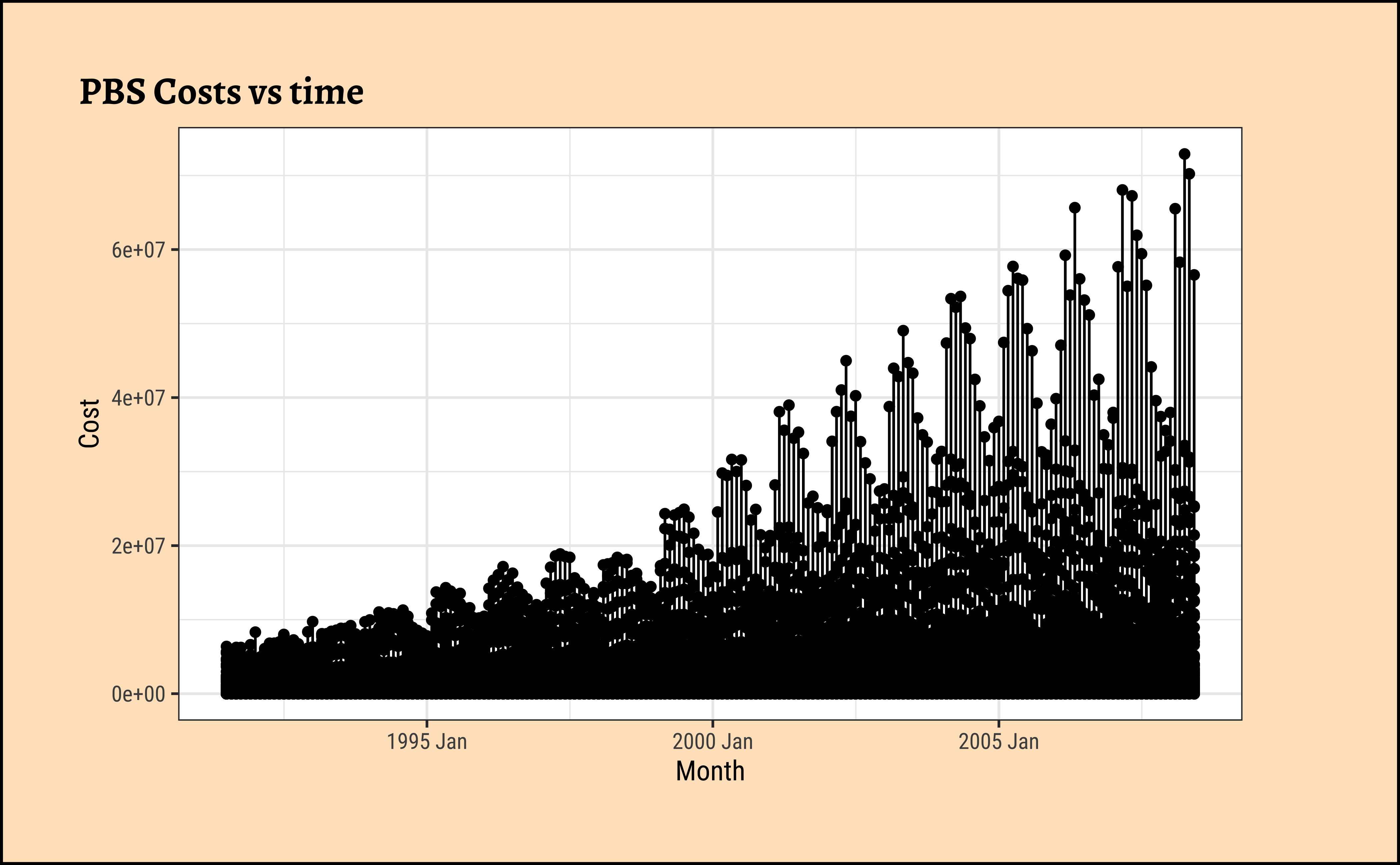

This basic plot is quite messy, and it is now time (sic!) for us to look at summaries of the data using dplyr-like verbs.
4
We have now arrived at the need to filter, group, and summarize time-series data. We can do this in two ways, with two packages:
Tip
tsibble has dplyr-like functions
Using tsibble data, the tsibble package has specialized filter and group_by functions to do with the index (i.e time) variable and the key variables, such as index_by() and group_by_key().
Filtering based on Qual variables can be done with dplyr. We can use dplyr functions such as group_by, mutate(), filter(), select() and summarise() to work with tsibble objects.
Tip
timetk also has dplyr-like functions!
Using tibbles, timetk provides functions such as summarize_by_time, filter_by_time and slidify that are quite powerful. Again, as with tsibble, dplyr can always be used for other variables (i.e non-time).
Let us first see how many observations there are for each combo of keys:
We have 336 combinations of Qualitative variables, each combo containing 204 observations (except some! Take a look!): so let us filter for a few such combinations and plot:
# Costs
PBS %>%
tsibble::group_by_key(ATC1, ATC2, Concession, Type) %>%
gf_line(Cost ~ Month,
colour = ~Type,
data = .
) %>%
gf_point(title = "Costs, per Month")
# Scripts
PBS %>%
tsibble::group_by_key(ATC1, ATC2, Concession, Type) %>%
gf_line(Scripts ~ Month,
colour = ~Type,
data = .
) %>%
gf_point(title = "Scripts, per Month")
# Costs variable for a specific combo of Qual variables(keys)
PBS %>%
dplyr::filter(
Concession == "General",
ATC1 == "A",
ATC2 == "A10"
) %>%
gf_line(Cost ~ Month,
colour = ~Type,
data = .
) %>%
gf_point(title = "Costs, per Month for General/A/A10 category patients")
# Scripts variable for a specific combo of Qual variables(keys)
PBS %>%
dplyr::filter(
Concession == "General",
ATC1 == "A",
ATC2 == "A10"
) %>%
gf_line(Scripts ~ Month,
colour = ~Type,
data = .
) %>%
gf_point(title = "Scripts, per Month for General/A/A10 category patients")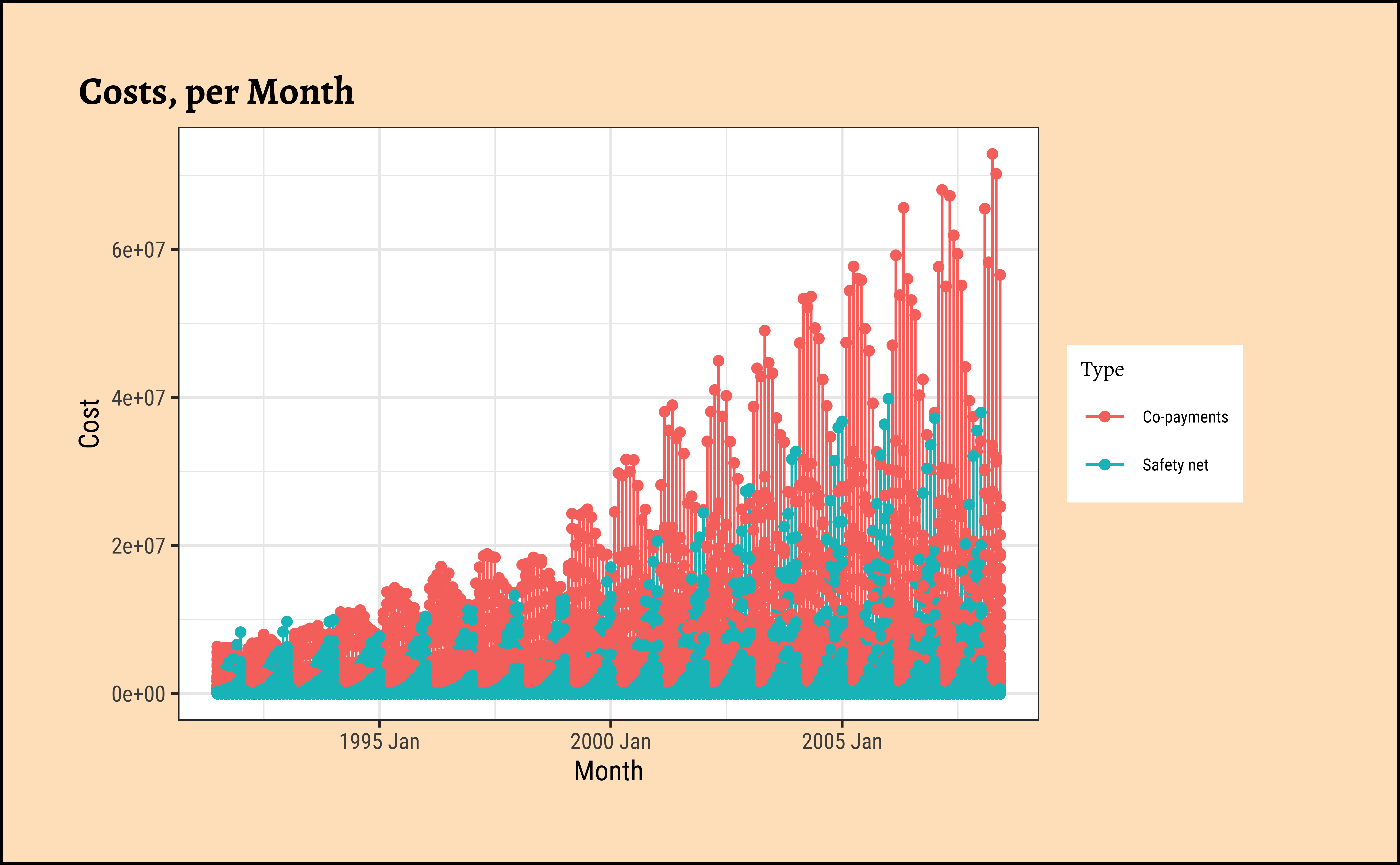
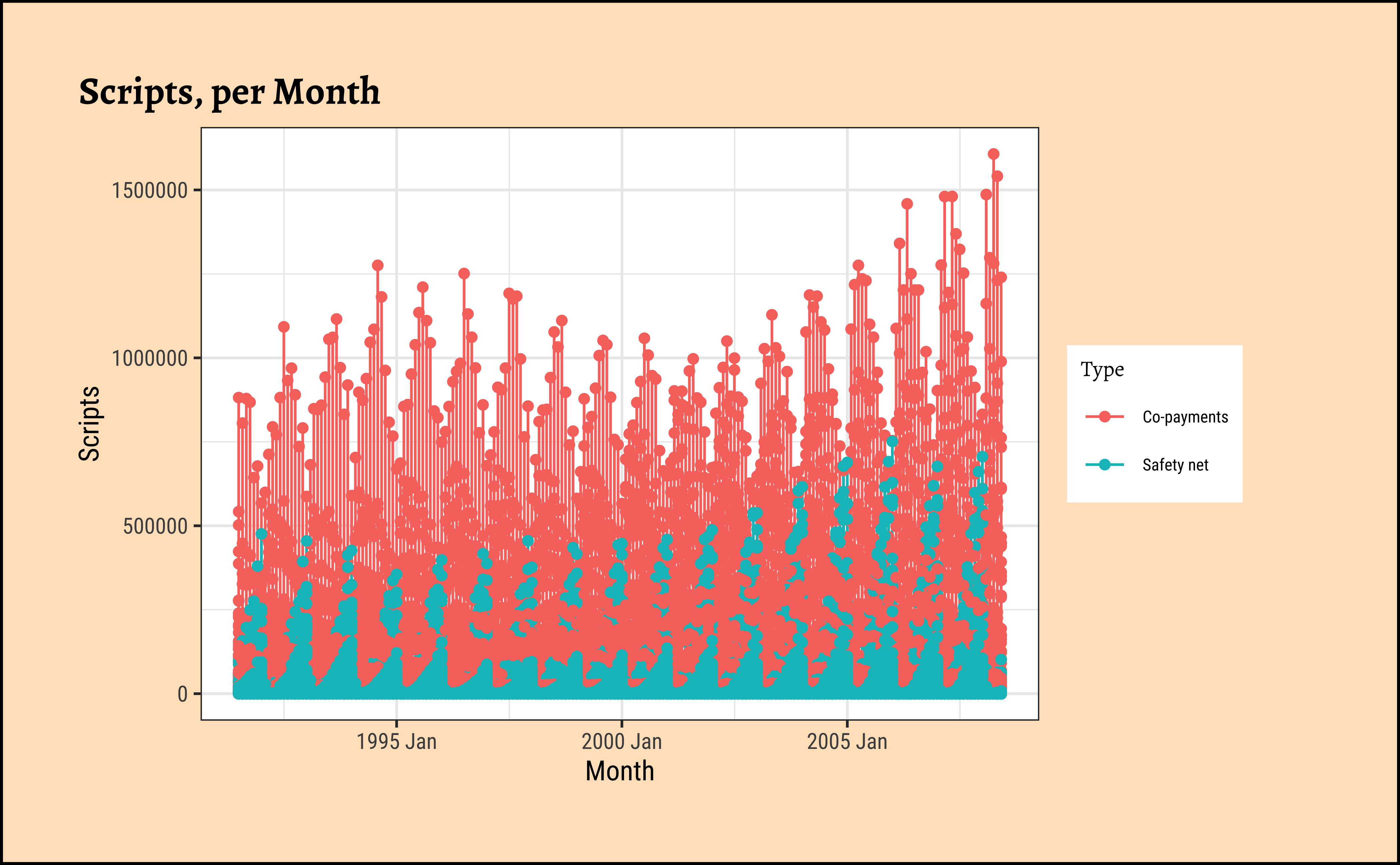
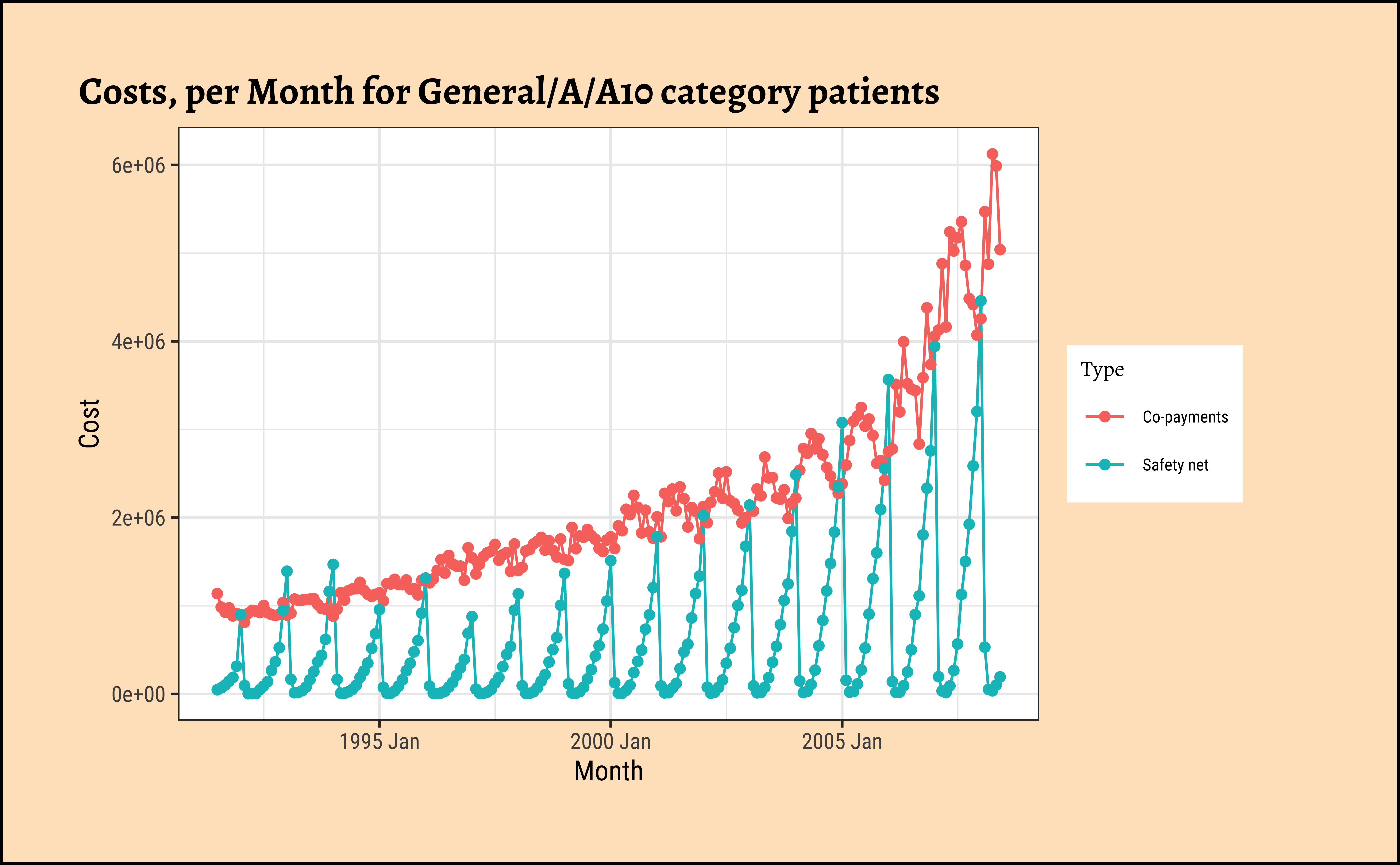
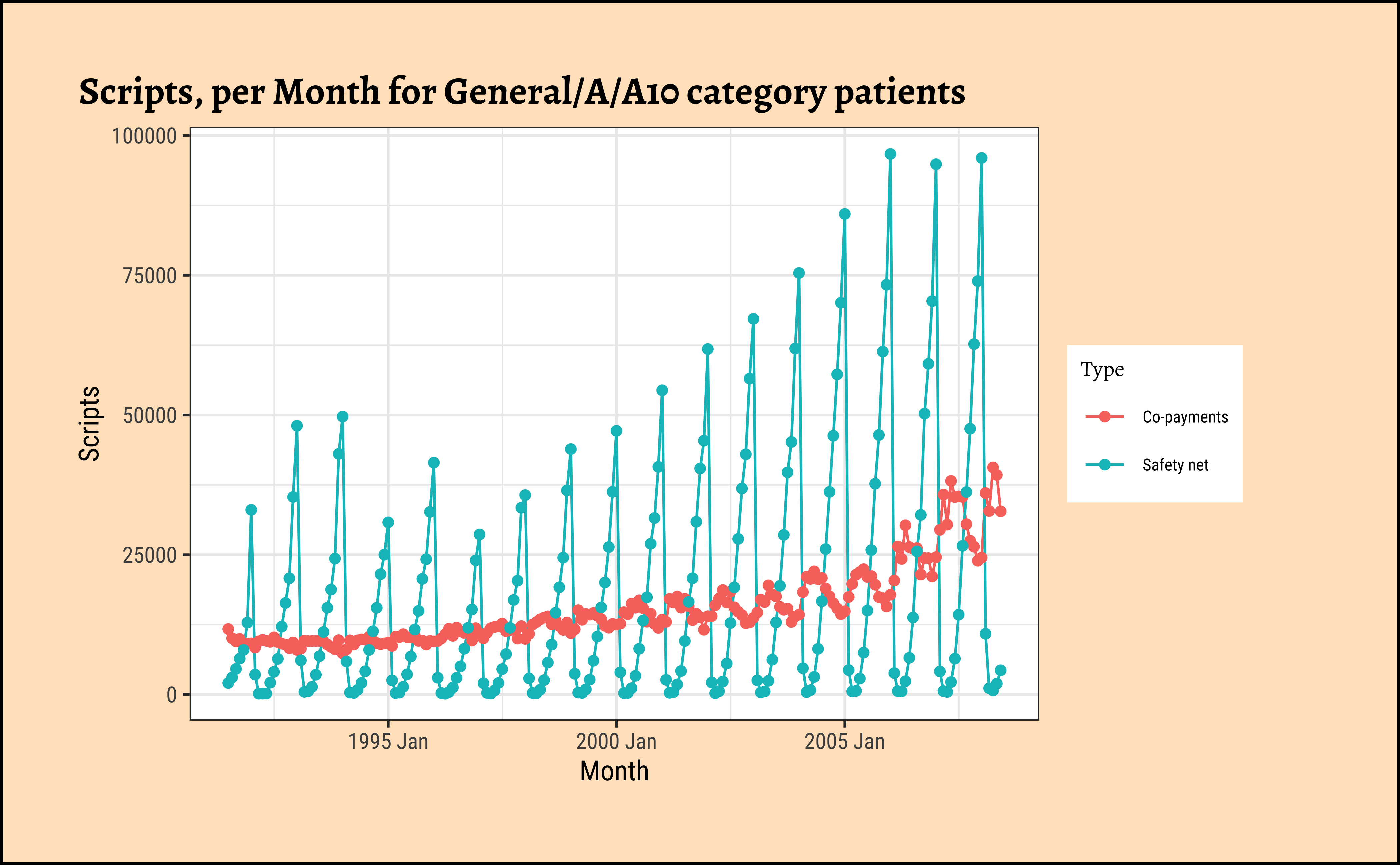
As can be seen, very different time patterns based on the two Types of payment methods, and also with Costs and Scripts. Strongly seasonal for both, with seasonal variation increasing over the years, a clear sign of a multiplicative time series. There is a strong upward trend with both types of subsidies, Safety net and Co-payments. But these trends are somewhat different in magnitude for specific combinations of ATC1 and ATC2 categories.
We can use tsibble’s dplyr-like commands to develop summaries by year, quarter, month(original data): Look carefully at the new time variable created each time:
# Original Data
PBS# Cost Summary by Month, which is the original data
# Only grouping happens here
# New Variable Name to make grouping visible
PBS %>%
tsibble::group_by_key(ATC1, ATC2, Concession, Type) %>%
tsibble::index_by(Month_Group = Month) %>%
dplyr::summarise(across(
.cols = c(Cost, Scripts),
.fn = mean,
.names = "mean_{.col}"
))Finally, it may be a good idea to convert some tibble into a tsibble to leverage some of functions that tsibble offers:
births_tsibble <- births_2000_2014 %>%
mutate(date = lubridate::make_date(
year = year,
month = month,
day = date_of_month
)) %>%
# Convert to tsibble
tsibble::as_tsibble(index = date) # Time VariableError:
! object 'births_2000_2014' not foundbirths_tsibbleError:
! object 'births_tsibble' not foundThis is DAILY data of course. Let us say we want to group by month and plot mean monthly births as before, but now using tsibble and the index variable:
births_tsibble %>%
gf_line(births ~ date,
data = .,
title = "Basic tsibble plotted with ggformula"
)
# timetk **can** plot tsibbles.
births_tsibble %>%
timetk::plot_time_series(
.date_var = date,
.value = births,
.title = "Tsibble Plotted with timetk"
)Error:
! object 'births_tsibble' not foundError:
! object 'births_tsibble' not foundbirths_tsibble %>%
tsibble::index_by(month_index = ~ tsibble::yearmonth(.)) %>%
dplyr::summarise(mean_births = mean(births, na.rm = TRUE)) %>%
gf_point(mean_births ~ month_index,
data = .,
title = "Monthly Aggregate with tsibble"
) %>%
gf_line() %>%
gf_smooth(se = FALSE, method = "loess")
births_timeseries %>%
# timetk cannot wrangle tsibbles
# timetk needs tibble or data frame
timetk::summarise_by_time(
.date_var = date,
.by = "month",
mean = mean(births)
) %>%
timetk::plot_time_series(date, mean,
.title = "Monthly aggregate births with timetk",
.x_lab = "year",
.y_lab = "Mean Monthly Births"
)Error:
! object 'births_tsibble' not foundError:
! object 'births_timeseries' not foundApart from the bump during in 2006-2007, there are also seasonal trends that repeat each year, which we glimpsed earlier.
births_tsibble %>%
tsibble::index_by(year_index = ~ lubridate::year(.)) %>%
dplyr::summarise(mean_births = mean(births, na.rm = TRUE)) %>%
gf_point(mean_births ~ year_index, data = .) %>%
gf_line() %>%
gf_smooth(se = FALSE, method = "loess")
births_timeseries %>%
timetk::summarise_by_time(
.date_var = date,
.by = "year",
mean = mean(births)
) %>%
timetk::plot_time_series(date, mean,
.title = "Yearly aggregate births with timetk",
.x_lab = "year",
.y_lab = "Mean Yearly Births"
)Error:
! object 'births_tsibble' not foundError:
! object 'births_timeseries' not found
5
Hmm…can we try to plot boxplots over time (Candle-Stick Plots)? Over month / quarter or year?
5.1
births_tsibble %>%
index_by(month_index = ~ yearmonth(.)) %>%
# 15 years
# No need to summarise, since we want boxplots per year / month
gf_boxplot(births ~ date,
group = ~month_index,
fill = ~month_index, data = .
)
# plot the groups
# 180 plots!!
births_timeseries %>%
# timetk::summarise_by_time(.date_var = date,
# .by = "month",
# mean = mean(births)) %>%
timetk::plot_time_series_boxplot(date, births,
.title = "Monthly births with timetk",
.x_lab = "year", .period = "month",
.y_lab = "Mean Monthly Births"
)Error:
! object 'births_tsibble' not foundError:
! object 'births_timeseries' not found
5.2
births_tsibble %>%
index_by(qrtr_index = ~ yearquarter(.)) %>% # 60 quarters over 15 years
# No need to summarise, since we want boxplots per year / month
gf_boxplot(births ~ date,
group = ~qrtr_index,
fill = ~qrtr_index,
data = .
) # 60 plots!!Error:
! object 'births_tsibble' not foundbirths_timeseries %>%
timetk::plot_time_series_boxplot(date, births,
.title = "Quarterly births with timetk",
.x_lab = "year", .period = "quarter",
.y_lab = "Mean Monthly Births"
)Error:
! object 'births_timeseries' not found
5.3
births_tsibble %>%
index_by(year_index = ~ lubridate::year(.)) %>% # 15 years, 15 groups
# No need to summarise, since we want boxplots per year / month
gf_boxplot(births ~ date,
group = ~year_index,
fill = ~year_index,
data = .
) %>% # plot the groups 15 plots
gf_labs(title = "Yearly aggregate births with ggformula") %>%
gf_theme(scale_fill_distiller(palette = "Spectral"))Error:
! object 'births_tsibble' not foundbirths_timeseries %>%
timetk::plot_time_series_boxplot(date, births,
.title = "Yearly aggregate births with timetk",
.x_lab = "year", .period = "year",
.y_lab = "Births"
)Error:
! object 'births_timeseries' not foundAlthough the graphs are very busy, they do reveal seasonality trends at different periods.
How about a heatmap? We can cook up a categorical variable based on the number of births (low, fine, high) and use that to create a heatmap:
births_2000_2014 %>%
mutate(birthrate = case_when(
births >= 10000 ~ "high",
births <= 8000 ~ "low",
TRUE ~ "fine"
)) %>%
gf_tile(
data = .,
year ~ month,
fill = ~birthrate,
color = "black"
) %>%
gf_theme(scale_x_time(
breaks = 1:12,
labels = c(
"Jan", "Feb", "Mar", "Apr",
"May", "Jun", "Jul", "Aug",
"Sep", "Oct", "Nov", "Dec"
)
)) %>%
gf_theme(theme_classic())Error:
! object 'births_2000_2014' not found
6
We have seen a good few data formats for time series, and how to work with them and plot them. We have also seen how to decompose time series into periodic and aperiodic components, which can be used to make business decisions.
7
- Choose some of the datasets in the
tsdland in thetsibbledatapackages. Plot basic, filtered and model-based graphs for these and interpret.
8
Robert Hyndman, Forecasting: Principles and Practice (Third Edition). available online
9
11
Error in `cite_packages()`:
! could not find function "cite_packages"Footnotes
https://www.gapminder.org/data/↩︎
Citation
BibTeX citation:
@online{v2022,
author = {V, Arvind},
title = {🕔 {Time} {Series}},
date = {2022-12-15},
url = {https://madhatterguide.netlify.app/content/courses/Analytics/10-Descriptive/Modules/50-Time/files/interactive/time-interactive.html},
langid = {en},
abstract = {Events, Trends, Seasons, and Changes over Time}
}
For attribution, please cite this work as:
V, Arvind. 2022. “🕔 Time Series.” December 15, 2022. https://madhatterguide.netlify.app/content/courses/Analytics/10-Descriptive/Modules/50-Time/files/interactive/time-interactive.html.