🕔 Time Series Wrangling
1
Plot Fonts and Theme
Show the Code
library(systemfonts)
library(showtext)
library(marquee)
library(ggrepel)
## Clean the slate
systemfonts::clear_local_fonts()
systemfonts::clear_registry()
##
showtext_opts(dpi = 96) # set DPI for showtext
sysfonts::font_add(
  family = "Alegreya",
  regular = "../../../../../../../../fonts/Alegreya-Regular.ttf",
  bold = "../../../../../../../../fonts/Alegreya-Bold.ttf",
  italic = "../../../../../../../../fonts/Alegreya-Italic.ttf",
  bolditalic = "../../../../../../../../fonts/Alegreya-BoldItalic.ttf"
)

sysfonts::font_add(
  family = "Roboto Condensed",
  regular = "../../../../../../../../fonts/RobotoCondensed-Regular.ttf",
  bold = "../../../../../../../../fonts/RobotoCondensed-Bold.ttf",
  italic = "../../../../../../../../fonts/RobotoCondensed-Italic.ttf",
  bolditalic = "../../../../../../../../fonts/RobotoCondensed-BoldItalic.ttf"
)
showtext_auto(enable = TRUE) # enable showtext
##
##
theme_custom <- function() {
  theme_bw(base_size = 10) +

    # theme(panel.widths = unit(11, "cm"),
    #       panel.heights = unit(6.79, "cm")) + # Golden Ratio

    theme(
      plot.margin = margin_auto(t = 1, r = 2, b = 1, l = 1, unit = "cm"),
      plot.background = element_rect(
        fill = "bisque",
        colour = "black",
        linewidth = 1
      )
    ) +

    theme_sub_axis(
      title = element_text(
        family = "Roboto Condensed",
        size = 10
      ),
      text = element_text(
        family = "Roboto Condensed",
        size = 8
      )
    ) +

    theme_sub_legend(
      text = element_text(
        family = "Roboto Condensed",
        size = 6
      ),
      title = element_text(
        family = "Alegreya",
        size = 8
      )
    ) +

    theme_sub_plot(
      title = element_text(
        family = "Alegreya",
        size = 14, face = "bold"
      ),
      title.position = "plot",
      subtitle = element_text(
        family = "Alegreya",
        size = 10
      ),
      caption = element_text(
        family = "Alegreya",
        size = 6
      ),
      caption.position = "plot"
    )
}

## Use available fonts in ggplot text geoms too!
ggplot2::update_geom_defaults(geom = "text", new = list(
  family = "Roboto Condensed",
  face = "plain",
  size = 3.5,
  color = "#2b2b2b"
))
ggplot2::update_geom_defaults(geom = "label", new = list(
  family = "Roboto Condensed",
  face = "plain",
  size = 3.5,
  color = "#2b2b2b"
))

ggplot2::update_geom_defaults(geom = "marquee", new = list(
  family = "Roboto Condensed",
  face = "plain",
  size = 3.5,
  color = "#2b2b2b"
))
ggplot2::update_geom_defaults(geom = "text_repel", new = list(
  family = "Roboto Condensed",
  face = "plain",
  size = 3.5,
  color = "#2b2b2b"
))
ggplot2::update_geom_defaults(geom = "label_repel", new = list(
  family = "Roboto Condensed",
  face = "plain",
  size = 3.5,
  color = "#2b2b2b"
))

## Set the theme
ggplot2::theme_set(new = theme_custom())

## tinytable options
options("tinytable_tt_digits" = 2)
options("tinytable_format_num_fmt" = "significant_cell")
options(tinytable_html_mathjax = TRUE)


## Set defaults for flextable
flextable::set_flextable_defaults(font.family = "Roboto Condensed")
2
We have now arrived at the need to start from raw, multiple time series data and filter, group, and summarize these time series grasp their meaning, a process known as “wrangling”.
dplyr
The tutorial for wrangling using dplyr is here
Here, we will first use the births data we encountered earlier which had a single time series, and then proceed to a more complex example which has multiple time-series.
3
We can do this in two ways, and with two packages:
For all the above operations, we can either use time variable as the basis, by filtering for specific periods, or computing summaries over larger intervals of time e.g. month, quarter, year;
AND/OR
We can do the same over space variables, i.e. the Qualitative variables that define individual time series, and based on which we can filter and and analyze these specific time series. Each unique setting of these Qualitative variables could potentially define a time series! There are 336 groups/combinations of them in PBS, but not all are unique time series, since some of the Qual variables are nested inside others, e.g ATC1_desc provides more info on each value of ATC1 and is not truly a separate Qual variable.
And the packages are:
tsibble has dplyr-like functions
Using tsibble data, the tsibble package has specialized filter and group_by functions to do with the index (i.e time) variable and the key variables, such as index_by() and group_by_key().
(Filtering based on Qual variables can be done with dplyr. We can use dplyr functions such as group_by, mutate(), filter(), select() and summarise() to work with tsibble objects.)
timetk also has dplyr-like functions!
Using tibbles, timetk provides functions such as summarize_by_time, filter_by_time and slidify that are quite powerful. Again, as with tsibble, dplyr can always be used for other Qual variables (i.e non-time).
4
As a second example let us read and inspect in the now familiar US births data from 2000 to 2014. Download this data by clicking on the icon below, and saving the downloaded file in a sub-folder called data inside your project.
# Step1: Read the data
births_2000_2014 <- read_csv("https://raw.githubusercontent.com/fivethirtyeight/data/master/births/US_births_2000-2014_SSA.csv")
Let us make a date column out of the individual year/month/day columns:
Note that this is still just a tibble, with a time-formatted column. Next let us create a full-blown tsibble with the same data:
[1] "tbl_df" "tbl" "data.frame"# Step3: Convert to tsibble
# combine the year/month/date_of_month columns into a date
# drop them thereafter
births_tsibble <-
births_2000_2014 %>%
mutate(index = lubridate::make_date(
year = year,
month = month,
day = date_of_month
)) %>%
tsibble::as_tsibble(index = index) %>%
select(index, births)
births_tsibble
class(births_tsibble)Both data frames look identical, except for data class difference. This is DAILY data of course.
[1] "tbl_ts" "tbl_df" "tbl" "data.frame"We will (sadly) need both formats; the tsibble packages needs, well, tsibble-formats, and timetk cannot, it seems, handle tsibble-formats and needs regular tibbles. Sigh.
5
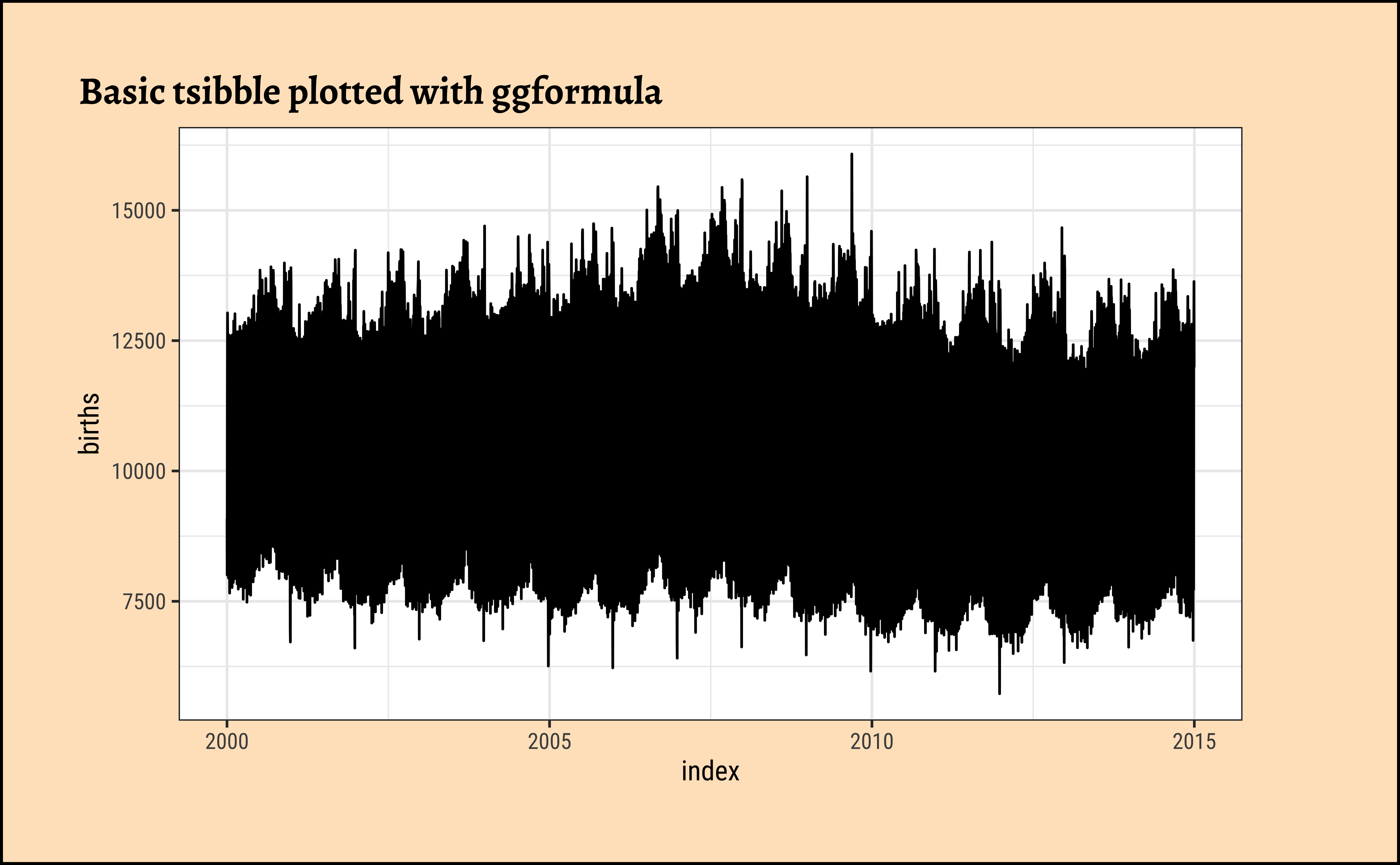
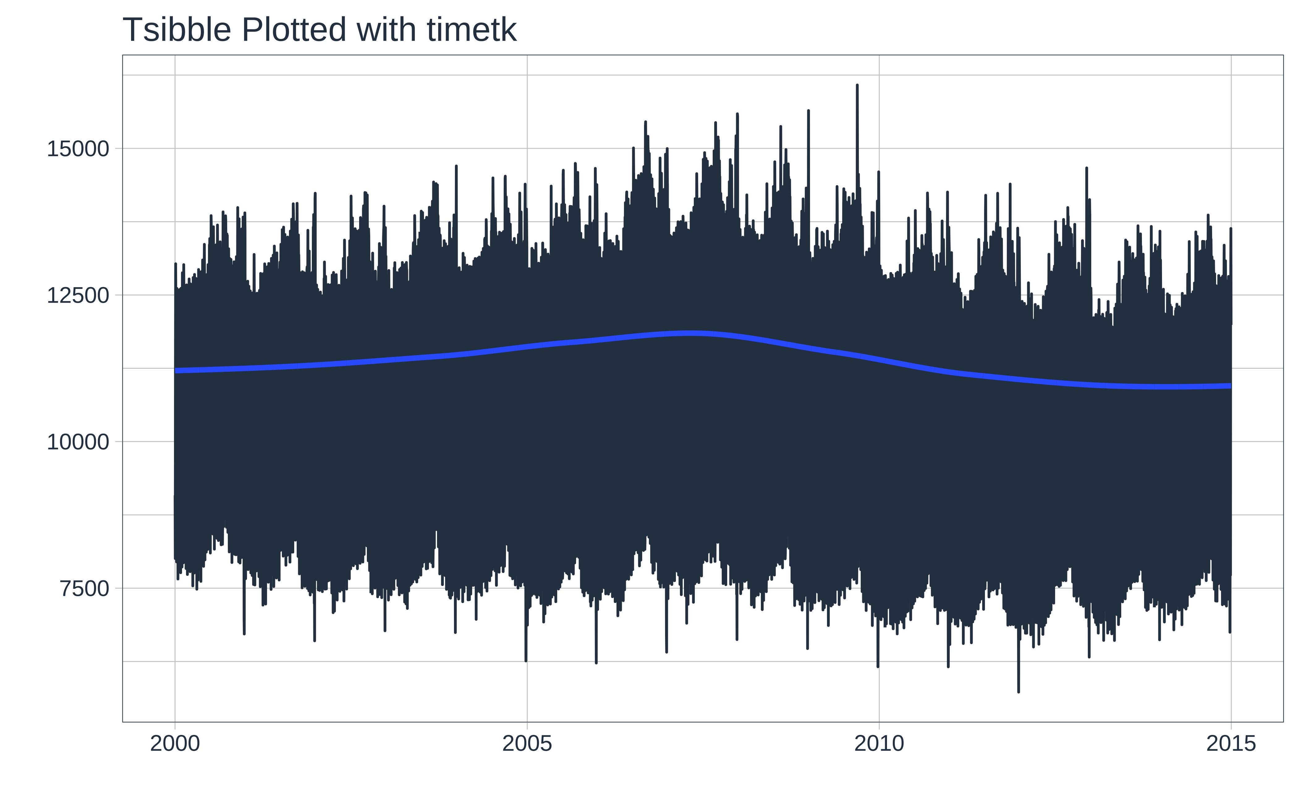
Let us plot the timeseries using the tsibble data, with both ggformula and timetk:
Let us try a basic plot with both tsibble vs timetk packages.
# column: body-outset-right
# Set graph theme
theme_set(new = theme_custom())
#
births_tsibble %>%
  gf_line(births ~ index,
    data = .,
    title = "Basic tsibble plotted with ggformula"
  )
# timetk **can** plot tsibbles.
births_tsibble %>%
  timetk::plot_time_series(
    .date_var = index,
    .value = births, .interactive = FALSE,
    .title = "Tsibble Plotted with timetk"
  )
6
Let us plot the time series using the tsibble data, with both ggformula and timetk, this time grouping by month and get monthly aggregates to get a summary:
Here we plot Monthly Aggregates with both ggformula and timetk:
# Set graph theme
theme_set(new = theme_custom())
##
births_tsibble %>%
  tsibble::index_by(month_index = ~ tsibble::yearmonth(.)) %>%
  dplyr::summarise(mean_births = mean(births, na.rm = TRUE)) %>%
  gf_point(mean_births ~ month_index,
    data = .,
    title = "Monthly Aggregate with tsibble + ggformula"
  ) %>%
  gf_line() %>%
  gf_smooth(se = FALSE, method = "loess") %>%
  gf_labs(x = "Year", y = "Mean Monthly Births")

##
##
##
##
births_timeseries %>%
  # cannot use tsibble here
  # tsibble format cannot be summarized/wrangled by timetk

  timetk::summarize_by_time(
    .date_var = date,
    .by = "month",
    month_mean = mean(births)
  ) %>%
  timetk::plot_time_series(date, month_mean,
    .title = "Monthly aggregate births with timetk",
    .interactive = FALSE,
    .x_lab = "year",
    .y_lab = "Mean Monthly Births"
  )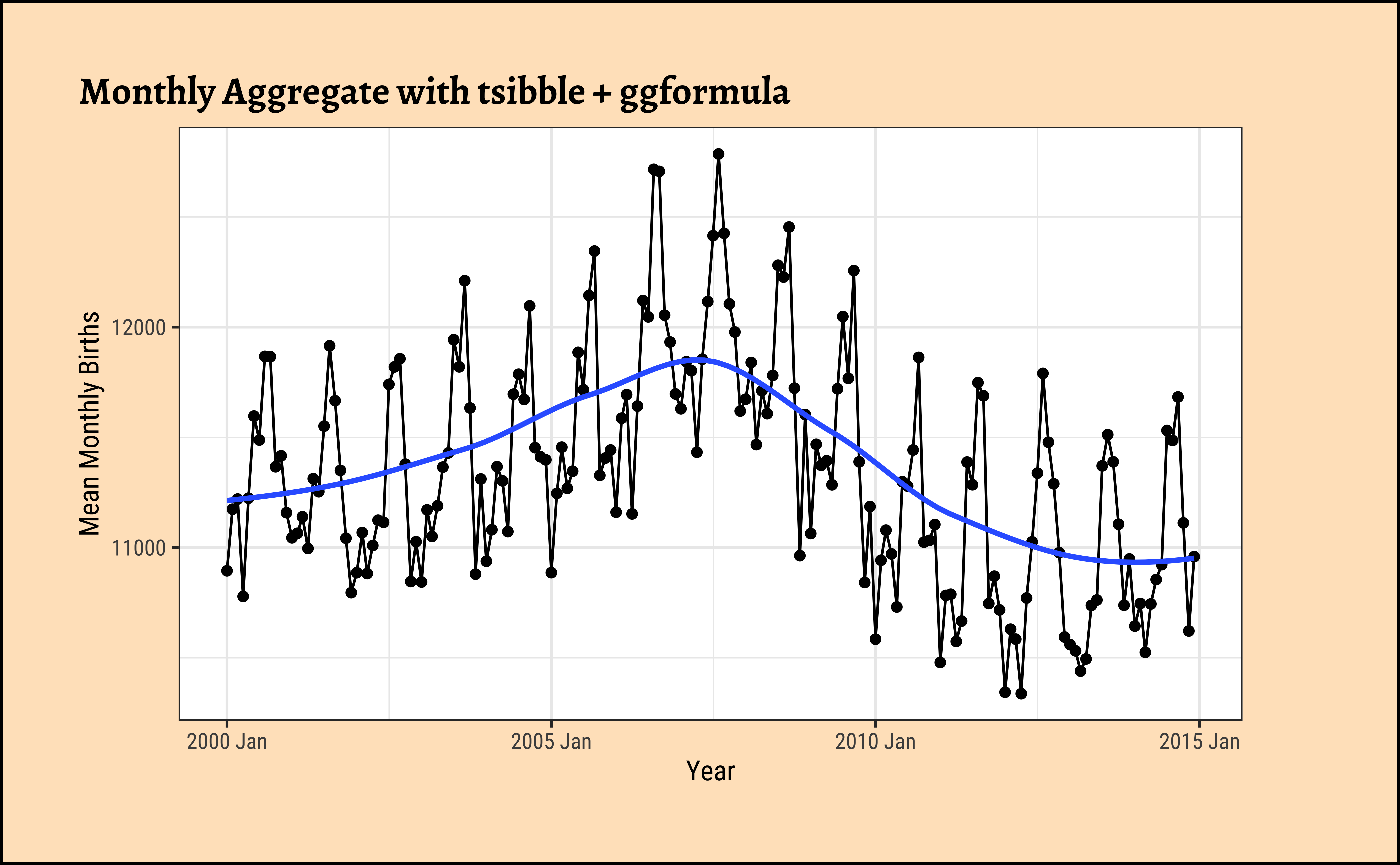
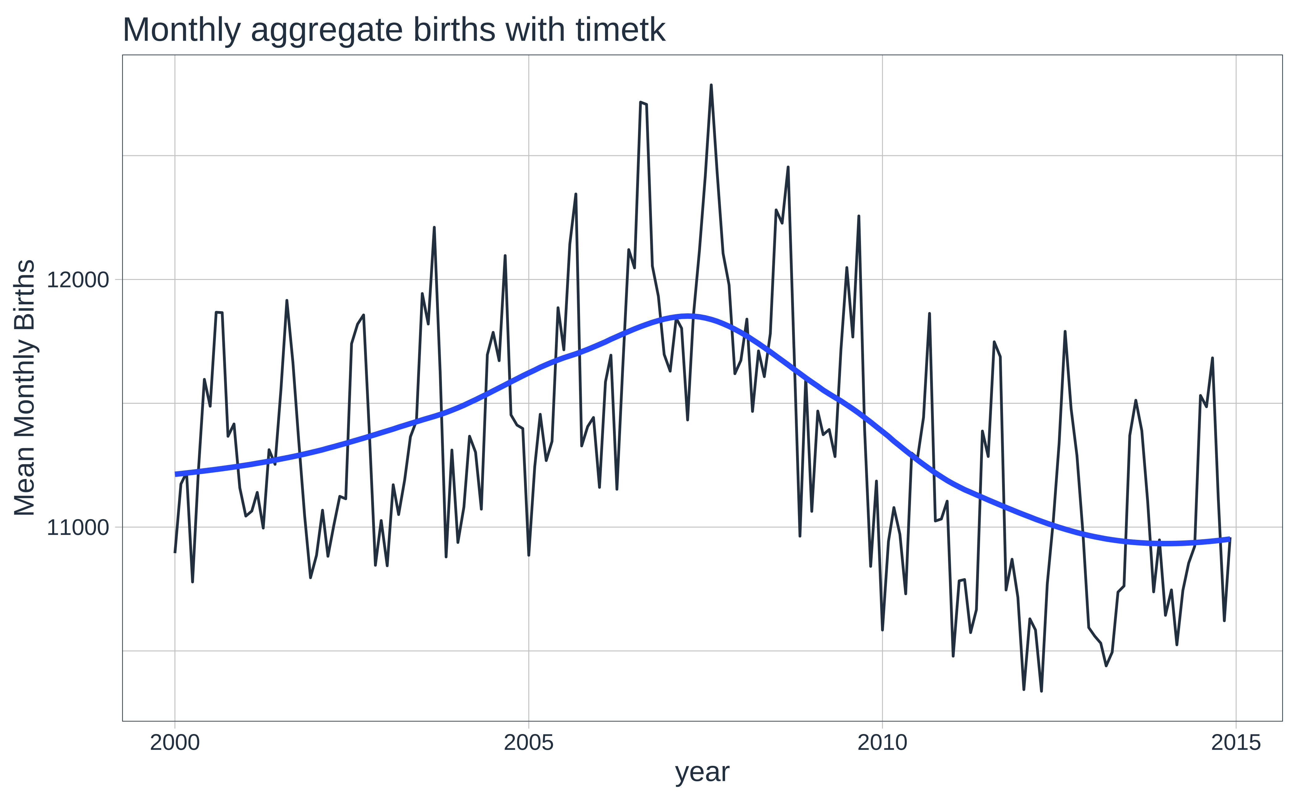
Apart from the bump during in 2006-2007, there are also seasonal trends that repeat each year, which we glimpsed earlier. We will analyse seasonal trends in another module.
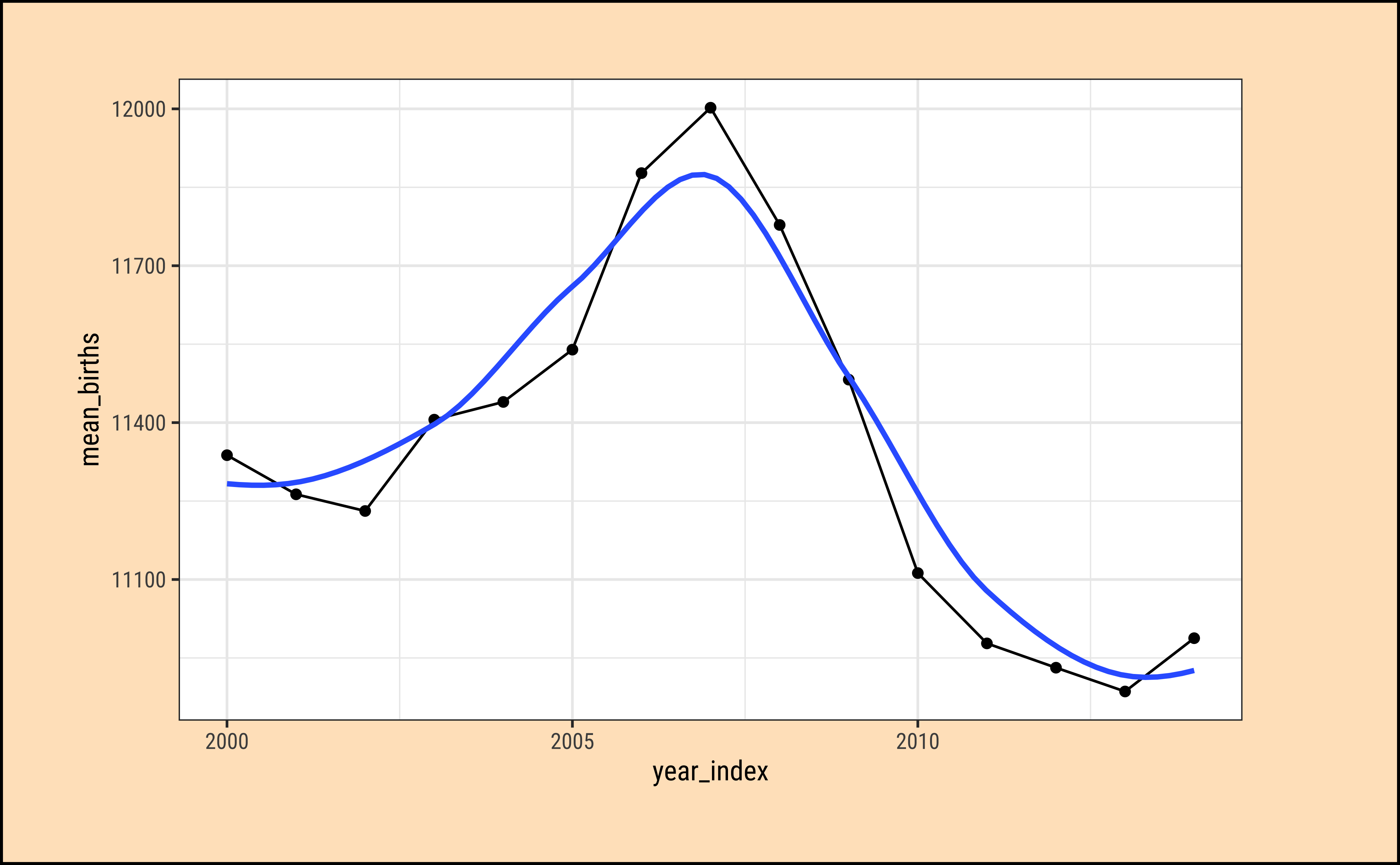
Let us try getting annual aggregates.
# Set graph theme
theme_set(new = theme_custom())
births_tsibble %>%
tsibble::index_by(year_index = ~ lubridate::year(.)) %>%
## tsibble does not have a "year" function? So using lubridate..
## Summarize
dplyr::summarise(mean_births = mean(births, na.rm = TRUE)) %>%
## Plot
gf_point(mean_births ~ year_index, data = .) %>%
gf_line() %>%
gf_smooth(se = FALSE, method = "loess")
##
##
##
##
##
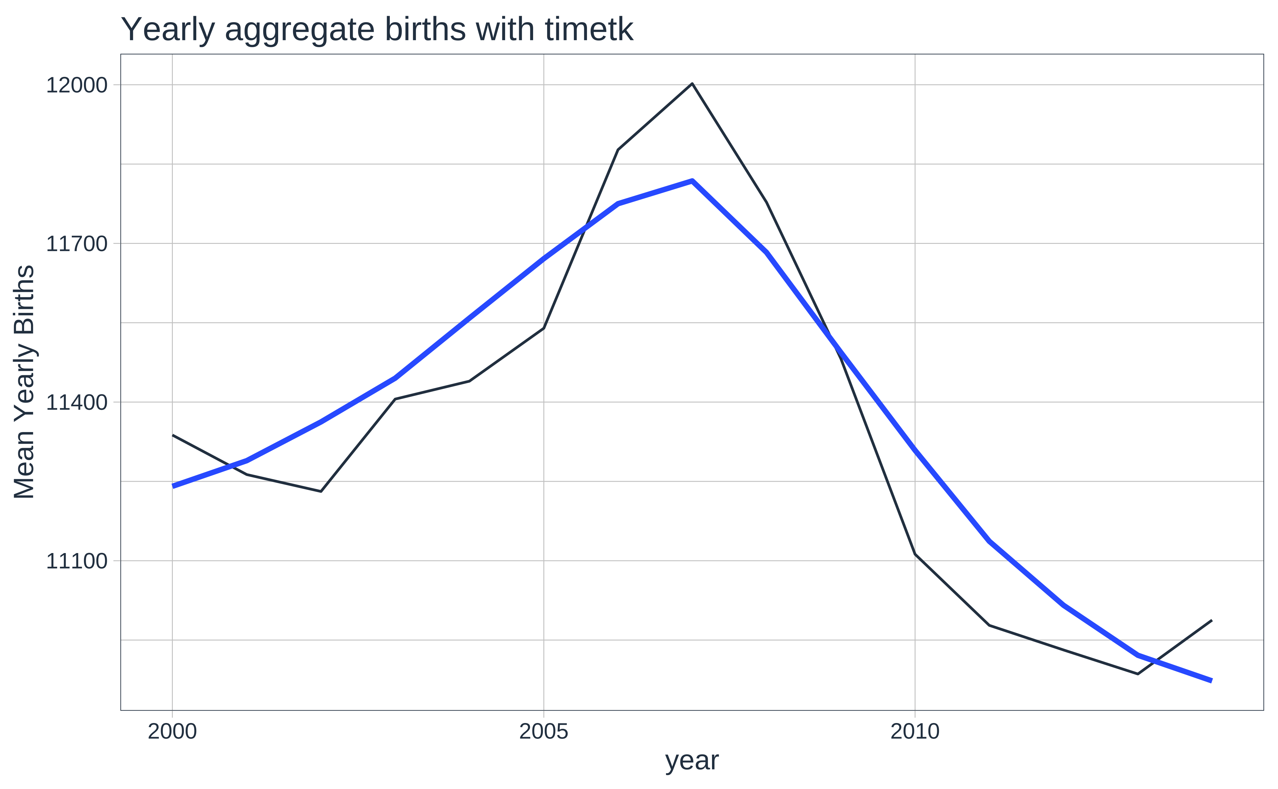
births_timeseries %>%
## Summarize
timetk::summarise_by_time(
.date_var = date,
.by = "year",
mean = mean(births)
) %>%
## Plot
timetk::plot_time_series(date, mean,
.title = "Yearly aggregate births with timetk",
.interactive = FALSE,
.x_lab = "year",
.y_lab = "Mean Yearly Births"
)
7
Hmm…can we try to plot boxplots over time (Candle-Stick Plots)? Over month, quarter or year?
7.1
# Set graph theme
theme_set(new = theme_custom())
births_tsibble %>%
index_by(month_index = ~ yearmonth(.)) %>%
# 15 years
# No need to summarise, since we want boxplots per year / month
# Plot the groups
# 180 plots!!
gf_boxplot(births ~ index,
group = ~month_index,
fill = ~month_index,
data = .,
title = "Boxplots of Births by Month",
caption = "tsibble + ggformula"
)
####
####
####
####
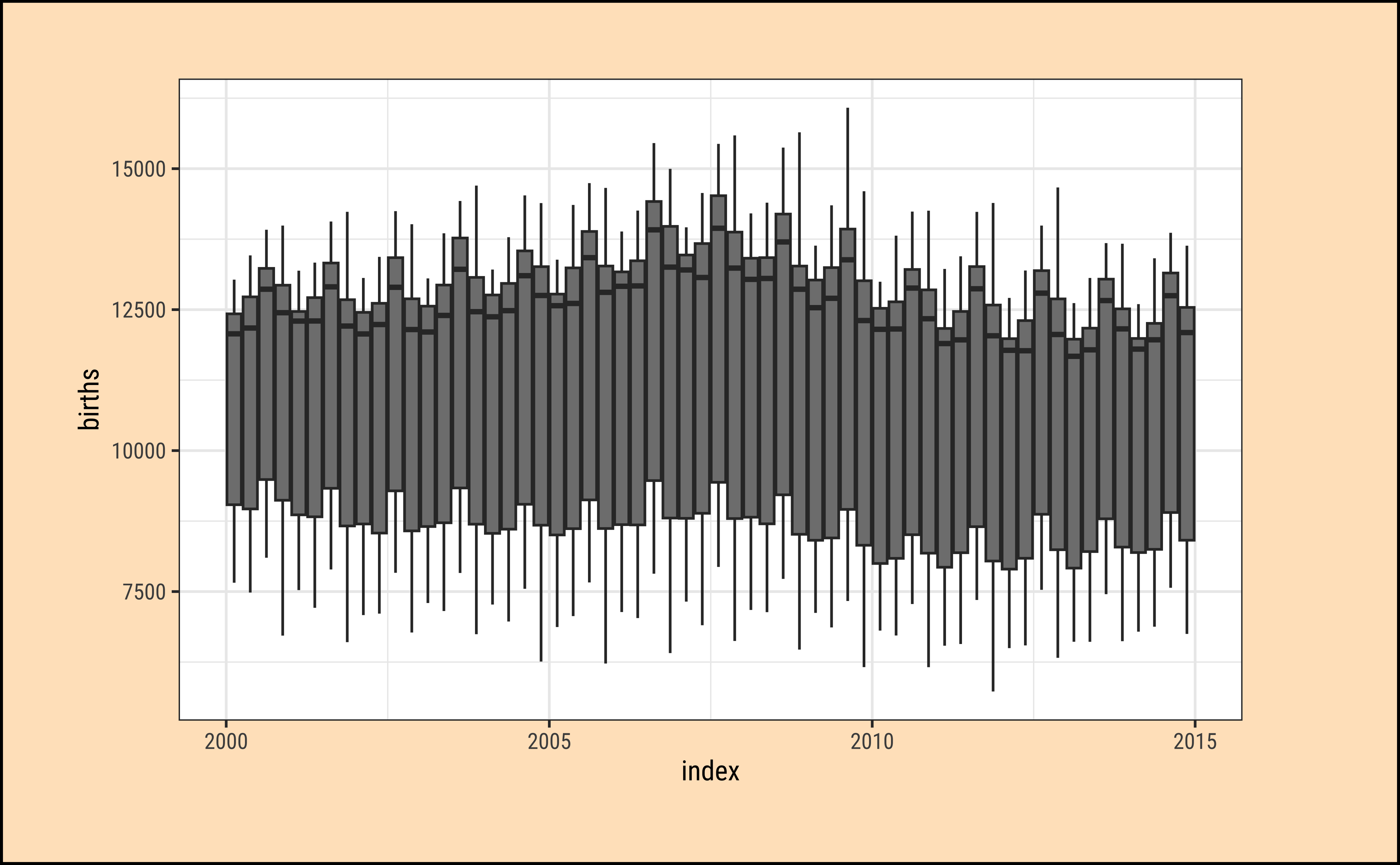
births_tsibble %>% # Can try births_timeseries too
timetk::plot_time_series_boxplot(
index, births,
.period = "month",
.plotly_slider = TRUE,
.title = "Boxplots of Births by Month",
.interactive = TRUE,
.x_lab = "year",
.y_lab = "Mean Monthly Births"
)timetk can take tsibble-format data to plot with, but cannot perform aggregation: summarize_by_time() will throw an error!
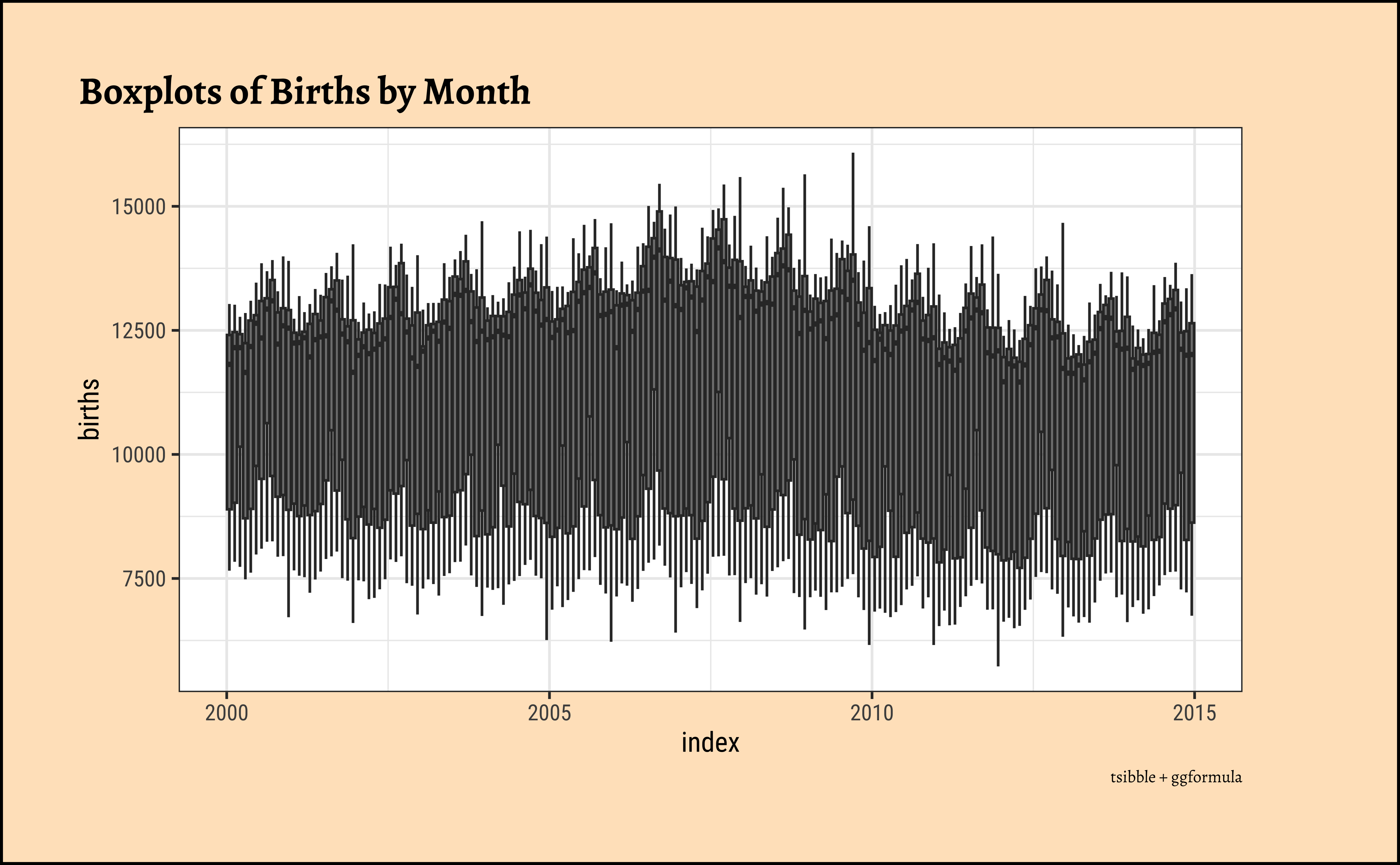
We see 180 boxplots…yes this is still too busy a plot for us to learn much from.
8
# Set graph theme
theme_set(new = theme_custom())

births_tsibble %>%
  index_by(qrtr_index = ~ yearquarter(.)) %>% # 60 quarters over 15 years
  # No need to summarise, since we want boxplots per year / month
  gf_boxplot(births ~ index,
    group = ~qrtr_index,
    fill = ~qrtr_index,
    data = .
  ) # 60 plots!!
###
###
###
###
###

births_tsibble %>% # Can try births_timeseries too
  timetk::plot_time_series_boxplot(
    index, births,
    .period = "quarter",
    .title = "Quarterly births with timetk",
    .interactive = TRUE,
    .plotly_slider = TRUE,
    .x_lab = "year",
    .y_lab = "Mean Quarterly Births"
  )
We have 60 boxplots…over a period of 15 years, one box plot per quarter…
8.1
# Set graph theme
theme_set(new = theme_custom())

births_tsibble %>%
  index_by(year_index = ~ lubridate::year(.)) %>% # 15 years, 15 groups
  # No need to summarise, since we want boxplots per year / month

  gf_boxplot(births ~ index,
    group = ~year_index,
    fill = ~year_index,
    data = .
  ) %>% # plot the groups 15 plots
  gf_theme(scale_fill_distiller(palette = "Spectral"))
####
####
####
####
####
####

births_tsibble %>%
  timetk::plot_time_series_boxplot(
    index, births,
    .period = "year",
    .title = "Yearly aggregate births with timetk",
    .interactive = TRUE,
    .plotly_slider = TRUE,
    .x_lab = "year",
    .y_lab = "Births"
  )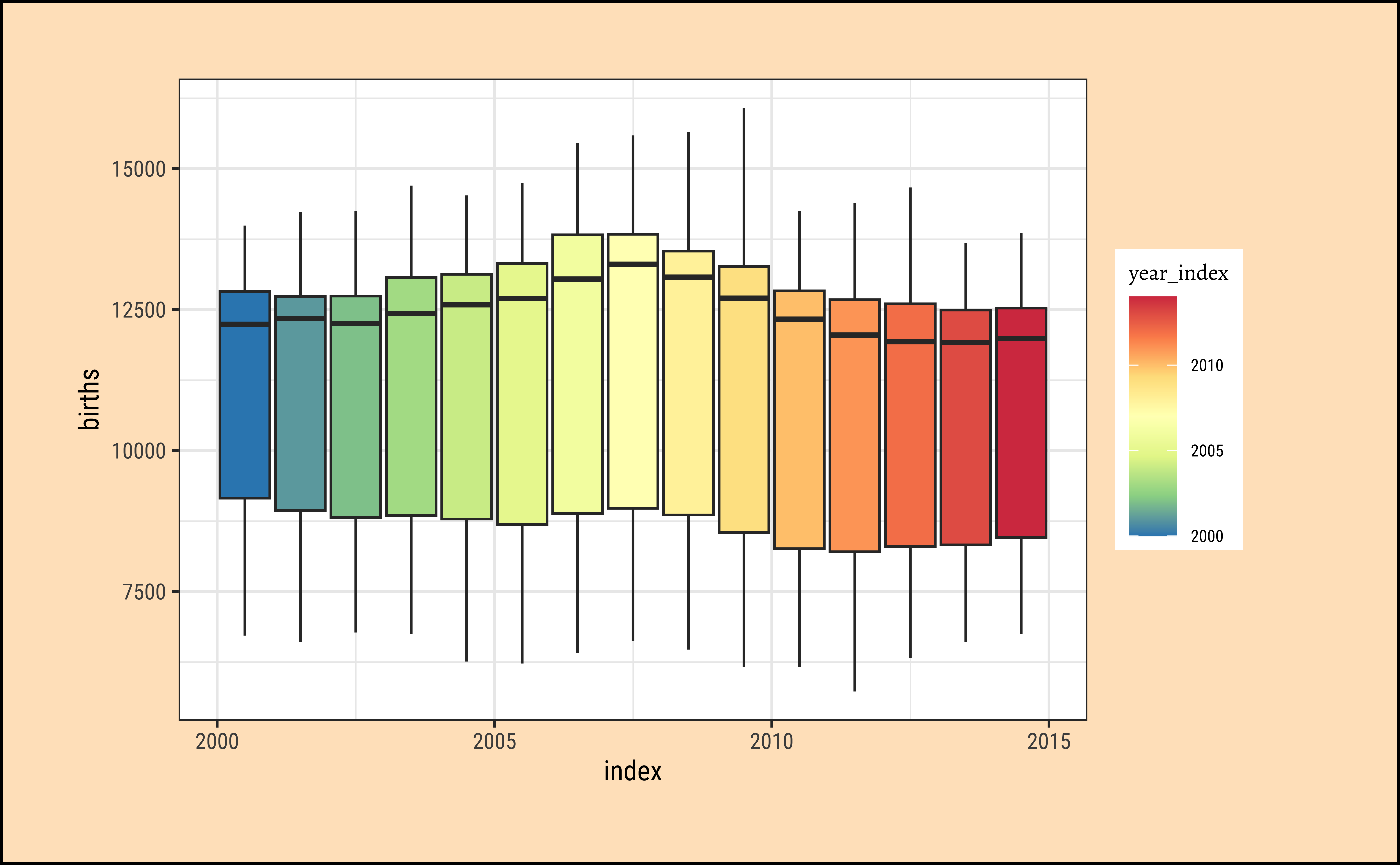
This looks much better…We can more easily see that 2006-2009 the births were somewhat higher, because the medians in these years are the highest.
9
We previously encountered the PBS dataset from the tsibbledata package earlier, which is a dataset containing Monthly Medicare prescription data in Australia. We will resume from there:
data("PBS", package = "tsibbledata")
PBSglimpse(PBS)Rows: 67,596
Columns: 9
Key: Concession, Type, ATC1, ATC2 [336]
$ Month <mth> 1991 Jul, 1991 Aug, 1991 Sep, 1991 Oct, 1991 Nov, 1991 Dec,…
$ Concession <chr> "Concessional", "Concessional", "Concessional", "Concession…
$ Type <chr> "Co-payments", "Co-payments", "Co-payments", "Co-payments",…
$ ATC1 <chr> "A", "A", "A", "A", "A", "A", "A", "A", "A", "A", "A", "A",…
$ ATC1_desc <chr> "Alimentary tract and metabolism", "Alimentary tract and me…
$ ATC2 <chr> "A01", "A01", "A01", "A01", "A01", "A01", "A01", "A01", "A0…
$ ATC2_desc <chr> "STOMATOLOGICAL PREPARATIONS", "STOMATOLOGICAL PREPARATIONS…
$ Scripts <dbl> 18228, 15327, 14775, 15380, 14371, 15028, 11040, 15165, 168…
$ Cost <dbl> 67877.00, 57011.00, 55020.00, 57222.00, 52120.00, 54299.00,…# inspect(PBS) # does not work since mosaic cannot handle tsibbles
# skimr::skim(PBS) # does not work, need to investigate
9.1
Let us first see how many observations there are for each combo of keys:
PBS
This is a large-ish dataset: (Run PBS in your console)
67K observations
Quant Variables: Two Quant variables (
ScriptsandCost)-
Time Variable:
- Data appears to be monthly, as indicated by the
1M. - the time index variable is called
Month - formatted as
yearmonth, a new type of variable introduced in thetsibblepackage.yearmonthdoes not show inglimpseoutput!
- Data appears to be monthly, as indicated by the
-
Qual variables:
-
Concession:ConcessionalandGeneral(Concessionalscriptsare given to pensioners, unemployed, dependents, and other card holders) -
Type:Co-paymentsandSafety Net -
ATC1: Anatomical Therapeutic Chemical index (level 1).- 15 types
-
-
ATC2: Anatomical Therapeutic Chemical index (level 2).- 84 types, nested inside
ATC1.
- 84 types, nested inside
We will start with the familiar basic messy plot, and work our way towards filtering, summaries, and averages.
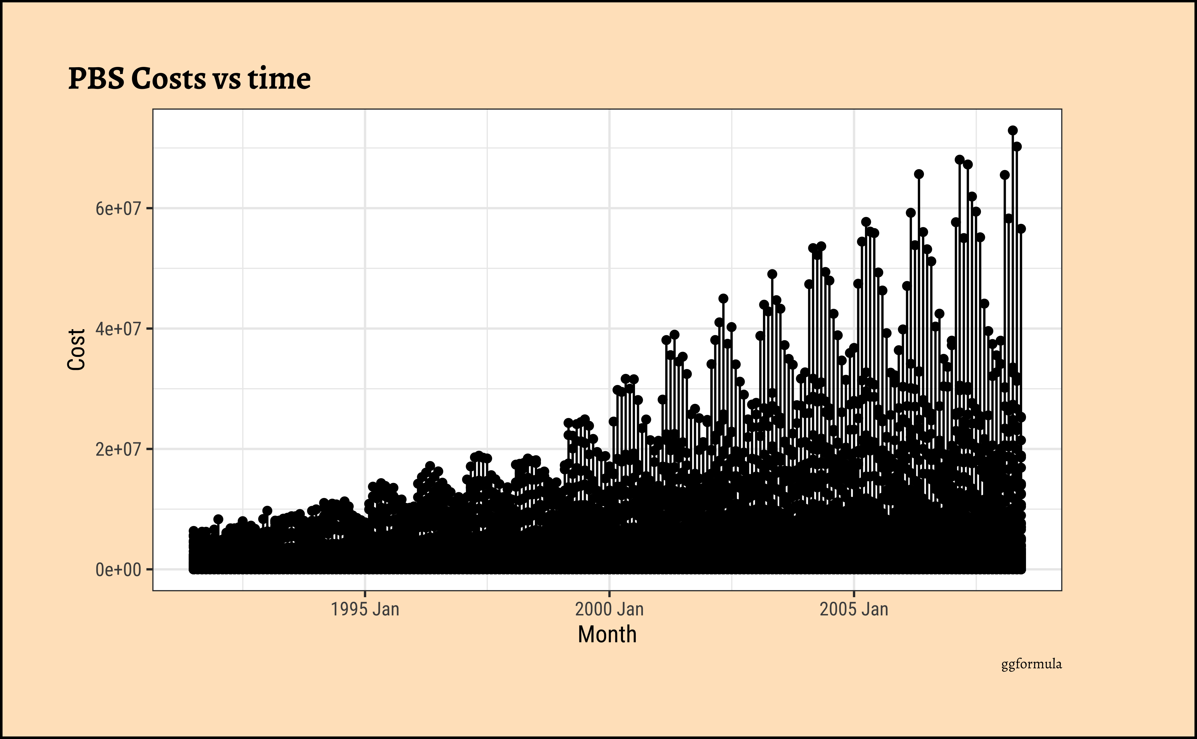
As noted earlier, this basic plot is quite messy. Other than an overall rising trend and more vigorous variations pointing to a multiplicative process, we cannot say more. There is simply too much happening here and it is now time (sic!) for us to look at summaries of the data using dplyr-like verbs. We will perform summaries with tsibble and plots with ggformula first. Then we will use timetk to perform both operations.
# Set graph theme
theme_set(new = theme_custom())

# Costs variable for a specific combo of Qual variables(keys)
PBS %>%
  dplyr::filter(
    Concession == "General",
    ATC1 == "A"
  ) %>%
  gf_line(Cost ~ Month,
    colour = ~Type,
    data = .
  ) %>%
  gf_point(title = "Costs per Month for General A category patients") %>%
  gf_refine(scale_y_continuous(labels = scales::label_comma()))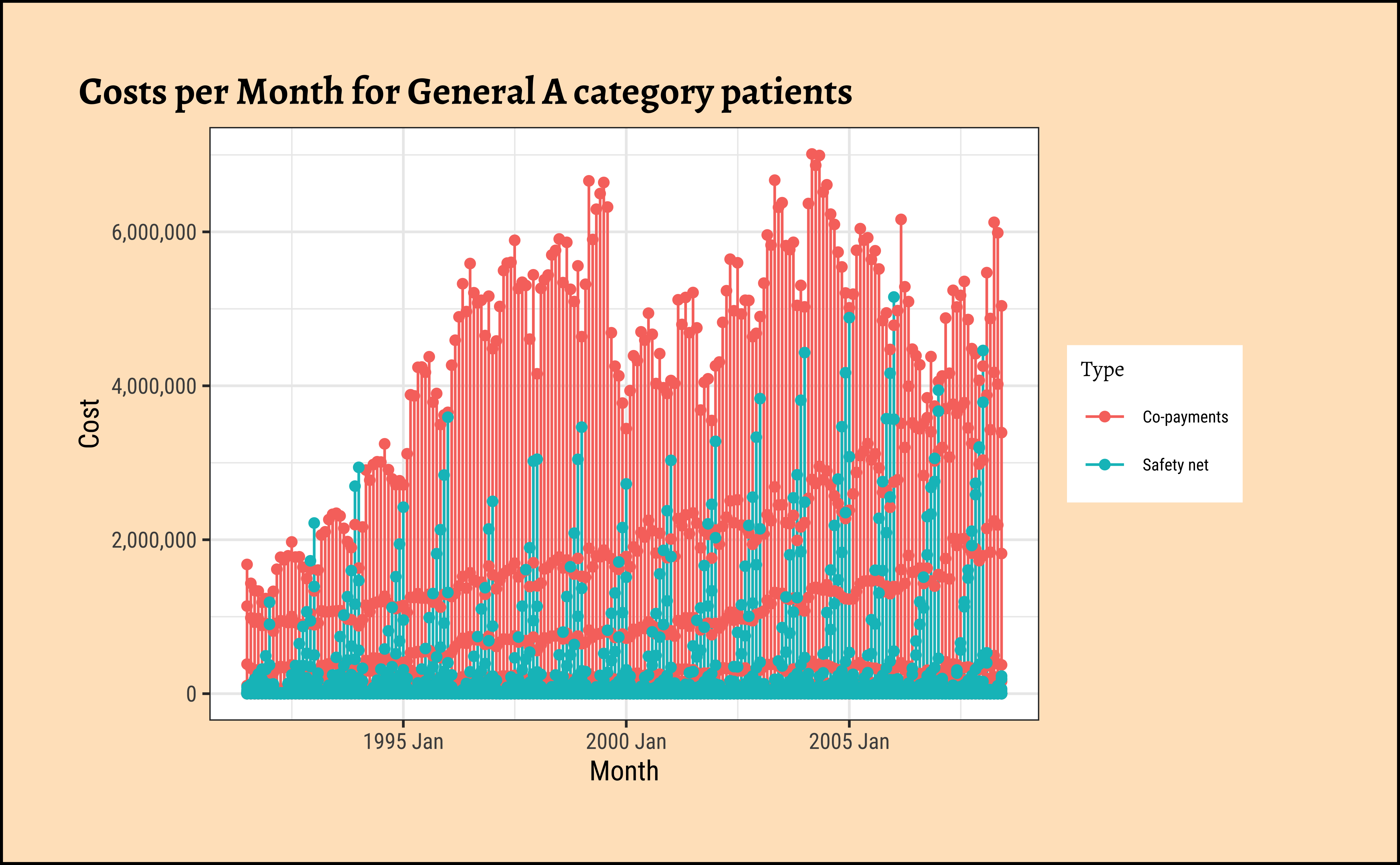
As can be seen:
- strongly seasonal for both
Types of graphs; - seasonal variation increasing over the years, a clear sign of a multiplicative time series, especially for
Safety net. - Upward trend with both types of subsidies,
Safety netandCo-payments. -
Co-paymentstype have some kind of dip around the year 2000… - But this is still messy and overwhelming and we could certainly use some summaries/aggregates/averages.
We can now use tsibble’s dplyr-like commands to develop summaries by year, quarter, month(original data): Look carefully at the new time variable created each time, and the size the data frame decrease with each aggregation:
# Cost Summary by Month, which is the original data
# New Variable Name to make grouping visible
PBS_month <- PBS %>%
  dplyr::filter(
    Concession == "General",
    ATC1 == "A"
  ) %>%
  tsibble::index_by(Month_Date = Month) %>%
  dplyr::summarise(
    across(
      .cols = c(Cost, Scripts),
      .fn = mean,
      .names = "mean_{.col}"
    )
  )

PBS_month
# Set graph theme
theme_set(new = theme_custom())
PBS_month %>%
mutate(Month_Date = as_date(Month_Date)) %>%
gf_line(mean_Cost ~ Month_Date) %>%
gf_line(mean_Scripts ~ Month_Date,
title = "Mean Costs and Scripts for General + A category",
subtitle = "Means over General + A category "
) %>%
gf_refine(scale_y_continuous(labels = scales::label_comma()))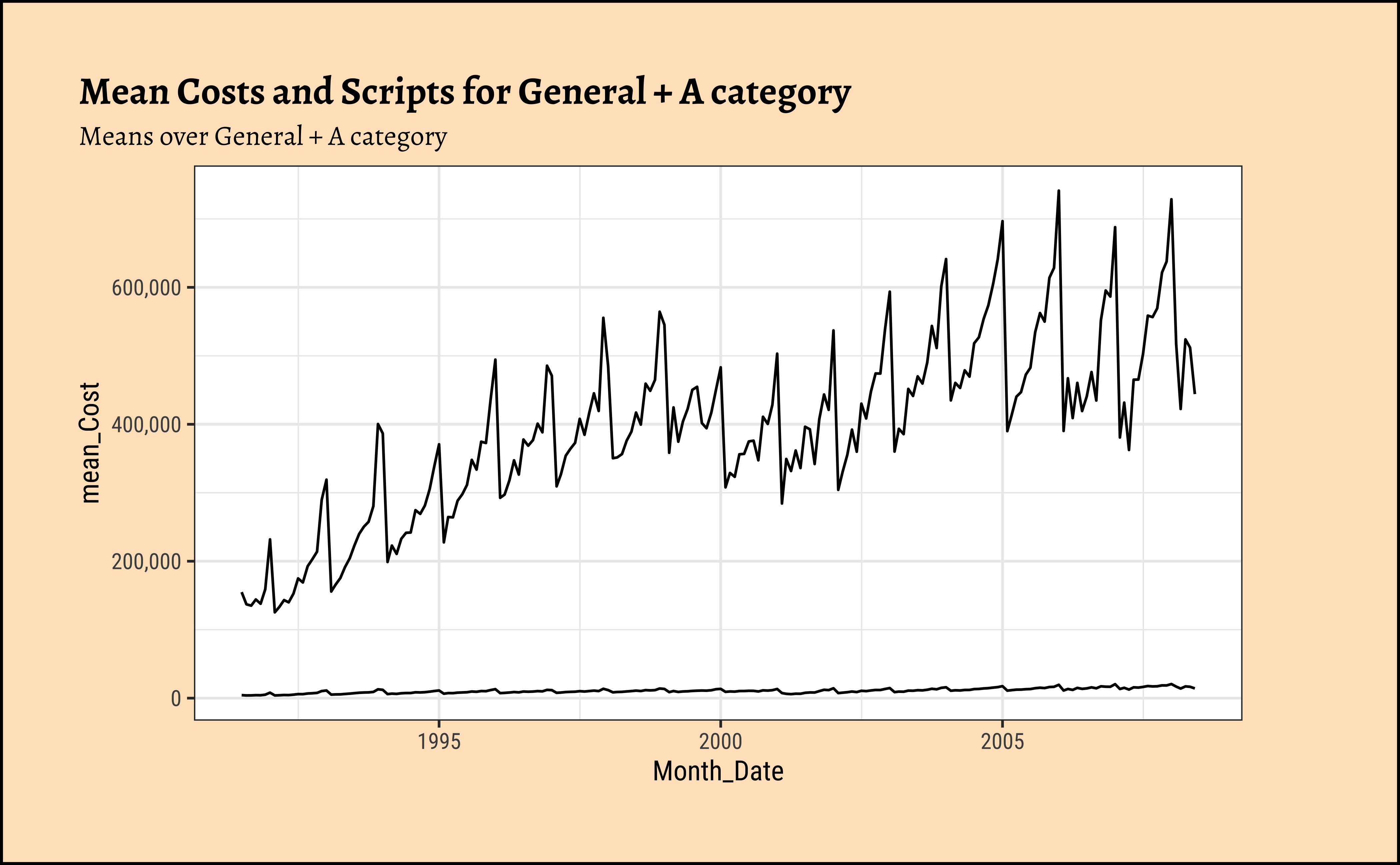
As can be seen: To Be Written Up !!!
# Set graph theme
theme_set(new = theme_custom())
#
PBS_quarter %>%
  gf_line(mean_Cost ~ Quarter_Date) %>%
  gf_refine(scale_y_continuous(labels = scales::label_comma()))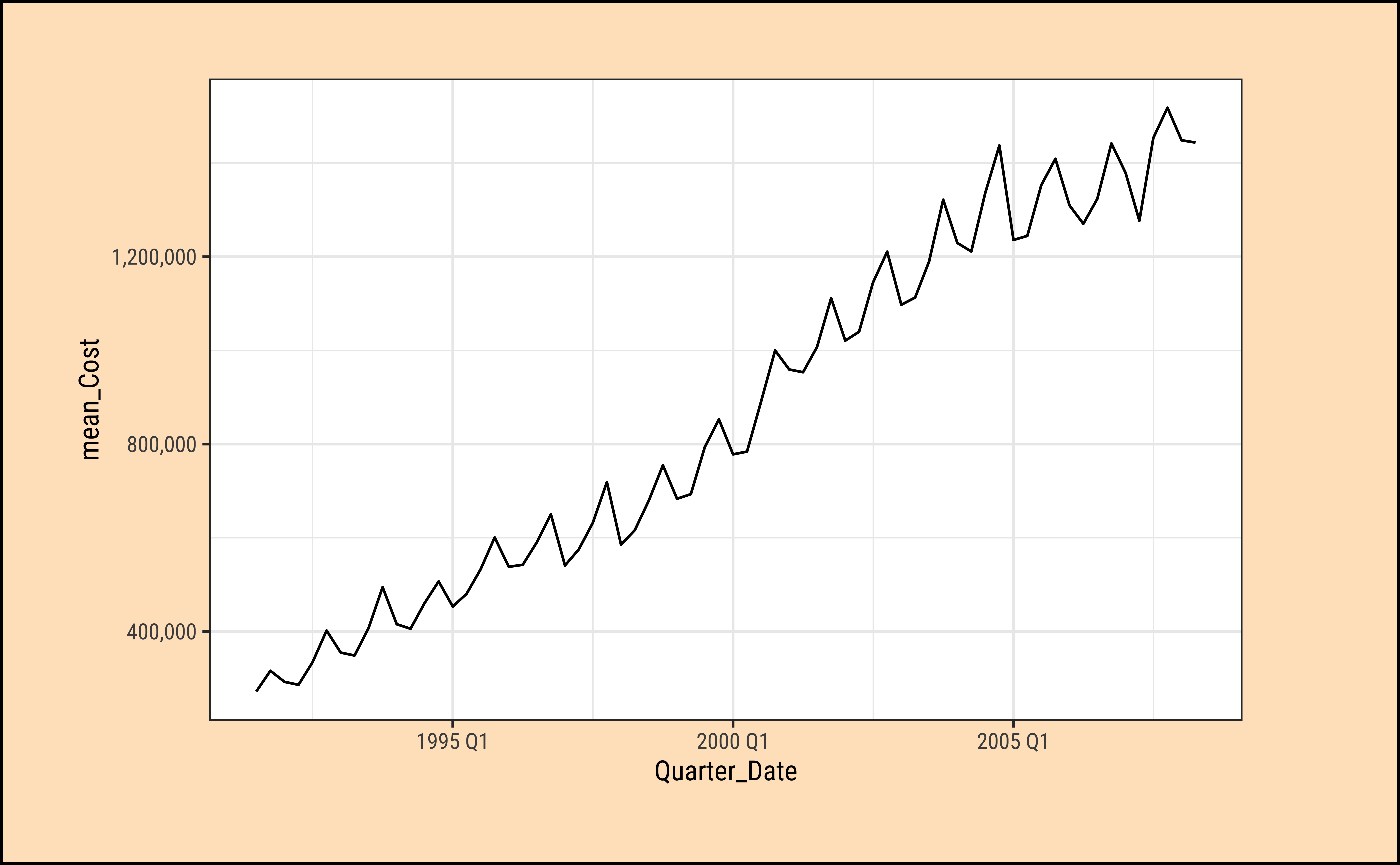
As can be seen: TBD
# Set graph theme
theme_set(new = theme_custom())
#
PBS_year %>%
  gf_line(mean_Cost ~ Year_Date) %>%
  gf_refine(scale_y_continuous(labels = scales::label_comma()))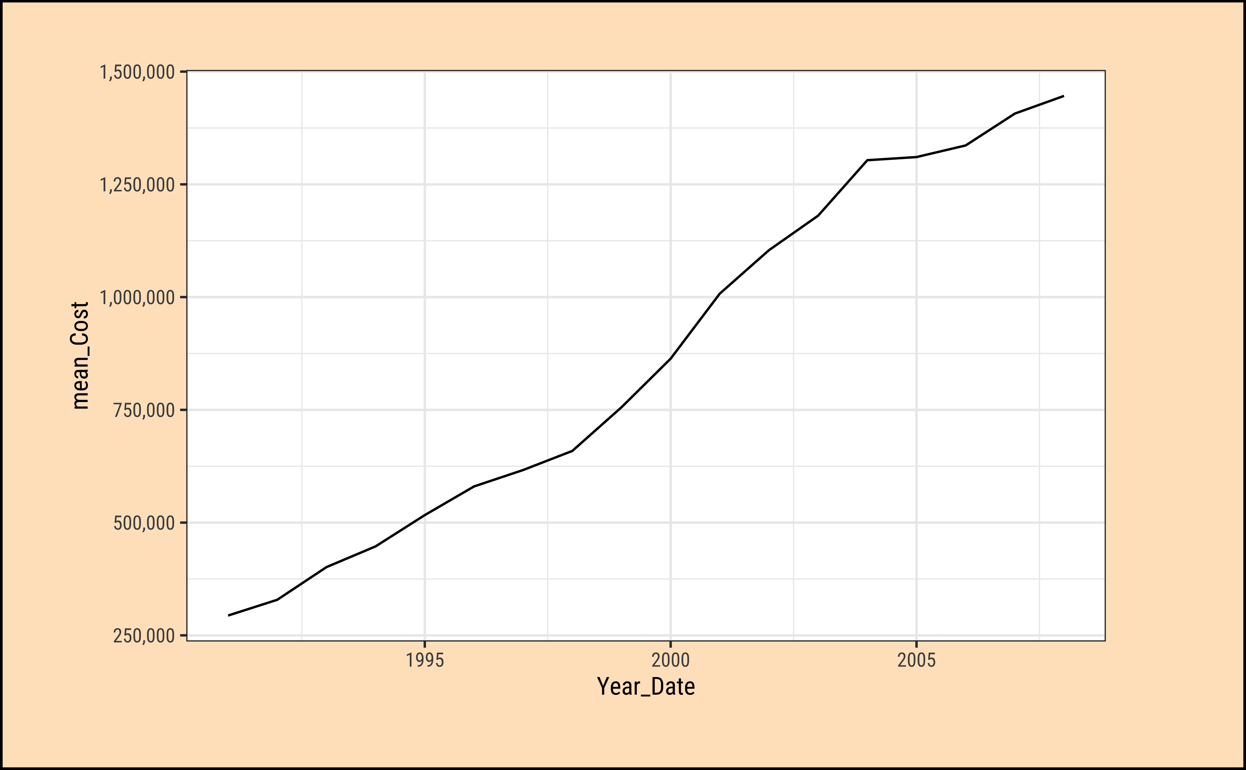
As can be seen: TBD. I must write this up soon!
9.2 Using timetk
time variable for timetk
The PBS-derived tsibbles have their “time-oriented” variables formatted asyearmonth,yearquarter and dbl, as seen. We need to mutate these into a proper date format for the timetk package to summarise them successfully. (Plotting a tsibble with timetk is possible, as seen earlier.)
# Set graph theme
theme_set(new = theme_custom())

PBS %>%
  mutate(Month_Date = lubridate::as_date(Month)) %>%
  ##
  timetk::summarise_by_time(
    .date_var = Month_Date,
    .by = "month",
    mean_Cost = mean(Cost)
  ) %>%
  ##
  timetk::plot_time_series(
    .date_var = Month_Date,
    .value = mean_Cost,
    .interactive = FALSE,
    .x_lab = "Time", .y_lab = "Costs",
    .title = "Mean Costs by Month"
  ) +
  labs(caption = "Tsibble Plotted with timetk")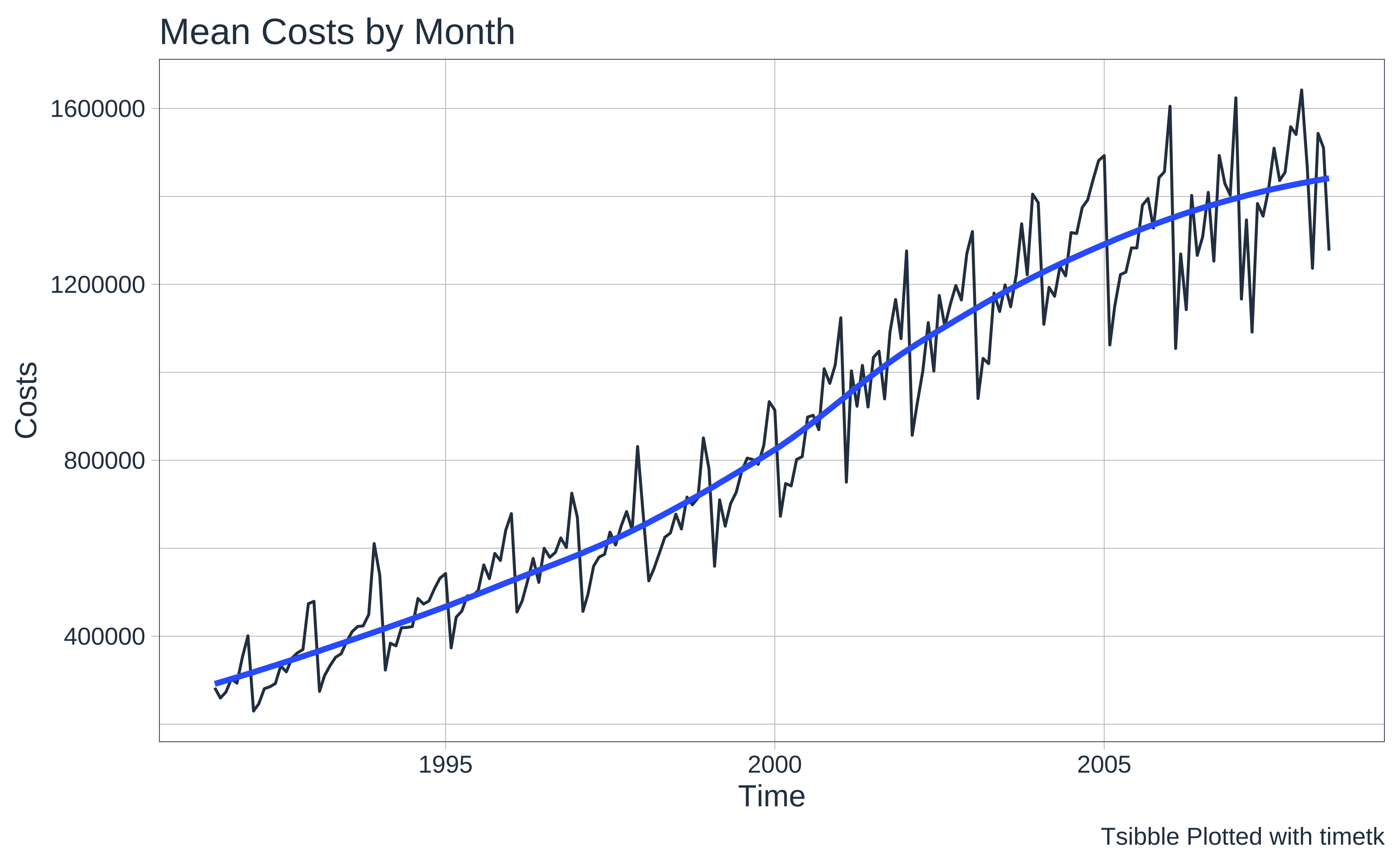
# Set graph theme
theme_set(new = theme_custom())

PBS %>%
  mutate(Month_Date = lubridate::as_date(Month)) %>%
  as_tibble() %>%
  ##
  timetk::summarise_by_time(
    .date_var = Month_Date,
    .by = "quarter",
    mean_Cost = mean(Cost)
  ) %>%
  ##
  timetk::plot_time_series(
    .date_var = Month_Date,
    .value = mean_Cost,
    .interactive = FALSE,
    .x_lab = "Time", .y_lab = "Costs",
    .title = "Mean Costs by Quarter"
  ) +
  labs(caption = "Tsibble Plotted with timetk")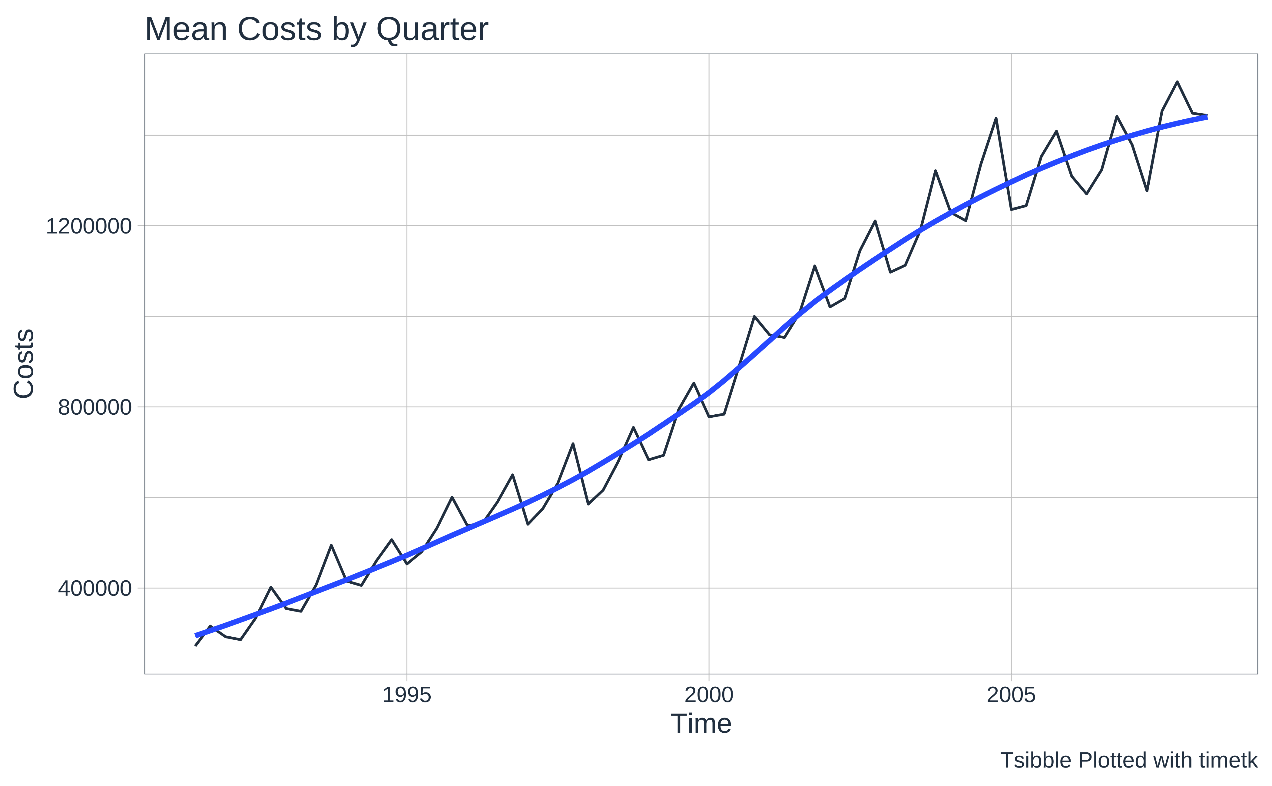
# Set graph theme
theme_set(new = theme_custom())
PBS %>%
  mutate(Month_Date = lubridate::as_date(Month)) %>%
  as_tibble() %>%
  ##
  timetk::summarise_by_time(
    .date_var = Month_Date,
    .by = "year",
    mean_Cost = mean(Cost)
  ) %>%
  ##
  timetk::plot_time_series(
    .date_var = Month_Date,
    .value = mean_Cost,
    .interactive = FALSE,
    .x_lab = "Time", .y_lab = "Costs",
    .title = "Mean Costs by Year"
  ) +
  labs(caption = "Tsibble Plotted with timetk")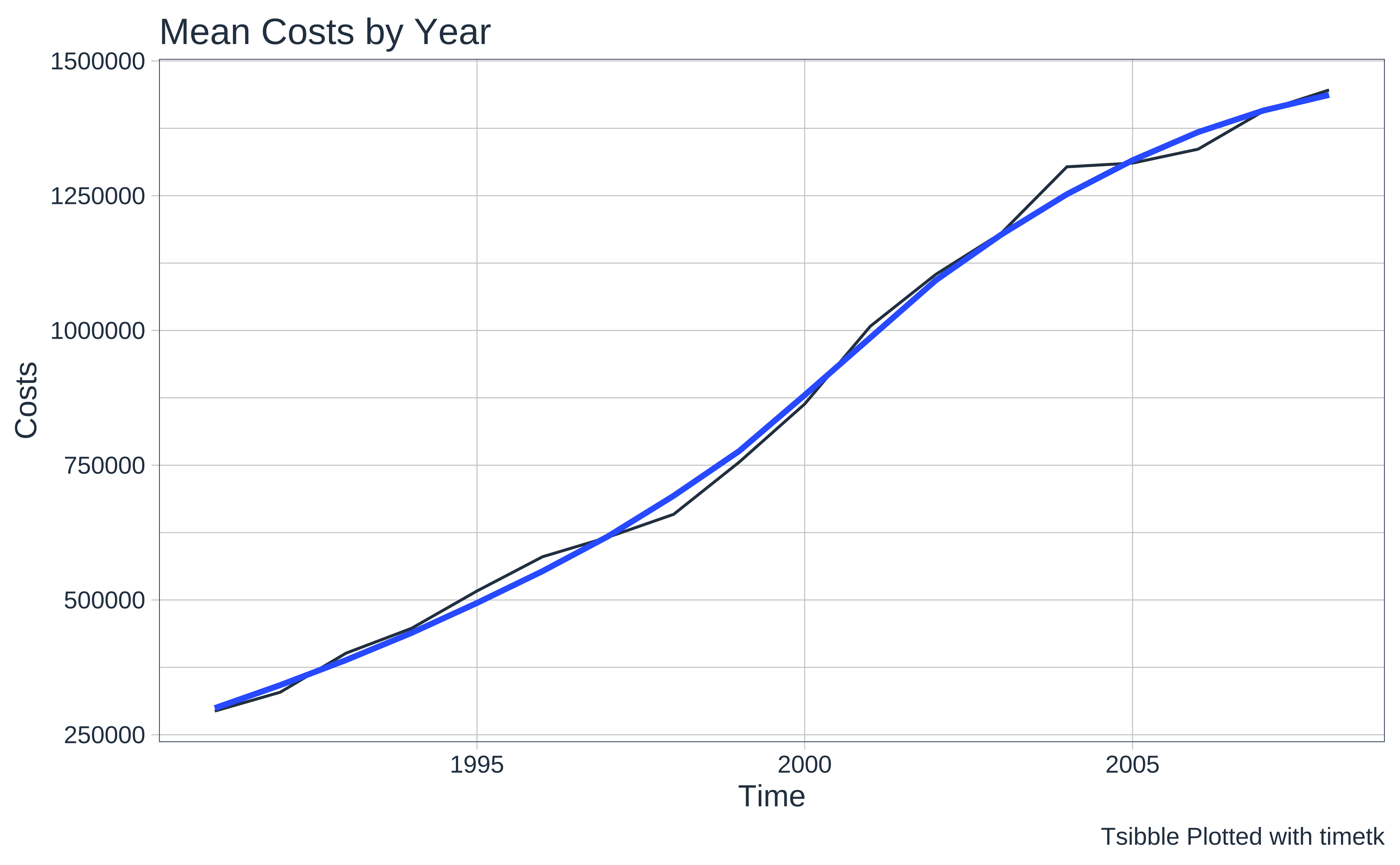
10
We have learnt how to filter, summarize and compute various aggregate metrics from them and to plot these. Both tsibble and timetk offer similar capability here.
11
- Choose some of the data sets in the
tsdland in thetsibbledatapackages. Plot basic, filtered and summarized graphs for these and interpret.
12
- Robert Hyndman, Forecasting: Principles and Practice (Third Edition). available online
-
Time Series Analysis at Our Coding Club
Error in `cite_packages()`:
! could not find function "cite_packages"Citation
@online{2022,
  author = {},
  title = {🕔 {Time} {Series} {Wrangling}},
  date = {2022-12-15},
  url = {https://madhatterguide.netlify.app/content/courses/Analytics/10-Descriptive/Modules/50-Time/files/wrangling/timeseries-wrangling.html},
  langid = {en},
  abstract = {Grouping, Filtering, and Summarizing Time Series Data}
}