library(tidyverse) # Manage data
library(ggformula) # ggplot2 with a formula interface
library(scales) # Create special ( % or $ ) scales
library(RColorBrewer) # Colour Palettes
library(paletteer) # Colour Palettes Super Package
library(colorspace) # Colour Palettes
library(wesanderson) # Colour Palettes
library(grDevices) # Colour Palettes and fonts and...;-O
####
# devtools::install_github("EdwinTh/dutchmasters")
library(dutchmasters) # Dutch Masters Palettes
####
# devtools::install_github("aljrico/gameofthrones")
library(gameofthrones) # You all know this!
library(harrypotter) # Harry Potter Palettes
library(ggthemes) # Extra ggplot2 themes and scales

library(patchwork) # arranges plots on Row-Col
library(reactable) # Interactive tables ( for choosing palettes)Colours
Palettes from Famous Paintings, GoT, Harry Potter, and Wes Anderson

1
Plot Fonts and Theme
Show the Code
library(systemfonts)
library(showtext)
library(ggrepel)
library(marquee)
## Clean the slate
systemfonts::clear_local_fonts()
systemfonts::clear_registry()
##
showtext_opts(dpi = 96) # set DPI for showtext
sysfonts::font_add(
  family = "Alegreya",
  regular = "../../../../../../fonts/Alegreya-Regular.ttf",
  bold = "../../../../../../fonts/Alegreya-Bold.ttf",
  italic = "../../../../../../fonts/Alegreya-Italic.ttf",
  bolditalic = "../../../../../../fonts/Alegreya-BoldItalic.ttf"
)

sysfonts::font_add(
  family = "Roboto Condensed",
  regular = "../../../../../../fonts/RobotoCondensed-Regular.ttf",
  bold = "../../../../../../fonts/RobotoCondensed-Bold.ttf",
  italic = "../../../../../../fonts/RobotoCondensed-Italic.ttf",
  bolditalic = "../../../../../../fonts/RobotoCondensed-BoldItalic.ttf"
)
showtext_auto(enable = TRUE) # enable showtext
##
theme_custom <- function() {
  theme_bw(base_size = 10) +

    theme_sub_axis(
      title = element_text(
        family = "Roboto Condensed",
        size = 8
      ),
      text = element_text(
        family = "Roboto Condensed",
        size = 6
      )
    ) +

    theme_sub_legend(
      text = element_text(
        family = "Roboto Condensed",
        size = 6
      ),
      title = element_text(
        family = "Alegreya",
        size = 8
      )
    ) +

    theme_sub_plot(
      title = element_text(
        family = "Alegreya",
        size = 14, face = "bold"
      ),
      title.position = "plot",
      subtitle = element_text(
        family = "Alegreya",
        size = 10
      ),
      caption = element_text(
        family = "Alegreya",
        size = 6
      ),
      caption.position = "plot"
    )
}

## Use available fonts in ggplot text geoms too!
ggplot2::update_geom_defaults(geom = "text", new = list(
  family = "Roboto Condensed",
  face = "plain",
  size = 3.5,
  color = "#2b2b2b"
))
ggplot2::update_geom_defaults(geom = "label", new = list(
  family = "Roboto Condensed",
  face = "plain",
  size = 3.5,
  color = "#2b2b2b"
))

ggplot2::update_geom_defaults(geom = "marquee", new = list(
  family = "Roboto Condensed",
  face = "plain",
  size = 3.5,
  color = "#2b2b2b"
))
ggplot2::update_geom_defaults(geom = "text_repel", new = list(
  family = "Roboto Condensed",
  face = "plain",
  size = 3.5,
  color = "#2b2b2b"
))
ggplot2::update_geom_defaults(geom = "label_repel", new = list(
  family = "Roboto Condensed",
  face = "plain",
  size = 3.5,
  color = "#2b2b2b"
))

## Set the theme
ggplot2::theme_set(new = theme_custom())

## tinytable options
options("tinytable_tt_digits" = 2)
options("tinytable_format_num_fmt" = "significant_cell")
options(tinytable_html_mathjax = TRUE)


## Set defaults for flextable
flextable::set_flextable_defaults(font.family = "Roboto Condensed")
2
We will look at how to use colour scales and palettes to embellish our plots in ggplot2.
3
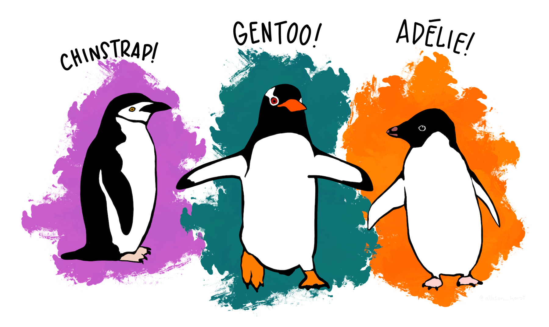
We will use the penguins dataset built into R itself. Your should try other datasets too!
Here is a glimpse of the data:
Rows: 344
Columns: 8
$ species     <fct> Adelie, Adelie, Adelie, Adelie, Adelie, Adelie, Adelie, Ad…
$ island      <fct> Torgersen, Torgersen, Torgersen, Torgersen, Torgersen, Tor…
$ bill_len    <dbl> 39.1, 39.5, 40.3, NA, 36.7, 39.3, 38.9, 39.2, 34.1, 42.0, …
$ bill_dep    <dbl> 18.7, 17.4, 18.0, NA, 19.3, 20.6, 17.8, 19.6, 18.1, 20.2, …
$ flipper_len <int> 181, 186, 195, NA, 193, 190, 181, 195, 193, 190, 186, 180,…
$ body_mass   <int> 3750, 3800, 3250, NA, 3450, 3650, 3625, 4675, 3475, 4250, …
$ sex         <fct> male, female, female, NA, female, male, female, male, NA, …
$ year        <int> 2007, 2007, 2007, 2007, 2007, 2007, 2007, 2007, 2007, 2007…
3.1
NoteQuantitative Data
-
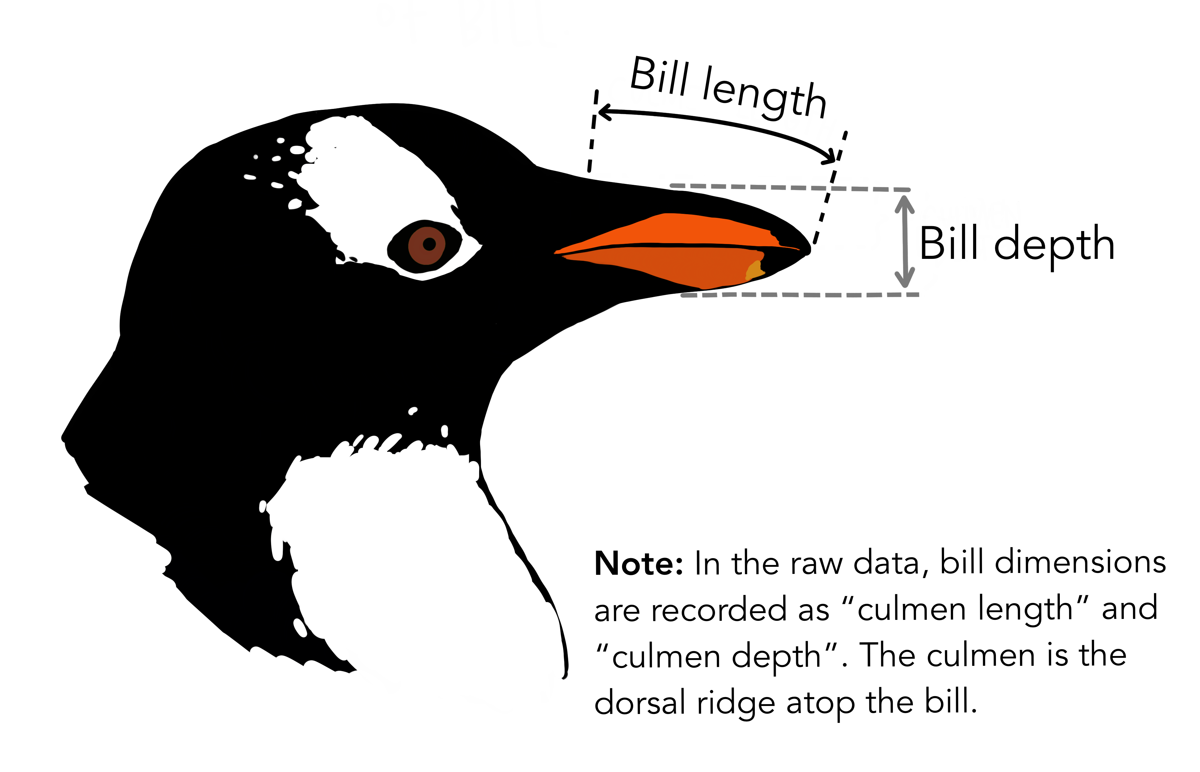
bill_len- length of the penguin’s bill in millimeters (continuous) -
bill_dep- depth of the penguin’s bill in millimeters (continuous) -
flipper_len- length of the penguin’s flipper in millimeters (continuous) -
body_mass- mass of the penguin in grams (continuous) -
year- year of observation (discrete, integer)
NoteQualitative Data
-
species- the species of penguin (categorical) -
island- the island where the penguin was observed (categorical)
4
Fill and colour scales in ggplot2 can use the same palettes. Some shapes such as lines only accept the colour aesthetic, while others, such as polygons, accept both colour and fill aesthetics. In the latter case, the colour refers to the border of the shape, and the fill to the interior.

All symbols have a foreground colour, so if we add color = "navy", they all are affected.

While all symbols have a foreground colour, symbols 21-25 also take a background colour (fill). So if we add fill = "orchid", only the last row of symbols are affected.

5 Discrete vs continuous variables
Please revisit:
WHAT IS THE DIFFERENCE BETWEEN CATEGORICAL, ORDINAL AND INTERVAL VARIABLES?
In order to use color with your data, most importantly, you need to know if you’re dealing with discrete or continuous variables. Discrete variables are categorical variables that can take on a limited number of values. For example, the species of penguins in the penguins dataset is a discrete variable because it can only take on a limited number of values (Adelie, Chinstrap, Gentoo).
Continuous variables, on the other hand, can take on any value within a range. For example, the body_mass of penguins in the penguins dataset is a continuous variable because it can take on any value within a range (e.g., 3000g to 6000g).
6
Colour palettes are a set of colours that can be used to represent data in a visual way. They are used to make plots more visually appealing and to help convey information more effectively. In R, there are many packages that provide colour palettes, and they can be used in ggplot2 to create beautiful and informative plots. Colour palettes can be used to represent different types of data, such as categorical, ordinal, and continuous data.
There are three main types of colour palettes in R:
For Quantitative Variables: Sequential (type = “seq”) palettes are suited to ordered data that progress from low to high. Lightness steps dominate the look of these schemes, with light colors for low data values to dark colors for high data values. (for numerical data, that are ordered)
For Quantitative Variables: Diverging (type = “div”) palettes put equal emphasis on mid-range critical values and extremes at both ends of the data range. The critical class or break in the middle of the legend is emphasized with light colors and low and high extremes are emphasized with dark colors that have contrasting hues.(for numerical data that can be positive or negative, often representing deviations from some norm or baseline)
For Qualitative Variables (type = “qual”) palettes do not imply magnitude differences between legend classes, and hues are used to create the primary visual differences between classes. Qualitative schemes are best suited to representing nominal or categorical data. (for qualitative unordered data)
Let us now create plots that show the effect of these palettes on the penguins dataset. We will use different colour packages from R to achieve this.
6.1 Create a simple set of scatter plots
We will create simple base plots in ggplot2 and see how we may alter the colour scales using palettes.
names(penguins)[1] "species" "island" "bill_len" "bill_dep" "flipper_len"
[6] "body_mass" "sex" "year" p1 <- penguins %>%
drop_na() %>%
# pipe data into ggplot
# after removing data rows that have missing ( NA ) values
gf_point(body_mass ~ flipper_len,
color = ~species
) %>% # COLOUR = DISCRETE/QUAL VARIABLE
gf_labs(
title = "Default QUAL Colours",
x = "Flipper Length (mm)", y = "Body Mass (g)"
) # Add labels
p2 <-
penguins %>%
drop_na() %>%
# pipe the data into ggplot,
# after removing data rows that have missing ( NA ) values
gf_point(body_mass ~ flipper_len,
color = ~bill_len
) %>% # COLOUR = CONT/QUANT VARIABLE
gf_labs(
title = "Default QUANT Colours",
x = "Flipper Length (mm)", y = "Body Mass (g)"
) # Add labels
patchwork::wrap_plots(p1, p2, ncol = 2) + plot_annotation(tag_levels = "1", tag_prefix = "P")
Note that these use the default colours in R. We did not specify any colour scales, so the default colours are used. The first plot uses a qualitative variable (species) and the second plot uses a quantitative variable (bill length).
Note the colour legends next to either of the plots: this shows the default colours used by ggplot2 for the discrete and continuous variables.
7 with chameleon ease
P1: For Discrete (QUAL) Variables The commands below are used to fill colours based on Qualitative Variables:
-
scale_colour/fill_discrete(Default ggplot2 colours) -
scale_colour/fill_brewer# RColorBrewer -
scale_colour/fill_manual# Specify colours manually -
scale_colour/fill_paletteer_d# Use palettes frompaletteerpackage
P2: For Continuous (QUANT) Variables
The commands below are used to fill colours based on Quantitative Variables:
-
scale_colour/fill_continuous()(Default ggplot2 colours) -
scale_colour/fill_gradient(Two colour gradient) -
scale_colour/fill_gradient2(Three colour gradient) -
scale_colour/fill_gradientn(Specify Palette, from other packages also, likewesanderson) -
scale_colour/fill_distiller(Palettes from RColorBrewer) -
scale_colour/fill_paletteer_c(Use palettes frompaletteerpackage)
Now to use these!
7.1 Using ggplot2 colour scales
Let us just assure ourselves of the “default-ness” of ggplot2 colours, when we do not specify a palette or colour scale.
p10 <- p1 %>%
  gf_refine(scale_color_discrete())

p20 <- p2 %>%
  gf_refine(scale_color_continuous())

patchwork::wrap_plots(p10, p20, ncol = 2) +
  plot_annotation(tag_levels = "1", tag_prefix = "P")
No change, as we are using the default colours in ggplot2. we expected this, of course.
7.2 Using RColorBrewer
Let us examine the palettes available in the {RColorBrewer} package.
Show the Code
RColorBrewer::brewer.pal.info %>% reactable::reactable(data = ., filterable = TRUE, minRows = 5, searchable = TRUE, resizable = TRUE, striped = TRUE, compact = TRUE, bordered = TRUE, highlight = TRUE, showSortable = TRUE, showSortIcon = TRUE)
RColorBrewer::display.brewer.all(type = "all")
Note the palette category: div / seq / qual !!
p11 <- p1 +
  scale_color_brewer(palette = "Set2") +
  labs(
    title = "",
    subtitle = "QUAL Palette = Set2"
  )

p21 <- p2 +
  scale_color_distiller(palette = "YlOrRd") +
  labs(
    title = "",
    subtitle = "QUANT Palette = YlOrRd"
  )

patchwork::wrap_plots(p11, p21, ncol = 2) + plot_annotation(title = "Using the RColorBrewer package", tag_levels = "1", tag_prefix = "P")
Note the legend changes again! The colours are now from the RColorBrewer package, and the legend shows the palette used.
7.3 Using paletteer
The paletteer package by Emil Hvitfeldt contains over 2000 palettes and seems to have everything accessible in a simple way!
Note
NOTE: In order to access some palettes in paletteer, you may be asked to install other packages. E.g. harrypotter or scico. These need not be brought into your session using library() but are accessed directly by paletteer which is very convenient!!
Show the Code
Show the Code
NoteDynamic Palettes from
paletteer
Dynamic palettes are those that can change based on the data they are applied to, where the colors of the palette depend on the number of colors you need, like the green.pal palette from the cartography package. They are useful for creating plots that adapt to the data being visualized.
Dynamic palettes are available for both discrete and continuous variables in paletteer.
Show the Code
Show the Code
p12 <- p1 +
  scale_colour_paletteer_d("ggthemes_ptol::qualitative",
    dynamic = TRUE
  ) +
  labs(
    title = "",
    subtitle = "ggThemes Palette: Qualitative"
  )

# I like Vermeer's "Girl with the Pearl Earring"!
p13 <- p1 +
  scale_colour_paletteer_d("dutchmasters::pearl_earring") +

  labs(
    title = "",
    subtitle = " Vermeer Palette: Qualitative",
    caption = "Girl with the Pearl Earring"
  )

patchwork::wrap_plots(p12, p13, ncol = 2) + plot_annotation(title = "Using the paletteer package")
OK, one of the Games of Thrones Palettes, and Harry Potter palette, both for QUANT data!
Show the Code
p22 <- p2 +
  scale_color_got(option = "jon_snow") +
  labs(
    title = "",
    subtitle = "Game of Thrones::Jon Snow",
    caption = "Oh you awful Srishti people..."
  )

# Harry Potter Gryffindor Palette.
# Will ask for `harrypotter` package to be installed. Say yes!
p23 <- p2 +
  scale_colour_paletteer_c("harrypotter::gryffindor") +
  labs(
    title = "",
    subtitle = "Harry Potter::Gryffindor"
  )

patchwork::wrap_plots(p22, p23, ncol = 2) + plot_annotation(title = "Using the got and paletteer packages")
7.4 Using Manual Scales
There are a good few ways in which we can manually specify colour scales for both Qual and Quant variables in ggplot. There are built in functions for developing colour gradients and palettes, for Quant variables, such as scale_colour_gradient(), scale_colour_gradient2(), and scale_colour_gradientn().
For Qual variables, we can use scale_colour_manual() or scale_fill_manual() alog with a vector of colours, or a named vector of colours.
Continuous Two-Colour Gradients
Creates a pallete containing continuous shades between two colours:
Show the Code
p2 +
  scale_color_gradient(
    low = "dodgerblue", # Play with this setting
    high = "firebrick"
  ) + # Play with this setting

  labs(
    title = "Two Colour Gradients",
    subtitle = "P2: Continuous 2-Colour Pallete"
  )
Continuous Three-Colour Gradients
Sometimes we want a palette this way: a midpoint colour, and colours for the two extremes of a continuous variable:
Show the Code
colour_midpoint <- mean(penguins$bill_len,
  na.rm = TRUE
) # remove missing values
# Struggled all morning on 22 Aug 2020 to get at this ;-D

# Play with the function: 0/mean/median/mode/max/min

p2 +
  scale_colour_gradient2(
    low = "brown", # Play with this in the chunk below
    mid = "white", # Play with this in the chunk below
    high = "purple", # Play with this in the chunk below
    midpoint = colour_midpoint, # see above
    space = "Lab", # don't mess with this!
    na.value = "grey50"
  ) +
  labs(
    title = "Three colour continuous gradient",
    subtitle = "Mid Colour mapped to midpoint of data variable",
    caption = "Colours inspired by my favourite cocker spaniel, Lord Chestnut"
  ) # Play with these
Continuous n-Colour Gradients - grDevices package
Show the Code
# grDevices Palettes
p2 +
  scale_colour_gradientn(
    colours = terrain.colors(10)
  ) +
  # Try these:
  # heat.colors() / topo.colors() / cm.colors() / rainbow()

  labs(
    title = "N-colour continuous gradients",
    subtitle = "Palettes from grDevices",
    caption = "Palette: terrain.colors"
  )
Continuous n-Colour Gradients - wesanderson Palettes
Let us look at the wesanderson package, which has some beautiful colour palettes inspired by Wes Anderson’s movies.
Show the Code
p2 +
  scale_colour_gradientn(
    colors = wes_palette(
      name = "Zissou1Continuous",
      n = 11
    ), # Keep an eye on "n" for the chosen palette!
    na.value = "grey"
  ) +

  labs(
    title = "N-colour continuous gradients",
    subtitle = "Palettes from wesanderson",
    caption = "Palette: Zissou1Continuous"
  ) # Change this caption based on palette choice
Discrete wesanderson Palettes
Show the Code
p1 +
  scale_colour_discrete(type = wes_palette(
    name = "GrandBudapest1",
    n = 3
  )) +
  labs(title = "Wes Anderson Palette: GrandBudapest")
We can also specify colour codes ourselves with scale_colour_manual(). Use argument values instead of type. These colours could be chosen manually, or based on a palette from another package, or even from a website like Coolors.
manual_colours <- c("#fba4b2", "#af14b8", "#1fb1e1")
manual_colours
[1] "#fba4b2" "#af14b8" "#1fb1e1"p1 +
scale_colour_manual(values = manual_colours) +
labs(
title = "Manual Colours for Qual variable",
subtitle = "Using scale_colour_manual()",
caption = "Colours: afc4b8, f1a4b2, 1fb1e1"
) # Change this caption based on palette choice
8 Using multiple color or fill?
With some complex charts, such as an alluvial chart for example, we may need to use the fill aesthetic in more than once.
library(vcdExtra)
library(ggalluvial)
options(rgl.useNULL = TRUE)
rgl::rgl.useNULL()
[1] TRUETitanicp %>%
ggplot(aes(axis1 = pclass, axis3 = survived, axis2 = sex)) +
geom_alluvium(aes(fill = survived), alpha = 0.5) + # first fill
geom_stratum(aes(fill = after_stat(stratum))) + # second fill
geom_label(stat = "stratum", aes(label = after_stat(stratum))) +
scale_x_discrete(limits = c("Class", "Sex", "Survived?")) +
labs(title = "My Titanic Plot", subtitle = "Rose is Evil", caption = "Made with ggalluvial")
There are two legends here, and the fill colours can certainly be improved! We want to (usually) set separate palettes for each of the fills, and also perhaps not have a legend for one of the fills, in this case, the stratum. So how we do this?
We use a package called ggnewscale to “reset” the fill aesthetic after its first use, and then set separate palettes for the two fills. We can also blank out the legend for either of the two fills:
library(ggnewscale)

Titanicp %>%
  ggplot(aes(axis1 = pclass, axis3 = survived, axis2 = sex)) +
  geom_alluvium(aes(fill = survived), alpha = 0.8) + # first fill

  scale_fill_manual(
    name = "Survived?",
    values = c(
      "survived" = "#1b9e77",
      "died" = "firebrick"
    )
  ) +
  new_scale_fill() + # reset fill scale

  geom_stratum(aes(fill = after_stat(stratum)),
    show.legend = FALSE
  ) + # second fill, no legend
  scale_fill_brewer(palette = "Spectral") +
  geom_label(stat = "stratum", aes(label = after_stat(stratum))) +
  scale_x_discrete(limits = c("Class", "Sex", "Survived?")) +
  labs(title = "My Improved Titanic Plot", subtitle = "Rose is Evil", caption = "Made with ggalluvial")
Here we have reset the fill scale midway, added a new palette for each fill, and disabled the legend for the second fill ( stratum).
9
Why do we need all these colour palettes? Why not just use the default colours in ggplot2? The default colours in ggplot2 are not always suitable for all types of data. For example, if you have a categorical variable with many levels, the default colours may not be distinct enough to differentiate between the levels. Similarly, if you have a continuous variable with a wide range of values, the default colours may not be able to represent the data effectively.
Using colour palettes allows you to choose colours that are more suitable for your data, and that can help convey information more effectively. It also allows you to create more visually appealing plots that are easier to interpret.
Finally, colours in charts also reflect your brand! Websites like The Economist and FiveThirtyEight have their own branded palettes. Color Selection websites like Coolors can help you create colour palettes that match your brand colours.
10
We have seen how to use colour palettes in ggplot2 to enhance our plots. We have used the RColorBrewer, paletteer, and wesanderson packages to create beautiful and informative plots. We have also seen how to use manual colour scales to create custom colour palettes.
We have also seen how to use colour scales for both discrete and continuous variables, and how to use different types of colour palettes for different types of data.
11
- Lisa Charlotte Muth. How to pick more beautiful colors for your data visualizations. https://www.datawrapper.de/blog/beautifulcolors
- Albert Rapp. (2022). 4 Ways to use colors in ggplot more efficiently https://albert-rapp.de/posts/ggplot2-tips/07_four_ways_colors_more_efficiently/07_four_ways_colors_more_efficiently
- Emil Hvitfeldt. (2023). paletteer: A Palette Manager for R. https://emilhvitfeldt.github.io/paletteer/
- David Keyes.(2019). Themes to Improve Your ggplot Figures. https://rfortherestofus.com/2019/08/themes-to-improve-your-ggplot-figures/
- https://coolors.co/ - A website to generate colour palettes.
Arnold, Jeffrey B. 2025. ggthemes: Extra Themes, Scales and Geoms for “ggplot2”. https://doi.org/10.32614/CRAN.package.ggthemes.
Hvitfeldt, Emil. 2021. paletteer: Comprehensive Collection of Color Palettes. https://github.com/EmilHvitfeldt/paletteer.
Jimenez Rico, Alejandro. 2020. harrypotter: Palettes Generated from All “Harry Potter” Movies. https://doi.org/10.32614/CRAN.package.harrypotter.
———. 2025. gameofthrones: Palettes Inspired in the TV Show “Game of Thrones”. https://github.com/aljrico/gameofthrones.
Lin, Greg. 2025. reactable: Interactive Data Tables for r. https://doi.org/10.32614/CRAN.package.reactable.
Pedersen, Thomas Lin. 2025. patchwork: The Composer of Plots. https://doi.org/10.32614/CRAN.package.patchwork.
R Core Team. 2025. R: A Language and Environment for Statistical Computing. Vienna, Austria: R Foundation for Statistical Computing. https://www.R-project.org/.
Ram, Karthik, and Hadley Wickham. 2023. wesanderson: A Wes Anderson Palette Generator. https://doi.org/10.32614/CRAN.package.wesanderson.