library(tidyverse)
library(mosaic)
library(ggformula)
library(skimr)
##
# install.packages("remotes")
# library(remotes)
# remotes::install_github("wilkelab/ggridges")
library(ggridges) # Ridge Density Plots
##
library(janitor) # Data cleaning and tidying package
library(visdat) # Visualize whole dataframes for missing data
library(naniar) # Clean missing data
library(DT) # Interactive Tables for our data
library(tinytable) # Elegant Tables for our data
library(ggrepel) # Repel overlapping text labels in ggplot2
library(marquee) # Annotations in ggplot2
The Hills are Shadows, said Tennyson
Quant Variables
Qual Variables
Density Plots
Ridge Plots
Abstract
Quant and Qual Variable Graphs and their Siblings
“Never let the future disturb you. You will meet it, if you have to, with the same weapons of reason which today arm you against the present.”
— Marcus Aurelius
1
Plot Fonts and Theme
Show the Code
library(systemfonts)
library(showtext)
## Clean the slate
systemfonts::clear_local_fonts()
systemfonts::clear_registry()
##
showtext_opts(dpi = 96) # set DPI for showtext
sysfonts::font_add(
  family = "Alegreya",
  regular = "../../../../../../fonts/Alegreya-Regular.ttf",
  bold = "../../../../../../fonts/Alegreya-Bold.ttf",
  italic = "../../../../../../fonts/Alegreya-Italic.ttf",
  bolditalic = "../../../../../../fonts/Alegreya-BoldItalic.ttf"
)

sysfonts::font_add(
  family = "Roboto Condensed",
  regular = "../../../../../../fonts/RobotoCondensed-Regular.ttf",
  bold = "../../../../../../fonts/RobotoCondensed-Bold.ttf",
  italic = "../../../../../../fonts/RobotoCondensed-Italic.ttf",
  bolditalic = "../../../../../../fonts/RobotoCondensed-BoldItalic.ttf"
)
showtext_auto(enable = TRUE) # enable showtext
##
theme_custom <- function() {
  theme_bw(base_size = 10) +

    # theme(panel.widths = unit(11, "cm"),
    #       panel.heights = unit(6.79, "cm")) + # Golden Ratio

    theme(
      plot.margin = margin_auto(t = 1, r = 2, b = 1, l = 1, unit = "cm"),
      plot.background = element_rect(
        fill = "bisque",
        colour = "black",
        linewidth = 1
      )
    ) +

    theme_sub_axis(
      title = element_text(
        family = "Roboto Condensed",
        size = 10
      ),
      text = element_text(
        family = "Roboto Condensed",
        size = 8
      )
    ) +

    theme_sub_legend(
      text = element_text(
        family = "Roboto Condensed",
        size = 6
      ),
      title = element_text(
        family = "Alegreya",
        size = 8
      )
    ) +

    theme_sub_plot(
      title = element_text(
        family = "Alegreya",
        size = 14, face = "bold"
      ),
      title.position = "plot",
      subtitle = element_text(
        family = "Alegreya",
        size = 10
      ),
      caption = element_text(
        family = "Alegreya",
        size = 6
      ),
      caption.position = "plot"
    )
}

## Use available fonts in ggplot text geoms too!
ggplot2::update_geom_defaults(geom = "text", new = list(
  family = "Roboto Condensed",
  face = "plain",
  size = 3.5,
  color = "#2b2b2b"
))
ggplot2::update_geom_defaults(geom = "label", new = list(
  family = "Roboto Condensed",
  face = "plain",
  size = 3.5,
  color = "#2b2b2b"
))

ggplot2::update_geom_defaults(geom = "marquee", new = list(
  family = "Roboto Condensed",
  face = "plain",
  size = 3.5,
  color = "#2b2b2b"
))
ggplot2::update_geom_defaults(geom = "text_repel", new = list(
  family = "Roboto Condensed",
  face = "plain",
  size = 3.5,
  color = "#2b2b2b"
))
ggplot2::update_geom_defaults(geom = "label_repel", new = list(
  family = "Roboto Condensed",
  face = "plain",
  size = 3.5,
  color = "#2b2b2b"
))

## Set the theme
ggplot2::theme_set(new = theme_custom())

## tinytable options
options("tinytable_tt_digits" = 2)
options("tinytable_format_num_fmt" = "significant_cell")
options(tinytable_html_mathjax = TRUE)


## Set defaults for flextable
flextable::set_flextable_defaults(font.family = "Roboto Condensed")
2
| Variable #1 | Variable #2 | Chart Names | Chart Shape | |
|---|---|---|---|---|
| Quant | None | Density plot, Ridge Density Plot |
3
| No | Pronoun | Answer | Variable/Scale | Example | What Operations? |
|---|---|---|---|---|---|
| 1 | How Many / Much / Heavy? Few? Seldom? Often? When? | Quantities, with Scale and a Zero Value.Differences and Ratios /Products are meaningful. | Quantitative/Ratio | Length,Height,Temperature in Kelvin,Activity,Dose Amount,Reaction Rate,Flow Rate,Concentration,Pulse,Survival Rate | Correlation |
4
Show the Code
ggplot2::theme_set(new = theme_custom())

lincoln_weather %>%
  gf_density_ridges_gradient(Month ~ `Max Temperature [F]`,
    group = ~Month
  ) %>%
  gf_refine(scale_fill_viridis_c(
    name = "Temperature [F]",
    option = "B"
  )) %>%
  gf_labs(title = "Weather in Lincoln, Nebraska")
April is the cruelest month, said T.S Eliot. But December in Nebraska must be tough.
5
As we saw earlier, Histograms are best to show the distribution of raw Quantitative data, by displaying the number of values that fall within defined ranges, often called buckets or bins.
Sometimes it is useful to consider a chart where the bucket width shrinks to zero!
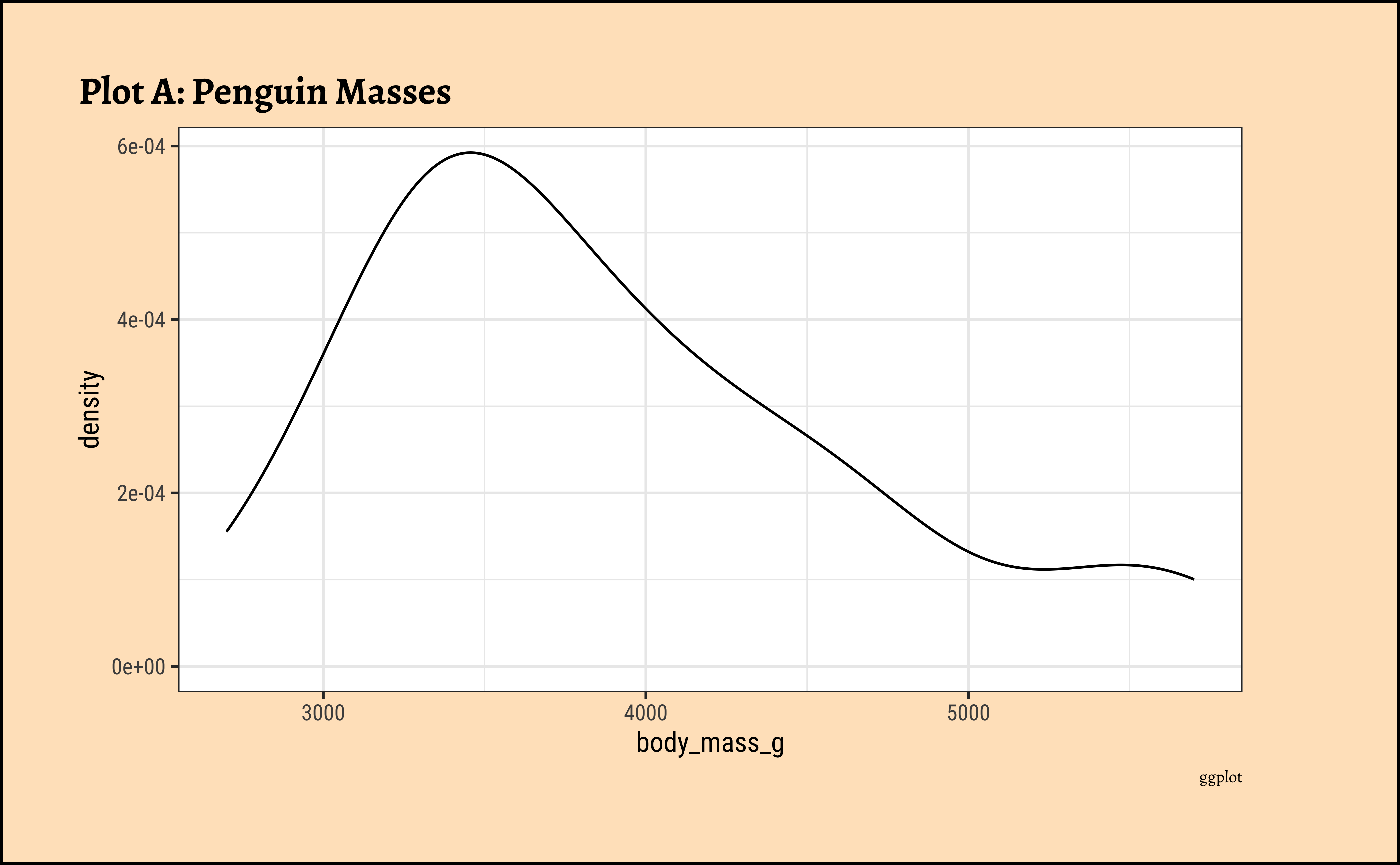
You might imagine a density chart as a histogram where the buckets are infinitesimally small, i.e. zero width. Think of the frequency density as a differentiation (as in calculus) of the histogram. By taking the smallest of steps \(\sim 0\), we get a measure of the slope of distribution. This may seem counter-intuitive, but densities have their uses in spotting the ranges in the data where there are more frequent values. In this, they serve a similar purpose as do histograms, but may offer insights not readily apparent with histograms, especially with default bucket widths. The chunkiness that we see in the histograms is removed and gives us a smooth curve showing in which range the data are more frequent.
6 penguins dataset
We will first look at at a dataset that is available as a part of the palmerpenguins package (and also directly available in R now), the penguins dataset. Data were collected and made available by Dr. Kristen Gorman and the Palmer Station, Antarctica LTER, a member of the Long Term Ecological Research Network.
6.1
 [1] "studyName"           "Sample Number"       "Species"
 [4] "Region"              "Island"              "Stage"
 [7] "Individual ID"       "Clutch Completion"   "Date Egg"
[10] "Culmen Length (mm)"  "Culmen Depth (mm)"   "Flipper Length (mm)"
[13] "Body Mass (g)"       "Sex"                 "Delta 15 N (o/oo)"
[16] "Delta 13 C (o/oo)"   "Comments"
6.2
As per our Workflow, we will look at the data using all the three methods we have seen.
glimpse(penguins_raw)Rows: 344
Columns: 17
$ studyName <chr> "PAL0708", "PAL0708", "PAL0708", "PAL0708", "PAL…
$ `Sample Number` <dbl> 1, 2, 3, 4, 5, 6, 7, 8, 9, 10, 11, 12, 13, 14, 1…
$ Species <chr> "Adelie Penguin (Pygoscelis adeliae)", "Adelie P…
$ Region <chr> "Anvers", "Anvers", "Anvers", "Anvers", "Anvers"…
$ Island <chr> "Torgersen", "Torgersen", "Torgersen", "Torgerse…
$ Stage <chr> "Adult, 1 Egg Stage", "Adult, 1 Egg Stage", "Adu…
$ `Individual ID` <chr> "N1A1", "N1A2", "N2A1", "N2A2", "N3A1", "N3A2", …
$ `Clutch Completion` <chr> "Yes", "Yes", "Yes", "Yes", "Yes", "Yes", "No", …
$ `Date Egg` <date> 2007-11-11, 2007-11-11, 2007-11-16, 2007-11-16,…
$ `Culmen Length (mm)` <dbl> 39.1, 39.5, 40.3, NA, 36.7, 39.3, 38.9, 39.2, 34…
$ `Culmen Depth (mm)` <dbl> 18.7, 17.4, 18.0, NA, 19.3, 20.6, 17.8, 19.6, 18…
$ `Flipper Length (mm)` <dbl> 181, 186, 195, NA, 193, 190, 181, 195, 193, 190,…
$ `Body Mass (g)` <dbl> 3750, 3800, 3250, NA, 3450, 3650, 3625, 4675, 34…
$ Sex <chr> "MALE", "FEMALE", "FEMALE", NA, "FEMALE", "MALE"…
$ `Delta 15 N (o/oo)` <dbl> NA, 8.94956, 8.36821, NA, 8.76651, 8.66496, 9.18…
$ `Delta 13 C (o/oo)` <dbl> NA, -24.69454, -25.33302, NA, -25.32426, -25.298…
$ Comments <chr> "Not enough blood for isotopes.", NA, NA, "Adult…skim(penguins_raw)| Name | penguins_raw |
| Number of rows | 344 |
| Number of columns | 17 |
| _______________________ | |
| Column type frequency: | |
| character | 9 |
| Date | 1 |
| numeric | 7 |
| ________________________ | |
| Group variables | None |
Variable type: character
| skim_variable | n_missing | complete_rate | min | max | empty | n_unique | whitespace |
|---|---|---|---|---|---|---|---|
| studyName | 0 | 1.00 | 7 | 7 | 0 | 3 | 0 |
| Species | 0 | 1.00 | 33 | 41 | 0 | 3 | 0 |
| Region | 0 | 1.00 | 6 | 6 | 0 | 1 | 0 |
| Island | 0 | 1.00 | 5 | 9 | 0 | 3 | 0 |
| Stage | 0 | 1.00 | 18 | 18 | 0 | 1 | 0 |
| Individual ID | 0 | 1.00 | 4 | 6 | 0 | 190 | 0 |
| Clutch Completion | 0 | 1.00 | 2 | 3 | 0 | 2 | 0 |
| Sex | 11 | 0.97 | 4 | 6 | 0 | 2 | 0 |
| Comments | 290 | 0.16 | 18 | 68 | 0 | 10 | 0 |
Variable type: Date
| skim_variable | n_missing | complete_rate | min | max | median | n_unique |
|---|---|---|---|---|---|---|
| Date Egg | 0 | 1 | 2007-11-09 | 2009-12-01 | 2008-11-09 | 50 |
Variable type: numeric
| skim_variable | n_missing | complete_rate | mean | sd | p0 | p25 | p50 | p75 | p100 | hist |
|---|---|---|---|---|---|---|---|---|---|---|
| Sample Number | 0 | 1.00 | 63.15 | 40.43 | 1.00 | 29.00 | 58.00 | 95.25 | 152.00 | ▇▇▆▅▃ |
| Culmen Length (mm) | 2 | 0.99 | 43.92 | 5.46 | 32.10 | 39.23 | 44.45 | 48.50 | 59.60 | ▃▇▇▆▁ |
| Culmen Depth (mm) | 2 | 0.99 | 17.15 | 1.97 | 13.10 | 15.60 | 17.30 | 18.70 | 21.50 | ▅▅▇▇▂ |
| Flipper Length (mm) | 2 | 0.99 | 200.92 | 14.06 | 172.00 | 190.00 | 197.00 | 213.00 | 231.00 | ▂▇▃▅▂ |
| Body Mass (g) | 2 | 0.99 | 4201.75 | 801.95 | 2700.00 | 3550.00 | 4050.00 | 4750.00 | 6300.00 | ▃▇▆▃▂ |
| Delta 15 N (o/oo) | 14 | 0.96 | 8.73 | 0.55 | 7.63 | 8.30 | 8.65 | 9.17 | 10.03 | ▃▇▆▅▂ |
| Delta 13 C (o/oo) | 13 | 0.96 | -25.69 | 0.79 | -27.02 | -26.32 | -25.83 | -25.06 | -23.79 | ▆▇▅▅▂ |
inspect(penguins_raw)
categorical variables:
               name     class levels   n missing
1         studyName character      3 344       0
2           Species character      3 344       0
3            Region character      1 344       0
4            Island character      3 344       0
5             Stage character      1 344       0
6     Individual ID character    190 344       0
7 Clutch Completion character      2 344       0
8               Sex character      2 333      11
9          Comments character     10  54     290
                                   distribution
1 PAL0910 (34.9%), PAL0809 (33.1%) ...
2  (%) ...
3 Anvers (100%)
4 Biscoe (48.8%), Dream (36%) ...
5 Adult, 1 Egg Stage (100%)
6 N13A1 (0.9%), N13A2 (0.9%) ...
7 Yes (89.5%), No (10.5%)
8 MALE (50.5%), FEMALE (49.5%)
9  (%) ...

Date variables:
      name class      first       last min_diff max_diff   n missing
1 Date Egg  Date 2007-11-09 2009-12-01   0 days 349 days 344       0

quantitative variables:
                 name   class        min         Q1      median          Q3
1       Sample Number numeric    1.00000   29.00000   58.000000   95.250000
2  Culmen Length (mm) numeric   32.10000   39.22500   44.450000   48.500000
3   Culmen Depth (mm) numeric   13.10000   15.60000   17.300000   18.700000
4 Flipper Length (mm) numeric  172.00000  190.00000  197.000000  213.000000
5       Body Mass (g) numeric 2700.00000 3550.00000 4050.000000 4750.000000
6   Delta 15 N (o/oo) numeric    7.63220    8.29989    8.652405    9.172123
7   Delta 13 C (o/oo) numeric  -27.01854  -26.32030  -25.833520  -25.062050
         max        mean          sd   n missing
1  152.00000   63.151163  40.4301990 344       0
2   59.60000   43.921930   5.4595837 342       2
3   21.50000   17.151170   1.9747932 342       2
4  231.00000  200.915205  14.0617137 342       2
5 6300.00000 4201.754386 801.9545357 342       2
6   10.02544    8.733382   0.5517703 330      14
7  -23.78767  -25.686292   0.7939612 331      13
6.3
Among the variables that define the physical measurements of the penguins, there are a couple of entries that show missing data. Elsewhere there are more. The variable names also are human-readable, but not really computer-readable.
So let us follow through with our Data Munging Process:
penguins_clean <- penguins_raw %>%
  naniar::replace_with_na_all(condition = ~ .x %in% common_na_strings) %>% # replace common NA strings with actual NA
  naniar::replace_with_na_all(condition = ~ .x %in% common_na_numbers) %>%
  janitor::clean_names(case = "snake") %>% # clean names

  dplyr::mutate(across(where(is.character), as_factor)) %>% # make factors
  dplyr::relocate(where(is.factor)) # move factors to the right of rownames

glimpse(penguins_clean)
Rows: 344
Columns: 17
$ study_name <fct> PAL0708, PAL0708, PAL0708, PAL0708, PAL0708, PAL0708…
$ species <fct> Adelie Penguin (Pygoscelis adeliae), Adelie Penguin …
$ region <fct> Anvers, Anvers, Anvers, Anvers, Anvers, Anvers, Anve…
$ island <fct> Torgersen, Torgersen, Torgersen, Torgersen, Torgerse…
$ stage <fct> "Adult, 1 Egg Stage", "Adult, 1 Egg Stage", "Adult, …
$ individual_id <fct> N1A1, N1A2, N2A1, N2A2, N3A1, N3A2, N4A1, N4A2, N5A1…
$ clutch_completion <fct> Yes, Yes, Yes, Yes, Yes, Yes, No, No, Yes, Yes, Yes,…
$ sex <fct> MALE, FEMALE, FEMALE, NA, FEMALE, MALE, FEMALE, MALE…
$ comments <fct> Not enough blood for isotopes., NA, NA, Adult not sa…
$ sample_number <dbl> 1, 2, 3, 4, 5, 6, 7, 8, 9, 10, 11, 12, 13, 14, 15, 1…
$ date_egg <date> 2007-11-11, 2007-11-11, 2007-11-16, 2007-11-16, 200…
$ culmen_length_mm <dbl> 39.1, 39.5, 40.3, NA, 36.7, 39.3, 38.9, 39.2, 34.1, …
$ culmen_depth_mm <dbl> 18.7, 17.4, 18.0, NA, 19.3, 20.6, 17.8, 19.6, 18.1, …
$ flipper_length_mm <dbl> 181, 186, 195, NA, 193, 190, 181, 195, 193, 190, 186…
$ body_mass_g <dbl> 3750, 3800, 3250, NA, 3450, 3650, 3625, 4675, 3475, …
$ delta_15_n_o_oo <dbl> NA, 8.94956, 8.36821, NA, 8.76651, 8.66496, 9.18718,…
$ delta_13_c_o_oo <dbl> NA, -24.69454, -25.33302, NA, -25.32426, -25.29805, …Show the Code
penguins_clean %>%
  DT::datatable(
    caption = htmltools::tags$caption(
      style = "caption-side: top; text-align: left; color: black; font-size: 150%;",
      "Penguins Dataset (Clean)"
    ),
    options = list(pageLength = 10, autoWidth = TRUE)
  ) %>%
  DT::formatStyle(
    columns = names(penguins_clean),
    fontFamily = "Roboto Condensed",
    fontSize = "12px"
  )
6.4
We will restrict ourselves to some of the variables that pertain, by and large, to the body dimensions of our penguins:
NoteQualitative Data
-
sex: male and female penguins -
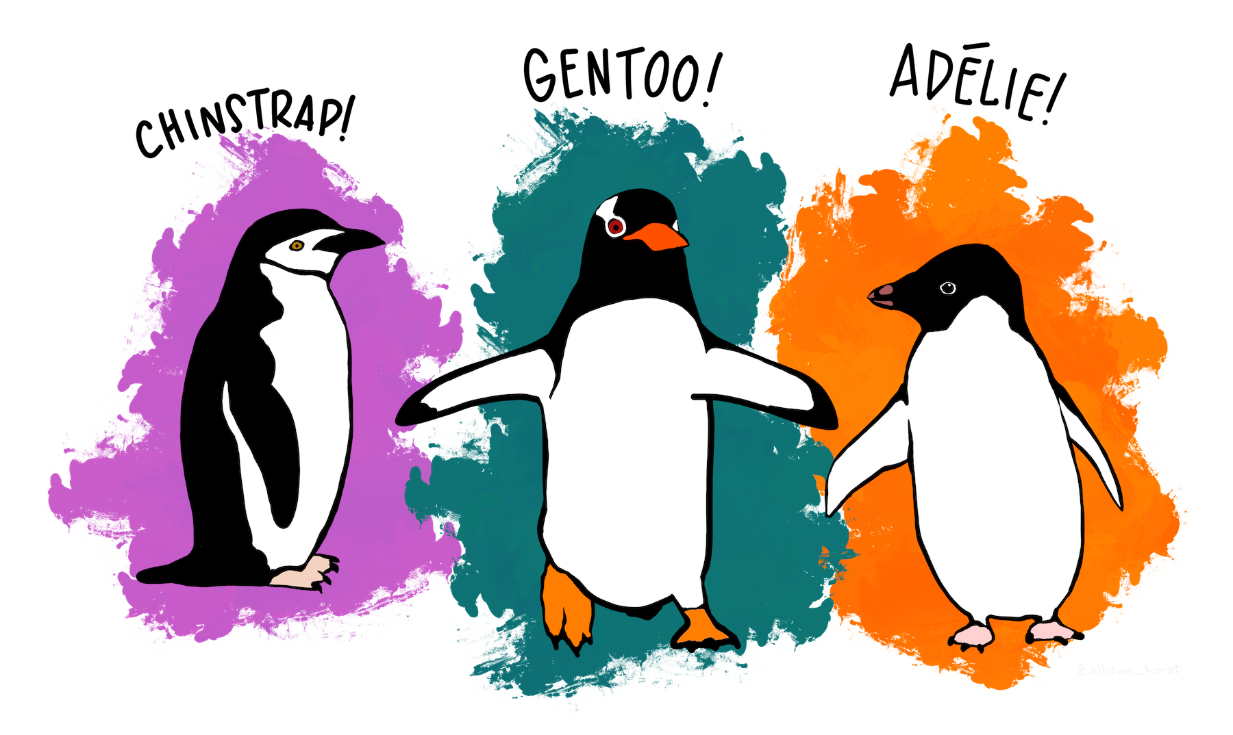
species: Three adorable types! -
island: they have islands to themselves!! -
region: Antarctica, duh!! Hmmm….
NoteQuantitative Data
-
bill_length_mm: The length of the penguins’ bills -
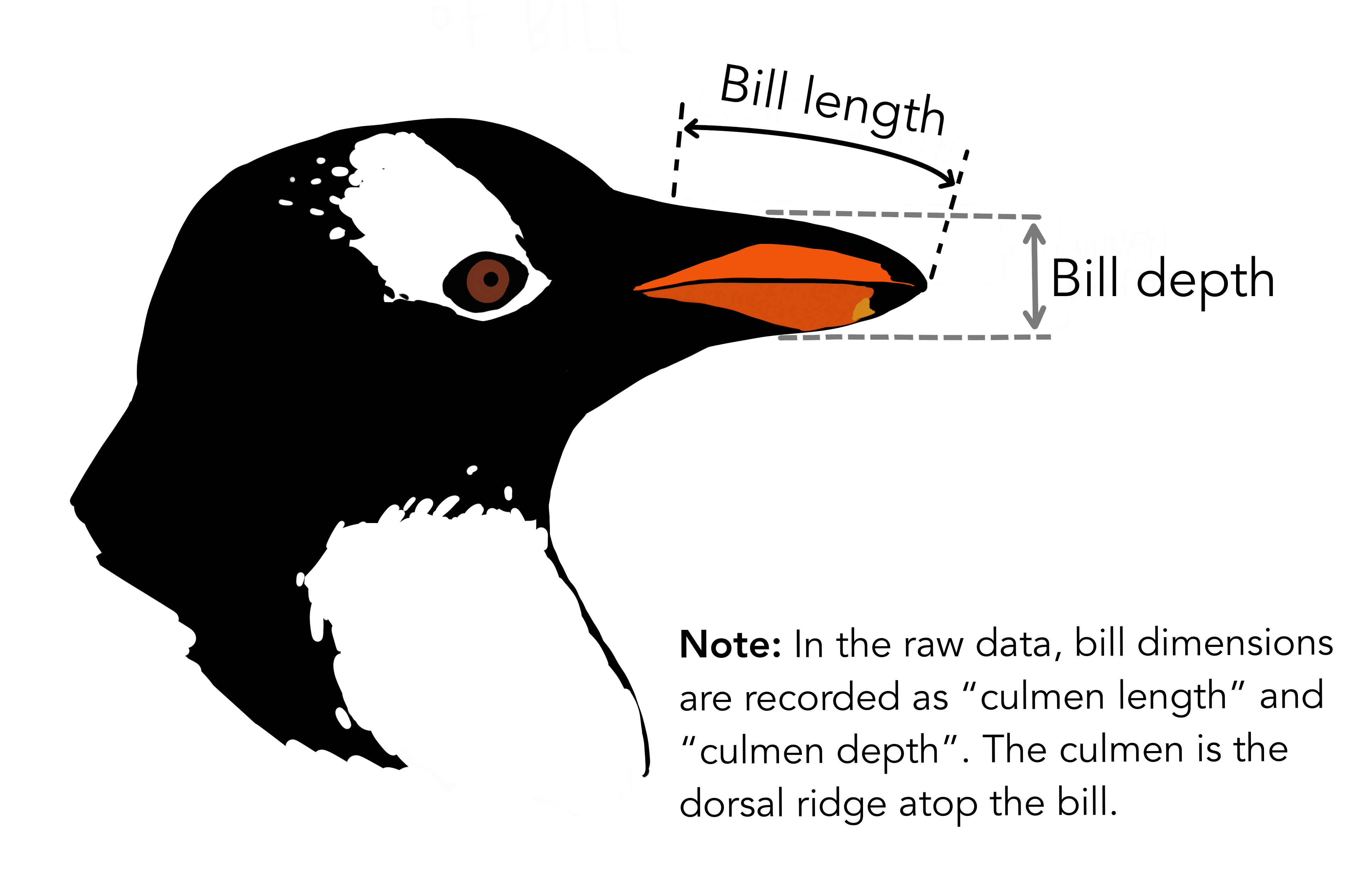
bill_depth_mm: See the picture!! -
flipper_length_mm: Flippers! Penguins have “hands”!! -
body_mass_g: Mass in grams. Grams? Grams??? Why, these penguins are like human babies!!❤️ -
culmen_depth_mm: Depth of the culmen (the upper ridge of the bill) -
culmen_length_mm: Length of the culmen
NoteBusiness Insights on Examining the
penguins dataset
- This is a smallish dataset (344 rows, 8 columns).
- They define the various physical dimensions of the penguins, along with other variables pertaining to their study.
6.5
ggplot2::theme_set(new = theme_custom())

gf_density(~body_mass_g, data = penguins_clean) %>%
  gf_labs(title = "Plot A: Penguin Masses", caption = "ggformula")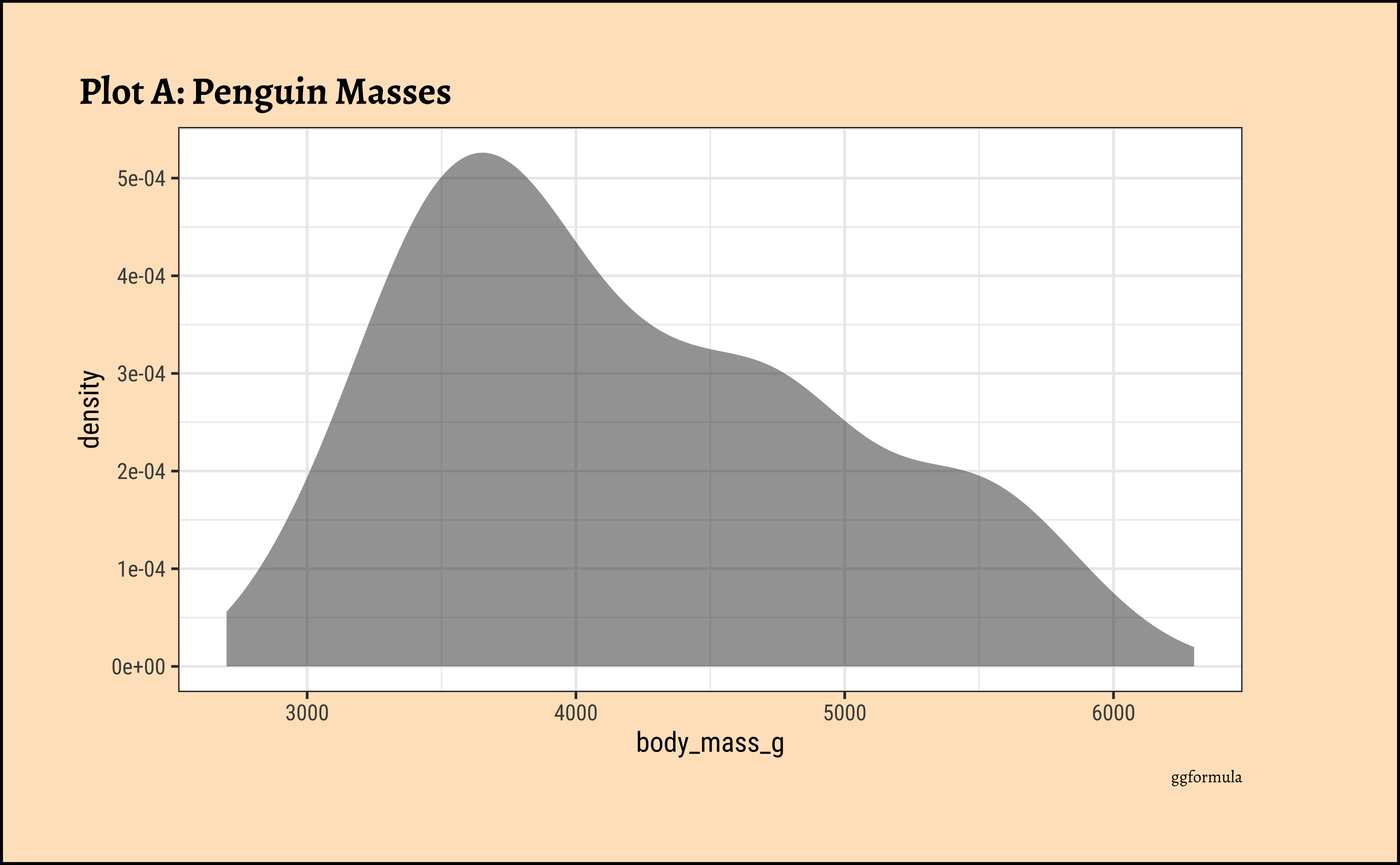
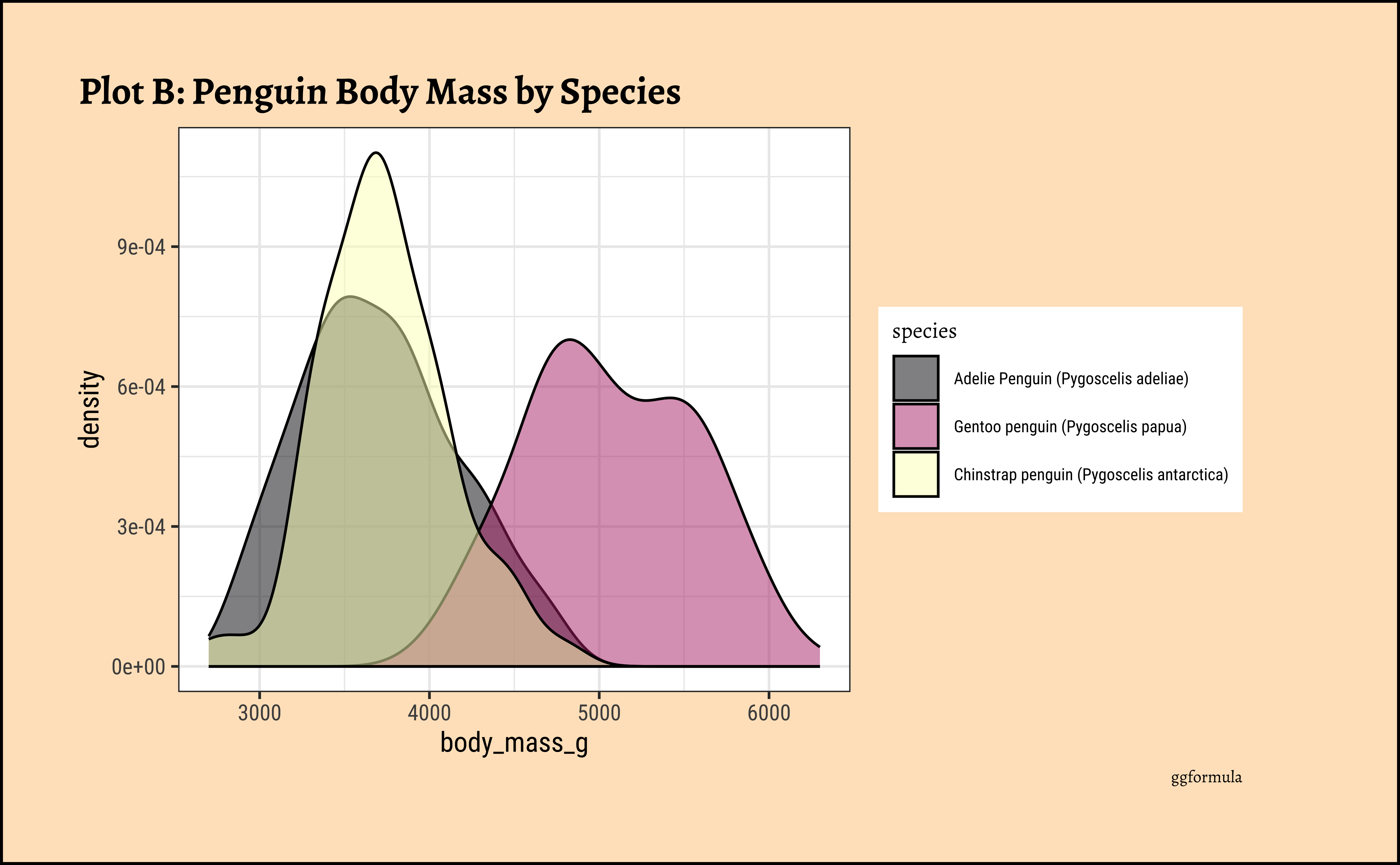
ggplot2::theme_set(new = theme_custom())
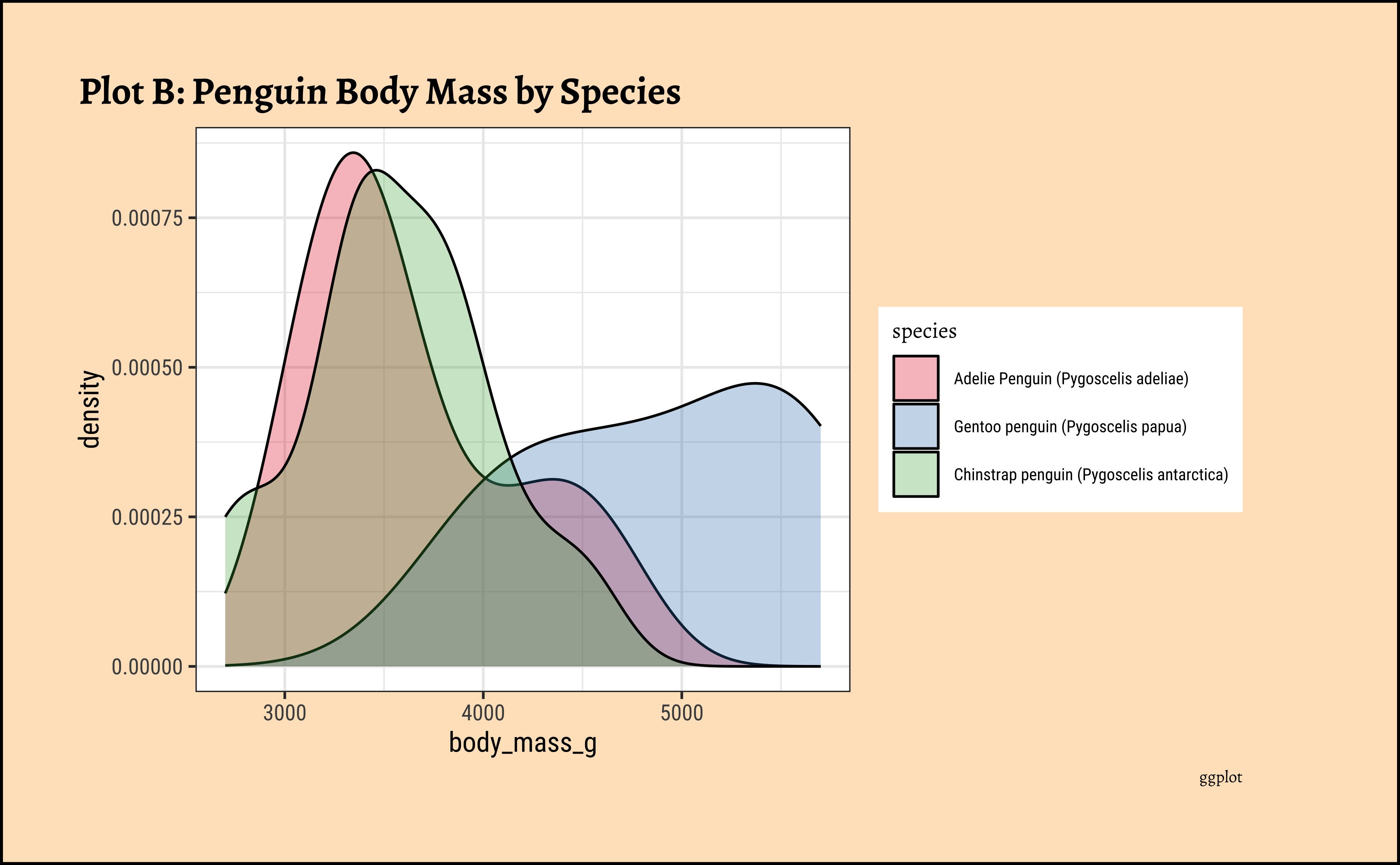
penguins_clean %>%
gf_density(~body_mass_g,
fill = ~species,
color = "black"
) %>%
gf_refine(scale_color_viridis_d(
option = "magma",
aesthetics = c("colour", "fill")
)) %>%
gf_labs(
title = "Plot B: Penguin Body Mass by Species",
caption = "ggformula"
)
ggplot2::theme_set(new = theme_custom())

penguins_clean %>%
  gf_density(
    ~body_mass_g,
    fill = ~species,
    color = "black",
    alpha = 0.3
  ) %>%
  gf_facet_wrap(vars(sex)) %>%
  gf_labs(title = "Plot C: Penguin Body Mass by Species and facetted by Sex", caption = "ggformula")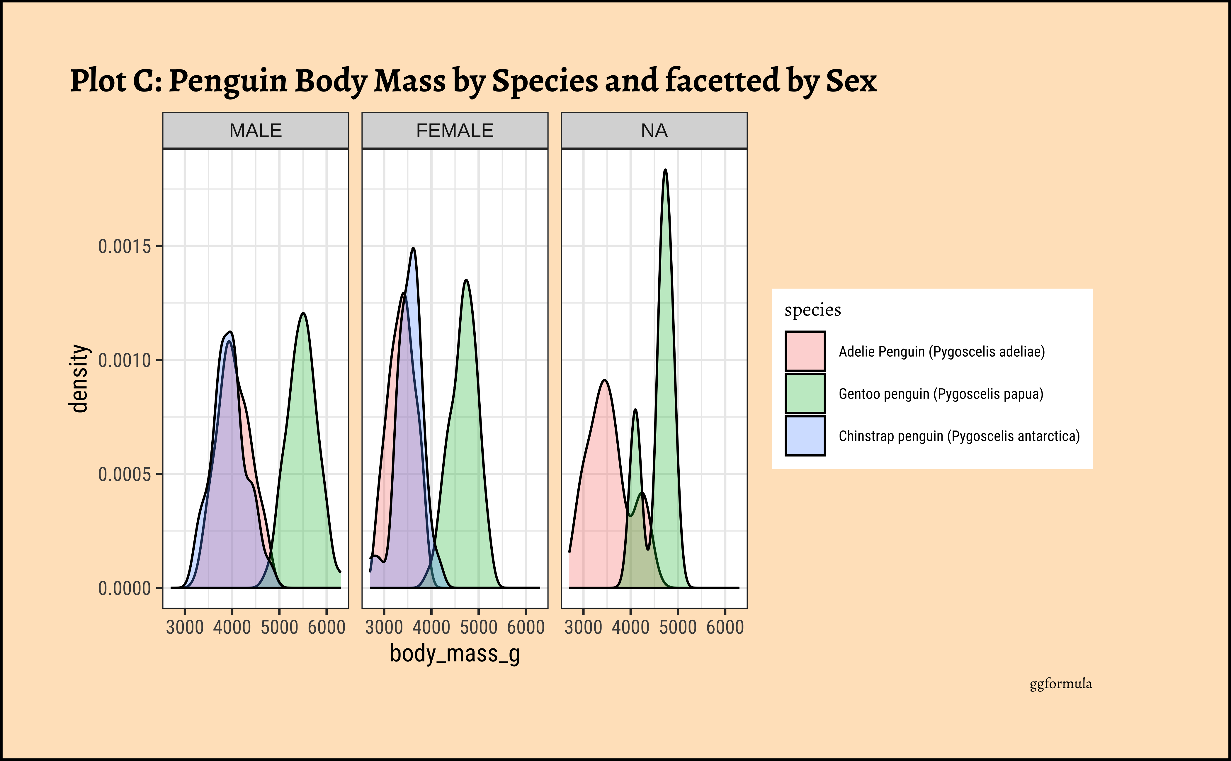
ggplot2::theme_set(new = theme_custom())
penguins_clean %>%
gf_density(~body_mass_g, fill = ~species, color = "black") %>%
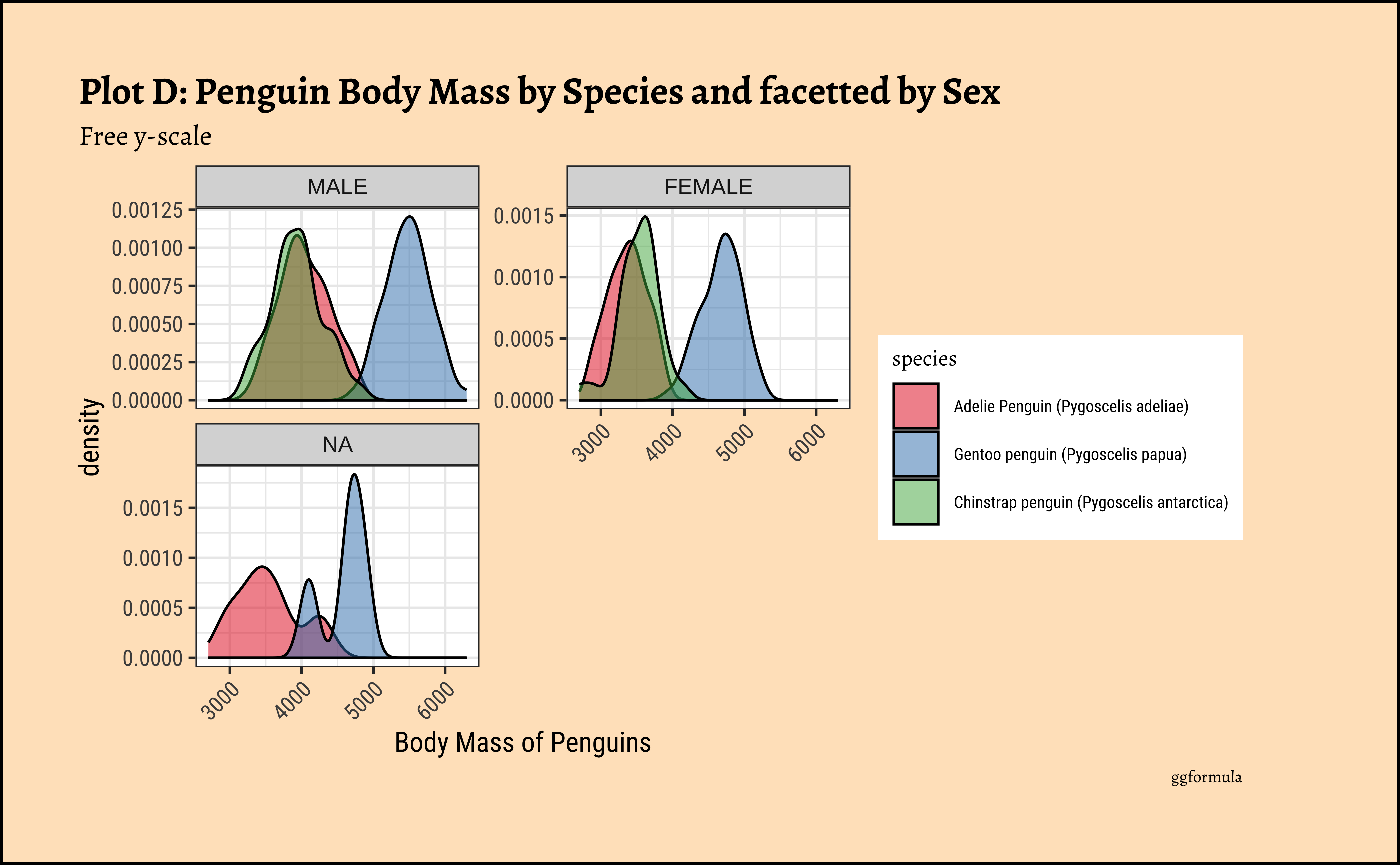
gf_facet_wrap(vars(sex), scales = "free_y", nrow = 2) %>%
gf_labs(
x = "Body Mass of Penguins", title = "Plot D: Penguin Body Mass by Species and facetted by Sex",
subtitle = "Free y-scale",
caption = "ggformula"
) %>%
gf_refine(scale_fill_brewer(palette = "Set1")) %>%
gf_theme(theme(axis.text.x = element_text(
angle = 45,
hjust = 1
)))
ggplot2::theme_set(new = theme_custom())

penguins_clean %>%
  ggplot() +
  geom_density(aes(x = body_mass_g, fill = species),
    alpha = 0.3,
    color = "black"
  ) +
  scale_color_brewer(
    palette = "Set1",
    aesthetics = c("colour", "fill")
  ) +
  labs(
    title = "Plot B: Penguin Body Mass by Species",
    caption = "ggplot"
  )
ggplot2::theme_set(new = theme_custom())

penguins_clean %>% ggplot() +
  geom_density(aes(x = body_mass_g, fill = species),
    color = "black",
    alpha = 0.3
  ) +
  facet_wrap(vars(sex)) +
  labs(title = "Plot C: Penguin Body Mass by Species and facetted by Sex", caption = "ggplot")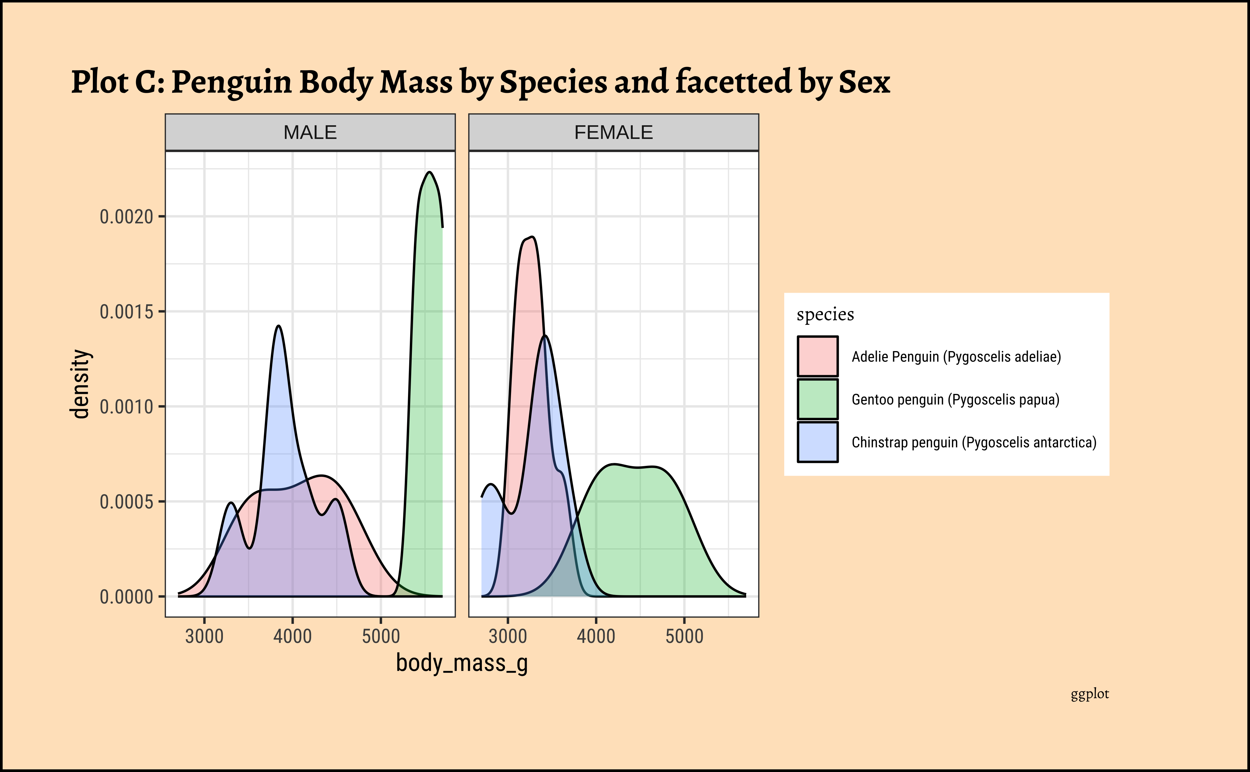
ggplot2::theme_set(new = theme_custom())

penguins_clean %>% ggplot() +
  geom_density(aes(x = body_mass_g, fill = species),
    alpha = 0.3,
    color = "black"
  ) +
  facet_wrap(vars(sex), scales = "free_y", nrow = 2) +
  labs(
    title = "Plot D: Penguin Body Mass by Species and facetted by Sex",
    subtitle = "Free y-scale", caption = "ggplot"
  ) +
  scale_fill_brewer(palette = "Set1") +
  theme(theme(axis.text.x = element_text(angle = 45, hjust = 1)))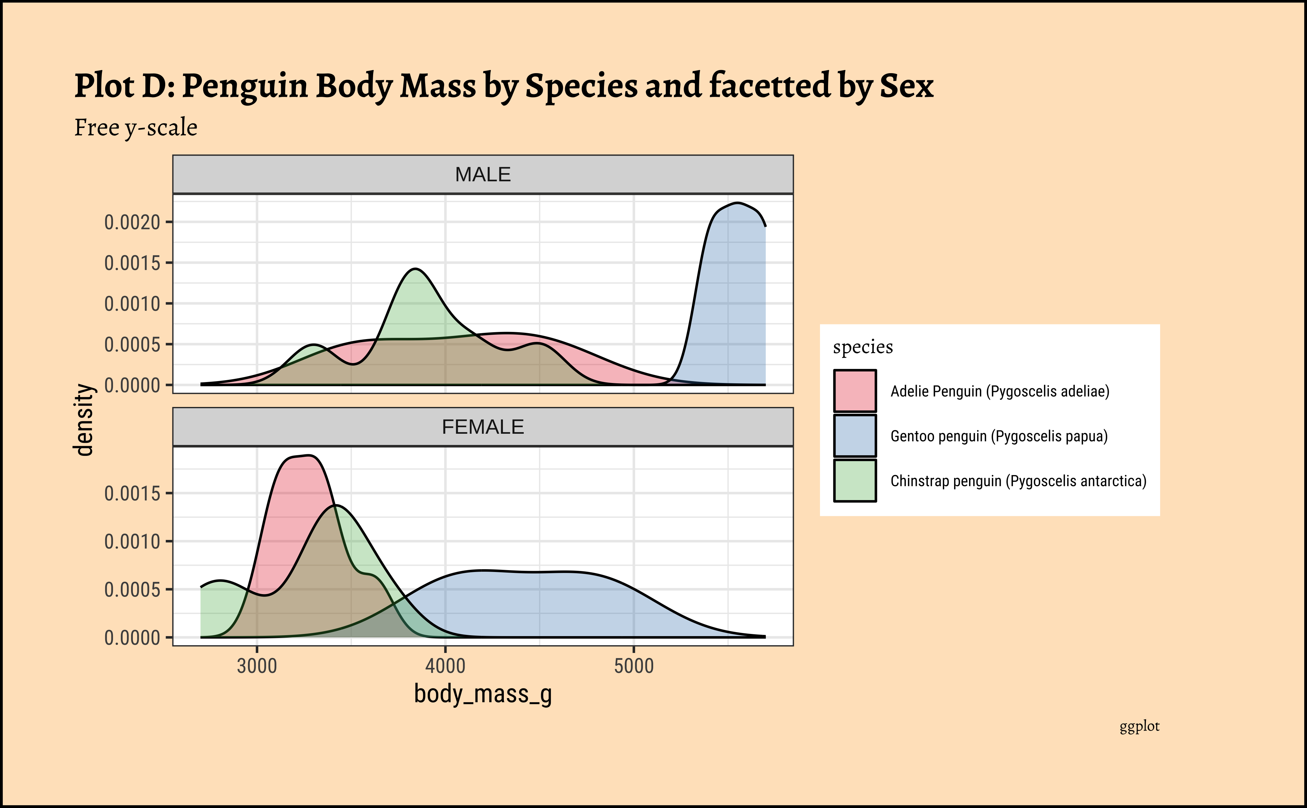
NoteBusiness Insights from
penguin Densities
Pretty much similar conclusions as with histograms. Although densities may not be used much in business contexts, they are better than histograms when comparing multiple distributions! So you should use them!
6.6
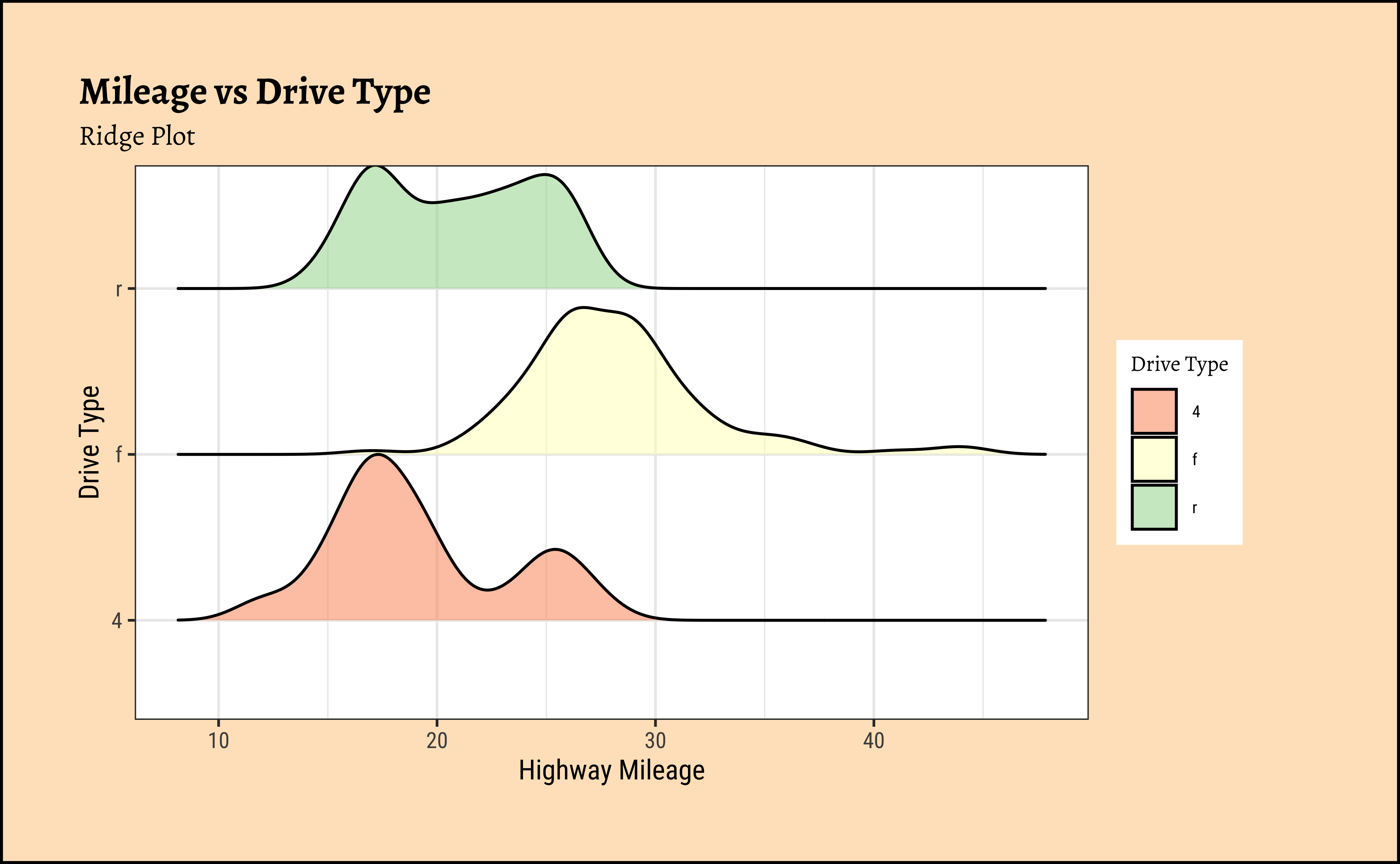
Sometimes we may wish to show the distribution/density of a Quant variable, against several levels of a Qual variable. For instance, the prices of different items of furniture, based on the furniture “style” variable. Or the sales of a particular line of products, across different shops or cities. We did this with both histograms and densities, by colouring based on a Qual variable, and by facetting using a Qual variable. There is a third way, using what is called a ridge plot. ggformula supports this plot by importing/depending upon the ggridges package. ggridges provides direct support for ridge plots, and can be used as an extension to ggplot2 and ggformula.
ggplot2::theme_set(new = theme_custom())

gf_density_ridges(drv ~ hwy,
  fill = ~drv,
  alpha = 0.5, # colour saturation
  data = mpg
) %>%
  gf_refine(scale_fill_brewer(
    name = "Drive Type",
    palette = "Spectral"
  )) %>%
  gf_labs(
    title = "Mileage vs Drive Type",
    subtitle = "Ridge Plot",
    x = "Highway Mileage",
    y = "Drive Type"
  )
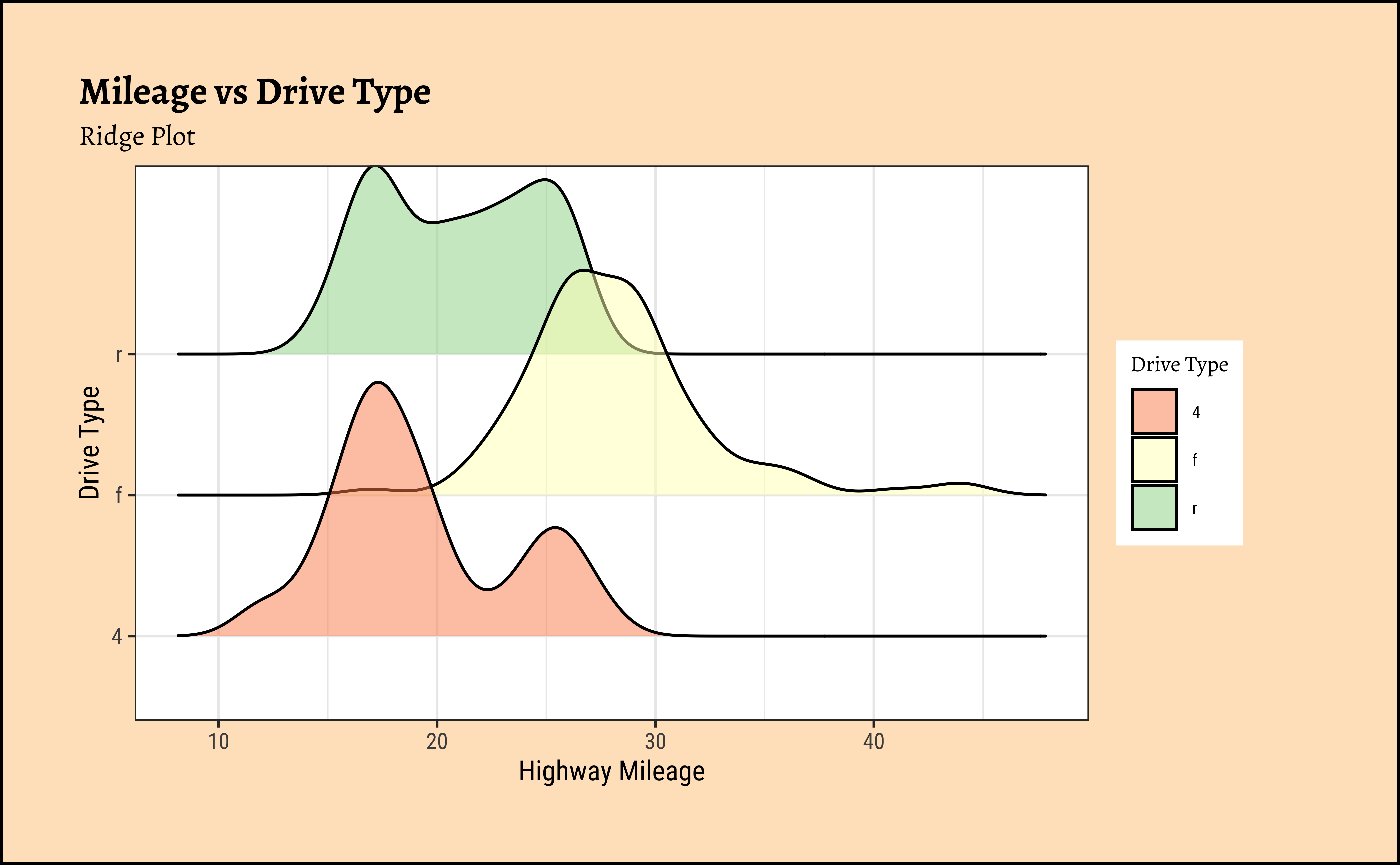
ggplot2::theme_set(new = theme_custom())

ggplot(data = mpg, mapping = aes(x = hwy, y = drv, fill = drv)) +
  geom_density_ridges(alpha = 0.5) +
  scale_fill_brewer(name = "Drive Type", palette = "Spectral") +
  labs(
    title = "Mileage vs Drive Type",
    subtitle = "Ridge Plot",
    x = "Highway Mileage",
    y = "Drive Type"
  )
NoteBusiness Insights from
mpg Ridge Plots
This is another way of visualizing multiple distributions, of a Quant variable at different levels of a Qual variable. We see that the distribution of hwy mileage varies substantially with drv type.
7
- Densities are sometimes easier to compare side by side. That is what Claus Wilke says, at least. Perhaps because they look less “busy” than histograms.
- Ridge Density Plots are very cool when it comes to comparing the density of a Quant variable as it varies against the levels of a Qual variable, without having to
facetorgroup. - It is possible to plot 2D-densities too, for two Quant variables, which give very evocative contour-like plots. Try to do this with the
faithfuldataset in R.
8
- Histograms and Frequency Distributions are both used for Quantitative data variables
- Whereas Histograms “dwell upon” counts, ranges, means and standard deviations
- Frequency Density plots “dwell upon” probabilities and densities
- Ridge Plots are density plots used for describing one Quant and one Qual variable (by inherent splitting)
- We can split all these plots on the basis of another Qualitative variable.(Ridge Plots are already split)
- Long tailed distributions need care in visualization and in inference making!
9
NoteStar Trek Books
Which would be the Group By variables here? And what would you summarize? With which function?
NoteMath Anxiety! Hah! Peasants.
10
- Winston Chang (2024). R Graphics Cookbook. https://r-graphics.org
- See the scrolly animation for a histogram at this website: Exploring Histograms, an essay by Aran Lunzer and Amelia McNamara
- Minimal R using
mosaic. https://cran.r-project.org/web/packages/mosaic/vignettes/MinimalRgg.pdf
- Sebastian Sauer, Plotting multiple plots using purrr::map and ggplot
| Package | Version | Citation |
|---|---|---|
| ggridges | 0.5.7 | Wilke (2025) |
| NHANES | 2.1.0 | Pruim (2015) |
| resampledata3 | 1.0 | Chihara and Hesterberg (2022) |
| rtrek | 0.5.2 | Leonawicz (2025) |
| TeachHist | 0.2.1 | Lange (2023) |
| TeachingDemos | 2.13 | Snow (2024) |
| tidyplots | 0.4.0 | Engler (2025) |
| tinyplot | 0.6.1 | McDermott, Arel-Bundock, and Zeileis (2026) |
| tinytable | 0.16.0 | Arel-Bundock (2026) |
| visualize | 4.5.0 | Balamuta (2023) |
Arel-Bundock, Vincent. 2026. tinytable: Simple and Configurable Tables in “HTML,” “LaTeX,” “Markdown,” “Word,” “PNG,” “PDF,” and “Typst” Formats. https://doi.org/10.32614/CRAN.package.tinytable.
Balamuta, James. 2023. visualize: Graph Probability Distributions with User Supplied Parameters and Statistics. https://doi.org/10.32614/CRAN.package.visualize.
Chihara, Laura, and Tim Hesterberg. 2022. Resampledata3: Data Sets for “Mathematical Statistics with Resampling and R” (3rd Ed). https://doi.org/10.32614/CRAN.package.resampledata3.
Engler, Jan Broder. 2025. “Tidyplots Empowers Life Scientists with Easy Code-Based Data Visualization.” iMeta, e70018. https://doi.org/10.1002/imt2.70018.
Lange, Carsten. 2023. TeachHist: A Collection of Amended Histograms Designed for Teaching Statistics. https://doi.org/10.32614/CRAN.package.TeachHist.
Leonawicz, Matthew. 2025. rtrek: Data Analysis Relating to Star Trek. https://doi.org/10.32614/CRAN.package.rtrek.
McDermott, Grant, Vincent Arel-Bundock, and Achim Zeileis. 2026. tinyplot: Lightweight Extension of the Base r Graphics System. https://doi.org/10.32614/CRAN.package.tinyplot.
Pruim, Randall. 2015. NHANES: Data from the US National Health and Nutrition Examination Study. https://doi.org/10.32614/CRAN.package.NHANES.
Snow, Greg. 2024. TeachingDemos: Demonstrations for Teaching and Learning. https://doi.org/10.32614/CRAN.package.TeachingDemos.
Wilke, Claus O. 2025. ggridges: Ridgeline Plots in “ggplot2”. https://doi.org/10.32614/CRAN.package.ggridges.
Citation
BibTeX citation:
@online{2024,
  author = {},
  title = {\textless Iconify-Icon Icon=“clarity:bell-Curve-Line”
    Width=“1.2em”
    Height=“1.2em”\textgreater\textless/Iconify-Icon\textgreater{}
    {Distributions}},
  date = {2024-06-22},
  url = {https://madhatterguide.netlify.app/content/courses/Analytics/10-Descriptive/Modules/26-Distributions/},
  langid = {en},
  abstract = {Quant and Qual Variable Graphs and their Siblings}
}
For attribution, please cite this work as:
“<Iconify-Icon Icon=‘clarity:bell-Curve-Line’
Width=‘1.2em’
Height=‘1.2em’></Iconify-Icon>
Distributions.” 2024. June 22, 2024. https://madhatterguide.netlify.app/content/courses/Analytics/10-Descriptive/Modules/26-Distributions/.